Dreaming of Butterflies

I know it’s been awhile since I’ve written. Still trying to get into a rhythm of making, photoing, and then posting. Thanks to technology and a busy schedule, there is usually a breakdown before the “posting” part. I’m working on it. 

It seems the thing I do best is blog when I’ve woken up in the middle of the night. But I’m often most creative at night or when I should be sleeping, so I suppose it all works out. Tonight was yet another one of those. Three hours of sleep after three hours of editing and, boom, I’m awake again. So I got up and made a card. (And now I’m posting because the picture is still on my phone.)

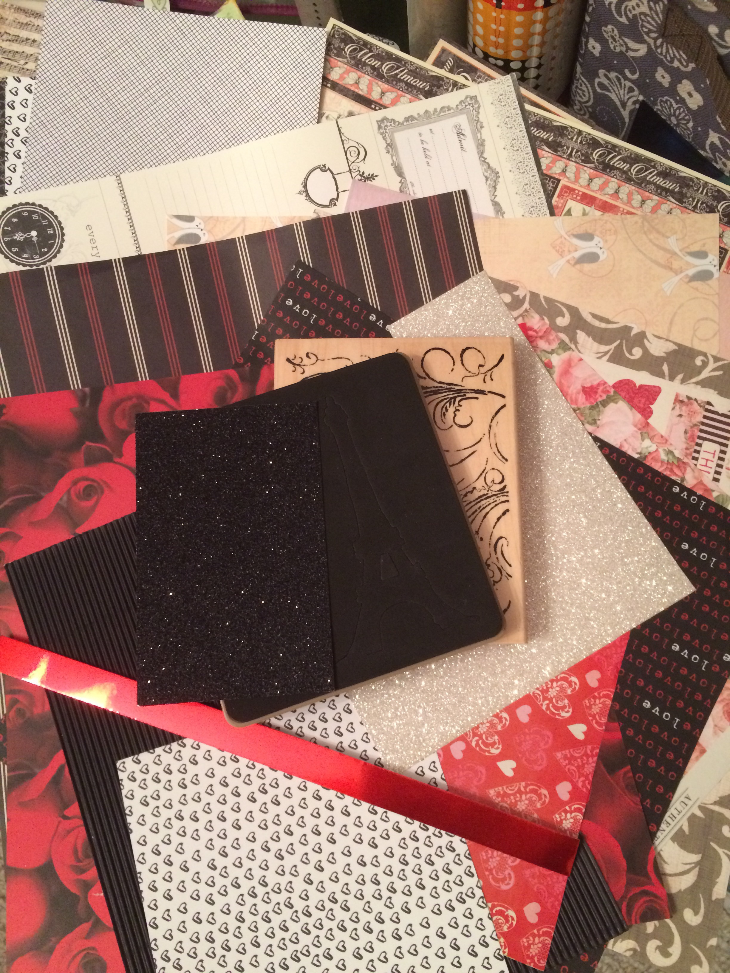
I had some free time last week, so I took a few minutes to do some rearranging and organizing in my craft room. My poor pegboard spinner is someday going to come crashing down from all the weight hanging off it. To alleviate a bit of its suffering, I decided to move my dry decoupage and peel-offs to a new three-drawer Sterilite storage container I got this summer. And, as usual, when I start organizing stuff, I find things to play with and get all distracted. I was good about setting them aside this time, so they were waiting for me on my desk when I woke up early and wandered in. 

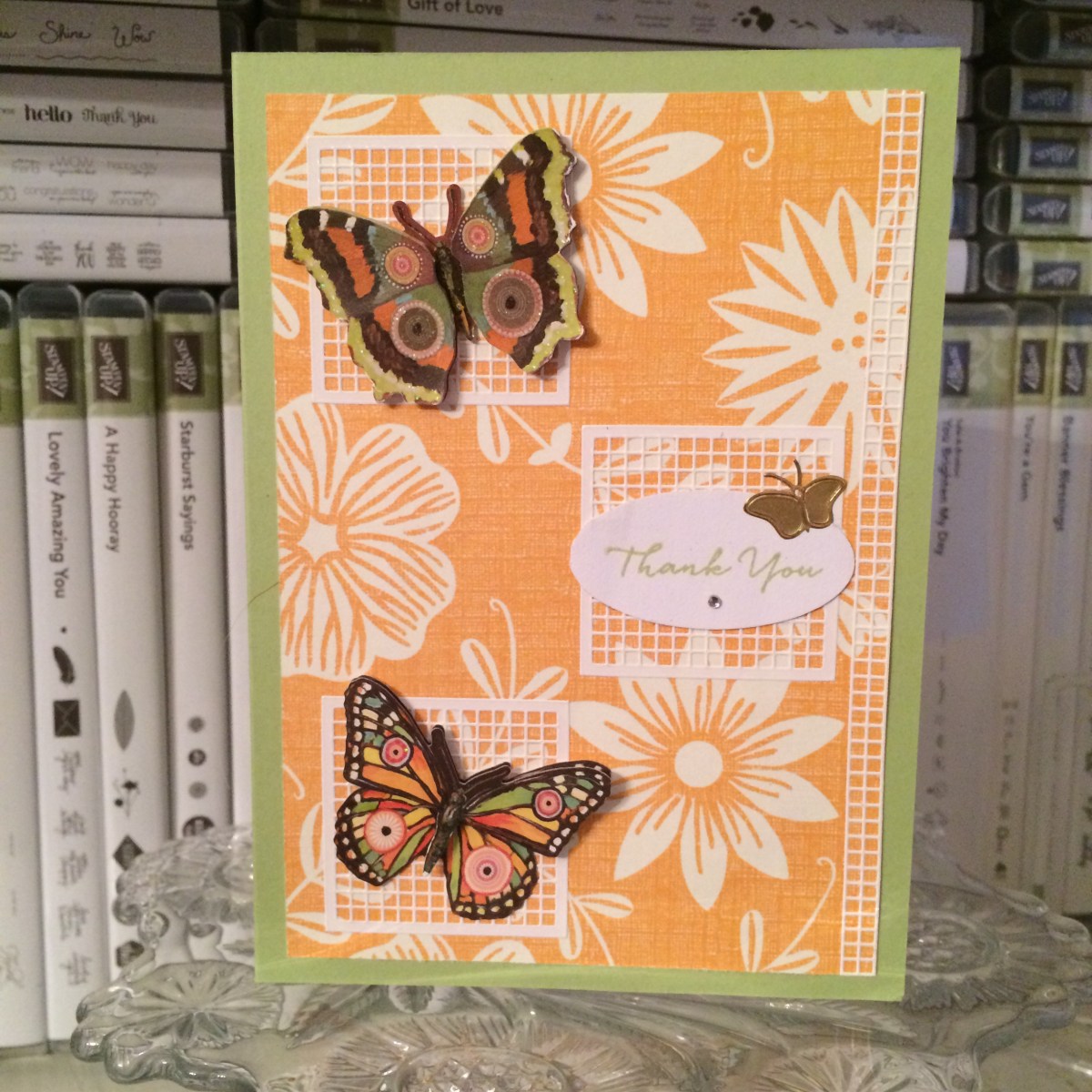
What I found then were some strangely colored butterflies, a page of white grid peel-offs, and a gold sheet of beautiful butterfly and flower peel-offs from StickerKing. I have way too many butterflies, so I’m always looking for a way to use them up. On my desk, unrelated to this card forming in my head, was a piece of orange, flowery paper that I hadn’t put away. This morning they all fell into the same card, which turned out about halfway like I’d imagined. Designs always morph into something I haven’t intended. 

I pulled the light green color in the butterflies into my card base by using Stampin’ Up’s Certainly Celery cardstock (very retired). The orange flowery (maybe K and Co?) paper decided to become the background mat. I positioned three of the white grid peel-offs on top of it because they had reminded me of latticework initially. 

At this point everything was glued down. And then I couldn’t decide where to put the butterflies or how many to use. I thought I’d had it figured out, but then I didn’t like it. The three big ones felt too crowded and overwhelming on the paper (the card is only an A2 – 4.25 x 5.5), but we’re generally supposed to use the “rule of three” in triangles when we create so it’s more pleasing to the eye. I turned the base and the attached paper every other direction looking for something that felt right. I needed a place to put a sentiment too. I ended up tearing off the orange paper and grids (gently) so I could flip the direction of the card opening. Then I placed the punched sentiment piece onto the third grid and planned to add a smaller gold butterfly above it to use that “rule of three” technique. 

I really didn’t have a sentiment in mind when I first started mentally creating this card, but I have a custom order for thank-you cards to do soon, so I figured if she liked this one, I could add it to her pile; otherwise it’ll go on the Etsy shop unless I need to use it sooner than that. 🙂

I added a tiny rhinestone gem underneath the words “Thank You” because I didn’t like the white space. The rhinestone is from CTMH (“Bitty Sparkles”) and they are probably my all-time favorite gem. They’re just so delicate and pretty. The “Thank You” stamp is from the “What I Love” Sale-a-bration set from Stampin’ Up (now retired). And I used Certainly Celery ink that matched the card base. 

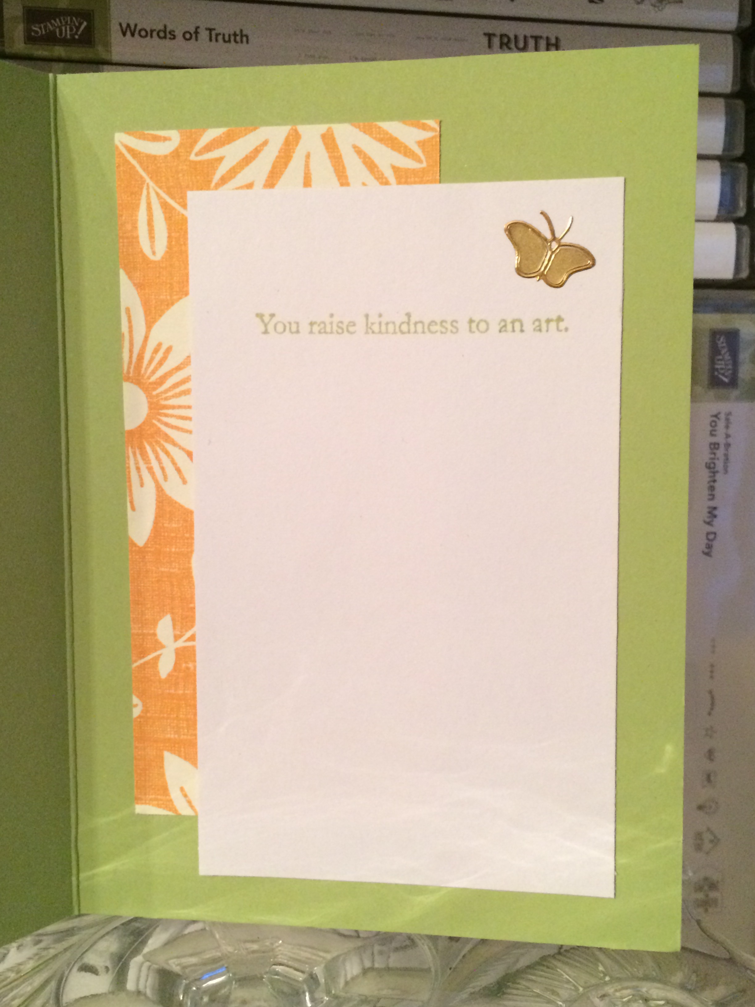
By the time I got to the inside, I was getting tired and lazy, so I didn’t feel like hunting down and cutting up a whole sheet of paper. I found a white scrap on my desk that was almost big enough to become the part you write your message on. Coupled with the leftover orange flowery paper from the front (which I’d intended for a different card front), the white scrap was now the perfect size. Then another sentiment popped into my head – “You raise kindness to an art” from SU’s “Vintage Vogue” set (retired) – and it didn’t take long to find it and stamp it on the inside. Certainly Celery ink again. Another gold butterfly on the inside and an identifying stamp on the back completed the card. 

Now that I’ve been creative AND blogged, it’s time to sleep again. Hope you like this little card offering for today. It’s just something quirky out of my own brain. Have a wonderful day!
Connie

Masculine movers thank-you card 5

One more in this series. Thanks for working through them with me.

I used “Brushed Gold” (retired) cardstock from Stampin’ Up as a base for this one. I have a partial pack of 8.5 x 11 cardstock and cut one sheet down to an A2 size before scoring it in half with my scoring board (wonderful invention, and so much easier than trying to fold it in half without creasing it where you don’t want to, which was the way I used to do it). I’m not really a “gold” person, but I do like this cardstock and wish it was still current. It has a beautiful shimmer in the light and isn’t too gold for me.

The same double-sided Martha Stewart brown/blue-and-pink-flowered patterned paper came into play for the matted layer, as on “Cards 2 and 3,” detailed here. I still hated covering up those beautiful flowers. I might just have to make a new card with it as penance. 🙂 On top of that solid brown, I put another section of the DCWV key paper – finally going back to the moving idea. It has a deliberate “stained” or distressed kind of look around the edges of the 12×12 sheet. This particular piece was from a corner, so that’s why it looks the way it does. I could have added ink on the border of the other “key” pieces to get the same idea (or the right-hand edge of this piece – which I just now realized), but I didn’t think it was all that necessary at the time. You can see in the close-up of the picture that the browns aren’t an exact match, but I’m reminding myself that people don’t usually look that closely – or hold it to their face. No one will know, right? 😉

When I remember to do it, I wait until I have most of my pieces ready or a solid idea of what I want to do before I start gluing layers together, so I can do things like wrapping this ribbon around part of the paper. Wrapping it is better than cutting it off, which will cause it to fray (and then get too short despite your initial measuring). Trust me on this. 🙂 I mean, yes, you can cut it with pinking shears, but you won’t always want that particular look. And you can use Fray-Check or another glue, as I used to, but then the ribbon will darken or even harden where the liquid was applied. And that’s not very pretty. So for me, wrapping works…when I plan ahead or stop to think about how to put everything together. The ribbon in this particular case is a retired 5/8″ Gold Satin ribbon from Stampin’ Up, and the flattish buttons are SU Gold Metallic Buttons (also retired – notice a theme yet?).

I thought about using another fancy die for the sentiment block, but time was growing short and I wondered whether the curves of the die might conflict with the shapes of the keys. When I found this scrap of Naturals Ivory (Stampin’ Up, retired) that was already cut down, that settled the debate. (This is one reason why I keep scraps with their pads.) This cardstock has little random flecks of color in it in keeping with that “natural” look.

I decided not to use the gold embossing powder on this card. It was late, T was sleeping, and my heat gun, since it’s almost twenty years old, is not the quietest. I hear the newer versions are much better with that – but mine works just fine, so I’m not going to invest in another one until it dies. Probably. So for this sentiment I just used my Soft Suede ink pad (Stampin’ Up, current). Stamps are also SU and from the “One Big Meaning” (current) and “So Very Much” (SAB, retired) sets.

The last step – and the one I find the most fun – was finding embellishments to pretty up the front of the card. This is actually when I found and placed the buttons, but the sentiment needed something too. Most company’s adhesive jewels and “dots” are rather raised, which sometimes requires a thin piece of cardboard in the envelope with the card so they don’t burrow through the envelope. I was trying to avoid that, but my best options were still problematic in that area, so I thought about photo corners or turning it into some kind of frame. I could have rooted through my photo corners tray, but as it was late and I needed to get the order packaged up, I chose the faster route of going to my die wall where I knew I had this tiny corner die. I have to cut it individually, four times, but sometimes it’s still the best choice. The size was perfect, so I cut it out of a metallic gold sheet of cardstock from a DCWV Metallics Stack. That pad is just beautiful, with many shades of metallic colors. Now that I’ve broken it open and used a bit of it, I may go back to it more often. (I’ve been trying to curb my “hoarding” urge; there’s always new stuff to buy as trends and preferred colors in the industry change. Not that I really need to buy much…but telling myself that does help me work through the fact that I should use up my stash. 🙂 )

So that’s it for this card and my five-note thank-you set. Which one was your favorite? This one might be mine, as it was both easy yet somewhat detailed. Thanks for reading! Feel free to “follow” me for more card ideas and tips in future posts.

Masculine mover thank-you card 4

Card 4 in my series of five masculine thank-you cards for movers.

Continuing in my set of five masculine thank-you cards (to be sent to people who helped my client move), this “Card 4” is another one where I couldn’t get the brown-and-white DCWV “key” paper to work with the plaid and metallic silver-toned base. The colors just weren’t compatible enough. But I thought it would still be simple and masculine, two other requirements for the order, so I continued.

At this point in the order, it was just about keeping things consistent (like the gold embossing powder)…and I’d already used the plaid once on a different card anyway (in my “Card 1” post here). This section was the remnant of the 6×6 piece. I like to use up my scraps when I can to keep my scraps box under control, so there wasn’t much question as to whether I’d use it now. (It was “either use it now” or throw it on the desk to be used soon, since I couldn’t really take the time to look up which Stampin’ Up paper pack I’d taken it from. The scraps box wasn’t an option. I’m fussy about my SU paper and always put the scraps back with their pads since I have matching inks and embellishments in my supplies.)

I wish I knew what company this base is from. I was given a number of thick metallic bases in a craft swap, and they’ve been great to work with. They feel thicker than the usual Stampin’ Up cardstock I typically use for my bases (those are an 80-lb card weight, I think). A good base is key to the card not falling over or flattening instead of standing up.

The mechanics of how I did this card are simple. I’ve already mailed the cards, so I’m not sure of the precise measurements of the individual pieces, but I think the remnant plaid piece is just over 2 inches. I believe the squarish one in the middle was the back side of the grey plaid paper I used in “Card 1” (K and Company). I already had a chunk cut out of it for the other card, so one side had already been shortened. I measured where I wanted it to fall on one of the strips of the yellow-and-grey piece and lopped off the other side with my Fiskars trimmer.

(Confession: I don’t do a lot of measuring or precutting. It’s more annoying to store the paper as pieces get cut out of it, but I’m always afraid of limiting myself to certain sizes or creativity if I “only” have so much of something because I’ve cut it down. I do both scrapbooking and cards, so I can be pretty random in my sizing of card fronts, mats, and journaling boxes. Usually I just take the large piece of paper and a pencil straight to my project and mark where I want to cut it for that specific purpose and then file the rest away to use later. I probably ought to rethink this as I try to streamline my process for card making, since precut pieces would make it faster, but I’ve been loathe to change.)

snapseed

Once I had the grey square piece cut, I took my anti-static bag to the front (I remembered!) to prepare it for heat embossing. I already had my embossing tray, coffee filter, embossing powder, and heat gun out (and just typing that sentence shows why it’s easier to do multiple cards with the same supplies at once), so I stamped the thank-you stamp (“One Big Meaning,” Stampin’ Up, current) with my VersaMark pad, pressed it onto the grey piece (don’t wiggle it!), sprinkled it with the gold embossing powder (Hampton Arts), and took my (very old) Marvy Uchida heat gun to it. (See this post about why I use a coffee filter with my embossing powder.)

It actually turned out well! Though I am beginning to wonder whether my powder is too old – or maybe it’s just the brand. I don’t think my Stampin’ Up powders dimple like that, but they’re newer. And I don’t heat emboss all that much, so I haven’t really compared it to my others yet. The dimpled look is fine for these masculine cards and during other times as well, but occasionally I do want a smoother look, which seems possible with other powders. Or companies. This is something I need to research. (If anybody has any knowledge or tips, feel free to leave me a comment!) After I glued the square piece onto the plaid one with my ATG gun, I repeated the embossing process with the “for your kindness” stamp (“So Very Much, Stampin’ Up SAB set, retired). Then I sat back and took a look at it to see if the card “needed” anything else.

It wasn’t very long before the empty spaces in the square bugged me. This is why I have trouble doing simple cards. I apparently despise “white space.” My husband is forever telling me to leave things alone and not fill every little area. I’m not very good at that. But sometimes something actually needs to be filled and looks better once it is. I think that’s the case with this one. It would have been fine on its own, but the little added touches make it more special. I used a gold peel-off from Dazzles for the top swoosh and heart doodads – not sure which exact one, since I’m still not near my supplies as I write this. (I’ve figured out how to blog ahead of time and schedule posts!) After I was done with the center, I adhered my Crushed Curry Enamel Dots (Stampin’ Up, retired) at the edges of the plaid piece. I probably could have left those off entirely, but I had pulled them when I was looking for something to finish off the grey square, so they were in front of me. And I don’t “leave well enough alone” very well either. 🙂

I was pleased with how this one turned out. It fit the requirements and didn’t take overly long.

Thanks for stopping by!


Masculine mover thank-you cards 2 and 3

In my quest to continue creating the masculine thank-you cards for my newest custom order, I went back to the brown and cream “key” paper I’d taken out of a DCWV 12×12 Stack (I think it came from “Tradewinds,” but I’m not near my supplies to check). I had to use this paper; I wasn’t sure what else to grab to signify the whole “thanks for helping us move” idea. 

My initial thought was to create cards based on one of these sketches turned on the side, using the key paper and three other coordinating papers…


…but I couldn’t get the sizing of the sentiment to work with the key paper and not completely hide it. In the end, since the sentiment stamp had been approved by the sender, I nixed the sketch idea and just went back to the basics: covering the majority of the card with pretty paper and layering something on top. In this case, I layered the key paper and then a retired 5/8″ gold satin ribbon from Stampin’ Up across the center of the card. I did that in the wrong order, but I’ll spare you the details.

I found two cream 5×7 card bases in my premade bases pile, so they were perfect to use with the coloring and the size of the sentiment stamp. I decided to ink up the edges with a dark brown chalk ink from Colorbox (Chestnut Roan?) to balance the brown in the key paper.

I only have a few dies that are large enough to hold the entire stamp and not cut off an edge (it really is big, people), so I chose one that was more decorative than the rest since the rest of the card background was pretty simple. The die is from Spellbinders, but I bought it used and haven’t looked up the name yet. Spellbinders dies allow for both cutting and dry embossing, in subsequent steps. You cut the outside first, then flip over the die with the paper still intact and add a squishy embossing mat and a firm knock-knock plate on top to get the embossing pressed into it. (“Knock-knock” is not my term for how you can tell the difference between some of the plates, but I can’t remember the source right now. However, it’s brilliant and I’ve never forgotten it! I’ll try to update and add the source later after I search for it.)

I found a light brown paper in one of my Martha Stewart 12×12 paper pads – it was a shame to cover up the pretty blue and pink flowers on the opposite side, but there was no helping it. The brown worked better than anything else I had nearby. Once I had chosen the paper I was going to use behind the sentiment, I laid the die on top and cut roughly around it, leaving a little room. (Have to cut down the 12×12 piece to get it into the 6-inch(ish) Cuttlebug for the die cutting and embossing.) Then I started the embossing process. 

Heat embossing used to really frustrate me. It felt like I never got a good clean image when I was done. I’m a perfectionist and hate it when stray flecks of embossing powder attach and then are heated onto the paper where I haven’t placed ink. With practice – and with the Embossing Buddy anti-static bag – I’ve gradually gotten better at it. I keep a paintbrush in my close-at-hand tools to whisk away stray flecks upon inspection before taking the heat gun to it (thank you, Betty!). Well, even with all that perfectionistic practice, sometimes I still forget to use the Embossing Buddy. Of course I forgot once on these two cards. But I remembered on the next one. 

Whether or not you remember to use the anti-static bag/Embossing Buddy, the next step is to take a VersaMark pad or pigment pad or thick craft ink to your intended stamp and stamp onto your paper. The thicker ink doesn’t dry as quickly as the water-based inks, which gives you time to move the image to your embossing powder. Some people keep theirs in separate plastic food containers with lids, which I’d like to try, but I’m already short on space and own an embossing tray with a funnel. I frankly despise using the funnel. The best tip I ever saw about embossing – besides using the anti-static bag – is to use a creased coffee filter on top of your work surface, under the embossing powder. The filter catches the extra powder that is tapped or slid off the card, and the crease allows you to quickly and easily “funnel” it back into your open container for next time. No need to waste it!

So I used the anti-static bag (or didn’t), prepped my new stamp by rubbing it on my inner arm (it rubs off the factory coating and gives the ink a chance to stick to the rubber or acrylic stamp right away – and you don’t want to rub it on your jeans due to lint), figured out the placement of where the stamp should go with the Spellbinders die, inked the stamp with VersaMark, stamped it onto the brown paper,  added the gold embossing powder from Hampton Arts, and then warmed up the heat gun before holding the paper under it. I love to watch it turn from flecks of embossing powder into a creamy, consistent, glossy image. It reminds me of a race – once the image starts to turn, the rest of the image races to catch up. 🙂 

Once the big “Thank you” sentiment was done, I took the second sentiment stamp, “for your kindness” (both stamps are from “So Very Much” SAB stamp set, Stampin’ Up, retired), then inked it and repeated the process. I recentered the die over the paper on my magnetic pad (best invention EVER) and cut it with my Cuttlebug. And then I dry embossed it by flipping it over and adding the squishy and knock-knock mats mentioned above. And it was perfect. I added 3D foam dots on the back side of the sentiment piece and stuck it down on top of the gold ribbon. 

I thought about adding a small enamel or epoxy heart or dot off to the side of the Thank You part, but it was late and I needed to go to bed, figuring I’d think about it the next day. The next day came and I wasn’t sure it was necessary, plus it was going to take some time to figure out what, exactly, to put there and I needed to just get the order done. Besides, they’re for guys. They’re going to spend about 2.4 seconds looking at it, say “it’s nice,” and move on. They won’t even notice a missing heart shape. We have to be realistic sometimes. 

Since the inside of the 5×7 cards were so big, I felt I needed to cut down the writing space a little. Nobody needs that much room to write a short, non-effusive thank-you note. I decided to stamp some corners (maker unknown) on the inside in Stampin’ Up’s Soft Suede ink, which matched the keys pretty well. I stamped them freehand without measuring, so they may be a little off. I’m choosing not to find out. 


So cards 2 and 3 didn’t take as long as card 1 did, thankfully, though they are much simpler and not really my preference. I like details…but to move along in the process, simple cards are a necessity sometimes. I’m learning to appreciate them. 

Masculine mover thank-you cards (with card 1)

Well, I’ve fallen a bit behind. A bit. Yeah. Some days I feel like I live my life in the rearview mirror, always chasing my tail and trying to catch the front of the train instead of the back. (I’m sure that’s far too many cliches for one blog post, but it’s the middle of the night and I’m deliberately ignoring editorial preferences.)

So what have I been doing? In a proverbial nutshell, trying to keep up with my health (some days are better than others), traveling to West Virginia, Arkansas, and Georgia and all places in between for family concerns, doing some editorial work, and finishing a very large custom card order for masculine love cards, one shabby chic Mother’s Day card order, a couple of birthday cards, and some grad cards. Some of those cards are on my new Instagram account (AnneGirl77). I’ve managed to keep up with that somehow. Part of my blogging delay was because I needed pics to be able to post. There is always an order to things! The rest of it was because I just had no more time. But I’m back now – at least for tonight, since I fell asleep uncharacteristically early and am now awake. 😛 

Tonight’s post is about another custom card order that is in the mail: five masculine thank-you cards for recipients who helped the sender move. I detail my initial process and then focus on the first card at the bottom.

Ask any cardmaker: masculine cards are challenging. Floral, pretty, girly prints are easy to work with; there’s masses of material out there and a lot of designers are women, so they create what appeals to them. (I’m thankful for those who deliberately go in another direction for more options.) So what do we have available for masculine cards? Plaids. Varying fonts. Gender-neutral items. Solids. Strong colors. Bold prints. Fishing or hunting. Cars, bikes, trucks, tractors, all manner of machine… Mustaches. Video games or comp sci/techs stuff. Math…? Okay, that may be stretching it. But you see what I mean. It’s not easy to come up with a lot of variety. And I was supposed to find something for movers. I picked keys, thinking house, and my guy go-to, plaids. Maybe plaids aren’t a normal “guy go-to” but I grew up buying “real” flannels for my dad every other year, so for me, it’s a given. 

I’ll confess, I was really struggling with these cards. Sometimes the simplest ones are the hardest. The thank-you cards that fell together the best were the plaids, which had nothing to do with moving – but the paper had landed on my desk and I couldn’t stop looking at it. And I had a design in my head I wanted to do with the DCWV key paper, but I couldn’t get the sizing to work right with the large stamp I wanted to try (which had been approved by the sender). I also wanted to make them nice and had to make the sentiment show up on the matching darker paper, so heat embossing seemed the way to go. One challenge after another. 

I finally conceded that the sizing just wasn’t working with the usual A2 card base, so I switched to another (smaller) thank-you sentiment for half of them and then grabbed a couple of premade cream 5×7 card bases for the bigger sentiment just so I would make some progress. 

I find I create cards much faster and easier when I’m throwing random bits around – things that happen to be laying on my desk that I need to put away…or I’ll look up at my pegboard spinner and focus on some item hanging there that’s never been a focus before and I suddenly know exactly what I want to use it for. Sometimes when I’m trying to feel my way around a vague idea, I find myself pulling out papers and fun embellishments that seemingly have nothing to do with each other. It’s like a stress relief…or maybe just a perfect stalling technique. But somehow all that creative “mess” often turns into a card, and usually rather quickly once it’s in front of me. 

I’d already pulled five A2 (4.25″ x 5.5″) card bases for the new order. When I was thinking through this key paper/mover problem, I was cleaning up my desk and floor from the love stuff – I work out mental problems best by cleaning – and I stumbled upon that yellow/grey plaid paper (Stampin’ Up brand). I had one 6×6 sheet of it because I had no idea which paper pack I’d pulled it from besides “Christmas.” But it matched one of those card bases perfectly, which isn’t easy to do when you’re not using coordinating products, so I had to either use it or set them both aside for another day, another card. And I really don’t need anything else sitting out to use “later” (I already have another 10-15 cards in pieces that I never got to make for the love order before I ran out of numbers). 

So using it was a given. And then I sat there and stared at it. The key paper (brown/gold) didn’t match. Nothing else matched. How could I do both browns and greys and make it look purposeful? Ugh. I ended up matting the paper with a random lightweight black piece that was also on my desk and went the gold/grey route instead of browns.

The goal was to keep the cards flat (so they would be easily mailable and not cost extra postage) and simple (because simple is the preference of this sender and, well, they’re for a bunch of guys who aren’t going to care anyway). I finally reconciled myself to using the smaller sentiment, and then it was just a matter of filling the space left over. That’s where the rummaging bit comes in. I knew I had some key embellishments, so I started digging in my “fun” drawers. But I needed them to stay flattish. It turned out that the Tim Holtz grungeboard keys worked best for the requirements, though I’d need to change the color of them. I didn’t want to use the only two I had on one card, so I settled for a keyhole plate as a companion piece to the smallest key and grabbed some Distress Inks to dirty them up a bit, as the original grungeboard color was too light to match. 

I’m still pretty new to working with the Distress Inks even though they’ve been around awhile. I only have a handful of colors and half of those are borrowed. I really wasn’t sure what to do with them besides the standard ink-it-up-and-stamp. Enter E, one of my crafty friends who often works at the same time. We’ve spent hours sending chats and pics back and forth for feedback as we craft. She’s an awesome resource on things I’ve been too afraid to try, so she was my first obvious stop. (If she hadn’t been awake, I would have hit YouTube.) 

She gave me a few instructions, so I gulped and tried to do what she said. Got out a little cup of water and a paintbrush beside the two colors I chose (Iced Spruce and Black Soot) and hesitantly started trying to combine them on top of the grungeboard – and the edges, later. I’m not altogether sure I did it the way I was supposed to, and I went back once after it was half dry and added more, but I like the result. And then I bounced over to do some editing while I waited for it to dry fully. I was still thinking through the rest of those thank-you cards. 

After the key/plate set was done, the rest was easy. Candy brad bases, pushed through the paper to hold the sentiments (Stampin’ Up, retired), Dark Chocolate Liquid Pearls (Ranger), double-sided matching paper behind the keyhole (K and Company), and gold embossing powder (Hampton Arts) for the sentiments. I thought about running a ribbon behind everything to tie it together but didn’t like the placement of the key with it, and I worried that it would make things look too congested.

I’d found a miscellaneous round raw chipboard frame (possibly Colorbok?) while I was digging in my embellishments that fit the smaller sentiment perfectly. I covered it with gold metallic paper from DCWV…and I used the flip side of the keyhole paper from K and Company behind the frame and for the small banner that held the second part of the sentiment, “for your kindness” (also previously approved). Plaid again, of course – it matched. 

Both sentiments are from Stampin’ Up (“One Big Meaning,” current, and “So Very Much,” SAB set, retired). I had the perfect ribbon that reminded me of a chain and it even matched – the idea came to me as I was doing the dishes. No idea who makes it, but I love it. I had to pop up the key a bit with a 3D foam dot because of the ribbon (that I also had to cut to lay flat). 

So that was it. After a lot of mental agony, the first one was done. Here you go. 🙂 The others will come in successive blog posts since I’m sure this one is already too long. (I did say I wasn’t editing, right?)

Aforementioned links: my Instagram account – AnneGirl77

The Process Begins

Hello again! Sorry it’s been so long. Busy, busy…

So, I don’t know if there are other creative types with my issue (though I suspect there are), but one of the things that happens to me at night is that my brain “winds up” instead of “winds down.”

There may a number of reasons for that, considering all I know about me, but it definitely seems to be something about the peace and quiet of the evening and the diminished stress that frees my mind of the somewhat stifled creativity that happens during the day (when I need to accomplish my before-the-husband-gets-home list). The evening just *feels* different to me. I find myself wanting to wander to the craft room and “play” in the waning hours even when I have editing projects I need to complete. (I’ve mentioned that I’m trying to run two businesses at once, right?)

Once these ideas strike, I’m left with the agonizing decision of whether to be a good girl and go to bed (where I may stare at the ceiling, wondering when sleep will arrive) or give in to that sparking creativity in hopes that I just finish the darn thing quickly so I can go to bed before the sunrise (or, I suppose, a third choice – go do my editing).

Plus, there’s always the niggling worry that I’m going to forget whatever “brilliant” thing I came up with in the first place once I wait on creating it. Because this forgetfulness does indeed happen, I’ve started sketching out what I imagine – sometimes. But more on that in another post.

So this was the scene occurring when I took this picture for my new Instagram account – boom! Idea. Stay up? Go to bed? Editing not optional. Ehh, let’s take a picture first to document the crafty process because I don’t normally do that sort of thing. (Yes, I joined IG even though I haven’t figured out watermarks yet. I’ll get there.)


Now, this may not look like much to you, but to me it looks like possibilities. That solid black piece in the middle is actually a Bigz die of the Eiffel Tower.

I haven’t sketched this card yet either, because I’m going to be following a template found on the site of another awesome Stampin’ Up consultant, Lyssa Zwolanek, who got the idea from one of her crafty friends. (I’m telling you, the craft community is pretty fantastic in how makers encourage and challenge each other. And technically, if I’m following a template, that means I shouldn’t have to sketch it, right?)

Lyssa’s card tutorial can be found here, and I can’t wait to try it. I have pieces and parts of a French-themed card heaped in a (large) pile on my desk that has been waiting for me to get to it to include it in a custom card order. As soon as I saw the layout of Lyssa’s card, I knew my Eiffel Tower would fit perfectly on the front piece. Or at least I think it will. I haven’t actually tried it yet. But I do have more than one Eiffel Tower if the size proves to be confounding.

You may be wondering what I decided to do that night – to stay up or go to bed. Well, I didn’t make the card yet. I ended up cleaning the desk a little, looking at some of the French items and trying to plan a card in my head before I really had to sleep. Turns out I have about five French cards in my head. And as the picture attests, I have enough paper to make at least that many. 😛 (Good thing I have an Etsy shop! 😉 ) I feel pretty confident that I know where I’m going with this one even without sketching. I just have to wait a few more days to get to it, as I’ve been called elsewhere temporarily.

In the midst of that little desk-sorting episode, I ran across my in-progress Texas card, also for the custom card order. And that is really what I ended up focusing on, the night in question but mostly last night, because it finally started coming together, after months of thinking. Yeah. Months. However, that’s for a future blog post, complete with pictures. 😉

The good news is that I’m linked to WordPress on my phone now, so blogging should begin happening faster. I have to do some driving tomorrow, but I hope to post about Texas soon. More to come!

Connie

Trying Something New

“You can’t teach an old dog new tricks.”

“The definition of insanity is doing the same thing over and over again and expecting new results.”

“To improve is to change; to be perfect is to change often.” —Winston Churchill

“Change before you have to.” —Jack Welch

“The only way to make sense out of change is to plunge into it, move with it, and join the dance.” —Alan Watts

*****************

These quotes are some of the kinds of thoughts tumbling in my head recently. I have a good life here in quaint old Amish Country, with family and friends who love me; I work from home (“no, in pajamas,” my conscience tells me); and I have two cats who follow me around the house just to be near me. I’m not wealthy, but I’m not poor. I have plenty. But I also have dreams…dreams I want to turn into plans…plans I want to turn into my own success story, even if the only way success is seen is by looking over my shoulder to where I’ve been.

One of my dreams is to make this passion, this excitement I feel about the crafting I do for fun, into a THING, a thing that works, a thing that goes somewhere. A thing that makes other people smile or brightens a bad day. That makes ME smile when I’m having a bad day. That maybe even makes some money at some point. Really, a thing that says I’m not crazy to consider a new kind of “job” because I’m theoretically good at this too. (I’m a book editor. My love of details is the only thing in common here.) I was once told I’m not very creative—too “boxy,” apparently. I beg to differ. I will shout my differing from the rooftop.

Well, what kind of dreams could I—a mostly introverted book nerd who now prefers to stay at home (until I’m traveling the world) and occasionally contemplates the real possibility of having social anxiety (regardless of how many hours my Facebook is active)—dream about the crafting world? You make a birthday card and send it and the recipient loves it, or you do a scrapbook or two for the kids and grandkids to look at years later, right? Or you join the rest of America in having bigger appetites than budgets and create the coolest craft room in town with fun grownup toys like die-cutting machines. My online crafty friends would love that…. Isn’t that it? Hmm. No. Well, yes, to a degree, but…no.

Even if it does sound rather peacockish (and it really isn’t that), I’m going to take the scary step of admitting my dreams out loud: I want to create something amazing. I want to be recognized for my creativity or my designing or simply that I made something beautiful and inspired someone else to do the same, helping them find their creativity. I want to be published in a crafting magazine or somewhere besides my own photos on Facebook. I want to join a design team, given product and trusted that I will do something cool with it. I want to have as many followers on my “My Craftiness” Pinterest board of personal projects as I do on my “Great [insert long name here involving crafts]” board of things other people have made. (The thought of joining a design team for a company both terrifies and thrills me, for the record. One dream at a time, however.) And I’ve dreamed about making my playtime-slash-therapy in my craft room a business instead—getting paid to play, as it were, instead of how it is now: working to play. I’ve been debating about becoming a Stampin’ Up demonstrator for months (my poor, long-suffering, would-be upline Amy… See her awesome blog here, by the way, and be inspired already!). But it always seems like life is too busy to really go for it. I have too many other things I want to do or have to do or feel compelled to do. *sigh* Truthfully, I’m tired of this hamster wheel.

So here’s the thing. Tonight I’m feeling like that old dog who needs to learn a new trick, a dog that has been in the cycle of insanity for far, far too long. I’m not looking for perfection (sorry, Winston), but I do admit to the tendency of dreading that word “change.” And I despise the active process of it even more. But if I want my dreams to go somewhere, I have to do or be something I’m not currently doing or being; Winston kindly says I have to improve. Sadly, there are ever so many ways I could improve….

The point is, if I want my life to be different, I have to start making it that way. The alternative is not something I want to live with any longer. I’m not getting any younger. I want to enjoy my job again. I’m tired of waiting for life to continue going along as I’d hoped it would (because it’s been a “relatively” awful decade, to be honest—despite the pun), so the time to change is now. Feel free to call this my midlife crisis. (Can I have a Harley too?) Wait… Squirrel! Sorry…regrouping… “Until the pain of staying the same is greater than the pain of change, there will be no change.” Dwight Mason, lead pastor of NewPointe Community Church—my pastor—said that a few months back. He’s absolutely right, and I haven’t forgotten it.

Here’s my thinking (see, I’m a planner): to have any kind of following or sales or be part of any publication, I’ll need a blog. My Pinterest pins already have no “home,” even if they are being repinned. (This is not necessarily a good thing.) If I go the sales route, I’ll need to learn a whole new business AND blogging, along with several other kinds of social media, all at once. Along with keeping up with the Etsy shop I started a couple of years ago when I thought I’d see just how cold my toes would get once I dipped them into the water. And all those to-dos I’m deliberately not thinking about…oy. It already feels overwhelming. So Jack and Alan might approve, for as little or as much as we may agree on whatever else: I’m changing before I have to. I’m, shall we say, plunging into change and joining the dance of social media. (Hopefully it won’t be too chilly!) I’m late to the game, but maybe it will all make sense eventually.

Here’s your hearty welcome to my new blog: ConstantlyCreating.Me (yes, “dot” me, or the long version, constantlycreatingme.wordpress.com). It will be mainly about crafty stuff I “constantly” create in my happy little pink room. I do all kinds of crafts, so I’ll show my current projects, projects I need to return to, custom orders, my process of creating things, tips and tricks, crafty videos, new things I’m learning (quilling and iris folding fit in there)…and perhaps, occasionally, things I find inspiring or even how I’m juggling it all. And probably cat pictures—they do so love paper. But one beast at a time. (Watch out, Instagram. You’re next. After I figure out how to make a watermark.)

I’m trying something new. A card. A blog. A shop. Me. George Eliot said, “It is never too late to be who you might have been.” It’s time. Let’s do this.

Connie

Sites referenced:

My Pinterest boards: www.pinterest.com/conniet1492

My Etsy shop: www.etsy.com/shop/thelittlewhatnotshop

Find me on Instagram as annegirl77 (posts to come)

Amy Koenders’s blog: www.stampwithamyk.com

NewPointe Community Church: https://newpointe.org

Pat's Blog Site

One place to fit it all!

Stamp Dabbles

Donna Leonard | Independent Stampin’ Up! Demonstrator | Huntsville, AL

Niya Scrap

Démonstratrice indépendante Stampin' Up!®

From Pole to Pole

Adventures in the Land of the Pierogi

Stampin' in the Meadows

Akiko Sudano - Independent Stampin' Up! Demonstrator Downingtown, PA

Creative Stamping Designs

Karen Ksenzakovic, Independent Stampin' Up! Demonstrator in Somerville, NJ Let's make some cards!!

Stamp it up with Jaimie

Helping you find a stress free creative outlet through paper crafting.

Stamp With Amy K

Amy Koenders, Independent Stampin' Up! Demonstrator in Mendham, New Jersey...Let's make some cards!

The Daily Post

The Art and Craft of Blogging

WordPress.com News

The latest news on WordPress.com and the WordPress community.

%d bloggers like this: