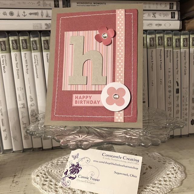
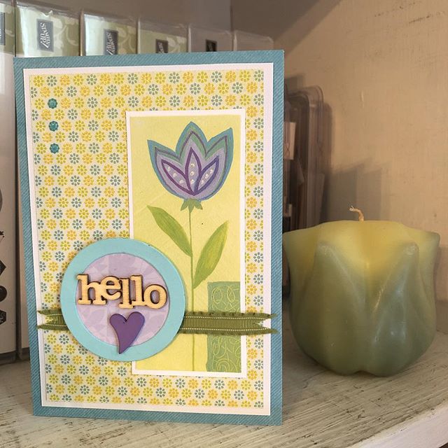
So what’s the first thing I do after a week of hard mental labor with *zero* time in the craft room, before I even go to bed? Make a card, of course! Thanks to Deb for the kit pieces – I just rearranged them in a pleasing arrangement. 🙂 And there’s another waiting yet. But bedtime first. #cardmakersofinstagram #easypeasy #randombits #thelittlewhatnotshop #constantlycreating
This is a card I made back in the winter for my local gift shop that I neglected to post to social media until now. I love the delicate details of this one! The flower bouquet is embossed—I think the set was from K & Company—and the lattice paper is from Stampin’ Up (the Delightfully Detailed Laser-Cut Specialty Paper, available only until June 4 or until supplies last: https://www.stampinup.com/ecweb/product/146907/delightfully-detailed-laser-cut-specialty-paper). I inked the lattice and background slightly with Distress Ink as well. The beautiful ribbon is Stampin’ Up’s Blushing Bride color, and the ink I used on the sentiment is also from SU.
Welcome to another blog post for Stamp with Amy K’s Inkin’ Krew Blog Hop! We have a very talented lineup for you this week. Thanks for stopping by to see what I created. 🙂
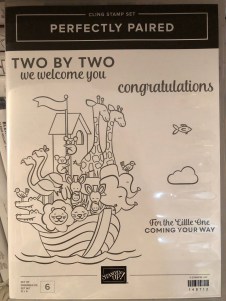
Our theme this month is “Celebrate Spring,” in whatever way we want to interpret that. Because I’m also making cards for my local gift shop, I chose to go with the “new birth/baby” idea. I couldn’t wait to get my hands on Stampin’ Up’s “Perfectly Paired” cling stamp set when it came out—it’s all about babies and features a Noah’s Ark image, one of my favorite themes for little ones. This stamp set (so far as we know) is only available for a couple more months since it’s in the current Occasions catalog.
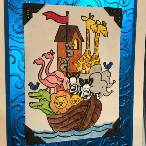
Since I knew this would be a nice card and likely given with a gift, I started off by grabbing a lovely, thick envelope from my stash and then made the card base a 5×7 size to match it, using SU’s Shimmery White cardstock. I chose Shimmery White because I wanted to color the image.
Well, as usual, although I was aiming for simple, I evidently have to complicate things. And I made plenty of mistakes to cover up. My “MO,” I’m starting to think.
It occurred to me that there were waves under the ark in the stamp but I thought it might look a bit “adrift” all by itself on a flat card base. So I got some of my new Ice Blue Matt Mirror Luxury Cardstock (Crafter’s Companion) and cut it down, leaving about a 3/8″ border of white on the base for the “shimmery” part of the “Shimmery White” to show. Then I embossed some waves onto the mirror card with my Cuttlebug (“Musical Flourish” embossing folder).
My piece of mirror card was slightly longer than the embossing folder, so I embossed both ends and then attempted to hide the faint line the edge of the folder left with some retired 1/2″ SU Pacific Point ribbon. I wrapped the ribbon around the edges to give it a neater, more finished look. I believe I used my 1/4″ Scor-Tape down the middle of the back of the ribbon.
I didn’t actually cover the line left by embossing because the ribbon wasn’t wide enough, but hopefully I distracted anyone from looking too closely. I tried to keep the embossed design from overlapping when I ran it through the Cuttlebug, and the embossed line really isn’t that bad, but it’s mirror card so everything shows…. 🤷♀️ Whether I needed the ribbon or not, it was an attempt to make the card look better, and I built the rest of the design from there.
After fiddling with the layout, I decided to also mat the mirror card with Pacific Point cardstock to bring more of the ribbon color in for balance. I left 1/8″ of the mat showing, glued the mirror card to the mat, and then glued the combo onto the card base. I used my ATG tape gun for these. Then I set aside the card so I could concentrate on the image. And here’s where things got interesting.
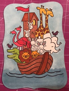
I wasn’t sure whether to use my Stampin’ Blends alcohol markers to color it or my usual: watercolor pencils with either an Aqua Painter or a Blender Pen. I figured I’d do one of each type of coloring and leave the extra in my “card parts” bin for faster cardmaking later. Because those mediums require different inks to control the color, I stamped the ark image from “Perfectly Paired” once in Memento Tuxedo Black (for the alcohol markers) and once in SU’s Archival Basic Black (for the watercoloring). I labeled the backs with a pencil so I’d know which went with what…and then promptly started coloring the wrong image with the wrong medium because I was “doing,” not “thinking.” 🙄🤦♀️
Surprisingly, the Archival Basic Black didn’t smear too badly with the alcohol Blends, but I had been careful about not coloring over the lines, just because I was carefully coloring. It wasn’t until I smeared the lions’ whiskers a little that I even realized I’d switched the pieces. (Live and learn?) But smearing lines is why we are supposed to use Memento ink with alcohol markers. Lesson learned.
And then I discovered that I don’t yet have enough Blends to finish coloring this particular image. 🤦♀️🤪 I’ve been building my collection a little at a time, and although the Smoky Slate and Basic Black Combos have each made it to my purchasing list at least once, I ended up dropping them for things I wanted more. (Sacrifices!) Therefore, I have to stop coloring the image until I can get those and finish. For the record, though, this was as far as I got, and I really like this medium. (If you look closely, you can spot my whiskers accident.)
So I had to put all that away and regroup. I couldn’t remember whether Memento would smear if I got it wet (since it is a water-based ink), but I just wanted to get something going that I could use. I mentally crossed my fingers and dove in. I could always stamp another one if I had to.
Fortunately, it worked just fine—no smearing that I can tell. My coloring isn’t perfect, but at least the lines didn’t move. I went with the Aqua Painter to smooth out the watercolor pencil lines too…though in hindsight, I should have tried the Blender Pen, for better control in small places. Or just chucked it all and gone straight for my stash of Stampin’ Write markers. (I hope you’re learning from my mistakes! This veteran scrapbooker is still learning so much about cards!)
I will admit to a little cheating as well. I knew I had a Pacific Point chalk in my arsenal. As my retired SU watercolor pencils are unlabeled, I went for the chalk to color the water (with my Aqua Painter) so I could be all matchy-matchy instead of throwing off the shades by introducing some other blue. 😊 Also, I lightly colored the background a sky blue so that it wasn’t stark white paper. If I was coloring waves, I had to color sky too, right? But it’s hard to see in the picture.
So this is where I ended up with it (including doctoring the zebras with white Smooch paint and a Memento pen in desperation after watercoloring and black got the better of me). Coloring was the longest part and why it may be better to use some sort of marker next time. 🤷♀️ Another lesson learned!
The main focal image, colored.
Once the image was done and dried, I covered a good portion of the back of it with my 1/2″ Terrifically Tacky Tape (TTT), which is just like SU’s Sticky Strip. I did this to combat the curvature of the paper that happens once water goes onto it. Then I peeled off the tape backing and centered it in the section above the ribbon on the card front.
I had found some black, glittered chipboard faux photo corners when I was debating about the layout, so I glued those overtop the corners of the image with my Art Glitter liquid adhesive. And then I pulled a metal bar sentiment (“celebrating your arrival”) out of the heap of baby ephemera in front of me on my desk, and I adhered it to the top of the ribbon with more 1/4″ Scor-Tape. The front was done. Finally. And I’m even happy with it. 😂 I especially love how the foil look of the matt mirror cardstock shines and changes depth and color in the light. I so love using specialty materials to make cards pop.
(Oops! You can see that faint embossed line in this pic! Well, it’s not that noticeable in person. 😊)
For the inside of the card, I used the “Two by two we welcome you” sentiment from “Perfectly Paired,” stamping it with VersaMark on Shimmery White cardstock before heat embossing it with “Blue Tinsel” embossing powder from my stash. (No idea who made that; I’ve had it for years.) It was the closest embossing powder I could find to the Pacific Point color I’d been using, and it does actually look glittery, like tinsel, and has some texture to it once embossed. I then backed the white sentiment piece with a die-cut Pacific Point cardstock tag from a Spellbinders die (“Fancy Tags Two,” I believe. #neverstopmaking). I think it turned out quite lovely.
To finish off the card, I took a strip of dotted blue (SU Pool Party) cardstock from the retired Tutti-Frutti Cards and Envelopes pack and attached it to the bottom of the inside. I also cut off a small strip of matt mirror cardstock to top it. And then I found two goofy pink flamingo stickers in my stash from Sandylion and stuck them to the bottom right corner just for fun, to carry through the theme. I was looking for my smaller Noah’s Ark stamp for the corner, but I have to keep looking. 🤔🤷♀️
I haven’t decorated the envelope yet, but I’m thinking of stamping a row of various animals across the horizontal bottom (under the address section) as a sneak peek to the theme.
Below the list of hop participants are the current products I used in my card (or similar ones) that you can purchase through my online Stampin’ Up store if you wish to own any. (Please use host code 6WPHJ2MC when you check out.) Don’t forget that we have until March 31 to get free gifts from Stampin’ Up through Sale-a-Bration with orders of $50 or more before tax and shipping! There are some awesome reward products available! I also give free gifts to those who order through me. 😉
Thanks again for visiting today. I hope my mistakes keep you from making your own! Feel free to post questions or comments. 🙂
To continue with our hop and visit Jaimie Babarczy’s blog offering, click Next or her name in the list below. To view what Karen Ksenzakovic created, click Previous or her name. Thanks for hopping along with us!
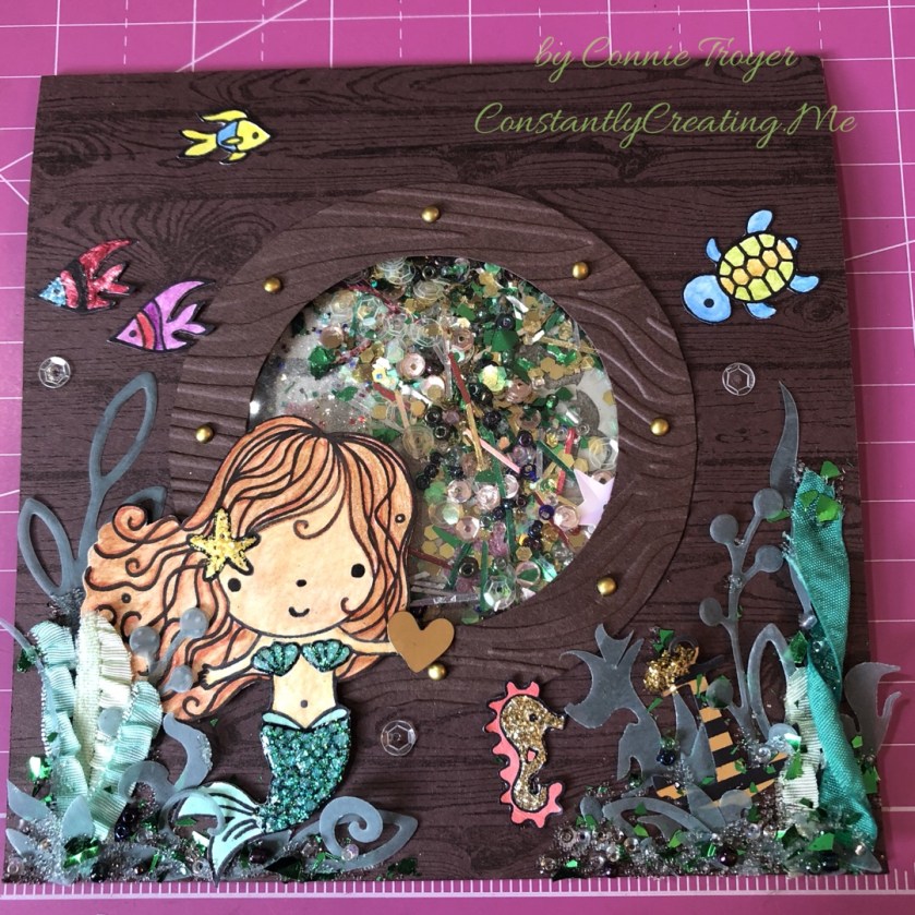
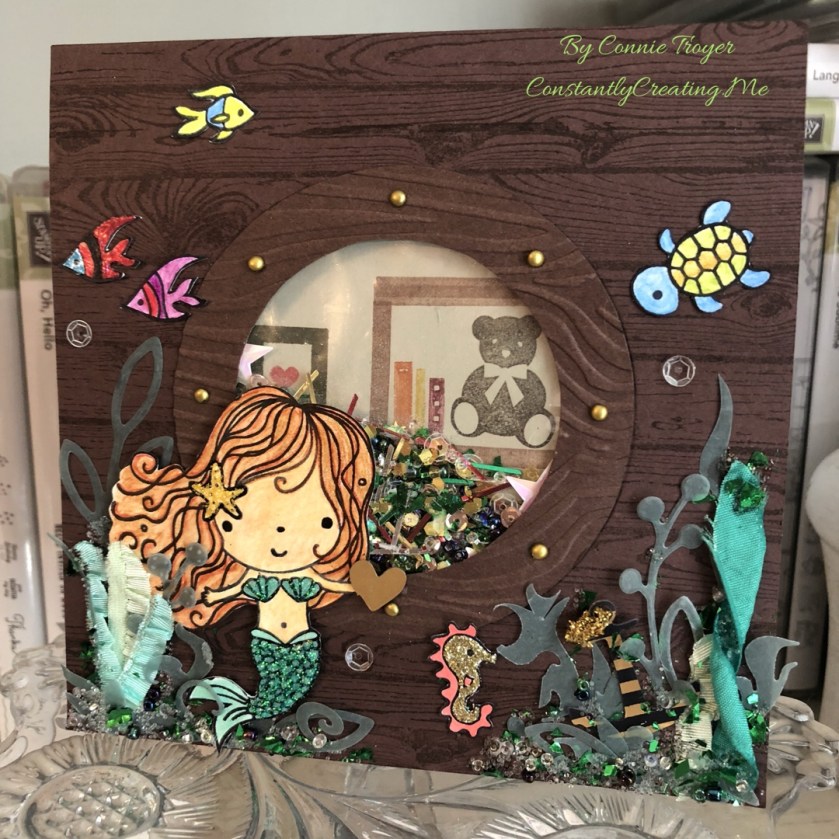
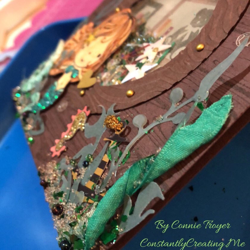
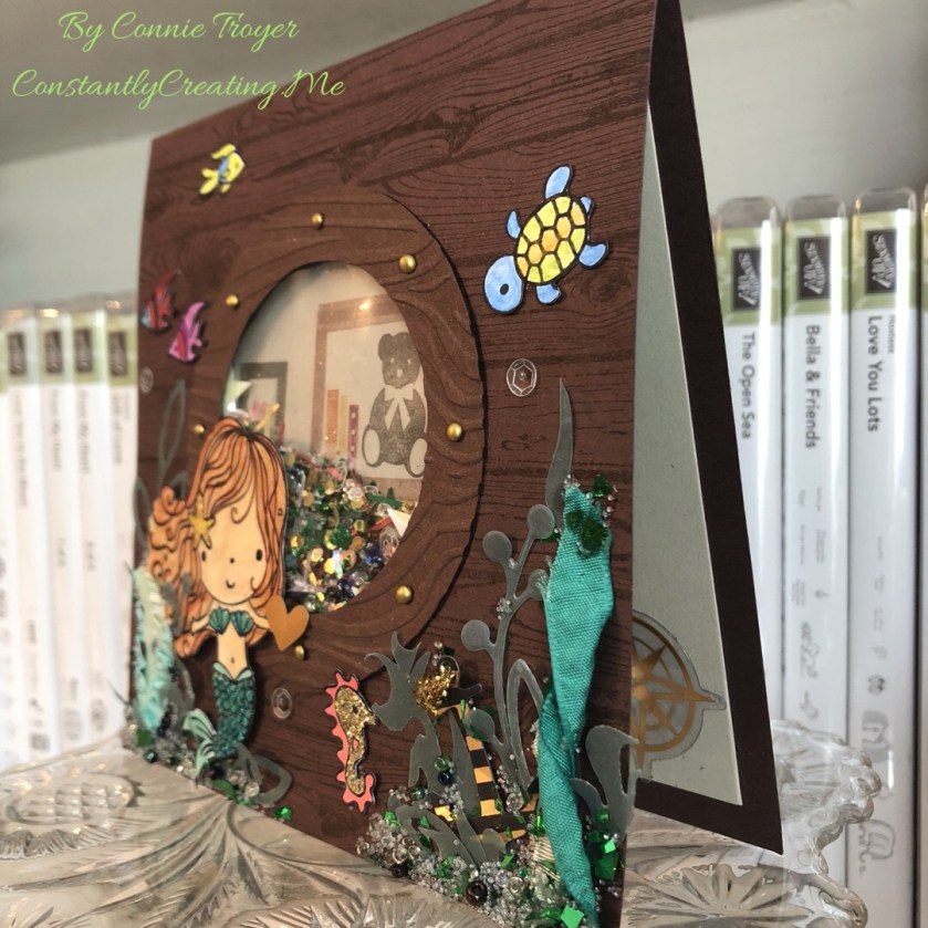
Thanks to my niece’s unicorn birthday card, I got in a few more custom card orders. One of those was for a special mermaid birthday card. I get the craziest ideas in my head sometimes, without any inkling of how I’m actually going to accomplish them. And then, through trial and error and time and SMH-at-myself moments, eventually they come together–and hopefully I’m even pleased and kind of impressed that the whole thing didn’t flop. Such was the case with the mystifying mermaid.
I could see it in my head–a cute little mermaid on the outside of a wooden ship, peering through the porthole to see what she could see, much as I imagine Ariel would have done had she not been collecting artifacts in her grotto or spying on the dancing taking place on the deck of Prince Eric’s ship. The trouble was that I didn’t quite think through all the steps of just how to create it.
The ship wouldn’t be a problem to create, as I own the Stampin’ Up Hardwood stamp (current catalog) and the porthole and mermaid were only going to be so big (I didn’t have to create the entire ship). I began by cutting down a piece of Stampin’ Up Chocolate Chip (retired) cardstock to 6″x12″, scored it 6″ up, and folded it. (And then shortly thereafter I cut down that card base to 5.5″x5.5″.) I used SU Early Espresso ink (current) to stamp overtop the Chocolate Chip so the wood grain could be seen. I then looked at several circle dies on my die wall and decided that the double-circle die from SU’s “Sliding Star” Framelits (retired) had the spacing I wanted for the porthole. I centered the die on the now-smaller card base, put another piece of cardstock behind the card base so the marks in my die-cutting plate wouldn’t transfer to the inside of my card base, and ran it through (forgetting until then that the die would cut through both the base and the extra piece. Oops! Goof #1!).
(Side note: There are at least two ways to create a shaker card. The way I know best, I didn’t do. It would have been easier to cut a separate 5.5″ piece and make that the porthole piece with foam strips rather than cut through the base and do it all backward. But I didn’t think that far ahead. Goof #2.)
Once I had the hole cut into the card base, I had to make the porthole cover, which would need to extend over the hole slightly. I went back to my Chocolate Chip cardstock to find a remnant that would fit, placed the die on the paper, and traced around the inside circle. Then I grabbed one of my most favorite and very old tools (a layering tool from Stampin’ Up from waaaay back), put the smallest layering circle against the die, and dragged it around the die with a pencil through the center of the layering circle (it rolls around objects to make slightly larger mats). Then I cut the now-slightly-larger circle out of the cardstock by hand. Once I had both circles cut, I embossed the new porthole with a wood grain embossing folder, decided I wanted the debossed side up, marked where the mini brads should go, punched the necessary 1/16″ holes (it’s easier than forcing brads through the paper by hand), and placed my chosen brassy mini brads in their spots. And then I glued the porthole onto the card base.
But that still didn’t get me the shaker feature. And that’s when I realized that I was once again taking the hard road by not doing the way I already know (albeit not well). So I conferenced with my friend E, who happened to be on video chat with me while I crafted (there are some days I love technology!). And she proceeded to explain to me how to use my much-desired Fuse tool that I’d purchased, longed to use, put off using, and then started looking at in a rather intimidated fashion. Apparently one can make shaker pockets with a Fuse tool! I’d heard that somewhere but had never attempted it. And fortunately for me, I’d happened to find some Fuse Project Life pockets on clearance the last time I went to JoAnn Fabrics. Even better, I found them in my craft room without too much looking.
While the Fuse warmed up, I revisited the shaker elements I’d gathered a few days prior–different colors and shapes of sequins (the stars reminded me of starfish, and the gold, clear, and rose were the perfect shades); seed beads in clear and marine colors and clear Stampin’ Up microbeads (retired) for space in the shaker pocket; leftover gold, green, and red long confetti flakes from a Stampin’ Up card kit; gold, white, and green mica flakes (that I’d never tried using); gold glitter hexagonal flakes; and some white Rock Candy Distress Glitter from Ranger. I spooned various quantities of these things into the pocket–and put in too many (goof #3?)–but actually managed to work the Fuse tool correctly on the first try. The second try wasn’t as good, but I’ll practice now that I’m no longer scared of it. 🙂 I cut away the excess of the filled shaker pocket and asked E how to hide the thing in the card.
Since I wanted my mermaid to be looking at something inside the ship, I cut a large circle in a lighter color and stamped the background of a bookshelf and human objects with SU Bookcase Builder (retired), which would be seen through the shaker pocket; then I glued that to the back of the acetate piece in what I hoped would be the right position (since the shaker elements would and did move around). Then I took another remnant of Chocolate Chip cardstock, placed foam dots around the edges, and put it overtop the background and shaker pocket. And then I breathed a sigh of relief, because the thing actually shook around the way it was supposed to, even if I did probably put too much in it. I was hoping it would look like the outside of the porthole had collected some sea stuff there on the ledge as it moved through the water…but Miss Mermaid got what appears to be the amount that collects in a shipwreck! Oh well. Live and learn and stuff another envelope later.
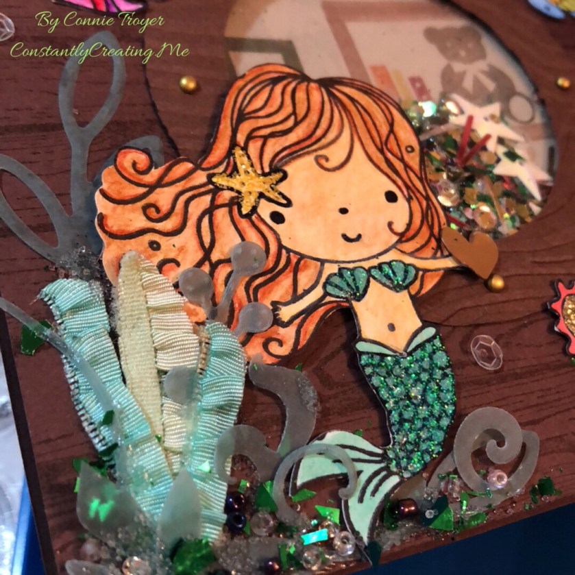
So my porthole was done–and I’d previously colorized my little mermaid and her friends with watercolor pencils, an Aqua Painter, Adirondack Dimensional Pearls, Stickles, Nuvo Glitter Drops, and Distress Glitter Stickles. I’d actually tried to stamp her tail on some very nice flaked cardstock that reminded me of scales, but that didn’t work like I’d thought it would (and I should have known better anyway–another goof), so watercoloring and two layers of glitter glue ended up working for the tail instead. I fussy-cut them all out, glued the mermaid to the card front in between two of the mini brads in the porthole, and started trying to figure out my seaweed issue. In my head, I saw things floating near her on the outside of the ship, like her friends or the occasional sea life. I ended up with more things there than I’d intended, but I think it’s cute anyway.
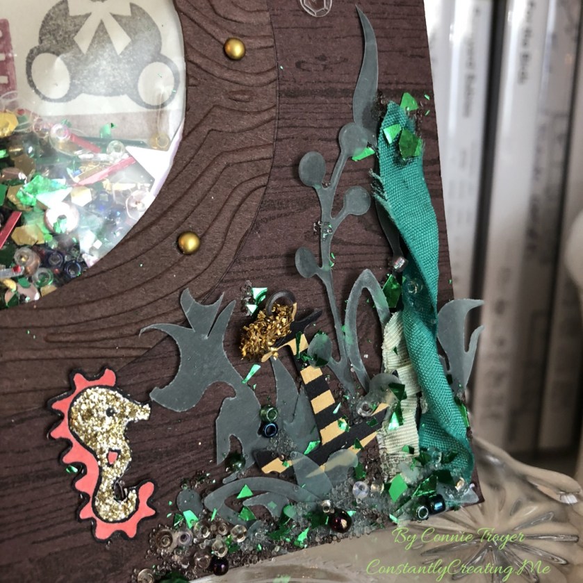
I found some retired Stampin’ Up ribbon in Emerald Envy, Pistachio Pudding, and Coastal Cabana that was ruched or ruffled, so I thought that might work for seaweed. I didn’t think I had any seaweed dies or stamps–but I found dies that would have worked better after the card was done (goof #5). Too late. So I trimmed up the ribbon (cut some of it in half and twisted others) and found some greenery dies on my wall that I thought could pass for seaweed. I used a couple of miscellaneous green vellum sheets of paper with the dies and then attempted to glue them all together with Zots and Tombow Multi (green and white) Glue.
But I couldn’t stop there. I had to add beads and microbeads and mica flakes to the outside bottom edges too. The inside of the shaker can’t have all the fun. Plus, I was hoping to hide some of the glue marks on the vellum pieces. 😀 I also found a little gold heart die-cut for the mermaid to hold, a gold compass for the inside of the card, and a black-and-gold die-cut anchor piece inside a random pack of travel/beach die-cuts I’d just received. I let it all dry overnight but had to go back in the morning, shift a couple of things, and reglue. My twisted seaweed had righted itself, and one of the taller seaweeds I’d cut by hand was tilting precariously.
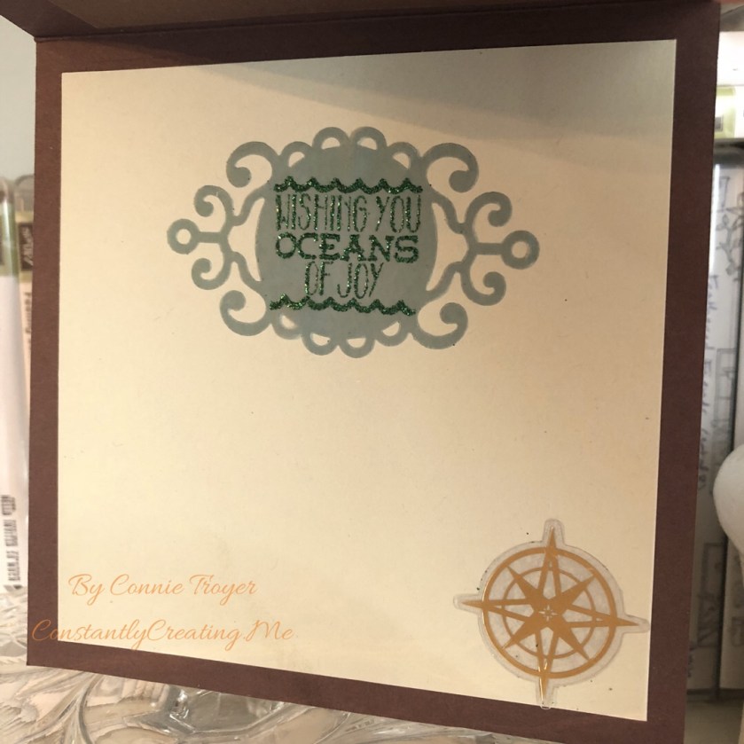
After the front was done, I had to do the inside. Thanks to guidance from the client, I knew which sentiment to use. I had just enough green vellum remnant left to cut out a tag that had a wispy or ocean feel to it, and I stamped the “Wishing You Oceans of Joy” sentiment from Elizabeth Craft Designs with SU Lost Lagoon ink (not normally something one can emboss with–goof #6). But it held okay on the vellum, at least long enough for me to pour Green Tinsel embossing powder over it and heat it all. It joined the compass on the inside of the card and I resisted the temptation to create more seaweed or pour more microbeads onto something. 🙂
I probably spent far too long on this card, but it was fun to work with the vision I had in my head and see it all come about. Now I just have to hope that the little recipient doesn’t shake off all the beads immediately!
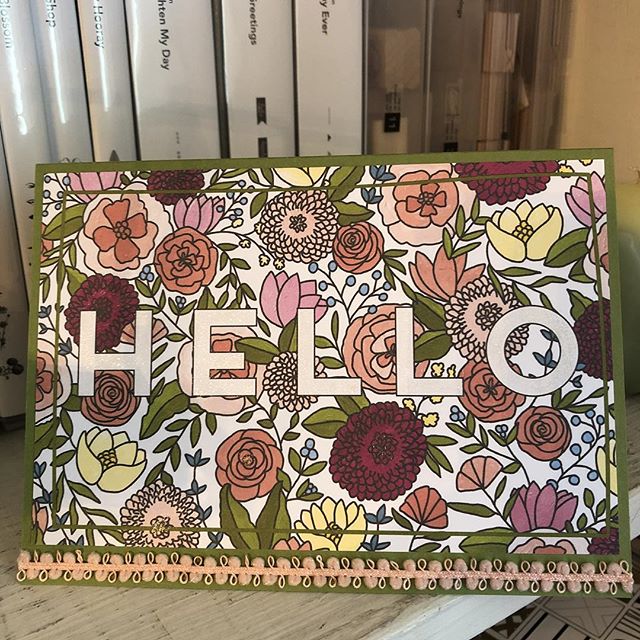
I grabbed a 4×6 printed piece from my Sweet Soiree Memories and More Card Pack from Stampin’ Up and adhered it to an Old Olive card base for this clean-and-simple hello card for Stacy. The peach ribbon is from Recollections but matched perfectly, and I also colored in the “Hello” and the centers of the flowers with a Clear Wink of Stella glitter brush pen. Quick and easy card.
Sometimes things are just too pretty or useful to throw away. (Yes, I have a Depression-era mind-set.) Here I used part of a printed card that had made its way to me into a little hello card, complete with a new tag, wood and resin pieces, two types of patterned paper (one being embossed and glittered), Stampin’ Up Lucky Limeade ribbon, and translucent, glow-in-the-dark Nuvo Drops.
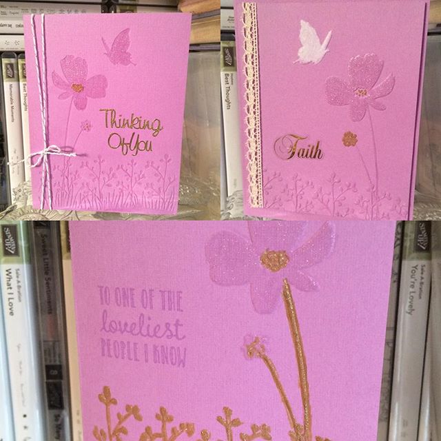
Three different looks to using the same Darice embossing folder and SU Orchid Opulence cardstock. Two of the cards have embossing, and my favorite has debossing. All were glittered with Wink of Stella Clear, white, and/or gold glitter pens. All ribbon and twine is Stampin’ Up too. Sentiments are Sticko stickers, a Stampin’ Up stamp (from “Hanging Garden”), or gold Dazzles. The card with the lace has a set-on, popped-up front.
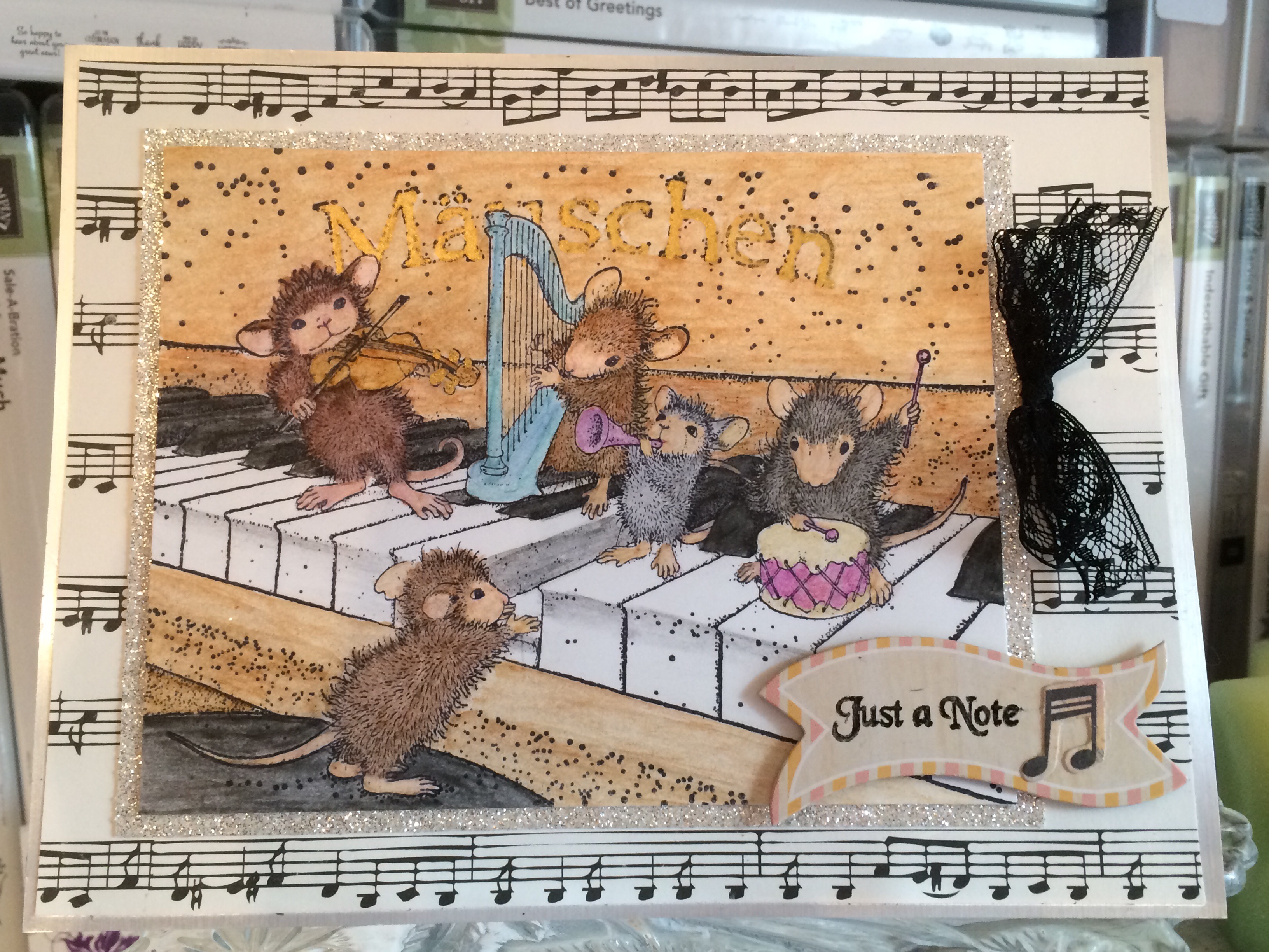
A musical birthday card for a musician celebrating a milestone year.
I took a break from Christmas cards to do up a few birthday cards that I needed to deliver or mail. One of them went to my aunt, who is a supremely talented pianist. I had thought of using this focal image for her ever since I first got my hands on this cute House Mouse stamp.
I grabbed a premade base that was of a larger size, since the stamp itself is basically the size of an A2 card front. No room for the music note paper I wanted to use behind it. But this larger card size worked well for the idea.
First I put down a layer of silver foil cardstock (cutting out the inner portion with snowflake and winter-themed word dies that I can use on other projects). The music paper I placed on top is from Echo Park’s “Be Mine” line. I then stamped, colored, and cut the House Mouse image so I would know what size to cut the Silver Glimmer Paper (glittered cardstock) from Stampin’ Up, which I placed behind the image as a mat.
I think I might need to work on my coloring skills, or at the very least shading, but I’m pleased enough with my creation. 🙂 I used three sets of watercolor pencils, an AquaPainter, and Ranger’s Jet Black Archival Ink to stamp and color the image. I topped it off with some gold Smooch Paint for the knobs on the violin and the lettering of “Mauschen,” the name of the piano. I had looked up the stamp online and found the colored image from House Mouse, so I tried to imitate those color choices. (Each of the mice are named and has their own coloring specifications.) I think next time I might try a black piano, however.
I had the most trouble finding and placing a sentiment on the card due to limitations in space and supplies. I had to revise my initial idea several times, and the more I hurried to finish it (since I needed to be leaving the house), the worse it got. Isn’t that always the way of it? Eventually something worked, although I realized an hour later that I’d forgotten to include the milestone number she was turning, as I’d intended. But maybe she doesn’t need that advertised. 😉
So, the tag is from the American Crafts “Everyday” line, the “Just a Note” sentiment is from Rubber Cottage, and I couldn’t read my handwriting on the back of the tiny music notes I added to the tag, so I can’t say who made that. The black lace ribbon is from Stampin’ Up. I stamped the sentiment with Jet Black Staz-On ink because the tag was chipboard with a shiny top and water-based dye inks just wipe right off of those. I used my heat gun to speed up the drying process as well.
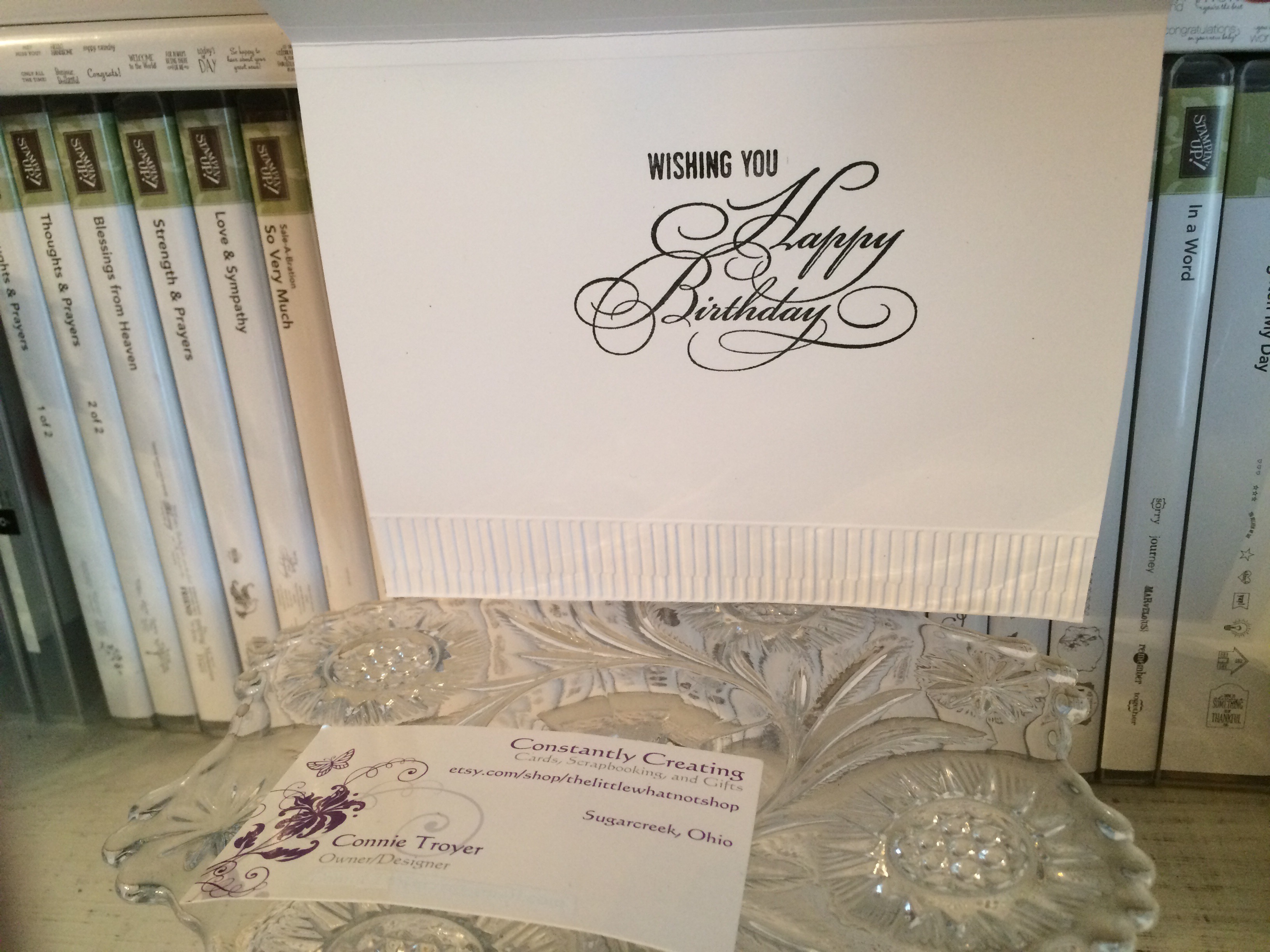
The inside of the card finished the thought begun on the front (“Just a Note”) with “Wishing You Happy Birthday.” Again not quite what I’d intended to say, but time really was of the essence, so I made do with the first couple things I found rather than creating a custom sentiment. And I’m the only one who overthinks these things, so it probably doesn’t matter. 🙂 The stamp sets I used for the inside are from Stampin’ Up (“Wrapped in Warmth”) and Close to My Heart (“Gracious Greetings”). I also embossed piano keys for the bottom border. The embossing folder I used is 5×7 and entitled “Keyboard,” from Cuttlebug.
Coloring always takes a bit of time, and I really do need to perfect some shading skills (here’s wishing I could go back to art class), but I’m generally pleased with the images once I’m done. I always enjoy seeing how the lines swirl and blend together when I’m watercoloring. Perhaps I’m really a Renoir at heart. 😉
That’s all for this birthday card. The others I created were simpler, of course. But details are my specialty. 🙂 Thanks for reading!
Throwback to a custom wedding card made last year for a couple I’ve never met.
In late 2015 I started accepting orders for custom-made cards. This fact still kind of boggles my mind. I never figured I’d be a cardmaker at all. I’m a scrapbooker–since the mid-nineties. Cards were confusing. Such a small canvas on which to put so much stuff! Give me a 12×12 page any day, thank you. But somehow with the purchase of my friend’s used Cricut, cards suddenly made sense, like that proverbial light bulb over the head. Someday maybe I’ll show those first three cards I made as I attempted to figure out the chirping machine.
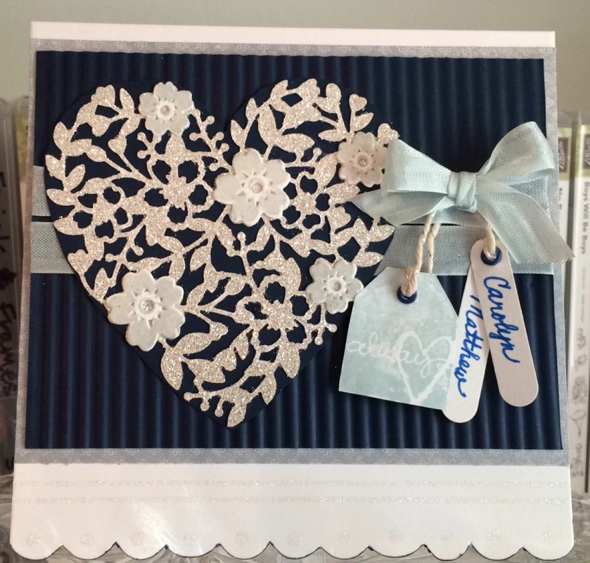
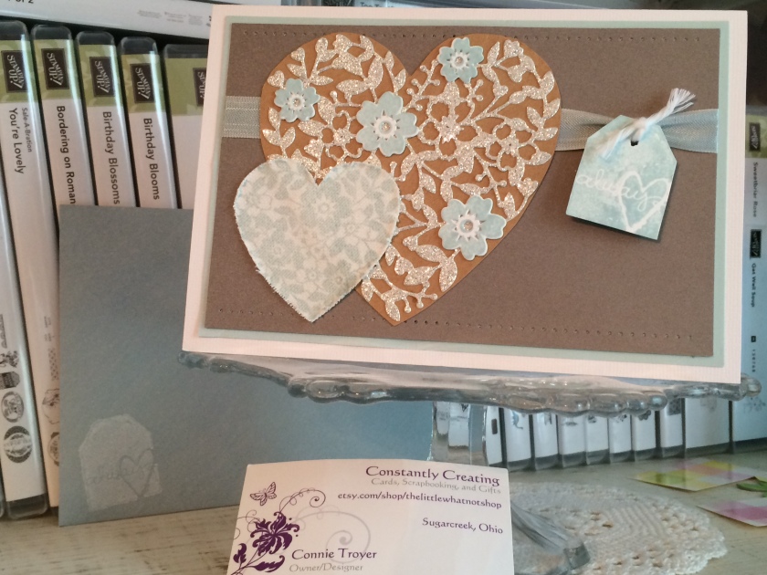
So fast-forward a couple of years and suddenly I’m at the point of taking custom card orders…? Um, okay. If you say so. Indeed, it seems that’s what I mostly do now. Instead of creating cards for fun, for friends, for a local church group, for Hospice, etc., like I imagined I might do, family and friends and a particular lady in North Carolina have kept me very busy making cards for them ever since August 2015. And I’m grateful. (Though still boggling.) Here is one of the examples I made for a relative, so she could give it to a couple with a wedding gift. It is a twist on a version I made for my NC lady the year before that (why recreate the wheel if you don’t have to?), but in this version, I personalized it with the recipient couple’s names.
I used a premade, glittered card base from DCWV (5.5×5.5 size), added some light blue/grey patterned paper on top of it as a mat, and then ran some dark blue Recollections paper through my Fiskars handheld (hand-cranked) paper crimper tool. Their wedding color was dark blue, and I thought it would pair well with the Soft Sky color I’d used in the earlier NC version, which was still in my head.
On top of the now-corrugated dark blue paper, I placed a die-cut I’d made from a local friend’s Bloomin’ Heart Thinlits Dies from Stampin’ Up (she and I share supplies so we don’t have to buy as much individually and then have an excuse to get together to craft!). I used Stampin’ Up’s Silver Glimmer Paper for the heart – and found out the hard way (i.e., remembered) that it is best to cut on the back side of that glittered paper rather than trying to get the die to cut through the glitter on the front. (Let’s just say “Lesson learned”!)
I decided I didn’t like the look of it by itself on the corrugated paper, not to mention that it is a delicate thing and would be hard to glue on top of the corrugation, so I glued the heart die-cut to another piece of the dark blue Recollections paper (that I did not run through the crimper). I then stamped out the little matching flowers of the corresponding Bloomin’ Love photopolymer stamp set in Soft Sky ink, die-cut them with the matching thinlit, and glued them on top in the appropriate places. I actually found it difficult to die-cut those without one edge or the other slipping and not staying centered where I put it. I have a number of rejects I didn’t deem “good enough” for the card. Must need more practice.
Before I glued the heart die-cut down, I laid it out to see where I wanted it, marked it, removed it, and then wrapped some Soft Sky Seam Binding ribbon twice around the corrugated paper and tried to tie a bow off to where the side of the heart would be. This step was trickier than I thought it would be, but I do like the effect. And I used up some of my seam binding ribbon, which pleased me immensely. I think it’s pretty as a whole, but I struggle with using it because it is so delicate. I feel like using the word “fragile,” actually. It catches on things easily, gets holes easily, and is almost see-through. I feel like glue or strip tape can be seen underneath it as well, so I have a hard time finding ways to use it that aren’t simply bows. So this worked. (And after I use up my seam binding stash, I will never buy any again.) I think I actually made the bow separately from the ribbon wrap because I couldn’t get it to lay right. I believe I attached the bow with Zots after gluing down the heart.
Then came the fiddly stuff. I stamped the tag that says “Always” from the retired SU Too Terrific Tags set in Soft Sky, cut it out (I don’t own the matching punch), and set it aside. Next I got out my retired Word Window punch and took it to some white cardstock. I then used some very retired SU Brilliant Blue eyelets from way back when, with my Crop-a-Dile at the tops of the “Always” tag and oval windows. I hand-wrote the couple’s names (more than once) and strung the three tags from the top ribbon with some SU Silver Baker’s Twine. I actually double-strung the “Always” tag to keep it the direction I wanted. And then because it was still not cooperating, I stuck a pop-up dot to the back of it and told it to stay put. The names still dangle sweetly as I imagined.
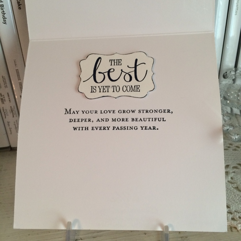
The inside of the card was simpler. “The best is yet to come” sentiment came from my retired SU “Best Thoughts” Hostess stamp set, which I stamped on white cardstock in SU Night of Navy ink and punched out with my retired SU Decorative Label punch. I edged around the punch with my matching Night of Navy marker to highlight the edges since it was white on white. Then I stamped the “May your love” sentiment from the current SU Floral Phrases stamp set. (Yes, I do have some current items! 🙂 )
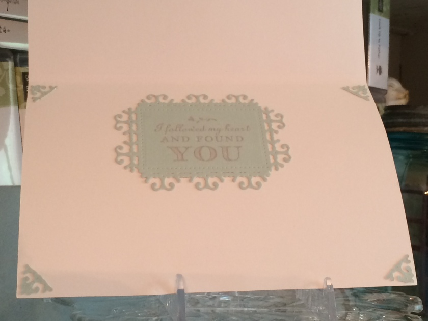
All in all, I was pleased with the way this “version 2” card came out. Just for fun, here’s “version 1” that went to NC, in Soft Sky, kraft, white, and Crumb Cake. Version 1 also uses some distressed, stamped-on canvas.
Thanks for stopping by! Hope I’ve given some inspiration for your own wedding cards. 🙂
Well, I’ve fallen a bit behind. A bit. Yeah. Some days I feel like I live my life in the rearview mirror, always chasing my tail and trying to catch the front of the train instead of the back. (I’m sure that’s far too many cliches for one blog post, but it’s the middle of the night and I’m deliberately ignoring editorial preferences.)
So what have I been doing? In a proverbial nutshell, trying to keep up with my health (some days are better than others), traveling to West Virginia, Arkansas, and Georgia and all places in between for family concerns, doing some editorial work, and finishing a very large custom card order for masculine love cards, one shabby chic Mother’s Day card order, a couple of birthday cards, and some grad cards. Some of those cards are on my new Instagram account (AnneGirl77). I’ve managed to keep up with that somehow. Part of my blogging delay was because I needed pics to be able to post. There is always an order to things! The rest of it was because I just had no more time. But I’m back now – at least for tonight, since I fell asleep uncharacteristically early and am now awake. 😛
Tonight’s post is about another custom card order that is in the mail: five masculine thank-you cards for recipients who helped the sender move. I detail my initial process and then focus on the first card at the bottom.
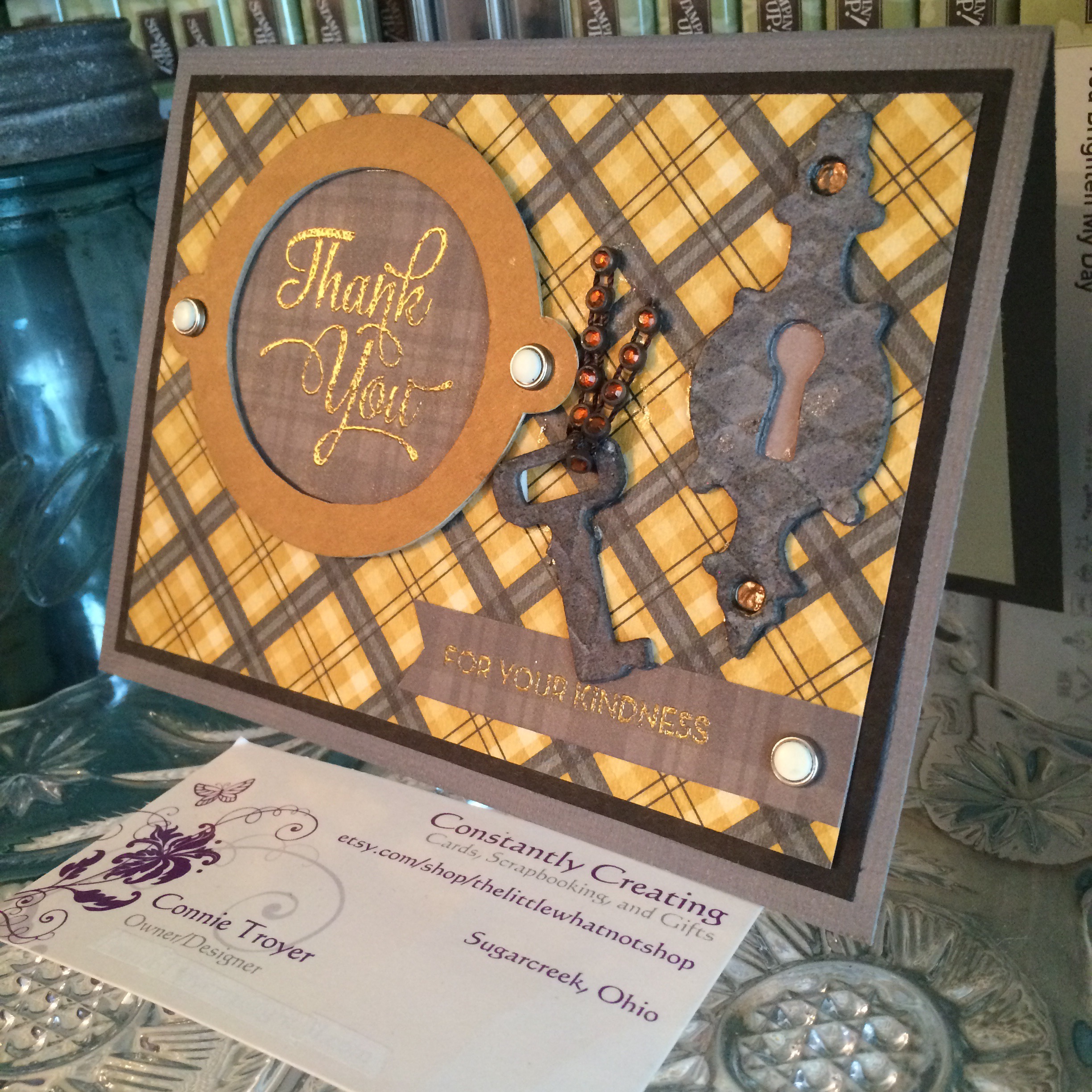
Ask any cardmaker: masculine cards are challenging. Floral, pretty, girly prints are easy to work with; there’s masses of material out there and a lot of designers are women, so they create what appeals to them. (I’m thankful for those who deliberately go in another direction for more options.) So what do we have available for masculine cards? Plaids. Varying fonts. Gender-neutral items. Solids. Strong colors. Bold prints. Fishing or hunting. Cars, bikes, trucks, tractors, all manner of machine… Mustaches. Video games or comp sci/techs stuff. Math…? Okay, that may be stretching it. But you see what I mean. It’s not easy to come up with a lot of variety. And I was supposed to find something for movers. I picked keys, thinking house, and my guy go-to, plaids. Maybe plaids aren’t a normal “guy go-to” but I grew up buying “real” flannels for my dad every other year, so for me, it’s a given.
I’ll confess, I was really struggling with these cards. Sometimes the simplest ones are the hardest. The thank-you cards that fell together the best were the plaids, which had nothing to do with moving – but the paper had landed on my desk and I couldn’t stop looking at it. And I had a design in my head I wanted to do with the DCWV key paper, but I couldn’t get the sizing to work right with the large stamp I wanted to try (which had been approved by the sender). I also wanted to make them nice and had to make the sentiment show up on the matching darker paper, so heat embossing seemed the way to go. One challenge after another.
I finally conceded that the sizing just wasn’t working with the usual A2 card base, so I switched to another (smaller) thank-you sentiment for half of them and then grabbed a couple of premade cream 5×7 card bases for the bigger sentiment just so I would make some progress.
I find I create cards much faster and easier when I’m throwing random bits around – things that happen to be laying on my desk that I need to put away…or I’ll look up at my pegboard spinner and focus on some item hanging there that’s never been a focus before and I suddenly know exactly what I want to use it for. Sometimes when I’m trying to feel my way around a vague idea, I find myself pulling out papers and fun embellishments that seemingly have nothing to do with each other. It’s like a stress relief…or maybe just a perfect stalling technique. But somehow all that creative “mess” often turns into a card, and usually rather quickly once it’s in front of me.
I’d already pulled five A2 (4.25″ x 5.5″) card bases for the new order. When I was thinking through this key paper/mover problem, I was cleaning up my desk and floor from the love stuff – I work out mental problems best by cleaning – and I stumbled upon that yellow/grey plaid paper (Stampin’ Up brand). I had one 6×6 sheet of it because I had no idea which paper pack I’d pulled it from besides “Christmas.” But it matched one of those card bases perfectly, which isn’t easy to do when you’re not using coordinating products, so I had to either use it or set them both aside for another day, another card. And I really don’t need anything else sitting out to use “later” (I already have another 10-15 cards in pieces that I never got to make for the love order before I ran out of numbers).
So using it was a given. And then I sat there and stared at it. The key paper (brown/gold) didn’t match. Nothing else matched. How could I do both browns and greys and make it look purposeful? Ugh. I ended up matting the paper with a random lightweight black piece that was also on my desk and went the gold/grey route instead of browns.
The goal was to keep the cards flat (so they would be easily mailable and not cost extra postage) and simple (because simple is the preference of this sender and, well, they’re for a bunch of guys who aren’t going to care anyway). I finally reconciled myself to using the smaller sentiment, and then it was just a matter of filling the space left over. That’s where the rummaging bit comes in. I knew I had some key embellishments, so I started digging in my “fun” drawers. But I needed them to stay flattish. It turned out that the Tim Holtz grungeboard keys worked best for the requirements, though I’d need to change the color of them. I didn’t want to use the only two I had on one card, so I settled for a keyhole plate as a companion piece to the smallest key and grabbed some Distress Inks to dirty them up a bit, as the original grungeboard color was too light to match.
I’m still pretty new to working with the Distress Inks even though they’ve been around awhile. I only have a handful of colors and half of those are borrowed. I really wasn’t sure what to do with them besides the standard ink-it-up-and-stamp. Enter E, one of my crafty friends who often works at the same time. We’ve spent hours sending chats and pics back and forth for feedback as we craft. She’s an awesome resource on things I’ve been too afraid to try, so she was my first obvious stop. (If she hadn’t been awake, I would have hit YouTube.)
She gave me a few instructions, so I gulped and tried to do what she said. Got out a little cup of water and a paintbrush beside the two colors I chose (Iced Spruce and Black Soot) and hesitantly started trying to combine them on top of the grungeboard – and the edges, later. I’m not altogether sure I did it the way I was supposed to, and I went back once after it was half dry and added more, but I like the result. And then I bounced over to do some editing while I waited for it to dry fully. I was still thinking through the rest of those thank-you cards.
After the key/plate set was done, the rest was easy. Candy brad bases, pushed through the paper to hold the sentiments (Stampin’ Up, retired), Dark Chocolate Liquid Pearls (Ranger), double-sided matching paper behind the keyhole (K and Company), and gold embossing powder (Hampton Arts) for the sentiments. I thought about running a ribbon behind everything to tie it together but didn’t like the placement of the key with it, and I worried that it would make things look too congested.
I’d found a miscellaneous round raw chipboard frame (possibly Colorbok?) while I was digging in my embellishments that fit the smaller sentiment perfectly. I covered it with gold metallic paper from DCWV…and I used the flip side of the keyhole paper from K and Company behind the frame and for the small banner that held the second part of the sentiment, “for your kindness” (also previously approved). Plaid again, of course – it matched.
Both sentiments are from Stampin’ Up (“One Big Meaning,” current, and “So Very Much,” SAB set, retired). I had the perfect ribbon that reminded me of a chain and it even matched – the idea came to me as I was doing the dishes. No idea who makes it, but I love it. I had to pop up the key a bit with a 3D foam dot because of the ribbon (that I also had to cut to lay flat).
So that was it. After a lot of mental agony, the first one was done. Here you go. 🙂 The others will come in successive blog posts since I’m sure this one is already too long. (I did say I wasn’t editing, right?)
Aforementioned links: my Instagram account – AnneGirl77