3D Decoupage Bird and Flowers Card with Glitter Accents (a Kit Card)

I made a sweet little 3D dry decoupage card from a UK magazine kit last week when I was supposed to be cleaning off my desk. It was just too irresistible not to make! Silver glitter accents the bird, flowers, and bottom border. Foam pads pop up various levels of flowers and the bird for definition. I modified the “Made with Love” label they gave me so it could be used with several kinds of cards. I think I will add matching paper and a butterfly to the inside. It’s the perfect little springtime card.

.

Currently for sale if someone wants to claim it – $5 plus first-class shipping or have me add it to a stack already in process for you! 🙂

.

.

#constantlycreating #thelittlewhatnotshop #3ddecoupagecards #glitterpaper #fromtheuk #magazinekit #withlove #perfectforspring

Red Foxes in Winter Special Birthday Card

Back in the summer, I was asked to make a special birthday card for a special friend’s son who has a fondness for foxes—all shades and types. She gave me free creative rein and said she didn’t care what I did with the idea, but that he might like a red one. I considered several different fox stamps and stickers but finally chose a particular stamp that shows foxes in a wintry scene since his birthday was in February (“300-16 Red Foxes and Birches,” Stampa Rosa).

I’ve never really thought much about foxes in my life, other than thinking they’re beautiful animals in general, so I had no idea how to shade one. Coloring is something I’m still not comfortable with, because I feel like the concept of shading is one I haven’t begun to learn. Luckily for me, the wooden stamp I was using had a colored picture on the front that I just had to attempt to recreate! 🙂

First I had to choose the right paper, though, which evidently was not the bumpy watercolor paper I tried to stamp on first (twice). I knew that, but I was thinking of using my water-filled Aqua Painter on it and felt the paper would handle it. I liked the textured look of the watercolor paper too, but the image was too detailed to stamp cleanly with the bumps in the paper. Then I remembered Stampin’ Up’s Shimmery White cardstock, a must-have in my collection. It’s not any thicker than the rest of their cardstock (other than the aptly named “Thick” cardstock in the line), but it’s smooth and somehow holds up great with watercoloring–and it’s sparkly to boot (hence the “Shimmery” part of the name). Bonus for me was that the paper helped my snow scene sparkle.

Once I had the paper figured out and the stamp stamped correctly, I took my watercolor pencils and tried to emulate what I saw on the wooden stamp block. I had to mix a few shades to get that red fox coat color with the darker spots. After using the watercolor pencils, I took my Aqua Painter to it as planned and went back and forth between the two tools a few times until it felt right (because I have no idea what I’m doing, really. I’m assuming I’ll get better as I learn by trial and error).

After I was satisfied with the colors and the paper had basically dried, I went over the snow and snow-covered branches with my Clear Wink of Stella brush marker to bring back the sparkle to the snow that I’d ended up coloring over with the white pencil. (The sparkle shows through the color a little, but I really wanted the snow to glimmer.) Then I set aside the piece to dry while I figured out the rest of the card.

My favorite crafty thing to use these days are metal cutting dies. They’re simple, quick to use, and make things prettier or more elegant than I could come up with on my own. (They’re also faster for me than my Cricut.) I hang most of them on my wall and the back of my door on large magnetic sheets or vent covers so that I can easily walk over and try different sizes and shapes with whatever I’m wanting to cut out, rather than taking time to flip through a box and take die sets out of envelopes.

For this card, I looked at a bunch of large shapes, trying to decide whether to cut it into a type of oval or a fancy square or a rectangle. I ended up using one of my new sets from Spellbinders that hadn’t yet made it to my wall (Art Nouveau Designer Series “Water Lilies Decorative Element”), because it fit the image perfectly without making me cut it down too much (after all that hard work in coloring, I hated to do that!).

I debated whether to use a SU Cajun Craze cardstock base or a white base and which color to set off where. I ended up cutting several different colors of cardstock with the frame die to test them and see what worked. The card finally fell together color-wise when I brought in the darker wood-grain paper (SU “Country Lane” DSP) as a background to echo the dark shading in the picture. The dark complements the darker orangish-brown Cajun Craze well enough while keeping the same tones. With the white base, there was too much contrast and the frame jumped out at me rather than letting me focus on the colored image. So I ended up using a Cajun Craze base but covering the entire front with the wood grain and using a Cajun Craze frame on top and beneath the white colored image. (It’s a solid piece that gives a mat to whatever is inserted into the sides.)

This particular frame die acts like a gift card holder where the center flowers are, gently opening up and holding whatever is placed in the solid middle. That took some thinking, trying to measure and cut down the colored image so that it fit into that space under the flowers just right. The opening/middle rectangle is much larger than a gift card, but it’s the same idea…though this is only one way to use it.

The one thing I forgot to do to the test pieces was to make sure they were embossed well also. (One reason I love Spellbinders is because they have awesome sections of the dies that are intended to be embossed to give it a little something extra. I miss that feature when I use other brands.) So the embossing could have been done a little better in parts here, because I forgot to take that step to make it pop. I didn’t remember it until I’d mailed the card and noticed it in the pictures. In the photos above, perhaps you can see that the center flower pieces are more deeply etched than the corners above and below them. Next time…I shall remember next time. 🙂

My customer wasn’t picky about what to say on the inside either, other than asking me to write his name and theirs in it and mail it straight to him. So I had to dream up something based on other things she had said to me. After adding fox washi tape to the bottom of a white piece and then matting the paper onto a different kind of wood-grain patterned paper from a 6×6 pad (can’t remember which one now), I used three different stamp sets and another die to make the sentiment section. “A little expression of love” is from SU’s “Painter’s Palette,” “just for you” is from SU’s “From the Herd,” and “Happy birthday” is from MFT’s “LJD For the Boys” (part of the “Happy Birthday, Handsome” stamp). The die is among those in a retired nested set from SU called “Deco Labels.”

I used my stamping platform and its grid to line up the sentiments on the die-cut and stamp out a couple of test pieces in Cajun Craze ink to make sure they sat where I wanted them. (I had tried stamping right on the matted liner paper but I accidentally got ink where I shouldn’t have, so at that point I just had to cover it up because it was already adhered.)

After the sentiment box was stamped, I edged around the die-cut with my Cajun Craze Stampin’ Write Marker so it would stand out against the white paper. And, once again too late, I saw that the double fox spot on the washi piece. I didn’t create that intentionally; it’s just how it came off the roll. I wish I had seen it sooner; it bothers the part of me that prefers symmetry. 🙂 I also added two gold glitter hearts from MME (“Niche/On Trend Foam Stickers”) in the white space of the sentiment box.

I like how this one turned out even though it tested me at times and there are a couple of things I wish I could do differently. It’s always easier to make a similar card a second time. Maybe I’ll try to do one for the local gift shop. After all, I’m not completely convinced that winter is over with where I live.

Some of the Stampin’ Up items I used on this card are retired, but you can purchase the ink, cardstocks, and other current items through my online store if you want to try them (please use code 6WPHJ2MC at checkout unless your order is over $150). The thumbnails below will take you right there…and this is an awesome time to get them since Sale-a-bration is still going through the end of March. For every $50+ order before tax and shipping, you get to pick an item out of a select group of almost two dozen items and Stampin’ Up will send it to you for free with your order! Plus you’ll also get a free gift from me. 🙂 Please contact me if you have questions.

Thanks for visiting my blog! I truly appreciate my readers. ❤️ Have a lovely day! #neverstopmaking #mftstamps

Product List


Cards from the Notes of Kindness Kit with Variations

A bit about the Notes of Kindness card kit I made up recently – twenty cards in one night!

I promise that I make more than card kits these days – and I’ll have some individual cards blogged about soon – but right now I’m trying to accumulate some stock for my local gift shop and get ahead on cards I need to send myself. 🙂

I recently found myself looking at another card kit I had waiting, and before I knew it, I had a bunch done! As a matter of fact, I made all twenty cards in one sitting (though I did go back and add sentiments to a few insides the next night). That’s just not me. I take way too long to make cards with my level of detail. What a freeing, productive feeling it was to have that many done at once! And I didn’t feel like the designs were too simple for my style, either.

This particular card kit, the Notes of Kindness All-Inclusive Card Kit, is current in the 2018-2019 Annual Catalog from Stampin’ Up, on page 7. The kit itself is $35 but it comes with a clear stamp block, an Archival Black ink spot, a 6-piece set of photopolymer stamps, Copper Baker’s Twine, adhesived mini pearls, Stampin’ Dimensional pop-up dots, die-cut sentiment stickers, die-cut flowers, lined envelopes, twenty printed card bases, and a kraft box you can store or gift them in. Full-color picture instructions are also included. All you need is your choice of adhesive and anything extra or different that you want to do.

There is also a refill kit you can purchase for $21 that includes all this except the stamp set, block, ink, and box – and the refill makes another twenty cards. (I know what is on my wishlist!)

I snuck another stamp set into my work so that I had “Best Wishes” wedding and anniversary cards as well as thank-yous. I also used some Wink of Stella Clear on some of my flowers to make them sparkle and shine. I made the card fronts the way the kit suggested otherwise. I did use some retired thank-you stamps on the insides where appropriate, just so I had some variation. And I was even able to use one of the German sentiments that are included. I live in a Pennsylvania Dutch area and thought I’d test one and see if it sells. (There are French sentiment stickers too!)

The colors in the kit are some of my favorites: Blushing Bride, Blackberry Bliss, Soft Seafoam, Mint Macaron, Mossy Meadow, and Basic Black and Whisper White. Though the sentiments inked up well, I love that they are photopolymer – for just in case I needed to realign something.

I think this one is my favorite. I turned it into a 5-piece card set complete with acetate box and pen!

You can see some Wink of Stella shimmer on the dark parts of this flower too.

I used the current Stitched All-Around stamp set for the “Best Wishes” cards (inside and out).
For this tiny thank-you sentiment with the twine behind it, I laid down some ATG tape first, to keep the twine controlled, before adding the Stampin’ Dimensionals and sentiment.

You can really see the Wink of Stella shimmering on this succulent. I varied where and how much I used it on the succulents but ended up loving them all!

Anyway, I’m not usually a card-kit user, but I’ve been beginning to change my mind about them. As long as they don’t feel too simple to me, I’ll probably give others a try now too. I also still have the Lots of Happy kit to finish sometime. 😉

If you’re interested in trying this kit or others, or if you need some supplies, I’m happy to be your Stampin’ Up demonstrator! Sale-a-Bration just started this week, which means you can get a free select product with any $50 purchase. And they even have a couple of amazing products for $100 orders! SAB goes through March 31. Let me know if I can help! ❤️

Thanks for reading!

Cards from the Designer Tin of Cards Project Kit

Some cards from the Designer Tin of Cards Project Kit – quick and easy cards with a bit of variation.

Hello again. 🙂 I’ve had interest in a blog post about one of my birthday cards, so I thought I’d do up a quick blog post about it and a couple of others I made from the same kit.

The kit in question is the now-retired Designer Tin of Cards Project Kit from Stampin’ Up. When I was on vacation this past summer, I took an evening and mainly made up the cards the way the kit suggested, with little variations to the cards here and there. I didn’t add the sentiments at the time because I wasn’t sure what I would need them for and I didn’t have all my options in front of me anyway. So little by little I’ve been picking out of the batch and finishing them to send as needed, with some still waiting.

All my blue-and-white-and-gold ones have gone to the local gift shop for sale, and they had different sentiments. I used one of the masculine looks for my dad’s birthday. I used the banners/garlands base for another relative’s birthday and added some llama and cactus paper elements from a UK magazine I had with me. (I still have two of those bases to create with, actually.) I sent at least one of the coral hibiscus cards to the gift shop, and one went for a friend’s birthday. I used the “Celebrate Your Day” and “Sending Love” sentiments from the coordinating stamp set. I still have two coral and one masculine card to sentiment yet.

I didn’t used to be very fond of the kit idea in general because they’re usually too simple for my preferred style of details. But as I get busier, I have seen how useful they can be for when I want to send a handmade card but haven’t had extra time. Also, now that I’m constantly making cards for the gift shop, it’s been nice to fall back on ones that are faster and easier to make without taxing my design skills. I’m beginning to let go of the need to have everything perfectly perfect and just the way I like it. I simply don’t have enough time to keep up with all I’d like to do in this life. They need cards, so I must make them and not fuss around. Besides, some people really prefer the simpler, “to the point” cards rather than all the detail and fluff I like, so this way I hope to reach a bigger audience in interest. 🙂 For ones I send personally, I like to create cards with the recipient in mind. But for the shop, I don’t know who is buying them or who they are for. So the kits are beginning to work for me there. (And if any of the kits make it to the clearance rack, they’re even cheaper, which I also like.)

The kit coordinates with the Designer Tin of Cards stamp set, which I used for a few of the cards but not all. It was supposed to be used to make a filing system of cards on tabs, with the tin to hold everything, but I chose to use the sentiments rather than the tabs.

I’ve added in some of the finished cards as examples for you to see what the kit was like. Evidently I didn’t take all the pictures I should have. 🤦‍♀️ But if I find other pics, I’ll update the post with them.

The Designer Tin of Cards stamp set.
Sentiment from the “Birthday Wit” stamp set, with Pacific Point ink, gold sequins, and gold washi tape.
Sentiment from Blended Seasons stamp set, with Night of Navy ink.
Unbranded happy birthday die with blue-and-white card base, vellum, gold-edged tag, gold sequins, gold washi, white twine, and a blue flowered die-cut all from the kit. I stamped the flower on the envelope with the coordinating Floral Phrases stamp set in Night of Navy ink.
Blue flower die-cut and gold washi tape from the kit.
The only additions to the kit here were the Martha Stewart cake sticker and the gold-foil sentiment from a Spellbinders die. The kit even included paper clips!
Ink is Night of Navy. Stamp is from MSE.
In this gift-shop pic, one of the other blue-and-white ones can be seen with the sentiment “Best Wishes” in gold foil. The die is from a UK magazine. (Two other “kit cards” are also in the picture.)

Thanks for reading! If you have any questions about how I created something, just leave me a comment. 🙂 And stay tuned for another blog post about a “love” card for a blog hop. 🙂

If you need any papercrafting supplies, I’d be happy to become your Stampin’ Up Demonstrator! My direct store link is in my blog sidebar.

May your day be a happy one!

With Deepest Sympathy, Yellow Flowers and Butterflies

Thanks for visiting my blog today. Unfortunately (of sorts), I’m back with another sympathy card today. They just are not ending! It’s a good thing cards are beautiful. There has to be something redeeming about this season.

I consider this card to have two recipients. It was first intended to go to a dear friend who lost her grandmother – but in my hit-and-miss-mostly-miss craft room time as of late, I’d managed to lay it out but not glue it together before seeing her at an event. So I showed her a picture. She seemed to love it and then told me to mark sending it off my to-do list. Best news ever! …And then a couple of days later I heard about the passing of a longtime church member. 😦 I sadly trudged back up to the craft room and glued it together (being very thankful I was that far along considering my utter lack of time), and I mailed it off this week to his widow. Sigh. So many people to lose lately. I don’t like it one bit. But I hope I can bring some comfort and a bit of beauty by remembering and praying for those left behind.

The card mechanics are pretty simple. White A2 card base with scraps of Stampin’ Up’s Always Artichoke (dark green) behind some leftover SU Designer Series Paper (DSP). I don’t remember the name of the pack it came out of; I just saw this decently sized piece and thought it was pretty enough to use as a focal point. Initially it was a complete rectangle, but I had thought to echo the cut-out corners in the sentiment. Alas, I grabbed the wrong punch…and then forgot to “highlight” the corner with a pearl or gem, though I did sprinkle a few pearls elsewhere. Oh well. You wouldn’t have known, right?

The two butterflies came from generous RAKs (Random Acts of Kindness) from crafty acquaintances I’ve never actually met (but I love how Facebook brings us together…), so I can’t tell you what designers or machines they are from. They are stunning, though. The big yellow one came already assembled, and I have two more like it in other colors to use at a later date. I topped the littlest butterfly with two tiny pearls as well.

The “With Deepest Sympathy” tag came from a pack of sentiments that I’ve now used the last of. (*cheer*) I got it years ago at JoAnn Fabrics in one of those premade card sections like David Tutera or somebody. Pretty easy.

The inside was stamped in Stampin’ Up’s Mellow Moss ink (retired). There are a few favorite colors that I just love and continue to use. This one matches a lot of things I create with and has a good muted, vintage vibe to it.

The stamp on the left came from a retired Stampin’ Up set called Words of Wisdom. It has a lot of great Bible verses and sayings.

The stamps on the right are both from a favorite polyclear Hero Arts sympathy stamp set. I go to it often, but it was my first time using that flower. It stamped beautifully and I will be returning to it in future cards.

So that’s it for this one, a classic, beautiful card made with randomness that pulled together well in the end – despite my missing corner. 🙂 I hope it brings some comfort to the recipient to be thought of since I couldn’t make it to the services. ❤️

————

In Stampin’ Up news, we’re gearing up for the November 1 release of the suite called Snowflake Showcase. These products will all be sold separately – no bundle – and will be available for sale for ONE MONTH ONLY in November. There are two stamp sets, a gorgeous die set, little metal snowflake trinkets that are a little flatter than ones they’ve had in the past (which makes them perfect for mailing on a card or including in a scrapbook), and flocked white “velvet” paper. I personally can’t wait to use that paper. 🙂 A similar treatment is used in the Santa’s Workshop DSP and Memories and More Card Pack for highlighted little bits like candy canes and Santa’s hat, and it feels amazing! Just so pretty and a fun detail to touchable cards. Below are pictures of the upcoming release. Once items sell out, that’s it! So be sure you get them sooner rather later if you’re interested.

If I can help you order, you can find my Stampin’ Up shop link in my sidebar or at https://www.stampinup.com/ecweb/default.aspx. I’m happy to be your demonstrator and get you awesome products so you can create special things. 🙂 Thanks for considering me!

Happiness Surrounds stamp set
Snow Is Glistening stamp set
Snowfall Thinlits Dies
Snowflake Trinkets
White Velveteen Paper


A Mystifying Mermaid Shaker Card (with Bookcase Builder, Hardwood, Sliding Star Framelits, and Flourish Thinlits)

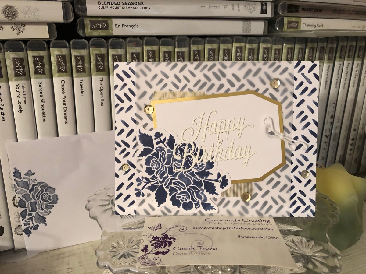
And this is how a unicorn led me to a mermaid.

Thanks to my niece’s unicorn birthday card, I got in a few more custom card orders. One of those was for a special mermaid birthday card. I get the craziest ideas in my head sometimes, without any inkling of how I’m actually going to accomplish them. And then, through trial and error and time and SMH-at-myself moments, eventually they come together–and hopefully I’m even pleased and kind of impressed that the whole thing didn’t flop. Such was the case with the mystifying mermaid.

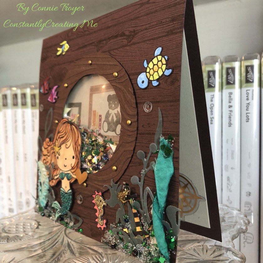
I could see it in my head–a cute little mermaid on the outside of a wooden ship, peering through the porthole to see what she could see, much as I imagine Ariel would have done had she not been collecting artifacts in her grotto or spying on the dancing taking place on the deck of Prince Eric’s ship. The trouble was that I didn’t quite think through all the steps of just how to create it.

The ship wouldn’t be a problem to create, as I own the Stampin’ Up Hardwood stamp (current catalog) and the porthole and mermaid were only going to be so big (I didn’t have to create the entire ship). I began by cutting down a piece of Stampin’ Up Chocolate Chip (retired) cardstock to 6″x12″, scored it 6″ up, and folded it. (And then shortly thereafter I cut down that card base to 5.5″x5.5″.) I used SU Early Espresso ink (current) to stamp overtop the Chocolate Chip so the wood grain could be seen. I then looked at several circle dies on my die wall and decided that the double-circle die from SU’s “Sliding Star” Framelits (retired) had the spacing I wanted for the porthole. I centered the die on the now-smaller card base, put another piece of cardstock behind the card base so the marks in my die-cutting plate wouldn’t transfer to the inside of my card base, and ran it through (forgetting until then that the die would cut through both the base and the extra piece. Oops! Goof #1!).

(Side note: There are at least two ways to create a shaker card. The way I know best, I didn’t do. It would have been easier to cut a separate 5.5″ piece and make that the porthole piece with foam strips rather than cut through the base and do it all backward. But I didn’t think that far ahead. Goof #2.)

Once I had the hole cut into the card base, I had to make the porthole cover, which would need to extend over the hole slightly. I went back to my Chocolate Chip cardstock to find a remnant that would fit, placed the die on the paper, and traced around the inside circle. Then I grabbed one of my most favorite and very old tools (a layering tool from Stampin’ Up from waaaay back), put the smallest layering circle against the die, and dragged it around the die with a pencil through the center of the layering circle (it rolls around objects to make slightly larger mats). Then I cut the now-slightly-larger circle out of the cardstock by hand. Once I had both circles cut, I embossed the new porthole with a wood grain embossing folder, decided I wanted the debossed side up, marked where the mini brads should go, punched the necessary 1/16″ holes (it’s easier than forcing brads through the paper by hand), and placed my chosen brassy mini brads in their spots. And then I glued the porthole onto the card base.

But that still didn’t get me the shaker feature. And that’s when I realized that I was once again taking the hard road by not doing the way I already know (albeit not well). So I conferenced with my friend E, who happened to be on video chat with me while I crafted (there are some days I love technology!). And she proceeded to explain to me how to use my much-desired Fuse tool that I’d purchased, longed to use, put off using, and then started looking at in a rather intimidated fashion. Apparently one can make shaker pockets with a Fuse tool! I’d heard that somewhere but had never attempted it. And fortunately for me, I’d happened to find some Fuse Project Life pockets on clearance the last time I went to JoAnn Fabrics. Even better, I found them in my craft room without too much looking.

While the Fuse warmed up, I revisited the shaker elements I’d gathered a few days prior–different colors and shapes of sequins (the stars reminded me of starfish, and the gold, clear, and rose were the perfect shades); seed beads in clear and marine colors and clear Stampin’ Up microbeads (retired) for space in the shaker pocket; leftover gold, green, and red long confetti flakes from a Stampin’ Up card kit; gold, white, and green mica flakes (that I’d never tried using); gold glitter hexagonal flakes; and some white Rock Candy Distress Glitter from Ranger. I spooned various quantities of these things into the pocket–and put in too many (goof #3?)–but actually managed to work the Fuse tool correctly on the first try. The second try wasn’t as good, but I’ll practice now that I’m no longer scared of it. 🙂 I cut away the excess of the filled shaker pocket and asked E how to hide the thing in the card.

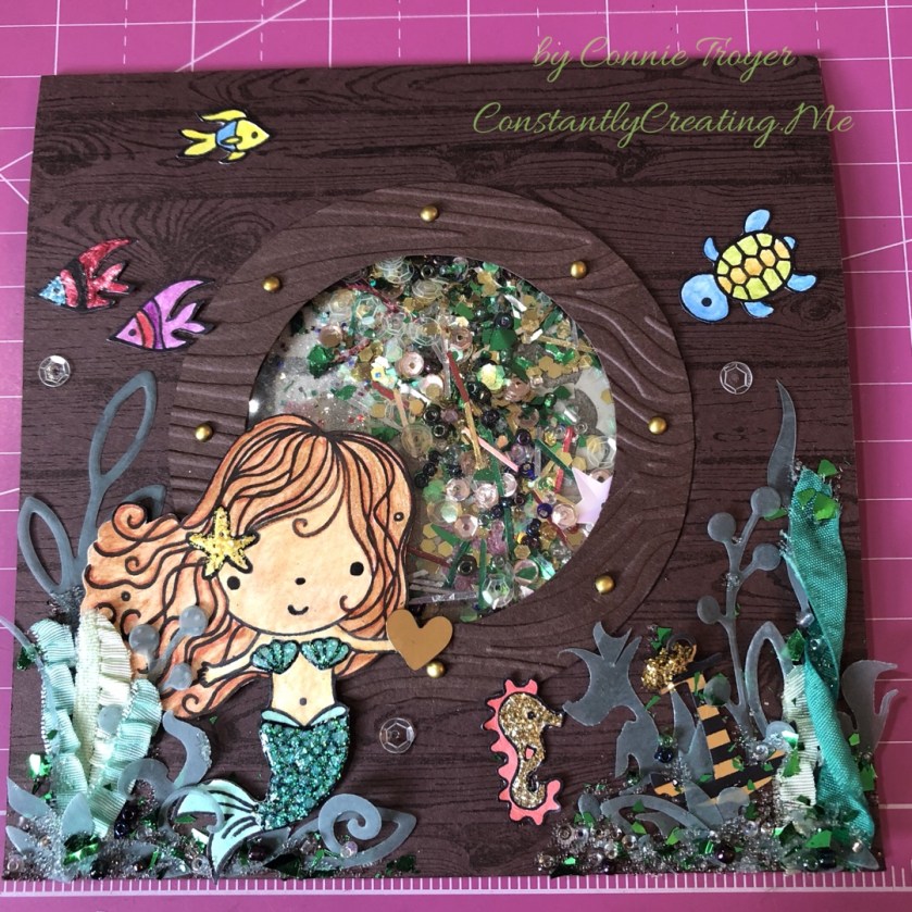
Since I wanted my mermaid to be looking at something inside the ship, I cut a large circle in a lighter color and stamped the background of a bookshelf and human objects with SU Bookcase Builder (retired), which would be seen through the shaker pocket; then I glued that to the back of the acetate piece in what I hoped would be the right position (since the shaker elements would and did move around). Then I took another remnant of Chocolate Chip cardstock, placed foam dots around the edges, and put it overtop the background and shaker pocket. And then I breathed a sigh of relief, because the thing actually shook around the way it was supposed to, even if I did probably put too much in it. I was hoping it would look like the outside of the porthole had collected some sea stuff there on the ledge as it moved through the water…but Miss Mermaid got what appears to be the amount that collects in a shipwreck! Oh well. Live and learn and stuff another envelope later.

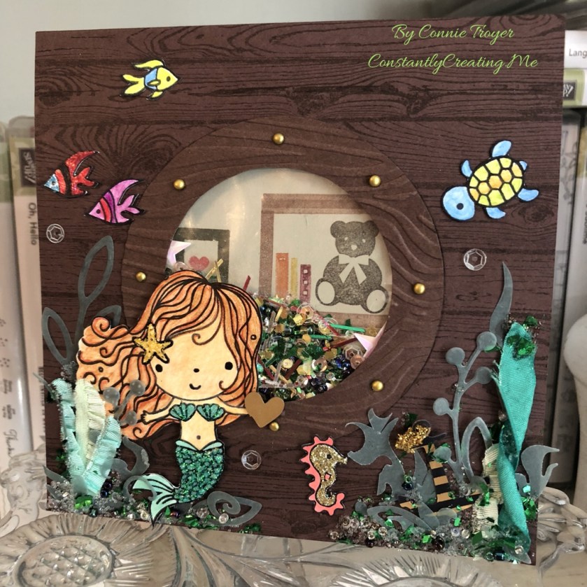
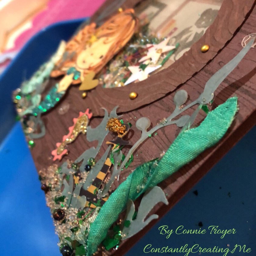
So my porthole was done–and I’d previously colorized my little mermaid and her friends with watercolor pencils, an Aqua Painter, Adirondack Dimensional Pearls, Stickles, Nuvo Glitter Drops, and Distress Glitter Stickles. I’d actually tried to stamp her tail on some very nice flaked cardstock that reminded me of scales, but that didn’t work like I’d thought it would (and I should have known better anyway–another goof), so watercoloring and two layers of glitter glue ended up working for the tail instead. I fussy-cut them all out, glued the mermaid to the card front in between two of the mini brads in the porthole, and started trying to figure out my seaweed issue. In my head, I saw things floating near her on the outside of the ship, like her friends or the occasional sea life. I ended up with more things there than I’d intended, but I think it’s cute anyway.

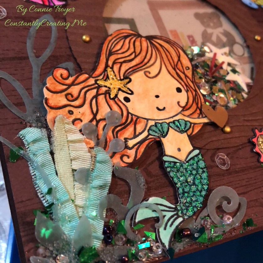
I found some retired Stampin’ Up ribbon in Emerald Envy, Pistachio Pudding, and Coastal Cabana that was ruched or ruffled, so I thought that might work for seaweed. I didn’t think I had any seaweed dies or stamps–but I found dies that would have worked better after the card was done (goof #5). Too late. So I trimmed up the ribbon (cut some of it in half and twisted others) and found some greenery dies on my wall that I thought could pass for seaweed. I used a couple of miscellaneous green vellum sheets of paper with the dies and then attempted to glue them all together with Zots and Tombow Multi (green and white) Glue.

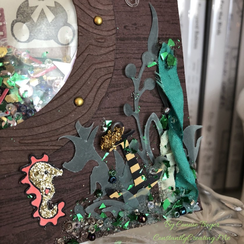
But I couldn’t stop there. I had to add beads and microbeads and mica flakes to the outside bottom edges too. The inside of the shaker can’t have all the fun. Plus, I was hoping to hide some of the glue marks on the vellum pieces. 😀 I also found a little gold heart die-cut for the mermaid to hold, a gold compass for the inside of the card, and a black-and-gold die-cut anchor piece inside a random pack of travel/beach die-cuts I’d just received. I let it all dry overnight but had to go back in the morning, shift a couple of things, and reglue. My twisted seaweed had righted itself, and one of the taller seaweeds I’d cut by hand was tilting precariously.

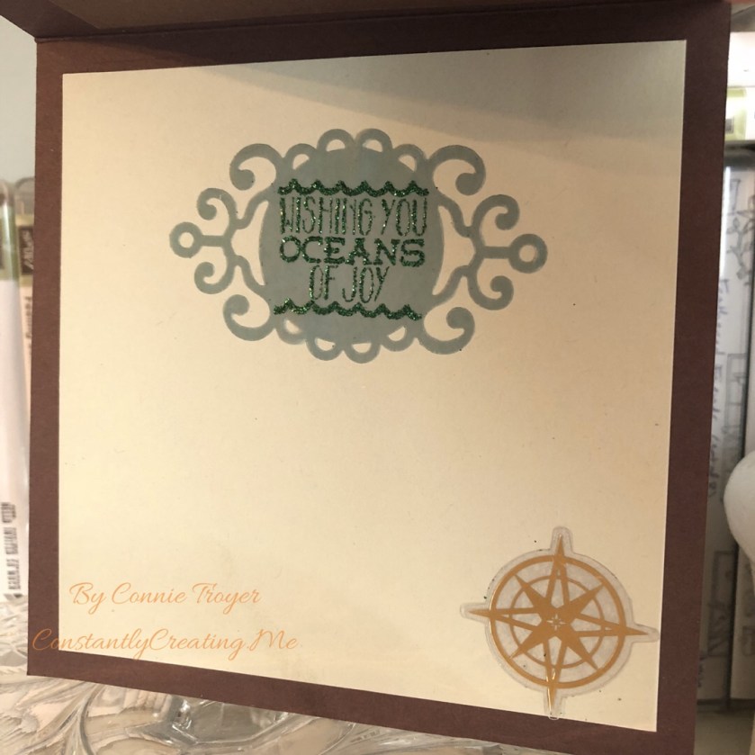
After the front was done, I had to do the inside. Thanks to guidance from the client, I knew which sentiment to use. I had just enough green vellum remnant left to cut out a tag that had a wispy or ocean feel to it, and I stamped the “Wishing You Oceans of Joy” sentiment from Elizabeth Craft Designs with SU Lost Lagoon ink (not normally something one can emboss with–goof #6). But it held okay on the vellum, at least long enough for me to pour Green Tinsel embossing powder over it and heat it all. It joined the compass on the inside of the card and I resisted the temptation to create more seaweed or pour more microbeads onto something. 🙂

I probably spent far too long on this card, but it was fun to work with the vision I had in my head and see it all come about. Now I just have to hope that the little recipient doesn’t shake off all the beads immediately!

Card Kit Pieces–“For Someone Special” Birthday Card

View on Instagram https://ift.tt/2IUOyVz
Glittered pieces, stickers, die-cuts, and pop-up dots make a simple but fast card thanks to a kit I dipped into. #thelittlewhatnotshop #forstacy #birthdaycards #quickandeasy #icecream #forsomeonespecial #cardkit #customcardorders #thankstodeb
Pat's Blog Site

One place to fit it all!

Stamp Dabbles

Donna Leonard | Independent Stampin’ Up! Demonstrator | Huntsville, AL

Niya Scrap

Démonstratrice indépendante Stampin' Up!®

From Pole to Pole

Adventures in the Land of the Pierogi

Stampin' in the Meadows

Akiko Sudano - Independent Stampin' Up! Demonstrator Downingtown, PA

Creative Stamping Designs

Karen Ksenzakovic, Independent Stampin' Up! Demonstrator in Somerville, NJ Let's make some cards!!

Stamp it up with Jaimie

Helping you find a stress free creative outlet through paper crafting.

Stamp With Amy K

Amy Koenders, Independent Stampin' Up! Demonstrator in Mendham, New Jersey...Let's make some cards!

The Daily Post

The Art and Craft of Blogging

WordPress.com News

The latest news on WordPress.com and the WordPress community.

%d bloggers like this: