Hello there and thanks for stopping by my blog! I’m sorry I’ve been quiet lately; I’ve had too many projects and people to please recently. (You all knows how that goes, right? Maybe I’m not the only one? 😂)
I haven’t had a lot of time in the craft room this month but I did sneak in there a couple of evenings recently to try to finish a batch for my local gift shop/employer. I’ve done a few grad cards and some easy cards. Here’s an easy one you can duplicate if you have or can find the World of Good Memories and More Card Pack and the Flowers for Every Season Cards and Envelopes.
I used a piece of Misty Moonlight cardstock for my base (A6 size) first and then picked the large foil-globe card and the smaller 3×4 “Be the Change” card out of the card pack. I adhered the largest card with my preferred glue, and then I measured (yes, I actually measured!) and punched 3/16” holes in the corners for some 3/16” gold brads. Once I had the brads fastened, I popped up the card on foam dimensionals. And that was it! I used a Misty-Moonlight-lined envelope from the Flowers for Every Season Cards and Emvelopes and called it done. 😂 I guess simple and easy really is the best. (The next post about a fancy grad card I did this week will be the opposite!) Most of all, I liked the sentiment on this card. I think it could even be used as a grad card, a masculine card, or one of encouragement. Thanks again for visiting, and stay tuned for more when I get time!
Birthday and Thinking of You cards made with the Kerchief Card Kit available for free only during Sale-a-Bration with Stampin’ Up!
Thanks for joining me on my blog today! I have to start off with an apology and a correction; this blog post is for Amy’s Tuesday Blog Hop, not Sunday’s. I was thinking of the day I had to post the link! And now I can’t change it…. More proof that I’m not perfect, I suppose. 🙂
So, for the Tuesday Blog Hop, which is going with a birthday theme this month, I decided to make up the Kerchief Card Kit, which is available as a Sale-a-Bration reward for spending $50 before tax and shipping. It had been backordered, but I got it in on Saturday and sat right down to put them together. I’m still making cards for sale for my local gift shop in Amish Country, so this set is perfect to do up for them. I plan on ordering a second kit and selling them in sets of five and some singles, using our Acetate Boxes and some card jackets.
I decided to go with this kit for the birthday blog hop because of the included “Celebrate Today” sentiments, planned for the Coastal Cabana rose cards. (The Poppy Parade kerchief cards have “Thinking of You” sentiments.) I adore the blue cards (and its gold foil-dotted vellum!) because of the colors and style, and the red cards were simple and fun to put together as well (also with vellum, but plain). I also really liked the thicker twine included in the kit, and I hope I see more of it in the future. I was pleasantly surprised and pleased to note that there is no stamp or ink spot in the set; the sentiments are already printed and included as die-cuts, ready to be added to the cards. It made the work go much faster—and yet still allows me creativity to add whichever sentiments I see fit for the insides of the cards.
The picture above only shows four of the eight cards in the A2-sized kit because I made two of each of the cards shown. On the blue Coastal Cabana cards, I popped up the rose and sentiment on two of them and left the other two roses flat; I also put two bows up and away at the right and two at the lower left bottom, for variation.
I changed the placement of the gold leaves on the Poppy Parade cards, two being centered and two being placed at a diagonal the way the kit shows. I also changed the location of the bow, not placing them under the tag as in the instructions. I actually even put the bow on top of one of the tags, which is not reflected here.
I finished the cards by adding sequins from the retired Love Blossoms Kit, as I thought the gold, white, and Blushing Bride colors matched well.
When I considered sentiments for the insides of the cards and looked through my current stamp sets, I found four that will work nicely for wedding or anniversary, general celebrations, or celebrating a special person or a special day that may or may not be love relate. Though they’re not stamped on the cards yet, I plan on using “Be strong, be happy, be you” from Rooted in Nature; “Wishing you the best on your special day” from the Perennial Birthday set; “Hoping you experience love and joy today, tomorrow, and always” from the Last a Lifetime set in the Mini catalog; and “Here’s to always finding joy in one another’s laughter, warmth in one another’s embrace, and love in one another’s lives” from Path of Petals. I think the “celebrate today” cards could also be used as graduation, retirement or promotion, even the birth of a baby or baby shower, and more occasions as well, if you didn’t feel the need to use the standard icons of the event. They would work fine as blank cards too—celebrating life or spring or no reason whatsoever!
Free with your purchase, the kit is a good investment. Quick to make up and easy to have a few cards on hand or to give as gifts, it’s one that will appeal to many (if for convenience’s sake if nothing else!), and the cards are lovely to boot. They’re also very easy to adapt to other styles or make into alternate designs. The envelopes are all lined with either Balmy Blue or Petal Pink and make a nice “wow” moment when they’re opened as well.
I’ll leave you with a close-up of my favorite card in the stack. 🙂 Please be sure to scroll down and “hop” through the rest of our list of participants so you can see the special birthday cards they created. We have a fantastic, creative team! If you are needing Stampin’ Up supplies, catalogs, or a consultant, I’m happy to help you out with any. You can use host code WAA2PGYR until February 16 when you check out. Thanks again for stopping by!
This fun summertime card uses some retired Stampin’ Up DSP—Tasty Treats and Cupcakes & Carousels—along with an unnamed stamp set (a different maker) featuring puns (I used the sentiment and the small popsicle here). I even incorporated a large popsicle from an adult coloring book. I colored the small popsicle with Stampin’ Blends alcohol markers (Balmy Blue, Light Calypso Coral, and Light BlackBerry Bliss) and I used Tuxedo Black Memento Ink for the sentiment and small popsicle. The Decorative Label Punch was used around the sentiment (which I then inked the edges of with a Crumb Cake Stampin’ Write Marker).
A masculine card for use during Father’s Day (or any day!) for Stamp with Amy K’s Tuesday blog hop.
Hello again and welcome back to my blog—or thanks for stopping by if you’re a new visitor! The theme for Stamp with Amy K’s current Tuesday blog hop is “masculine,” so I decided to create two “Father’s Day” type of cards that can be used at any time for the guys in our lives. Since they are going to my local gift shop for sale, I needed to create something that didn’t explicitly say “Happy Father’s Day” (best for a longer shelf life!).
I’ve used all current or upcoming products that are available on June 4, when Stampin’ Up customers can order from the new catalog. I was able to preorder some things because of my demonstrator status. So I’m using stamps from the new cling set “A Good Man” and one of our brand-new In-Colors, Seaside Spray (only available for purchase June 4, 2019 through May/June of 2021).
Seaside Spray is a gorgeous color that reminds me of a smoky blue. It’s one of the shades in my valances, actually, so I have a feeling I’ll be using this color for years to come even after it retires. 🙂 And “A Good Man” is one of those casual, contemporary sets that have a sketched look to the images, with some slight distressing on the sentiments.
I began each A2 card with a Seaside Spray card base, taking an 8.5×11 piece of cardstock and cutting it in half. I wanted to use two of the colorable images in the stamp set, one on each card, and quickly figured out which rectangles my chosen images would fit inside in my new Stitched Rectangles die set.
I stamped each colorable image in Memento Tuxedo Black ink and die-cut the first rectangles. Then I colored them with some of our Alcohol Blends: Dark Mango Melody, Dark Old Olive, Dark Smoky Slate, Dark and Light Basic Black, Ivory, Bronze, Dark and Light Shaded Spruce, Dark and Light Balmy Blue, and Dark and Light Real Red. (I need to get a dark blue yet, so I had to color all pants in various shades of black and gray.)
Seaside Spray isn’t one of the colors I own in the Blends yet either, so I used Light Balmy Blue for the sky and border, hoping it would look all right. Turns out it does sometimes…but not if there’s a lot of concentration. I filled in the background of one of the images but left the other white. I wasn’t sure which way to go. Tell me which one you like best. 🙂
Next I die-cut other various-sized rectangles from the Come Sail Away and Perennial Essence Designer Series Paper packs and and staggered them with the images and sentiment block.
I also carefully edged around the border of one of the die-cut, colored images with my Balmy Blue Blend. I wanted to do something in the corners the way I would dye ink, but I didn’t trust myself enough to try it with the Blend. I’ve had to redo enough this evening. I’m actually pretty pleased with how the edging turned out. It was easy and looks clean and simple. I liked it so well that I did it on the second card too, with a Night of Navy Stampin’ Write Marker (but it was much easier to accomplish with the Blend, at least tonight!).
After I placed the sentiment block and glued the rectangles for the first card, I added three Heart Epoxy Droplets to two corners to finish the card.
And here is where I have to confess something. Two things, really. I lost a stamp before I finished my cards or this blog post. Specifically, I lost the main sentiment for the front of the cards. I have torn this room apart, searching through my trash can, cleaning off my desk and the cart next to me, checking my clothes…. It still hasn’t turned up. (Please tell me I’m not the only one this has happened to!) I can attest that the new cling stickers are really sticky, because I had the stamp rubber-side down in the case with the sticker facing up so I could quickly grab it and stamp it after I was done with the inside pieces. I’m certain it’s stuck to *something*. 🤦♀️ So... Sigh. I handwrote the same sentiment in a similar kind of font and lightly stuck it to the card—for this blog’s purposes only—where the real sentiment will be stamped in Night of Navy ink on Seaside Spray cardstock. When I find it. Humor me, please. (If I can’t find the stamp eventually, I may just have to repurchase this set because that pair of sentiments is essential!)
This card has now also convinced me that I need to get the Subtle 3D embossing folder. The background still needs something. I thought of stamping too late, after I adhered the rectangles. I’ll pretend I’m going for “clean and simple.”
The first card.
Another angle, showing the hearts a little better.
And now for my second confession. My roll of Night of Navy/Sahara Sand Baker’s Twine has gone AWOL as well. (I’m betting the cat did it. She’s been known to do so.) So I’m using most of the piece of twine that I snitched at OnStage for my Come Sail Away card I finished later at home. I also cut card #2’s heavy-striped piece of Night of Navy/Whisper White DSP the wrong size…and that was after I spilled ginger ale on four newly opened papers and cut out the wet sections. 🙄🤦♀️ Trust me, if I can make cards I’m proud of with all this chaos, anybody can!
So this is what I refigured for the second card, after some challenges (like the fact that I had to use the Color Lifter too, even before I cut the striped piece incorrectly). I used Linen Thread at the bottom of this one. I felt I needed to separate the Balmy Blue Blends background from the Seaside Spray cardstock because, for me, the color difference was too much to have them next to each other. My first thought was to have the striped paper cover the entire card front, but obviously that went awry. I decided that the mistake wasn’t so terrible as to have to redo that too (and I sort of hated to cover up all that beautiful new In-Color anyway), so I just went with it. I hate wasting paper. (My apologies again for the handwritten sentiment. It will look so much better with the real one….)
The gift shop card.
The insides of both cards are identical, and they went so much smoother than the rest. I was even watching a TV show while I stamped. (That does it—I should always watch TV while crafting. But not in the dim light, because I think that’s when I lost my stamp.)
So that’s it for me tonight. It’s time for bed. Thanks again for stopping by my blog! So sorry about all the mishaps. Some nights just go like that.
If you’re interested in receiving a catalog, I’d love to send you one. Just drop me an email with your info using my Contact Me form.
If you want to continue the hop to see what the rest of my fabulous team members made, click the Next button to see what our fearless leader, Amy Koenders, has made, and if you’d like to go backward instead, click the Previous button to visit Sue Prather’s blog.
Back in the summer, I was asked to make a special birthday card for a special friend’s son who has a fondness for foxes—all shades and types. She gave me free creative rein and said she didn’t care what I did with the idea, but that he might like a red one. I considered several different fox stamps and stickers but finally chose a particular stamp that shows foxes in a wintry scene since his birthday was in February (“300-16 Red Foxes and Birches,” Stampa Rosa).
I’ve never really thought much about foxes in my life, other than thinking they’re beautiful animals in general, so I had no idea how to shade one. Coloring is something I’m still not comfortable with, because I feel like the concept of shading is one I haven’t begun to learn. Luckily for me, the wooden stamp I was using had a colored picture on the front that I just had to attempt to recreate! 🙂
First I had to choose the right paper, though, which evidently was not the bumpy watercolor paper I tried to stamp on first (twice). I knew that, but I was thinking of using my water-filled Aqua Painter on it and felt the paper would handle it. I liked the textured look of the watercolor paper too, but the image was too detailed to stamp cleanly with the bumps in the paper. Then I remembered Stampin’ Up’s Shimmery White cardstock, a must-have in my collection. It’s not any thicker than the rest of their cardstock (other than the aptly named “Thick” cardstock in the line), but it’s smooth and somehow holds up great with watercoloring–and it’s sparkly to boot (hence the “Shimmery” part of the name). Bonus for me was that the paper helped my snow scene sparkle.
Once I had the paper figured out and the stamp stamped correctly, I took my watercolor pencils and tried to emulate what I saw on the wooden stamp block. I had to mix a few shades to get that red fox coat color with the darker spots. After using the watercolor pencils, I took my Aqua Painter to it as planned and went back and forth between the two tools a few times until it felt right (because I have no idea what I’m doing, really. I’m assuming I’ll get better as I learn by trial and error).
After I was satisfied with the colors and the paper had basically dried, I went over the snow and snow-covered branches with my Clear Wink of Stella brush marker to bring back the sparkle to the snow that I’d ended up coloring over with the white pencil. (The sparkle shows through the color a little, but I really wanted the snow to glimmer.) Then I set aside the piece to dry while I figured out the rest of the card.
My favorite crafty thing to use these days are metal cutting dies. They’re simple, quick to use, and make things prettier or more elegant than I could come up with on my own. (They’re also faster for me than my Cricut.) I hang most of them on my wall and the back of my door on large magnetic sheets or vent covers so that I can easily walk over and try different sizes and shapes with whatever I’m wanting to cut out, rather than taking time to flip through a box and take die sets out of envelopes.
For this card, I looked at a bunch of large shapes, trying to decide whether to cut it into a type of oval or a fancy square or a rectangle. I ended up using one of my new sets from Spellbinders that hadn’t yet made it to my wall (Art Nouveau Designer Series “Water Lilies Decorative Element”), because it fit the image perfectly without making me cut it down too much (after all that hard work in coloring, I hated to do that!).
I debated whether to use a SU Cajun Craze cardstock base or a white base and which color to set off where. I ended up cutting several different colors of cardstock with the frame die to test them and see what worked. The card finally fell together color-wise when I brought in the darker wood-grain paper (SU “Country Lane” DSP) as a background to echo the dark shading in the picture. The dark complements the darker orangish-brown Cajun Craze well enough while keeping the same tones. With the white base, there was too much contrast and the frame jumped out at me rather than letting me focus on the colored image. So I ended up using a Cajun Craze base but covering the entire front with the wood grain and using a Cajun Craze frame on top and beneath the white colored image. (It’s a solid piece that gives a mat to whatever is inserted into the sides.)
This particular frame die acts like a gift card holder where the center flowers are, gently opening up and holding whatever is placed in the solid middle. That took some thinking, trying to measure and cut down the colored image so that it fit into that space under the flowers just right. The opening/middle rectangle is much larger than a gift card, but it’s the same idea…though this is only one way to use it.
The one thing I forgot to do to the test pieces was to make sure they were embossed well also. (One reason I love Spellbinders is because they have awesome sections of the dies that are intended to be embossed to give it a little something extra. I miss that feature when I use other brands.) So the embossing could have been done a little better in parts here, because I forgot to take that step to make it pop. I didn’t remember it until I’d mailed the card and noticed it in the pictures. In the photos above, perhaps you can see that the center flower pieces are more deeply etched than the corners above and below them. Next time…I shall remember next time. 🙂
My customer wasn’t picky about what to say on the inside either, other than asking me to write his name and theirs in it and mail it straight to him. So I had to dream up something based on other things she had said to me. After adding fox washi tape to the bottom of a white piece and then matting the paper onto a different kind of wood-grain patterned paper from a 6×6 pad (can’t remember which one now), I used three different stamp sets and another die to make the sentiment section. “A little expression of love” is from SU’s “Painter’s Palette,” “just for you” is from SU’s “From the Herd,” and “Happy birthday” is from MFT’s “LJD For the Boys” (part of the “Happy Birthday, Handsome” stamp). The die is among those in a retired nested set from SU called “Deco Labels.”
I used my stamping platform and its grid to line up the sentiments on the die-cut and stamp out a couple of test pieces in Cajun Craze ink to make sure they sat where I wanted them. (I had tried stamping right on the matted liner paper but I accidentally got ink where I shouldn’t have, so at that point I just had to cover it up because it was already adhered.)
After the sentiment box was stamped, I edged around the die-cut with my Cajun Craze Stampin’ Write Marker so it would stand out against the white paper. And, once again too late, I saw that the double fox spot on the washi piece. I didn’t create that intentionally; it’s just how it came off the roll. I wish I had seen it sooner; it bothers the part of me that prefers symmetry. 🙂 I also added two gold glitter hearts from MME (“Niche/On Trend Foam Stickers”) in the white space of the sentiment box.
I like how this one turned out even though it tested me at times and there are a couple of things I wish I could do differently. It’s always easier to make a similar card a second time. Maybe I’ll try to do one for the local gift shop. After all, I’m not completely convinced that winter is over with where I live.
Some of the Stampin’ Up items I used on this card are retired, but you can purchase the ink, cardstocks, and other current items through my online store if you want to try them (please use code 6WPHJ2MC at checkout unless your order is over $150). The thumbnails below will take you right there…and this is an awesome time to get them since Sale-a-bration is still going through the end of March. For every $50+ order before tax and shipping, you get to pick an item out of a select group of almost two dozen items and Stampin’ Up will send it to you for free with your order! Plus you’ll also get a free gift from me. 🙂 Please contact me if you have questions.
Thanks for visiting my blog! I truly appreciate my readers. ❤️ Have a lovely day! #neverstopmaking #mftstamps
Hello again… I thought I’d pop on while multitasking and detail a couple of simple cards I made recently. I got distracted last week before my husband and I went to Florida for his job (Florida in January from Ohio – huge perk, right? Well, if one stays healthy, yes. 🙂 ). When I should have been packing or finishing a card order, I ended up pulling things together for a card I didn’t anticipate making. Then last night I made another one since the first was so easy and I had a second stitched piece yet to use. 🙂
Since I’ve started selling cards and making custom items, I’ve been looking for ways to make more cards faster to keep more customers happier. I’m not really a “fast” card creator; I spend too much time in the details that I love. Creating keepsakes is really my thing, but most customers don’t need that much hoopla or focus on cards they’re just sending to be thoughtful. So I have started reserving that “type” of card for specialty or specific occasion ones, cards that the recipients will love and treasure.
Through this process, I’ve figured out that card kits, though not my first love, are rather useful for making lots of cards with limited supplies and time, and when the kits come with a stamp set too, all the better. Today’s cards were not from a kit but rather from a DCWV pad of paper that was made up of various stitched designs, so it’s a similar idea. I bought the pad when I was first starting out in cardmaking and thought then that it would be a cheap way to have several nice card fronts right there at my fingertips. I’m happy to report that my hunch was correct and I only have four left to use up, which feels great. 🙂 I love the look of stitchery, being a “soft crafter” myself. These cards are the same flowered design on kraft but they look totally different because of the papers and colors I chose.
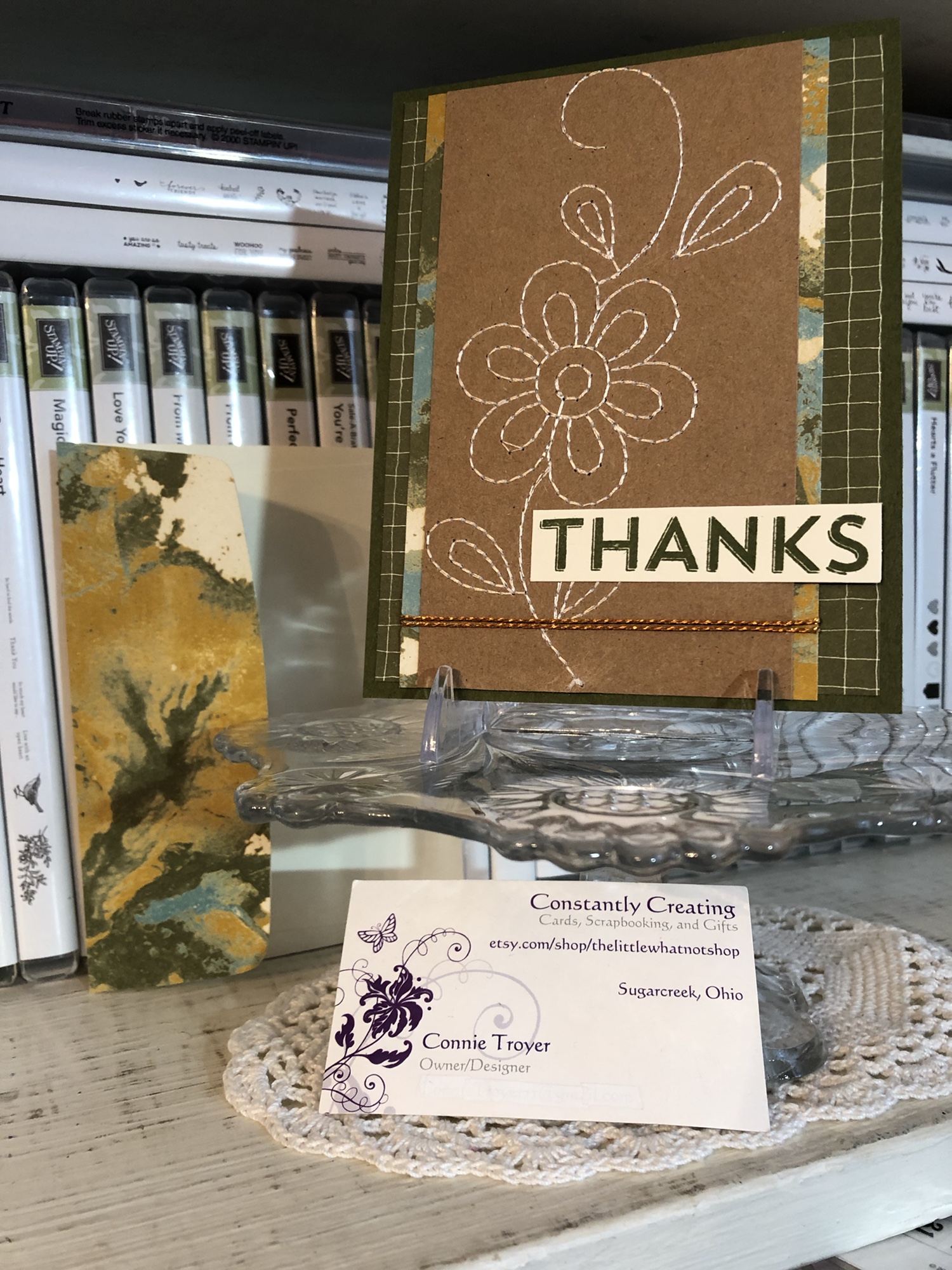
The original green, yellow, and blue card has a green Mossy Meadow card base from Stampin’ Up. I paired the base and flower panel with some Designer Series Paper (DSP) from Stampin’ Up’s retired “Going Places” pack. I still have lots of useful papers in it, and one of its colors is Mossy Meadow. I don’t have much of that shade, so when I also found a Mossy Meadow grid paper in the same pack and they coordinated perfectly, as Stampin’ Up does, I stopped overthinking and put them together. It felt like it was headed toward a masculine or gender-neutral kind of card, which I don’t make as often as I should.
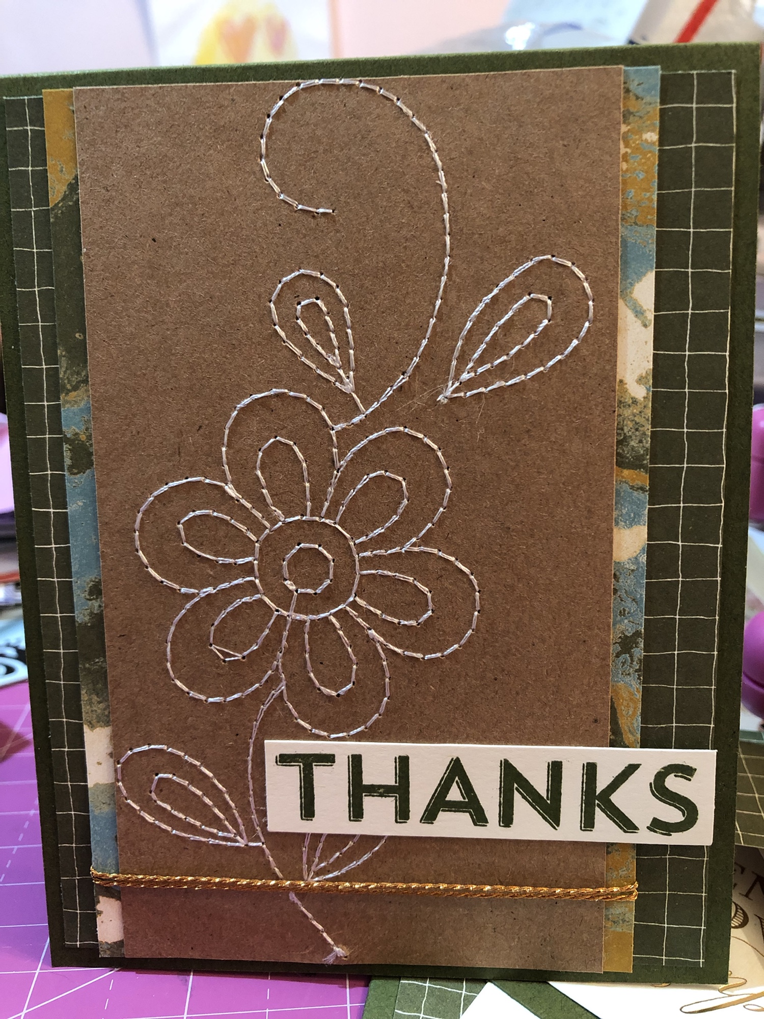
My detailed self, however, needed some kind of embellishment near the stem of the flower to accent where I was going to place the sentiment, so next I picked up what little remains of my Copper Twine and wrapped it around the DSP/flower panel a couple of times before gluing the panel–off-center–onto the card base, to leave room for the large “Thanks.” I just love that twine and wish I had more of it, but it was from the Notes of Kindness kit from Stampin’ Up. (Mental note: must order refill to get more!)
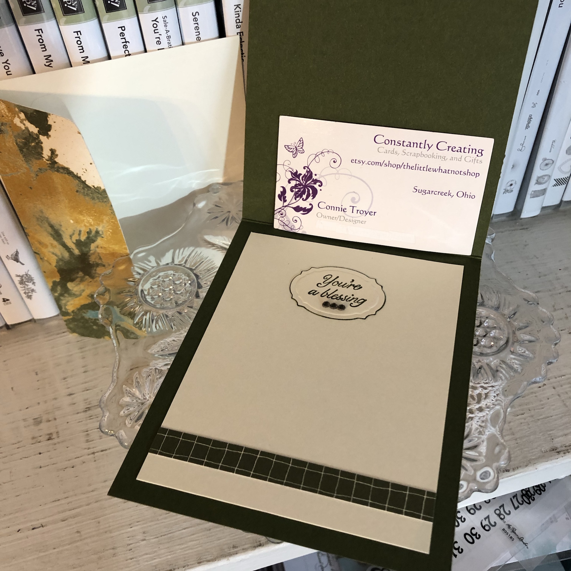
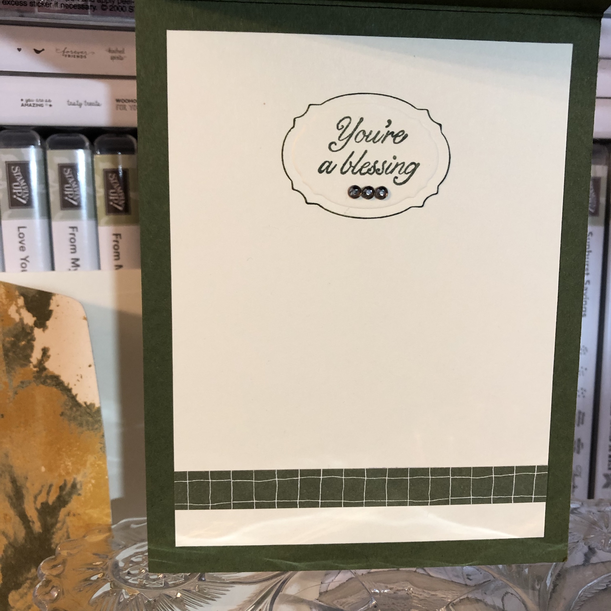
In keeping with the contemporary, simplistic, somewhat masculine style of the card, I needed the sentiment to be brief and obvious. The “Thanks” stamp also from the Notes of Kindness card kit was just the right thing. I used my Mossy Meadow Stampin’ Spot inch-sized ink pad and stamping platform and had it done in a jiffy. For the inside, I laid down a white paper to write on (just eyeballed a measurement for borders I liked and cut it to size with my trimmer), before using a Spellbinders die for the sentiment spot on the inside and going around the edges of it with my Mossy Meadow marker before gluing it. I used Stampin’ Up’s current Very Vintage (host only) stamp set for the “You’re a blessing” wording and accented it with three dark rhinestones from Recollections in my stash. And I added a strip of the Mossy Meadow grid paper to the bottom of the white piece for some color and continuity and a piece of matching DSP to the envelope flap to dress it up a bit. That’s it!
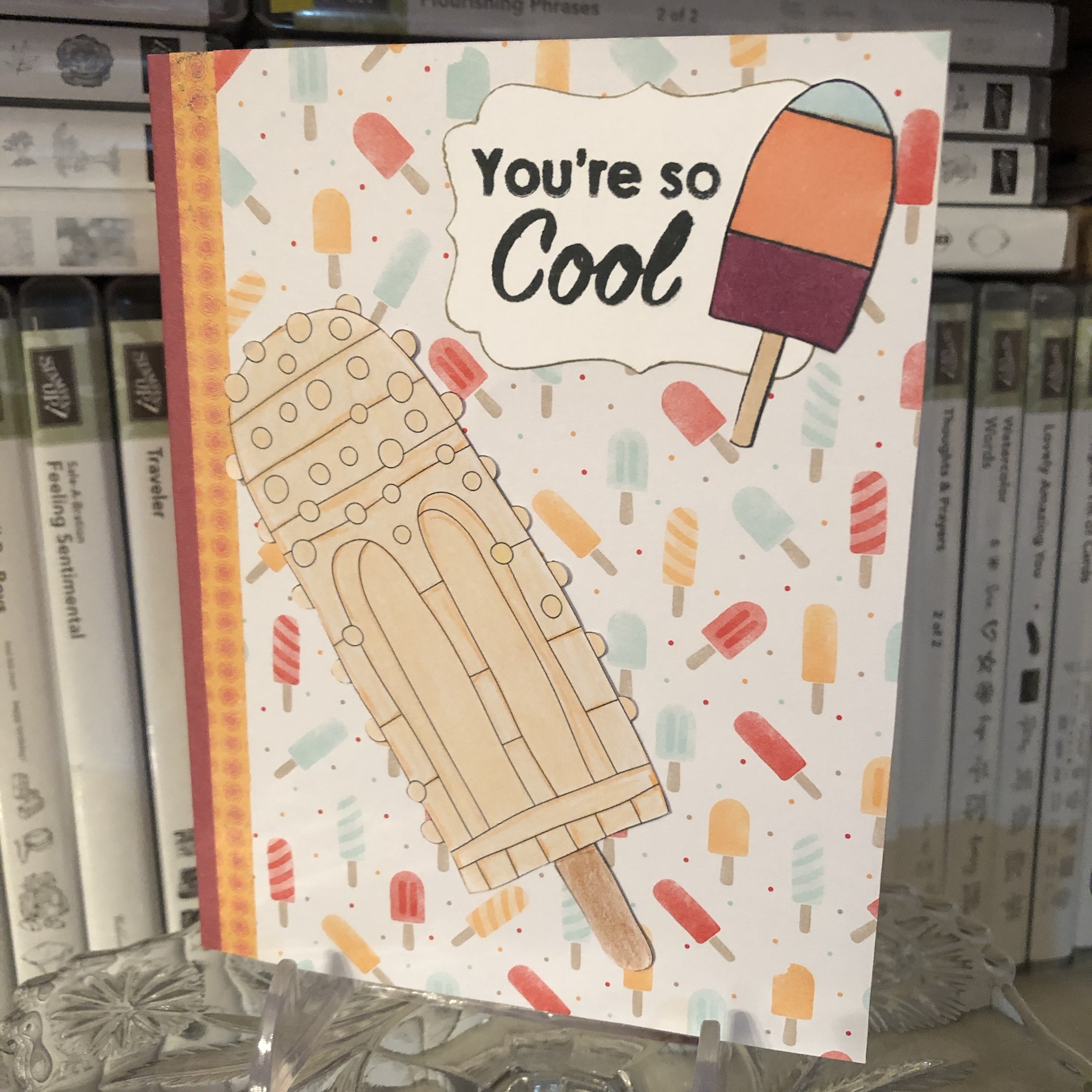
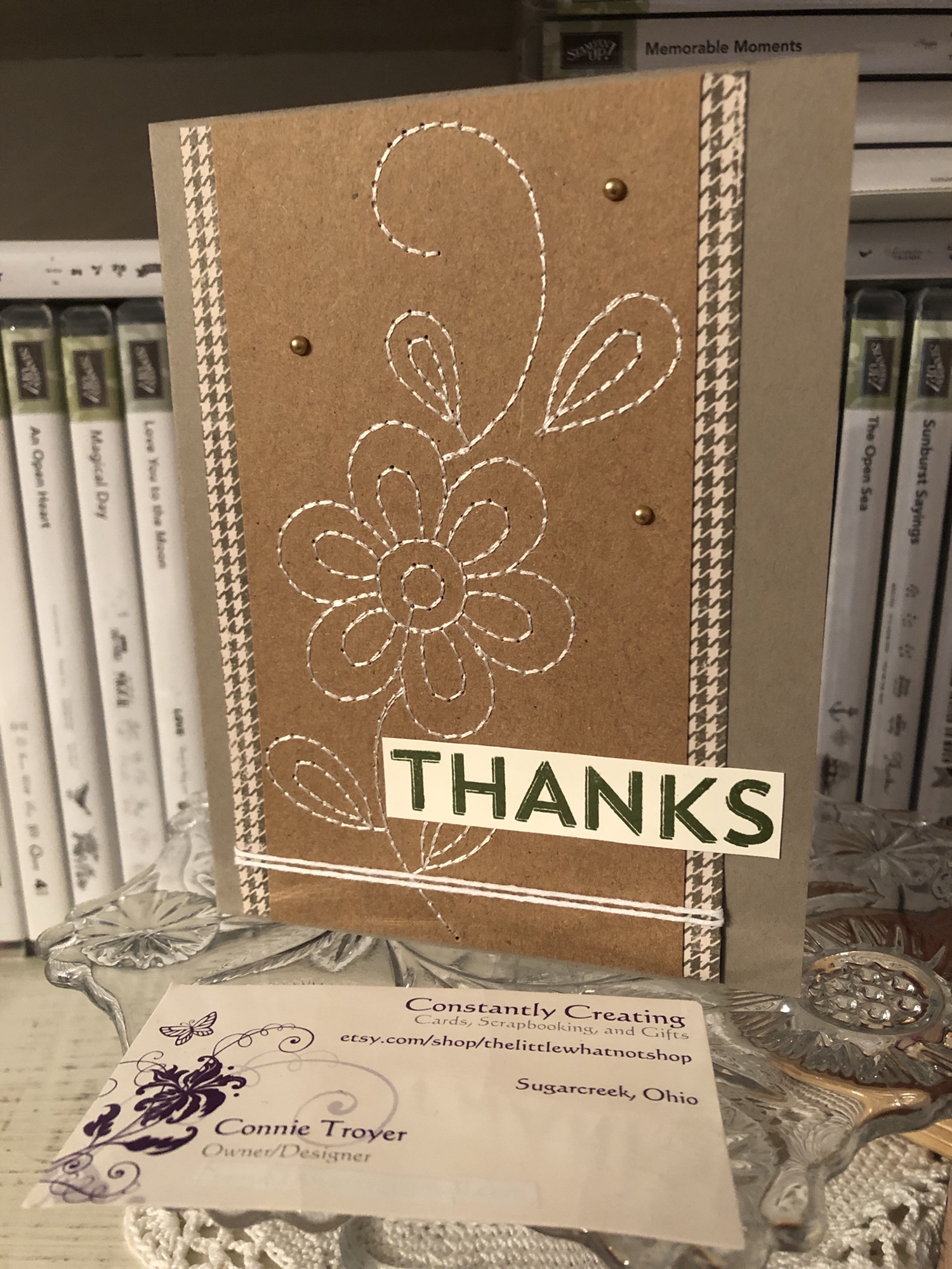
It was so simple that I made another card last night with the remaining flower panel. Since I had used up the grid paper with the last card, I had to go a different direction for the new one. I have a photo box full of cut-and-scored A2 card bases, and when I remember that I have them, I pick one of those out of the box rather than take time to cut and score a new one or two from my loose cardstock sheets. I thought a retired Tip Top Taupe card base from the photo box matched the kraft piece well enough. Then I had to find papers to match. I started riffling through my loose stack of random 6×6 papers just because they were behind my chair and I really should use them up. They come from swaps or generous RAK-givers or are leftovers that would get lost in my patterned paper drawer because of their size.
Included in that stack were three coordinating 3×6 sheets someone had once sent me in the mail. And one of those was the houndstooth pattern I decided to use for the new card. I’m not sure what is different about the sizing between the two cards, but it seemed like it wasn’t working to fit a second piece of patterned paper and sentiment with the houndstooth the way it had with the marbled and grid papers on the first card. Losing a layer bothered me at first, but I made myself continue and (again) stop thinking and just go with it.
(One way to faster cards is to stop looking for the “perfect” thing and use what I know matches and will work. Yes, there are probably lots of options in my craft room, but how much time do I really want to waste, sifting through papers and getting paper cuts in the process? This is a battle I wage constantly with myself. No one will really know the difference anyway, whether it should have been THIS paper over THAT paper. One paper is likely about as good as the other, unless they’re just hideous choices. 🙂 Even saying that makes me feel like I care less than I should, which I do not like. But it comes down to time, always.)
So. Since one paper worked just fine and didn’t really require another paper with it, I stopped frowning and cut a couple of strips to attach to the sides of the flowered panel. Then I did the same kind of wrapping with baker’s twine–white this time, because I really didn’t want to use up the rest of the copper–and pulled out the Mossy Meadow sentiment I’d created in duplication when I stamped the first one last week. 🙂 I’ve started keeping a drawer full of blank tags and another of sentiments as a way to speed things up, and so far that’s working! I added three of SU’s Metallic Pearls (current item–love them) to the kraft around the flower for some pizzazz.
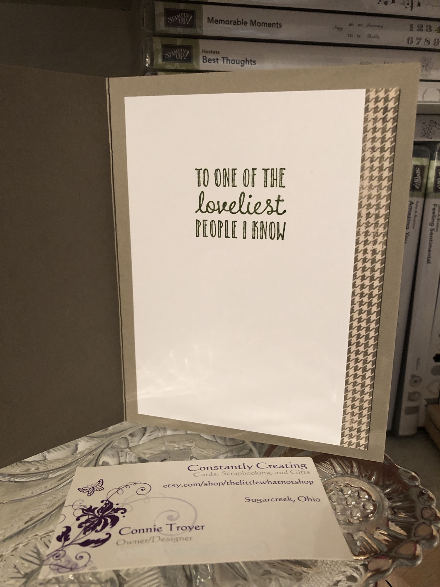
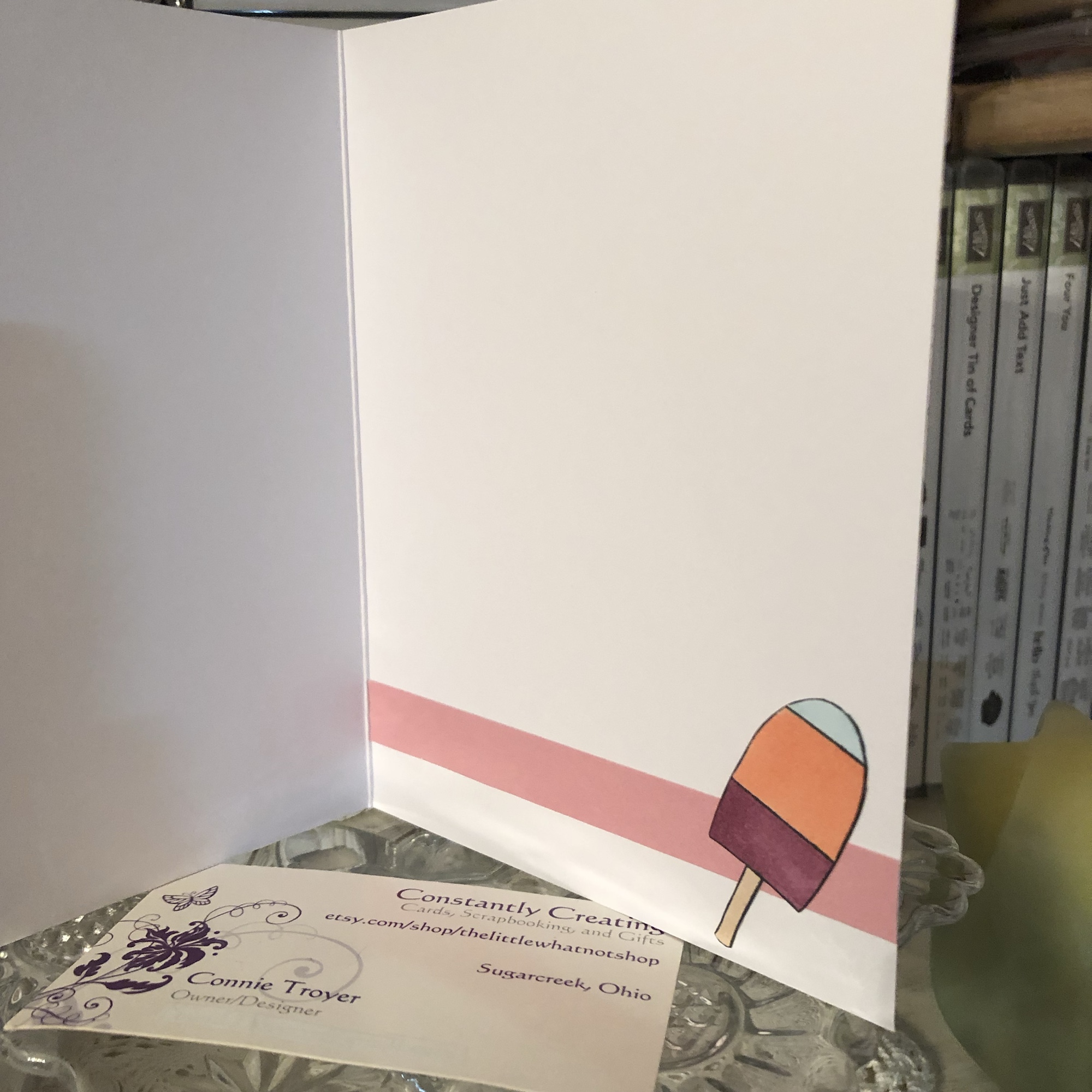
I sold the first card already, but this one was going to a special person as a thank-you for a very thoughtful Christmas gift she’d sent me (yes, I know, it’s February). So I had a certain sentiment for the inside in my mind, but I couldn’t find it on my shelves. It’s probably in the ones I stacked aside that are baby-, wedding-, or general-themed, for my upcoming gift shop cards. I’m really going to need to separate those. I keep missing particular stamp sets. I searched my shelves for similar options and came up with one from a current SU set called Hanging Garden. It’s the second time I’ve used it, but I think it’s going to be a favorite: “To one of the loveliest people I know.” And when I use it, I mean it. (That’s one of the nicer things about stamping these days–designers are doing a wonderful job with creating sentiments from the heart for all kinds of situations. I feel like we have more options these days than we used to.)
I stamped the Hanging Garden sentiment in Mossy Meadow on a sheet of white to match the sentiment on the outside and then cut another strip of houndstooth paper to accent the edge. Nice and simple, good for male or female. I’m happy to report that it has already been mailed and is winging its way to Missouri (higher postage notwithstanding).
I feel rather eager to continue using those stitched panels, so you may see more from me in this vein. There’s a certain feather floating around in my mind, and I keep mentally sifting through sentiments that would go with it. But for now I must focus on a fox card and two birthday cards this weekend. The lemons are done (blogs to come), and so are J’s wedding and sympathy cards (though two more Thinking of You are also on the list). And the Etsy sale is on (10% off!) and the order to S is wrapping up, so things are moving along. Life feels good right now. 🙂 Thanks for coming along for the ride.
A bit about the Notes of Kindness card kit I made up recently – twenty cards in one night!
I promise that I make more than card kits these days – and I’ll have some individual cards blogged about soon – but right now I’m trying to accumulate some stock for my local gift shop and get ahead on cards I need to send myself. 🙂
I recently found myself looking at another card kit I had waiting, and before I knew it, I had a bunch done! As a matter of fact, I made all twenty cards in one sitting (though I did go back and add sentiments to a few insides the next night). That’s just not me. I take way too long to make cards with my level of detail. What a freeing, productive feeling it was to have that many done at once! And I didn’t feel like the designs were too simple for my style, either.
This particular card kit, the Notes of Kindness All-Inclusive Card Kit, is current in the 2018-2019 Annual Catalog from Stampin’ Up, on page 7. The kit itself is $35 but it comes with a clear stamp block, an Archival Black ink spot, a 6-piece set of photopolymer stamps, Copper Baker’s Twine, adhesived mini pearls, Stampin’ Dimensional pop-up dots, die-cut sentiment stickers, die-cut flowers, lined envelopes, twenty printed card bases, and a kraft box you can store or gift them in. Full-color picture instructions are also included. All you need is your choice of adhesive and anything extra or different that you want to do.
There is also a refill kit you can purchase for $21 that includes all this except the stamp set, block, ink, and box – and the refill makes another twenty cards. (I know what is on my wishlist!)
I snuck another stamp set into my work so that I had “Best Wishes” wedding and anniversary cards as well as thank-yous. I also used some Wink of Stella Clear on some of my flowers to make them sparkle and shine. I made the card fronts the way the kit suggested otherwise. I did use some retired thank-you stamps on the insides where appropriate, just so I had some variation. And I was even able to use one of the German sentiments that are included. I live in a Pennsylvania Dutch area and thought I’d test one and see if it sells. (There are French sentiment stickers too!)
The colors in the kit are some of my favorites: Blushing Bride, Blackberry Bliss, Soft Seafoam, Mint Macaron, Mossy Meadow, and Basic Black and Whisper White. Though the sentiments inked up well, I love that they are photopolymer – for just in case I needed to realign something.
I think this one is my favorite. I turned it into a 5-piece card set complete with acetate box and pen!
You can see some Wink of Stella shimmer on the dark parts of this flower too.
I used the current Stitched All-Around stamp set for the “Best Wishes” cards (inside and out).
For this tiny thank-you sentiment with the twine behind it, I laid down some ATG tape first, to keep the twine controlled, before adding the Stampin’ Dimensionals and sentiment.
You can really see the Wink of Stella shimmering on this succulent. I varied where and how much I used it on the succulents but ended up loving them all!
Anyway, I’m not usually a card-kit user, but I’ve been beginning to change my mind about them. As long as they don’t feel too simple to me, I’ll probably give others a try now too. I also still have the Lots of Happy kit to finish sometime. 😉
If you’re interested in trying this kit or others, or if you need some supplies, I’m happy to be your Stampin’ Up demonstrator! Sale-a-Bration just started this week, which means you can get a free select product with any $50 purchase. And they even have a couple of amazing products for $100 orders! SAB goes through March 31. Let me know if I can help! ❤️
Sharing four Christmas card designs today from the Timeless Tidings Project Kit – an easy, fun way to make twenty Christmas cards quickly!
Hello, and welcome to my blog for Amy’s Inkin’ Krew’s blog hop for Tuesday, November 13! The theme for the month is holiday or Christmas, so I finished up some of my cards in Stampin’ Up’s Timeless Tidings Project Kit to show you.
When I got the kit in last month, I took a couple of hours to put the various pieces of the four card designs together (twenty cards total) – other than the banners and circle sentiment pieces, which I needed more time to do later. The kit looked so fun and festive that I had to tear into it right away. 🙂 The premade card bases have lines on them to show where to put the certain pieces, which is all outlined in the instruction guide. (Just look for the lines first so you don’t accidentally glue the layers to the back side of the card base, as I did. It’s easy to do because the front and back look the same other than that little guiding line!)
I had not ordered the Timeless Tidings stamp set that is made to fit perfectly on the sentiment spots simply because I ordered the kit when it was low inventory so I would be sure I got it. I figured I would think about the stamp set later. Later came last week when I started looking through my stamp sets to see if I already owned sentiments that would fit the four differently-sized areas…since my SU wish list was still plenty large with only two months left to order holiday products. (In hindsight, it would have been easier and faster to simply order the matching sentiment set, so keep that in mind! 😂)
I did find a current stamp in my inventory that fit the kit, and it is “Peace and Joy” from the photopolymer set that comes in the Christmas Traditions Punch Box. (Several would have fit, as they are all of similar size, but I liked that one best for the tree card.) The next time I use it, I may try to color various parts of the stamp with Stampin’ Up markers to draw attention to the pretty pine branches on it.
The decorative tree piece and the poinsettia were already watercolored and included in the kit – I just had to glue them down. (Also, that Christmas Traditions Punch Box really is delightful. The stamps are beautiful, and I love that the punch coordinates with them and other stamps in our catalog. Be sure to give this one a second look!)
The “Merry Christmas” sentiment on the poinsettia card is from a retired Stampin’ Up set called Versatile Christmas. Both of the cards have been embellished with a gold foil border and the gold and green rhinestone gems that are included with the kit. On the poinsettia card, I put green stones on the edge of the sentiment and gold ones inside the flower center.
For the other two cards, I used sentiments from a Penny Black stamp set. These cards also have gold foil and gems for embellishment, and I popped up the piece under the largest circle with foam dots. The one says “Happy New Year” because it fit the large circle best, and truthfully I have sent New Year’s cards instead of Christmas cards at least twice. 🤷♀️ So I’m bound to use it at some point. 😂 I used Old Olive ink for all four cards.
Not buying the matching stamp set outright did end up taking more time than I would have liked. The kits are meant to be an easy way to get a bunch of Christmas cards done quickly, so scrounging in my stash sort of defeated the purpose. If you’re a budget buyer like I am and have unlimited time, sure, you can find ways to work around it and even create your own cards from various pieces rather than following everything exactly like I did (other than the bling)…but if you want a painless, faster way to get the job accomplished, it’s worth the extra money to get the set. I actually never thought I’d say that. 🙂 The sentiments are great ones to have on hand for later anyway, so I doubt you’ll regret the purchase.
The Timeless Tidings Project Kit is currently on backorder for a couple more weeks yet (it’s been popular!), but they have lots more coming soon if this is something you’re considering for a future purchase. If I can help you order it or other supplies, or if you just need a Stampin’ Up demonstrator, I’m happy to help! Feel free to contact me or go to my store website listed over in the right sidebar.
Thanks for stopping by and reading! Hopefully you’ll be finding a bit of time soon to make some easy Christmas cards, if that’s your thing. I have quite a few outsides finished (not counting the twenty in this kit!), but I still need sentiments on the inside. And as I didn’t get mine finished in time to send last year, I’ve determined that this year will be different! The weeks to Christmas are already counting down, though. I don’t know how it’s already mid-November. May your holidays (and your Christmas) be merry and peaceful and wonderful this year. ❤️
To continue “hopping” along with our group, just click the “Next” button to view Karen Ksenzakovic’s offering (or click this link), or go to the “Previous” button (or this link) to view Linda Richenberg’s project. For your convenience, the list of all our participants are listed in order below. Merry early Christmas, everyone!
A quick decoupage birthday card I created before bedtime.
Last night I attempted to go to bed a little earlier, but I still had some time to kill before actually turning in (the brain was still restless, looking for something to amuse itself with).
I had wandered into the craft room for something else and ended up stumbling upon this Log Cabin quilt paper remnant on the desk while putting some things away. And oddly enough, there was matching SU designer series paper and cardstock right beside it in a heap intended for quilt cards for the local gift shop. Not for the particular card they ended up creating, but at least they’re being used, right?
I’ve also started keeping a new organizational system for pieces I can grab and adhere to cards quickly, trying to speed up my creative process. So before I stacked any layers together, I turned to my “Card Toppers to Use” drawer and this 3D flowered circle was the first one I pulled out. And it even mostly matches. 🙂 Just had to decide how to utilize the card front’s space.
This was the arrangement that seemed most pleasing to me – and I even ended up using a very retired color of SU cardstock for the base and middle layer as a plus! (No idea what color it is…it was an In-Color back 10-15 years ago! I haven’t researched it.)
The 3D pieces are some of my favorite ones to make. It’s so relaxing to sit there and fiddle while talking or listening to something else. And they’re pretty impressive up close.
I had a pack of gold Dazzles sentiments on my desk in the heap as well, so I cut apart a “Happy Birthday” one to make it fit better, and it went on easily. I refrained from adding any Wink of Stella or bling bits, as the card front is busy enough already.
The inside of the card is simply a scrap of border paper from a UK magazine (love those!) and a sentiment from a Studio 112 clear stamp set on top of a remnant of white. I used Stampin’ Up’s Sweet Sugarplum ink for the saying.
This card feels supremely satisfying to me. It didn’t take me long at all to create it from start to finish – maybe 20-30 minutes? – and even though I was just throwing bits of random things together, it turned out to be something pretty. I think that method is actually my favorite way of creating and also turns out my most creative works, making something out of nothing missing any semblance of sense at the start. 🙂
I’m not sure who is going to end up with this card, so it’s currently for sale if someone wants it. It may end up at the gift shop otherwise, if they like it enough. 🙂
I have a lady who periodically orders cards from me and enjoys seeing whatever creativity comes through, rather than give me specifics on how she wants the cards done. Her style–clean and simple–is sometimes a challenge for me, as I naturally tend to complicate life, but sometimes it’s also really refreshing to not have to overthink every little thing. Sometimes it’s just so nice to find a few simple bits and put them together quickly in a pleasing arrangement–leading me to wonder why I don’t do that kind more often. 🙂 This “embossed red roses” card was one of those for her.
A crafty acquaintance gave me this embossed panel, so I don’t know the designer, but the sentiment, ink color, and baker’s twine are from Stampin’ Up (Rose Wonder stamp set, Real Red ink, and Candy Cane Lane Metallic Baker’s Twine, respectively). I also used Stampin’ Up’s retired Candy Dots Brads and a Thick Whisper White card base. This is one card where I feel like simple still equals beautiful in my book. I later decided to add a little red rose in one of the corners on the inside.