Friends Are Like Seashells with Flowers for Every Season for Stamp with Amy K’s Tuesday Blog Hop

Scraps of paper can make something beautiful!

Hello and thanks for stopping by my part of this Stamp with Amy K’s Tuesday team blog hop! We’ve made cards “for the ladies” today.

One of my favorite things to do is to encourage my girl friends and other women on my life’s path. I had a Mother’s Day card in mind to create, but I’ve had an excess of other work during the last couple of weeks—so I went with this butterfly one instead. It’s a card I would send to one of my dear friends as a thinking of you or a birthday or a card of encouragement, to brighten their day and make them feel special.

I began the card really just wanting to use up some of my scraps of Flowers for Every Season 6×6 DSP (item #152486, currently on sale for $6.90 on stampinup.com during the Annual’s Last-Chance sale). I found three long and skinny scraps that were around the same size and had a pretty pattern among them that I could use as a center strip.

I decided to use the Misty Moonlight color in two of the strips as the color of my card base, and I glued a mat of Very Vanilla cardstock (item #101650) atop the card base, leaving about an 1/8″ border, to give some separation and definition to the colors in the papers that would be on top. (Forgive me for the guesstimate, but I don’t really measure things; I just work with things until they feel right.)

Once I glued the patterned DSP, I felt the strips also needed some Very Vanilla to break the color clash. Those strips are definitely an 1/8″ each because I cut them with my trimmer intentionally. 🙂 I also measured the smaller edge of the DSP strips so that I could place the floral pieces in exactly the center. I use a ruler on my work mat and inch inward by eighths and quarters until I figure out where the middle is. (I do better with seeing physical measurements than with abstract figures.)

To add the butterfly, I first took a piece of recently sold-out Bijou Butterfly DSP and fussy-cut the largest butterfly with my Paper Snips before popping up the butterfly on foam Dimensionals (item #104430) in the top half of the card, leaving room for a sentiment below.

To create that sentiment, I used one of the Stitched with Whimsy Dies (item #155314) and Misty Moonlight ink (item #153118) with a sentiment from the Friends Are Like Seashells stamp set (item #158203).

I first took the die to a scrap of Very Vanilla, which impressed the stitching into the paper. The die does not cut around the stitching; I fussy-cut around it myself with my Paper Snips (item #103579) using the edge of the impression as a guide and then edged it with a Misty Moonlight Stampin’ Write Marker (item #153125 for the In-Color Pack of five).

Then I placed my sentiment stamp on my Stamparatus stamping platform (item #146276), created a few test sentiments for placement, and finally stamped it where it would fit before decorating the sentiment box with embellishments from Wonderful Gems, Blue Adhesive-Backed Gems (item #153547), 2020-2022 In Color Enamel Dots (item #152480), and Playing with Patterns Resin Dots (item #152467).

I was able to pull out each of the colors used on the card with those embellishments, so I was pleased. (The white space in the corner was just too much for me. If you follow my blog posts, you’ll have heard that I’m not a big fan of white space.) I also felt that doing something different with the gems in that way spoke to the “unique” idea of the card.

I plan on decorating the inside of the card with a thinner strip of the floral paper and then selling the card to my local gift shop so one of their buyers can encourage a friend or relative too.

I hope you’ve enjoyed my card today. To continue on with the hop, press the Previous and Next buttons or click on the linked names in the list. My team members always come up with inspiring and beautiful projects! Thanks again for hopping with me. If you like this card, please leave a comment or consider following my blog for future posts. 🙂

Birthday Wishes with Stampin’ Up’s Dandy Garden Memories and More for Amy’s Inkin’ Krew Blog Hop

Make an easy birthday card (or any other occasion!) with the Dandy Garden Memories and More Card Pack!

Hello again, and welcome back to my blog! Thanks so much for being here. I’m hopping with my teammates from Amy Koenders’s Inkin’ Krew, and we are showcasing birthday cards this month.

I unexpectedly put most of this card together while gathering some supplies to gift another Stampin’ Up demonstrator friend. As I pulled cards for my friend to use from the Dandy Garden Memories and More Card Pack (item 154302), I realized that the larger grid card (which I consider the back of a “prettier” one) went well with the smaller colored dandelion card I’d also pulled. They just looked so nice beside each other that I had to do something about it. 🙂 Since there are two of each card in the card pack, I sent her one and made mine into a card right away.

I appreciate how the grid has that colored “frame” around it, which makes it look like another layer. It is just one card from the pack. I used the Night of Navy twine from the Well Suited Twine Combo Pack (item 154566) and wrapped it around the focal card, offsetting it, before adding Mini Stampin’ Dimensionals (item 144108) onto the back. Then I centered the dandelion card high inside the grid. I took a piece of dragonfly paper from the Dandy Garden 6×6 Designer Series Paper (item 154297) pack and my Dragonflies Punch (item 154240) and punched a dragonfly that I could hover over a dandelion. I used the Clear Wink of Stella Glitter Brush (item 141897) over the entire dragonfly before adding cut-down Mini Dimensionals on the tips of the wings that are above the grid. Since I often do things out of order, I then added the cards to a card base from the Assorted Memories and More Cards and Envelopes pack. My pack happens to be the now-retired Whisper White version, but the Basic White pack is available now (item 159234). I do have some of the Basic White items to use later.

Close-up of Wink of Stella on the wings

I decided to use what I’d made thus far for the birthday blog hop, so I searched my shelves for an appropriate sentiment that would fit in the space under the dandelion/dragonfly card. (Yeah, I didn’t plan ahead. But it still works.) I had several sentiments to choose from and went with the Happiest of Birthdays stamp set (item 152539), which is a new set to me. I love the size and fonts of the sentiments in it. I see me getting a lot of uses out of this particular stamp set. I picked the “It’s your day! Enjoy it” sentiment, lined it up on the grid of the card with my Stamparatus (item 146276), checked that the stamp was also straight on the grid of the plate, and inked it up with the In-Color Misty Moonlight ink (item 153118). Stampin’ Up’s In-Colors are only available for two years from the beginning of their release period. Luckily for me (because it’s one of my favorite colors), Misty Moonlight will be here through mid-2022 since it just came out last summer. I secondarily tested my inked stamp for alignment by first bringing the plate down to a sheet of the Small Grid Paper (item 149621), which fits the Stamparatus perfectly. I’ve found I’m happiest with my stamping that way. I cleaned my stamp with our Simply Shammy (item 147042).

I haven’t made the inside of the card because I’m not sure where it’s going yet. I’ll likely carry over some of the matching Designer Series Paper to the inside before I pick a sentiment.

To see the other birthday cards my team members made, check out their links below or use the “Previous” and “Next” buttons. This team never fails to impress and inspire!

If you’ve seen something you like, a purchase of $50 before tax and shipping through my online store gets you a free gift and a point to my reward system. And don’t forget that during the rest of the month of February, you’ll also get to choose a free gift from Stampin’ Up if you order in increments of $50 or more! Who doesn’t love free stuff?!

Thanks again for stopping by, and comment if I can help you!

  1. Mary Deatherage – https://wp.me/p5snyt-gFY
  2. Jaimie Babarczy – https://wp.me/p79UhD-4Pn
  3. Jillian Good – http://dyedwith.love/?p=126
  4. Karen Ksenzakovic – https://wp.me/paaNf4-41V
  5. Leslie Larkin – https://leslielarkin.com/a-touch-of-ink-stamp-set/
  6. Akiko Sudano – https://wp.me/paOv8E-2pi
  7. Connie Troyer – https://constantlycreating.me/2021/02/09/birthday-wishes-with-stampin-ups-dandy-garden-memories-and-more-for-amys-inkin-krew-blog-hop/
  8. Sue Prather – https://wp.me/p5yitZ-2qO
  9. Terry Lynn Bright – https://tlsbrightspot.com/2021/02/09/stampin-up-you-are-amazing/
  10. Donna Leonard – http://stampdabbles.com/?p=4327
  11. Tara Carpenter – https://tarabethstamps.blogspot.com/2021/02/stampin-up-prettiest-birthday-card-for.html
  12. Krista Yagci – https://www.thestampingnook.com/post/stampin-up-hey-birthday-chick-and-stitched-whimsy-dies-birthday-card
  13. Amy Koenders – https://wp.me/p2SFwf-m62

Birthday/Celebration and Thinking of You Cards with the Sale-a-Bration Kerchief Card Kit for Stamp with Amy K’s Sunday Blog Hop

Birthday and Thinking of You cards made with the Kerchief Card Kit available for free only during Sale-a-Bration with Stampin’ Up!

img_9128

Thanks for joining me on my blog today! I have to start off with an apology and a correction; this blog post is for Amy’s Tuesday Blog Hop, not Sunday’s. I was thinking of the day I had to post the link! And now I can’t change it…. More proof that I’m not perfect, I suppose. 🙂

So, for the Tuesday Blog Hop, which is going with a birthday theme this month, I decided to make up the Kerchief Card Kit, which is available as a Sale-a-Bration reward for spending $50 before tax and shipping. It had been backordered, but I got it in on Saturday and sat right down to put them together. I’m still making cards for sale for my local gift shop in Amish Country, so this set is perfect to do up for them. I plan on ordering a second kit and selling them in sets of five and some singles, using our Acetate Boxes and some card jackets.

I decided to go with this kit for the birthday blog hop because of the included “Celebrate Today” sentiments, planned for the Coastal Cabana rose cards. (The Poppy Parade kerchief cards have “Thinking of You” sentiments.) I adore the blue cards (and its gold foil-dotted vellum!) because of the colors and style, and the red cards were simple and fun to put together as well (also with vellum, but plain). I also really liked the thicker twine included in the kit, and I hope I see more of it in the future. I was pleasantly surprised and pleased to note that there is no stamp or ink spot in the set; the sentiments are already printed and included as die-cuts, ready to be added to the cards. It made the work go much faster—and yet still allows me creativity to add whichever sentiments I see fit for the insides of the cards.

The picture above only shows four of the eight cards in the A2-sized kit because I made two of each of the cards shown. On the blue Coastal Cabana cards, I popped up the rose and sentiment on two of them and left the other two roses flat; I also put two bows up and away at the right and two at the lower left bottom, for variation.

I changed the placement of the gold leaves on the Poppy Parade cards, two being centered and two being placed at a diagonal the way the kit shows. I also changed the location of the bow, not placing them under the tag as in the instructions. I actually even put the bow on top of one of the tags, which is not reflected here.

I finished the cards by adding sequins from the retired Love Blossoms Kit, as I thought the gold, white, and Blushing Bride colors matched well.

When I considered sentiments for the insides of the cards and looked through my current stamp sets, I found four that will work nicely for wedding or anniversary, general celebrations, or celebrating a special person or a special day that may or may not be love-related. Though they’re not stamped on the cards yet, I plan on using “Be strong, be happy, be you” from Rooted in Nature; “Wishing you the best on your special day” from the Perennial Birthday set; “Hoping you experience love and joy today, tomorrow, and always” from the Last a Lifetime set in the Mini catalog; and “Here’s to always finding joy in one another’s laughter, warmth in one another’s embrace, and love in one another’s lives” from Path of Petals. I think the “celebrate today” cards could also be used as graduation, retirement or promotion, even the birth of a baby or baby shower, and more occasions as well, if you didn’t feel the need to use the standard icons of the event. They would work fine as blank cards too—celebrating life or spring or no reason whatsoever!

Free with your purchase, the kit is a good investment. Quick to make up and easy to have a few cards on hand or to give as gifts, it’s one that will appeal to many (if for convenience’s sake if nothing else!), and the cards are lovely to boot. They’re also very easy to adapt to other styles or make into alternate designs. The envelopes are all lined with either Balmy Blue or Petal Pink and make a nice “wow” moment when they’re opened as well.

I’ll leave you with a close-up of my favorite card in the stack. 🙂 Please be sure to scroll down and “hop” through the rest of our list of participants so you can see the special birthday cards they created. We have a fantastic, creative team! If you are needing Stampin’ Up supplies, catalogs, or a consultant, I’m happy to help you out with any. You can use host code WAA2PGYR until February 16 when you check out. Thanks again for stopping by!

NextPrevious

  1. Jaimie Babarczy – https://wp.me/p79UhD-3B4
  2. Connie Troyer – You are here!
  3. Akiko Sudano – https://wp.me/paOv8E-Qx
  4. Mary Deatherage – https://wp.me/p5snyt-btg
  5. Karen Ksenzakovic – https://wp.me/paaNf4-1DA
  6. Leslie Larkin – https://leslielarkin.com/birthday-with-the-peaceful-moments-bundle/
  7. Sue Prather – https://wp.me/p5yitZ-1KD
  8. Julie Johnston – https://wp.me/p8SzmQ-2hu
  9. Karen Finkle – https://karenscardkorner.blogspot.com/2020/02/stampin-up-young-at-heart-for-amys.html
  10. Amy Koenders – https://wp.me/p2SFwf-iuS

Flowery Eiffel Tower Love Card with Stampin’ Up’s Forever Blossoms, Parisian Beauty, and Last a Lifetime for Stamp with Amy K’s Tuesday Blog Hop

Enjoy a bit of France and flowers as we gear up for all things “love-ly” for Valentine’s Day!

img_9128-1

Whew! That’s a long blog title. (And I didn’t even add all the stamp sets!) Maybe you know by now that my preferred style is lots of details and fuss—complication is somehow my specialty. I’ve used all current Stampin’ Up products in my card today, and there are quite a few. Thank you so much for coming to my post! Thumbnails of the products I used will be at the end of post, and clicking them will take you to my online store for more details.

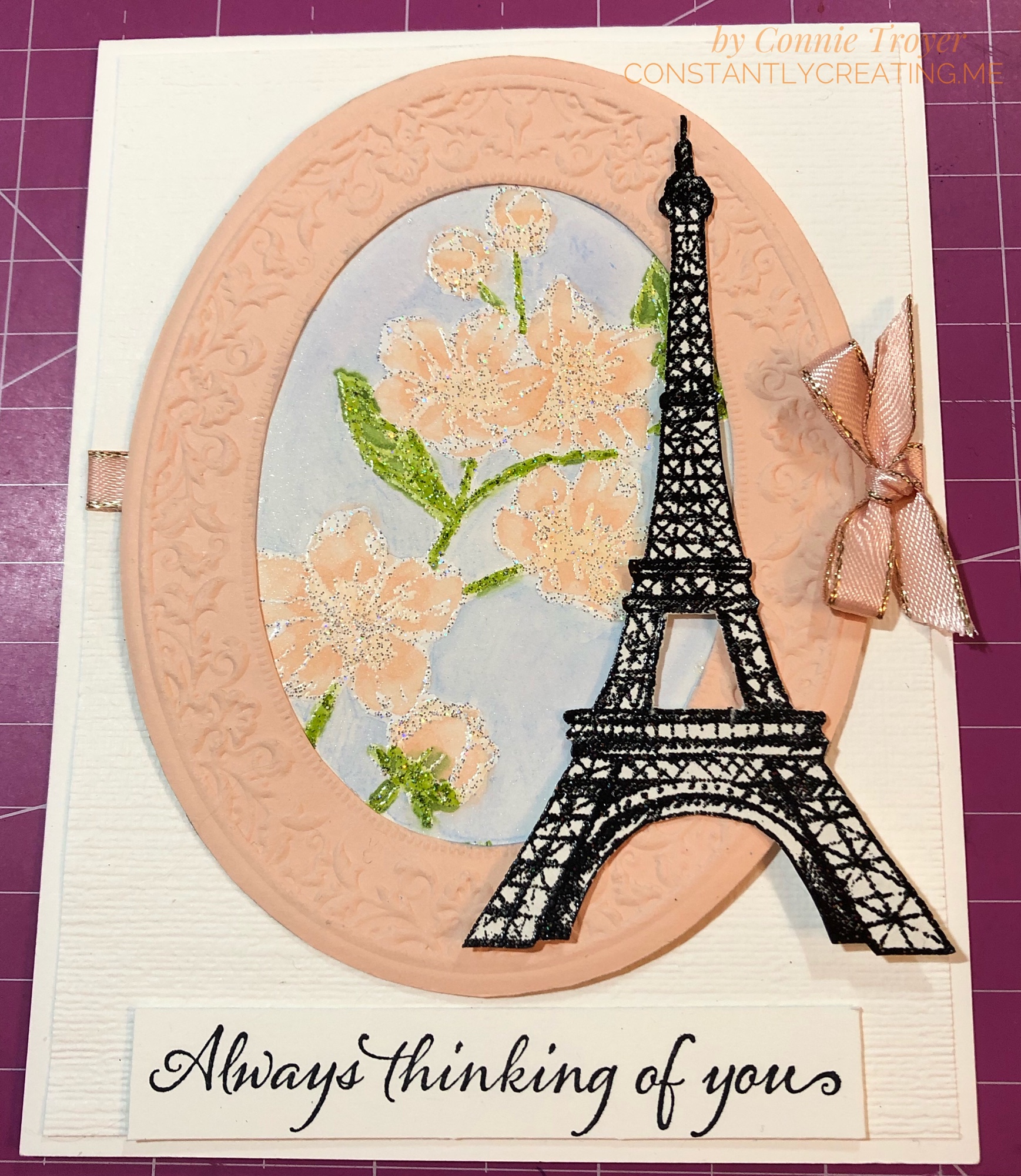
The theme for Stamp with Amy K’s blog hop for this month is “love.” Well, I have a “love” for all things France, so when I was thinking about current Stampin’ Up product I already own that I could create with, of course I turned to the Eiffel Tower. And flowers. I love flowers too. They’re my go-to any time of year. I didn’t have anyone particularly in mind when I created this card; it will likely go to my local gift shop for sale soon. The idea of it came to me while I was driving the other day. The background has changed since, but ideas do that in this craft room. 🙂
I started with an A2 (4.5″ x 5.5″) Thick Whisper White card base and then eyeballed and cut a slightly smaller separate piece of regular Whisper White for a layer on the top. The margin difference is between 1/8″ and 1/16″ because one was too big and the other was too small. I dry-embossed this separate piece with the Subtle 3D Embossing Folder first in one direction, and then I flipped the paper and embossed it in the other direction, which gives it a crosshatched look. I tucked a piece of 1/4″ Petal Pink Metallic-Edge Ribbon around the edges slightly higher than the middle, gluing them on the back side, and then glued my embossed piece down to the card base. (Well, technically, I did a lot of the steps backward, including that part, but do as I say, not as I did!)
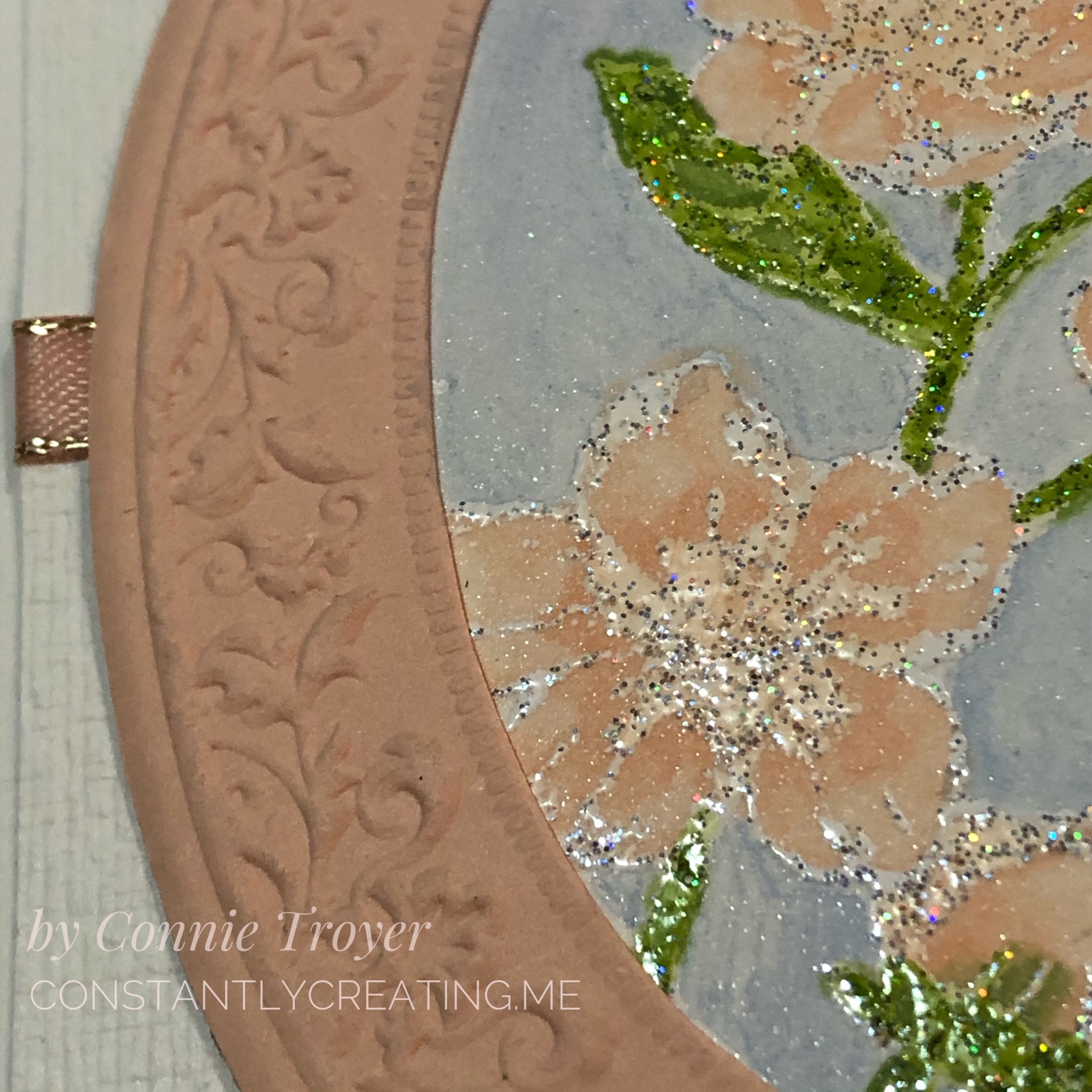
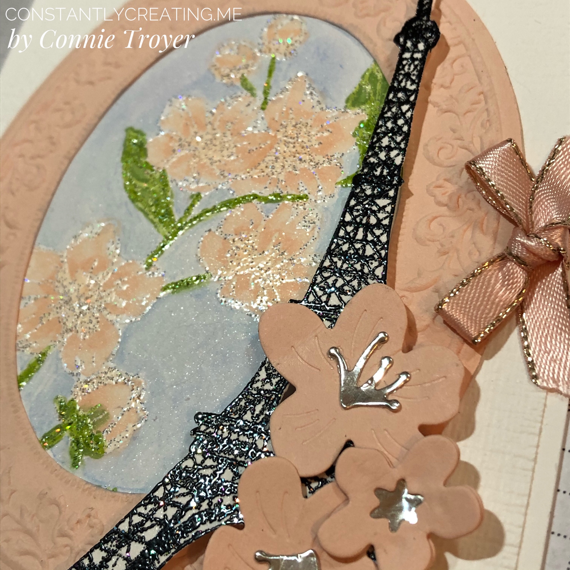
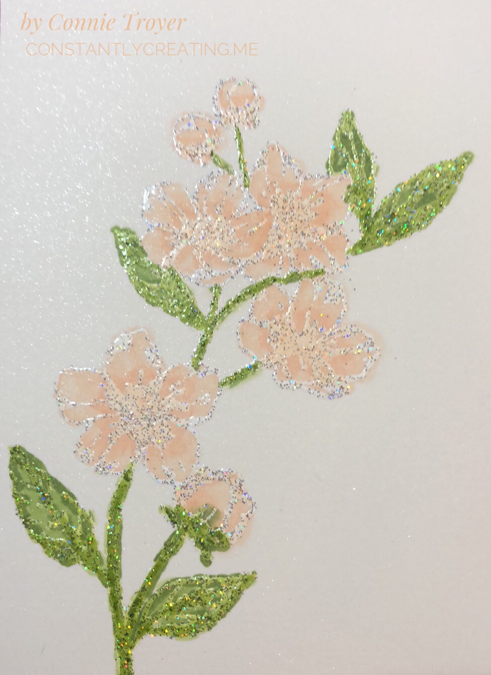
The focal part of my card front is the large flower stamp from the Forever Blossoms Cling Stamp Set, surrounded by an embossed die-cut made from the Heirloom Frames Dies and Heirloom Frames 3D Embossing Folders, with the Eiffel Tower stamp from the Parisian Beauty Cling Stamp Set and die-cut flowers from the Cherry Blossoms Dies offset to the side.

I knew I wanted to use Alcohol Blends on the flowers and leaves, but I don’t like coloring large sections with the Blends and making lines, so I felt like watercoloring the background would be best for me. I used the Balmy Blue watercolor pencil in the Assortment 2 pack and an Aqua Painter. (Truthfully, I forgot to color the background until after I’d already distractedly glued the piece to the back of the oval once my flowers were done, so don’t do that. Color it all first; then cut and glue.) Since we can use Memento Tuxedo Black to hold in the colors of the alcohol markers BUT Memento is water-based and will run when touched with water during watercoloring, I decided I’d better heat-emboss some embossing powder on the image after stamping with VersaMark so that I could do both techniques. I’d wanted to try out Stampin’ Up’s new Shimmer White and Shimmer Black Stampin’ Emboss Powders anyway.

I’m actually really impressed with those new embossing powders. I didn’t expect to see the holographic flecks in them, and that feature turns out some neat highlights. The Shimmer White is, of course, white when embossed, but there’s also a mix of silver and holographic flecks that don’t meld together when heated, unlike the white and black colors themselves. And the Shimmer Black includes flecks of silver, magenta, green, blue, and something yellowy that sit subtly on top of the black. The ones in the black are very hard to pick up in the lighting when showing a card, but they’re fun to see. After I heat-embossed the Eiffel Tower with the Shimmer Black, I think my jaw actually fell open—it looked like it was sparkling with diamonds!

When I was working on the oval, I had trouble getting the embossing perfectly centered in the die-cut, and that bothered me—and it also took up more of the card front that way, room I needed—so I trimmed off the excess around the crimped part. It lays flatter now anyway without the extra border edge. Once I had that done, I used it to figure out how I wanted to show my flowers inside it. They are stamped at an angle. I actually had a different angle chosen, but I didn’t glue it in the same way I had set it, so watch that if you do it. Mark a place at the top so you don’t twist it too far to the side. I cut a small section of Shimmery White Cardstock for the flowered piece, which you can see some of in the blue background in closeups. This card is quite shimmery everywhere you look!

To color the flowers, I used my Dark Petal Pink, Light Granny Apple Green, and Dark Granny Apple Green Alcohol Blends, as well as the Color Lifter. I tried to work with the Ivory too, but I had to lift the color right out of it because it felt too dark on the buds I colored. (I used to have a Light Petal Pink Blend and wanted to use it, but at the last show where I was a vendor, the cap didn’t get put back on correctly and I didn’t catch it until it had already dried out. So I have to order a new one.) When I colored the flowers, I went over the centers and extended the color some with the Dark Petal Pink first, then lightly went over everything with the same marker, and then took the Color Lifter to the outside edges of the flowers or buds. I would have also liked to have left some white on the flowers to look more like the DSP in the Parisian Blossoms Specialty Designer Series Paper, but it just didn’t work out that way. The embossing on the flowers and leaves is really where all the shading and shadowing is, so it felt more like reverse coloring as I worked with it. There’s not a lot of space in the flowers that isn’t embossed. I did color right over the embossing, and it does not rub off (though I did not intentionally test that when it was wet).
The Parisian Beauty stamp set is one I won with my Prize Patrol number at November’s OnStage conference, and I hadn’t ordered the matching Parisian Dies yet because I already have a Bigz Eiffel Tower die and several stamp sets having to do with France. In my mind, I saw the SU die-cut at the side of the card and thought I had bought the set until I went looking and remembered. Stampin’ Up’s die-cut is much prettier than the other die I have, so I will be ordering the Parisian Dies after all. For today’s card, though, I had to fussy-cut the stamped/embossed image.

I used the Cherry Blossom dies for the flowers on top of the Eiffel Tower. The stamens and star center were cut out of Champagne Foil and the flowers themselves out of Petal Pink cardstock. I actually doubled the littlest blossom, sandwiching the foil in between to make sure it stayed where it was supposed to. I wanted the blossoms to curl up a bit and had to use the tip of my Tombow Mono Liquid Glue to get the curves I imagined, instead of my large ball tool that was “somewhere.” The dies emboss curving lines in the flowers when cut, as well.

img_9460-1

I popped up the Eiffel Tower with Mini Dimensionals to help the height of the knot at the edge of the card, so some of the cherry blossoms on top of it are glued flat and some have been half glued flat and half popped up. The littlest blossom actually has two half Mini Dimensionals at the right and is glued on top of the others otherwise. I knotted a small bow with the 1/4″ Petal Pink Metallic-Edge Ribbon (the last of my sample from OnStage!) and used glue dots under it, on top of the ribbon that was wrapped around to the back, to keep it in place.

To finish the card front, I used the “Always thinking of you” sentiment from the Very Versailles Cling stamp set and stamped it in Jet Black Staz-On ink on a scrap of Thick Whisper White cardstock (with no embossing either way). The Staz-On ink seems darker than the Tuxedo Black Memento ink, and since I had such a dark Eiffel Tower, I didn’t want to go halfway on my ink. To my surprise and delight, my Simply Shammy removed the Staz-On ink from my stamp with just a little scrubbing. Now I don’t have to drag out the pungent Staz-On Cleaner and do the whole paper towel mess! Hooray!

I also used my new Paper Trimmer and even the new Mini Cutter to trim up the sentiment scrap and the first version of my Subtle-embossed piece. The Mini Cutter is only available to demonstrators and those who become demonstrators during Sale-a-Bration, so if you want one, you’ll need to sign up to get it and some other goodies (but I promise it’s worth it!).

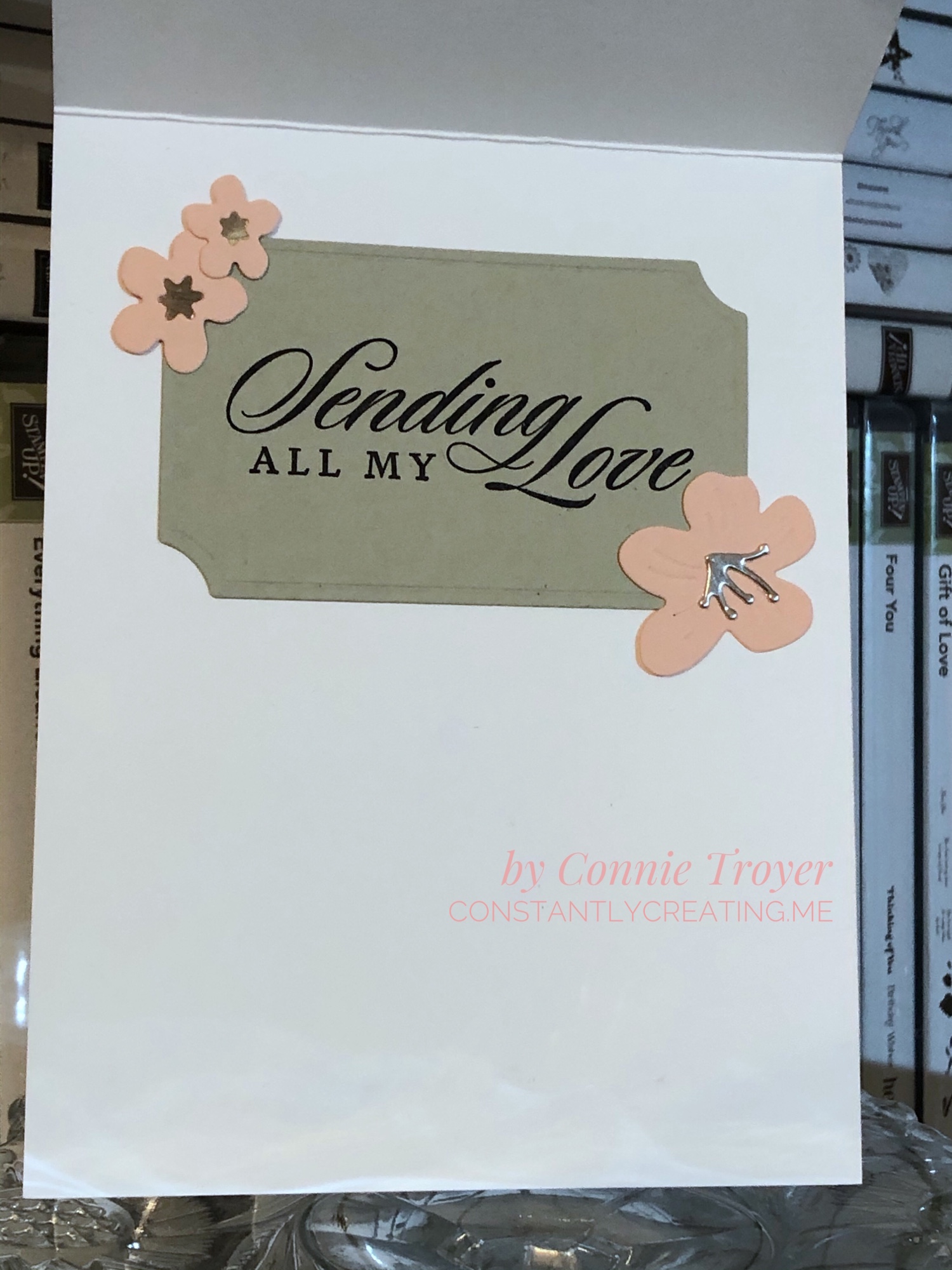
The inside of the card is hiding an oops, but I got a lot more creative with what you see versus what I had, so I’m happy about that mistake. I used the largest of the Painted Labels Dies to cut my “label” for the sentiment out of Sahara Sand cardstock. I stamped the “Sending All My Love” sentiment from the Last a Lifetime Cling Stamp Set in Jet Black Staz-On, using my Stamparatus. And then I glued more Champagne Foil to three more blossoms of various sizes (star centers and stamens, both) to two corners of the label. I did not curve those blossoms. 🙂
All in all, I’m pretty happy with this card. I hope you like it too. Please leave me a comment and let me know what you think or what you would have done differently—or any questions you may have. Just for fun, I’ve included a picture of the “clean and simple” version of this card to show you what it would look like without the flowers. Somehow it’s a very different feel! Nothing was glued down yet when I took the photo.
We have a very talented team creating for you today, so please “hop” around to the others on this list to see what they made! If you hit the “Previous” button, you’ll go back to Mary Deatherage’s blog, or you can go “Next” to Akiko Sudano’s offering. Both women create amazing cards! Or you can skip around with the links below—you’ll find many you like. 🙂

PreviousNext

  1. Karen Ksenzakovic – https://wp.me/paaNf4-1uG
  2. Shirley Gentry – https://stampinwithshirleyg.com/?p=10221
  3. Mary Deatherage – https://wp.me/p5snyt-aZ2
  4. Connie Troyer – You are here!
  5. Akiko Sudano – https://wp.me/paOv8E-KT
  6. Jaimie Babarczy – https://wp.me/p79UhD-3wt
  7. Karen Finkle – https://karenscardkorner.blogspot.com/2020/01/stampin-up-parisian-beauty-for-amys.html
  8. Sue Prather – https://wp.me/p5yitZ-1I8
  9. Leslie Larkin – https://leslielarkin.com/heart-to-heart-bundle-for-amys-inkin-krew-team-blog-hop/
  10. Amy Koenders – https://wp.me/p2SFwf-idu

And if you are interested in the products I used on this card, I’ve added them to the next list, and the thumbnails are direct links to my online store for more information or purchasing.

If you wish to purchase something from my online store, please use the host code WAA2PGYR during checkout. Orders of $50 before tax and shipping also gets you a free gift of your choice worth up to $8, from me to you as my thanks. 🙂 (You’ll also get a free Sale-a-Bration item from Stampin’ Up with every order of $50 before tax and shipping!) If you’re interested in becoming a demonstrator and want to sign up with a great time, I’d love to have you join mine—and Sale-a-Bration is the best time to do it! Recruits who join before March 31, 2020, will receive the brand-new (only available here) Mini Cutter (which is a guillotine-style trimmer), a 6″x6″ sampler pack of Designer Series Paper (48 sheets of most of the DSP from the Mini catalog), a free stamp set of their choice, $125 worth of items for $99, and more. I’ve never regretted it!

SAB recruit pic

Thank you again for stopping by to see what I created today!

Connie


Product List


Thinking of You Card with Painted Harvest for Stamp with Amy K’s Blog Hop

Welcome to my blog for Stamp with Amy K’s Inkin’ Krew Blog Hop for Tuesday, August 13! We have a great lineup for you today. Thanks for stopping by to see what I created. 🙂

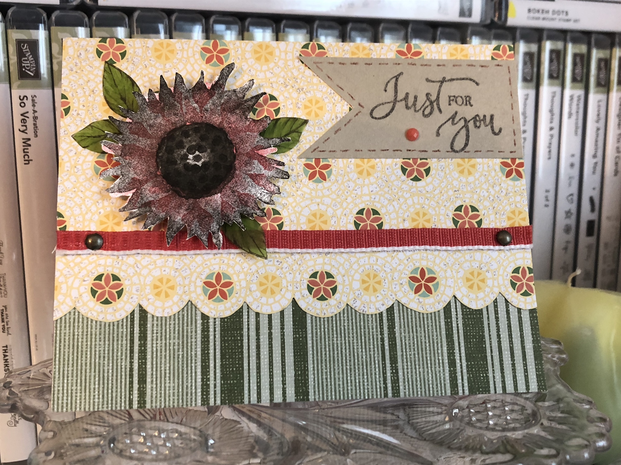
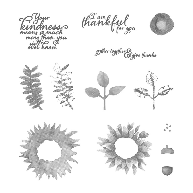
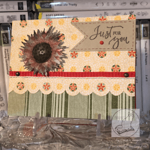
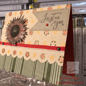
With the seasonal change coming soon, this month’s blog hop theme is “fall frenzy.” So I have a thinking of you/just for you sunflower card to share with you today using Stampin’ Up’s “Painted Harvest” and “Rare Blessings” stamp sets.

Painted Harvest

Rare Blessings

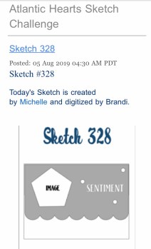
I decided to use last week’s Atlantic Hearts Sketch Challenge—Sketch #328—to give me a basic idea of construction. I don’t use sketches often because I usually just design straight from my brain based on what I’m feeling with the products I see in front of me, but I’ve had a busy weekend (okay, month). I’m thankful I can turn to a sketch or a Pinterest pin for less-than-ideal crafting times when I need to come up with something quickly in either design or time. So here is the sketch image I worked from.

I was also inspired by a card from my teammate Leslie Larkin (leslielarkin.com) that was posted on our team Facebook page last month. After I saw her card, I wanted to make one immediately. I love the black-and-white flower with the color around it (she used Memento Tuxedo Black ink with Lovely Lipstick paper, cardstock, and gems).

So without further paragraphs, let’s get to my card! Although I had to create it in a crunch, I found several ideas vying for realization as I looked through my current DSP and video-chatted with a crafty friend. I didn’t have time to make the five cards I wanted to, so I’ve had to back-burner most of them. I did pull out supplies to make a second card following the same sketch, so I’ll make that and post it another day. Here’s the one I put together for today. (Be sure to catch the updated picture at the end!)

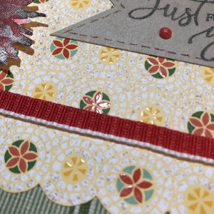
What I ended up using was a Terracotta Tile card base, a sheet of striped paper from the “Come Sail Away” DSP pack (Mossy Meadow color), and a sheet of flowered paper from the Mosaic Mood Specialty DSP (Crushed Curry, Garden Green, Mint Macaron, Terracotta Tile, and Very Vanilla colors). It is a specialty DSP because half the sheets in the pack have Spot UV gloss on the paper to showcase various designs. In the paper I used, the flowered circles have the gloss on them.

I thought the Mosaic Mood paper would work for the scalloped piece on the sketch because the flowered circles are all in a row and have radiating circles around each flower. I just took my scissors and fussy-cut around the largest circle of each flower in the row, up to where it touches the next circle. It seemed the fastest way to move forward on the card and stop all the overthinking I was doing.

The striped Mossy Meadow paper from “Come Sail Away” pulls out the Garden Green from the “Mosaic Mood” paper and balances everything visually. For some reason, I always think stripes go on the bottom. I suppose that’s one of my “ruts” in card-making. However much I tried to argue with that while designing the card, in the end it was easiest to cave and promise myself that I’d try something new later.

Once I had the stripes glued down and the top portion cut, I tried to find a way to use the beautiful 1/2″ Poppy Parade Textured Weave Ribbon in my “current product accessories” bin. I began using the ribbon the way it comes off the roll but didn’t like how it was the same width as the flowered/scalloped border. I needed something thinner, but I only have so many ribbons and twine options right now. So I put some heavy-duty Tear & Tape Adhesive down on one side of the ribbon and did my best at folding it over in half (it’s kind of tricky, actually). And then I located the 1/8″ Glubers glue line I’d cut in half previously for another card. It comes in 1/4″ strips, but as I’ve mislaid my 1/8″ red-line tape, I made do with the other—twice now. Tear & Tape Adhesive would have worked for that as well, but I already had the other one cut and waiting for me.

The metallic brads are basically just decorative. Since I hadn’t yet adhered the flowered piece to my card base, I could still punch a tiny hole on each side of the ribbon, place the brads through the holes, and fasten them at the back before gluing the paper. I’m considering them to be two of the gem places in the sketch, with the third located on the tag. My brads are miscellaneous from my stash, but Stampin’ Up has a great set of Metallic Brads in the current catalog, so I’ll add them to the list of supplies at the end.

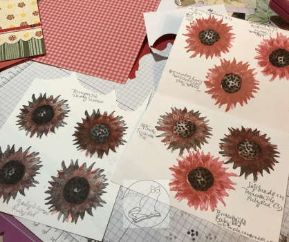
Then came the tedious part of the card—figuring out which colors to use for the two-step photopolymer “Painted Harvest” sunflower. I know I’ve saved some color swatches for this sunflower in Pinterest, but for some reason I thought it would be faster to use the colors I’d narrowed down and stacked on my table rather than search in my Color Combos and Sketches board. Hindsight is 20/20.

I wasn’t entirely sure how the stamping was supposed to go, so I got some scrap paper and started “playing” with the two darker ink colors I’d pulled—Early Espresso and Soft Suede. I did several of both colors as the base. Then I opened the two ink colors in my stash that matched the paper the best—Terracotta Tile and a very old (but perfectly juicy) Ruby Red. I need to get a Poppy Parade ink pad yet. I wasn’t sure which color would work best with both the Poppy Parade ribbon and the Terracotta Tile in the paper.

After too much experimentation, including tone-on-tone and color mixing in the brighter colors, I chose to go with the Early Espresso/Ruby Red combination. The Terracotta Tile is more orange than Poppy Parade, and the Ruby Red has a better balance of an orange and something rosier or pinker when both Terracotta Tile and Poppy Parade are on the same card. The flower spots that have Terracotta Tile in them on the DSP are small enough it doesn’t seem to matter much. I had originally picked a Soft Suede/Terracotta Tile combination, but I didn’t stamp the center quite right on the best piece and royally messed it up when trying to fix it, per my usual. Anyway, that color combination works too.

The center of the finished flower is tone-on-tone Early Espresso. Stamping the center of the sunflower was a little challenging to line up at first, but the more I “practiced,” the better I got at it. So just keep trying while you figure out how it works. After I chose one of the images I’d stamped, I then fussy-cut around the finished sunflower and added pop-up foam dots to the back of it. I’m just now realizing that I probably should have added leaves as well. But I’m calling this card done. Maybe I’ll add leaves before I send it. That’s for another day.

For the “Just for You” tag from the “Rare Blessings” stamp set, I used Early Espresso ink and a scrap of Crumb Cake cardstock. The stamp set is one of the new cling sets, so I had to put it together first with the new stickers (that actually stick to the block!). I actually kind of love doing that with the new stamp sets. 🙂 After that was done and I stamped it on the Crumb Cake, I cut down the tag and snipped up the middle at the left with my scissors to make a banner end. Then I took a Really Rust Stampin’ Write Marker (retired) and added some faux stitching in a thin border just inside the edges of the tag. I would have used an Early Espresso marker, but something happened to mine and I no longer have one. The Really Rust is close enough to the Terracotta Tile that it still matches. And, finally, I added a Terracotta Tile gem from the 2019-2020 In-Color Faceted Dots embellishment pack to the tag as one of the gem spots in the sketch.

I’m not sure what is going on the inside yet. The card is going to a friend who recently lost his mother. I need to look for the right sentiment before I send it with a delayed memorial gift. It’s been a busy year here. But at least I’m one step closer in getting the card and gift sent out the door.

UPDATE!: I decided to add some vellum leaves from the Magnolia Lane Memories and More Card Pack around the flower. I fussy-cut them and colored them on the front and back (to make them darker) with my Dark Old Olive Alcohol Blend marker. (I don’t have the Mossy Meadow Blends yet, so I made do.) The sentiment on the inside reads “With Deepest Sympathy” and is from the current Golden Afternoon stamp set. I stamped it in Crumb Cake. I also ran one of the sticker border strips across the bottom of the inside from the Magnolia Lane Memories and More Card Pack. NOW I’m finished with the card. 🙂

That’s all for today. Stay tuned for the next card using “Painted Harvest” and Sketch 328. Thanks again for visiting! Feel free to post questions or comments. Below the list of blog hop participants of my Stampin’ Up team members are the products I used in my card. You can purchase any of them through my online store here—or just click on the picture—and if you use the host code 3W7RXKCU when you check out, I’ll send a free gift your way! Also, if you happen to need a current Annual Catalog or the upcoming Holiday Catalog (which should arrive on my doorstep tomorrow), I’m happy to send you one! Just use the Contact Me link at the top of the main page.

To continue with our blog hop using the arrows, click Previous to view Paula Vincent’s offering or Next to view Karen Ksenzakovic’s card. Or you can click any of the links below to go directly to any demonstrator’s blog.

  1. Jaimie Babarczy: https://wp.me/p79UhD-32A
  2. Terry Lynn Bright: https://wp.me/p8fxPh-ak
  3. Mary Deatherage: https://wp.me/p5snyt-8YX
  4. Akiko Sudano: https://wp.me/paOv8E-hO
  5. Shirley Gentry: https://stampinwithshirleyg.com/?p=6855
  6. Karen Finkle: https://karenscardkorner.blogspot.com/2019/08/stampin-up-accented-blooms-thinking-of.html
  7. Paula Vincent: https://cockeyedcrafter.com/?p=160
  8. Connie Troyer: https://wp.me/p8xvI6-E
  9. Karen Ksenzakovic: https://wp.me/paaNf4-RH
  10. Amy Koenders: https://wp.me/p2SFwf-gGt


Product List

Plus the Golden Afternoon stamp set and Magnolia Lane Memories and More Card Pack!

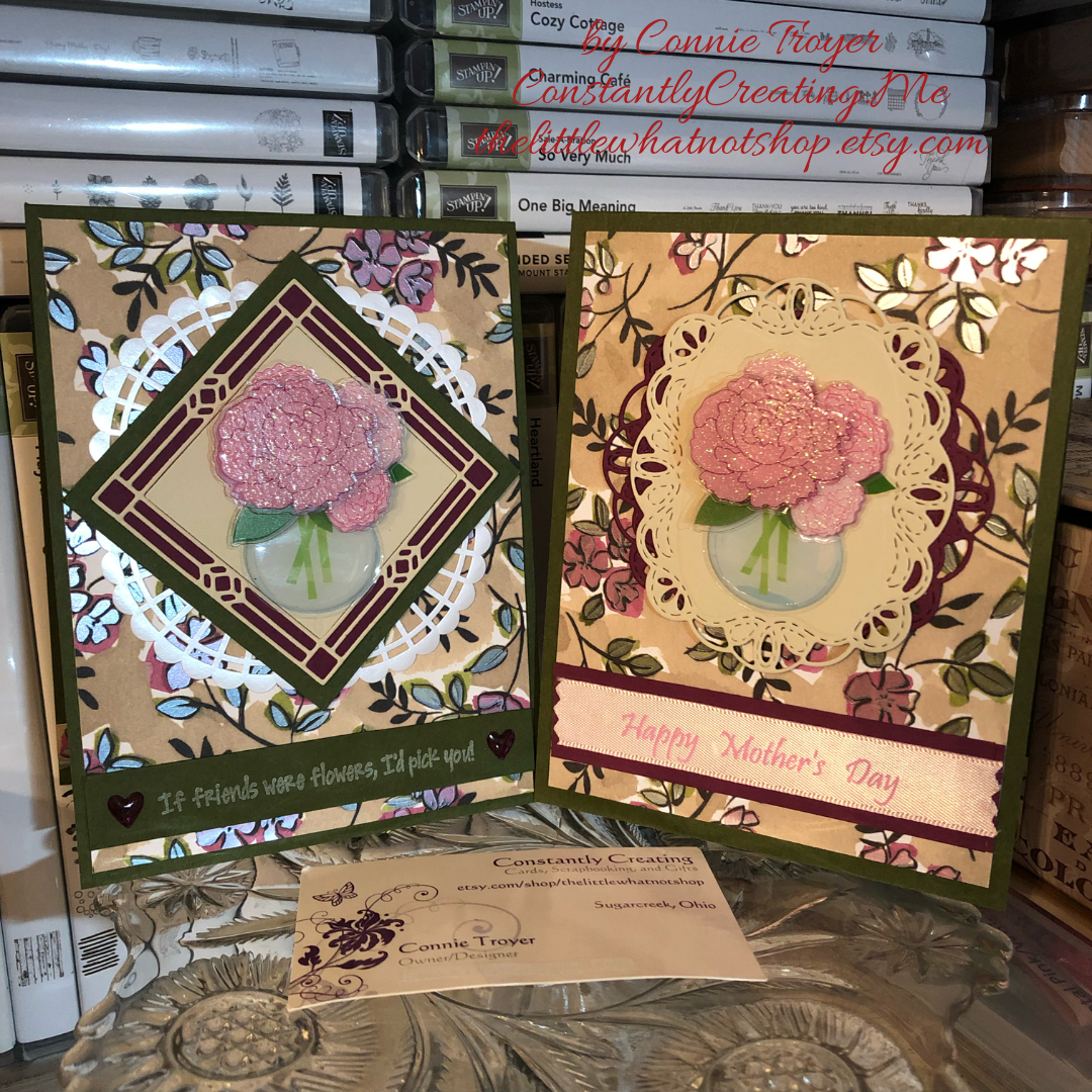
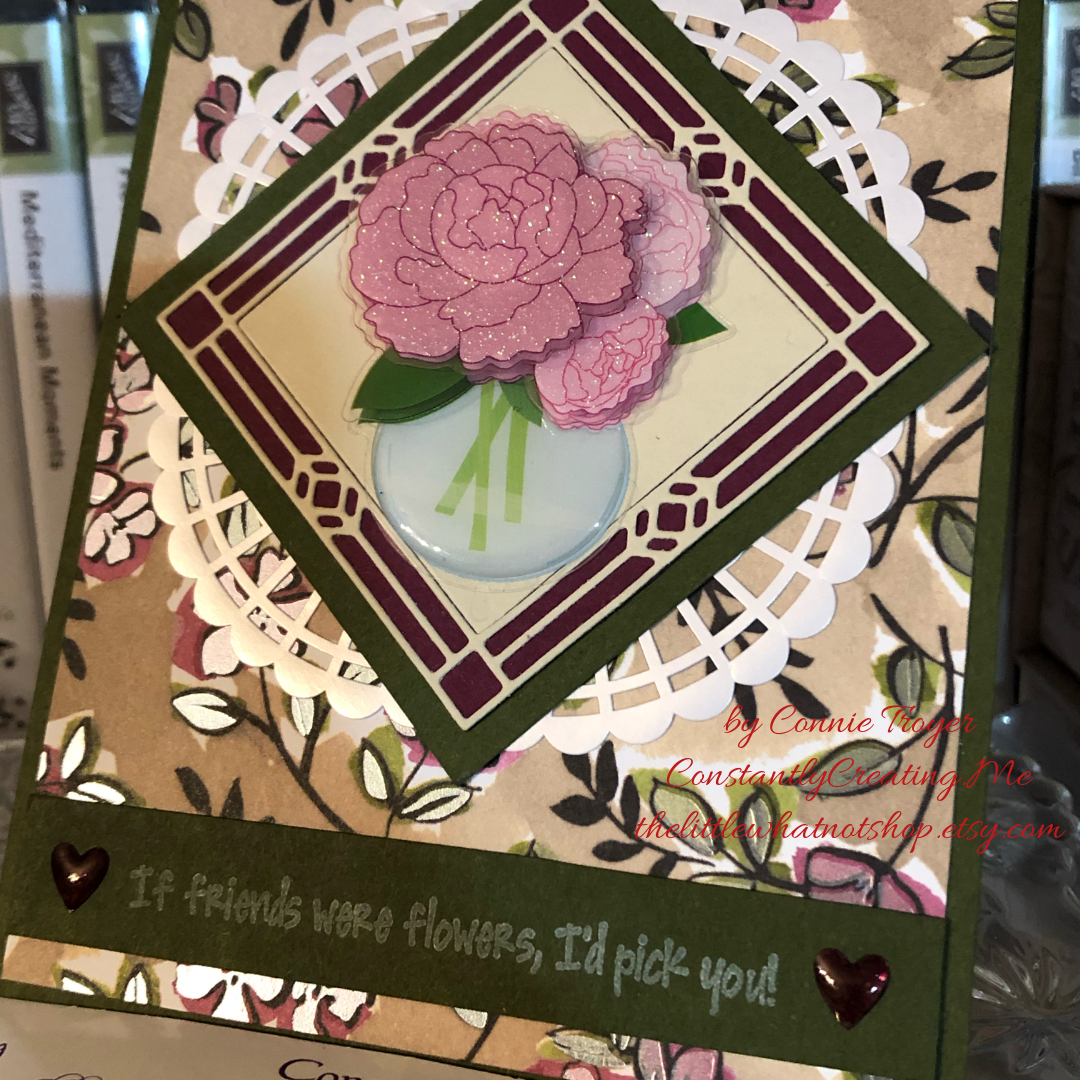
“Feminine” Blog Hop for Amy K’s Krew (If Friends Were Flowers…)

I’m part of Amy’s Inkin’ Krew Blog Hop with a “Feminine” theme for Tuesday, April 9. See what I created with some paper and dies for friendship and Mother’s Day!

img_9128

Hello, and welcome back to Constantly Creating/The Little Whatnot Shop! I’m blog-hopping with Stamp with Amy K’s Inkin’ Krew today, and our topic is “feminine.” That gives a lot of options for card creation (men being much harder to design for)!

This is really the story of two cards. I’ve been traveling and freelancing again lately, so I haven’t had a lot of time in the craft room. But before I left the state, I started thinking about several different cards I need to send, and I decided to use a flowery piece of the Share What You Love Specialty Designer Series Paper (DSP) as a background for all of them. (I confess, I was also hoping to meet a 4-6-card “use it up” challenge on a Facebook group by doing so. Ambitious for someone who hasn’t been home!)

Last week I cut three card fronts out of one 12×12 sheet of the DSP and still have a couple of scraps leftover for another smaller notecard yet—maybe a thank-you. Of the cards with the bigger sections, one will be for a belated birthday, another became a Mother’s Day card, and the friendship card I’ve used for today’s blog title will likely go to the local gift shop upon my next delivery. I love how the same piece of paper works for each type of card.

I’ve acquired a few off-brand things recently as well, so these cards are not entirely made up of Stampin’ Up products (as my demo status would prefer). But the bulk of them are SU, and you could easily substitute SU’s vases or flower stamps or another sentiment where I’ve placed mine; the design works regardless. I grabbed the “other” products because they were near me (read: not yet put away) and I’m always trying to use up my consumables. (Plus, I needed to finish a card quickly to be able to blog!) In the products list at the end of the post, I’ll add some Stampin’ Up product suggestions you could use to change this card into one of “theirs” entirely, alongside what I did use from SU’s line. 🙂

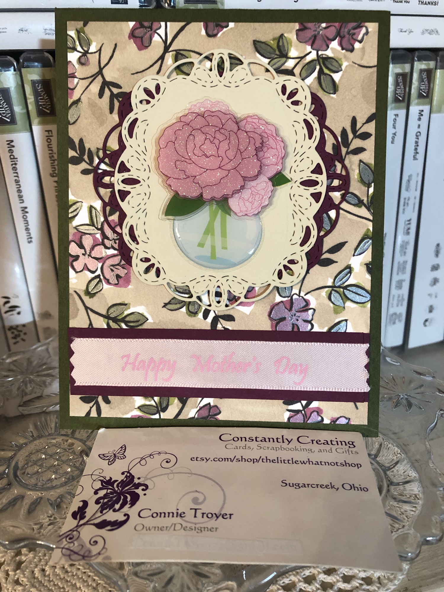
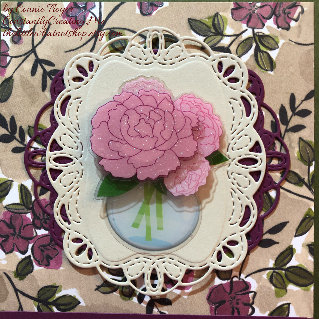
So, diving into the cards I’ve finished…I have to confess first that I began a card for friendship, forgot what I was doing with it, and turned it into the aforementioned Mother’s Day card. I had the sketchiest of ideas when I started pulling things together—which is probably why I got distracted and it became something else—but sometimes one just has to go with the creative flow. After I finished the Mother’s Day card, it was easier to just emulate the structure for the actual friendship card, only tweaking the materials. As the two are similar, I’ll show the Mother’s Day one here as well. In the pictures, you can see how the flowers and leaves in the Specialty DSP have a pearlized, translucent finish.

For both the blog card and the Mother’s Day card, I began with a Mossy Meadow card base of 80-lb cardstock in an A2 (4.25″ x 5.2″ finished) size, and I cut down the Crumb Cake background with shimmery Rich Razzleberry/Mossy Meadow flowered piece from the Share What You Love Specialty DSP to mostly cover the card front, with a little Mossy Meadow border showing all the way around. The Mother’s Day border is slightly larger than 1/8″, whereas the friendship border is slightly smaller than 1/8″.

The other day, I sat down with my Cuttlebug, my Stained Glass Thinlits and Stitched Labels Framelits die sets, and pieces of Rich Razzleberry cardstock and a random cardstock I ended up with that reminds me a little of Crumb Cake. It is just a shade lighter, so it matches the Share What You Love paper quite well (and it’s another consumable I can use up! Yay!). I made off several die-cuts out of the cardstock and put them on the desk with the rest of my card pieces until I had more time.

On Monday, I tried several of them (unglued) with different flower stickers to see what I liked best together. The Mother’s Day card uses two Stitched Framelits, one of each color, layered together perpendicularly so that the lighter cardstock has a bit more weight to it on the busy background. The additional Rich Razzleberry die-cut seemed to ground the top one and give a fuller look even though I also liked the simplicity of only one Framelit.

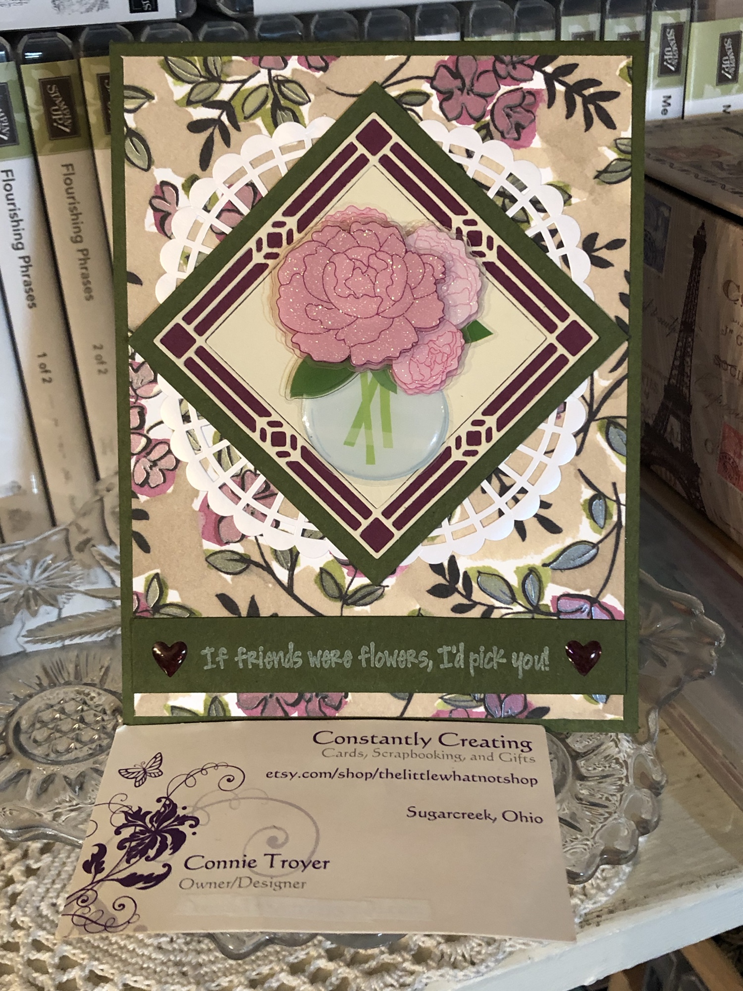
For the friendship (“If friends were flowers, I’d pick you”) card, I had originally chosen the vase idea (before I forgot what I was doing) because I saw the sentiment and the vase/flower stickers about the same time, and they made sense to use together. Since I had used the Stitched Framelits on the first card, I used one of the Stained Glass Thinlits Dies for the second. I adhered some sticky adhesive to the back of the die-cut and replaced the square that comes loose when first cut, and then I backed both the “stained glass” piece and the solid square onto some Rich Razzleberry cardstock, using my micro-tip scissors to cut around the edges once they were stuck.

Note: Keep track of how the solid square comes out of the die; it’s not completely symmetrical, and there is a spacing difference when it’s turned the “other” way.

When I positioned the flower/vase sticker and temporarily placed the diagonal onto the DSP, I then felt it was too simple (story of my crafting life), so I cut down a couple of the gorgeous Pearlized Doilies and glued them to the back of the sides of the diagonal, which fluffed out the center in a similar style to the Mother’s Day card. I got three out of one doily the way I cut them, and the center circle is still able to be used for something else.

I wanted to make sure I left room for a sentiment across the bottom on both cards, so I tested the placement and figured out how big the border strip at the bottom would need to be. For the Mother’s Day card, I added 1/8″ above and below the sentiment ribbon I planned on using to darken the ribbon a bit and make it look more finished; then I cut some vellum adhesive to fit inside the ribbon and carefully merged the two. Ribbon is tricky to glue, the way it’s so flexible. It’s not my favorite way of doing it. I was going to wrap the edges behind the DSP, but because of where I’d trimmed the ribbon around the words on the next repetition, I didn’t end up having enough room to tuck it around. So I took pinking shears to the ends instead since regular scissors and a straight cut would cause it to fray.

The solid Mossy Meadow border for the sentiment on the friendship card is about 3/8″, though I didn’t measure. Because the letters are close together on the stamp, I was leery of using embossing powder or getting things too juicy in case they would blur or blend together. I fell back on some old Craft White pigment ink to stamp it, and then I heat-embossed it, hoping it would turn slightly puffy but still be readable (I remember doing that once somehow, but since heating it this time did nothing except dry it, I’ll have to figure out the “puffy” process again). And then because I had room at the sides of the sentiment for geegaws, I trotted out my new Heart Epoxy Droplets and colored them with my Light Blackberry Bliss Stampin’ Blends alcohol marker, the way I’ve heard others have done. It actually works!

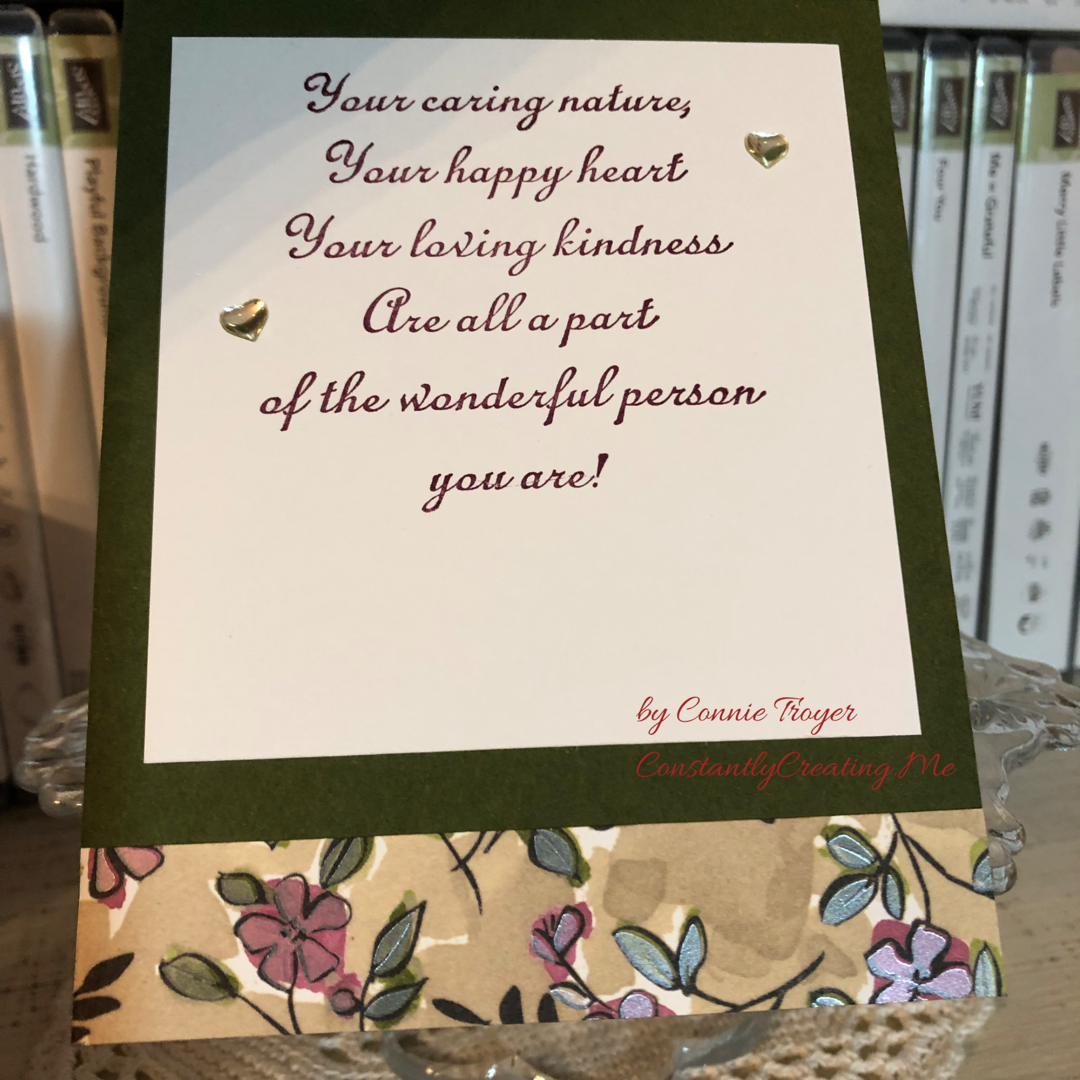
I’ve made the inside of both cards the same—white paper to stamp and write on, an old random wooden stamp sentiment that fits both types of cards, a little writing room, and a strip of Specialty DSP running along the bottom. And I used some retired heart epoxy sticker gems on the inside of the Mother’s Day card as well. Both cards flip up to open rather than right to left.

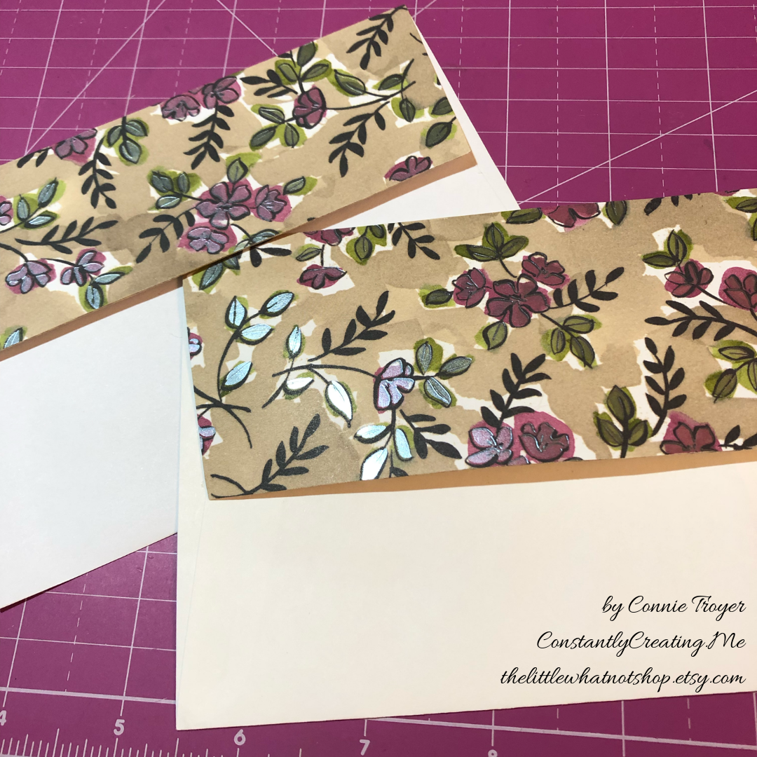
I also added DSP to the envelope flaps since the cards are the nicer sort.

Now that both are done, I might like the simpler Mother’s Day card better, though I do love the Stained Glass die. But I’m thinking I should have kept the doilies closer to the diagonal on the friendship card so the overall look wouldn’t spread out so much. Well, next time, I guess. The sentiment may be my favorite thing about them anyway, the way it uplifts and encourages the recipients. The older I get, the more I see how important it is to do that for others. Whose day can you brighten this week?

Thanks again for stopping by to read and say hello! The products I used or suggested will be at the very bottom of the post, after the linked list of hop participants. Clicking on any of the thumbnails will take you right to my online store if you see something you’d like to purchase.

We have a great group with much talent hopping with us today! Be sure to go to the other blogs and see what my team members have created too. 🙂 You can follow the linking list through each person on each blog you visit.

To see what Terry Lynn Bright made this week, click the Previous button. To jump to Sue Prather’s blog, click Next.

inkin-krew-blog-hop-previous2inkin-krew-blog-hop-next2

  1. Karen Ksenzakovic: https://wp.me/paaNf4-wU
  2. Mary Deatherage: https://wp.me/p5snyt-7OG
  3. Jaimie Babarczy: https://wp.me/p79UhD-2E8
  4. Julie Johnston: https://wp.me/p8SzmQ-2db

Product List

Celebrate Spring with New Babies! (“Perfectly Paired” for Amy’s Inkin’ Krew Blog Hop)

Welcome to another blog post for Stamp with Amy K’s Inkin’ Krew Blog Hop! We have a very talented lineup for you this week. Thanks for stopping by to see what I created. 🙂

Our theme this month is “Celebrate Spring,” in whatever way we want to interpret that. Because I’m also making cards for my local gift shop, I chose to go with the “new birth/baby” idea. I couldn’t wait to get my hands on Stampin’ Up’s “Perfectly Paired” cling stamp set when it came out—it’s all about babies and features a Noah’s Ark image, one of my favorite themes for little ones. This stamp set (so far as we know) is only available for a couple more months since it’s in the current Occasions catalog.

Since I knew this would be a nice card and likely given with a gift, I started off by grabbing a lovely, thick envelope from my stash and then made the card base a 5×7 size to match it, using SU’s Shimmery White cardstock. I chose Shimmery White because I wanted to color the image.

Well, as usual, although I was aiming for simple, I evidently have to complicate things. And I made plenty of mistakes to cover up. My “MO,” I’m starting to think.

It occurred to me that there were waves under the ark in the stamp but I thought it might look a bit “adrift” all by itself on a flat card base. So I got some of my new Ice Blue Matt Mirror Luxury Cardstock (Crafter’s Companion) and cut it down, leaving about a 3/8″ border of white on the base for the “shimmery” part of the “Shimmery White” to show. Then I embossed some waves onto the mirror card with my Cuttlebug (“Musical Flourish” embossing folder).

My piece of mirror card was slightly longer than the embossing folder, so I embossed both ends and then attempted to hide the faint line the edge of the folder left with some retired 1/2″ SU Pacific Point ribbon. I wrapped the ribbon around the edges to give it a neater, more finished look. I believe I used my 1/4″ Scor-Tape down the middle of the back of the ribbon.

I didn’t actually cover the line left by embossing because the ribbon wasn’t wide enough, but hopefully I distracted anyone from looking too closely. I tried to keep the embossed design from overlapping when I ran it through the Cuttlebug, and the embossed line really isn’t that bad, but it’s mirror card so everything shows…. 🤷‍♀️ Whether I needed the ribbon or not, it was an attempt to make the card look better, and I built the rest of the design from there.

After fiddling with the layout, I decided to also mat the mirror card with Pacific Point cardstock to bring more of the ribbon color in for balance. I left 1/8″ of the mat showing, glued the mirror card to the mat, and then glued the combo onto the card base. I used my ATG tape gun for these. Then I set aside the card so I could concentrate on the image. And here’s where things got interesting.

I wasn’t sure whether to use my Stampin’ Blends alcohol markers to color it or my usual: watercolor pencils with either an Aqua Painter or a Blender Pen. I figured I’d do one of each type of coloring and leave the extra in my “card parts” bin for faster cardmaking later. Because those mediums require different inks to control the color, I stamped the ark image from “Perfectly Paired” once in Memento Tuxedo Black (for the alcohol markers) and once in SU’s Archival Basic Black (for the watercoloring). I labeled the backs with a pencil so I’d know which went with what…and then promptly started coloring the wrong image with the wrong medium because I was “doing,” not “thinking.” 🙄🤦‍♀️

Surprisingly, the Archival Basic Black didn’t smear too badly with the alcohol Blends, but I had been careful about not coloring over the lines, just because I was carefully coloring. It wasn’t until I smeared the lions’ whiskers a little that I even realized I’d switched the pieces. (Live and learn?) But smearing lines is why we are supposed to use Memento ink with alcohol markers. Lesson learned.

And then I discovered that I don’t yet have enough Blends to finish coloring this particular image. 🤦‍♀️🤪 I’ve been building my collection a little at a time, and although the Smoky Slate and Basic Black Combos have each made it to my purchasing list at least once, I ended up dropping them for things I wanted more. (Sacrifices!) Therefore, I have to stop coloring the image until I can get those and finish. For the record, though, this was as far as I got, and I really like this medium. (If you look closely, you can spot my whiskers accident.)

So I had to put all that away and regroup. I couldn’t remember whether Memento would smear if I got it wet (since it is a water-based ink), but I just wanted to get something going that I could use. I mentally crossed my fingers and dove in. I could always stamp another one if I had to.

Fortunately, it worked just fine—no smearing that I can tell. My coloring isn’t perfect, but at least the lines didn’t move. I went with the Aqua Painter to smooth out the watercolor pencil lines too…though in hindsight, I should have tried the Blender Pen, for better control in small places. Or just chucked it all and gone straight for my stash of Stampin’ Write markers. (I hope you’re learning from my mistakes! This veteran scrapbooker is still learning so much about cards!)

I will admit to a little cheating as well. I knew I had a Pacific Point chalk in my arsenal. As my retired SU watercolor pencils are unlabeled, I went for the chalk to color the water (with my Aqua Painter) so I could be all matchy-matchy instead of throwing off the shades by introducing some other blue. 😊 Also, I lightly colored the background a sky blue so that it wasn’t stark white paper. If I was coloring waves, I had to color sky too, right? But it’s hard to see in the picture.

So this is where I ended up with it (including doctoring the zebras with white Smooch paint and a Memento pen in desperation after watercoloring and black got the better of me). Coloring was the longest part and why it may be better to use some sort of marker next time. 🤷‍♀️ Another lesson learned!

The main focal image, colored.

Once the image was done and dried, I covered a good portion of the back of it with my 1/2″ Terrifically Tacky Tape (TTT), which is just like SU’s Sticky Strip. I did this to combat the curvature of the paper that happens once water goes onto it. Then I peeled off the tape backing and centered it in the section above the ribbon on the card front.

I had found some black, glittered chipboard faux photo corners when I was debating about the layout, so I glued those overtop the corners of the image with my Art Glitter liquid adhesive. And then I pulled a metal bar sentiment (“celebrating your arrival”) out of the heap of baby ephemera in front of me on my desk, and I adhered it to the top of the ribbon with more 1/4″ Scor-Tape. The front was done. Finally. And I’m even happy with it. 😂 I especially love how the foil look of the matt mirror cardstock shines and changes depth and color in the light. I so love using specialty materials to make cards pop.

(Oops! You can see that faint embossed line in this pic! Well, it’s not that noticeable in person. 😊)

For the inside of the card, I used the “Two by two we welcome you” sentiment from “Perfectly Paired,” stamping it with VersaMark on Shimmery White cardstock before heat embossing it with “Blue Tinsel” embossing powder from my stash. (No idea who made that; I’ve had it for years.) It was the closest embossing powder I could find to the Pacific Point color I’d been using, and it does actually look glittery, like tinsel, and has some texture to it once embossed. I then backed the white sentiment piece with a die-cut Pacific Point cardstock tag from a Spellbinders die (“Fancy Tags Two,” I believe. #neverstopmaking). I think it turned out quite lovely.

To finish off the card, I took a strip of dotted blue (SU Pool Party) cardstock from the retired Tutti-Frutti Cards and Envelopes pack and attached it to the bottom of the inside. I also cut off a small strip of matt mirror cardstock to top it. And then I found two goofy pink flamingo stickers in my stash from Sandylion and stuck them to the bottom right corner just for fun, to carry through the theme. I was looking for my smaller Noah’s Ark stamp for the corner, but I have to keep looking. 🤔🤷‍♀️

I haven’t decorated the envelope yet, but I’m thinking of stamping a row of various animals across the horizontal bottom (under the address section) as a sneak peek to the theme.

Below the list of hop participants are the current products I used in my card (or similar ones) that you can purchase through my online Stampin’ Up store if you wish to own any. (Please use host code 6WPHJ2MC when you check out.) Don’t forget that we have until March 31 to get free gifts from Stampin’ Up through Sale-a-Bration with orders of $50 or more before tax and shipping! There are some awesome reward products available! I also give free gifts to those who order through me. 😉

Thanks again for visiting today. I hope my mistakes keep you from making your own! Feel free to post questions or comments. 🙂

To continue with our hop and visit Jaimie Babarczy’s blog offering, click Next or her name in the list below. To view what Karen Ksenzakovic created, click Previous or her name. Thanks for hopping along with us!


  1. Karen Ksenzakovic
  2. Connie TroyerYou are here!
  3. Jaimie Babarczy
  4. Sue Prather
  5. Julie Johnston
  6. Mary Deatherage
  7. Karen Finkle
  8. Shirley Gentry
  9. Amy Koenders

Product List

Batty for You Stampin’ Up Halloween Card for Inkin’ Krew Blog Hop

Halloween is sneaking up on us! To start the celebration, I’ve joined Amy K’s Inkin’ Krew to show some Halloween cards.

Hello, everyone! Thanks for stopping by my blog today. It’s my first time “hopping” with Amy Koenders’s Stampin’ Up Inkin’ Krew!

We are focusing on Halloween cards today. Truthfully, I’m not a huge Halloween fan, so I rarely make cards about it, but I did do this one in the more-recent past using mainly Stampin’ Up products. It’s currently for sale in my Etsy shop (thelittlewhatnotshop.etsy.com).

I used Stampin’ Up’s Basic Black cardstock for a base, layered it with gold metallic foil (which makes for some wonky picture-taking), and then adhered some SU “bat” DSP from the (retired) “Happy Haunting” pack across the bottom third of the card.

I can’t remember the name of the black-and-gold foil bat doilies from Stampin’ Up, but they are fun to play with if you run across a pack. (They’re retired too.) They come with black backgrounds as pictured here or the reverse. The large singular bat is from SU’s “Cheer All Year” stamp set and it was stamped in Memento Tuxedo Black ink.

I used a circle die to cut a white piece for my sentiment – I just laid the nested dies atop my bat doily until I saw the size I wanted. And then I used SU’s retired photopolymer “Skinny Mini Alphabet” and placed the letters where I wanted them.

The only thing that isn’t Stampin’ Up on this card are the little bats flying around the sentiment. I found those on a wooden Halloween stamp and individually inked up the rubber parts I wanted and attempted to place them around the letters. Might have been easier, faster, or more accurate to hand-draw some. I had a lesson in patience that day….

I kept the inside of the card simple with a white piece to write on and more of the bat paper from the front.

Thanks for joining me today! “Hop” on over to Julie Johnston’s blog by clicking “Next” or go back and visit Sue Prather by clicking “Previous” to see what they’ve come up with for Halloween cards!

If you need to hop around, here is the lineup of participants:
Sue Prather
Connie Troyer (you are here!)
Julie Johnston
Mary Deatherage
Karen Finkle
Amy Koenders
Pat's Blog Site

One place to fit it all!

Stamp Dabbles

Donna Leonard | Independent Stampin’ Up! Demonstrator | Huntsville, AL

Niya Scrap

Démonstratrice indépendante Stampin' Up!®

From Pole to Pole

Adventures in the Land of the Pierogi

Stampin' in the Meadows

Akiko Sudano - Independent Stampin' Up! Demonstrator Downingtown, PA

Creative Stamping Designs

Karen Ksenzakovic, Independent Stampin' Up! Demonstrator in Somerville, NJ Let's make some cards!!

Stamp it up with Jaimie

Helping you find a creative outlet through paper crafting.

Stamp With Amy K

Amy Koenders, Independent Stampin' Up! Demonstrator in Mendham, New Jersey...Let's make some cards!

The Daily Post

The Art and Craft of Blogging

WordPress.com News

The latest news on WordPress.com and the WordPress community.