Let’s all say hooray that I can finally blog again! I started this masculine card while in Charlotte at OnStage with Stampin’ Up in mid-April but didn’t finish putting it together until the preordered corresponding dies arrived at my house after vacation and I had some time to do sit down with them. The Stampin’ Up team gave us precut pieces in a kit to use with supplies on the table, though we could change it any way we wanted to. I did end up varying my card a little from the picture they included with the kit.
This card features the Come Sail Away suite, which will be new in the 2019-2020 Annual Catalog (available to customers June 4). What I used from the suite is the Sailing Home Stamp Set, the Smooth Sailing Dies, some of the Come Sail Away DSP, the Sail Away Trinkets, and a bit of its Sahara Sand/Night of Navy Baker’s Twine. The suite itself also includes the Come Sail Away Memories and More Card Pack and the High Seas 3D Embossing Folder—and let me tell you, this suite is awesome. I will be making up some cards with the Come Sail Away Memories and More Card Pack soon as well (there are laser-cut specialty cards in the pack of 50 double-sided cards!).
New cling stamp set available June 4.The stamps, dies, twine, trinkets, embossing folder, and Designer Series Paper. A must-have!The cards in the Memories and More Card Pack…one of my all-time favorites! Look at those laser-cut designs!These trinkets are flat enough to mail and lightweight!
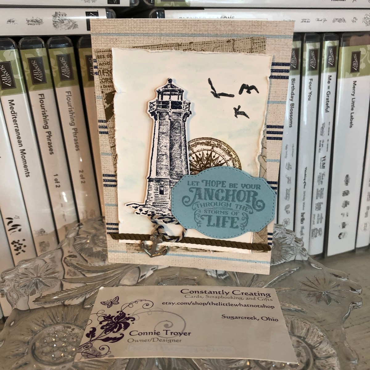
So, for this A2 card, I glued some Come Sail Away DSP onto the card base first and then placed the smaller piece of DSP cockeyed at an angle for its position behind the focal piece. For that focal piece, I used Balmy Blue ink with an AquaPainter to create a light wash of blue sky in the background (technically I did that last, but it’s smarter to do it first).
I stamped the lighthouse onto the Whisper White focal piece with Night of Navy ink and then stamped the compass off to the right of it with Early Espresso ink the way the kit photo suggested. Then I stamped and fussy-cut another lighthouse on scrap Whisper White and placed it atop the first one with foam dots so it became 3D. (The kit also suggested we add a die-cut ship’s steering wheel here with the lighthouse/compass/sentiment area, but I moved my wheel to the inside of the card instead—and left plenty of room for an overdue message.)
I stamped three flying birds in Tuxedo Black Memento Ink in the sky and distressed the edges of the Whisper White piece with a distressing tool. Then I die-cut a piece of rope with some dark brown (Soft Suede?) cardstock to lay across the bottom under the lighthouse (it embosses while it cuts!), and I die-cut a sentiment spot out of Balmy Blue cardstock after that. The sentiment die has a wonderful dashed or stitched outside border that is pressed into the paper as it cuts the die-cut.
I then stamped the sentiment (“Let Hope Be Your Anchor Through the Storms of Life”) in Balmy Blue. Since this is a cling stamp set, it is much easier to line up visually, so the stamping went well the first time through, even if I probably should have used Night of Navy ink instead. 😉
To finish off the card, I tied a bit of the Baker’s Twine through one of the anchor trinkets (there are both anchor and ship’s wheel trinkets) and glued the ends of the twine up under the sentiment spot, as if it was dangling there or laying near the lighthouse.
Here are some snapshots I took at OnStage including the display boards of the Come Sail Away suite. Our presenter in Charlotte was the incomparable Mary Deatherage, who happens to be one of my team members! She created the samples on the display boards for this suite as well. It was so much fun (and a bit awe-inspiring) to see her demonstrating the products right up there live in front of us, and she did an amazing job.
Suffice it to say I will be using these again soon! I think the “Set Sail in the Direction of Your Dreams” sentiment is going to be great for masculine graduation cards this season. They hit a home run with this bundle.
Although the new catalog isn’t available to order from until June 4, I’m happy to send one your way once I get them. If you’d like a catalog, just email me! There are also still a lot of great things carrying over and retiring from the two current catalogs. If you need a demonstrator, you can use host code RRCMHZ4E when you shop with me (catch the direct store link in my sidebar at the right or click http://www.stampinup.com/ECWeb/default.aspx?dbwsdemoid=2202334!). I’m happy to answer any questions you may have. Thanks for stopping by! Let me know what you think of this product suite!
Welcome to another blog post for Stamp with Amy K’s Inkin’ Krew Blog Hop! We have a very talented lineup for you this week. Thanks for stopping by to see what I created. 🙂
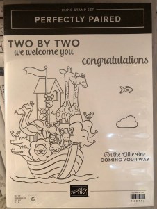
Our theme this month is “Celebrate Spring,” in whatever way we want to interpret that. Because I’m also making cards for my local gift shop, I chose to go with the “new birth/baby” idea. I couldn’t wait to get my hands on Stampin’ Up’s “Perfectly Paired” cling stamp set when it came out—it’s all about babies and features a Noah’s Ark image, one of my favorite themes for little ones. This stamp set (so far as we know) is only available for a couple more months since it’s in the current Occasions catalog.
Since I knew this would be a nice card and likely given with a gift, I started off by grabbing a lovely, thick envelope from my stash and then made the card base a 5×7 size to match it, using SU’s Shimmery White cardstock. I chose Shimmery White because I wanted to color the image.
Well, as usual, although I was aiming for simple, I evidently have to complicate things. And I made plenty of mistakes to cover up. My “MO,” I’m starting to think.
It occurred to me that there were waves under the ark in the stamp but I thought it might look a bit “adrift” all by itself on a flat card base. So I got some of my new Ice Blue Matt Mirror Luxury Cardstock (Crafter’s Companion) and cut it down, leaving about a 3/8″ border of white on the base for the “shimmery” part of the “Shimmery White” to show. Then I embossed some waves onto the mirror card with my Cuttlebug (“Musical Flourish” embossing folder).
My piece of mirror card was slightly longer than the embossing folder, so I embossed both ends and then attempted to hide the faint line the edge of the folder left with some retired 1/2″ SU Pacific Point ribbon. I wrapped the ribbon around the edges to give it a neater, more finished look. I believe I used my 1/4″ Scor-Tape down the middle of the back of the ribbon.
I didn’t actually cover the line left by embossing because the ribbon wasn’t wide enough, but hopefully I distracted anyone from looking too closely. I tried to keep the embossed design from overlapping when I ran it through the Cuttlebug, and the embossed line really isn’t that bad, but it’s mirror card so everything shows…. 🤷♀️ Whether I needed the ribbon or not, it was an attempt to make the card look better, and I built the rest of the design from there.
After fiddling with the layout, I decided to also mat the mirror card with Pacific Point cardstock to bring more of the ribbon color in for balance. I left 1/8″ of the mat showing, glued the mirror card to the mat, and then glued the combo onto the card base. I used my ATG tape gun for these. Then I set aside the card so I could concentrate on the image. And here’s where things got interesting.
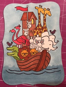
I wasn’t sure whether to use my Stampin’ Blends alcohol markers to color it or my usual: watercolor pencils with either an Aqua Painter or a Blender Pen. I figured I’d do one of each type of coloring and leave the extra in my “card parts” bin for faster cardmaking later. Because those mediums require different inks to control the color, I stamped the ark image from “Perfectly Paired” once in Memento Tuxedo Black (for the alcohol markers) and once in SU’s Archival Basic Black (for the watercoloring). I labeled the backs with a pencil so I’d know which went with what…and then promptly started coloring the wrong image with the wrong medium because I was “doing,” not “thinking.” 🙄🤦♀️
Surprisingly, the Archival Basic Black didn’t smear too badly with the alcohol Blends, but I had been careful about not coloring over the lines, just because I was carefully coloring. It wasn’t until I smeared the lions’ whiskers a little that I even realized I’d switched the pieces. (Live and learn?) But smearing lines is why we are supposed to use Memento ink with alcohol markers. Lesson learned.
And then I discovered that I don’t yet have enough Blends to finish coloring this particular image. 🤦♀️🤪 I’ve been building my collection a little at a time, and although the Smoky Slate and Basic Black Combos have each made it to my purchasing list at least once, I ended up dropping them for things I wanted more. (Sacrifices!) Therefore, I have to stop coloring the image until I can get those and finish. For the record, though, this was as far as I got, and I really like this medium. (If you look closely, you can spot my whiskers accident.)
So I had to put all that away and regroup. I couldn’t remember whether Memento would smear if I got it wet (since it is a water-based ink), but I just wanted to get something going that I could use. I mentally crossed my fingers and dove in. I could always stamp another one if I had to.
Fortunately, it worked just fine—no smearing that I can tell. My coloring isn’t perfect, but at least the lines didn’t move. I went with the Aqua Painter to smooth out the watercolor pencil lines too…though in hindsight, I should have tried the Blender Pen, for better control in small places. Or just chucked it all and gone straight for my stash of Stampin’ Write markers. (I hope you’re learning from my mistakes! This veteran scrapbooker is still learning so much about cards!)
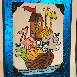
I will admit to a little cheating as well. I knew I had a Pacific Point chalk in my arsenal. As my retired SU watercolor pencils are unlabeled, I went for the chalk to color the water (with my Aqua Painter) so I could be all matchy-matchy instead of throwing off the shades by introducing some other blue. 😊 Also, I lightly colored the background a sky blue so that it wasn’t stark white paper. If I was coloring waves, I had to color sky too, right? But it’s hard to see in the picture.
So this is where I ended up with it (including doctoring the zebras with white Smooch paint and a Memento pen in desperation after watercoloring and black got the better of me). Coloring was the longest part and why it may be better to use some sort of marker next time. 🤷♀️ Another lesson learned!
The main focal image, colored.
Once the image was done and dried, I covered a good portion of the back of it with my 1/2″ Terrifically Tacky Tape (TTT), which is just like SU’s Sticky Strip. I did this to combat the curvature of the paper that happens once water goes onto it. Then I peeled off the tape backing and centered it in the section above the ribbon on the card front.
I had found some black, glittered chipboard faux photo corners when I was debating about the layout, so I glued those overtop the corners of the image with my Art Glitter liquid adhesive. And then I pulled a metal bar sentiment (“celebrating your arrival”) out of the heap of baby ephemera in front of me on my desk, and I adhered it to the top of the ribbon with more 1/4″ Scor-Tape. The front was done. Finally. And I’m even happy with it. 😂 I especially love how the foil look of the matt mirror cardstock shines and changes depth and color in the light. I so love using specialty materials to make cards pop.
(Oops! You can see that faint embossed line in this pic! Well, it’s not that noticeable in person. 😊)
For the inside of the card, I used the “Two by two we welcome you” sentiment from “Perfectly Paired,” stamping it with VersaMark on Shimmery White cardstock before heat embossing it with “Blue Tinsel” embossing powder from my stash. (No idea who made that; I’ve had it for years.) It was the closest embossing powder I could find to the Pacific Point color I’d been using, and it does actually look glittery, like tinsel, and has some texture to it once embossed. I then backed the white sentiment piece with a die-cut Pacific Point cardstock tag from a Spellbinders die (“Fancy Tags Two,” I believe. #neverstopmaking). I think it turned out quite lovely.
To finish off the card, I took a strip of dotted blue (SU Pool Party) cardstock from the retired Tutti-Frutti Cards and Envelopes pack and attached it to the bottom of the inside. I also cut off a small strip of matt mirror cardstock to top it. And then I found two goofy pink flamingo stickers in my stash from Sandylion and stuck them to the bottom right corner just for fun, to carry through the theme. I was looking for my smaller Noah’s Ark stamp for the corner, but I have to keep looking. 🤔🤷♀️
I haven’t decorated the envelope yet, but I’m thinking of stamping a row of various animals across the horizontal bottom (under the address section) as a sneak peek to the theme.
Below the list of hop participants are the current products I used in my card (or similar ones) that you can purchase through my online Stampin’ Up store if you wish to own any. (Please use host code 6WPHJ2MC when you check out.) Don’t forget that we have until March 31 to get free gifts from Stampin’ Up through Sale-a-Bration with orders of $50 or more before tax and shipping! There are some awesome reward products available! I also give free gifts to those who order through me. 😉
Thanks again for visiting today. I hope my mistakes keep you from making your own! Feel free to post questions or comments. 🙂
To continue with our hop and visit Jaimie Babarczy’s blog offering, click Next or her name in the list below. To view what Karen Ksenzakovic created, click Previous or her name. Thanks for hopping along with us!
A dry decoupage sympathy card using Stampin’ Up for everything but the main image (at last!).
The hits keep coming. Two more sympathies on my to-do list, along with a celebration theme for a blog hop. For these two, at least it’s a celebration of sorts, though sad now. Still, I feel muddled. My heart aches for them, so I went looking for something that spoke to me and seemed to reflect the people I’m thinking of. My “card toppers” bin bailed me out for the one I’m blogging about today. (The other, yet unmade, will focus on Stampin’ Up’s Graceful Glass vellum DSP and alcohol markers, so stay tuned for that.)
My mother used to say that I was “an accident waiting to happen.” She’d probably still say that, given the chance. That phrase came to me as I wrestled with this card. I began to feel like it was one accident after another. I love how it turned out in the end, but my goodness, the process! (This means there’s hope for me, right?) Another case of “when things don’t go well.” Please tell me you’d never know. 😉
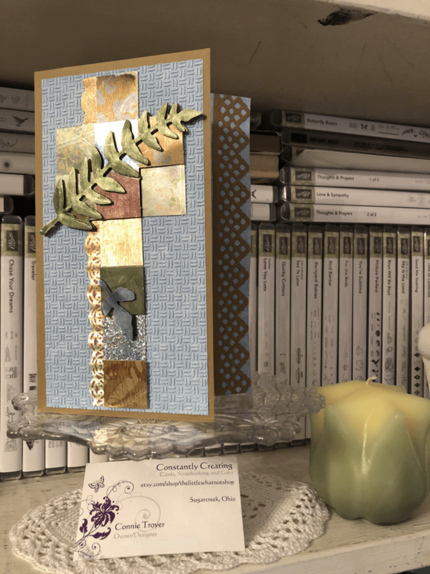
One of my husband’s coworkers lost her dear husband last week, and it’s been such a sad thing. I wanted to make a beautiful card – part masculine in remembrance and part feminine for her – but had no idea where to start. Since I often clean or organize when I have a problem to mull over, that’s what I ended up doing, which led me to the main cross piece seen on the front of the card today.
Finding a brown card base to match the topper was easy; Stampin’ Up’s Baked Brown Sugar, a retired color, matched the foiled copper/silver/gold/burgundy/blue cross the best. I only have so many browns, and I usually use SU for my card bases since I like how the 80-lb weight cardstock stands. (I grab premade bases only if I start with the base first rather than the main image. It’s just easier to match it that way rather than working in reverse.)
During my cleaning spree, I was also looking at and putting away some new SU Designer Series Paper. So when I tried to find paper the cross could match, the blue piece was fresh in my mind and looked prettier than any other neutrals I put next to it. The blue paper is from the Tranquil Textures DSP pack in the current Annual Catalog from Stampin’ Up. It’s not a solid blue, but it it hard to tell that with the dry embossing I put on top of it to give the card some texture. I used the “Oxford” Cuttlebug folder for the textured design. I wanted something light and barely textured like Stampin’ Up’s Subtle embossing folder, but I don’t own that particular one yet.
Here’s where things got tricky. The card is a 5×7 because the cross is so tall. But because it’s narrow, there was a lot of “white space” around it. I don’t like white space (even if it’s blue). So I started to wonder what I could do or put next to the cross to take up the width. A sentiment would only be so big, as well as being awkward to work with around the 3D leaf layers toward the bottom, so I wasn’t sure that was the answer. I thought maybe I could make a decorative edge to the card front at the right instead. I could see it in my mind but wasn’t sure how to achieve it (story of my crafting life, btw). That seemed to be the best thing to try…but all my dies were too small to stretch across 7 inches. Nothing felt right. So that night I went to bed frustrated, having made only the card base and embossing the paper.
The next night I attempted to keep going on the card while I was on the phone. I should have known better. I spotted a long Spellbinders die on my die wall and got all excited because it would fit lengthwise. I didn’t think about the fact that ALL of the edges of the die does indeed cut…until I wrapped a card base around a Cuttlebug plate (so that I didn’t cut through the second layer), positioned the die, and wondered why an inch of the card base separated from itself after I ran it through the machine. (*insert facepalm here*) To my defense, I was still on the phone. LOL
So suddenly I had a card base with one side shorter than the other. That was not what was supposed to happen. Not to mention, the magnetic plate dinged up the middle of the card base, and the B plate left marks on the back side of the base, making it warped and weak. Sigh. Time to rethink. Maybe I needed to make a new card base.
I tried to process where to go next. The decorative edge thing hadn’t worked and I couldn’t think how to make it work other than an edge punch – if I made a new base. I’ve never tried the popsicle sticks I’ve heard about, to keep part of it from cutting, so I wasn’t sure how to do that either (again, on a new base). But I hated to destroy the one I’d just cut. What I did manage to do after thinking was flip the card base around (even though I’d folded it correctly after scoring the first time). That would give me a chance to add paper atop the marked-up part to hide it and also add some stability with the extra paper layers. I hoped. I also took my bone folder and tried to work out the middle bumps and crease it sharply.
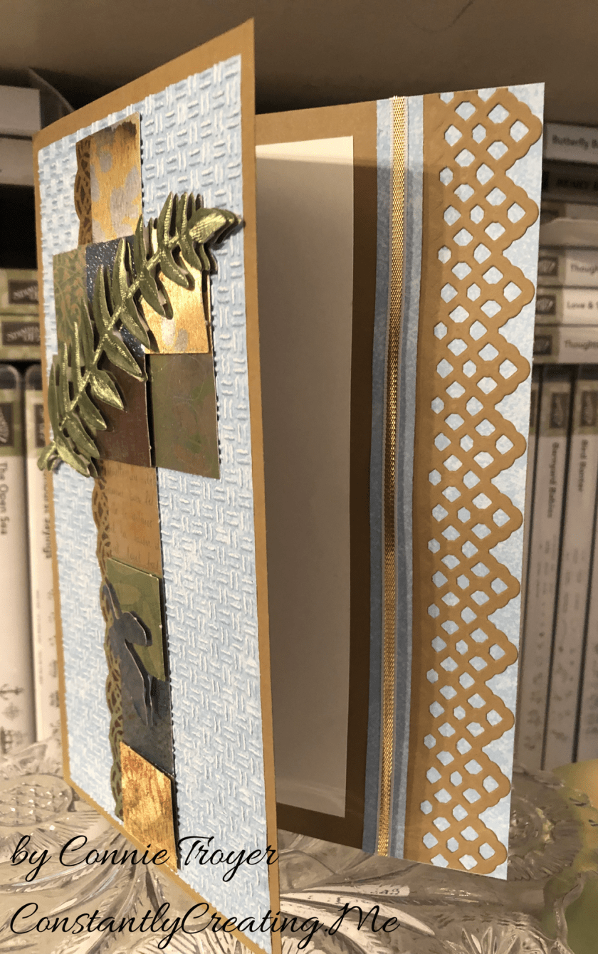
Once the base was salvaged, I decided to play with the pieces and arrange them just to see what I could do. I ended up liking a little bit of breathing room between the die cut and the now-shorter edge of the card base, rather than placing the die cut right up against the piece it had just been cut from. And obviously if there’s a peekaboo die, something needed to peek through it underneath. I grabbed more blue DSP and left it as is on the inside of the card rather than embossing it for texture like the front.
I also realized that I needed to run the textured piece through the Cuttlebug again, as one side has trouble with a piece of paper I got stuck in the roller years ago. Part of the paper was hardly embossed, so I realigned it in the folder, flipped it around to the other side that impresses better, and ran it through again. Came out perfectly that time.
The trouble was that when I left that breathing room space between the die cut and the base, it was not centered once the card was opened. I didn’t like that. But it looked like I had enough room to add 1/8″ of ribbon or something else. I chose SU’s gold and white ribbon to match the cross and the browns and loved how it looked.
But then I couldn’t get it adhered. The ribbon is thin enough that the line of Art Glitter liquid glue I laid down soaked right into the ribbon. I wasn’t confident it wouldn’t end up slightly sticking to the inside of the card once it had been closed for a while. But as I told a friend last night, when a person has too much product in her house, she will find a way. I decided to use my Cosmo Cricket Glubers Adhesive Strips. I rarely use them, but sometimes they’re just the best option. They are 1/4″ strips, though, so I took my nonstick microscissors from CutterBee and cut right down one of the strips, eyeballing it to just under 1/8″. And then I placed it with my tweezers and stuck a new piece of ribbon to it. I was much happier with the inside then.
I decided not to stamp a sentiment on the inside yet. I needed to finish up and get to bed and I wanted to really look through my stamps to figure out what I wanted to say on the card. I will probably go back and add one later, but right now it’s blank.
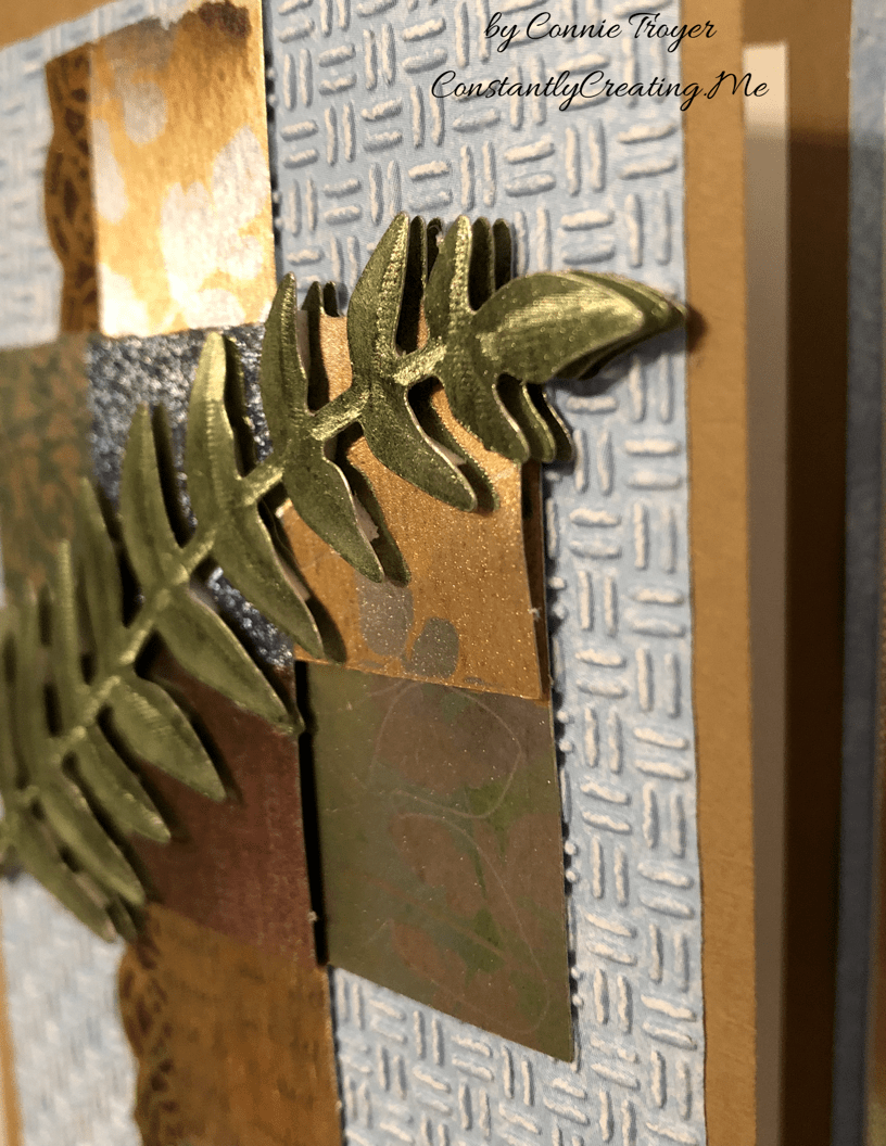
I’ve spoken about dry decoupage in past blog posts. A reader had asked me to do a tutorial on how to do it, and I am working on that currently. I hope to post one soon. For now, here are a couple of closeups to be able to see the decoupage layers that make up the cross. I should have trimmed off the little perforation bumps more as I was making the topper, but it’s probably too late to fix it now.
The cross has several layers of dimension to it in the squares as well as the leaves, which made it interesting to put together. And the leaves are the top layer.
Thanks again for coming to visit my blog! I appreciate your readership!
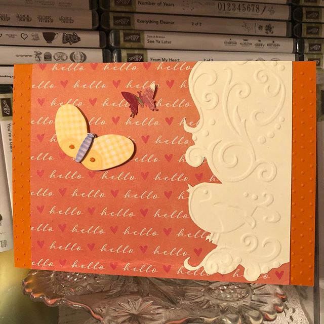
I needed to send out two cards with RAKs (Random Acts of Kindness for craft happy mail) this month. This is the first one; they’re both going to Canada. I embossed my Stampin’ Up Tangerine Tango cardstock card base with the Swiss Dots embossing folder and added “Hello” patterned paper from a UK magazine on top. On the right-hand side of the card, a little embossed bird is visiting his butterfly friends. I’m not sure which embossing folder he came from, but he’s cute! The yellow butterfly is from Tim Coffey and K & Co, and the smaller butterfly is a random punched piece.
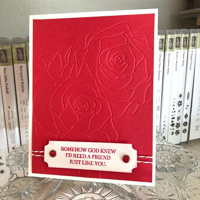
I have a lady who periodically orders cards from me and enjoys seeing whatever creativity comes through, rather than give me specifics on how she wants the cards done. Her style–clean and simple–is sometimes a challenge for me, as I naturally tend to complicate life, but sometimes it’s also really refreshing to not have to overthink every little thing. Sometimes it’s just so nice to find a few simple bits and put them together quickly in a pleasing arrangement–leading me to wonder why I don’t do that kind more often. 🙂 This “embossed red roses” card was one of those for her.
A crafty acquaintance gave me this embossed panel, so I don’t know the designer, but the sentiment, ink color, and baker’s twine are from Stampin’ Up (Rose Wonder stamp set, Real Red ink, and Candy Cane Lane Metallic Baker’s Twine, respectively). I also used Stampin’ Up’s retired Candy Dots Brads and a Thick Whisper White card base. This is one card where I feel like simple still equals beautiful in my book. I later decided to add a little red rose in one of the corners on the inside.
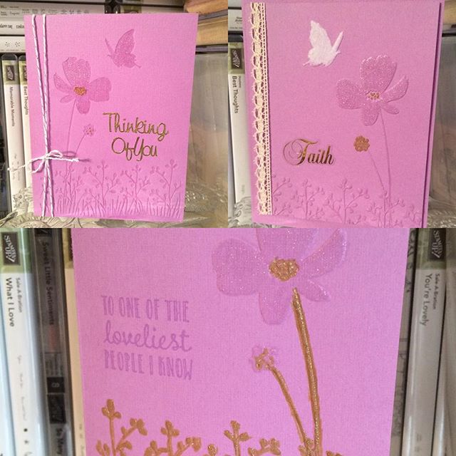
Three different looks to using the same Darice embossing folder and SU Orchid Opulence cardstock. Two of the cards have embossing, and my favorite has debossing. All were glittered with Wink of Stella Clear, white, and/or gold glitter pens. All ribbon and twine is Stampin’ Up too. Sentiments are Sticko stickers, a Stampin’ Up stamp (from “Hanging Garden”), or gold Dazzles. The card with the lace has a set-on, popped-up front.
It’s time to start making Christmas cards! Okay, it’s probably past time, and I’ve been creating them for a couple of weeks, but here’s my first blog post about one.
It may be October, but for crafters, it’s Christmas card season!
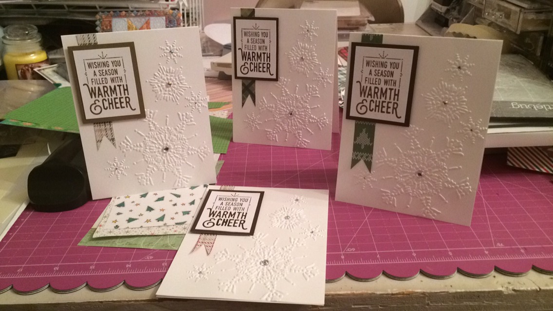
The other day, hubs and I figured out a new way to keep each other company while I remained productive with crafting. The result was the outside of four winter/Christmas cards finished. They’re pretty simple, but simple can be elegant sometimes. Our wedding, for example. (Or at least that’s what I was trying for back then.)
Pardon the mess behind my desk, but this is the only shot of the four together so far.
I have two custom Christmas card orders right now along with the niggle of something bigger in the works (we’ll see if it goes anywhere), so I figured all four would go one place or the other, or I could split them up.
I used all Stampin’ Up materials for these except for the bling – Whisper White cardstock, the retired Northern Flurry embossing folder, paper strips cut into banners from one of their retired 6×6 Christmas paper packs (I didn’t write down which one), Soft Suede and Early Espresso inks with matching cardstock, and the “Wishing you a season filled with warmth and cheer” sentiment from the set “Wrapped in Warmth.” The rhinestone bling is from Michael’s, SU, and CTMH.
I’m still stamping the insides of three of them. So far I have “Merry Christmas to You and Yours” (from SU’s “To You and Yours Too” set) on the inside of the Soft Suede version, shown below.
I love how the embossing just pops off the card. I had originally wanted the snowflakes to come cascading from the upper-left corner but realized after I cut the cardstock that that wasn’t going to be possible because of the direction I’d cut it. And I had thought to only have a smaller 1/4″ strip extending from top to bottom but didn’t like how that interrupted the little snowflake down there…so after some brainstorming with hubby, since he was in the room, this is what we decided looked best. And I’m pleased with it. I think it like it better than my original idea. (Not that I won’t try that original idea again some year. 🙂 )
Thanks for reading! If I can make Christmas cards for you sometime, send me a note or visit thelittlewhatnotshop.etsy.com. 🙂