Thinking of You Card with Painted Harvest for Stamp with Amy K’s Blog Hop

Welcome to my blog for Stamp with Amy K’s Inkin’ Krew Blog Hop for Tuesday, August 13! We have a great lineup for you today. Thanks for stopping by to see what I created. 🙂

With the seasonal change coming soon, this month’s blog hop theme is “fall frenzy.” So I have a thinking of you/just for you sunflower card to share with you today using Stampin’ Up’s “Painted Harvest” and “Rare Blessings” stamp sets.

Painted Harvest
Rare Blessings

I decided to use last week’s Atlantic Hearts Sketch Challenge—Sketch #328—to give me a basic idea of construction. I don’t use sketches often because I usually just design straight from my brain based on what I’m feeling with the products I see in front of me, but I’ve had a busy weekend (okay, month). I’m thankful I can turn to a sketch or a Pinterest pin for less-than-ideal crafting times when I need to come up with something quickly in either design or time. So here is the sketch image I worked from.

And I was also inspired by a card from my teammate Leslie Larkin (leslielarkin.com) that was posted on our team Facebook page last month. After I saw her card, I wanted to make one immediately. I love the black-and-white flower with the color around it (she used Memento Tuxedo Black ink with Lovely Lipstick paper, cardstock, and gems).

So without further paragraphs, let’s get to my card! Although I had to create it in a crunch, I found several ideas vying for realization as I looked through my current DSP and video chatted with a crafty friend. I didn’t have time to make the five cards I wanted to, so I’ve had to back-burner most of them. I did pull out supplies to make a second card following the same sketch, so I’ll make that and post it another day. Here’s the one I put together for today. (Be sure to catch the updated picture at the end!)

What I ended up using was a Terracotta Tile card base, a sheet of striped paper from the “Come Sail Away” DSP pack (Mossy Meadow color), and a sheet of flowered paper from the Mosaic Mood Specialty DSP (Crushed Curry, Garden Green, Mint Macaron, Terracotta Tile, and Very Vanilla colors). It is a specialty DSP because half the sheets in the pack have Spot UV gloss on the paper to showcase various designs. In the paper I used, the flowered circles have the gloss on them.

I thought the Mosaic Mood paper would work for the scalloped piece on the sketch because the flowered circles are all in a row and have radiating circles around each flower. I just took my scissors and fussy-cut around the largest circle of each flower in the row, up to where it touches the next circle. It seemed the fastest way to move forward on the card and stop all the overthinking I was doing.

The striped Mossy Meadow paper from “Come Sail Away” pulls out the Garden Green from the “Mosaic Mood” paper and balances everything visually. For some reason, I always think stripes go on the bottom. I suppose that’s one of my “ruts” in card-making. However much I tried to argue with that while designing the card, in the end it was easiest to cave and promise myself that I’d try something new later.

Once I had the stripes glued down and the top portion cut, I tried to find a way to use the beautiful 1/2″ Poppy Parade Textured Weave Ribbon in my “current product accessories” bin. I began using the ribbon the way it comes off the roll but didn’t like how it was the same width as the flowered/scalloped border. I needed something thinner, but I only have so many ribbons and twine options right now. So I put some heavy-duty Tear & Tape Adhesive down on one side of the ribbon and did my best at folding it over in half (it’s kind of tricky, actually). And then I located the 1/8″ Glubers glue line I’d cut in half previously for another card. It comes in 1/4″ strips, but as I’ve mislaid my 1/8″ red-line tape, I made do with the other—twice now. Tear & Tape Adhesive would have worked for that as well, but I already had the other one cut and waiting for me.

The metallic brads are basically just decorative. Since I hadn’t yet adhered the flowered piece to my card base, I could still punch a tiny hole on each side of the ribbon, place the brads through the holes, and fasten them at the back before gluing the paper. I’m considering them to be two of the gem places in the sketch, with the third located on the tag. My brads are miscellaneous from my stash, but Stampin’ Up has a great set of Metallic Brads in the current catalog, so I’ll add them to the list of supplies at the end.

Then came the tedious part of the card—figuring out which colors to use for the two-step photopolymer “Painted Harvest” sunflower. I know I’ve saved some color swatches for this sunflower in Pinterest, but for some reason I thought it would be faster to use the colors I’d narrowed down and stacked on my table rather than search in my Color Combos and Sketches board. Hindsight is 20/20.

I wasn’t entirely sure how the stamping was supposed to go, so I got some scrap paper and started “playing” with the two darker ink colors I’d pulled—Early Espresso and Soft Suede. I did several of both colors as the base. Then I opened the two ink colors in my stash that matched the paper the best—Terracotta Tile and a very old (but perfectly juicy) Ruby Red. I need to get a Poppy Parade ink pad yet. I wasn’t sure which color would work best with both the Poppy Parade ribbon and the Terracotta Tile in the paper.

After too much experimentation, including tone-on-tone and color mixing in the brighter colors, I chose to go with the Early Espresso/Ruby Red combination. The Terracotta Tile is more orange than Poppy Parade, and the Ruby Red has a better balance of an orange and something rosier or pinker when both Terracotta Tile and Poppy Parade are on the same card. The flower spots that have Terracotta Tile in them on the DSP are small enough it doesn’t seem to matter much. I had originally picked a Soft Suede/Terracotta Tile combination, but I didn’t stamp the center quite right on the best piece and royally messed it up when trying to fix it, per my usual. Anyway, that color combination works too.

The center of the finished flower is tone-on-tone Early Espresso. Stamping the center of the sunflower was a little challenging to line up at first, but the more I “practiced,” the better I got at it. So just keep trying while you figure out how it works. After I chose one of the images I’d stamped, I then fussy-cut around the finished sunflower and added pop-up foam dots to the back of it. I’m just now realizing that I probably should have added leaves as well. But I’m calling this card done. Maybe I’ll add leaves before I send it. That’s for another day.

For the “Just for You” tag from the “Rare Blessings” stamp set, I used Early Espresso ink and a scrap of Crumb Cake cardstock. The stamp set is one of the new cling sets, so I had to put it together first with the new stickers (that actually stick to the block!). I actually kind of love doing that with the new stamp sets. 🙂 After that was done and I stamped it on the Crumb Cake, I cut down the tag and snipped up the middle at the left with my scissors to make a banner end. Then I took a Really Rust Stampin’ Write Marker (retired) and added some faux stitching in a thin border just inside the edges of the tag. I would have used an Early Espresso marker, but something happened to mine and I no longer have one. The Really Rust is close enough to the Terracotta Tile that it still matches. And, finally, I added a Terracotta Tile gem from the 2019-2020 In-Color Faceted Dots embellishment pack to the tag as one of the gem spots in the sketch.

I’m not sure what is going on the inside yet. The card is going to a friend who recently lost his mother. I need to look for the right sentiment before I send it with a delayed memorial gift. It’s been a busy year here. But at least I’m one step closer in getting the card and gift sent out the door.

UPDATE!: I decided to add some vellum leaves from the Magnolia Lane Memories and More Card Pack around the flower. I fussy-cut them and colored them on the front and back (to make them darker) with my Dark Old Olive Alcohol Blend marker. (I don’t have the Mossy Meadow Blends yet, so I made do.) The sentiment on the inside reads “With Deepest Sympathy” and is from the current Golden Afternoon stamp set. I stamped it in Crumb Cake. I also ran one of the sticker border strips across the bottom of the inside from the Magnolia Lane Memories and More Card Pack. NOW I’m finished with the card. 🙂

That’s all for today. Stay tuned for the next card using “Painted Harvest” and Sketch 328. Thanks again for visiting! Feel free to post questions or comments. Below the list of blog hop participants of my Stampin’ Up team members are the products I used in my card. You can purchase any of them through my online store here—or just click on the picture—and if you use the host code 3W7RXKCU when you check out, I’ll send a free gift your way! Also, if you happen to need a current Annual Catalog or the upcoming Holiday Catalog (which should arrive on my doorstep tomorrow), I’m happy to send you one! Just use the Contact Me link at the top of the main page.

To continue with our blog hop using the arrows, click Previous to view Paula Vincent’s offering or Next to view Karen Ksenzakovic’s card. Or you can click any of the links below to go directly to any demonstrator’s blog.

  1. Jaimie Babarczy: https://wp.me/p79UhD-32A
  2. Terry Lynn Bright: https://wp.me/p8fxPh-ak
  3. Mary Deatherage: https://wp.me/p5snyt-8YX
  4. Akiko Sudano: https://wp.me/paOv8E-hO
  5. Shirley Gentry: https://stampinwithshirleyg.com/?p=6855
  6. Karen Finkle: https://karenscardkorner.blogspot.com/2019/08/stampin-up-accented-blooms-thinking-of.html
  7. Paula Vincent: https://cockeyedcrafter.com/?p=160
  8. Connie Troyer: https://wp.me/p8xvI6-E
  9. Karen Ksenzakovic: https://wp.me/paaNf4-RH
  10. Amy Koenders: https://wp.me/p2SFwf-gGt


Product List

Plus the Golden Afternoon stamp set and Magnolia Lane Memories and More Card Pack!

Celebrate Spring with New Babies! (“Perfectly Paired” for Amy’s Inkin’ Krew Blog Hop)

Welcome to another blog post for Stamp with Amy K’s Inkin’ Krew Blog Hop! We have a very talented lineup for you this week. Thanks for stopping by to see what I created. 🙂

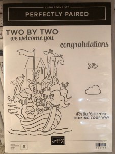
Our theme this month is “Celebrate Spring,” in whatever way we want to interpret that. Because I’m also making cards for my local gift shop, I chose to go with the “new birth/baby” idea. I couldn’t wait to get my hands on Stampin’ Up’s “Perfectly Paired” cling stamp set when it came out—it’s all about babies and features a Noah’s Ark image, one of my favorite themes for little ones. This stamp set (so far as we know) is only available for a couple more months since it’s in the current Occasions catalog.

Since I knew this would be a nice card and likely given with a gift, I started off by grabbing a lovely, thick envelope from my stash and then made the card base a 5×7 size to match it, using SU’s Shimmery White cardstock. I chose Shimmery White because I wanted to color the image.

Well, as usual, although I was aiming for simple, I evidently have to complicate things. And I made plenty of mistakes to cover up. My “MO,” I’m starting to think.

It occurred to me that there were waves under the ark in the stamp but I thought it might look a bit “adrift” all by itself on a flat card base. So I got some of my new Ice Blue Matt Mirror Luxury Cardstock (Crafter’s Companion) and cut it down, leaving about a 3/8″ border of white on the base for the “shimmery” part of the “Shimmery White” to show. Then I embossed some waves onto the mirror card with my Cuttlebug (“Musical Flourish” embossing folder).

My piece of mirror card was slightly longer than the embossing folder, so I embossed both ends and then attempted to hide the faint line the edge of the folder left with some retired 1/2″ SU Pacific Point ribbon. I wrapped the ribbon around the edges to give it a neater, more finished look. I believe I used my 1/4″ Scor-Tape down the middle of the back of the ribbon.

I didn’t actually cover the line left by embossing because the ribbon wasn’t wide enough, but hopefully I distracted anyone from looking too closely. I tried to keep the embossed design from overlapping when I ran it through the Cuttlebug, and the embossed line really isn’t that bad, but it’s mirror card so everything shows…. 🤷‍♀️ Whether I needed the ribbon or not, it was an attempt to make the card look better, and I built the rest of the design from there.

After fiddling with the layout, I decided to also mat the mirror card with Pacific Point cardstock to bring more of the ribbon color in for balance. I left 1/8″ of the mat showing, glued the mirror card to the mat, and then glued the combo onto the card base. I used my ATG tape gun for these. Then I set aside the card so I could concentrate on the image. And here’s where things got interesting.

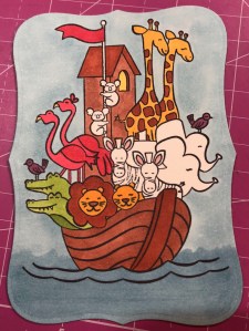
I wasn’t sure whether to use my Stampin’ Blends alcohol markers to color it or my usual: watercolor pencils with either an Aqua Painter or a Blender Pen. I figured I’d do one of each type of coloring and leave the extra in my “card parts” bin for faster cardmaking later. Because those mediums require different inks to control the color, I stamped the ark image from “Perfectly Paired” once in Memento Tuxedo Black (for the alcohol markers) and once in SU’s Archival Basic Black (for the watercoloring). I labeled the backs with a pencil so I’d know which went with what…and then promptly started coloring the wrong image with the wrong medium because I was “doing,” not “thinking.” 🙄🤦‍♀️

Surprisingly, the Archival Basic Black didn’t smear too badly with the alcohol Blends, but I had been careful about not coloring over the lines, just because I was carefully coloring. It wasn’t until I smeared the lions’ whiskers a little that I even realized I’d switched the pieces. (Live and learn?) But smearing lines is why we are supposed to use Memento ink with alcohol markers. Lesson learned.

And then I discovered that I don’t yet have enough Blends to finish coloring this particular image. 🤦‍♀️🤪 I’ve been building my collection a little at a time, and although the Smoky Slate and Basic Black Combos have each made it to my purchasing list at least once, I ended up dropping them for things I wanted more. (Sacrifices!) Therefore, I have to stop coloring the image until I can get those and finish. For the record, though, this was as far as I got, and I really like this medium. (If you look closely, you can spot my whiskers accident.)

So I had to put all that away and regroup. I couldn’t remember whether Memento would smear if I got it wet (since it is a water-based ink), but I just wanted to get something going that I could use. I mentally crossed my fingers and dove in. I could always stamp another one if I had to.

Fortunately, it worked just fine—no smearing that I can tell. My coloring isn’t perfect, but at least the lines didn’t move. I went with the Aqua Painter to smooth out the watercolor pencil lines too…though in hindsight, I should have tried the Blender Pen, for better control in small places. Or just chucked it all and gone straight for my stash of Stampin’ Write markers. (I hope you’re learning from my mistakes! This veteran scrapbooker is still learning so much about cards!)

I will admit to a little cheating as well. I knew I had a Pacific Point chalk in my arsenal. As my retired SU watercolor pencils are unlabeled, I went for the chalk to color the water (with my Aqua Painter) so I could be all matchy-matchy instead of throwing off the shades by introducing some other blue. 😊 Also, I lightly colored the background a sky blue so that it wasn’t stark white paper. If I was coloring waves, I had to color sky too, right? But it’s hard to see in the picture.

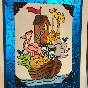
So this is where I ended up with it (including doctoring the zebras with white Smooch paint and a Memento pen in desperation after watercoloring and black got the better of me). Coloring was the longest part and why it may be better to use some sort of marker next time. 🤷‍♀️ Another lesson learned!

The main focal image, colored.

Once the image was done and dried, I covered a good portion of the back of it with my 1/2″ Terrifically Tacky Tape (TTT), which is just like SU’s Sticky Strip. I did this to combat the curvature of the paper that happens once water goes onto it. Then I peeled off the tape backing and centered it in the section above the ribbon on the card front.

I had found some black, glittered chipboard faux photo corners when I was debating about the layout, so I glued those overtop the corners of the image with my Art Glitter liquid adhesive. And then I pulled a metal bar sentiment (“celebrating your arrival”) out of the heap of baby ephemera in front of me on my desk, and I adhered it to the top of the ribbon with more 1/4″ Scor-Tape. The front was done. Finally. And I’m even happy with it. 😂 I especially love how the foil look of the matt mirror cardstock shines and changes depth and color in the light. I so love using specialty materials to make cards pop.

(Oops! You can see that faint embossed line in this pic! Well, it’s not that noticeable in person. 😊)

For the inside of the card, I used the “Two by two we welcome you” sentiment from “Perfectly Paired,” stamping it with VersaMark on Shimmery White cardstock before heat embossing it with “Blue Tinsel” embossing powder from my stash. (No idea who made that; I’ve had it for years.) It was the closest embossing powder I could find to the Pacific Point color I’d been using, and it does actually look glittery, like tinsel, and has some texture to it once embossed. I then backed the white sentiment piece with a die-cut Pacific Point cardstock tag from a Spellbinders die (“Fancy Tags Two,” I believe. #neverstopmaking). I think it turned out quite lovely.

To finish off the card, I took a strip of dotted blue (SU Pool Party) cardstock from the retired Tutti-Frutti Cards and Envelopes pack and attached it to the bottom of the inside. I also cut off a small strip of matt mirror cardstock to top it. And then I found two goofy pink flamingo stickers in my stash from Sandylion and stuck them to the bottom right corner just for fun, to carry through the theme. I was looking for my smaller Noah’s Ark stamp for the corner, but I have to keep looking. 🤔🤷‍♀️

I haven’t decorated the envelope yet, but I’m thinking of stamping a row of various animals across the horizontal bottom (under the address section) as a sneak peek to the theme.

Below the list of hop participants are the current products I used in my card (or similar ones) that you can purchase through my online Stampin’ Up store if you wish to own any. (Please use host code 6WPHJ2MC when you check out.) Don’t forget that we have until March 31 to get free gifts from Stampin’ Up through Sale-a-Bration with orders of $50 or more before tax and shipping! There are some awesome reward products available! I also give free gifts to those who order through me. 😉

Thanks again for visiting today. I hope my mistakes keep you from making your own! Feel free to post questions or comments. 🙂

To continue with our hop and visit Jaimie Babarczy’s blog offering, click Next or her name in the list below. To view what Karen Ksenzakovic created, click Previous or her name. Thanks for hopping along with us!


  1. Karen Ksenzakovic
  2. Connie TroyerYou are here!
  3. Jaimie Babarczy
  4. Sue Prather
  5. Julie Johnston
  6. Mary Deatherage
  7. Karen Finkle
  8. Shirley Gentry
  9. Amy Koenders

Product List

Cards from the Designer Tin of Cards Project Kit

Some cards from the Designer Tin of Cards Project Kit – quick and easy cards with a bit of variation.

Hello again. 🙂 I’ve had interest in a blog post about one of my birthday cards, so I thought I’d do up a quick blog post about it and a couple of others I made from the same kit.

The kit in question is the now-retired Designer Tin of Cards Project Kit from Stampin’ Up. When I was on vacation this past summer, I took an evening and mainly made up the cards the way the kit suggested, with little variations to the cards here and there. I didn’t add the sentiments at the time because I wasn’t sure what I would need them for and I didn’t have all my options in front of me anyway. So little by little I’ve been picking out of the batch and finishing them to send as needed, with some still waiting.

All my blue-and-white-and-gold ones have gone to the local gift shop for sale, and they had different sentiments. I used one of the masculine looks for my dad’s birthday. I used the banners/garlands base for another relative’s birthday and added some llama and cactus paper elements from a UK magazine I had with me. (I still have two of those bases to create with, actually.) I sent at least one of the coral hibiscus cards to the gift shop, and one went for a friend’s birthday. I used the “Celebrate Your Day” and “Sending Love” sentiments from the coordinating stamp set. I still have two coral and one masculine card to sentiment yet.

I didn’t used to be very fond of the kit idea in general because they’re usually too simple for my preferred style of details. But as I get busier, I have seen how useful they can be for when I want to send a handmade card but haven’t had extra time. Also, now that I’m constantly making cards for the gift shop, it’s been nice to fall back on ones that are faster and easier to make without taxing my design skills. I’m beginning to let go of the need to have everything perfectly perfect and just the way I like it. I simply don’t have enough time to keep up with all I’d like to do in this life. They need cards, so I must make them and not fuss around. Besides, some people really prefer the simpler, “to the point” cards rather than all the detail and fluff I like, so this way I hope to reach a bigger audience in interest. 🙂 For ones I send personally, I like to create cards with the recipient in mind. But for the shop, I don’t know who is buying them or who they are for. So the kits are beginning to work for me there. (And if any of the kits make it to the clearance rack, they’re even cheaper, which I also like.)

The kit coordinates with the Designer Tin of Cards stamp set, which I used for a few of the cards but not all. It was supposed to be used to make a filing system of cards on tabs, with the tin to hold everything, but I chose to use the sentiments rather than the tabs.

I’ve added in some of the finished cards as examples for you to see what the kit was like. Evidently I didn’t take all the pictures I should have. 🤦‍♀️ But if I find other pics, I’ll update the post with them.

The Designer Tin of Cards stamp set.
Sentiment from the “Birthday Wit” stamp set, with Pacific Point ink, gold sequins, and gold washi tape.
Sentiment from Blended Seasons stamp set, with Night of Navy ink.
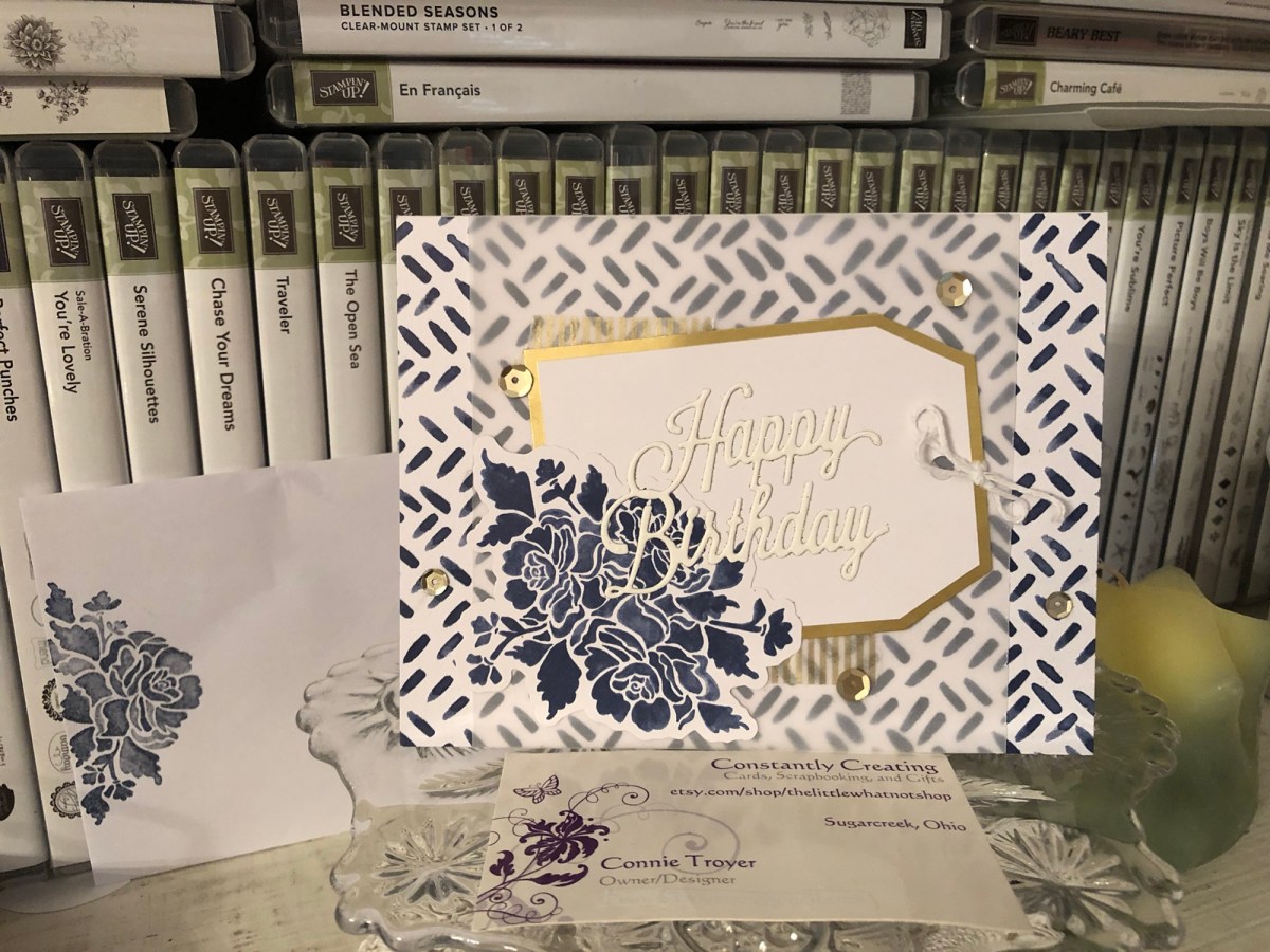
Unbranded happy birthday die with blue-and-white card base, vellum, gold-edged tag, gold sequins, gold washi, white twine, and a blue flowered die-cut all from the kit. I stamped the flower on the envelope with the coordinating Floral Phrases stamp set in Night of Navy ink.
Blue flower die-cut and gold washi tape from the kit.
The only additions to the kit here were the Martha Stewart cake sticker and the gold-foil sentiment from a Spellbinders die. The kit even included paper clips!
Ink is Night of Navy. Stamp is from MSE.
In this gift-shop pic, one of the other blue-and-white ones can be seen with the sentiment “Best Wishes” in gold foil. The die is from a UK magazine. (Two other “kit cards” are also in the picture.)

Thanks for reading! If you have any questions about how I created something, just leave me a comment. 🙂 And stay tuned for another blog post about a “love” card for a blog hop. 🙂

If you need any papercrafting supplies, I’d be happy to become your Stampin’ Up Demonstrator! My direct store link is in my blog sidebar.

May your day be a happy one!

Hello Recycling (of Cards)

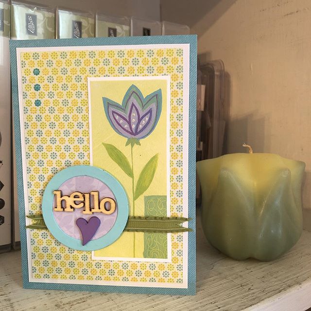
Recycled card bits made new.

View on Instagram https://ift.tt/2sgDiZl
Sometimes things are just too pretty or useful to throw away. (Yes, I have a Depression-era mind-set.) Here I used part of a printed card that had made its way to me into a little hello card, complete with a new tag, wood and resin pieces, two types of patterned paper (one being embossed and glittered), Stampin’ Up Lucky Limeade ribbon, and translucent, glow-in-the-dark Nuvo Drops.
#thelittlewhatnotshop #forstacy #hellocard #etsypreneur #recycling

Personalized Wedding Card for Carolyn and Matthew

Throwback to a custom wedding card made last year for a couple I’ve never met.

In late 2015 I started accepting orders for custom-made cards. This fact still kind of boggles my mind. I never figured I’d be a cardmaker at all. I’m a scrapbooker–since the mid-nineties. Cards were confusing. Such a small canvas on which to put so much stuff! Give me a 12×12 page any day, thank you. But somehow with the purchase of my friend’s used Cricut, cards suddenly made sense, like that proverbial light bulb over the head. Someday maybe I’ll show those first three cards I made as I attempted to figure out the chirping machine.

So fast-forward a couple of years and suddenly I’m at the point of taking custom card orders…? Um, okay. If you say so. Indeed, it seems that’s what I mostly do now. Instead of creating cards for fun, for friends, for a local church group, for Hospice, etc., like I imagined I might do, family and friends and a particular lady in North Carolina have kept me very busy making cards for them ever since August 2015. And I’m grateful. (Though still boggling.) Here is one of the examples I made for a relative, so she could give it to a couple with a wedding gift. It is a twist on a version I made for my NC lady the year before that (why recreate the wheel if you don’t have to?), but in this version, I personalized it with the recipient couple’s names.

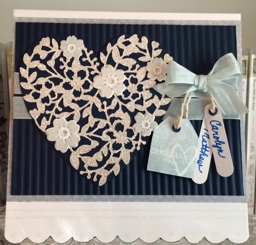
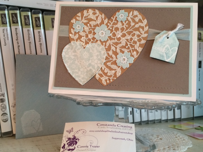
I used a premade, glittered card base from DCWV (5.5×5.5 size), added some light blue/grey patterned paper on top of it as a mat, and then ran some dark blue Recollections paper through my Fiskars handheld (hand-cranked) paper crimper tool. Their wedding color was dark blue, and I thought it would pair well with the Soft Sky color I’d used in the earlier NC version, which was still in my head.

On top of the now-corrugated dark blue paper, I placed a die-cut I’d made from a local friend’s Bloomin’ Heart Thinlits Dies from Stampin’ Up (she and I share supplies so we don’t have to buy as much individually and then have an excuse to get together to craft!). I used Stampin’ Up’s Silver Glimmer Paper for the heart – and found out the hard way (i.e., remembered) that it is best to cut on the back side of that glittered paper rather than trying to get the die to cut through the glitter on the front. (Let’s just say “Lesson learned”!)

2016-08-25 16.19.30

I decided I didn’t like the look of it by itself on the corrugated paper, not to mention that it is a delicate thing and would be hard to glue on top of the corrugation, so I glued the heart die-cut to another piece of the dark blue Recollections paper (that I did not run through the crimper). I then stamped out the little matching flowers of the corresponding Bloomin’ Love photopolymer stamp set in Soft Sky ink, die-cut them with the matching thinlit, and glued them on top in the appropriate places. I actually found it difficult to die-cut those without one edge or the other slipping and not staying centered where I put it. I have a number of rejects I didn’t deem “good enough” for the card. Must need more practice.

Before I glued the heart die-cut down, I laid it out to see where I wanted it, marked it, removed it, and then wrapped some Soft Sky Seam Binding ribbon twice around the corrugated paper and tried to tie a bow off to where the side of the heart would be. This step was trickier than I thought it would be, but I do like the effect. And I used up some of my seam binding ribbon, which pleased me immensely. I think it’s pretty as a whole, but I struggle with using it because it is so delicate. I feel like using the word “fragile,” actually. It catches on things easily, gets holes easily, and is almost see-through. I feel like glue or strip tape can be seen underneath it as well, so I have a hard time finding ways to use it that aren’t simply bows. So this worked. (And after I use up my seam binding stash, I will never buy any again.) I think I actually made the bow separately from the ribbon wrap because I couldn’t get it to lay right. I believe I attached the bow with Zots after gluing down the heart.

Then came the fiddly stuff. I stamped the tag that says “Always” from the retired SU Too Terrific Tags set in Soft Sky, cut it out (I don’t own the matching punch), and set it aside. Next I got out my retired Word Window punch and took it to some white cardstock. I then used some very retired SU Brilliant Blue eyelets from way back when, with my Crop-a-Dile at the tops of the “Always” tag and oval windows. I hand-wrote the couple’s names (more than once) and strung the three tags from the top ribbon with some SU Silver Baker’s Twine. I actually double-strung the “Always” tag to keep it the direction I wanted. And then because it was still not cooperating, I stuck a pop-up dot to the back of it and told it to stay put. The names still dangle sweetly as I imagined.

2016-08-25 16.20.36

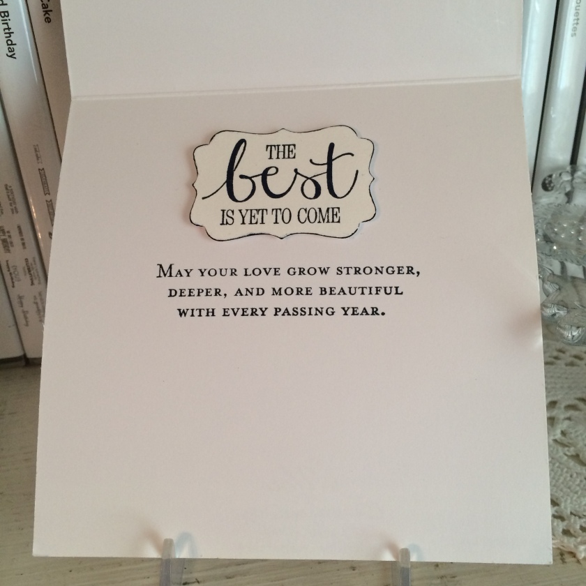
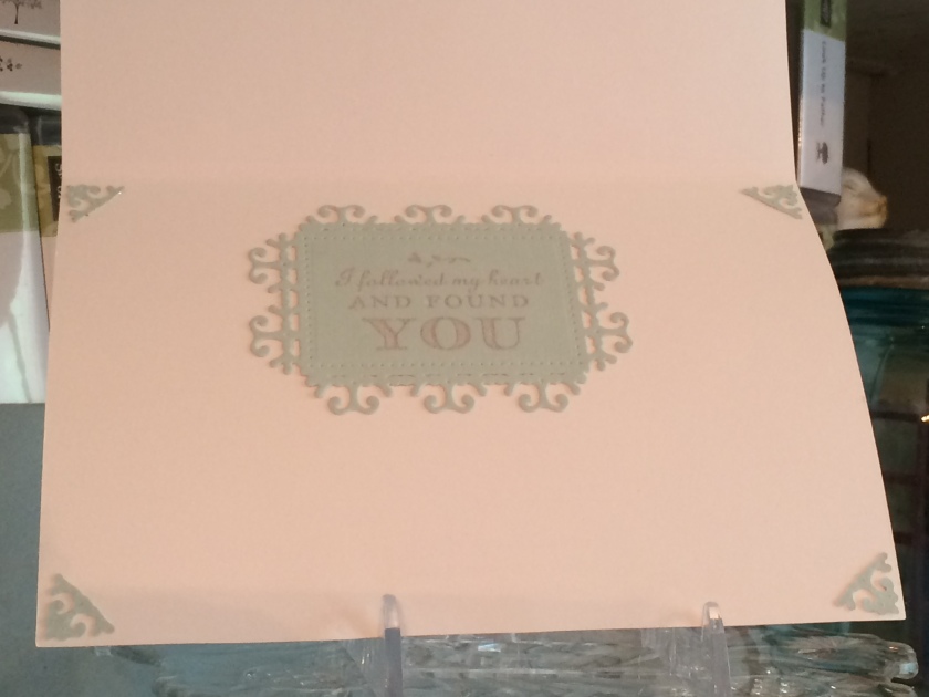
The inside of the card was simpler. “The best is yet to come” sentiment came from my retired SU “Best Thoughts” Hostess stamp set, which I stamped on white cardstock in SU Night of Navy ink and punched out with my retired SU Decorative Label punch. I edged around the punch with my matching Night of Navy marker to highlight the edges since it was white on white. Then I stamped the “May your love” sentiment from the current SU Floral Phrases stamp set. (Yes, I do have some current items! 🙂 )

All in all, I was pleased with the way this “version 2” card came out. Just for fun, here’s “version 1” that went to NC, in Soft Sky, kraft, white, and Crumb Cake. Version 1 also uses some distressed, stamped-on canvas.

2016-05-14 15.22.02

2016-05-14 15.23.41

Thanks for stopping by! Hope I’ve given some inspiration for your own wedding cards. 🙂

Pat's Blog Site

One place to fit it all!

Stamp Dabbles

Donna Leonard | Independent Stampin’ Up! Demonstrator | Huntsville, AL

Niya Scrap

Démonstratrice indépendante Stampin' Up!®

From Pole to Pole

Adventures in the Land of the Pierogi

Stampin' in the Meadows

Akiko Sudano - Independent Stampin' Up! Demonstrator Downingtown, PA

Creative Stamping Designs

Karen Ksenzakovic, Independent Stampin' Up! Demonstrator in Somerville, NJ Let's make some cards!!

Stamp it up with Jaimie

Helping you find a stress free creative outlet through paper crafting.

Stamp With Amy K

Amy Koenders, Independent Stampin' Up! Demonstrator in Mendham, New Jersey...Let's make some cards!

The Daily Post

The Art and Craft of Blogging

WordPress.com News

The latest news on WordPress.com and the WordPress community.

%d bloggers like this: