Thinking of You Card in Blue Roses (Stampin’ Up Embellishments and Paper Pumpkin Sentiment)

Using up a favorite piece of paper with a favorite technique—and it’s so easy that anybody can do it!

Hi, everybody! I’ve had quite a good run on cardmaking lately. I need to be reorganizing my craft room too but can’t seem to stay away from the desk! I know my schedule will be changing soon with springtime, so I’m thankful the creativity is here while it’s here.

One of the challenges I have in my craft room (just a secondary bedroom) is the amount of stuff—consumables like paper, embellishments, and more—due to the number of years I’ve been crafting (paper crafting for about 30 years now; other types, longer). I do confess: I LOVE paper and embellishments. I love having just the right special little thing to add to a card or scrapbook layout to top it off and make it perfect (or as perfect as the receiver will believe it to be 😉). And don’t even get me started on all the beautiful patterns and color choices I have in paper.

Sadly, as my “collection” grows and I fight losing space within four walls, I find myself striving more earnestly to use up my consumables to gain space. I’m not sure this will really work, considering how little room a few pieces of paper and gems take 😆, but I’m going with that for now in an attempt to feel as if I’m progressing somewhere. But that theory is why I made the card I’m sharing today.

I don’t actually know the name of the company who made today’s beautiful background. Sometimes I get papers from other crafters in destashes or swaps or RAKs (Random Acts of [Craft] Kindness). I had only two pieces of this one and always thought them beautiful but I’d moved them around a few times—in and out of the “make these next” piles of card parts, different storage options, and the like. The day I made this card, they moved from “make this sometime” to “make this NOW.” The design was too pretty to put off any longer. But I wasn’t sure what I wanted to do with it (the very reason, I suspect, that I kept moving it around in the first place). I first made a card base out of Stampin’s Up’s Misty Moonlight cardstock (item #153081), which matched the roses perfectly, while I continued to think. I use their cardstock for 99% of my card bases; this color is the regular 80-lb weight.

I must have had 3D things still in my subconscious after making the bird/flower card from a UK magazine kit in a previous post, because I was suddenly willing to sacrifice BOTH pieces of this pretty paper. I latched onto an idea of popping up some of the roses from one sheet on foam dots to give them dimension and make them 3D on the actual card. I cut out the two trio bunches for this and used Stampin’ Up’s self-adhesive Dimensionals underneath (item #104430, current). And then I used my Wink of Stella White and Clear glitter pens on top of all the lightest blue roses, because it’s been my go-to thing lately. I recently opened a new Clear one (item #141897, current) and am loving the amount of glitter it puts out. So fast and easy with an “Ooh, pretty!” punch. 🙂 The White one gives a nice whitewashed look (I only used it on the centers), but I didn’t think it was dramatic enough since the roses were already sketched with white too. It just softened the middles a little.

I was arbitrarily chatting while making this card (“Attempted Multitasking” is often my middle name), so I wasn’t feeling like complicating things further by sorting through my stamp sets, finding a sentiment that fit, hoping to ink and stamp the thing properly in between the dimensional roses—I needed more fast and easy. And then my eyes fell on some recent Paper Pumpkin sets I have stacked nearby. (Yes, Connie should make an effort to use these up more quickly—it will save space! 😂) I hadn’t even opened February 2021’s “Bouquet of Hope” kit yet but I thought there was something in there (consumable) that I could use, from what I was remembering from the promo pictures. Sure enough, sentiments in three languages, in die-cut sticker form. Perfect. And the English one even fit. No mess, no fuss, and I could nestle it into place without worrying about accidentally inking up 3D roses.

I decided to cut apart the “of” and “you” words because I didn’t like how close to the edge the “you” was falling, right where a right-handed person would hang onto the card. But what to do to make everything fit? Well, I ended up sticking the “of” to the top of the bottom dimensional roses and thinly chopping up Dimensional pads to fit under the part of the “f” that hung over the flower. That was tricky, yes. But it’s possible.

Then, time for embellishments! Stampin’ Up to the rescue again (and more gems used up!). I have previously hesitated on adding the Matte Black Dots (item #154284, current) to the top layers of my projects because they’re about 1/8” thick and I often “card” in layers, stacking things even higher. But here I could use them on the bottom layer without fear because the top layer would be against the envelope. 😁 I also scribbled some fake black dots onto the topmost rose trio since I didn’t want to chance them poking through the envelope when mailing. I used my black glitter brush from Art-C for that (very similar to Wink of Stella). I also added three champagne-colored gems from the Elegant Faceted Gems pack (item #152464, current) to the bottom layer to pick up the yellow/gold tones of the smaller flowers in the background. And that took care of the outside of the card.

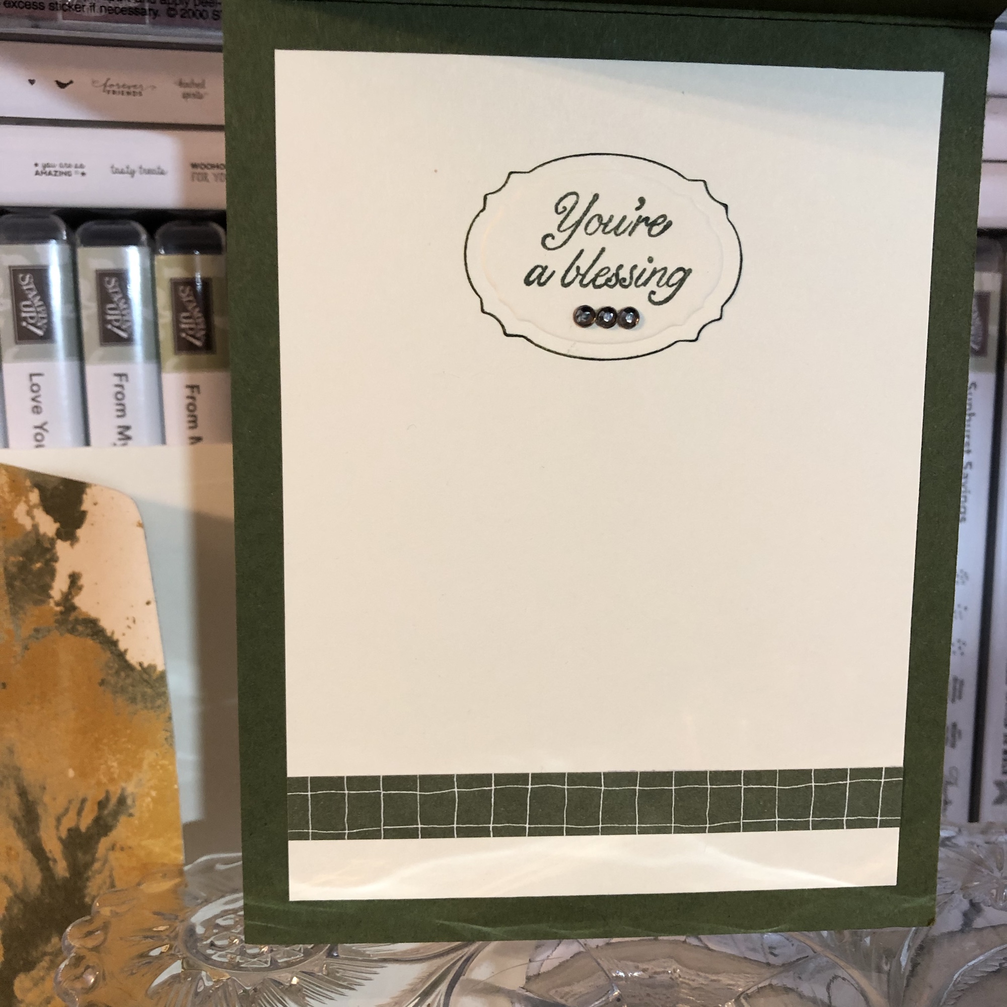
I kept the inside even simpler. I have several ongoing card orders to fill all the time these days, and one is for a lady who likes a simpler style. (That’s hard for me, but she’s helping me learn it!) I did think of her while making both the outside and the inside of the card, wondering whether she would want it, so I deliberately left the inside blank with just a strip of leftover background paper at the edge of miscellaneous white writing space (a substitute would be Basic White cardstock, item #159276, current).

Connie Troyer, ConstantlyCreating.Me

And now I’ve used up all that pretty paper. But it was worth it. 😍

Here are the links for what I’ve used in today’s post:

Product List

If you’d like to own any of these Stampin’ Up products yourself, you can go to my online store and shop with me at http://www.stampinup.com?demoid=2202334. The retiring list for the current Annual catalog hits this Wednesday!! Lots of good stuff coming! (But the Mini is still active until May 3. 😉) Contact me if you’d like paper catalogs instead. 🙂 You can also use Host Code WMW62ECS during checkout and receive a free gift! Orders totaling $50 before tax and shipping can choose a free gift from me up to $8 retail value; I’ll ship it separately to your preferred address after the order is placed. You’ll also earn 1 reward point toward a total of 8, which will get you a free $40 order from me. (And once you hit 8 points, the counter starts over!)

If you’d like to join a Stampin’ Up team and become a demonstrator yourself, I’d love to have you! I’m working on achieving some “leveling up” requirements and would be thrilled to have someone new! No pressure about sales amounts from me, ever. I know what it’s like to lead and juggle a busy life around many priorities. If you’re interested, contact me any time or check out my joining link at http://www.stampinup.com/join?demoid=2202334.

Check back on Wednesday for the 2020-2021 Annual retiring list! And thanks for stopping by. 🥰

Celebrate Spring with New Babies! (“Perfectly Paired” for Amy’s Inkin’ Krew Blog Hop)

Welcome to another blog post for Stamp with Amy K’s Inkin’ Krew Blog Hop! We have a very talented lineup for you this week. Thanks for stopping by to see what I created. 🙂

Our theme this month is “Celebrate Spring,” in whatever way we want to interpret that. Because I’m also making cards for my local gift shop, I chose to go with the “new birth/baby” idea. I couldn’t wait to get my hands on Stampin’ Up’s “Perfectly Paired” cling stamp set when it came out—it’s all about babies and features a Noah’s Ark image, one of my favorite themes for little ones. This stamp set (so far as we know) is only available for a couple more months since it’s in the current Occasions catalog.

Since I knew this would be a nice card and likely given with a gift, I started off by grabbing a lovely, thick envelope from my stash and then made the card base a 5×7 size to match it, using SU’s Shimmery White cardstock. I chose Shimmery White because I wanted to color the image.

Well, as usual, although I was aiming for simple, I evidently have to complicate things. And I made plenty of mistakes to cover up. My “MO,” I’m starting to think.

It occurred to me that there were waves under the ark in the stamp but I thought it might look a bit “adrift” all by itself on a flat card base. So I got some of my new Ice Blue Matt Mirror Luxury Cardstock (Crafter’s Companion) and cut it down, leaving about a 3/8″ border of white on the base for the “shimmery” part of the “Shimmery White” to show. Then I embossed some waves onto the mirror card with my Cuttlebug (“Musical Flourish” embossing folder).

My piece of mirror card was slightly longer than the embossing folder, so I embossed both ends and then attempted to hide the faint line the edge of the folder left with some retired 1/2″ SU Pacific Point ribbon. I wrapped the ribbon around the edges to give it a neater, more finished look. I believe I used my 1/4″ Scor-Tape down the middle of the back of the ribbon.

I didn’t actually cover the line left by embossing because the ribbon wasn’t wide enough, but hopefully I distracted anyone from looking too closely. I tried to keep the embossed design from overlapping when I ran it through the Cuttlebug, and the embossed line really isn’t that bad, but it’s mirror card so everything shows…. 🤷‍♀️ Whether I needed the ribbon or not, it was an attempt to make the card look better, and I built the rest of the design from there.

After fiddling with the layout, I decided to also mat the mirror card with Pacific Point cardstock to bring more of the ribbon color in for balance. I left 1/8″ of the mat showing, glued the mirror card to the mat, and then glued the combo onto the card base. I used my ATG tape gun for these. Then I set aside the card so I could concentrate on the image. And here’s where things got interesting.

I wasn’t sure whether to use my Stampin’ Blends alcohol markers to color it or my usual: watercolor pencils with either an Aqua Painter or a Blender Pen. I figured I’d do one of each type of coloring and leave the extra in my “card parts” bin for faster cardmaking later. Because those mediums require different inks to control the color, I stamped the ark image from “Perfectly Paired” once in Memento Tuxedo Black (for the alcohol markers) and once in SU’s Archival Basic Black (for the watercoloring). I labeled the backs with a pencil so I’d know which went with what…and then promptly started coloring the wrong image with the wrong medium because I was “doing,” not “thinking.” 🙄🤦‍♀️

Surprisingly, the Archival Basic Black didn’t smear too badly with the alcohol Blends, but I had been careful about not coloring over the lines, just because I was carefully coloring. It wasn’t until I smeared the lions’ whiskers a little that I even realized I’d switched the pieces. (Live and learn?) But smearing lines is why we are supposed to use Memento ink with alcohol markers. Lesson learned.

And then I discovered that I don’t yet have enough Blends to finish coloring this particular image. 🤦‍♀️🤪 I’ve been building my collection a little at a time, and although the Smoky Slate and Basic Black Combos have each made it to my purchasing list at least once, I ended up dropping them for things I wanted more. (Sacrifices!) Therefore, I have to stop coloring the image until I can get those and finish. For the record, though, this was as far as I got, and I really like this medium. (If you look closely, you can spot my whiskers accident.)

So I had to put all that away and regroup. I couldn’t remember whether Memento would smear if I got it wet (since it is a water-based ink), but I just wanted to get something going that I could use. I mentally crossed my fingers and dove in. I could always stamp another one if I had to.

Fortunately, it worked just fine—no smearing that I can tell. My coloring isn’t perfect, but at least the lines didn’t move. I went with the Aqua Painter to smooth out the watercolor pencil lines too…though in hindsight, I should have tried the Blender Pen, for better control in small places. Or just chucked it all and gone straight for my stash of Stampin’ Write markers. (I hope you’re learning from my mistakes! This veteran scrapbooker is still learning so much about cards!)

I will admit to a little cheating as well. I knew I had a Pacific Point chalk in my arsenal. As my retired SU watercolor pencils are unlabeled, I went for the chalk to color the water (with my Aqua Painter) so I could be all matchy-matchy instead of throwing off the shades by introducing some other blue. 😊 Also, I lightly colored the background a sky blue so that it wasn’t stark white paper. If I was coloring waves, I had to color sky too, right? But it’s hard to see in the picture.

So this is where I ended up with it (including doctoring the zebras with white Smooch paint and a Memento pen in desperation after watercoloring and black got the better of me). Coloring was the longest part and why it may be better to use some sort of marker next time. 🤷‍♀️ Another lesson learned!

The main focal image, colored.

Once the image was done and dried, I covered a good portion of the back of it with my 1/2″ Terrifically Tacky Tape (TTT), which is just like SU’s Sticky Strip. I did this to combat the curvature of the paper that happens once water goes onto it. Then I peeled off the tape backing and centered it in the section above the ribbon on the card front.

I had found some black, glittered chipboard faux photo corners when I was debating about the layout, so I glued those overtop the corners of the image with my Art Glitter liquid adhesive. And then I pulled a metal bar sentiment (“celebrating your arrival”) out of the heap of baby ephemera in front of me on my desk, and I adhered it to the top of the ribbon with more 1/4″ Scor-Tape. The front was done. Finally. And I’m even happy with it. 😂 I especially love how the foil look of the matt mirror cardstock shines and changes depth and color in the light. I so love using specialty materials to make cards pop.

(Oops! You can see that faint embossed line in this pic! Well, it’s not that noticeable in person. 😊)

For the inside of the card, I used the “Two by two we welcome you” sentiment from “Perfectly Paired,” stamping it with VersaMark on Shimmery White cardstock before heat embossing it with “Blue Tinsel” embossing powder from my stash. (No idea who made that; I’ve had it for years.) It was the closest embossing powder I could find to the Pacific Point color I’d been using, and it does actually look glittery, like tinsel, and has some texture to it once embossed. I then backed the white sentiment piece with a die-cut Pacific Point cardstock tag from a Spellbinders die (“Fancy Tags Two,” I believe. #neverstopmaking). I think it turned out quite lovely.

To finish off the card, I took a strip of dotted blue (SU Pool Party) cardstock from the retired Tutti-Frutti Cards and Envelopes pack and attached it to the bottom of the inside. I also cut off a small strip of matt mirror cardstock to top it. And then I found two goofy pink flamingo stickers in my stash from Sandylion and stuck them to the bottom right corner just for fun, to carry through the theme. I was looking for my smaller Noah’s Ark stamp for the corner, but I have to keep looking. 🤔🤷‍♀️

I haven’t decorated the envelope yet, but I’m thinking of stamping a row of various animals across the horizontal bottom (under the address section) as a sneak peek to the theme.

Below the list of hop participants are the current products I used in my card (or similar ones) that you can purchase through my online Stampin’ Up store if you wish to own any. (Please use host code 6WPHJ2MC when you check out.) Don’t forget that we have until March 31 to get free gifts from Stampin’ Up through Sale-a-Bration with orders of $50 or more before tax and shipping! There are some awesome reward products available! I also give free gifts to those who order through me. 😉

Thanks again for visiting today. I hope my mistakes keep you from making your own! Feel free to post questions or comments. 🙂

To continue with our hop and visit Jaimie Babarczy’s blog offering, click Next or her name in the list below. To view what Karen Ksenzakovic created, click Previous or her name. Thanks for hopping along with us!


  1. Karen Ksenzakovic
  2. Connie TroyerYou are here!
  3. Jaimie Babarczy
  4. Sue Prather
  5. Julie Johnston
  6. Mary Deatherage
  7. Karen Finkle
  8. Shirley Gentry
  9. Amy Koenders

Product List

Two Kinds of Simple, Stitched Thanks Cards (Notes of Kindness, Hanging Garden, Very Vintage)

Hello again… I thought I’d pop on while multitasking and detail a couple of simple cards I made recently. I got distracted last week before my husband and I went to Florida for his job (Florida in January from Ohio – huge perk, right? Well, if one stays healthy, yes. 🙂 ). When I should have been packing or finishing a card order, I ended up pulling things together for a card I didn’t anticipate making. Then last night I made another one since the first was so easy and I had a second stitched piece yet to use. 🙂

Since I’ve started selling cards and making custom items, I’ve been looking for ways to make more cards faster to keep more customers happier. I’m not really a “fast” card creator; I spend too much time in the details that I love. Creating keepsakes is really my thing, but most customers don’t need that much hoopla or focus on cards they’re just sending to be thoughtful. So I have started reserving that “type” of card for specialty or specific occasion ones, cards that the recipients will love and treasure.

Through this process, I’ve figured out that card kits, though not my first love, are rather useful for making lots of cards with limited supplies and time, and when the kits come with a stamp set too, all the better. Today’s cards were not from a kit but rather from a DCWV pad of paper that was made up of various stitched designs, so it’s a similar idea. I bought the pad when I was first starting out in cardmaking and thought then that it would be a cheap way to have several nice card fronts right there at my fingertips. I’m happy to report that my hunch was correct and I only have four left to use up, which feels great. 🙂 I love the look of stitchery, being a “soft crafter” myself. These cards are the same flowered design on kraft but they look totally different because of the papers and colors I chose.

The original green, yellow, and blue card has a green Mossy Meadow card base from Stampin’ Up. I paired the base and flower panel with some Designer Series Paper (DSP) from Stampin’ Up’s retired “Going Places” pack. I still have lots of useful papers in it, and one of its colors is Mossy Meadow. I don’t have much of that shade, so when I also found a Mossy Meadow grid paper in the same pack and they coordinated perfectly, as Stampin’ Up does, I stopped overthinking and put them together. It felt like it was headed toward a masculine or gender-neutral kind of card, which I don’t make as often as I should.

My detailed self, however, needed some kind of embellishment near the stem of the flower to accent where I was going to place the sentiment, so next I picked up what little remains of my Copper Twine and wrapped it around the DSP/flower panel a couple of times before gluing the panel–off-center–onto the card base, to leave room for the large “Thanks.” I just love that twine and wish I had more of it, but it was from the Notes of Kindness kit from Stampin’ Up. (Mental note: must order refill to get more!)

In keeping with the contemporary, simplistic, somewhat masculine style of the card, I needed the sentiment to be brief and obvious. The “Thanks” stamp also from the Notes of Kindness card kit was just the right thing. I used my Mossy Meadow Stampin’ Spot inch-sized ink pad and stamping platform and had it done in a jiffy. For the inside, I laid down a white paper to write on (just eyeballed a measurement for borders I liked and cut it to size with my trimmer), before using a Spellbinders die for the sentiment spot on the inside and going around the edges of it with my Mossy Meadow marker before gluing it. I used Stampin’ Up’s current Very Vintage (host only) stamp set for the “You’re a blessing” wording and accented it with three dark rhinestones from Recollections in my stash. And I added a strip of the Mossy Meadow grid paper to the bottom of the white piece for some color and continuity and a piece of matching DSP to the envelope flap to dress it up a bit. That’s it!

It was so simple that I made another card last night with the remaining flower panel. Since I had used up the grid paper with the last card, I had to go a different direction for the new one. I have a photo box full of cut-and-scored A2 card bases, and when I remember that I have them, I pick one of those out of the box rather than take time to cut and score a new one or two from my loose cardstock sheets. I thought a retired Tip Top Taupe card base from the photo box matched the kraft piece well enough. Then I had to find papers to match. I started riffling through my loose stack of random 6×6 papers just because they were behind my chair and I really should use them up. They come from swaps or generous RAK-givers or are leftovers that would get lost in my patterned paper drawer because of their size.

Included in that stack were three coordinating 3×6 sheets someone had once sent me in the mail. And one of those was the houndstooth pattern I decided to use for the new card. I’m not sure what is different about the sizing between the two cards, but it seemed like it wasn’t working to fit a second piece of patterned paper and sentiment with the houndstooth the way it had with the marbled and grid papers on the first card. Losing a layer bothered me at first, but I made myself continue and (again) stop thinking and just go with it.

(One way to faster cards is to stop looking for the “perfect” thing and use what I know matches and will work. Yes, there are probably lots of options in my craft room, but how much time do I really want to waste, sifting through papers and getting paper cuts in the process? This is a battle I wage constantly with myself. No one will really know the difference anyway, whether it should have been THIS paper over THAT paper. One paper is likely about as good as the other, unless they’re just hideous choices. 🙂 Even saying that makes me feel like I care less than I should, which I do not like. But it comes down to time, always.)

So. Since one paper worked just fine and didn’t really require another paper with it, I stopped frowning and cut a couple of strips to attach to the sides of the flowered panel. Then I did the same kind of wrapping with baker’s twine–white this time, because I really didn’t want to use up the rest of the copper–and pulled out the Mossy Meadow sentiment I’d created in duplication when I stamped the first one last week. 🙂 I’ve started keeping a drawer full of blank tags and another of sentiments as a way to speed things up, and so far that’s working! I added three of SU’s Metallic Pearls (current item–love them) to the kraft around the flower for some pizzazz.

I sold the first card already, but this one was going to a special person as a thank-you for a very thoughtful Christmas gift she’d sent me (yes, I know, it’s February). So I had a certain sentiment for the inside in my mind, but I couldn’t find it on my shelves. It’s probably in the ones I stacked aside that are baby-, wedding-, or general-themed, for my upcoming gift shop cards. I’m really going to need to separate those. I keep missing particular stamp sets. I searched my shelves for similar options and came up with one from a current SU set called Hanging Garden. It’s the second time I’ve used it, but I think it’s going to be a favorite: “To one of the loveliest people I know.” And when I use it, I mean it. (That’s one of the nicer things about stamping these days–designers are doing a wonderful job with creating sentiments from the heart for all kinds of situations. I feel like we have more options these days than we used to.)

I stamped the Hanging Garden sentiment in Mossy Meadow on a sheet of white to match the sentiment on the outside and then cut another strip of houndstooth paper to accent the edge. Nice and simple, good for male or female. I’m happy to report that it has already been mailed and is winging its way to Missouri (higher postage notwithstanding).

I feel rather eager to continue using those stitched panels, so you may see more from me in this vein. There’s a certain feather floating around in my mind, and I keep mentally sifting through sentiments that would go with it. But for now I must focus on a fox card and two birthday cards this weekend. The lemons are done (blogs to come), and so are J’s wedding and sympathy cards (though two more Thinking of You are also on the list). And the Etsy sale is on (10% off!) and the order to S is wrapping up, so things are moving along. Life feels good right now. 🙂 Thanks for coming along for the ride.


Lemon Lime Twist Green and Marvelous Magenta Lilies Sympathy

A simple but stunning sympathy to share with you today.

I’ve had a rash of sympathy cards to make lately, so I’ll be talking about those in several posts to come. They are all very different and more of a clean-and-simple idea than ones that are overly complicated.

The one I want to show today was created with a base of 80-lb. weight retired Stampin’ Up Marvelous Magenta cardstock, which matched the main lily design perfectly. It is an A2 size (so 4.25″ x 5.5″).

I cut a piece of retired SU Fabulous Foil Acetate to fit the size of the card front and then glued it with Tombow Multi-Glue (green-and-white bottle) under where the lily block would be attached. The acetate is freestanding otherwise. It is accented with silver on one side and gold on the other. The gold happened to match the warmth of my green better (and my sentiment was also in gold).

I “cheated” a little bit on this card by using a some preprinted materials. (Isn’t that what patterned paper is, though?) Specifically, I can confess that the magenta/lime/white lily piece is the front of a pocket calendar, cut down. I never would have guessed, myself, if I looked at this card for the first time. The block was just too pretty to toss, so I cut off the wording, squared it up, and found things that matched. Luckily for me, one of Stampin’ Up’s current In-Colors, Lemon Lime Twist, also matches perfectly, so I matted the calendar piece with LLT cardstock.

Then, because I was once again short on time (chronic problem), I dug through some Anna Griffin sentiment pieces I’d acquired secondhand. The lime green oval mat is a separate piece from the gold-foil sentiment, but they coordinate perfectly. And using them was faster than stamping my own. I popped up the top oval with Stampin’ Dimensionals and remembered that I had some matching In-Color felt bows from the last catalog. Raising up the top layer allowed me to nestle that bow knot right beneath it rather than stick up in its own layer.

For the inside, I used a leftover strip of the Fabulous Foil Acetate and a Hero Arts set of sympathy stamps that is one of my favorites. I turn to it often. “Sending caring thoughts your way” was stamped in SU Lemon Lime Twist ink, and the flower stamp from the same stamp set was colored with Marvelous Magenta and Lucky Limeade markers on a piece of white paper that I cut to fit the inside.

Clean and simple but elegantly stunning at the same time. It’s prettier in person, even though I did some “recycling” by using the calendar piece. Anything is fair game to go on a card!

Thank you for stopping by and reading! Leave a comment if something I did inspired you!

Hello Recycling (of Cards)

Recycled card bits made new.

View on Instagram https://ift.tt/2sgDiZl
Sometimes things are just too pretty or useful to throw away. (Yes, I have a Depression-era mind-set.) Here I used part of a printed card that had made its way to me into a little hello card, complete with a new tag, wood and resin pieces, two types of patterned paper (one being embossed and glittered), Stampin’ Up Lucky Limeade ribbon, and translucent, glow-in-the-dark Nuvo Drops.
#thelittlewhatnotshop #forstacy #hellocard #etsypreneur #recycling
Pat's Blog Site

One place to fit it all!

Stamp Dabbles

Donna Leonard | Independent Stampin’ Up! Demonstrator | Huntsville, AL

Niya Scrap

Démonstratrice indépendante Stampin' Up!®

From Pole to Pole

Adventures in the Land of the Pierogi

Stampin' in the Meadows

Akiko Sudano - Independent Stampin' Up! Demonstrator Downingtown, PA

Creative Stamping Designs

Karen Ksenzakovic, Independent Stampin' Up! Demonstrator in Somerville, NJ Let's make some cards!!

Stamp it up with Jaimie

Helping you find a stress free creative outlet through paper crafting.

Stamp With Amy K

Amy Koenders, Independent Stampin' Up! Demonstrator in Mendham, New Jersey...Let's make some cards!

The Daily Post

The Art and Craft of Blogging

WordPress.com News

The latest news on WordPress.com and the WordPress community.

%d bloggers like this: