Everything and More

www.instagram.com/p/CW6hDy4pQJQ/

I feel like I’ve been here, there, and everywhere (or my bed) for the last six months. Crafting times have been random and unplanned. I’ve been trying to reorganize my stamps (and keep my desk clear) too. This is a card I made one night after vacation and before I hit the deer.

I fussy-cut around the foliage of a retired #stampinup Magnolia Lane Memories and More card before popping it up on Dimensionals and running some retired #petalpink and white baker’s twine behind it and for the bow. I’ve used a retired kraft Magnolia Lane Cards and Envelopes card base and used some retired #envelopepaper on the inside. Retired #su gems on the card front: Frosted Flower Embellishments and Share What You Love Artisan Pearls. Current gems: Elegant Faceted Gems.

. #magnolialane #fussycutting #cardmaking #usingupretiredsupplies #elegantfacetedgems #sharewhatyouloveartisanpearls #frostedflowerembellishments #memoriesandmore

A Masculine Card with the Come Sail Away Suite (2019-2010 Annual Catalog–Sailing Home stamps)

Let’s all say hooray that I can finally blog again! I started this masculine card while in Charlotte at OnStage with Stampin’ Up in mid-April but didn’t finish putting it together until the preordered corresponding dies arrived at my house after vacation and I had some time to do sit down with them. The Stampin’ Up team gave us precut pieces in a kit to use with supplies on the table, though we could change it any way we wanted to. I did end up varying my card a little from the picture they included with the kit.

This card features the Come Sail Away suite, which will be new in the 2019-2020 Annual Catalog (available to customers June 4). What I used from the suite is the Sailing Home Stamp Set, the Smooth Sailing Dies, some of the Come Sail Away DSP, the Sail Away Trinkets, and a bit of its Sahara Sand/Night of Navy Baker’s Twine. The suite itself also includes the Come Sail Away Memories and More Card Pack and the High Seas 3D Embossing Folder—and let me tell you, this suite is awesome. I will be making up some cards with the Come Sail Away Memories and More Card Pack soon as well (there are laser-cut specialty cards in the pack of 50 double-sided cards!).

New cling stamp set available June 4.
The stamps, dies, twine, trinkets, embossing folder, and Designer Series Paper. A must-have!
The cards in the Memories and More Card Pack…one of my all-time favorites! Look at those laser-cut designs!
These trinkets are flat enough to mail and lightweight!

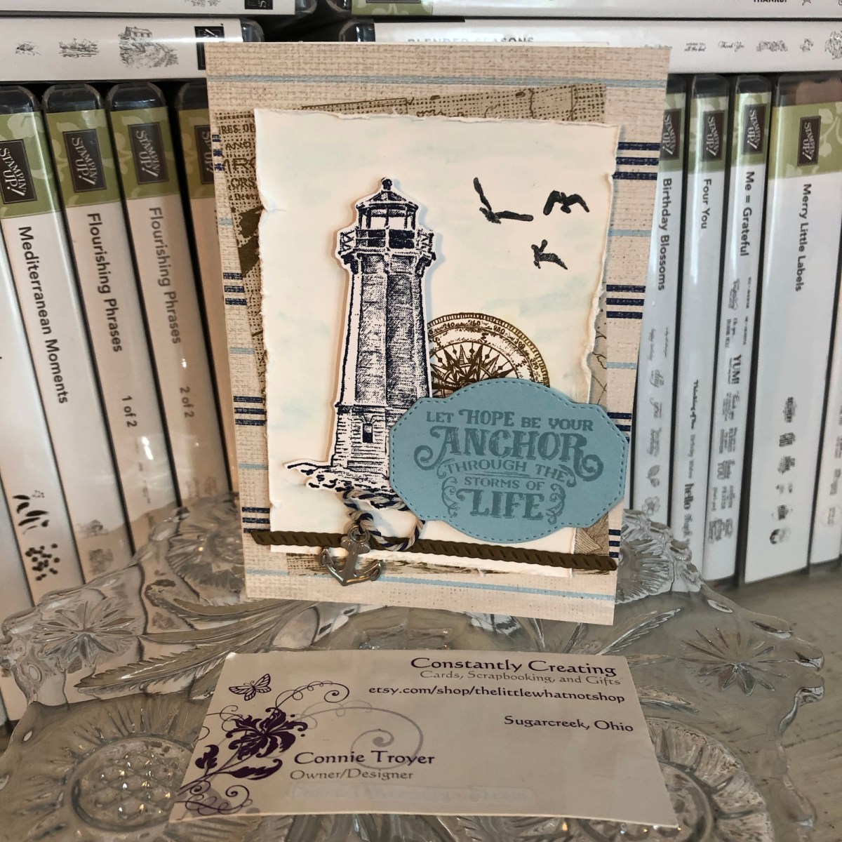
So, for this A2 card, I glued some Come Sail Away DSP onto the card base first and then placed the smaller piece of DSP cockeyed at an angle for its position behind the focal piece. For that focal piece, I used Balmy Blue ink with an AquaPainter to create a light wash of blue sky in the background (technically I did that last, but it’s smarter to do it first).

I stamped the lighthouse onto the Whisper White focal piece with Night of Navy ink and then stamped the compass off to the right of it with Early Espresso ink the way the kit photo suggested. Then I stamped and fussy-cut another lighthouse on scrap Whisper White and placed it atop the first one with foam dots so it became 3D. (The kit also suggested we add a die-cut ship’s steering wheel here with the lighthouse/compass/sentiment area, but I moved my wheel to the inside of the card instead—and left plenty of room for an overdue message.)

I stamped three flying birds in Tuxedo Black Memento Ink in the sky and distressed the edges of the Whisper White piece with a distressing tool. Then I die-cut a piece of rope with some dark brown (Soft Suede?) cardstock to lay across the bottom under the lighthouse (it embosses while it cuts!), and I die-cut a sentiment spot out of Balmy Blue cardstock after that. The sentiment die has a wonderful dashed or stitched outside border that is pressed into the paper as it cuts the die-cut.

I then stamped the sentiment (“Let Hope Be Your Anchor Through the Storms of Life”) in Balmy Blue. Since this is a cling stamp set, it is much easier to line up visually, so the stamping went well the first time through, even if I probably should have used Night of Navy ink instead. 😉

To finish off the card, I tied a bit of the Baker’s Twine through one of the anchor trinkets (there are both anchor and ship’s wheel trinkets) and glued the ends of the twine up under the sentiment spot, as if it was dangling there or laying near the lighthouse.

Here are some snapshots I took at OnStage including the display boards of the Come Sail Away suite. Our presenter in Charlotte was the incomparable Mary Deatherage, who happens to be one of my team members! She created the samples on the display boards for this suite as well. It was so much fun (and a bit awe-inspiring) to see her demonstrating the products right up there live in front of us, and she did an amazing job.

Suffice it to say I will be using these again soon! I think the “Set Sail in the Direction of Your Dreams” sentiment is going to be great for masculine graduation cards this season. They hit a home run with this bundle.

Although the new catalog isn’t available to order from until June 4, I’m happy to send one your way once I get them. If you’d like a catalog, just email me! There are also still a lot of great things carrying over and retiring from the two current catalogs. If you need a demonstrator, you can use host code RRCMHZ4E when you shop with me (catch the direct store link in my sidebar at the right or click http://www.stampinup.com/ECWeb/default.aspx?dbwsdemoid=2202334!). I’m happy to answer any questions you may have. Thanks for stopping by! Let me know what you think of this product suite!

Two Kinds of Simple, Stitched Thanks Cards (Notes of Kindness, Hanging Garden, Very Vintage)

Hello again… I thought I’d pop on while multitasking and detail a couple of simple cards I made recently. I got distracted last week before my husband and I went to Florida for his job (Florida in January from Ohio – huge perk, right? Well, if one stays healthy, yes. 🙂 ). When I should have been packing or finishing a card order, I ended up pulling things together for a card I didn’t anticipate making. Then last night I made another one since the first was so easy and I had a second stitched piece yet to use. 🙂

Since I’ve started selling cards and making custom items, I’ve been looking for ways to make more cards faster to keep more customers happier. I’m not really a “fast” card creator; I spend too much time in the details that I love. Creating keepsakes is really my thing, but most customers don’t need that much hoopla or focus on cards they’re just sending to be thoughtful. So I have started reserving that “type” of card for specialty or specific occasion ones, cards that the recipients will love and treasure.

Through this process, I’ve figured out that card kits, though not my first love, are rather useful for making lots of cards with limited supplies and time, and when the kits come with a stamp set too, all the better. Today’s cards were not from a kit but rather from a DCWV pad of paper that was made up of various stitched designs, so it’s a similar idea. I bought the pad when I was first starting out in cardmaking and thought then that it would be a cheap way to have several nice card fronts right there at my fingertips. I’m happy to report that my hunch was correct and I only have four left to use up, which feels great. 🙂 I love the look of stitchery, being a “soft crafter” myself. These cards are the same flowered design on kraft but they look totally different because of the papers and colors I chose.

The original green, yellow, and blue card has a green Mossy Meadow card base from Stampin’ Up. I paired the base and flower panel with some Designer Series Paper (DSP) from Stampin’ Up’s retired “Going Places” pack. I still have lots of useful papers in it, and one of its colors is Mossy Meadow. I don’t have much of that shade, so when I also found a Mossy Meadow grid paper in the same pack and they coordinated perfectly, as Stampin’ Up does, I stopped overthinking and put them together. It felt like it was headed toward a masculine or gender-neutral kind of card, which I don’t make as often as I should.

My detailed self, however, needed some kind of embellishment near the stem of the flower to accent where I was going to place the sentiment, so next I picked up what little remains of my Copper Twine and wrapped it around the DSP/flower panel a couple of times before gluing the panel–off-center–onto the card base, to leave room for the large “Thanks.” I just love that twine and wish I had more of it, but it was from the Notes of Kindness kit from Stampin’ Up. (Mental note: must order refill to get more!)

In keeping with the contemporary, simplistic, somewhat masculine style of the card, I needed the sentiment to be brief and obvious. The “Thanks” stamp also from the Notes of Kindness card kit was just the right thing. I used my Mossy Meadow Stampin’ Spot inch-sized ink pad and stamping platform and had it done in a jiffy. For the inside, I laid down a white paper to write on (just eyeballed a measurement for borders I liked and cut it to size with my trimmer), before using a Spellbinders die for the sentiment spot on the inside and going around the edges of it with my Mossy Meadow marker before gluing it. I used Stampin’ Up’s current Very Vintage (host only) stamp set for the “You’re a blessing” wording and accented it with three dark rhinestones from Recollections in my stash. And I added a strip of the Mossy Meadow grid paper to the bottom of the white piece for some color and continuity and a piece of matching DSP to the envelope flap to dress it up a bit. That’s it!

It was so simple that I made another card last night with the remaining flower panel. Since I had used up the grid paper with the last card, I had to go a different direction for the new one. I have a photo box full of cut-and-scored A2 card bases, and when I remember that I have them, I pick one of those out of the box rather than take time to cut and score a new one or two from my loose cardstock sheets. I thought a retired Tip Top Taupe card base from the photo box matched the kraft piece well enough. Then I had to find papers to match. I started riffling through my loose stack of random 6×6 papers just because they were behind my chair and I really should use them up. They come from swaps or generous RAK-givers or are leftovers that would get lost in my patterned paper drawer because of their size.

Included in that stack were three coordinating 3×6 sheets someone had once sent me in the mail. And one of those was the houndstooth pattern I decided to use for the new card. I’m not sure what is different about the sizing between the two cards, but it seemed like it wasn’t working to fit a second piece of patterned paper and sentiment with the houndstooth the way it had with the marbled and grid papers on the first card. Losing a layer bothered me at first, but I made myself continue and (again) stop thinking and just go with it.

(One way to faster cards is to stop looking for the “perfect” thing and use what I know matches and will work. Yes, there are probably lots of options in my craft room, but how much time do I really want to waste, sifting through papers and getting paper cuts in the process? This is a battle I wage constantly with myself. No one will really know the difference anyway, whether it should have been THIS paper over THAT paper. One paper is likely about as good as the other, unless they’re just hideous choices. 🙂 Even saying that makes me feel like I care less than I should, which I do not like. But it comes down to time, always.)

So. Since one paper worked just fine and didn’t really require another paper with it, I stopped frowning and cut a couple of strips to attach to the sides of the flowered panel. Then I did the same kind of wrapping with baker’s twine–white this time, because I really didn’t want to use up the rest of the copper–and pulled out the Mossy Meadow sentiment I’d created in duplication when I stamped the first one last week. 🙂 I’ve started keeping a drawer full of blank tags and another of sentiments as a way to speed things up, and so far that’s working! I added three of SU’s Metallic Pearls (current item–love them) to the kraft around the flower for some pizzazz.

I sold the first card already, but this one was going to a special person as a thank-you for a very thoughtful Christmas gift she’d sent me (yes, I know, it’s February). So I had a certain sentiment for the inside in my mind, but I couldn’t find it on my shelves. It’s probably in the ones I stacked aside that are baby-, wedding-, or general-themed, for my upcoming gift shop cards. I’m really going to need to separate those. I keep missing particular stamp sets. I searched my shelves for similar options and came up with one from a current SU set called Hanging Garden. It’s the second time I’ve used it, but I think it’s going to be a favorite: “To one of the loveliest people I know.” And when I use it, I mean it. (That’s one of the nicer things about stamping these days–designers are doing a wonderful job with creating sentiments from the heart for all kinds of situations. I feel like we have more options these days than we used to.)

I stamped the Hanging Garden sentiment in Mossy Meadow on a sheet of white to match the sentiment on the outside and then cut another strip of houndstooth paper to accent the edge. Nice and simple, good for male or female. I’m happy to report that it has already been mailed and is winging its way to Missouri (higher postage notwithstanding).

I feel rather eager to continue using those stitched panels, so you may see more from me in this vein. There’s a certain feather floating around in my mind, and I keep mentally sifting through sentiments that would go with it. But for now I must focus on a fox card and two birthday cards this weekend. The lemons are done (blogs to come), and so are J’s wedding and sympathy cards (though two more Thinking of You are also on the list). And the Etsy sale is on (10% off!) and the order to S is wrapping up, so things are moving along. Life feels good right now. 🙂 Thanks for coming along for the ride.


Cards from the Notes of Kindness Kit with Variations

A bit about the Notes of Kindness card kit I made up recently – twenty cards in one night!

I promise that I make more than card kits these days – and I’ll have some individual cards blogged about soon – but right now I’m trying to accumulate some stock for my local gift shop and get ahead on cards I need to send myself. 🙂

I recently found myself looking at another card kit I had waiting, and before I knew it, I had a bunch done! As a matter of fact, I made all twenty cards in one sitting (though I did go back and add sentiments to a few insides the next night). That’s just not me. I take way too long to make cards with my level of detail. What a freeing, productive feeling it was to have that many done at once! And I didn’t feel like the designs were too simple for my style, either.

This particular card kit, the Notes of Kindness All-Inclusive Card Kit, is current in the 2018-2019 Annual Catalog from Stampin’ Up, on page 7. The kit itself is $35 but it comes with a clear stamp block, an Archival Black ink spot, a 6-piece set of photopolymer stamps, Copper Baker’s Twine, adhesived mini pearls, Stampin’ Dimensional pop-up dots, die-cut sentiment stickers, die-cut flowers, lined envelopes, twenty printed card bases, and a kraft box you can store or gift them in. Full-color picture instructions are also included. All you need is your choice of adhesive and anything extra or different that you want to do.

There is also a refill kit you can purchase for $21 that includes all this except the stamp set, block, ink, and box – and the refill makes another twenty cards. (I know what is on my wishlist!)

I snuck another stamp set into my work so that I had “Best Wishes” wedding and anniversary cards as well as thank-yous. I also used some Wink of Stella Clear on some of my flowers to make them sparkle and shine. I made the card fronts the way the kit suggested otherwise. I did use some retired thank-you stamps on the insides where appropriate, just so I had some variation. And I was even able to use one of the German sentiments that are included. I live in a Pennsylvania Dutch area and thought I’d test one and see if it sells. (There are French sentiment stickers too!)

The colors in the kit are some of my favorites: Blushing Bride, Blackberry Bliss, Soft Seafoam, Mint Macaron, Mossy Meadow, and Basic Black and Whisper White. Though the sentiments inked up well, I love that they are photopolymer – for just in case I needed to realign something.

I think this one is my favorite. I turned it into a 5-piece card set complete with acetate box and pen!

You can see some Wink of Stella shimmer on the dark parts of this flower too.

I used the current Stitched All-Around stamp set for the “Best Wishes” cards (inside and out).
For this tiny thank-you sentiment with the twine behind it, I laid down some ATG tape first, to keep the twine controlled, before adding the Stampin’ Dimensionals and sentiment.

You can really see the Wink of Stella shimmering on this succulent. I varied where and how much I used it on the succulents but ended up loving them all!

Anyway, I’m not usually a card-kit user, but I’ve been beginning to change my mind about them. As long as they don’t feel too simple to me, I’ll probably give others a try now too. I also still have the Lots of Happy kit to finish sometime. 😉

If you’re interested in trying this kit or others, or if you need some supplies, I’m happy to be your Stampin’ Up demonstrator! Sale-a-Bration just started this week, which means you can get a free select product with any $50 purchase. And they even have a couple of amazing products for $100 orders! SAB goes through March 31. Let me know if I can help! ❤️

Thanks for reading!

Cards from the Designer Tin of Cards Project Kit

Some cards from the Designer Tin of Cards Project Kit – quick and easy cards with a bit of variation.

Hello again. 🙂 I’ve had interest in a blog post about one of my birthday cards, so I thought I’d do up a quick blog post about it and a couple of others I made from the same kit.

The kit in question is the now-retired Designer Tin of Cards Project Kit from Stampin’ Up. When I was on vacation this past summer, I took an evening and mainly made up the cards the way the kit suggested, with little variations to the cards here and there. I didn’t add the sentiments at the time because I wasn’t sure what I would need them for and I didn’t have all my options in front of me anyway. So little by little I’ve been picking out of the batch and finishing them to send as needed, with some still waiting.

All my blue-and-white-and-gold ones have gone to the local gift shop for sale, and they had different sentiments. I used one of the masculine looks for my dad’s birthday. I used the banners/garlands base for another relative’s birthday and added some llama and cactus paper elements from a UK magazine I had with me. (I still have two of those bases to create with, actually.) I sent at least one of the coral hibiscus cards to the gift shop, and one went for a friend’s birthday. I used the “Celebrate Your Day” and “Sending Love” sentiments from the coordinating stamp set. I still have two coral and one masculine card to sentiment yet.

I didn’t used to be very fond of the kit idea in general because they’re usually too simple for my preferred style of details. But as I get busier, I have seen how useful they can be for when I want to send a handmade card but haven’t had extra time. Also, now that I’m constantly making cards for the gift shop, it’s been nice to fall back on ones that are faster and easier to make without taxing my design skills. I’m beginning to let go of the need to have everything perfectly perfect and just the way I like it. I simply don’t have enough time to keep up with all I’d like to do in this life. They need cards, so I must make them and not fuss around. Besides, some people really prefer the simpler, “to the point” cards rather than all the detail and fluff I like, so this way I hope to reach a bigger audience in interest. 🙂 For ones I send personally, I like to create cards with the recipient in mind. But for the shop, I don’t know who is buying them or who they are for. So the kits are beginning to work for me there. (And if any of the kits make it to the clearance rack, they’re even cheaper, which I also like.)

The kit coordinates with the Designer Tin of Cards stamp set, which I used for a few of the cards but not all. It was supposed to be used to make a filing system of cards on tabs, with the tin to hold everything, but I chose to use the sentiments rather than the tabs.

I’ve added in some of the finished cards as examples for you to see what the kit was like. Evidently I didn’t take all the pictures I should have. 🤦‍♀️ But if I find other pics, I’ll update the post with them.

The Designer Tin of Cards stamp set.
Sentiment from the “Birthday Wit” stamp set, with Pacific Point ink, gold sequins, and gold washi tape.
Sentiment from Blended Seasons stamp set, with Night of Navy ink.
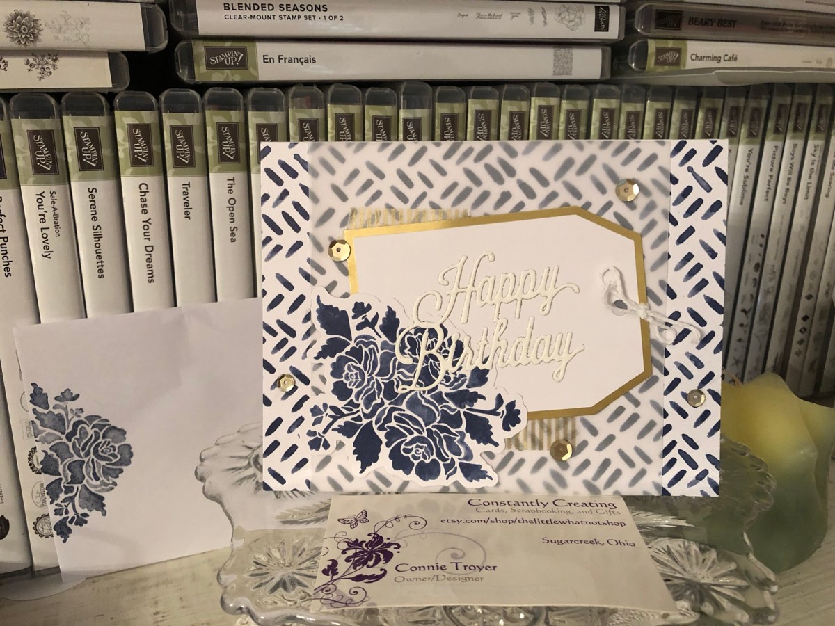
Unbranded happy birthday die with blue-and-white card base, vellum, gold-edged tag, gold sequins, gold washi, white twine, and a blue flowered die-cut all from the kit. I stamped the flower on the envelope with the coordinating Floral Phrases stamp set in Night of Navy ink.
Blue flower die-cut and gold washi tape from the kit.
The only additions to the kit here were the Martha Stewart cake sticker and the gold-foil sentiment from a Spellbinders die. The kit even included paper clips!
Ink is Night of Navy. Stamp is from MSE.
In this gift-shop pic, one of the other blue-and-white ones can be seen with the sentiment “Best Wishes” in gold foil. The die is from a UK magazine. (Two other “kit cards” are also in the picture.)

Thanks for reading! If you have any questions about how I created something, just leave me a comment. 🙂 And stay tuned for another blog post about a “love” card for a blog hop. 🙂

If you need any papercrafting supplies, I’d be happy to become your Stampin’ Up Demonstrator! My direct store link is in my blog sidebar.

May your day be a happy one!

A Quick-and-Easy Thank-You Card for Amy’s Inkin’ Krew

For my second time “hopping” with Amy’s Inkin’ Krew on Tuesdays, I chose a simple thank-you card that anyone can make.

img_9128-1

Hello! It’s time (somehow) for my second team blog hop with Amy’s Inkin’ Krew! This month’s theme is “Giving Thanks,” so I have a simple thank-you card to share today. It didn’t take much time at all, and it’s one anybody can make!

I’ve remarked in past posts how difficult thank-you cards seem to be for me to get out on time. I found a new way to help speed up the process. This kind of card always brings out the scrapbooker in me. First, there is no stamping on it at all. And second, I used a front piece that is part of a 12″x12″ piece of decorative paper from American Crafts (item # 320490) that I picked up at JoAnn Fabrics in the open-stock paper section some months back. The paper included twelve different “seed packets” that said various things. All show flowers or a type of plant. You can see another example of one here. I merely cut them apart with my trimmer and sorted them by type before filing them for later. They weren’t all about gratitude, but I did set those aside so I could reach them quickly in an effort to get them onto cards and out the door faster. 🙂

So since I knew what main piece I was using, I just built the rest of the card from there, using the colors I saw. I had a retired piece of Stampin’ Up 80-lb cardstock (possibly Bashful Blue) that I cut into two bases, using one for this card and saving the other for later. I chose it because of the tiny little circle flowers behind the orange poppies (if they are poppies). I had to try out several versions of patterned paper for other layers between them to see what looked best. The little orange-and-yellow flowered patterned piece directly underneath is from a pack of retired Designer Series Paper from Stampin’ Up. I had always wondered what I was going to use that scrap piece for. It fit just right. 🙂 The neutral chevrons are from an Art-C Ephemera Pack. It was the only cardstock in the pack and I just wanted to use it up so I didn’t have to keep awkwardly storing it in the package. A bonus was that it toned down the orange flowers and grounded everything with its “neutralness.”

It was actually hardest to figure out the arrangement of the pieces after I knew what matched. I was not following a sketch, instead just making it up as I went along. I rearranged things several times and eventually decided that it was too plain as is – no embellishments?? – so I wanted to add the Pool Party Thick Baker’s Twine (the closest color I had to the blue base)…but I didn’t like any place I put it overtop the seed packet design. And the layers were a little too boring for me just one after another. (Though, granted, that would have been even easier and faster to make!) So I placed the seed packet piece above the chevrons and left a large space for the baker’s twine to go across as a decorative detail. Thankfully I thought ahead a little bit, because I realized before I glued it down that the baker’s twine (rightfully called “Thick”) is difficult to place underneath patterned paper without gaining a large bump in the paper and awkward gluing. That’s where the foam pop-up dots come in.

I used my ATG tape gun to adhere the seed packet to the chevron piece, leaving the top portion unglued, so that it essentially became one piece instead of two. Then I put pop-up dots on the back side of both papers regardless of where they overlapped. Before taking off the backing paper of the pop-up dots, I fed the twine under the chevron layer and arranged where I wanted it to lay in the end. Then I carefully took up the unattached background and pulled off the pop-up dots before placing it down just as carefully (and hopefully straight). I tied the ends of the twine into a bow and moved on.

To bring a little more detail to the card, I wanted to bring out the little dots in the centers of the orange flowers (Merriam Webster tells me those things are called “anthers,” so I learned something tonight). My first thought was to use my liquid Ranger’s Inkssentials Enamel Accents bottle of black, which dries nicely with a bit of a 3D idea off the paper; however, I didn’t have a lot of time and I would have had to move other things to get to it. I had a bottle of Ranger’s Adirondack Dimensional Pearls in the Espresso color nearby that I hoped was dark enough to get the look I wanted without being too off-color. It is more like a lovely chocolate brown, but it seemed to dry a little darker, and since there wasn’t much of it on the card anyway, it worked out well. So well that at first I thought I had used the Enamel Accents after all, when I started writing this post. 🙂 I just slowly worked a little out of the bottle and dabbed the tip near or to the so-called anthers, before putting it aside and letting it dry overnight. They still dried a little “puffy” like I had wanted for texture.

With the inside, I knew I would be writing a long note, because it was also going to be a “catching up on life since I haven’t called” kind of card. So I just used the smallest scrap of chevron paper and glued it horizontally on the bottom of the inside. (And then I ended up writing on it anyway, so I probably should have just left it off.)

So that’s it. To recreate the card, just find one of those 12″x12″ sheets (I’ve seen several kinds now since I bought the first one), cut it apart, and find paper and string to match it. And decorate otherwise if you wish. Easy-peasy. 🙂

Thanks for joining me today! To continue “hopping” with the Krew, you can click the “Next” (forward) button to view Shirley Gentry’s card or the “Previous” (backward) button to view Linda Richenberg’s takes on “Giving Thanks.” I have such amazing team members who do wonderful work. Please be sure to check them out. 🙂 See you next time!

img_9130-1img_9129-1

If you get lost or want to hop around the participants, here is the lineup of Krew members:

  1. Julie Johnston
  2. Karen Finkle
  3. Karen Ksenzakovic
  4. Jaimie Babarczy
  5. Linda Richenberg
  6. Connie Troyer (you are here!)
  7. Shirley Gentry
  8. Mary Deatherage
  9. Sue Prather
  10. Aurora Lopez
  11. Amy Koenders

Happy Birthday Card with UK in WV

Writing about crafting on the run.

It’s probably no surprise that I’ve been running a lot lately. For months, really. Certain seasons in life just seem to end up that way. Or maybe it’s just that I try to do too much with whatever energy I have. Either way, I made this card on the go, while I was on vacation with family.

The point in dragging some of my craft room south with me was that, being a new Stampin’ Up Demonstrator, I needed the practice in explaining how to make cards to people who were at least slightly interested yet uninformed about how the tools are actually used or how cards are put together. My mom and my aunt were graciously my guinea pigs. (And I apparently need more practice, as I did not inform them about how much glue to use until it was too late!) Still, I couldn’t take the entire craft room, so I had to also be creative and intentional about what I brought and how I used it. I had a lot of SU with me, but in the end I only used two SU items for this card.

After our session was over and they wandered away or off to bed, I found it hard to drag myself away from the now-messy “craft” table. Fifteen cards, one ignored book deadline, and a few hours later, I finally made myself go to bed too. But I got two lemon cards made for a current card order (out of six), two birthday cards, one sympathy card, and ten cards from the Designer Tin of Cards Stampin’ Up kit I bought last year and brought with me – just have to add the sentiments, since I didn’t know I was supposed to bring things besides Christmas (sometimes I feel like I’m playing the old “telephone” game with how much information I receive from others). I don’t think I’ve ever made fifteen cards in one sitting before. Although that number would be fewer if I’d actually stamped the sentiments too. 🙂

So this is one of the birthday cards I made. I just wanted to put it together before I forgot the idea in my head or mislaid all the pieces that matched. I guess the number of cards or the late hour was getting to me, because this was the last card I created – quickly, too. It’s not quite my usual style and yet it is still detailed, which is what I do best. I would have chosen different pieces to coordinate if I’d had more time or supplies at hand – but it’s perfectly fine as is too.

Happy Birthday with UK paper made in WV

I had neglected to pack cardstock or card bases among all the fun embellishments and beautiful paper, so when I happened to find myself at my favorite vacation Hobby Lobby (it’s a yearly pilgrimage, really – I live too far away from one to go regularly), I grabbed a box of premade bases too. Back at the house, during our craft session post-Hobby Lobby, I opened up the folder where I keep all my “UK magazine” papers. My mom purchased a couple of UK “free gift” craft magazine subscriptions for me this year for my birthday 😀 and I’ve purchased single issues occasionally too. The UK papers are generally either thicker or thinner than any other papers in my stash and coordinate with whatever came with them, as a set. Thus, I store them separately so that I don’t mangle or lose them. Truthfully, they’re just very special to this Anglophile.

I had been told that my aunt wanted to make a fall or Halloween birthday card, and the large orange-flowered UK paper was one piece under consideration. When she decided to go a different direction, I liked it too much to put it back. And it matched one of the new card bases perfectly. It was also double-sided, showing pieces of wood on the other side.

I found a dark blue/almost black background piece from a blue-and-yellow Paper Studio pad I’d bought at Hobby Lobby (thanks to the lemon cards), so I put it down onto the card base as a mat layer. And after I cut the orange-flowered paper incorrectly, I decided there was too much of the dark layer showing…so I then put down some gold-striped washi tape between the two, directly on top of the dark mat. The washi was from the SU Designer Tin of Cards kit, which I’d already worked with earlier that night. I suppose my philosophy was “Use what’s in front of your nose.” Anyway, it worked. The washi gives another nice layer and blends with the dark and the light. I merely glued the flowered piece on top of those washi strips.

I flipped over the flowered paper to use the wood side. I didn’t have the time or inclination to dig through what I brought to find other papers that matched. Usually I think too much about what goes onto the cards, so “slapping it down and moving on,” as my friend A encourages me, is still a new and freeing feeling. Flowers go with wood, right? I didn’t like the way the washi edges overlapped, though. I also didn’t want to waste my “special” UK paper. And I wanted to show more of the wood anyway. So although I never create “photo corners” in card layouts, I did that night. I hand-cut one without measuring it and then held it up to a cropped piece of paper and cut off the three other corners in succession, using the first one on top as a guide (very technical, you see). And then I used the wood side for a banner underneath where the sentiment would be too, as a way to display more of it and yet not cover up the beautiful flowers.

Some people use a triangle or banner punch for the ends. For me, I snip up the middle of it with scissors and then angle in from each side to the center. It’s not perfect, but no one ever notices and I never feel like it has to be perfect (oddly enough). It’s faster and takes less supplies anyway. Crafting is expensive enough; sometimes it’s nice to get back to the basics and the simpler times of crafting, before all the collecting of the supplies started.

Since I hadn’t brought general sentiment stamps with me, I had to resort to what I had for finishing off the front, which was a separate set of UK paper in the same folder. That issue included sentiments, banners, and borders in the paper instead of just background designs (and a lot of blue and pink!). It matches in theme, at least, and the greens are close too. Besides, I’d rather have a card finished than not. I was going to make it work. 🙂

So I decided that the “Happy Birthday” sentiment matched well enough, figured out the placement on top of the vertical banner, popped it up with foam dimensionals, and then thought I needed more detail to the card – some extra little embellishment that wasn’t paper. Nearby was some baker’s twine with a gold strand running through it. I’ve been on a kick to use up things in my stash lately, so because it too was in front of me, I found myself wrapping it around the banner to get rid of it. I have a hard time liking those metallic strands intertwined with the baker’s twine anyway. The strands always separate and leave me frustrated when working with it. Little by little, I’m learning what I can do without….

I kept the inside simple with just two vertical strips of the gold-striped washi beside each other, running down the side edge of the card, without a sentiment inside. I can always add one later if I choose. For now, I’ll stick it in my stash and be grateful that I have an extra card already made up as a time-saver for later. (Sadly, I’m already going to have to use the sympathy card I created the same night, though I had no one in mind then.) One day I do hope to have a stash I can pull from when occasions arrive. These days I end up creating more for orders than I do for my own use. Not necessarily a terrible problem to have, but one that has drawbacks….

Thanks for stopping in and reading about my recent crafting adventures! Once I have sentiments on some of the other cards, perhaps I can blog about those too. I’m hoping I can get more crafting and blogging done in October. For now, it’s back to yet another book deadline for me.

Embossed Red Roses on White with Rose Wonder Stamp Set

Sometimes simple equals beautiful.

View on Instagram https://ift.tt/2IZg30h
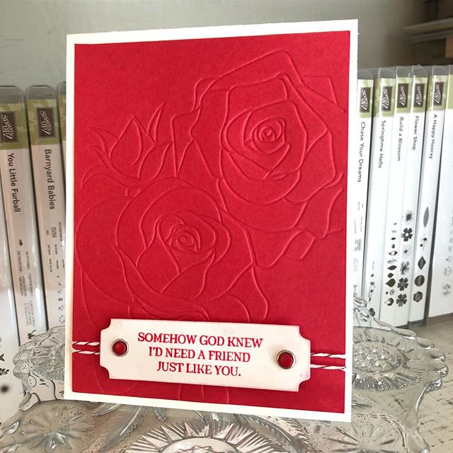
I have a lady who periodically orders cards from me and enjoys seeing whatever creativity comes through, rather than give me specifics on how she wants the cards done. Her style–clean and simple–is sometimes a challenge for me, as I naturally tend to complicate life, but sometimes it’s also really refreshing to not have to overthink every little thing. Sometimes it’s just so nice to find a few simple bits and put them together quickly in a pleasing arrangement–leading me to wonder why I don’t do that kind more often. 🙂 This “embossed red roses” card was one of those for her.
A crafty acquaintance gave me this embossed panel, so I don’t know the designer, but the sentiment, ink color, and baker’s twine are from Stampin’ Up (Rose Wonder stamp set, Real Red ink, and Candy Cane Lane Metallic Baker’s Twine, respectively). I also used Stampin’ Up’s retired Candy Dots Brads and a Thick Whisper White card base. This is one card where I feel like simple still equals beautiful in my book. I later decided to add a little red rose in one of the corners on the inside.
#thelittlewhatnotshop #forstacy #thanks #redroses #embossingfolder #kaisercraft #tagsandshapes #simpleequalsbeautiful #cleanandsimple #duplicatable #debossed

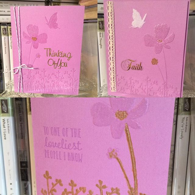
One Embossing Folder, Three Looks (Including SU Hanging Garden)

View on Instagram https://ift.tt/2GJF3Yv
Three different looks to using the same Darice embossing folder and SU Orchid Opulence cardstock. Two of the cards have embossing, and my favorite has debossing. All were glittered with Wink of Stella Clear, white, and/or gold glitter pens. All ribbon and twine is Stampin’ Up too. Sentiments are Sticko stickers, a Stampin’ Up stamp (from “Hanging Garden”), or gold Dazzles. The card with the lace has a set-on, popped-up front.
#thelittlewhatnotshop #forstacy #fordixie #darice #embossingfolders #stampinup #winkofstella #orchidopulence #etsysellerofinstagram #bakerstwine #laceribbon #coloringwithmarkers #embossing #debossing #flowers #dazzles #hanginggarden #sticko #customorders
Pat's Blog Site

One place to fit it all!

Stamp Dabbles

Donna Leonard | Independent Stampin’ Up! Demonstrator | Huntsville, AL

Niya Scrap

Démonstratrice indépendante Stampin' Up!®

From Pole to Pole

Adventures in the Land of the Pierogi

Stampin' in the Meadows

Akiko Sudano - Independent Stampin' Up! Demonstrator Downingtown, PA

Creative Stamping Designs

Karen Ksenzakovic, Independent Stampin' Up! Demonstrator in Somerville, NJ Let's make some cards!!

Stamp it up with Jaimie

Helping you find a stress free creative outlet through paper crafting.

Stamp With Amy K

Amy Koenders, Independent Stampin' Up! Demonstrator in Mendham, New Jersey...Let's make some cards!

The Daily Post

The Art and Craft of Blogging

WordPress.com News

The latest news on WordPress.com and the WordPress community.

%d bloggers like this: