Red Foxes in Winter Special Birthday Card

Back in the summer, I was asked to make a special birthday card for a special friend’s son who has a fondness for foxes—all shades and types. She gave me free creative rein and said she didn’t care what I did with the idea, but that he might like a red one. I considered several different fox stamps and stickers but finally chose a particular stamp that shows foxes in a wintry scene since his birthday was in February (“300-16 Red Foxes and Birches,” Stampa Rosa).

I’ve never really thought much about foxes in my life, other than thinking they’re beautiful animals in general, so I had no idea how to shade one. Coloring is something I’m still not comfortable with, because I feel like the concept of shading is one I haven’t begun to learn. Luckily for me, the wooden stamp I was using had a colored picture on the front that I just had to attempt to recreate! 🙂

First I had to choose the right paper, though, which evidently was not the bumpy watercolor paper I tried to stamp on first (twice). I knew that, but I was thinking of using my water-filled Aqua Painter on it and felt the paper would handle it. I liked the textured look of the watercolor paper too, but the image was too detailed to stamp cleanly with the bumps in the paper. Then I remembered Stampin’ Up’s Shimmery White cardstock, a must-have in my collection. It’s not any thicker than the rest of their cardstock (other than the aptly named “Thick” cardstock in the line), but it’s smooth and somehow holds up great with watercoloring–and it’s sparkly to boot (hence the “Shimmery” part of the name). Bonus for me was that the paper helped my snow scene sparkle.

Once I had the paper figured out and the stamp stamped correctly, I took my watercolor pencils and tried to emulate what I saw on the wooden stamp block. I had to mix a few shades to get that red fox coat color with the darker spots. After using the watercolor pencils, I took my Aqua Painter to it as planned and went back and forth between the two tools a few times until it felt right (because I have no idea what I’m doing, really. I’m assuming I’ll get better as I learn by trial and error).

After I was satisfied with the colors and the paper had basically dried, I went over the snow and snow-covered branches with my Clear Wink of Stella brush marker to bring back the sparkle to the snow that I’d ended up coloring over with the white pencil. (The sparkle shows through the color a little, but I really wanted the snow to glimmer.) Then I set aside the piece to dry while I figured out the rest of the card.

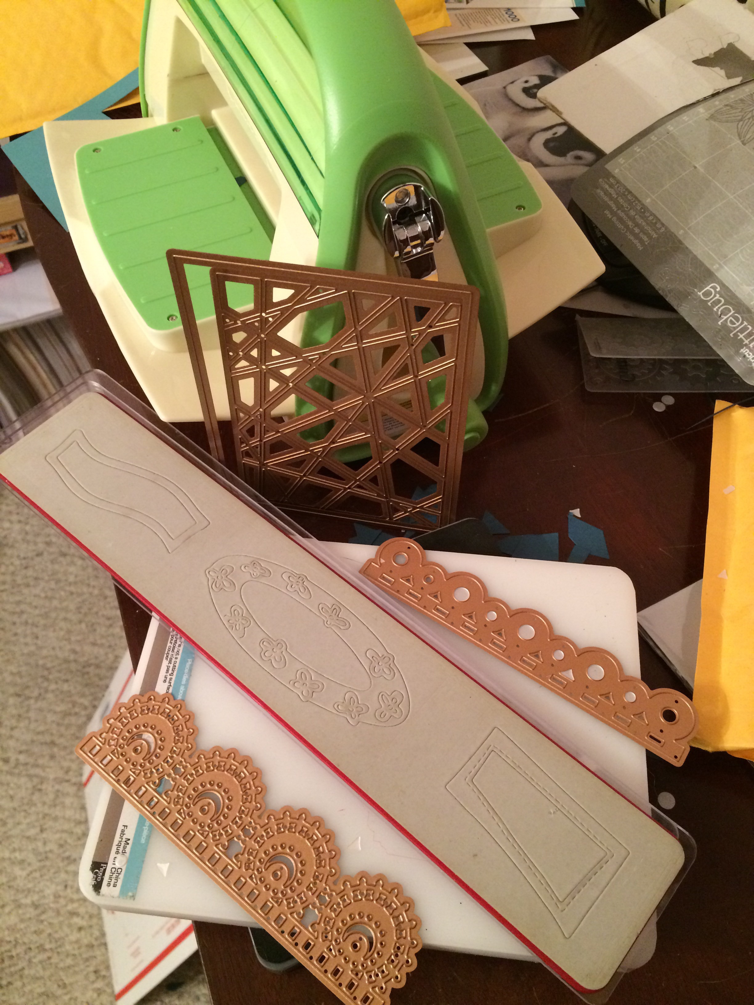
My favorite crafty thing to use these days are metal cutting dies. They’re simple, quick to use, and make things prettier or more elegant than I could come up with on my own. (They’re also faster for me than my Cricut.) I hang most of them on my wall and the back of my door on large magnetic sheets or vent covers so that I can easily walk over and try different sizes and shapes with whatever I’m wanting to cut out, rather than taking time to flip through a box and take die sets out of envelopes.

For this card, I looked at a bunch of large shapes, trying to decide whether to cut it into a type of oval or a fancy square or a rectangle. I ended up using one of my new sets from Spellbinders that hadn’t yet made it to my wall (Art Nouveau Designer Series “Water Lilies Decorative Element”), because it fit the image perfectly without making me cut it down too much (after all that hard work in coloring, I hated to do that!).

I debated whether to use a SU Cajun Craze cardstock base or a white base and which color to set off where. I ended up cutting several different colors of cardstock with the frame die to test them and see what worked. The card finally fell together color-wise when I brought in the darker wood-grain paper (SU “Country Lane” DSP) as a background to echo the dark shading in the picture. The dark complements the darker orangish-brown Cajun Craze well enough while keeping the same tones. With the white base, there was too much contrast and the frame jumped out at me rather than letting me focus on the colored image. So I ended up using a Cajun Craze base but covering the entire front with the wood grain and using a Cajun Craze frame on top and beneath the white colored image. (It’s a solid piece that gives a mat to whatever is inserted into the sides.)

This particular frame die acts like a gift card holder where the center flowers are, gently opening up and holding whatever is placed in the solid middle. That took some thinking, trying to measure and cut down the colored image so that it fit into that space under the flowers just right. The opening/middle rectangle is much larger than a gift card, but it’s the same idea…though this is only one way to use it.

The one thing I forgot to do to the test pieces was to make sure they were embossed well also. (One reason I love Spellbinders is because they have awesome sections of the dies that are intended to be embossed to give it a little something extra. I miss that feature when I use other brands.) So the embossing could have been done a little better in parts here, because I forgot to take that step to make it pop. I didn’t remember it until I’d mailed the card and noticed it in the pictures. In the photos above, perhaps you can see that the center flower pieces are more deeply etched than the corners above and below them. Next time…I shall remember next time. 🙂

My customer wasn’t picky about what to say on the inside either, other than asking me to write his name and theirs in it and mail it straight to him. So I had to dream up something based on other things she had said to me. After adding fox washi tape to the bottom of a white piece and then matting the paper onto a different kind of wood-grain patterned paper from a 6×6 pad (can’t remember which one now), I used three different stamp sets and another die to make the sentiment section. “A little expression of love” is from SU’s “Painter’s Palette,” “just for you” is from SU’s “From the Herd,” and “Happy birthday” is from MFT’s “LJD For the Boys” (part of the “Happy Birthday, Handsome” stamp). The die is among those in a retired nested set from SU called “Deco Labels.”

I used my stamping platform and its grid to line up the sentiments on the die-cut and stamp out a couple of test pieces in Cajun Craze ink to make sure they sat where I wanted them. (I had tried stamping right on the matted liner paper but I accidentally got ink where I shouldn’t have, so at that point I just had to cover it up because it was already adhered.)

After the sentiment box was stamped, I edged around the die-cut with my Cajun Craze Stampin’ Write Marker so it would stand out against the white paper. And, once again too late, I saw that the double fox spot on the washi piece. I didn’t create that intentionally; it’s just how it came off the roll. I wish I had seen it sooner; it bothers the part of me that prefers symmetry. 🙂 I also added two gold glitter hearts from MME (“Niche/On Trend Foam Stickers”) in the white space of the sentiment box.

I like how this one turned out even though it tested me at times and there are a couple of things I wish I could do differently. It’s always easier to make a similar card a second time. Maybe I’ll try to do one for the local gift shop. After all, I’m not completely convinced that winter is over with where I live.

Some of the Stampin’ Up items I used on this card are retired, but you can purchase the ink, cardstocks, and other current items through my online store if you want to try them (please use code 6WPHJ2MC at checkout unless your order is over $150). The thumbnails below will take you right there…and this is an awesome time to get them since Sale-a-bration is still going through the end of March. For every $50+ order before tax and shipping, you get to pick an item out of a select group of almost two dozen items and Stampin’ Up will send it to you for free with your order! Plus you’ll also get a free gift from me. 🙂 Please contact me if you have questions.

Thanks for visiting my blog! I truly appreciate my readers. ❤️ Have a lovely day! #neverstopmaking #mftstamps

Product List


You’re Not Old…You’re Retro! (“Free Cake” Birthday Stamp Set from Stampin’ Up)

Hopping with Amy’s Inkin’ Krew for a Birthday Theme!

Hello again! It’s “birthday month” for Amy’s February blog hop! 🙂 I’ve made a card using the “Free Cake” stamp set to show you this time.

I all too often create on a quick timeline, but I had to fly at double speed that night so I could first listen in on our team meeting (while driving home…shh!) and then get my blog link up to the group before the deadline. And I had to create the card, or at least know where I was going with it, before I could do the link. What that means is that I made a REALLY SIMPLE CARD that any of you can recreate. 🙂 #simplestamping for the win.

I guess I have a wacky sense of humor. I like puns and sarcasm and slapping-my-knee funny and maybe slightly snarky stuff. I have several stamp sets in my possession that reflect this. And I recently acquired another one—the “Free Cake” set. It is current in the 2018-2019 Annual Stampin’ Up Catalog (page 70, to be precise). I was a little torn about which combination of stamps to use, so I just had to pick one and start. The good thing about owning the stamp set is that I can make the other card percolating in my brain at any time. 😉

I’m actually making this one for our team swap, which requires me to use current products in case the receiving demonstrator wants to use it on display. This is a big one for me to remember, because I have lots of retired products at my fingertips that I still love to use too. I use things up sparingly. 😉 And I confess that the one I’m sending for the swap is actually my second attempt. I didn’t like how I forgot to turn one of the radios when I was stamping, so I redid it since it may be used for demonstration. Not that it really matters. Either card is fine. I’m merely fighting my perfectionistic streak. 🙂 (And it was such a quick card that I had time to make a second!)

I’ve used the 2018-20 In-Colors (Lovely Lipstick, Grapefruit Grove, Pineapple Punch, Call Me Clover, and Blueberry Bushel) for inks, as well as our Archival Basic Black.  I’m just now realizing that the Archival pad retired. I should have used the Memento Tuxedo Black ink. Oops. 😦 I also used the fantastic Thick Whisper White cardstock for my card base.

I’m a child of the ’80s…mostly. So I remember the big boomboxes and all the other fun things we grew up with. It is unfathomable to me how I could be so OLD already—like, practically middle-aged. Ugh. I don’t even like typing that. But I do love the big transistor radio featured in the stamp set probably because of it. I stamped with the radio rather randomly (with a bit of placement 😉 ) in most of the In-Colors mentioned above. I saved the Pineapple Punch for the stars around the radios on the swap card (though the first card has both). If I make it again, I think I’ll stamp the stars while I’m stamping the radios. It was a bit tricky to place the stars afterward. Sometimes I wiped off part of the stamp so I could work around the radios and not be stamping so many stars at once. (You should see my inky fingers!) I did also use a bit of Lovely Lipstick Stampin’ Write Marker to one of the radios on the initial card when I didn’t get it inky enough the first time, though that card is pictured at the end.

I had already decided to split the matching sentiments between the front and the back, so I knew I was going to put “You’re not old…” on the front and “you’re RETRO!” on the inside. That meant I could keep the front simple and place the opening phrase underneath the featured black radio, which I then stamped on a separate piece of paper, matted with a scrap of Classic Garage Designer Series Paper (the oil/gas can sheet), and popped up with Stampin’ Dimensionals. I chose this DSP because it reminded me of the ’80s stonewashed look up close and was also black, meaning I wasn’t featuring one color over another.

Before I glued the stamped black radio to the DSP, I distressed the white edges with my scissors first. I love the distressed look and don’t always remember to do it. But since this is a gender-neutral card and could go to men, it seemed appropriate. Truthfully, it was also because I need to change the blade on my trimmer, so I was either going to have to trim off the leftover fuzzies with my scissors or make them worse intentionally. 😂

Stampin’ Up has been asking us to create simple cards anyone can make with just a few supplies and to hashtag it with #simplestamping…so this is my first try at that. This month they, too, are focusing on birthday cards and suggested that we use only ink, paper, stamps, and some DSP…so I intentionally didn’t embellish the card further. The front was done.

For the inside, I had to add the “you’re RETRO” saying, but I didn’t want to put only the words, and I also wanted to vary how I do the insides of cards. I tend to default to a fancy-edged die-cut with the words inside and DSP scraps. To change it up a bit, I chose one of the IC inks, Lovely Lipstick, and stamped off on scrap paper first to lighten it up before stamping it straight onto the card (skewed). Then I used my stamping platform to line up the “retro” sentiment and added the “Happy Birthday” from the same set as well. I stamped the words in the Archival Basic Black again and then stamped two star bunches to frame the entirety. (For the inside of the first card, which was now being made simultaneously with the swap card, I used Grapefruit Grove ink without stamping off, and that actually turned out better because it’s a lighter color than the stamped-off Lovely Lipstick.)

I attempted to pretty up the blank envelopes as my team members do. The front turned out great with a Lovely Lipstick tilted radio and two bunches of stars near it, but the flaps–nothing but stars–gave me some trouble. They’ll pass, but I’d redo them if they were more important.

As far as that other card goes, it is not spoken for yet…though I’m tempted to give it to my also-aging brother when his day comes around. What are siblings for, right? 😂😜

The products I used for these cards will be at the bottom of the post. If I can help you order or if you need a Stampin’ Up demonstrator, please feel free to comment or email. I’d love to be of assistance. Sale-a-Bration is the best time of the year to shop because you earn free products with every $50 spent. New choices hit the website on February 15, too. 😁 You can shop with my direct store link in the sidebar.

Thanks for joining me on the blog hop today! To continue “hopping” with our birthday blog group, click the Previous button to go visit Karen Finkle…or click Next to see what Sue Prather created. Links are below as well. Happy crafting!

Previous

Next

  1. Karen Ksenzakovic – https://wp.me/paaNf4-nC
  2. Jaimie Babarczy – https://wp.me/p79UhD-2xd
  3. Karen Finkle – https://karenscardkorner.blogspot.com/2019/02/stampin-up-high-tide-for-amys-inkin.html
  4. Connie Troyer (you are here!) – https://wp.me/p8xvI6-gY
  5. Sue Prather – https://wp.me/p5yitZ-10K
  6. Mary Deatherage – https://wp.me/p5snyt-7lk
  7. Shirley Gentry – https://stampinwithshirleyg.com/?p=3927
  8. Amy Koenders – https://wp.me/p2SFwf-dpz

Product List

Cards from the Designer Tin of Cards Project Kit

Some cards from the Designer Tin of Cards Project Kit – quick and easy cards with a bit of variation.

Hello again. 🙂 I’ve had interest in a blog post about one of my birthday cards, so I thought I’d do up a quick blog post about it and a couple of others I made from the same kit.

The kit in question is the now-retired Designer Tin of Cards Project Kit from Stampin’ Up. When I was on vacation this past summer, I took an evening and mainly made up the cards the way the kit suggested, with little variations to the cards here and there. I didn’t add the sentiments at the time because I wasn’t sure what I would need them for and I didn’t have all my options in front of me anyway. So little by little I’ve been picking out of the batch and finishing them to send as needed, with some still waiting.

All my blue-and-white-and-gold ones have gone to the local gift shop for sale, and they had different sentiments. I used one of the masculine looks for my dad’s birthday. I used the banners/garlands base for another relative’s birthday and added some llama and cactus paper elements from a UK magazine I had with me. (I still have two of those bases to create with, actually.) I sent at least one of the coral hibiscus cards to the gift shop, and one went for a friend’s birthday. I used the “Celebrate Your Day” and “Sending Love” sentiments from the coordinating stamp set. I still have two coral and one masculine card to sentiment yet.

I didn’t used to be very fond of the kit idea in general because they’re usually too simple for my preferred style of details. But as I get busier, I have seen how useful they can be for when I want to send a handmade card but haven’t had extra time. Also, now that I’m constantly making cards for the gift shop, it’s been nice to fall back on ones that are faster and easier to make without taxing my design skills. I’m beginning to let go of the need to have everything perfectly perfect and just the way I like it. I simply don’t have enough time to keep up with all I’d like to do in this life. They need cards, so I must make them and not fuss around. Besides, some people really prefer the simpler, “to the point” cards rather than all the detail and fluff I like, so this way I hope to reach a bigger audience in interest. 🙂 For ones I send personally, I like to create cards with the recipient in mind. But for the shop, I don’t know who is buying them or who they are for. So the kits are beginning to work for me there. (And if any of the kits make it to the clearance rack, they’re even cheaper, which I also like.)

The kit coordinates with the Designer Tin of Cards stamp set, which I used for a few of the cards but not all. It was supposed to be used to make a filing system of cards on tabs, with the tin to hold everything, but I chose to use the sentiments rather than the tabs.

I’ve added in some of the finished cards as examples for you to see what the kit was like. Evidently I didn’t take all the pictures I should have. 🤦‍♀️ But if I find other pics, I’ll update the post with them.

The Designer Tin of Cards stamp set.
Sentiment from the “Birthday Wit” stamp set, with Pacific Point ink, gold sequins, and gold washi tape.
Sentiment from Blended Seasons stamp set, with Night of Navy ink.
Unbranded happy birthday die with blue-and-white card base, vellum, gold-edged tag, gold sequins, gold washi, white twine, and a blue flowered die-cut all from the kit. I stamped the flower on the envelope with the coordinating Floral Phrases stamp set in Night of Navy ink.
Blue flower die-cut and gold washi tape from the kit.
The only additions to the kit here were the Martha Stewart cake sticker and the gold-foil sentiment from a Spellbinders die. The kit even included paper clips!
Ink is Night of Navy. Stamp is from MSE.
In this gift-shop pic, one of the other blue-and-white ones can be seen with the sentiment “Best Wishes” in gold foil. The die is from a UK magazine. (Two other “kit cards” are also in the picture.)

Thanks for reading! If you have any questions about how I created something, just leave me a comment. 🙂 And stay tuned for another blog post about a “love” card for a blog hop. 🙂

If you need any papercrafting supplies, I’d be happy to become your Stampin’ Up Demonstrator! My direct store link is in my blog sidebar.

May your day be a happy one!

Berry-and-Blue Birthday 3D Decoupage Quilt Card

A quick decoupage birthday card I created before bedtime.

Last night I attempted to go to bed a little earlier, but I still had some time to kill before actually turning in (the brain was still restless, looking for something to amuse itself with).

I had wandered into the craft room for something else and ended up stumbling upon this Log Cabin quilt paper remnant on the desk while putting some things away. And oddly enough, there was matching SU designer series paper and cardstock right beside it in a heap intended for quilt cards for the local gift shop. Not for the particular card they ended up creating, but at least they’re being used, right?

I’ve also started keeping a new organizational system for pieces I can grab and adhere to cards quickly, trying to speed up my creative process. So before I stacked any layers together, I turned to my “Card Toppers to Use” drawer and this 3D flowered circle was the first one I pulled out. And it even mostly matches. 🙂 Just had to decide how to utilize the card front’s space.

This was the arrangement that seemed most pleasing to me – and I even ended up using a very retired color of SU cardstock for the base and middle layer as a plus! (No idea what color it is…it was an In-Color back 10-15 years ago! I haven’t researched it.)

The 3D pieces are some of my favorite ones to make. It’s so relaxing to sit there and fiddle while talking or listening to something else. And they’re pretty impressive up close.

I had a pack of gold Dazzles sentiments on my desk in the heap as well, so I cut apart a “Happy Birthday” one to make it fit better, and it went on easily. I refrained from adding any Wink of Stella or bling bits, as the card front is busy enough already.

The inside of the card is simply a scrap of border paper from a UK magazine (love those!) and a sentiment from a Studio 112 clear stamp set on top of a remnant of white. I used Stampin’ Up’s Sweet Sugarplum ink for the saying.

This card feels supremely satisfying to me. It didn’t take me long at all to create it from start to finish – maybe 20-30 minutes? – and even though I was just throwing bits of random things together, it turned out to be something pretty. I think that method is actually my favorite way of creating and also turns out my most creative works, making something out of nothing missing any semblance of sense at the start. 🙂

I’m not sure who is going to end up with this card, so it’s currently for sale if someone wants it. It may end up at the gift shop otherwise, if they like it enough. 🙂

A Mystifying Mermaid Shaker Card (with Bookcase Builder, Hardwood, Sliding Star Framelits, and Flourish Thinlits)

And this is how a unicorn led me to a mermaid.

Thanks to my niece’s unicorn birthday card, I got in a few more custom card orders. One of those was for a special mermaid birthday card. I get the craziest ideas in my head sometimes, without any inkling of how I’m actually going to accomplish them. And then, through trial and error and time and SMH-at-myself moments, eventually they come together–and hopefully I’m even pleased and kind of impressed that the whole thing didn’t flop. Such was the case with the mystifying mermaid.

I could see it in my head–a cute little mermaid on the outside of a wooden ship, peering through the porthole to see what she could see, much as I imagine Ariel would have done had she not been collecting artifacts in her grotto or spying on the dancing taking place on the deck of Prince Eric’s ship. The trouble was that I didn’t quite think through all the steps of just how to create it.

The ship wouldn’t be a problem to create, as I own the Stampin’ Up Hardwood stamp (current catalog) and the porthole and mermaid were only going to be so big (I didn’t have to create the entire ship). I began by cutting down a piece of Stampin’ Up Chocolate Chip (retired) cardstock to 6″x12″, scored it 6″ up, and folded it. (And then shortly thereafter I cut down that card base to 5.5″x5.5″.) I used SU Early Espresso ink (current) to stamp overtop the Chocolate Chip so the wood grain could be seen. I then looked at several circle dies on my die wall and decided that the double-circle die from SU’s “Sliding Star” Framelits (retired) had the spacing I wanted for the porthole. I centered the die on the now-smaller card base, put another piece of cardstock behind the card base so the marks in my die-cutting plate wouldn’t transfer to the inside of my card base, and ran it through (forgetting until then that the die would cut through both the base and the extra piece. Oops! Goof #1!).

(Side note: There are at least two ways to create a shaker card. The way I know best, I didn’t do. It would have been easier to cut a separate 5.5″ piece and make that the porthole piece with foam strips rather than cut through the base and do it all backward. But I didn’t think that far ahead. Goof #2.)

Once I had the hole cut into the card base, I had to make the porthole cover, which would need to extend over the hole slightly. I went back to my Chocolate Chip cardstock to find a remnant that would fit, placed the die on the paper, and traced around the inside circle. Then I grabbed one of my most favorite and very old tools (a layering tool from Stampin’ Up from waaaay back), put the smallest layering circle against the die, and dragged it around the die with a pencil through the center of the layering circle (it rolls around objects to make slightly larger mats). Then I cut the now-slightly-larger circle out of the cardstock by hand. Once I had both circles cut, I embossed the new porthole with a wood grain embossing folder, decided I wanted the debossed side up, marked where the mini brads should go, punched the necessary 1/16″ holes (it’s easier than forcing brads through the paper by hand), and placed my chosen brassy mini brads in their spots. And then I glued the porthole onto the card base.

But that still didn’t get me the shaker feature. And that’s when I realized that I was once again taking the hard road by not doing the way I already know (albeit not well). So I conferenced with my friend E, who happened to be on video chat with me while I crafted (there are some days I love technology!). And she proceeded to explain to me how to use my much-desired Fuse tool that I’d purchased, longed to use, put off using, and then started looking at in a rather intimidated fashion. Apparently one can make shaker pockets with a Fuse tool! I’d heard that somewhere but had never attempted it. And fortunately for me, I’d happened to find some Fuse Project Life pockets on clearance the last time I went to JoAnn Fabrics. Even better, I found them in my craft room without too much looking.

While the Fuse warmed up, I revisited the shaker elements I’d gathered a few days prior–different colors and shapes of sequins (the stars reminded me of starfish, and the gold, clear, and rose were the perfect shades); seed beads in clear and marine colors and clear Stampin’ Up microbeads (retired) for space in the shaker pocket; leftover gold, green, and red long confetti flakes from a Stampin’ Up card kit; gold, white, and green mica flakes (that I’d never tried using); gold glitter hexagonal flakes; and some white Rock Candy Distress Glitter from Ranger. I spooned various quantities of these things into the pocket–and put in too many (goof #3?)–but actually managed to work the Fuse tool correctly on the first try. The second try wasn’t as good, but I’ll practice now that I’m no longer scared of it. 🙂 I cut away the excess of the filled shaker pocket and asked E how to hide the thing in the card.

Since I wanted my mermaid to be looking at something inside the ship, I cut a large circle in a lighter color and stamped the background of a bookshelf and human objects with SU Bookcase Builder (retired), which would be seen through the shaker pocket; then I glued that to the back of the acetate piece in what I hoped would be the right position (since the shaker elements would and did move around). Then I took another remnant of Chocolate Chip cardstock, placed foam dots around the edges, and put it overtop the background and shaker pocket. And then I breathed a sigh of relief, because the thing actually shook around the way it was supposed to, even if I did probably put too much in it. I was hoping it would look like the outside of the porthole had collected some sea stuff there on the ledge as it moved through the water…but Miss Mermaid got what appears to be the amount that collects in a shipwreck! Oh well. Live and learn and stuff another envelope later.

So my porthole was done–and I’d previously colorized my little mermaid and her friends with watercolor pencils, an Aqua Painter, Adirondack Dimensional Pearls, Stickles, Nuvo Glitter Drops, and Distress Glitter Stickles. I’d actually tried to stamp her tail on some very nice flaked cardstock that reminded me of scales, but that didn’t work like I’d thought it would (and I should have known better anyway–another goof), so watercoloring and two layers of glitter glue ended up working for the tail instead. I fussy-cut them all out, glued the mermaid to the card front in between two of the mini brads in the porthole, and started trying to figure out my seaweed issue. In my head, I saw things floating near her on the outside of the ship, like her friends or the occasional sea life. I ended up with more things there than I’d intended, but I think it’s cute anyway.

I found some retired Stampin’ Up ribbon in Emerald Envy, Pistachio Pudding, and Coastal Cabana that was ruched or ruffled, so I thought that might work for seaweed. I didn’t think I had any seaweed dies or stamps–but I found dies that would have worked better after the card was done (goof #5). Too late. So I trimmed up the ribbon (cut some of it in half and twisted others) and found some greenery dies on my wall that I thought could pass for seaweed. I used a couple of miscellaneous green vellum sheets of paper with the dies and then attempted to glue them all together with Zots and Tombow Multi (green and white) Glue.

But I couldn’t stop there. I had to add beads and microbeads and mica flakes to the outside bottom edges too. The inside of the shaker can’t have all the fun. Plus, I was hoping to hide some of the glue marks on the vellum pieces. 😀 I also found a little gold heart die-cut for the mermaid to hold, a gold compass for the inside of the card, and a black-and-gold die-cut anchor piece inside a random pack of travel/beach die-cuts I’d just received. I let it all dry overnight but had to go back in the morning, shift a couple of things, and reglue. My twisted seaweed had righted itself, and one of the taller seaweeds I’d cut by hand was tilting precariously.

After the front was done, I had to do the inside. Thanks to guidance from the client, I knew which sentiment to use. I had just enough green vellum remnant left to cut out a tag that had a wispy or ocean feel to it, and I stamped the “Wishing You Oceans of Joy” sentiment from Elizabeth Craft Designs with SU Lost Lagoon ink (not normally something one can emboss with–goof #6). But it held okay on the vellum, at least long enough for me to pour Green Tinsel embossing powder over it and heat it all. It joined the compass on the inside of the card and I resisted the temptation to create more seaweed or pour more microbeads onto something. 🙂

I probably spent far too long on this card, but it was fun to work with the vision I had in my head and see it all come about. Now I just have to hope that the little recipient doesn’t shake off all the beads immediately!

A Special 3D Decoupage Unicorn Birthday Card (with Magical Day and Beautiful Peacock)

A Special Unicorn Birthday Card for a Special Birthday Girl

I’m on book deadline again, so I haven’t had a whole lot of craft time, but when one’s only niece is turning another year older and one is attending her party, one must also make a special birthday card.

The kiddo loves horses, so I remembered just in time that I had an internationally printed sheet of dry decoupage with a unicorn on it. Close enough, I hoped. Besides, who doesn’t love unicorns right now? And even better, making the decoupage card was simpler than dreaming up something new. I’d been having trouble deciding which direction to go anyway. These decoupage pieces make fabulous card fronts once they are put together. There’s not usually room for much else.

Unfortunately, this particular unicorn was not one of the easy, perforated, die-cut ones. I hate trimming off those little bumps, but they sure are faster. So I attacked this unicorn with my best CutterBee micro scissors and went to fussy-cutting. After that, I cut or attached appropriately sized pop-up (foam) pieces. I used the Stampin’ Up ones for this project, both the regular hexagon size and the mini hexagons. And when I needed smaller bits for the legs, I just cut one down to what I needed. The trickier part is lining up all the cut paper layers so the ones beneath don’t show. I may or may not have completely succeeded at that. 🙄

Once the unicorn was cut, fastened, and done, I just had to choose complimentary paper and cardstock. Kiddo also loves purple, I was told strongly on her birthday wish list (another reason this unicorn would work, because of the background). The Marvelous Magenta cardstock color was one of the best color-matching choices for the card base from my stash, and I had already pulled the ombré teal/purple geometric-patterned paper from a Recollections pad a couple of weeks ago, in case I wanted to use it for her card. I stumbled upon it again just in time. I rummaged a bit through my specialty paper drawer (a special unicorn for a special birthday deserves special paper, right?) and found a glittered corrugated cardboard/cardstock I’d never had the right feeling about before, and then I found a soft pink-and-purple paper that felt like it could be mulberry paper or handmade paper. Had to be extra careful not to crease it – they won’t come out! I decided how I wanted to layer them and cut each slightly larger than the last, for an A2 card base size. I cut the glittered cardboard from behind so I didn’t dull my blade – and I had to trim off the side fuzzies from the soft paper after I cut it.

I adhered all the layers together with my ATG tape gun, hoping it would hold over the glittered piece (so far, so good)…and then I sat back, looked at it, and wanted to tinker. I ended up using my clear Wink of Stella glitter pen on the unicorn’s mane and tail. It’s super difficult to see in photos, but it dried nicely and is visible in person. I didn’t think there was enough room for a birthday message on the front, and I didn’t want to interrupt the beauty of the scene, so I didn’t add anything else.

For the inside, I found a square piece of white cardstock laying in the random remnant pile that seems permanently next to my desk, but it wasn’t quite long enough, so I just trimmed off more geometric-patterned paper to put underneath it. It tied in with the front that way anyway. Then the square white piece looked too bland, so I took an old Marvy corner punch to all four corners.

I had thought about a different inside sentiment, but time was ticking and bedtime should have already been, so I went looking for something I wouldn’t have to custom-create. I had been reminded earlier in the day from Pinterest or one of my crafty FB groups about the “Magical Day” sentiment from a stamp set of the same name, so I figured a unicorn was “magical” enough to make that work. And the “Beautiful Peacock” stamp set from SU was right next to the first one on the shelf. So the “Today is all about you” line became a birthday sentiment. I used my Tim Holtz Stamping Platform to line up and stamp the two sentiments. Thankful I did, too, because I had to reink both. Then, just for good measure, I hand-stamped an 11 on the inside because I usually put what year she’s turning on her cards. I had just gotten that number stamp set free from White Rose Crafts LLC in my order with them. It arrived that day! So much fun when that happens. 😁

Cardmakers seem to remember to decorate the envelopes more frequently than I do…but I remembered this time! And I love how it turned out. I stamped the unicorn and the stars from the “Magical Day” stamp set in SU Coastal Cabana and Marvelous Magenta inks to match. I definitely need to remember to decorate them more often.

So there we have it, something that took me about two hours in the middle of the night – it looks crazy simple, doesn’t it? But the decoupaging can take some time to cut and fasten together if fussy-cutting is required. It’s okay. I enjoy it, and she’s more than worth it. ❤️

***

Card Kit Pieces–“For Someone Special” Birthday Card

View on Instagram https://ift.tt/2IUOyVz
Glittered pieces, stickers, die-cuts, and pop-up dots make a simple but fast card thanks to a kit I dipped into. #thelittlewhatnotshop #forstacy #birthdaycards #quickandeasy #icecream #forsomeonespecial #cardkit #customcardorders #thankstodeb

House Mouse “Musical Mice” Birthday Card

A musical birthday card for a musician celebrating a milestone year.

I took a break from Christmas cards to do up a few birthday cards that I needed to deliver or mail. One of them went to my aunt, who is a supremely talented pianist. I had thought of using this focal image for her ever since I first got my hands on this cute House Mouse stamp. 

I grabbed a premade base that was of a larger size, since the stamp itself is basically the size of an A2 card front. No room for the music note paper I wanted to use behind it. But this larger card size worked well for the idea. 


First I put down a layer of silver foil cardstock (cutting out the inner portion with snowflake and winter-themed word dies that I can use on other projects). The music paper I placed on top is from Echo Park’s “Be Mine” line. I then stamped, colored, and cut the House Mouse image so I would know what size to cut the Silver Glimmer Paper (glittered cardstock) from Stampin’ Up, which I placed behind the image as a mat. 


I think I might need to work on my coloring skills, or at the very least shading, but I’m pleased enough with my creation. 🙂 I used three sets of watercolor pencils, an AquaPainter, and Ranger’s Jet Black Archival Ink to stamp and color the image. I topped it off with some gold Smooch Paint for the knobs on the violin and the lettering of “Mauschen,” the name of the piano. I had looked up the stamp online and found the colored image from House Mouse, so I tried to imitate those color choices. (Each of the mice are named and has their own coloring specifications.) I think next time I might try a black piano, however. 

I had the most trouble finding and placing a sentiment on the card due to limitations in space and supplies. I had to revise my initial idea several times, and the more I hurried to finish it (since I needed to be leaving the house), the worse it got. Isn’t that always the way of it? Eventually something worked, although I realized an hour later that I’d forgotten to include the milestone number she was turning, as I’d intended. But maybe she doesn’t need that advertised. 😉 

So, the tag is from the American Crafts “Everyday” line, the “Just a Note” sentiment is from Rubber Cottage, and I couldn’t read my handwriting on the back of the tiny music notes I added to the tag, so I can’t say who made that. The black lace ribbon is from Stampin’ Up. I stamped the sentiment with Jet Black Staz-On ink because the tag was chipboard with a shiny top and water-based dye inks just wipe right off of those. I used my heat gun to speed up the drying process as well.


The inside of the card finished the thought begun on the front (“Just a Note”) with “Wishing You Happy Birthday.” Again not quite what I’d intended to say, but time really was of the essence, so I made do with the first couple things I found rather than creating a custom sentiment. And I’m the only one who overthinks these things, so it probably doesn’t matter. 🙂 The stamp sets I used for the inside are from Stampin’ Up (“Wrapped in Warmth”) and Close to My Heart (“Gracious Greetings”). I also embossed piano keys for the bottom border. The embossing folder I used is 5×7 and entitled “Keyboard,” from Cuttlebug. 

Coloring always takes a bit of time, and I really do need to perfect some shading skills (here’s wishing I could go back to art class), but I’m generally pleased with the images once I’m done. I always enjoy seeing how the lines swirl and blend together when I’m watercoloring. Perhaps I’m really a Renoir at heart. 😉 

That’s all for this birthday card. The others I created were simpler, of course. But details are my specialty. 🙂 Thanks for reading!

Nuts and Bolts about You Birthday Card

I’ve been on book deadline this past week and will be again next week, so I haven’t had much time to play in the craft room even though I have several cards I need to make and send out. I finally HAD to make time to squeeze in one for my nephew’s birthday since the party was tonight.

My day wasn’t going that well, honestly. I’ve felt better physically, I’ve thought more coherently, and it seemed like I had a case of the dropsies, where I couldn’t hang onto things with my fingers. Imagine crafting when you drop every other item. Those are the days I pick up a book or occupy myself otherwise instead of crafting. But for this card. Regardless of how frustrated I was, it wasn’t making itself.

I had heard from his mom that nephew is now interested in robots and how things come apart and fit together, as a budding engineer would. 🙂 One of my best friends just happened to give me robot stickers for my birthday (surprise gift of 20+ sticker packs?! Yes, please!). So of course they were perfect to use for his card. (They are from Jot, btw.)

I’d been thinking of how I wanted to lay it out all week. I have these awesome gold metal gears that I thought would look great stacked and staggered in a couple of corners, and I couldn’t wait to use them. Well, even though I saw them recently, I still have to wait to use them, because I can’t figure out where I stashed them. And that was just the beginning of the frustration. Alas, some cards go like this.

 
I had to use a bigger card base because I wanted to use both the robot and the robot dog on the front of the card and they weren’t fitting on an A2 OR a horizontal card because of the height of the robot. I also had plaid paper of cream, brown, and teal that I thought would work with the teal and brighter colors of the stickers, along with a tan piece of embossed gears a crafty friend had sent me…but in the end I couldn’t make the sizing work for the plaid. I ended up using a Spellbinders card creator die (that didn’t release all its pieces, so there I was taking my CutterBee scissors to them even though I ran it through the Cuttlebug three times…), and I added in one of my new Spellbinders edge dies that I hadn’t had a chance to use yet. (It had fallen off the wall and when I picked it up, I realized it sort of looked like gears too. Why not use it? I actually tried two of those edge dies, but the one with frosted vellum did not work at all – it kept moving on me and I couldn’t get a whole one. I tossed it out of the running.)

 
I put the die that did work in a metallic foil cardstock, which turned out well. Didn’t fully cut again, but I liked the look even with the additional pieces.

So there I was with my SU Not Quite Navy cardstock mosaic die-cut piece on top of the embossed tan gears, both hovering above the 5×7 green Moroccan-patterned card base. NOT what I had imagined for this card. (I only have ten types of premade card bases. I often make my own, but whatever was the shorter route to finishing the card had my vote today.) I decided to fill in some of the mosaic holes I’d already taken out, thinking it would look better. I really wanted to add in a red color to the mosaic but didn’t want to fight that die again, so I went on. Looking at the combination of those four elements almost made me nauseated, but I’d taken too long at that point to reverse direction. It was time for robot stickers. And then to look for a balloon so the robot didn’t appear empty-handed – plus I wanted to fill in some of the space below the sentiment but above the dog. The brand-new sticker pack that held my balloon then stuck to the inside of its plastic, so I’m not sure how many of those are even useable any longer. But at least the balloon didn’t suffer.

The sentiments were the easiest part. Finally, something going right! I stamped four different ones and didn’t mess up at all, even with my cloudy thinking and growling stomach. So that tells me I’ve actually improved on my stamping. Practice makes perfect! I used SU Basic Gray Archival ink and the SU Sunburst Sayings stamp set for the “It’s your day” stamp inside the stitched wonky square Sizzix die journaling box in the “Frames” strip of three dies, adding in the red color there and hoping the ink would be dark enough to cover it. It worked! All that was left was a number on the balloon and a metal photo holder with brad for decoration. 

It’s hard to see, but the robot and dog are actually popped up, as is the wonky square sentiment. And the balloon is a puffy sticker from SandyLion (PFOM10). I was thankful I wasn’t mailing the card.

I moved on quickly to the inside, since I was supposed to be leaving my house for the party right about then. Stamped all three correctly in Basic Gray Archival ink and SU Lost Lagoon ink (hooray! No wasted time or covering up mistakes!). The “Happy Birthday” stamp is from Stampin’ Up’s “Birthday Blast.” “I’m Nuts and Bolts about You!” and the random nuts and bolts pattern I used as a border are from Stampendous/Fran’s (SSC1033). This is the second time I’ve used the Fran’s set and I like it very much.


(As usual, I forgot to take the picture BEFORE writing something on the inside.)

Sometimes I create well under stress and deadline. Not so today. I think parts of this card are really cute. I would rather have the chance to redo some of it, though. But I must move on. I am not perfect and neither is my work, and I have other cards I must do. After next week’s deadline. (Dottie, if you’re reading this, your very overdue thank-you note IS coming!)

Thanks for reading. Time to “hit the hay.”

Here are pics of some of the supplies I used.

Pat's Blog Site

One place to fit it all!

Stamp Dabbles

Donna Leonard | Independent Stampin’ Up! Demonstrator | Huntsville, AL

Niya Scrap

Démonstratrice indépendante Stampin' Up!®

From Pole to Pole

Adventures in the Land of the Pierogi

Stampin' in the Meadows

Akiko Sudano - Independent Stampin' Up! Demonstrator Downingtown, PA

Creative Stamping Designs

Karen Ksenzakovic, Independent Stampin' Up! Demonstrator in Somerville, NJ Let's make some cards!!

Stamp it up with Jaimie

Helping you find a stress free creative outlet through paper crafting.

Stamp With Amy K

Amy Koenders, Independent Stampin' Up! Demonstrator in Mendham, New Jersey...Let's make some cards!

The Daily Post

The Art and Craft of Blogging

WordPress.com News

The latest news on WordPress.com and the WordPress community.

%d bloggers like this: