“Be the Change” with World of Good Memories and More Card Pack

Hello there and thanks for stopping by my blog! I’m sorry I’ve been quiet lately; I’ve had too many projects and people to please recently. (You all knows how that goes, right? Maybe I’m not the only one? 😂)

I haven’t had a lot of time in the craft room this month but I did sneak in there a couple of evenings recently to try to finish a batch for my local gift shop/employer. I’ve done a few grad cards and some easy cards. Here’s an easy one you can duplicate if you have or can find the World of Good Memories and More Card Pack and the Flowers for Every Season Cards and Envelopes.

I used a piece of Misty Moonlight cardstock for my base (A6 size) first and then picked the large foil-globe card and the smaller 3×4 “Be the Change” card out of the card pack. I adhered the largest card with my preferred glue, and then I measured (yes, I actually measured!) and punched 3/16” holes in the corners for some 3/16” gold brads. Once I had the brads fastened, I popped up the card on foam dimensionals. And that was it! I used a Misty-Moonlight-lined envelope from the Flowers for Every Season Cards and Emvelopes and called it done. 😂 I guess simple and easy really is the best. (The next post about a fancy grad card I did this week will be the opposite!) Most of all, I liked the sentiment on this card. I think it could even be used as a grad card, a masculine card, or one of encouragement. Thanks again for visiting, and stay tuned for more when I get time!

Masculine/Unisex Card with Stampin’ Up’s Come Sail Away Memories and More Card Pack for Stamp with Amy K’s Tuesday Blog Hop

team blog hop logo

Hello, and welcome back for my post joining Amy’s Inkin’ Krew Tuesday Blog Hop for May! This time we’re focusing on cards for the men or boys. I intended to make mine a masculine card (and it has been approved as such), but I’ve also been told by three women that it is “pretty.” So I guess it’s up to you as to how you feel about it. Feel free to leave a comment and let me know. 🙂 Maybe I’ve finally achieved a perfect unisex card! 🙂

I first got the idea by thumbing through the remaining double-sided cards in my Come Sail Away Memories and More Card Pack (#149552), which has been put on the retiring list (first come, first serve, and they won’t last long!). I really love this card pack and am sorry to see it go. Since I fulfill orders for a gift shop (with a second shop upcoming, after things finally return to some normalcy), I’m always looking for quick and easy cards I can make. Even though I love fussy details and spending agonizing amounts of time on card masterpieces 🙂 I do have to create some that are just simple and fast. So when I saw this 3″ x 4″ “Any Day with You Is the Best” Project Life–style card, it just worked. I quickly found a matching 4″ x 6″ background piece that matched it, and then it was just a matter of finishing with details.

img_2798.jpg

I have three sets of retired or almost-retired “Cards and Envelopes” pack that are card bases and matching envelopes that I keep dipping into. For this card, because the shades in it are grey and black, a white card base and envelope from the retired Whisper White Large Memories and More Cards and Envelopes pack looked the best.

To add a layer before gluing everything together, I considered using Stampin’ Up’s retired Corrugated Cardstock between the two paper pieces, but it just didn’t look right, with stripes going both ways. I chose some lightweight mulberry paper I had in my stash, instead, tearing it to leave a border around the smaller card. And then I found my roll of retired Halloween Night Baker’s Twine, which is entwined Basic Grey and Basic Black colors, so I looped it around vertically twice and tied a bow. There still weren’t enough details to suit me and just a little more white space to play with, so I used my last remaining large adhesive heart sticker from the retiring Heart Epoxy Droplets (#148583) under the words on the front piece and then added four frosted gems from the Frosted & Clear Epoxy Droplets (#147801), which is carrying over to the new catalog (hooray!).

I haven’t decided what to put on the inside of this card yet, so it’s still blank for now. I’m open to suggestions if you have a fit of brilliance. 😉

Somehow I did manage to use both retiring and current products in my card, which is the theme of month for our team on our private Facebook page. 🙂 But this is a good example of why I keep or buy up retired products too, when I can get them. I literally use them for years on all kinds of projects. (And yes, the floor may fall through my craft room soon, as my husband fears. But then my craft room would be bigger! 😉 )

If you love a good sale like I do, please feel free to take advantage of the lower prices of the limited retiring stock (or carryover goodies) on Stampin’ Up’s website by shopping through my personal link at https://www.stampinup.com/ecweb/default.aspx. Supplies really are limited and things are already selling out. Use host code 6EFSC3TZ and get a free gift. (If your order is over $50 before tax and shipping, you can choose an item of up to $8 and I’ll ship it to you as my thanks, and you’ll earn one reward point toward a free $40 order. If your order is over $150 before tax and shipping, do not put in the host code because you’ll earn your own rewards before you confirm your order.)

And because my team is so awesomely creative, you’ll want to “hop” through the rest of the list to see what they’ve made for men or boys this month. (If you want to join my team and become a Independent Stampin’ Up Demonstrator like us, go here: https://ida.stampinup.com/en/?demoid=2202334.) Thanks for joining us today!

Press the Previous button to view Karen Finkle’s project or the Next button to see what Akiko created for us!

Previous logoNext logo

  1. Mary Deatherage – https://wp.me/p5snyt-cPT
  2. Karen Ksenzakovic – https://wp.me/paaNf4-2ap
  3. Sue Prather – https://wp.me/p5yitZ-1Ua
  4. Jaimie Babarczy – https://wp.me/p79UhD-3Rf
  5. Leslie Larkin – https://leslielarkin.com/friend-like-you-bundle
  6. Karen Finkle – https://karenscardkorner.blogspot.com/2020/05/stampin-up-tropical-oasis-masculine.html
  7. Connie Troyer – You are here!
  8. Akiko Sudano – https://wp.me/paOv8E-1bb
  9. Julie Johnston – https://wp.me/p8SzmQ-2kc
  10. Terry Lynn Bright – https://wp.me/p8fxPh-tt
  11. Amy Koenders – https://wp.me/p2SFwf-juR


“A Good Man” Stamp Set with Seaside Spray In-Color for Stamp with Amy K’s Tuesday Blog Hop

A masculine card for use during Father’s Day (or any day!) for Stamp with Amy K’s Tuesday blog hop.

img_9128

Hello again and welcome back to my blog—or thanks for stopping by if you’re a new visitor! The theme for Stamp with Amy K’s current Tuesday blog hop is “masculine,” so I decided to create two “Father’s Day” type of cards that can be used at any time for the guys in our lives. Since they are going to my local gift shop for sale, I needed to create something that didn’t explicitly say “Happy Father’s Day” (best for a longer shelf life!).

I’ve used all current or upcoming products that are available on June 4, when Stampin’ Up customers can order from the new catalog. I was able to preorder some things because of my demonstrator status. So I’m using stamps from the new cling set “A Good Man” and one of our brand-new In-Colors, Seaside Spray (only available for purchase June 4, 2019 through May/June of 2021).

Seaside Spray is a gorgeous color that reminds me of a smoky blue. It’s one of the shades in my valances, actually, so I have a feeling I’ll be using this color for years to come even after it retires. 🙂 And “A Good Man” is one of those casual, contemporary sets that have a sketched look to the images, with some slight distressing on the sentiments.

I began each A2 card with a Seaside Spray card base, taking an 8.5×11 piece of cardstock and cutting it in half. I wanted to use two of the colorable images in the stamp set, one on each card, and quickly figured out which rectangles my chosen images would fit inside in my new Stitched Rectangles die set.

I stamped each colorable image in Memento Tuxedo Black ink and die-cut the first rectangles. Then I colored them with some of our Alcohol Blends: Dark Mango Melody, Dark Old Olive, Dark Smoky Slate, Dark and Light Basic Black, Ivory, Bronze, Dark and Light Shaded Spruce, Dark and Light Balmy Blue, and Dark and Light Real Red. (I need to get a dark blue yet, so I had to color all pants in various shades of black and gray.)

Seaside Spray isn’t one of the colors I own in the Blends yet either, so I used Light Balmy Blue for the sky and border, hoping it would look all right. Turns out it does sometimes…but not if there’s a lot of concentration. I filled in the background of one of the images but left the other white. I wasn’t sure which way to go. Tell me which one you like best. 🙂

Next I die-cut other various-sized rectangles from the Come Sail Away and Perennial Essence Designer Series Paper packs and and staggered them with the images and sentiment block.

I also carefully edged around the border of one of the die-cut, colored images with my Balmy Blue Blend. I wanted to do something in the corners the way I would dye ink, but I didn’t trust myself enough to try it with the Blend. I’ve had to redo enough this evening. I’m actually pretty pleased with how the edging turned out. It was easy and looks clean and simple. I liked it so well that I did it on the second card too, with a Night of Navy Stampin’ Write Marker (but it was much easier to accomplish with the Blend, at least tonight!).

After I placed the sentiment block and glued the rectangles for the first card, I added three Heart Epoxy Droplets to two corners to finish the card.

And here is where I have to confess something. Two things, really. I lost a stamp before I finished my cards or this blog post. Specifically, I lost the main sentiment for the front of the cards. I have torn this room apart, searching through my trash can, cleaning off my desk and the cart next to me, checking my clothes…. It still hasn’t turned up. (Please tell me I’m not the only one this has happened to!) I can attest that the new cling stickers are really sticky, because I had the stamp rubber-side down in the case with the sticker facing up so I could quickly grab it and stamp it after I was done with the inside pieces. I’m certain it’s stuck to *something*. 🤦‍♀️ So... Sigh. I handwrote the same sentiment in a similar kind of font and lightly stuck it to the card—for this blog’s purposes only—where the real sentiment will be stamped in Night of Navy ink on Seaside Spray cardstock. When I find it. Humor me, please. (If I can’t find the stamp eventually, I may just have to repurchase this set because that pair of sentiments is essential!)

This card has now also convinced me that I need to get the Subtle 3D embossing folder. The background still needs something. I thought of stamping too late, after I adhered the rectangles. I’ll pretend I’m going for “clean and simple.”

The first card.

Another angle, showing the hearts a little better.

And now for my second confession. My roll of Night of Navy/Sahara Sand Baker’s Twine has gone AWOL as well. (I’m betting the cat did it. She’s been known to do so.) So I’m using most of the piece of twine that I snitched at OnStage for my Come Sail Away card I finished later at home. I also cut card #2’s heavy-striped piece of Night of Navy/Whisper White DSP the wrong size…and that was after I spilled ginger ale on four newly opened papers and cut out the wet sections. 🙄🤦‍♀️ Trust me, if I can make cards I’m proud of with all this chaos, anybody can!

So this is what I refigured for the second card, after some challenges (like the fact that I had to use the Color Lifter too, even before I cut the striped piece incorrectly). I used Linen Thread at the bottom of this one. I felt I needed to separate the Balmy Blue Blends background from the Seaside Spray cardstock because, for me, the color difference was too much to have them next to each other. My first thought was to have the striped paper cover the entire card front, but obviously that went awry. I decided that the mistake wasn’t so terrible as to have to redo that too (and I sort of hated to cover up all that beautiful new In-Color anyway), so I just went with it. I hate wasting paper. (My apologies again for the handwritten sentiment. It will look so much better with the real one….)

The gift shop card.

The insides of both cards are identical, and they went so much smoother than the rest. I was even watching a TV show while I stamped. (That does it—I should always watch TV while crafting. But not in the dim light, because I think that’s when I lost my stamp.)

So that’s it for me tonight. It’s time for bed. Thanks again for stopping by my blog! So sorry about all the mishaps. Some nights just go like that.

If you’re interested in receiving a catalog, I’d love to send you one. Just drop me an email with your info using my Contact Me form.

If you want to continue the hop to see what the rest of my fabulous team members made, click the Next button to see what our fearless leader, Amy Koenders, has made, and if you’d like to go backward instead, click the Previous button to visit Sue Prather’s blog.

  1. Karen Ksenzakovic – https://wp.me/paaNf4-Bn
  2. Terry Lynn Bright – https://wp.me/p8fxPh-80
  3. Jaimie Babarczy – https://wp.me/p79UhD-2Pa
  4. Mary Deatherage – https://wp.me/p5snyt-88U
  5. Karen Finkle – https://karenscardkorner.blogspot.com/2019/05/stampin-up-wood-textures-dsp-for-amys.html
  6. Akiko Sudano – https://stampininthemeadows.com/?p=462
  7. Shirley Gentry – https://stampinwithshirleyg.com/?p=5240
  8. Sue Prather – https://stampwithsueprather.com/?p=4744
  9. Connie Troyer – https://wp.me/p8xvI6-nm
  10. Amy Koenders – https://wp.me/p2SFwf-frW

A Masculine Card with the Come Sail Away Suite (2019-2010 Annual Catalog–Sailing Home stamps)

Let’s all say hooray that I can finally blog again! I started this masculine card while in Charlotte at OnStage with Stampin’ Up in mid-April but didn’t finish putting it together until the preordered corresponding dies arrived at my house after vacation and I had some time to do sit down with them. The Stampin’ Up team gave us precut pieces in a kit to use with supplies on the table, though we could change it any way we wanted to. I did end up varying my card a little from the picture they included with the kit.

This card features the Come Sail Away suite, which will be new in the 2019-2020 Annual Catalog (available to customers June 4). What I used from the suite is the Sailing Home Stamp Set, the Smooth Sailing Dies, some of the Come Sail Away DSP, the Sail Away Trinkets, and a bit of its Sahara Sand/Night of Navy Baker’s Twine. The suite itself also includes the Come Sail Away Memories and More Card Pack and the High Seas 3D Embossing Folder—and let me tell you, this suite is awesome. I will be making up some cards with the Come Sail Away Memories and More Card Pack soon as well (there are laser-cut specialty cards in the pack of 50 double-sided cards!).

New cling stamp set available June 4.

The stamps, dies, twine, trinkets, embossing folder, and Designer Series Paper. A must-have!

The cards in the Memories and More Card Pack…one of my all-time favorites! Look at those laser-cut designs!

These trinkets are flat enough to mail and lightweight!

So, for this A2 card, I glued some Come Sail Away DSP onto the card base first and then placed the smaller piece of DSP cockeyed at an angle for its position behind the focal piece. For that focal piece, I used Balmy Blue ink with an AquaPainter to create a light wash of blue sky in the background (technically I did that last, but it’s smarter to do it first).

I stamped the lighthouse onto the Whisper White focal piece with Night of Navy ink and then stamped the compass off to the right of it with Early Espresso ink the way the kit photo suggested. Then I stamped and fussy-cut another lighthouse on scrap Whisper White and placed it atop the first one with foam dots so it became 3D. (The kit also suggested we add a die-cut ship’s steering wheel here with the lighthouse/compass/sentiment area, but I moved my wheel to the inside of the card instead—and left plenty of room for an overdue message.)

I stamped three flying birds in Tuxedo Black Memento Ink in the sky and distressed the edges of the Whisper White piece with a distressing tool. Then I die-cut a piece of rope with some dark brown (Soft Suede?) cardstock to lay across the bottom under the lighthouse (it embosses while it cuts!), and I die-cut a sentiment spot out of Balmy Blue cardstock after that. The sentiment die has a wonderful dashed or stitched outside border that is pressed into the paper as it cuts the die-cut.

I then stamped the sentiment (“Let Hope Be Your Anchor Through the Storms of Life”) in Balmy Blue. Since this is a cling stamp set, it is much easier to line up visually, so the stamping went well the first time through, even if I probably should have used Night of Navy ink instead. 😉

To finish off the card, I tied a bit of the Baker’s Twine through one of the anchor trinkets (there are both anchor and ship’s wheel trinkets) and glued the ends of the twine up under the sentiment spot, as if it was dangling there or laying near the lighthouse.

Here are some snapshots I took at OnStage including the display boards of the Come Sail Away suite. Our presenter in Charlotte was the incomparable Mary Deatherage, who happens to be one of my team members! She created the samples on the display boards for this suite as well. It was so much fun (and a bit awe-inspiring) to see her demonstrating the products right up there live in front of us, and she did an amazing job.

Suffice it to say I will be using these again soon! I think the “Set Sail in the Direction of Your Dreams” sentiment is going to be great for masculine graduation cards this season. They hit a home run with this bundle.

Although the new catalog isn’t available to order from until June 4, I’m happy to send one your way once I get them. If you’d like a catalog, just email me! There are also still a lot of great things carrying over and retiring from the two current catalogs. If you need a demonstrator, you can use host code RRCMHZ4E when you shop with me (catch the direct store link in my sidebar at the right or click http://www.stampinup.com/ECWeb/default.aspx?dbwsdemoid=2202334!). I’m happy to answer any questions you may have. Thanks for stopping by! Let me know what you think of this product suite!

You Light Up My Life (Throwback Creation)

A throwback to a masculine lightbulb card I made previously.

Since I’m recovering from being sick and haven’t been in the craft room, I thought I’d take the next few posts to show cards I previously created and didn’t post to social media. Some of them were or are listed on my Etsy shop and some have sold privately. . . . I had fun creating this masculine card with retired materials from SU. I inked and distressed the edges and used Distress Stickles on the filament inside the light bulb. Thought I’d “grunge” it up a bit. . . . #thelittlewhatnotshop #constantlycreating #masculinecards #lightbulbs #youlightupmylife #summerstarfruit #sudsp


View on Instagram https://ift.tt/2UeMYmo

Red Foxes in Winter Special Birthday Card

Back in the summer, I was asked to make a special birthday card for a special friend’s son who has a fondness for foxes—all shades and types. She gave me free creative rein and said she didn’t care what I did with the idea, but that he might like a red one. I considered several different fox stamps and stickers but finally chose a particular stamp that shows foxes in a wintry scene since his birthday was in February (“300-16 Red Foxes and Birches,” Stampa Rosa).

I’ve never really thought much about foxes in my life, other than thinking they’re beautiful animals in general, so I had no idea how to shade one. Coloring is something I’m still not comfortable with, because I feel like the concept of shading is one I haven’t begun to learn. Luckily for me, the wooden stamp I was using had a colored picture on the front that I just had to attempt to recreate! 🙂

First I had to choose the right paper, though, which evidently was not the bumpy watercolor paper I tried to stamp on first (twice). I knew that, but I was thinking of using my water-filled Aqua Painter on it and felt the paper would handle it. I liked the textured look of the watercolor paper too, but the image was too detailed to stamp cleanly with the bumps in the paper. Then I remembered Stampin’ Up’s Shimmery White cardstock, a must-have in my collection. It’s not any thicker than the rest of their cardstock (other than the aptly named “Thick” cardstock in the line), but it’s smooth and somehow holds up great with watercoloring–and it’s sparkly to boot (hence the “Shimmery” part of the name). Bonus for me was that the paper helped my snow scene sparkle.

Once I had the paper figured out and the stamp stamped correctly, I took my watercolor pencils and tried to emulate what I saw on the wooden stamp block. I had to mix a few shades to get that red fox coat color with the darker spots. After using the watercolor pencils, I took my Aqua Painter to it as planned and went back and forth between the two tools a few times until it felt right (because I have no idea what I’m doing, really. I’m assuming I’ll get better as I learn by trial and error).

After I was satisfied with the colors and the paper had basically dried, I went over the snow and snow-covered branches with my Clear Wink of Stella brush marker to bring back the sparkle to the snow that I’d ended up coloring over with the white pencil. (The sparkle shows through the color a little, but I really wanted the snow to glimmer.) Then I set aside the piece to dry while I figured out the rest of the card.

My favorite crafty thing to use these days are metal cutting dies. They’re simple, quick to use, and make things prettier or more elegant than I could come up with on my own. (They’re also faster for me than my Cricut.) I hang most of them on my wall and the back of my door on large magnetic sheets or vent covers so that I can easily walk over and try different sizes and shapes with whatever I’m wanting to cut out, rather than taking time to flip through a box and take die sets out of envelopes.

For this card, I looked at a bunch of large shapes, trying to decide whether to cut it into a type of oval or a fancy square or a rectangle. I ended up using one of my new sets from Spellbinders that hadn’t yet made it to my wall (Art Nouveau Designer Series “Water Lilies Decorative Element”), because it fit the image perfectly without making me cut it down too much (after all that hard work in coloring, I hated to do that!).

I debated whether to use a SU Cajun Craze cardstock base or a white base and which color to set off where. I ended up cutting several different colors of cardstock with the frame die to test them and see what worked. The card finally fell together color-wise when I brought in the darker wood-grain paper (SU “Country Lane” DSP) as a background to echo the dark shading in the picture. The dark complements the darker orangish-brown Cajun Craze well enough while keeping the same tones. With the white base, there was too much contrast and the frame jumped out at me rather than letting me focus on the colored image. So I ended up using a Cajun Craze base but covering the entire front with the wood grain and using a Cajun Craze frame on top and beneath the white colored image. (It’s a solid piece that gives a mat to whatever is inserted into the sides.)

This particular frame die acts like a gift card holder where the center flowers are, gently opening up and holding whatever is placed in the solid middle. That took some thinking, trying to measure and cut down the colored image so that it fit into that space under the flowers just right. The opening/middle rectangle is much larger than a gift card, but it’s the same idea…though this is only one way to use it.

The one thing I forgot to do to the test pieces was to make sure they were embossed well also. (One reason I love Spellbinders is because they have awesome sections of the dies that are intended to be embossed to give it a little something extra. I miss that feature when I use other brands.) So the embossing could have been done a little better in parts here, because I forgot to take that step to make it pop. I didn’t remember it until I’d mailed the card and noticed it in the pictures. In the photos above, perhaps you can see that the center flower pieces are more deeply etched than the corners above and below them. Next time…I shall remember next time. 🙂

My customer wasn’t picky about what to say on the inside either, other than asking me to write his name and theirs in it and mail it straight to him. So I had to dream up something based on other things she had said to me. After adding fox washi tape to the bottom of a white piece and then matting the paper onto a different kind of wood-grain patterned paper from a 6×6 pad (can’t remember which one now), I used three different stamp sets and another die to make the sentiment section. “A little expression of love” is from SU’s “Painter’s Palette,” “just for you” is from SU’s “From the Herd,” and “Happy birthday” is from MFT’s “LJD For the Boys” (part of the “Happy Birthday, Handsome” stamp). The die is among those in a retired nested set from SU called “Deco Labels.”

I used my stamping platform and its grid to line up the sentiments on the die-cut and stamp out a couple of test pieces in Cajun Craze ink to make sure they sat where I wanted them. (I had tried stamping right on the matted liner paper but I accidentally got ink where I shouldn’t have, so at that point I just had to cover it up because it was already adhered.)

After the sentiment box was stamped, I edged around the die-cut with my Cajun Craze Stampin’ Write Marker so it would stand out against the white paper. And, once again too late, I saw that the double fox spot on the washi piece. I didn’t create that intentionally; it’s just how it came off the roll. I wish I had seen it sooner; it bothers the part of me that prefers symmetry. 🙂 I also added two gold glitter hearts from MME (“Niche/On Trend Foam Stickers”) in the white space of the sentiment box.

I like how this one turned out even though it tested me at times and there are a couple of things I wish I could do differently. It’s always easier to make a similar card a second time. Maybe I’ll try to do one for the local gift shop. After all, I’m not completely convinced that winter is over with where I live.

Some of the Stampin’ Up items I used on this card are retired, but you can purchase the ink, cardstocks, and other current items through my online store if you want to try them (please use code 6WPHJ2MC at checkout unless your order is over $150). The thumbnails below will take you right there…and this is an awesome time to get them since Sale-a-bration is still going through the end of March. For every $50+ order before tax and shipping, you get to pick an item out of a select group of almost two dozen items and Stampin’ Up will send it to you for free with your order! Plus you’ll also get a free gift from me. 🙂 Please contact me if you have questions.

Thanks for visiting my blog! I truly appreciate my readers. ❤️ Have a lovely day! #neverstopmaking #mftstamps

Product List


Cards from the Designer Tin of Cards Project Kit

Some cards from the Designer Tin of Cards Project Kit – quick and easy cards with a bit of variation.

Hello again. 🙂 I’ve had interest in a blog post about one of my birthday cards, so I thought I’d do up a quick blog post about it and a couple of others I made from the same kit.

The kit in question is the now-retired Designer Tin of Cards Project Kit from Stampin’ Up. When I was on vacation this past summer, I took an evening and mainly made up the cards the way the kit suggested, with little variations to the cards here and there. I didn’t add the sentiments at the time because I wasn’t sure what I would need them for and I didn’t have all my options in front of me anyway. So little by little I’ve been picking out of the batch and finishing them to send as needed, with some still waiting.

All my blue-and-white-and-gold ones have gone to the local gift shop for sale, and they had different sentiments. I used one of the masculine looks for my dad’s birthday. I used the banners/garlands base for another relative’s birthday and added some llama and cactus paper elements from a UK magazine I had with me. (I still have two of those bases to create with, actually.) I sent at least one of the coral hibiscus cards to the gift shop, and one went for a friend’s birthday. I used the “Celebrate Your Day” and “Sending Love” sentiments from the coordinating stamp set. I still have two coral and one masculine card to sentiment yet.

I didn’t used to be very fond of the kit idea in general because they’re usually too simple for my preferred style of details. But as I get busier, I have seen how useful they can be for when I want to send a handmade card but haven’t had extra time. Also, now that I’m constantly making cards for the gift shop, it’s been nice to fall back on ones that are faster and easier to make without taxing my design skills. I’m beginning to let go of the need to have everything perfectly perfect and just the way I like it. I simply don’t have enough time to keep up with all I’d like to do in this life. They need cards, so I must make them and not fuss around. Besides, some people really prefer the simpler, “to the point” cards rather than all the detail and fluff I like, so this way I hope to reach a bigger audience in interest. 🙂 For ones I send personally, I like to create cards with the recipient in mind. But for the shop, I don’t know who is buying them or who they are for. So the kits are beginning to work for me there. (And if any of the kits make it to the clearance rack, they’re even cheaper, which I also like.)

The kit coordinates with the Designer Tin of Cards stamp set, which I used for a few of the cards but not all. It was supposed to be used to make a filing system of cards on tabs, with the tin to hold everything, but I chose to use the sentiments rather than the tabs.

I’ve added in some of the finished cards as examples for you to see what the kit was like. Evidently I didn’t take all the pictures I should have. 🤦‍♀️ But if I find other pics, I’ll update the post with them.

The Designer Tin of Cards stamp set.

Sentiment from the “Birthday Wit” stamp set, with Pacific Point ink, gold sequins, and gold washi tape.

Sentiment from Blended Seasons stamp set, with Night of Navy ink.

Unbranded happy birthday die with blue-and-white card base, vellum, gold-edged tag, gold sequins, gold washi, white twine, and a blue flowered die-cut all from the kit. I stamped the flower on the envelope with the coordinating Floral Phrases stamp set in Night of Navy ink.

Blue flower die-cut and gold washi tape from the kit.

The only additions to the kit here were the Martha Stewart cake sticker and the gold-foil sentiment from a Spellbinders die. The kit even included paper clips!

Ink is Night of Navy. Stamp is from MSE.

In this gift-shop pic, one of the other blue-and-white ones can be seen with the sentiment “Best Wishes” in gold foil. The die is from a UK magazine. (Two other “kit cards” are also in the picture.)

Thanks for reading! If you have any questions about how I created something, just leave me a comment. 🙂 And stay tuned for another blog post about a “love” card for a blog hop. 🙂

If you need any papercrafting supplies, I’d be happy to become your Stampin’ Up Demonstrator! My direct store link is in my blog sidebar.

May your day be a happy one!

Yes, Another Sympathy (a Decoupage One This Time)

A dry decoupage sympathy card using Stampin’ Up for everything but the main image (at last!).

The hits keep coming. Two more sympathies on my to-do list, along with a celebration theme for a blog hop. For these two, at least it’s a celebration of sorts, though sad now. Still, I feel muddled. My heart aches for them, so I went looking for something that spoke to me and seemed to reflect the people I’m thinking of. My “card toppers” bin bailed me out for the one I’m blogging about today. (The other, yet unmade, will focus on Stampin’ Up’s Graceful Glass vellum DSP and alcohol markers, so stay tuned for that.)

My mother used to say that I was “an accident waiting to happen.” She’d probably still say that, given the chance. That phrase came to me as I wrestled with this card. I began to feel like it was one accident after another. I love how it turned out in the end, but my goodness, the process! (This means there’s hope for me, right?) Another case of “when things don’t go well.” Please tell me you’d never know. 😉

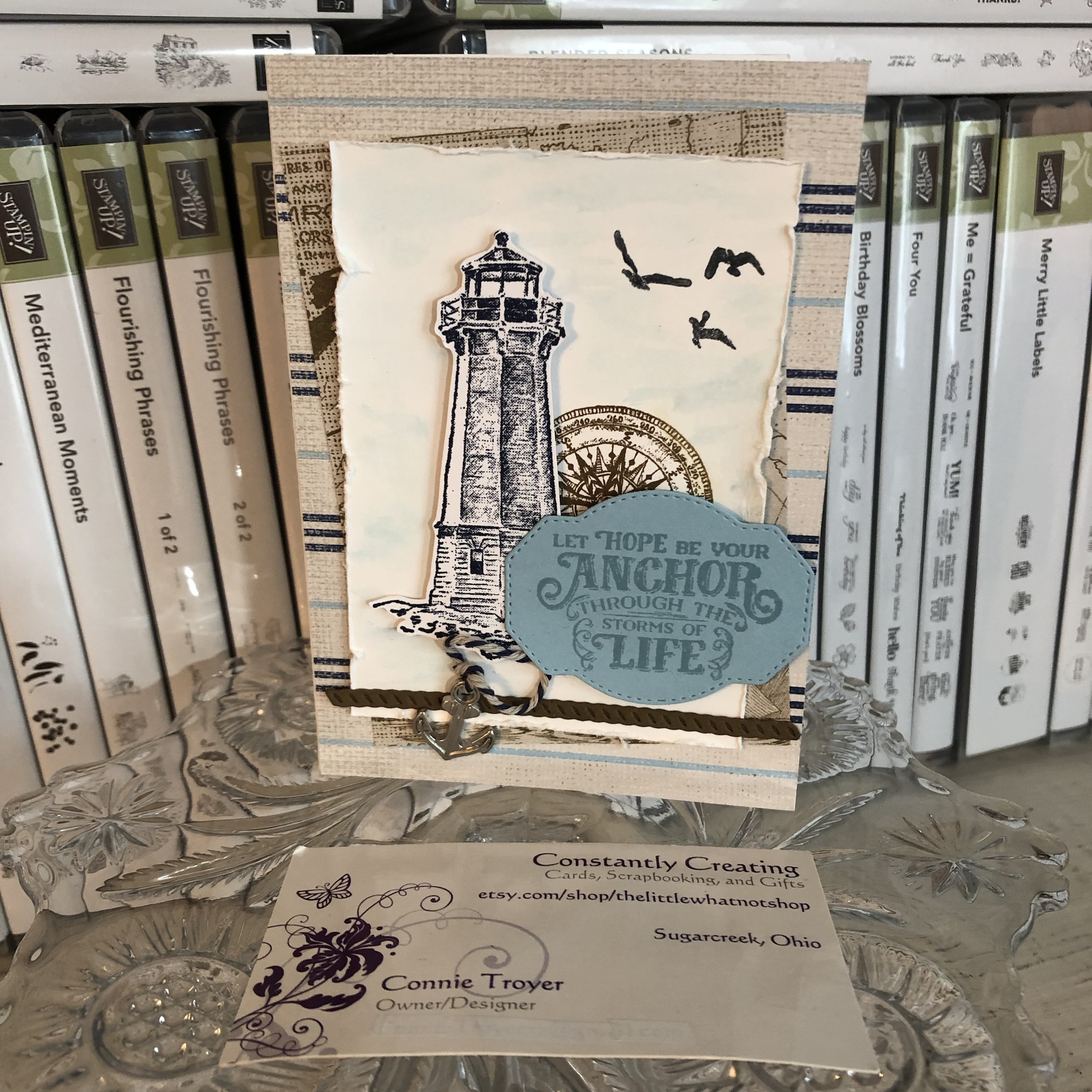
One of my husband’s coworkers lost her dear husband last week, and it’s been such a sad thing. I wanted to make a beautiful card – part masculine in remembrance and part feminine for her – but had no idea where to start. Since I often clean or organize when I have a problem to mull over, that’s what I ended up doing, which led me to the main cross piece seen on the front of the card today.

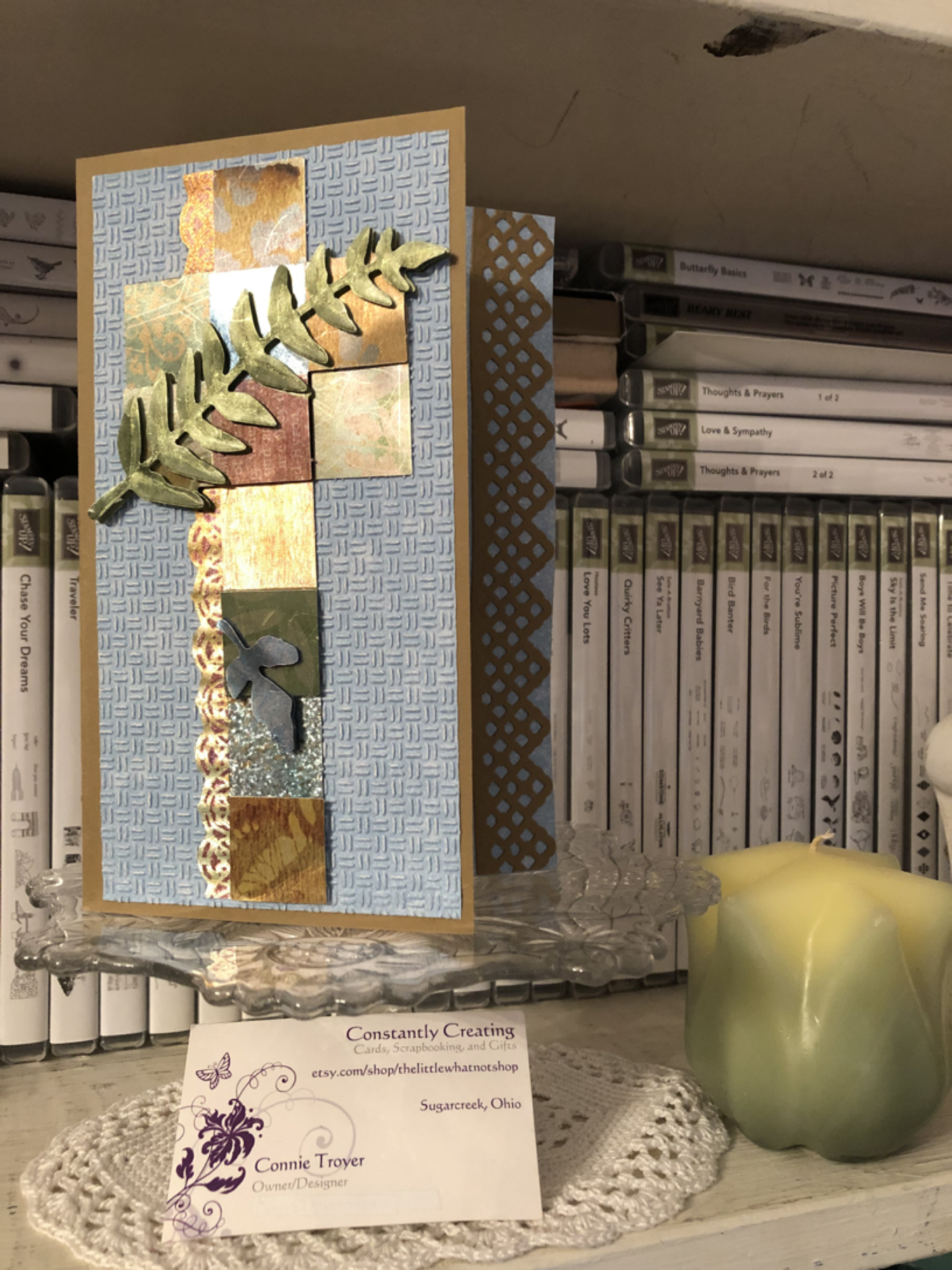
Finding a brown card base to match the topper was easy; Stampin’ Up’s Baked Brown Sugar, a retired color, matched the foiled copper/silver/gold/burgundy/blue cross the best. I only have so many browns, and I usually use SU for my card bases since I like how the 80-lb weight cardstock stands. (I grab premade bases only if I start with the base first rather than the main image. It’s just easier to match it that way rather than working in reverse.)

During my cleaning spree, I was also looking at and putting away some new SU Designer Series Paper. So when I tried to find paper the cross could match, the blue piece was fresh in my mind and looked prettier than any other neutrals I put next to it. The blue paper is from the Tranquil Textures DSP pack in the current Annual Catalog from Stampin’ Up. It’s not a solid blue, but it it hard to tell that with the dry embossing I put on top of it to give the card some texture. I used the “Oxford” Cuttlebug folder for the textured design. I wanted something light and barely textured like Stampin’ Up’s Subtle embossing folder, but I don’t own that particular one yet.

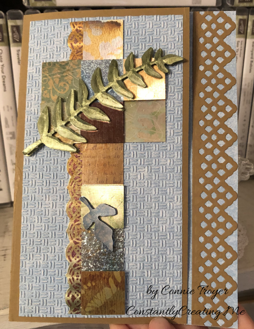
Here’s where things got tricky. The card is a 5×7 because the cross is so tall. But because it’s narrow, there was a lot of “white space” around it. I don’t like white space (even if it’s blue). So I started to wonder what I could do or put next to the cross to take up the width. A sentiment would only be so big, as well as being awkward to work with around the 3D leaf layers toward the bottom, so I wasn’t sure that was the answer. I thought maybe I could make a decorative edge to the card front at the right instead. I could see it in my mind but wasn’t sure how to achieve it (story of my crafting life, btw). That seemed to be the best thing to try…but all my dies were too small to stretch across 7 inches. Nothing felt right. So that night I went to bed frustrated, having made only the card base and embossing the paper.

The next night I attempted to keep going on the card while I was on the phone. I should have known better. I spotted a long Spellbinders die on my die wall and got all excited because it would fit lengthwise. I didn’t think about the fact that ALL of the edges of the die does indeed cut…until I wrapped a card base around a Cuttlebug plate (so that I didn’t cut through the second layer), positioned the die, and wondered why an inch of the card base separated from itself after I ran it through the machine. (*insert facepalm here*) To my defense, I was still on the phone. LOL

So suddenly I had a card base with one side shorter than the other. That was not what was supposed to happen. Not to mention, the magnetic plate dinged up the middle of the card base, and the B plate left marks on the back side of the base, making it warped and weak. Sigh. Time to rethink. Maybe I needed to make a new card base.

I tried to process where to go next. The decorative edge thing hadn’t worked and I couldn’t think how to make it work other than an edge punch – if I made a new base. I’ve never tried the popsicle sticks I’ve heard about, to keep part of it from cutting, so I wasn’t sure how to do that either (again, on a new base). But I hated to destroy the one I’d just cut. What I did manage to do after thinking was flip the card base around (even though I’d folded it correctly after scoring the first time). That would give me a chance to add paper atop the marked-up part to hide it and also add some stability with the extra paper layers. I hoped. I also took my bone folder and tried to work out the middle bumps and crease it sharply.

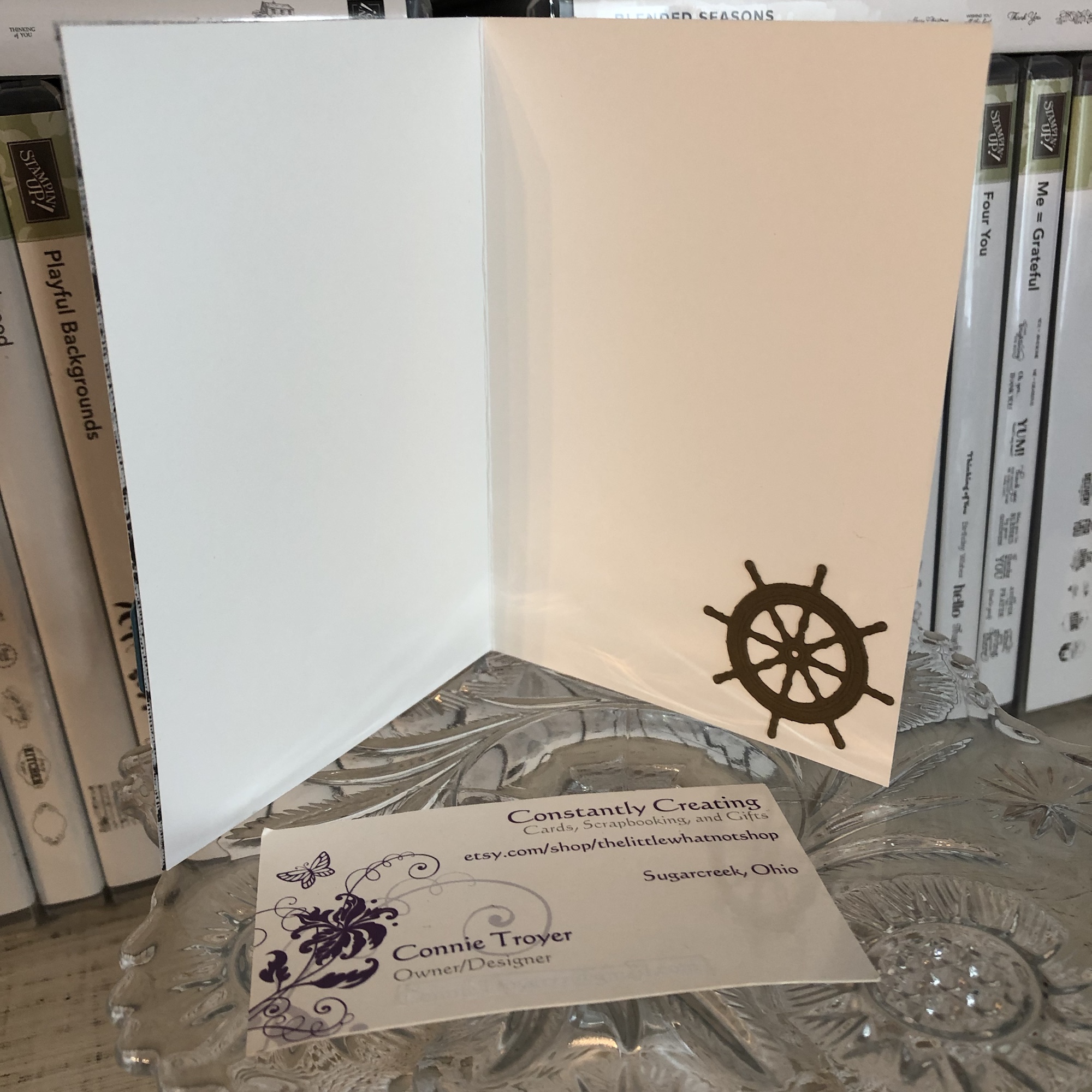
Once the base was salvaged, I decided to play with the pieces and arrange them just to see what I could do. I ended up liking a little bit of breathing room between the die cut and the now-shorter edge of the card base, rather than placing the die cut right up against the piece it had just been cut from. And obviously if there’s a peekaboo die, something needed to peek through it underneath. I grabbed more blue DSP and left it as is on the inside of the card rather than embossing it for texture like the front.

I also realized that I needed to run the textured piece through the Cuttlebug again, as one side has trouble with a piece of paper I got stuck in the roller years ago. Part of the paper was hardly embossed, so I realigned it in the folder, flipped it around to the other side that impresses better, and ran it through again. Came out perfectly that time.

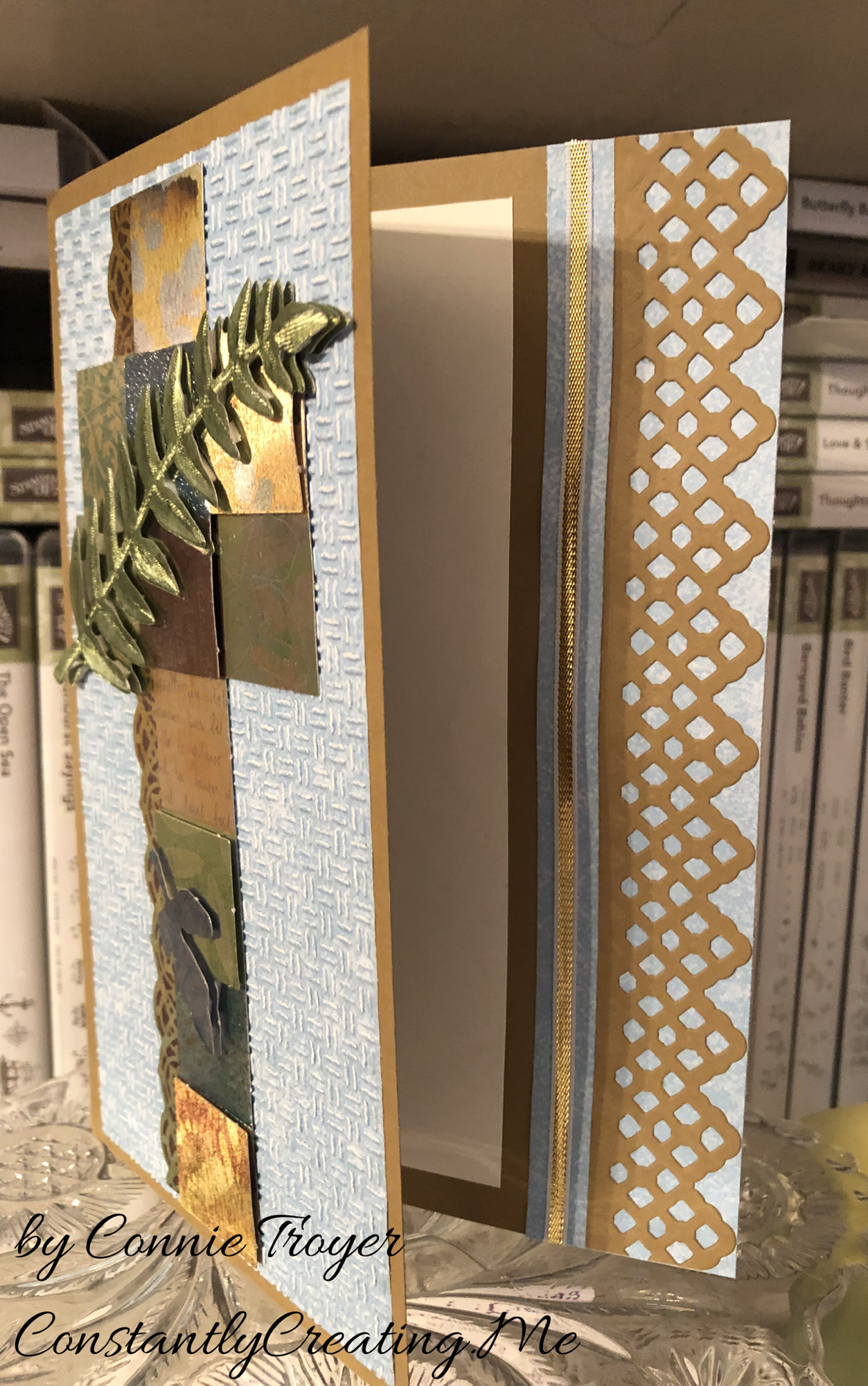
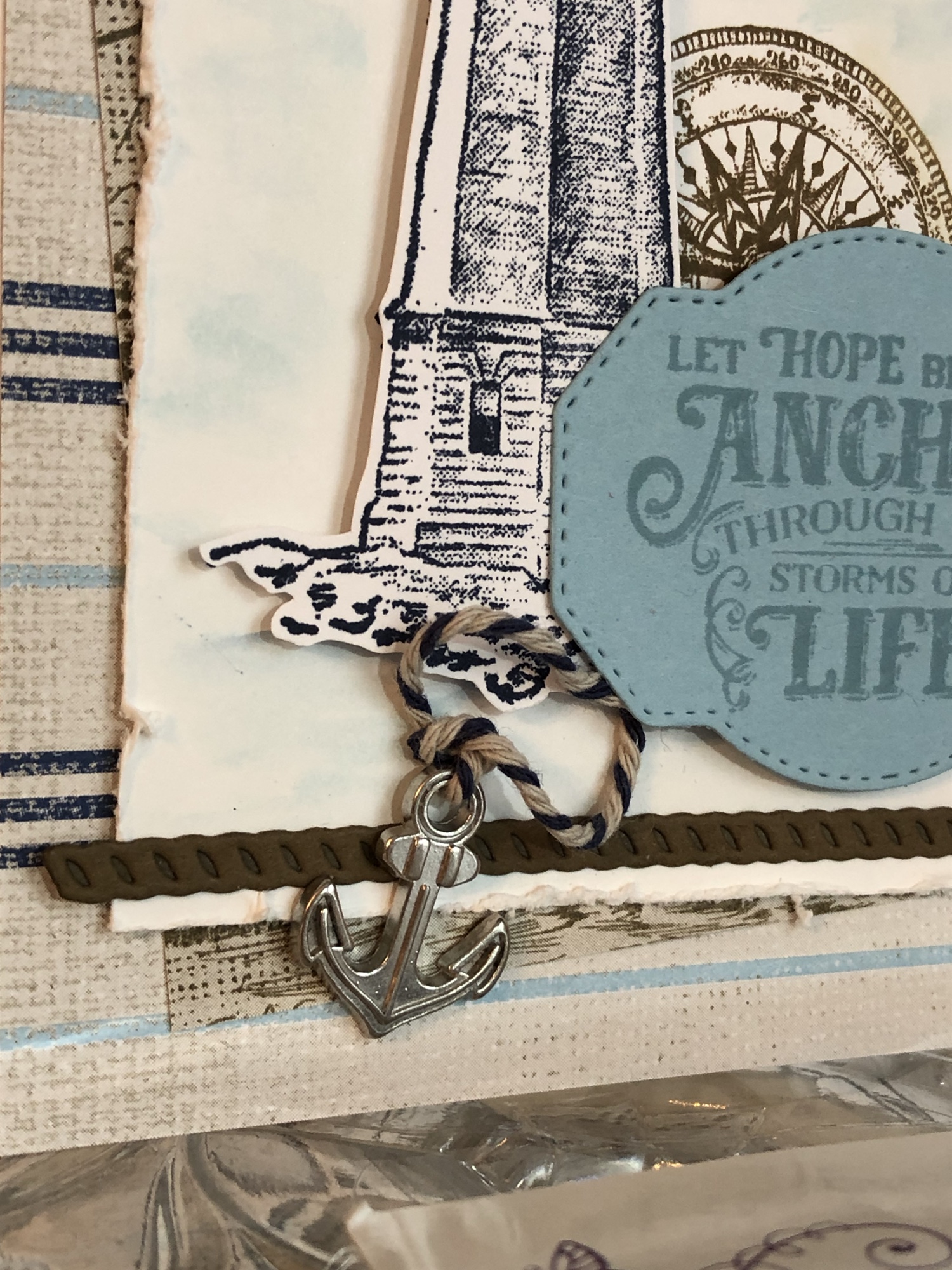
The trouble was that when I left that breathing room space between the die cut and the base, it was not centered once the card was opened. I didn’t like that. But it looked like I had enough room to add 1/8″ of ribbon or something else. I chose SU’s gold and white ribbon to match the cross and the browns and loved how it looked.

But then I couldn’t get it adhered. The ribbon is thin enough that the line of Art Glitter liquid glue I laid down soaked right into the ribbon. I wasn’t confident it wouldn’t end up slightly sticking to the inside of the card once it had been closed for a while. But as I told a friend last night, when a person has too much product in her house, she will find a way. I decided to use my Cosmo Cricket Glubers Adhesive Strips. I rarely use them, but sometimes they’re just the best option. They are 1/4″ strips, though, so I took my nonstick microscissors from CutterBee and cut right down one of the strips, eyeballing it to just under 1/8″. And then I placed it with my tweezers and stuck a new piece of ribbon to it. I was much happier with the inside then.

I decided not to stamp a sentiment on the inside yet. I needed to finish up and get to bed and I wanted to really look through my stamps to figure out what I wanted to say on the card. I will probably go back and add one later, but right now it’s blank.

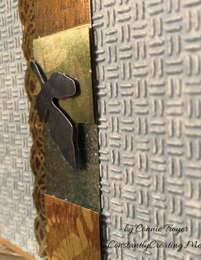
I’ve spoken about dry decoupage in past blog posts. A reader had asked me to do a tutorial on how to do it, and I am working on that currently. I hope to post one soon. For now, here are a couple of closeups to be able to see the decoupage layers that make up the cross. I should have trimmed off the little perforation bumps more as I was making the topper, but it’s probably too late to fix it now.

The cross has several layers of dimension to it in the squares as well as the leaves, which made it interesting to put together. And the leaves are the top layer.

Thanks again for coming to visit my blog! I appreciate your readership!

Superhero Batman Card for a Super Birthday

Thanks for the click! I feel like the proverbial broken record these days: “I’ve been on book deadline, so I haven’t had a lot of time in the craft room.” And when I’ve been there, I’ve had to do simple cards, which isn’t my true style. It’s been like this for months. Not really enough time to post either, but I try to keep up when I have to. Therefore, my post about Batman will be as short as I can make it. (There’s about another week until I think I can finally create for days on end again, and I can’t wait!)

Despite book deadlines and ASAP work and regular old “life” stuff, our family has birthdays in the latter half of the year, so I find myself away from home more often and scrambling for time beforehand to make birthday cards. I heard that the nephew wanted a superhero party this time around, and even though my gifts didn’t match that, I made sure my card would. I actually bought the “Let the Good Times Roll” roller coaster stamp and dies set months ago for his card. I guess I’ll make that another year. 🙂

I was randomly browsing Pinterest when I was killing time away from home one day, and I stumbled upon a seemingly easy Batman card. It looked simple enough to emulate (or CASE: Copy and Share Everything or Copy and Selectively Edit), which was perfect for my lack of time, but of course I had to put my own style to it too. I knew I had the oval punch and alphabet set she used, so using hers as a guide was perfect. Many, many thanks to the designer for bailing me out when I needed a quick card! You can see the original here: https://www.pinterest.com/pin/250372060519376773/.

As cute as I thought the original card was, I missed the light in the sky – you know, the one that always shows up as a beam whenever they cast the bat sign into the air from the spotlight. So I had to add that to my card, leading to my little bat. (I didn’t have room around the bat to punch the holes like the original designer did.)

To create the light beam, I first used Wink of Stella White and then layered another coat over most of it with either Wink of Stella Clear or Gold. The Wink of Stella line (Clear especially) is a favorite product in my craft room. I love that little bit of shimmer without the mess, and it dries quickly. I kept layering the colors, trying to keep my freehanded lines straight and also get both colors into the beam without one overpowering the other.

Wink of Stella Clear. Photo from StampinUp.com

The oval punch used was Stampin’ Up’s Extra-Large Oval Punch and I just used a scrap of yellow with it. Once I had it punched, I laid it onto my card and marked with a pencil the places the beam of light should theoretically end. I’ve never been very good at drawing 3D things, but I thought this turned out all right.

I do not (yet) own the new Spooky Bats Punch from Stampin’ Up and I’m not a huge Halloween person, so my choices for bats in the oval were limited. I’ve hand-drawn them before when I needed one, but I chose to fussy-cut one out of my paper share of current DSP for this card. It comes from the Toil and Trouble line in the current Holiday catalog. I looked for one that seemed most like the bat sign we know and love and cut it out using my beloved CutterBee microscissors.

Toil and Trouble Designer Series Paper. Photo from StampinUp.com.

Although the original poster used Stampin’ Up’s Labeler Alphabet (and I had intended to as well), for the sake of time, I opted for my SMASH Label Maker, which would save a lot of time of inking and trying to get the letters straight and cutting out the words before gluing them. There wasn’t much in the way of instructions on the packaging, so I still hold my breath and count when I operate it, and I’m still not entirely sure of the best way to keep the words fastened once I have them imprinted, but I keep working with it and learning.

For “To a super nephew,” I added extra spaces between the words and cut apart the words evenly when I was done before haphazardly affixing them first with Scor-Tape (which has mostly worked before). Before I was finished, I went back and reglued them with Tombow Multi, though, and that seemed to keep them where I wanted them, since the edges still wanted to curl up a little with the Scor-Tape.

Labeler Alphabet. Photo at StampinUp.com.

I don’t seem to have a picture of the inside. Maybe I forgot to take one. I thought I used a “Happy Birthday” stamp of some kind since I didn’t say that on the front. Regardless, that’s all there is for this card and blog post! Back to my regularly scheduled edit… Thanks for stopping by!

If you’re in need of craft supplies from Stampin’ Up, I’d love to be your demonstrator! You can shop with me at https://www.stampinup.com/ecweb/default.aspx or find me on Facebook at Constantly Creating / The Little Whatnot Shop. The current Annual and Holiday catalogs have some amazing products this year, and we’ll soon be making cards using the November-only special called the Snowflake Showcase! I recently got some of the flocked “White Velvet Paper,” and it is gorgeous! You don’t want to miss this special!

Masculine mover thank-you card 4

Card 4 in my series of five masculine thank-you cards for movers.

Continuing in my set of five masculine thank-you cards (to be sent to people who helped my client move), this “Card 4” is another one where I couldn’t get the brown-and-white DCWV “key” paper to work with the plaid and metallic silver-toned base. The colors just weren’t compatible enough. But I thought it would still be simple and masculine, two other requirements for the order, so I continued.

At this point in the order, it was just about keeping things consistent (like the gold embossing powder)…and I’d already used the plaid once on a different card anyway (in my “Card 1” post here). This section was the remnant of the 6×6 piece. I like to use up my scraps when I can to keep my scraps box under control, so there wasn’t much question as to whether I’d use it now. (It was “either use it now” or throw it on the desk to be used soon, since I couldn’t really take the time to look up which Stampin’ Up paper pack I’d taken it from. The scraps box wasn’t an option. I’m fussy about my SU paper and always put the scraps back with their pads since I have matching inks and embellishments in my supplies.)

I wish I knew what company this base is from. I was given a number of thick metallic bases in a craft swap, and they’ve been great to work with. They feel thicker than the usual Stampin’ Up cardstock I typically use for my bases (those are an 80-lb card weight, I think). A good base is key to the card not falling over or flattening instead of standing up.

The mechanics of how I did this card are simple. I’ve already mailed the cards, so I’m not sure of the precise measurements of the individual pieces, but I think the remnant plaid piece is just over 2 inches. I believe the squarish one in the middle was the back side of the grey plaid paper I used in “Card 1” (K and Company). I already had a chunk cut out of it for the other card, so one side had already been shortened. I measured where I wanted it to fall on one of the strips of the yellow-and-grey piece and lopped off the other side with my Fiskars trimmer.

(Confession: I don’t do a lot of measuring or precutting. It’s more annoying to store the paper as pieces get cut out of it, but I’m always afraid of limiting myself to certain sizes or creativity if I “only” have so much of something because I’ve cut it down. I do both scrapbooking and cards, so I can be pretty random in my sizing of card fronts, mats, and journaling boxes. Usually I just take the large piece of paper and a pencil straight to my project and mark where I want to cut it for that specific purpose and then file the rest away to use later. I probably ought to rethink this as I try to streamline my process for card making, since precut pieces would make it faster, but I’ve been loathe to change.)

snapseed

Once I had the grey square piece cut, I took my anti-static bag to the front (I remembered!) to prepare it for heat embossing. I already had my embossing tray, coffee filter, embossing powder, and heat gun out (and just typing that sentence shows why it’s easier to do multiple cards with the same supplies at once), so I stamped the thank-you stamp (“One Big Meaning,” Stampin’ Up, current) with my VersaMark pad, pressed it onto the grey piece (don’t wiggle it!), sprinkled it with the gold embossing powder (Hampton Arts), and took my (very old) Marvy Uchida heat gun to it. (See this post about why I use a coffee filter with my embossing powder.)

It actually turned out well! Though I am beginning to wonder whether my powder is too old – or maybe it’s just the brand. I don’t think my Stampin’ Up powders dimple like that, but they’re newer. And I don’t heat emboss all that much, so I haven’t really compared it to my others yet. The dimpled look is fine for these masculine cards and during other times as well, but occasionally I do want a smoother look, which seems possible with other powders. Or companies. This is something I need to research. (If anybody has any knowledge or tips, feel free to leave me a comment!) After I glued the square piece onto the plaid one with my ATG gun, I repeated the embossing process with the “for your kindness” stamp (“So Very Much, Stampin’ Up SAB set, retired). Then I sat back and took a look at it to see if the card “needed” anything else.

It wasn’t very long before the empty spaces in the square bugged me. This is why I have trouble doing simple cards. I apparently despise “white space.” My husband is forever telling me to leave things alone and not fill every little area. I’m not very good at that. But sometimes something actually needs to be filled and looks better once it is. I think that’s the case with this one. It would have been fine on its own, but the little added touches make it more special. I used a gold peel-off from Dazzles for the top swoosh and heart doodads – not sure which exact one, since I’m still not near my supplies as I write this. (I’ve figured out how to blog ahead of time and schedule posts!) After I was done with the center, I adhered my Crushed Curry Enamel Dots (Stampin’ Up, retired) at the edges of the plaid piece. I probably could have left those off entirely, but I had pulled them when I was looking for something to finish off the grey square, so they were in front of me. And I don’t “leave well enough alone” very well either. 🙂

I was pleased with how this one turned out. It fit the requirements and didn’t take overly long.

Thanks for stopping by!


Pat's Blog Site

One place to fit it all!

Stamp Dabbles

Donna Leonard | Independent Stampin’ Up! Demonstrator | Huntsville, AL

Niya Scrap

Démonstratrice indépendante Stampin' Up!®

From Pole to Pole

Adventures in the Land of the Pierogi

Stampin' in the Meadows

Akiko Sudano - Independent Stampin' Up! Demonstrator Downingtown, PA

Creative Stamping Designs

Karen Ksenzakovic, Independent Stampin' Up! Demonstrator in Somerville, NJ Let's make some cards!!

Stamp it up with Jaimie

Helping you find a stress free creative outlet through paper crafting.

Stamp With Amy K

Amy Koenders, Independent Stampin' Up! Demonstrator in Mendham, New Jersey...Let's make some cards!

The Daily Post

The Art and Craft of Blogging

WordPress.com News

The latest news on WordPress.com and the WordPress community.

%d bloggers like this: