“A Good Man” Stamp Set with Seaside Spray In-Color for Stamp with Amy K’s Tuesday Blog Hop

A masculine card for use during Father’s Day (or any day!) for Stamp with Amy K’s Tuesday blog hop.

img_9128

Hello again and welcome back to my blog—or thanks for stopping by if you’re a new visitor! The theme for Stamp with Amy K’s current Tuesday blog hop is “masculine,” so I decided to create two “Father’s Day” type of cards that can be used at any time for the guys in our lives. Since they are going to my local gift shop for sale, I needed to create something that didn’t explicitly say “Happy Father’s Day” (best for a longer shelf life!).

I’ve used all current or upcoming products that are available on June 4, when Stampin’ Up customers can order from the new catalog. I was able to preorder some things because of my demonstrator status. So I’m using stamps from the new cling set “A Good Man” and one of our brand-new In-Colors, Seaside Spray (only available for purchase June 4, 2019 through May/June of 2021).

Seaside Spray is a gorgeous color that reminds me of a smoky blue. It’s one of the shades in my valances, actually, so I have a feeling I’ll be using this color for years to come even after it retires. 🙂 And “A Good Man” is one of those casual, contemporary sets that have a sketched look to the images, with some slight distressing on the sentiments.
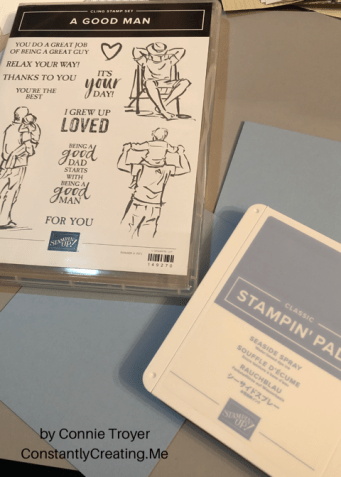
I began each A2 card with a Seaside Spray card base, taking an 8.5×11 piece of cardstock and cutting it in half. I wanted to use two of the colorable images in the stamp set, one on each card, and quickly figured out which rectangles my chosen images would fit inside in my new Stitched Rectangles die set.
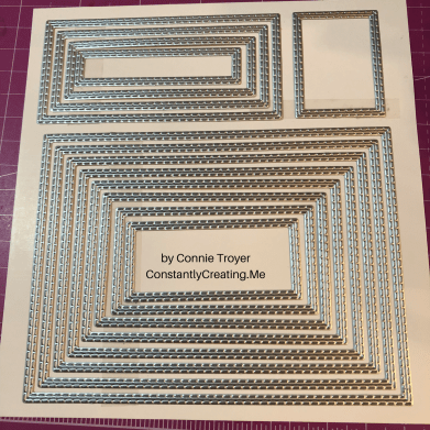
I stamped each colorable image in Memento Tuxedo Black ink and die-cut the first rectangles. Then I colored them with some of our Alcohol Blends: Dark Mango Melody, Dark Old Olive, Dark Smoky Slate, Dark and Light Basic Black, Ivory, Bronze, Dark and Light Shaded Spruce, Dark and Light Balmy Blue, and Dark and Light Real Red. (I need to get a dark blue yet, so I had to color all pants in various shades of black and gray.)

Seaside Spray isn’t one of the colors I own in the Blends yet either, so I used Light Balmy Blue for the sky and border, hoping it would look all right. Turns out it does sometimes…but not if there’s a lot of concentration. I filled in the background of one of the images but left the other white. I wasn’t sure which way to go. Tell me which one you like best. 🙂

Next I die-cut other various-sized rectangles from the Come Sail Away and Perennial Essence Designer Series Paper packs and and staggered them with the images and sentiment block.

I also carefully edged around the border of one of the die-cut, colored images with my Balmy Blue Blend. I wanted to do something in the corners the way I would dye ink, but I didn’t trust myself enough to try it with the Blend. I’ve had to redo enough this evening. I’m actually pretty pleased with how the edging turned out. It was easy and looks clean and simple. I liked it so well that I did it on the second card too, with a Night of Navy Stampin’ Write Marker (but it was much easier to accomplish with the Blend, at least tonight!).

After I placed the sentiment block and glued the rectangles for the first card, I added three Heart Epoxy Droplets to two corners to finish the card.

And here is where I have to confess something. Two things, really. I lost a stamp before I finished my cards or this blog post. Specifically, I lost the main sentiment for the front of the cards. I have torn this room apart, searching through my trash can, cleaning off my desk and the cart next to me, checking my clothes…. It still hasn’t turned up. (Please tell me I’m not the only one this has happened to!) I can attest that the new cling stickers are really sticky, because I had the stamp rubber-side down in the case with the sticker facing up so I could quickly grab it and stamp it after I was done with the inside pieces. I’m certain it’s stuck to *something*. 🤦‍♀️ So... Sigh. I handwrote the same sentiment in a similar kind of font and lightly stuck it to the card—for this blog’s purposes only—where the real sentiment will be stamped in Night of Navy ink on Seaside Spray cardstock. When I find it. Humor me, please. (If I can’t find the stamp eventually, I may just have to repurchase this set because that pair of sentiments is essential!)

This card has now also convinced me that I need to get the Subtle 3D embossing folder. The background still needs something. I thought of stamping too late, after I adhered the rectangles. I’ll pretend I’m going for “clean and simple.”
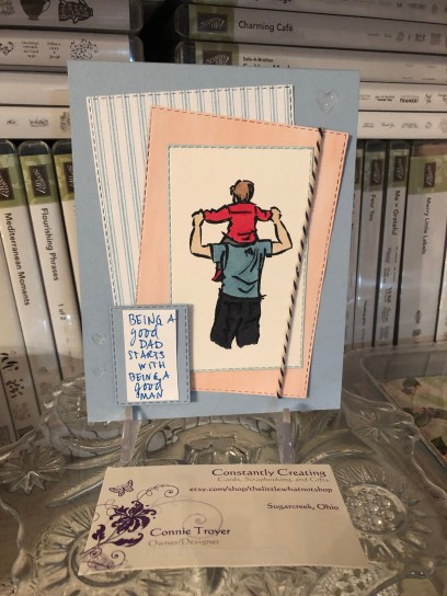
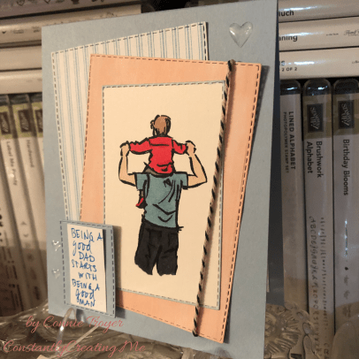
The first card.
Another angle, showing the hearts a little better.

And now for my second confession. My roll of Night of Navy/Sahara Sand Baker’s Twine has gone AWOL as well. (I’m betting the cat did it. She’s been known to do so.) So I’m using most of the piece of twine that I snitched at OnStage for my Come Sail Away card I finished later at home. I also cut card #2’s heavy-striped piece of Night of Navy/Whisper White DSP the wrong size…and that was after I spilled ginger ale on four newly opened papers and cut out the wet sections. 🙄🤦‍♀️ Trust me, if I can make cards I’m proud of with all this chaos, anybody can!

So this is what I refigured for the second card, after some challenges (like the fact that I had to use the Color Lifter too, even before I cut the striped piece incorrectly). I used Linen Thread at the bottom of this one. I felt I needed to separate the Balmy Blue Blends background from the Seaside Spray cardstock because, for me, the color difference was too much to have them next to each other. My first thought was to have the striped paper cover the entire card front, but obviously that went awry. I decided that the mistake wasn’t so terrible as to have to redo that too (and I sort of hated to cover up all that beautiful new In-Color anyway), so I just went with it. I hate wasting paper. (My apologies again for the handwritten sentiment. It will look so much better with the real one….)
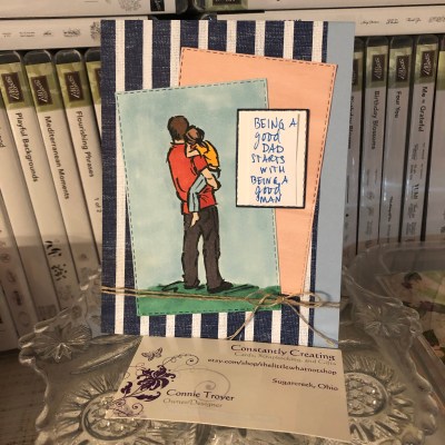
The gift shop card.

The insides of both cards are identical, and they went so much smoother than the rest. I was even watching a TV show while I stamped. (That does it—I should always watch TV while crafting. But not in the dim light, because I think that’s when I lost my stamp.)
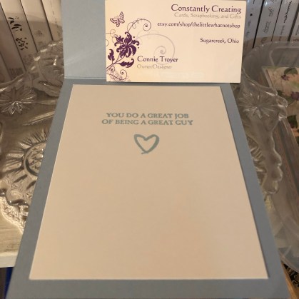
So that’s it for me tonight. It’s time for bed. Thanks again for stopping by my blog! So sorry about all the mishaps. Some nights just go like that.

If you’re interested in receiving a catalog, I’d love to send you one. Just drop me an email with your info using my Contact Me form.

If you want to continue the hop to see what the rest of my fabulous team members made, click the Next button to see what our fearless leader, Amy Koenders, has made, and if you’d like to go backward instead, click the Previous button to visit Sue Prather’s blog.

  1. Karen Ksenzakovic – https://wp.me/paaNf4-Bn
  2. Terry Lynn Bright – https://wp.me/p8fxPh-80
  3. Jaimie Babarczy – https://wp.me/p79UhD-2Pa
  4. Mary Deatherage – https://wp.me/p5snyt-88U
  5. Karen Finkle – https://karenscardkorner.blogspot.com/2019/05/stampin-up-wood-textures-dsp-for-amys.html
  6. Akiko Sudano – https://stampininthemeadows.com/?p=462
  7. Shirley Gentry – https://stampinwithshirleyg.com/?p=5240
  8. Sue Prather – https://stampwithsueprather.com/?p=4744
  9. Connie Troyer – https://wp.me/p8xvI6-nm
  10. Amy Koenders – https://wp.me/p2SFwf-frW

Celebrate Spring with New Babies! (“Perfectly Paired” for Amy’s Inkin’ Krew Blog Hop)

Welcome to another blog post for Stamp with Amy K’s Inkin’ Krew Blog Hop! We have a very talented lineup for you this week. Thanks for stopping by to see what I created. 🙂

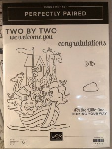
Our theme this month is “Celebrate Spring,” in whatever way we want to interpret that. Because I’m also making cards for my local gift shop, I chose to go with the “new birth/baby” idea. I couldn’t wait to get my hands on Stampin’ Up’s “Perfectly Paired” cling stamp set when it came out—it’s all about babies and features a Noah’s Ark image, one of my favorite themes for little ones. This stamp set (so far as we know) is only available for a couple more months since it’s in the current Occasions catalog.

Since I knew this would be a nice card and likely given with a gift, I started off by grabbing a lovely, thick envelope from my stash and then made the card base a 5×7 size to match it, using SU’s Shimmery White cardstock. I chose Shimmery White because I wanted to color the image.

Well, as usual, although I was aiming for simple, I evidently have to complicate things. And I made plenty of mistakes to cover up. My “MO,” I’m starting to think.

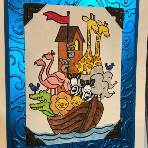
It occurred to me that there were waves under the ark in the stamp but I thought it might look a bit “adrift” all by itself on a flat card base. So I got some of my new Ice Blue Matt Mirror Luxury Cardstock (Crafter’s Companion) and cut it down, leaving about a 3/8″ border of white on the base for the “shimmery” part of the “Shimmery White” to show. Then I embossed some waves onto the mirror card with my Cuttlebug (“Musical Flourish” embossing folder).

My piece of mirror card was slightly longer than the embossing folder, so I embossed both ends and then attempted to hide the faint line the edge of the folder left with some retired 1/2″ SU Pacific Point ribbon. I wrapped the ribbon around the edges to give it a neater, more finished look. I believe I used my 1/4″ Scor-Tape down the middle of the back of the ribbon.

I didn’t actually cover the line left by embossing because the ribbon wasn’t wide enough, but hopefully I distracted anyone from looking too closely. I tried to keep the embossed design from overlapping when I ran it through the Cuttlebug, and the embossed line really isn’t that bad, but it’s mirror card so everything shows…. 🤷‍♀️ Whether I needed the ribbon or not, it was an attempt to make the card look better, and I built the rest of the design from there.

After fiddling with the layout, I decided to also mat the mirror card with Pacific Point cardstock to bring more of the ribbon color in for balance. I left 1/8″ of the mat showing, glued the mirror card to the mat, and then glued the combo onto the card base. I used my ATG tape gun for these. Then I set aside the card so I could concentrate on the image. And here’s where things got interesting.

I wasn’t sure whether to use my Stampin’ Blends alcohol markers to color it or my usual: watercolor pencils with either an Aqua Painter or a Blender Pen. I figured I’d do one of each type of coloring and leave the extra in my “card parts” bin for faster cardmaking later. Because those mediums require different inks to control the color, I stamped the ark image from “Perfectly Paired” once in Memento Tuxedo Black (for the alcohol markers) and once in SU’s Archival Basic Black (for the watercoloring). I labeled the backs with a pencil so I’d know which went with what…and then promptly started coloring the wrong image with the wrong medium because I was “doing,” not “thinking.” 🙄🤦‍♀️

Surprisingly, the Archival Basic Black didn’t smear too badly with the alcohol Blends, but I had been careful about not coloring over the lines, just because I was carefully coloring. It wasn’t until I smeared the lions’ whiskers a little that I even realized I’d switched the pieces. (Live and learn?) But smearing lines is why we are supposed to use Memento ink with alcohol markers. Lesson learned.

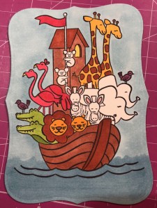
And then I discovered that I don’t yet have enough Blends to finish coloring this particular image. 🤦‍♀️🤪 I’ve been building my collection a little at a time, and although the Smoky Slate and Basic Black Combos have each made it to my purchasing list at least once, I ended up dropping them for things I wanted more. (Sacrifices!) Therefore, I have to stop coloring the image until I can get those and finish. For the record, though, this was as far as I got, and I really like this medium. (If you look closely, you can spot my whiskers accident.)

So I had to put all that away and regroup. I couldn’t remember whether Memento would smear if I got it wet (since it is a water-based ink), but I just wanted to get something going that I could use. I mentally crossed my fingers and dove in. I could always stamp another one if I had to.

Fortunately, it worked just fine—no smearing that I can tell. My coloring isn’t perfect, but at least the lines didn’t move. I went with the Aqua Painter to smooth out the watercolor pencil lines too…though in hindsight, I should have tried the Blender Pen, for better control in small places. Or just chucked it all and gone straight for my stash of Stampin’ Write markers. (I hope you’re learning from my mistakes! This veteran scrapbooker is still learning so much about cards!)

I will admit to a little cheating as well. I knew I had a Pacific Point chalk in my arsenal. As my retired SU watercolor pencils are unlabeled, I went for the chalk to color the water (with my Aqua Painter) so I could be all matchy-matchy instead of throwing off the shades by introducing some other blue. 😊 Also, I lightly colored the background a sky blue so that it wasn’t stark white paper. If I was coloring waves, I had to color sky too, right? But it’s hard to see in the picture.

So this is where I ended up with it (including doctoring the zebras with white Smooch paint and a Memento pen in desperation after watercoloring and black got the better of me). Coloring was the longest part and why it may be better to use some sort of marker next time. 🤷‍♀️ Another lesson learned!

The main focal image, colored.

Once the image was done and dried, I covered a good portion of the back of it with my 1/2″ Terrifically Tacky Tape (TTT), which is just like SU’s Sticky Strip. I did this to combat the curvature of the paper that happens once water goes onto it. Then I peeled off the tape backing and centered it in the section above the ribbon on the card front.

I had found some black, glittered chipboard faux photo corners when I was debating about the layout, so I glued those overtop the corners of the image with my Art Glitter liquid adhesive. And then I pulled a metal bar sentiment (“celebrating your arrival”) out of the heap of baby ephemera in front of me on my desk, and I adhered it to the top of the ribbon with more 1/4″ Scor-Tape. The front was done. Finally. And I’m even happy with it. 😂 I especially love how the foil look of the matt mirror cardstock shines and changes depth and color in the light. I so love using specialty materials to make cards pop.

(Oops! You can see that faint embossed line in this pic! Well, it’s not that noticeable in person. 😊)

For the inside of the card, I used the “Two by two we welcome you” sentiment from “Perfectly Paired,” stamping it with VersaMark on Shimmery White cardstock before heat embossing it with “Blue Tinsel” embossing powder from my stash. (No idea who made that; I’ve had it for years.) It was the closest embossing powder I could find to the Pacific Point color I’d been using, and it does actually look glittery, like tinsel, and has some texture to it once embossed. I then backed the white sentiment piece with a die-cut Pacific Point cardstock tag from a Spellbinders die (“Fancy Tags Two,” I believe. #neverstopmaking). I think it turned out quite lovely.

To finish off the card, I took a strip of dotted blue (SU Pool Party) cardstock from the retired Tutti-Frutti Cards and Envelopes pack and attached it to the bottom of the inside. I also cut off a small strip of matt mirror cardstock to top it. And then I found two goofy pink flamingo stickers in my stash from Sandylion and stuck them to the bottom right corner just for fun, to carry through the theme. I was looking for my smaller Noah’s Ark stamp for the corner, but I have to keep looking. 🤔🤷‍♀️

I haven’t decorated the envelope yet, but I’m thinking of stamping a row of various animals across the horizontal bottom (under the address section) as a sneak peek to the theme.

Below the list of hop participants are the current products I used in my card (or similar ones) that you can purchase through my online Stampin’ Up store if you wish to own any. (Please use host code 6WPHJ2MC when you check out.) Don’t forget that we have until March 31 to get free gifts from Stampin’ Up through Sale-a-Bration with orders of $50 or more before tax and shipping! There are some awesome reward products available! I also give free gifts to those who order through me. 😉

Thanks again for visiting today. I hope my mistakes keep you from making your own! Feel free to post questions or comments. 🙂

To continue with our hop and visit Jaimie Babarczy’s blog offering, click Next or her name in the list below. To view what Karen Ksenzakovic created, click Previous or her name. Thanks for hopping along with us!


  1. Karen Ksenzakovic
  2. Connie TroyerYou are here!
  3. Jaimie Babarczy
  4. Sue Prather
  5. Julie Johnston
  6. Mary Deatherage
  7. Karen Finkle
  8. Shirley Gentry
  9. Amy Koenders

Product List

Batty for You Stampin’ Up Halloween Card for Inkin’ Krew Blog Hop

Halloween is sneaking up on us! To start the celebration, I’ve joined Amy K’s Inkin’ Krew to show some Halloween cards.

Hello, everyone! Thanks for stopping by my blog today. It’s my first time “hopping” with Amy Koenders’s Stampin’ Up Inkin’ Krew!

We are focusing on Halloween cards today. Truthfully, I’m not a huge Halloween fan, so I rarely make cards about it, but I did do this one in the more-recent past using mainly Stampin’ Up products. It’s currently for sale in my Etsy shop (thelittlewhatnotshop.etsy.com).

I used Stampin’ Up’s Basic Black cardstock for a base, layered it with gold metallic foil (which makes for some wonky picture-taking), and then adhered some SU “bat” DSP from the (retired) “Happy Haunting” pack across the bottom third of the card.

I can’t remember the name of the black-and-gold foil bat doilies from Stampin’ Up, but they are fun to play with if you run across a pack. (They’re retired too.) They come with black backgrounds as pictured here or the reverse. The large singular bat is from SU’s “Cheer All Year” stamp set and it was stamped in Memento Tuxedo Black ink.

I used a circle die to cut a white piece for my sentiment – I just laid the nested dies atop my bat doily until I saw the size I wanted. And then I used SU’s retired photopolymer “Skinny Mini Alphabet” and placed the letters where I wanted them.

The only thing that isn’t Stampin’ Up on this card are the little bats flying around the sentiment. I found those on a wooden Halloween stamp and individually inked up the rubber parts I wanted and attempted to place them around the letters. Might have been easier, faster, or more accurate to hand-draw some. I had a lesson in patience that day….

I kept the inside of the card simple with a white piece to write on and more of the bat paper from the front.

Thanks for joining me today! “Hop” on over to Julie Johnston’s blog by clicking “Next” or go back and visit Sue Prather by clicking “Previous” to see what they’ve come up with for Halloween cards!

If you need to hop around, here is the lineup of participants:
Sue Prather
Connie Troyer (you are here!)
Julie Johnston
Mary Deatherage
Karen Finkle
Amy Koenders
Pat's Blog Site

One place to fit it all!

Stamp Dabbles

Donna Leonard | Independent Stampin’ Up! Demonstrator | Huntsville, AL

Niya Scrap

Démonstratrice indépendante Stampin' Up!®

From Pole to Pole

Adventures in the Land of the Pierogi

Stampin' in the Meadows

Akiko Sudano - Independent Stampin' Up! Demonstrator Downingtown, PA

Creative Stamping Designs

Karen Ksenzakovic, Independent Stampin' Up! Demonstrator in Somerville, NJ Let's make some cards!!

Stamp it up with Jaimie

Helping you find a stress free creative outlet through paper crafting.

Stamp With Amy K

Amy Koenders, Independent Stampin' Up! Demonstrator in Mendham, New Jersey...Let's make some cards!

The Daily Post

The Art and Craft of Blogging

WordPress.com News

The latest news on WordPress.com and the WordPress community.

%d bloggers like this: