Welcome, welcome! Despite coronvirus and economic shutdown and crazy March/April weather nationwide, it is somehow once again time for the Tuesday Blog Hop hosted by Stamp with Amy K (Amy Koenders). I’m back today with a friendship card that’s perfect for reaching out during this very odd time in our lives. Today’s blog hop is “for the ladies,” so it was created with my best friends in mind, to celebrate those relationships we’re grateful for and miss having in person right now. Thanks for following along today and stopping in on my page.

I woke up with a layout idea in my head about corner designs that I’ve never really tried before, and I was determined to give it a go. I’ve been working on an editorial project this week, so I didn’t have a lot of extra time to play around with creativity. It was more like “I only have [this much time], so I need to come up with something doable the first time around, and I need to do it now.” No pressure, right? With the layout and only the sketchiest of ideas in mind, I set to finding things that fit. I knew I wanted flowers. I always go to flowers, especially for women. They just brighten up my whole day and make me smile, and who wouldn’t want to make their friends smile?
Side note: you know, it’s always interesting to think about the creative process. At which points do you make decisions and proceed with them regardless of what happens during the interim? When do you redirect and try a different idea, after the first one brings contention? That’s sort of what happened to me here. In my head, I saw a landscape card with the top left and bottom right holding the flowers with the sentiment piece in the middle of the front. I had different options I could use for the background, embossing folders and stamps alike. And though the creative soul in me wanted to try several of the options to see what I liked best, I just kind of had to start with something and go with it.

I tried the Birch background stamp in Sahara Sand first since flowers make me think of trees and the rest of nature. (And because the embossing folder I really wanted to use is no longer current.) Here’s where I had to decide whether to proceed or redirect. I just could not get that stamp to line up correctly to do two beside each other in a horizontal fashion—the pattern on birch trees go horizontally, but the stamp is a portrait. The stamp isn’t big enough to cover one horizontal card front. And it’s not a photopolymer stamp to be able to line it up correctly. I tried to stamp it freehanded. I tried to do it using the Stamparatus. I both eyeballed and measured and frowned when necessary. I came close—but not close enough. And I decided I was tired of ruining cardstock. So rather than waste more time, I picked the one that came out the best and decided it was time to head a different direction.
The cardstock happened to be Very Vanilla, so that determined which shade and style I was going to be using. I cut off the cardstock and glued it on top of a new portrait card base (because I’d gotten ink on the other side of the first card base, of all things). I was suddenly stumped about how to arrange the rest of this card. It shouldn’t have been that hard, but the layout flip was messing with me and I couldn’t agree with myself about what would look like my original idea or what to use. I didn’t like any of it. The size was wrong. There was too much white space behind where I imagined the flowers (that I couldn’t commit to). Or the flowers were warring with the Birch background. All I knew was that I wanted to visibly set off the corners and perhaps also see a smaller diagonal strip and edge border extending from them. So I redirected again.
I kept the card base portrait style but started looking for Designer Series Paper to cover up the corners instead. As a longtime scrapbooker, I tend to fall back on DSP. I grabbed my 6×6 paper shares of current DSP, looking for something that would provide balance and grounding behind flowers. I thought one of the designs in the Perennial Essence DSP—one of the ones that remind me of a galaxy—would work for that job. So I took my little 6×6 square and looked for two blue corners that didn’t include many flowers on it, lopped off a corner where it worked, and then measured that corner against the rest of the DSP square to mark off and cut another for the opposite side. I glued down the blue corners on top of the birch background and stared at it. And decided that I didn’t like the stark color difference of the light background and the very dark corners. Any flowers I tried on top just didn’t please me. Frustration was building once more.
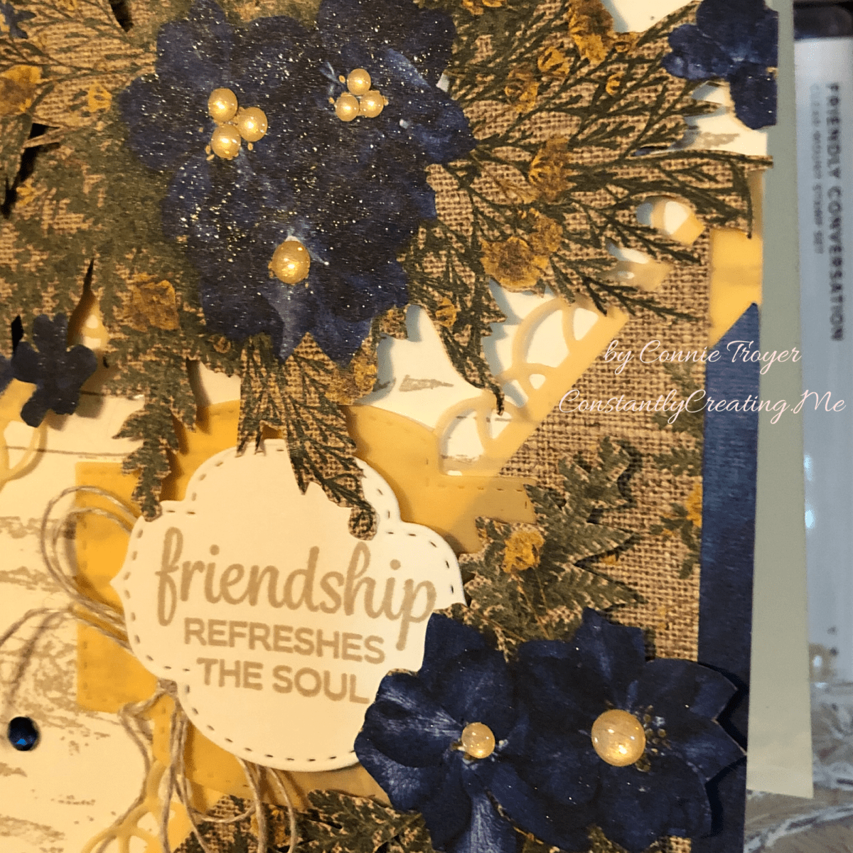
And then I saw it—paper that is so pretty, I almost want to weep. I’ve barely used it myself, other than cutting up some of the papers to give away at a party I demoed last fall. The Pressed Petals Specialty DSP has a paper in it with gorgeous blue flowers on burlap. Blue flowers that matched my Perennial Essence corners. …And then I realized that my last two little squares of that paper had flowers on them. Yes, I know I just said that. Light bulb moment—problem solved. No stamping needed! (This is why I love paper. 🙂 ) Rather than stamping and/or die-cutting flowers, I could merely cut out the ones in front of me and use those on the card, saving time and frustration! And so I did. I rough fussy-cut around one of the smaller blue flowers on my paper and one of large focal flower bunches. Usually I’m much more precise but the non-exactness went well with the rustic feel of the paper and I didn’t worry about it.

Then I had to finish the corners. With the blue galaxy already glued down, I did some mental aerobics and finally decided to offset the corners to show some of the blue and also work in the burlap. I took the square I’d cut into and sliced off the parts of the burlap paper left for the corners (which had a little bit of flowers too) by measuring it up against the corners already on the card. I then left a quarter of an inch margin showing when I glued them down. But that left a jagged edge on each side of the two corners, which felt odd. Here I went back to the layout in my head—I had already been thinking of using vellum to provide another smaller border coming out of the corner toward the center, along with some sort of decorative edge. But the elements were starting to fill up the card, and I wasn’t sure the sizing would work. Since I couldn’t quit looking at the jagged edges of both corners together, I decided to fill in those places with Petal Pink vellum from the Perennial Essence Vellum pack instead, so that’s why the corners are a little different. Accidentally on purpose, I guess. I also used that same vellum shade for the decorative border extending from the corners, and the die is from the Painted Labels dies.
After that it was just a matter of arranging where the bouquet and smaller flower went. I’m still not wild about my final placement of the large bouquet and my tags, but I love the location of the smaller flower next to the tag. In the end I saw that the large bouquet had a straight edge on it from where the paper was cut, so I just lined that up against my card edge, popped it up with 3D foam dots, and stuck it down, after figuring out the placement of the two tags from the Stitched So Sweetly dies with the smaller flowers. I should have brought the tags to the left a little more but I liked how the smaller flower sizes fit neatly into the corner and overlapped the tag. I did pop up the top layer of the tag with the sentiment. 🙂 I cut a piece of the Petal Pink vellum for the larger sentiment tag to give the Very Vanilla sentiment a bit of border and color as well.
I stamped the “Friendship refreshes the soul” sentiment from the Beautifully Braided stamp set in Sahara Sand ink as well as the inside sentiment (“Here’s to always finding joy in one another’s laughter, warmth in one another’s embrace, and love in one another’s love”) from the Path of Petals stamp set. I’ve used the inside sentiment for wedding cards before, but tonight, at least, I think it works for special friendships too. I “painted” the fussy-cut flowers with Clear Wink of Stella to give them some sparkle and added a little bow with our Linen Thread. And I used the Night of Navy Noble Peacock Rhinestones on the card front as well as little Gold Glitter Enamel Dots for the flower centers just for fun.

In the inside of the card, I used the Petal Pink vellum as a background for my sentiment. I just put a little bit of liquid glue underneath the words so that the glue wouldn’t show through. The glue on the back side of the Petal Pink, attaching it to the card base, doesn’t seem to be showing at all because of the layers. The inside sentiment is actually stamped in Blueberry Bushel ink on the tiny-flowered vellum and was heat-set on both sides briefly so that the vellum wouldn’t warp. And then I fussy-cut one last little flower and glued it with a Gold Glitter enamel off the side of the sentiment.
It was nice to feel that my forward progress and my redirections finally made something I actually liked to see. The card has a shabby chic sort of feel to it, which I haven’t made for a while. I may make more of these now that I’ve worked out all the kinks in placement logistics. Hope it inspires you to do one of your own (without all the creative grief!). You can find all the supplies I used on my card in my online store at https://www.stampinup.com/ecweb/default.aspx.
Please continue through the hop to see the awesome projects some of my teammates have made for you this week! It’s a very talented team. Pressing the “Previous” button will take you back to Karen, and “Next” will move you on to Mary. Thanks again for visiting!
 https://wp.me/paaNf4-1V2
 https://wp.me/p5snyt-cpO
- Karen Ksenzakovic–https://wp.me/paaNf4-1V2
- Connie Troyer–You Are Here!
- Mary Deatherage–https://wp.me/p5snyt-cpO
- Akiko Sudano–https://wp.me/paOv8E-13G
- Leslie Larkin–https://leslielarkin.com/young-at-heart/
- Karen Finkle–https://karenscardkorner.blogspot.com/2020/04/stampin-up-garden-lane-quilted-card-for.html
- Julie Johnston–https://wp.me/p8SzmQ-2jk
- Amy Koenders–https://wp.me/p2SFwf-j9H