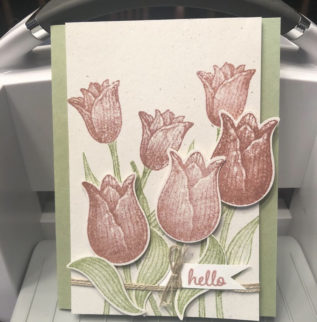
A “throwback” card I didn’t blog about, using the retired Timeless Tulips and Tranquil Thoughts stamp sets from Stampin’ Up.
I discovered some untitled, unposted posts in my WordPress tonight, ones I thought posted already. But as I’ve mentioned, I’ve had trouble getting some of my automatic posts to bounce around to the various apps I initially sent them to. So now I have a “throwback” card, I guess, to share with you (that I thought I’d already shared). And evidently there will be more to come.
This was a make-and-take idea from the 2019 Stampin’ Up OnStage before Covid hit, which I took home that weekend and made almost a year later. I used a retired Naturals cardstock that has little colored flecks in it for the base, with Pear Pizzazz ink and cardstock and Fresh Fig for the tulip blooms. I popped up some of the blooms with Dimensionals (foam dots). “Hello” is also from the retired Timeless Tulips stamp set, but the inside sentiment, “I thought of you today,” came from the Tranquil Thoughts stamp set. I took the completed card to the gift shop that sells my cards, and it did indeed sell quickly. Many thanks to Stampin’ Up for the fun idea.
Hello and thanks for stopping by my part of this Stamp with Amy K’s Tuesday team blog hop! We’ve made cards “for the ladies” today.
One of my favorite things to do is to encourage my girl friends and other women on my life’s path. I had a Mother’s Day card in mind to create, but I’ve had an excess of other work during the last couple of weeks—so I went with this butterfly one instead. It’s a card I would send to one of my dear friends as a thinking of you or a birthday or a card of encouragement, to brighten their day and make them feel special.
I began the card really just wanting to use up some of my scraps of Flowers for Every Season 6×6 DSP (item #152486, currently on sale for $6.90 on stampinup.com during the Annual’s Last-Chance sale). I found three long and skinny scraps that were around the same size and had a pretty pattern among them that I could use as a center strip.
I decided touse the Misty Moonlight color in two of the strips as the color of my card base, and I glued a mat of Very Vanilla cardstock(item #101650) atop the card base, leaving about an 1/8″ border, to give some separation and definition to the colors in the papers that would be on top. (Forgive me for the guesstimate, but I don’t really measure things; I just work with things until they feel right.)
Once I glued the patterned DSP, I felt the strips also needed some Very Vanilla to break the color clash. Those strips are definitely an 1/8″ each becauseI cut them with my trimmer intentionally. 🙂 I also measured the smaller edge of the DSP strips so that Icould place the floral pieces in exactly thecenter. I use a ruler on my work mat and inch inward by eighths and quarters until I figure out where the middle is. (I do better with seeing physical measurements than with abstract figures.)
To add the butterfly, I first took a piece of recently sold-out Bijou ButterflyDSP and fussy-cut the largest butterfly with my Paper Snips before popping up the butterfly on foam Dimensionals (item #104430) in the top half of the card, leaving room for a sentiment below.
To create that sentiment, I used one of the Stitched with Whimsy Dies (item #155314) and Misty Moonlight ink (item #153118) with a sentiment from the Friends Are Like Seashells stamp set (item #158203).
I first took the die to a scrap of Very Vanilla, which impressed the stitching into the paper. The die does not cut around the stitching; I fussy-cut around it myself with my Paper Snips (item #103579) using the edge of the impression as a guide and then edged it with a Misty Moonlight Stampin’ Write Marker (item #153125 for the In-Color Pack of five).
Then I placed my sentiment stamp on my Stamparatus stamping platform (item #146276), created a few test sentiments forplacement, and finally stamped it where it would fit before decorating the sentiment box with embellishmentsfrom Wonderful Gems, Blue Adhesive-Backed Gems (item #153547), 2020-2022 In Color Enamel Dots (item #152480), and Playing with Patterns Resin Dots (item #152467).
I was able to pull out each of the colors used on the card with those embellishments, so Iwas pleased. (The white space in the corner was just too much for me. If you follow my blog posts, you’ll have heard that I’m not a big fan of white space.) I alsofelt that doing something different with the gems in that way spoke to the “unique” idea of the card.
I plan on decorating the inside of the card with a thinner strip of the floral paper and then selling the card to my local gift shop so one of their buyers canencourage a friend or relative too.
I hope you’veenjoyed my card today. To continue on with the hop, press the Previous and Next buttons or click on the linked names in the list. My team members always come up with inspiring and beautifulprojects! Thanks again for hopping with me. If you like this card, please leave a comment orconsider following my blog for future posts. 🙂
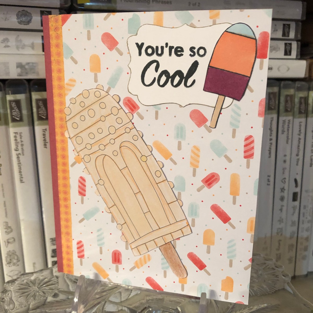
This fun summertime card uses some retired Stampin’ Up DSP—Tasty Treats and Cupcakes & Carousels—along with an unnamed stamp set by a different maker featuring puns (I used the sentiment and the small popsicle here). I even incorporated a large popsicle from an adult coloring book; my aunt colored it. I colored the small popsicle with Stampin’ Blends alcohol markers (Balmy Blue, Light Calypso Coral, and Light Blackberry Bliss) and I used Tuxedo Black Memento Ink for the sentiment and small popsicle. The Decorative Label Punch was used around the sentiment (which I then inked the edges of with a Crumb Cake Stampin’ Write Marker).
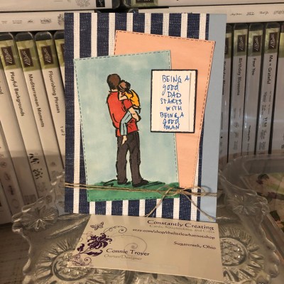
A masculine card for use during Father’s Day (or any day!) for Stamp with Amy K’s Tuesday blog hop.
Hello again and welcome back to my blog—or thanks for stopping by if you’re a new visitor! The theme for Stamp with Amy K’s current Tuesday blog hop is “masculine,” so I decided to create two “Father’s Day” type of cards that can be used at any time for the guys in our lives. Since they are going to my local gift shop for sale, I needed to create something that didn’t explicitly say “Happy Father’s Day” (best for a longer shelf life!).
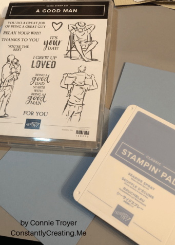
I’ve used all current or upcoming products that are available on June 4, when Stampin’ Up customers can order from the new catalog. I was able to preorder some things because of my demonstrator status. So I’m using stamps from the new cling set “A Good Man” and one of our brand-new In-Colors, Seaside Spray (only available for purchase June 4, 2019 through May/June of 2021).
Seaside Spray is a gorgeous color that reminds me of a smoky blue. It’s one of the shades in my valances, actually, so I have a feeling I’ll be using this color for years to come even after it retires. 🙂 And “A Good Man” is one of those casual, contemporary sets that have a sketched look to the images, with some slight distressing on the sentiments.
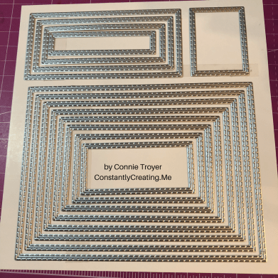
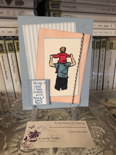
I began each A2 card with a Seaside Spray card base, taking an 8.5×11 piece of cardstock and cutting it in half. I wanted to use two of the colorable images in the stamp set, one on each card, and quickly figured out which rectangles my chosen images would fit inside in my new Stitched Rectangles die set.
I stamped each colorable image in Memento Tuxedo Black ink and die-cut the first rectangles. Then I colored them with some of our Alcohol Blends: Dark Mango Melody, Dark Old Olive, Dark Smoky Slate, Dark and Light Basic Black, Ivory, Bronze, Dark and Light Shaded Spruce, Dark and Light Balmy Blue, and Dark and Light Real Red. (I need to get a dark blue yet, so I had to color all pants in various shades of black and gray.)
Seaside Spray isn’t one of the colors I own in the Blends yet either, so I used Light Balmy Blue for the sky and border, hoping it would look all right. Turns out it does sometimes…but not if there’s a lot of concentration. I filled in the background of one of the images but left the other white. I wasn’t sure which way to go. Tell me which one you like best. 🙂
Next I die-cut other various-sized rectangles from the Come Sail Away and Perennial Essence Designer Series Paper packs and and staggered them with the images and sentiment block.
I also carefully edged around the border of one of the die-cut, colored images with my Balmy Blue Blend. I wanted to do something in the corners the way I would dye ink, but I didn’t trust myself enough to try it with the Blend. I’ve had to redo enough this evening. I’m actually pretty pleased with how the edging turned out. It was easy and looks clean and simple. I liked it so well that I did it on the second card too, with a Night of Navy Stampin’ Write Marker (but it was much easier to accomplish with the Blend, at least tonight!).
After I placed the sentiment block and glued the rectangles for the first card, I added three Heart Epoxy Droplets to two corners to finish the card.
And here is where I have to confess something. Two things, really. I lost a stamp before I finished my cards or this blog post. Specifically, I lost the main sentiment for the front of the cards. I have torn this room apart, searching through my trash can, cleaning off my desk and the cart next to me, checking my clothes…. It still hasn’t turned up. (Please tell me I’m not the only one this has happened to!) I can attest that the new cling stickers are really sticky, because I had the stamp rubber-side down in the case with the sticker facing up so I could quickly grab it and stamp it after I was done with the inside pieces. I’m certain it’s stuck to *something*. 🤦♀️ So... Sigh. I handwrote the same sentiment in a similar kind of font and lightly stuck it to the card—for this blog’s purposes only—where the real sentiment will be stamped in Night of Navy ink on Seaside Spray cardstock. When I find it. Humor me, please. (If I can’t find the stamp eventually, I may just have to repurchase this set because that pair of sentiments is essential!)
This card has now also convinced me that I need to get the Subtle 3D embossing folder. The background still needs something. I thought of stamping too late, after I adhered the rectangles. I’ll pretend I’m going for “clean and simple.”
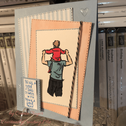
The first card.Another angle, showing the hearts a little better.
And now for my second confession. My roll of Night of Navy/Sahara Sand Baker’s Twine has gone AWOL as well. (I’m betting the cat did it. She’s been known to do so.) So I’m using most of the piece of twine that I snitched at OnStage for my Come Sail Away card I finished later at home. I also cut card #2’s heavy-striped piece of Night of Navy/Whisper White DSP the wrong size…and that was after I spilled ginger ale on four newly opened papers and cut out the wet sections. 🙄🤦♀️ Trust me, if I can make cards I’m proud of with all this chaos, anybody can!
So this is what I refigured for the second card, after some challenges (like the fact that I had to use the Color Lifter too, even before I cut the striped piece incorrectly). I used Linen Thread at the bottom of this one. I felt I needed to separate the Balmy Blue Blends background from the Seaside Spray cardstock because, for me, the color difference was too much to have them next to each other. My first thought was to have the striped paper cover the entire card front, but obviously that went awry. I decided that the mistake wasn’t so terrible as to have to redo that too (and I sort of hated to cover up all that beautiful new In-Color anyway), so I just went with it. I hate wasting paper. (My apologies again for the handwritten sentiment. It will look so much better with the real one….)
The gift shop card.
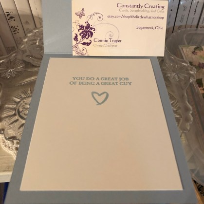
The insides of both cards are identical, and they went so much smoother than the rest. I was even watching a TV show while I stamped. (That does it—I should always watch TV while crafting. But not in the dim light, because I think that’s when I lost my stamp.)
So that’s it for me tonight. It’s time for bed. Thanks again for stopping by my blog! So sorry about all the mishaps. Some nights just go like that.
If you’re interested in receiving a catalog, I’d love to send you one. Just drop me an email with your info using my Contact Me form.
If you want to continue the hop to see what the rest of my fabulous team members made, click the Next button to see what our fearless leader, Amy Koenders, has made, and if you’d like to go backward instead, click the Previous button to visit Sue Prather’s blog.
I enjoy these Paper Pumpkin kits more and more as I receive them each month. The kit for April 2019, “Sentimental Rose,” is simply gorgeous. The kit makes nine cards, three of each designs, with all accompanying pieces and parts and stamp set so you can make the cards as shown or change them however you like. This kit also comes with an acetate card box you can decorate and store your cards in or give them together as a gift set.
Sentimental Rose instruction sheetThe stamp set that’s included with the Sentimental Rose kit.Kit pieces (what I haven’t used yet).Two of the three kinds of included envelopes, with fun liners too!
I made up one kind of card in the kit so far (all three cards of that type). It was the design I liked the best. I used one for my sister-in-law’s Mother’s Day card and have the other two going for sale once I add inside sentiments to them.
Sister-in-law’s Mother’s Day cardThe inside of the Mother’s Day cardThese kits are always so easy to create and give joy and satisfaction at making (and finishing!) something beautiful quickly during busy days. I was watching a movie with my husband when I made the box and the three cards I’ve completed so far. Can’t get much simpler than having the pieces already cut out and provided. 🙂
It’s time I go finish the other six cards. Best wishes to you and your families on this Mother’s Day, regardless of the emotions this day brings for you. Personally, it’s usually a hard one here, so I’m going to craft today and conveniently forget what day it is on the calendar. At least I can make beautiful cards, if nothing else, and tomorrow will be here soon enough.
If you are interested in receiving your own subscription to Paper Pumpkin, you can purchase a prepaid version from me here (you can choose from one month, three months, six months, or a year), or you can choose to be billed each month. Either way, I appreciate your business!
We are wrapping up the 2018-19 annual catalog as well—only a couple of weeks left! Ordering in the new catalog will begin on June 4. You can grab some of those remaining goodies at my online store here (stamps are available until May 24; everything else is while supplies last!).
Thanks again for stopping by my blog. Please feel free to email me if you need something!
Back in the summer, I was asked to make a special birthday card for a special friend’s son who has a fondness for foxes—all shades and types. She gave me free creative rein and said she didn’t care what I did with the idea, but that he might like a red one. I considered several different fox stamps and stickers but finally chose a particular stamp that shows foxes in a wintry scene since his birthday was in February (“300-16 Red Foxes and Birches,” Stampa Rosa).
I’ve never really thought much about foxes in my life, other than thinking they’re beautiful animals in general, so I had no idea how to shade one. Coloring is something I’m still not comfortable with, because I feel like the concept of shading is one I haven’t begun to learn. Luckily for me, the wooden stamp I was using had a colored picture on the front that I just had to attempt to recreate! 🙂
First I had to choose the right paper, though, which evidently was not the bumpy watercolor paper I tried to stamp on first (twice). I knew that, but I was thinking of using my water-filled Aqua Painter on it and felt the paper would handle it. I liked the textured look of the watercolor paper too, but the image was too detailed to stamp cleanly with the bumps in the paper. Then I remembered Stampin’ Up’s Shimmery White cardstock, a must-have in my collection. It’s not any thicker than the rest of their cardstock (other than the aptly named “Thick” cardstock in the line), but it’s smooth and somehow holds up great with watercoloring–and it’s sparkly to boot (hence the “Shimmery” part of the name). Bonus for me was that the paper helped my snow scene sparkle.
Once I had the paper figured out and the stamp stamped correctly, I took my watercolor pencils and tried to emulate what I saw on the wooden stamp block. I had to mix a few shades to get that red fox coat color with the darker spots. After using the watercolor pencils, I took my Aqua Painter to it as planned and went back and forth between the two tools a few times until it felt right (because I have no idea what I’m doing, really. I’m assuming I’ll get better as I learn by trial and error).
After I was satisfied with the colors and the paper had basically dried, I went over the snow and snow-covered branches with my Clear Wink of Stella brush marker to bring back the sparkle to the snow that I’d ended up coloring over with the white pencil. (The sparkle shows through the color a little, but I really wanted the snow to glimmer.) Then I set aside the piece to dry while I figured out the rest of the card.
My favorite crafty thing to use these days are metal cutting dies. They’re simple, quick to use, and make things prettier or more elegant than I could come up with on my own. (They’re also faster for me than my Cricut.) I hang most of them on my wall and the back of my door on large magnetic sheets or vent covers so that I can easily walk over and try different sizes and shapes with whatever I’m wanting to cut out, rather than taking time to flip through a box and take die sets out of envelopes.
For this card, I looked at a bunch of large shapes, trying to decide whether to cut it into a type of oval or a fancy square or a rectangle. I ended up using one of my new sets from Spellbinders that hadn’t yet made it to my wall (Art Nouveau Designer Series “Water Lilies Decorative Element”), because it fit the image perfectly without making me cut it down too much (after all that hard work in coloring, I hated to do that!).
I debated whether to use a SU Cajun Craze cardstock base or a white base and which color to set off where. I ended up cutting several different colors of cardstock with the frame die to test them and see what worked. The card finally fell together color-wise when I brought in the darker wood-grain paper (SU “Country Lane” DSP) as a background to echo the dark shading in the picture. The dark complements the darker orangish-brown Cajun Craze well enough while keeping the same tones. With the white base, there was too much contrast and the frame jumped out at me rather than letting me focus on the colored image. So I ended up using a Cajun Craze base but covering the entire front with the wood grain and using a Cajun Craze frame on top and beneath the white colored image. (It’s a solid piece that gives a mat to whatever is inserted into the sides.)
This particular frame die acts like a gift card holder where the center flowers are, gently opening up and holding whatever is placed in the solid middle. That took some thinking, trying to measure and cut down the colored image so that it fit into that space under the flowers just right. The opening/middle rectangle is much larger than a gift card, but it’s the same idea…though this is only one way to use it.
The one thing I forgot to do to the test pieces was to make sure they were embossed well also. (One reason I love Spellbinders is because they have awesome sections of the dies that are intended to be embossed to give it a little something extra. I miss that feature when I use other brands.) So the embossing could have been done a little better in parts here, because I forgot to take that step to make it pop. I didn’t remember it until I’d mailed the card and noticed it in the pictures. In the photos above, perhaps you can see that the center flower pieces are more deeply etched than the corners above and below them. Next time…I shall remember next time. 🙂
My customer wasn’t picky about what to say on the inside either, other than asking me to write his name and theirs in it and mail it straight to him. So I had to dream up something based on other things she had said to me. After adding fox washi tape to the bottom of a white piece and then matting the paper onto a different kind of wood-grain patterned paper from a 6×6 pad (can’t remember which one now), I used three different stamp sets and another die to make the sentiment section. “A little expression of love” is from SU’s “Painter’s Palette,” “just for you” is from SU’s “From the Herd,” and “Happy birthday” is from MFT’s “LJD For the Boys” (part of the “Happy Birthday, Handsome” stamp). The die is among those in a retired nested set from SU called “Deco Labels.”
I used my stamping platform and its grid to line up the sentiments on the die-cut and stamp out a couple of test pieces in Cajun Craze ink to make sure they sat where I wanted them. (I had tried stamping right on the matted liner paper but I accidentally got ink where I shouldn’t have, so at that point I just had to cover it up because it was already adhered.)
After the sentiment box was stamped, I edged around the die-cut with my Cajun Craze Stampin’ Write Marker so it would stand out against the white paper. And, once again too late, I saw that the double fox spot on the washi piece. I didn’t create that intentionally; it’s just how it came off the roll. I wish I had seen it sooner; it bothers the part of me that prefers symmetry. 🙂 I also added two gold glitter hearts from MME (“Niche/On Trend Foam Stickers”) in the white space of the sentiment box.
I like how this one turned out even though it tested me at times and there are a couple of things I wish I could do differently. It’s always easier to make a similar card a second time. Maybe I’ll try to do one for the local gift shop. After all, I’m not completely convinced that winter is over with where I live.
Some of the Stampin’ Up items I used on this card are retired, but you can purchase the ink, cardstocks, and other current items through my online store if you want to try them (please use code 6WPHJ2MC at checkout unless your order is over $150). The thumbnails below will take you right there…and this is an awesome time to get them since Sale-a-bration is still going through the end of March. For every $50+ order before tax and shipping, you get to pick an item out of a select group of almost two dozen items and Stampin’ Up will send it to you for free with your order! Plus you’ll also get a free gift from me. 🙂 Please contact me if you have questions.
Thanks for visiting my blog! I truly appreciate my readers. ❤️ Have a lovely day! #neverstopmaking #mftstamps
Welcome to another blog post for Stamp with Amy K’s Inkin’ Krew Blog Hop! We have a very talented lineup for you this week. Thanks for stopping by to see what I created. 🙂
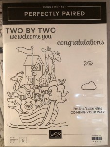
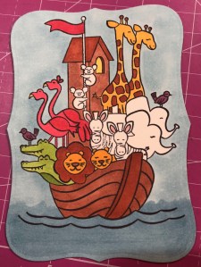
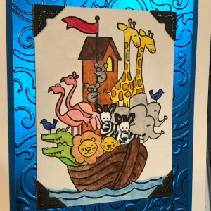
Our theme this month is “Celebrate Spring,” in whatever way we want to interpret that. Because I’m also making cards for my local gift shop, I chose to go with the “new birth/baby” idea. I couldn’t wait to get my hands on Stampin’ Up’s “Perfectly Paired” cling stamp set when it came out—it’s all about babies and features a Noah’s Ark image, one of my favorite themes for little ones. This stamp set (so far as we know) is only available for a couple more months since it’s in the current Occasions catalog.
Since I knew this would be a nice card and likely given with a gift, I started off by grabbing a lovely, thick envelope from my stash and then made the card base a 5×7 size to match it, using SU’s Shimmery White cardstock. I chose Shimmery White because I wanted to color the image.
Well, as usual, although I was aiming for simple, I evidently have to complicate things. And I made plenty of mistakes to cover up. My “MO,” I’m starting to think.
It occurred to me that there were waves under the ark in the stamp but I thought it might look a bit “adrift” all by itself on a flat card base. So I got some of my new Ice Blue Matt Mirror Luxury Cardstock (Crafter’s Companion) and cut it down, leaving about a 3/8″ border of white on the base for the “shimmery” part of the “Shimmery White” to show. Then I embossed some waves onto the mirror card with my Cuttlebug (“Musical Flourish” embossing folder).
My piece of mirror card was slightly longer than the embossing folder, so I embossed both ends and then attempted to hide the faint line the edge of the folder left with some retired 1/2″ SU Pacific Point ribbon. I wrapped the ribbon around the edges to give it a neater, more finished look. I believe I used my 1/4″ Scor-Tape down the middle of the back of the ribbon.
I didn’t actually cover the line left by embossing because the ribbon wasn’t wide enough, but hopefully I distracted anyone from looking too closely. I tried to keep the embossed design from overlapping when I ran it through the Cuttlebug, and the embossed line really isn’t that bad, but it’s mirror card so everything shows…. 🤷♀️ Whether I needed the ribbon or not, it was an attempt to make the card look better, and I built the rest of the design from there.
After fiddling with the layout, I decided to also mat the mirror card with Pacific Point cardstock to bring more of the ribbon color in for balance. I left 1/8″ of the mat showing, glued the mirror card to the mat, and then glued the combo onto the card base. I used my ATG tape gun for these. Then I set aside the card so I could concentrate on the image. And here’s where things got interesting.
I wasn’t sure whether to use my Stampin’ Blends alcohol markers to color it or my usual: watercolor pencils with either an Aqua Painter or a Blender Pen. I figured I’d do one of each type of coloring and leave the extra in my “card parts” bin for faster cardmaking later. Because those mediums require different inks to control the color, I stamped the ark image from “Perfectly Paired” once in Memento Tuxedo Black (for the alcohol markers) and once in SU’s Archival Basic Black (for the watercoloring). I labeled the backs with a pencil so I’d know which went with what…and then promptly started coloring the wrong image with the wrong medium because I was “doing,” not “thinking.” 🙄🤦♀️
Surprisingly, the Archival Basic Black didn’t smear too badly with the alcohol Blends, but I had been careful about not coloring over the lines, just because I was carefully coloring. It wasn’t until I smeared the lions’ whiskers a little that I even realized I’d switched the pieces. (Live and learn?) But smearing lines is why we are supposed to use Memento ink with alcohol markers. Lesson learned.
And then I discovered that I don’t yet have enough Blends to finish coloring this particular image. 🤦♀️🤪 I’ve been building my collection a little at a time, and although the Smoky Slate and Basic Black Combos have each made it to my purchasing list at least once, I ended up dropping them for things I wanted more. (Sacrifices!) Therefore, I have to stop coloring the image until I can get those and finish. For the record, though, this was as far as I got, and I really like this medium. (If you look closely, you can spot my whiskers accident.)
So I had to put all that away and regroup. I couldn’t remember whether Memento would smear if I got it wet (since it is a water-based ink), but I just wanted to get something going that I could use. I mentally crossed my fingers and dove in. I could always stamp another one if I had to.
Fortunately, it worked just fine—no smearing that I can tell. My coloring isn’t perfect, but at least the lines didn’t move. I went with the Aqua Painter to smooth out the watercolor pencil lines too…though in hindsight, I should have tried the Blender Pen, for better control in small places. Or just chucked it all and gone straight for my stash of Stampin’ Write markers. (I hope you’re learning from my mistakes! This veteran scrapbooker is still learning so much about cards!)
I will admit to a little cheating as well. I knew I had a Pacific Point chalk in my arsenal. As my retired SU watercolor pencils are unlabeled, I went for the chalk to color the water (with my Aqua Painter) so I could be all matchy-matchy instead of throwing off the shades by introducing some other blue. 😊 Also, I lightly colored the background a sky blue so that it wasn’t stark white paper. If I was coloring waves, I had to color sky too, right? But it’s hard to see in the picture.
So this is where I ended up with it (including doctoring the zebras with white Smooch paint and a Memento pen in desperation after watercoloring and black got the better of me). Coloring was the longest part and why it may be better to use some sort of marker next time. 🤷♀️ Another lesson learned!
The main focal image, colored.
Once the image was done and dried, I covered a good portion of the back of it with my 1/2″ Terrifically Tacky Tape (TTT), which is just like SU’s Sticky Strip. I did this to combat the curvature of the paper that happens once water goes onto it. Then I peeled off the tape backing and centered it in the section above the ribbon on the card front.
I had found some black, glittered chipboard faux photo corners when I was debating about the layout, so I glued those overtop the corners of the image with my Art Glitter liquid adhesive. And then I pulled a metal bar sentiment (“celebrating your arrival”) out of the heap of baby ephemera in front of me on my desk, and I adhered it to the top of the ribbon with more 1/4″ Scor-Tape. The front was done. Finally. And I’m even happy with it. 😂 I especially love how the foil look of the matt mirror cardstock shines and changes depth and color in the light. I so love using specialty materials to make cards pop.
(Oops! You can see that faint embossed line in this pic! Well, it’s not that noticeable in person. 😊)
For the inside of the card, I used the “Two by two we welcome you” sentiment from “Perfectly Paired,” stamping it with VersaMark on Shimmery White cardstock before heat embossing it with “Blue Tinsel” embossing powder from my stash. (No idea who made that; I’ve had it for years.) It was the closest embossing powder I could find to the Pacific Point color I’d been using, and it does actually look glittery, like tinsel, and has some texture to it once embossed. I then backed the white sentiment piece with a die-cut Pacific Point cardstock tag from a Spellbinders die (“Fancy Tags Two,” I believe. #neverstopmaking). I think it turned out quite lovely.
To finish off the card, I took a strip of dotted blue (SU Pool Party) cardstock from the retired Tutti-Frutti Cards and Envelopes pack and attached it to the bottom of the inside. I also cut off a small strip of matt mirror cardstock to top it. And then I found two goofy pink flamingo stickers in my stash from Sandylion and stuck them to the bottom right corner just for fun, to carry through the theme. I was looking for my smaller Noah’s Ark stamp for the corner, but I have to keep looking. 🤔🤷♀️
I haven’t decorated the envelope yet, but I’m thinking of stamping a row of various animals across the horizontal bottom (under the address section) as a sneak peek to the theme.
Below the list of hop participants are the current products I used in my card (or similar ones) that you can purchase through my online Stampin’ Up store if you wish to own any. (Please use host code 6WPHJ2MC when you check out.) Don’t forget that we have until March 31 to get free gifts from Stampin’ Up through Sale-a-Bration with orders of $50 or more before tax and shipping! There are some awesome reward products available! I also give free gifts to those who order through me. 😉
Thanks again for visiting today. I hope my mistakes keep you from making your own! Feel free to post questions or comments. 🙂
To continue with our hop and visit Jaimie Babarczy’s blog offering, click Next or her name in the list below. To view what Karen Ksenzakovic created, click Previous or her name. Thanks for hopping along with us!
A bit about the Notes of Kindness card kit I made up recently – twenty cards in one night!
I promise that I make more than card kits these days – and I’ll have some individual cards blogged about soon – but right now I’m trying to accumulate some stock for my local gift shop and get ahead on cards I need to send myself. 🙂
I recently found myself looking at another card kit I had waiting, and before I knew it, I had a bunch done! As a matter of fact, I made all twenty cards in one sitting (though I did go back and add sentiments to a few insides the next night). That’s just not me. I take way too long to make cards with my level of detail. What a freeing, productive feeling it was to have that many done at once! And I didn’t feel like the designs were too simple for my style, either.
This particular card kit, the Notes of Kindness All-Inclusive Card Kit, is current in the 2018-2019 Annual Catalog from Stampin’ Up, on page 7. The kit itself is $35 but it comes with a clear stamp block, an Archival Black ink spot, a 6-piece set of photopolymer stamps, Copper Baker’s Twine, adhesived mini pearls, Stampin’ Dimensional pop-up dots, die-cut sentiment stickers, die-cut flowers, lined envelopes, twenty printed card bases, and a kraft box you can store or gift them in. Full-color picture instructions are also included. All you need is your choice of adhesive and anything extra or different that you want to do.
There is also a refill kit you can purchase for $21 that includes all this except the stamp set, block, ink, and box – and the refill makes another twenty cards. (I know what is on my wishlist!)
I snuck another stamp set into my work so that I had “Best Wishes” wedding and anniversary cards as well as thank-yous. I also used some Wink of Stella Clear on some of my flowers to make them sparkle and shine. I made the card fronts the way the kit suggested otherwise. I did use some retired thank-you stamps on the insides where appropriate, just so I had some variation. And I was even able to use one of the German sentiments that are included. I live in a Pennsylvania Dutch area and thought I’d test one and see if it sells. (There are French sentiment stickers too!)
The colors in the kit are some of my favorites: Blushing Bride, Blackberry Bliss, Soft Seafoam, Mint Macaron, Mossy Meadow, and Basic Black and Whisper White. Though the sentiments inked up well, I love that they are photopolymer – for just in case I needed to realign something.
I think this one is my favorite. I turned it into a 5-piece card set complete with acetate box and pen!
You can see some Wink of Stella shimmer on the dark parts of this flower too.
I used the current Stitched All-Around stamp set for the “Best Wishes” cards (inside and out).For this tiny thank-you sentiment with the twine behind it, I laid down some ATG tape first, to keep the twine controlled, before adding the Stampin’ Dimensionals and sentiment.
You can really see the Wink of Stella shimmering on this succulent. I varied where and how much I used it on the succulents but ended up loving them all!
Anyway, I’m not usually a card-kit user, but I’ve been beginning to change my mind about them. As long as they don’t feel too simple to me, I’ll probably give others a try now too. I also still have the Lots of Happy kit to finish sometime. 😉
If you’re interested in trying this kit or others, or if you need some supplies, I’m happy to be your Stampin’ Up demonstrator! Sale-a-Bration just started this week, which means you can get a free select product with any $50 purchase. And they even have a couple of amazing products for $100 orders! SAB goes through March 31. Let me know if I can help! ❤️
Some cards from the Designer Tin of Cards Project Kit – quick and easy cards with a bit of variation.
Hello again. 🙂 I’ve had interest in a blog post about one of my birthday cards, so I thought I’d do up a quick blog post about it and a couple of others I made from the same kit.
The kit in question is the now-retired Designer Tin of Cards Project Kit from Stampin’ Up. When I was on vacation this past summer, I took an evening and mainly made up the cards the way the kit suggested, with little variations to the cards here and there. I didn’t add the sentiments at the time because I wasn’t sure what I would need them for and I didn’t have all my options in front of me anyway. So little by little I’ve been picking out of the batch and finishing them to send as needed, with some still waiting.
All my blue-and-white-and-gold ones have gone to the local gift shop for sale, and they had different sentiments. I used one of the masculine looks for my dad’s birthday. I used the banners/garlands base for another relative’s birthday and added some llama and cactus paper elements from a UK magazine I had with me. (I still have two of those bases to create with, actually.) I sent at least one of the coral hibiscus cards to the gift shop, and one went for a friend’s birthday. I used the “Celebrate Your Day” and “Sending Love” sentiments from the coordinating stamp set. I still have two coral and one masculine card to sentiment yet.
I didn’t used to be very fond of the kit idea in general because they’re usually too simple for my preferred style of details. But as I get busier, I have seen how useful they can be for when I want to send a handmade card but haven’t had extra time. Also, now that I’m constantly making cards for the gift shop, it’s been nice to fall back on ones that are faster and easier to make without taxing my design skills. I’m beginning to let go of the need to have everything perfectly perfect and just the way I like it. I simply don’t have enough time to keep up with all I’d like to do in this life. They need cards, so I must make them and not fuss around. Besides, some people really prefer the simpler, “to the point” cards rather than all the detail and fluff I like, so this way I hope to reach a bigger audience in interest. 🙂 For ones I send personally, I like to create cards with the recipient in mind. But for the shop, I don’t know who is buying them or who they are for. So the kits are beginning to work for me there. (And if any of the kits make it to the clearance rack, they’re even cheaper, which I also like.)
The kit coordinates with the Designer Tin of Cards stamp set, which I used for a few of the cards but not all. It was supposed to be used to make a filing system of cards on tabs, with the tin to hold everything, but I chose to use the sentiments rather than the tabs.
I’ve added in some of the finished cards as examples for you to see what the kit was like. Evidently I didn’t take all the pictures I should have. 🤦♀️ But if I find other pics, I’ll update the post with them.
The Designer Tin of Cards stamp set.Sentiment from the “Birthday Wit” stamp set, with Pacific Point ink, gold sequins, and gold washi tape.Sentiment from Blended Seasons stamp set, with Night of Navy ink.Unbranded happy birthday die with blue-and-white card base, vellum, gold-edged tag, gold sequins, gold washi, white twine, and a blue flowered die-cut all from the kit. I stamped the flower on the envelope with the coordinating Floral Phrases stamp set in Night of Navy ink.Blue flower die-cut and gold washi tape from the kit.The only additions to the kit here were the Martha Stewart cake sticker and the gold-foil sentiment from a Spellbinders die. The kit even included paper clips!Ink is Night of Navy. Stamp is from MSE.In this gift-shop pic, one of the other blue-and-white ones can be seen with the sentiment “Best Wishes” in gold foil. The die is from a UK magazine. (Two other “kit cards” are also in the picture.)
Thanks for reading! If you have any questions about how I created something, just leave me a comment. 🙂 And stay tuned for another blog post about a “love” card for a blog hop. 🙂
If you need any papercrafting supplies, I’d be happy to become your Stampin’ Up Demonstrator! My direct store link is in my blog sidebar.
Sharing four Christmas card designs today from the Timeless Tidings Project Kit – an easy, fun way to make twenty Christmas cards quickly!
Hello, and welcome to my blog for Amy’s Inkin’ Krew’s blog hop for Tuesday, November 13! The theme for the month is holiday or Christmas, so I finished up some of my cards in Stampin’ Up’s Timeless Tidings Project Kit to show you.
When I got the kit in last month, I took a couple of hours to put the various pieces of the four card designs together (twenty cards total) – other than the banners and circle sentiment pieces, which I needed more time to do later. The kit looked so fun and festive that I had to tear into it right away. 🙂 The premade card bases have lines on them to show where to put the certain pieces, which is all outlined in the instruction guide. (Just look for the lines first so you don’t accidentally glue the layers to the back side of the card base, as I did. It’s easy to do because the front and back look the same other than that little guiding line!)
I had not ordered the Timeless Tidings stamp set that is made to fit perfectly on the sentiment spots simply because I ordered the kit when it was low inventory so I would be sure I got it. I figured I would think about the stamp set later. Later came last week when I started looking through my stamp sets to see if I already owned sentiments that would fit the four differently-sized areas…since my SU wish list was still plenty large with only two months left to order holiday products. (In hindsight, it would have been easier and faster to simply order the matching sentiment set, so keep that in mind! 😂)
I did find a current stamp in my inventory that fit the kit, and it is “Peace and Joy” from the photopolymer set that comes in the Christmas Traditions Punch Box. (Several would have fit, as they are all of similar size, but I liked that one best for the tree card.) The next time I use it, I may try to color various parts of the stamp with Stampin’ Up markers to draw attention to the pretty pine branches on it.
The decorative tree piece and the poinsettia were already watercolored and included in the kit – I just had to glue them down. (Also, that Christmas Traditions Punch Box really is delightful. The stamps are beautiful, and I love that the punch coordinates with them and other stamps in our catalog. Be sure to give this one a second look!)
The “Merry Christmas” sentiment on the poinsettia card is from a retired Stampin’ Up set called Versatile Christmas. Both of the cards have been embellished with a gold foil border and the gold and green rhinestone gems that are included with the kit. On the poinsettia card, I put green stones on the edge of the sentiment and gold ones inside the flower center.
For the other two cards, I used sentiments from a Penny Black stamp set. These cards also have gold foil and gems for embellishment, and I popped up the piece under the largest circle with foam dots. The one says “Happy New Year” because it fit the large circle best, and truthfully I have sent New Year’s cards instead of Christmas cards at least twice. 🤷♀️ So I’m bound to use it at some point. 😂 I used Old Olive ink for all four cards.
Not buying the matching stamp set outright did end up taking more time than I would have liked. The kits are meant to be an easy way to get a bunch of Christmas cards done quickly, so scrounging in my stash sort of defeated the purpose. If you’re a budget buyer like I am and have unlimited time, sure, you can find ways to work around it and even create your own cards from various pieces rather than following everything exactly like I did (other than the bling)…but if you want a painless, faster way to get the job accomplished, it’s worth the extra money to get the set. I actually never thought I’d say that. 🙂 The sentiments are great ones to have on hand for later anyway, so I doubt you’ll regret the purchase.
The Timeless Tidings Project Kit is currently on backorder for a couple more weeks yet (it’s been popular!), but they have lots more coming soon if this is something you’re considering for a future purchase. If I can help you order it or other supplies, or if you just need a Stampin’ Up demonstrator, I’m happy to help! Feel free to contact me or go to my store website listed over in the right sidebar.
Thanks for stopping by and reading! Hopefully you’ll be finding a bit of time soon to make some easy Christmas cards, if that’s your thing. I have quite a few outsides finished (not counting the twenty in this kit!), but I still need sentiments on the inside. And as I didn’t get mine finished in time to send last year, I’ve determined that this year will be different! The weeks to Christmas are already counting down, though. I don’t know how it’s already mid-November. May your holidays (and your Christmas) be merry and peaceful and wonderful this year. ❤️
To continue “hopping” along with our group, just click the “Next” button to view Karen Ksenzakovic’s offering (or click this link), or go to the “Previous” button (or this link) to view Linda Richenberg’s project. For your convenience, the list of all our participants are listed in order below. Merry early Christmas, everyone!

![IMG_E3143[1]](https://constantlycreating.me/wp-content/uploads/2023/06/img_e31431.jpg?w=840)
![IMG_E3144[1]](https://constantlycreating.me/wp-content/uploads/2023/06/img_e31441.jpg?w=840)