Cards from the Notes of Kindness Kit with Variations

A bit about the Notes of Kindness card kit I made up recently – twenty cards in one night!

I promise that I make more than card kits these days – and I’ll have some individual cards blogged about soon – but right now I’m trying to accumulate some stock for my local gift shop and get ahead on cards I need to send myself. 🙂

I recently found myself looking at another card kit I had waiting, and before I knew it, I had a bunch done! As a matter of fact, I made all twenty cards in one sitting (though I did go back and add sentiments to a few insides the next night). That’s just not me. I take way too long to make cards with my level of detail. What a freeing, productive feeling it was to have that many done at once! And I didn’t feel like the designs were too simple for my style, either.

This particular card kit, the Notes of Kindness All-Inclusive Card Kit, is current in the 2018-2019 Annual Catalog from Stampin’ Up, on page 7. The kit itself is $35 but it comes with a clear stamp block, an Archival Black ink spot, a 6-piece set of photopolymer stamps, Copper Baker’s Twine, adhesived mini pearls, Stampin’ Dimensional pop-up dots, die-cut sentiment stickers, die-cut flowers, lined envelopes, twenty printed card bases, and a kraft box you can store or gift them in. Full-color picture instructions are also included. All you need is your choice of adhesive and anything extra or different that you want to do.

There is also a refill kit you can purchase for $21 that includes all this except the stamp set, block, ink, and box – and the refill makes another twenty cards. (I know what is on my wishlist!)

I snuck another stamp set into my work so that I had “Best Wishes” wedding and anniversary cards as well as thank-yous. I also used some Wink of Stella Clear on some of my flowers to make them sparkle and shine. I made the card fronts the way the kit suggested otherwise. I did use some retired thank-you stamps on the insides where appropriate, just so I had some variation. And I was even able to use one of the German sentiments that are included. I live in a Pennsylvania Dutch area and thought I’d test one and see if it sells. (There are French sentiment stickers too!)

The colors in the kit are some of my favorites: Blushing Bride, Blackberry Bliss, Soft Seafoam, Mint Macaron, Mossy Meadow, and Basic Black and Whisper White. Though the sentiments inked up well, I love that they are photopolymer – for just in case I needed to realign something.

I think this one is my favorite. I turned it into a 5-piece card set complete with acetate box and pen!

You can see some Wink of Stella shimmer on the dark parts of this flower too.

I used the current Stitched All-Around stamp set for the “Best Wishes” cards (inside and out).
For this tiny thank-you sentiment with the twine behind it, I laid down some ATG tape first, to keep the twine controlled, before adding the Stampin’ Dimensionals and sentiment.

You can really see the Wink of Stella shimmering on this succulent. I varied where and how much I used it on the succulents but ended up loving them all!

Anyway, I’m not usually a card-kit user, but I’ve been beginning to change my mind about them. As long as they don’t feel too simple to me, I’ll probably give others a try now too. I also still have the Lots of Happy kit to finish sometime. 😉

If you’re interested in trying this kit or others, or if you need some supplies, I’m happy to be your Stampin’ Up demonstrator! Sale-a-Bration just started this week, which means you can get a free select product with any $50 purchase. And they even have a couple of amazing products for $100 orders! SAB goes through March 31. Let me know if I can help! ❀

Thanks for reading!

A Polar Bear Christmas

Playing along with a Stamps, Ink, Paper Challenge (128) with a Snowy Polar Bear Christmas card and matching thank-you note.

Here’s another adorable card with matching thank-you note that I created for a custom card order needing to be mailed soon. I think it fits the Stamp Ink Paper 128 challenge, shown below:

http://stampinkpaper.com/wp-content/uploads/2017/12/SIP-Challenge-128-Let-it-Snow-NEW-800.jpg

So here are my matching cards.


I’ll tackle the main Christmas card first. The embossed snowy background was given to me by a crafty friend, and I flipped it over so that the debossed side was showing. I matted it with some current SU Emerald Envy plain cardstock on a Thick Whisper White card base. The paper-pieced polar bears and trees are 3D stickers from a “Holiday Time” series – I think they might be from Walmart. They’re actually pretty cool, using poms for the tails and the ends of scarves, and the tree is glittered. 

I was having trouble fitting all three on the A2 card base, so I thought if I had one peeking over a snowbank as if he were watching the scene, I could put them a little closer together. My “snowbank” is made out of two strips of shimmery translucent vellum paper, which I cut by tracing a Card Creator Spellbinders die and then cutting it out by hand (hubby was sleeping and I was trying to minimize the noise, plus I wasn’t exactly sure where I wanted the mounds to go, so I traced/cut it especially long and then positioned them where I wanted them). I popped up the vellum in parts for effect and to fit the back polar bear in without squishing him (trying to reduce that whole “translucent” thing). 

I had thought of using white handmade mulberry paper instead of vellum, but I didn’t feel like making a bunch of noise and rooting around in my “specialty paper” drawer since it was late and I was only supposed to be “fiddling” (i.e., going to bed soon) as opposed to outright intentionally creating. 

The “Happy Holidays” sentiment above the scene is from a 2016 Hampton Art stamp and die set (SC0718). It bugs me a little that the font sizes of the two words is not the same, but as the set is either photopolymer or acrylic (read: see-through), it was easier to line up than others. I inked the stamps with Stampin’ Up’s Emerald Envy ink overtop a strip of polka-dotted paper from American Crafts/Dear Lizzy “5th and Frolic.”


I kept the inside of the main card simple with a “Warm Wishes This Holiday Season” sentiment from Close to My Heart’s “Scandinavian Wishes Stamp of the Month,” (SU Emerald Envy ink), punched it out with my retired SU Scallop Oval punch, and matted it with my SU Decorative Label punch in Emerald Envy cardstock. 

The thank-you note, on the other hand, is simply a SU Whisper White notecard size (3.5×4 7/8) with a background of gold snowflakes on vellum from SU’s “Winter Wonderland” Designer Vellum Stack. I laid an Emerald Envy cardstock piece embossed with  the “Thanks Words” Cuttlebug folder (371134) on top (putting the glue for the vellum underneath where the cardstock layer would hide the adhesive) and then cut another “snowbank” out of the gold snowflakes before finally adding the last sticker in the Holiday Time set. (Yay, another thing used up in my stash! I really am trying, hubby dear.)

These cards were ones that were simple, thought-provoking, and yet fun to create – my favorite kind. It was my first time trying to create “snowbanks” even though I’ve seen them used with regularity this season. And I’m fairly pleased with how it all turned out. Unfortunately, they’re another two cards I can’t duplicate unless I find another pack of stickers (thus then adding to my stash). 🙂

Hope you’ve enjoyed this offering! Thanks for stopping in. 

Thank You (Seeds for Your Garden) card

A simple (and overdue) thank-you card using American Crafts, Glitz, and Stampin’ Up products.

Sometimes life gets ahead of me and I get behind on doing the seemingly easy, necessary things in life. One thing I’m really bad about is sending thank-you cards.

It’s not that I’m not grateful or that I don’t think of the sender every time I see or use their gift…I just fail to tell them how much it means to me. I often feel at a loss for words or inadequate when trying to compose all the feels onto a tiny 5-inch card. I could blame my parents (though I won’t), as I never had to write thank-you notes for gifts received. (Maybe because of that, receiving them just isn’t that important to me personally. As long as I know they got my gift, I’m good.) I’ve finally conceded that I’m wholly out of practice and singularly bad at composing them – and 100 percent a procrastinator. I’d rather the words magically flew onto the card and into the mailbox without my fumbling assistance, while I hope they pass muster. Not to mention that writing them out now kills my fibromyalgic hands. A card and a half, give or take a half, and I’m done in with hand cramps. I love the gift; I love the sender; I hate the card that follows.

Well, like other things in life, thank-you notes are apparently necessary and extremely important to (hmm, how do I say this?)…to people who aren’t me. For this particular thank-you note, I’m about two months behind. I’ve known what front piece I was going to use for at least that long, but it was a matter of finding or taking the time to do up a card. (Now that I’m a cardmaker, I feel REALLY funny about sending a store-bought card even if I’m short on time or behind on putting one in the mail, as if I’m secretly saying that I don’t care near enough about them to take the time to handmake a card. Therefore the calendar stretches out before I get the required cards made. Sigh.)

I’ve been having a pretty busy year. I’ve flown a handful of times, once out of the country, been to board meetings twice, made a half-country trek by car once and not-as-long other car trips at least twice, said goodbye to a dear uncle, crammed in editing projects, and continued to take and finish custom card orders through it all. It’s starting to feel as if I can’t stay home long enough to get ahead on anything. Enter the now-very-behind thank-you note, which I had to make and send for the reasons above. I’m just about out of brain cells at this point.

I knew how I wanted to make the card once upon a time. I laid it all out in a heap on my desk, to signify to myself that THIS was how it was going to go. And somewhere along the line other projects joined it and other work also had to get done, and the long and short of it is that by the time I finally had to shake myself out of the procrastination coma and send the blooming thing, I had only a semblance of an idea of what I was supposed to be doing with it. Plus I couldn’t find the burlap piece. Hubs decided to join me in the craft room that night, and we watched a movie on my not-so-used TV while I fiddled with the card, trying to come up with some new design.

The card is pretty simple, or at least it looks it. I grabbed a leftover base from my stash of unused Basic Gray baby-invitation bases, hoping I won’t regret that decision when I work on her baby album next year; I liked how the darkness of the outline of the flowered piece matched. And then I just rearranged card pieces in front of me until something made sense. I think I actually meant to do something else with it, but the sizing on the striped paper was perfect as it was and rather distracted me, so I ended up completely forgetting that I meant to go the other direction. I tried a number of compilations, but in the end, this is what made sense to my boxy self.


The striped paper is from Stampin’ Up. I needed to have some sort of color separation and size difference between the flowered piece (which is from American Crafts, 320490) and the stripes, so I ended up using a yellow remnant from Glitz Design that mostly matches the yellow in the flowers. I had a better color match but didn’t like the pattern or size nearly as well. I added “bling” in the form of something akin to Stampin’ Up’s Candy Dots; these yellow and green dots are from SU’s “Little Moments” Project Life Accessory Pack. It always amazes me how colors across completely different designers can still match. Or maybe it’s more amazing that I actually manage to pull them all together on a card.

At this point I decided the card was too simple or plain. I have this fight regularly with myself. One side of my brain says it’s fine/nice/great/perfect the way it is and shouts at me to leave it alone, and the other side of my brain hesitates and weighs things and just isn’t convinced, thinking it’s not quite right yet – more tinkering needs to be done. The latter won that day. I have a bottle here of SU’s Dazzling Details glitter glue in an iridescent whitish color, and I’m not sure I’ve ever used it much. This became evident when the glitter glue came out in nonspreadable clumps instead of a smooth flow. I did my best at smooshing them out onto the flower centers while I mumbled that I should throw the bottle away, but I persisted. It was better than trying to find a similar color in my Stickles from Ranger.

I finished the centers, leaned back in my chair, put my feet up, and watched some more of the movie before going on to create the inside of the card. And right after I flipped open the card and got glitter on my fingers, I remembered that the glitter glue on the flowers would still be wet. (I like to take an entire day to dry them, if I can.) So I muttered some more, closed the card, got out the bottle of glitter glue from where I’d put it away, and proceeded to redo the flower centers.

Eventually the inside did get finished. I’m just now realizing that I forgot to take a picture of it – the urge to mail the card was finally the foremost thing in my mind, apparently – but it was just a white piece to write on and a couple of leftover strips of paper as bottom borders. And, as usual, I didn’t have enough room to write all the heartfelt thoughts battling in my head for the 5-inch piece of paper. Sigh. At least this one is finally done and gone. I’m relieved that I no longer have to remember to do it. Until next time, that is.

…I really need to get better at this thank-you-note thing. Too bad practice comes with writing them. 😛

Masculine mover thank-you card 4

Card 4 in my series of five masculine thank-you cards for movers.

Continuing in my set of five masculine thank-you cards (to be sent to people who helped my client move), this “Card 4” is another one where I couldn’t get the brown-and-white DCWV “key” paper to work with the plaid and metallic silver-toned base. The colors just weren’t compatible enough. But I thought it would still be simple and masculine, two other requirements for the order, so I continued.

At this point in the order, it was just about keeping things consistent (like the gold embossing powder)…and I’d already used the plaid once on a different card anyway (in my “Card 1” post here). This section was the remnant of the 6×6 piece. I like to use up my scraps when I can to keep my scraps box under control, so there wasn’t much question as to whether I’d use it now. (It was “either use it now” or throw it on the desk to be used soon, since I couldn’t really take the time to look up which Stampin’ Up paper pack I’d taken it from. The scraps box wasn’t an option. I’m fussy about my SU paper and always put the scraps back with their pads since I have matching inks and embellishments in my supplies.)

I wish I knew what company this base is from. I was given a number of thick metallic bases in a craft swap, and they’ve been great to work with. They feel thicker than the usual Stampin’ Up cardstock I typically use for my bases (those are an 80-lb card weight, I think). A good base is key to the card not falling over or flattening instead of standing up.

The mechanics of how I did this card are simple. I’ve already mailed the cards, so I’m not sure of the precise measurements of the individual pieces, but I think the remnant plaid piece is just over 2 inches. I believe the squarish one in the middle was the back side of the grey plaid paper I used in “Card 1” (K and Company). I already had a chunk cut out of it for the other card, so one side had already been shortened. I measured where I wanted it to fall on one of the strips of the yellow-and-grey piece and lopped off the other side with my Fiskars trimmer.

(Confession: I don’t do a lot of measuring or precutting. It’s more annoying to store the paper as pieces get cut out of it, but I’m always afraid of limiting myself to certain sizes or creativity if I “only” have so much of something because I’ve cut it down. I do both scrapbooking and cards, so I can be pretty random in my sizing of card fronts, mats, and journaling boxes. Usually I just take the large piece of paper and a pencil straight to my project and mark where I want to cut it for that specific purpose and then file the rest away to use later. I probably ought to rethink this as I try to streamline my process for card making, since precut pieces would make it faster, but I’ve been loathe to change.)

snapseed

Once I had the grey square piece cut, I took my anti-static bag to the front (I remembered!) to prepare it for heat embossing. I already had my embossing tray, coffee filter, embossing powder, and heat gun out (and just typing that sentence shows why it’s easier to do multiple cards with the same supplies at once), so I stamped the thank-you stamp (“One Big Meaning,” Stampin’ Up, current) with my VersaMark pad, pressed it onto the grey piece (don’t wiggle it!), sprinkled it with the gold embossing powder (Hampton Arts), and took my (very old) Marvy Uchida heat gun to it. (See this post about why I use a coffee filter with my embossing powder.)

It actually turned out well! Though I am beginning to wonder whether my powder is too old – or maybe it’s just the brand. I don’t think my Stampin’ Up powders dimple like that, but they’re newer. And I don’t heat emboss all that much, so I haven’t really compared it to my others yet. The dimpled look is fine for these masculine cards and during other times as well, but occasionally I do want a smoother look, which seems possible with other powders. Or companies. This is something I need to research. (If anybody has any knowledge or tips, feel free to leave me a comment!) After I glued the square piece onto the plaid one with my ATG gun, I repeated the embossing process with the “for your kindness” stamp (“So Very Much, Stampin’ Up SAB set, retired). Then I sat back and took a look at it to see if the card “needed” anything else.

It wasn’t very long before the empty spaces in the square bugged me. This is why I have trouble doing simple cards. I apparently despise “white space.” My husband is forever telling me to leave things alone and not fill every little area. I’m not very good at that. But sometimes something actually needs to be filled and looks better once it is. I think that’s the case with this one. It would have been fine on its own, but the little added touches make it more special. I used a gold peel-off from Dazzles for the top swoosh and heart doodads – not sure which exact one, since I’m still not near my supplies as I write this. (I’ve figured out how to blog ahead of time and schedule posts!) After I was done with the center, I adhered my Crushed Curry Enamel Dots (Stampin’ Up, retired) at the edges of the plaid piece. I probably could have left those off entirely, but I had pulled them when I was looking for something to finish off the grey square, so they were in front of me. And I don’t “leave well enough alone” very well either. 🙂

I was pleased with how this one turned out. It fit the requirements and didn’t take overly long.

Thanks for stopping by!


Masculine mover thank-you cards 2 and 3

In my quest to continue creating the masculine thank-you cards for my newest custom order, I went back to the brown and cream “key” paper I’d taken out of a DCWV 12×12 Stack (I think it came from “Tradewinds,” but I’m not near my supplies to check). I had to use this paper; I wasn’t sure what else to grab to signify the whole “thanks for helping us move” idea. 

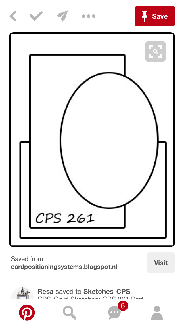
My initial thought was to create cards based on one of these sketches turned on the side, using the key paper and three other coordinating papers…


…but I couldn’t get the sizing of the sentiment to work with the key paper and not completely hide it. In the end, since the sentiment stamp had been approved by the sender, I nixed the sketch idea and just went back to the basics: covering the majority of the card with pretty paper and layering something on top. In this case, I layered the key paper and then a retired 5/8″ gold satin ribbon from Stampin’ Up across the center of the card. I did that in the wrong order, but I’ll spare you the details.

I found two cream 5×7 card bases in my premade bases pile, so they were perfect to use with the coloring and the size of the sentiment stamp. I decided to ink up the edges with a dark brown chalk ink from Colorbox (Chestnut Roan?) to balance the brown in the key paper.

I only have a few dies that are large enough to hold the entire stamp and not cut off an edge (it really is big, people), so I chose one that was more decorative than the rest since the rest of the card background was pretty simple. The die is from Spellbinders, but I bought it used and haven’t looked up the name yet. Spellbinders dies allow for both cutting and dry embossing, in subsequent steps. You cut the outside first, then flip over the die with the paper still intact and add a squishy embossing mat and a firm knock-knock plate on top to get the embossing pressed into it. (“Knock-knock” is not my term for how you can tell the difference between some of the plates, but I can’t remember the source right now. However, it’s brilliant and I’ve never forgotten it! I’ll try to update and add the source later after I search for it.)

I found a light brown paper in one of my Martha Stewart 12×12 paper pads – it was a shame to cover up the pretty blue and pink flowers on the opposite side, but there was no helping it. The brown worked better than anything else I had nearby. Once I had chosen the paper I was going to use behind the sentiment, I laid the die on top and cut roughly around it, leaving a little room. (Have to cut down the 12×12 piece to get it into the 6-inch(ish) Cuttlebug for the die cutting and embossing.) Then I started the embossing process. 

Heat embossing used to really frustrate me. It felt like I never got a good clean image when I was done. I’m a perfectionist and hate it when stray flecks of embossing powder attach and then are heated onto the paper where I haven’t placed ink. With practice – and with the Embossing Buddy anti-static bag – I’ve gradually gotten better at it. I keep a paintbrush in my close-at-hand tools to whisk away stray flecks upon inspection before taking the heat gun to it (thank you, Betty!). Well, even with all that perfectionistic practice, sometimes I still forget to use the Embossing Buddy. Of course I forgot once on these two cards. But I remembered on the next one. 

Whether or not you remember to use the anti-static bag/Embossing Buddy, the next step is to take a VersaMark pad or pigment pad or thick craft ink to your intended stamp and stamp onto your paper. The thicker ink doesn’t dry as quickly as the water-based inks, which gives you time to move the image to your embossing powder. Some people keep theirs in separate plastic food containers with lids, which I’d like to try, but I’m already short on space and own an embossing tray with a funnel. I frankly despise using the funnel. The best tip I ever saw about embossing – besides using the anti-static bag – is to use a creased coffee filter on top of your work surface, under the embossing powder. The filter catches the extra powder that is tapped or slid off the card, and the crease allows you to quickly and easily “funnel” it back into your open container for next time. No need to waste it!

So I used the anti-static bag (or didn’t), prepped my new stamp by rubbing it on my inner arm (it rubs off the factory coating and gives the ink a chance to stick to the rubber or acrylic stamp right away – and you don’t want to rub it on your jeans due to lint), figured out the placement of where the stamp should go with the Spellbinders die, inked the stamp with VersaMark, stamped it onto the brown paper,  added the gold embossing powder from Hampton Arts, and then warmed up the heat gun before holding the paper under it. I love to watch it turn from flecks of embossing powder into a creamy, consistent, glossy image. It reminds me of a race – once the image starts to turn, the rest of the image races to catch up. 🙂 

Once the big “Thank you” sentiment was done, I took the second sentiment stamp, “for your kindness” (both stamps are from “So Very Much” SAB stamp set, Stampin’ Up, retired), then inked it and repeated the process. I recentered the die over the paper on my magnetic pad (best invention EVER) and cut it with my Cuttlebug. And then I dry embossed it by flipping it over and adding the squishy and knock-knock mats mentioned above. And it was perfect. I added 3D foam dots on the back side of the sentiment piece and stuck it down on top of the gold ribbon. 

I thought about adding a small enamel or epoxy heart or dot off to the side of the Thank You part, but it was late and I needed to go to bed, figuring I’d think about it the next day. The next day came and I wasn’t sure it was necessary, plus it was going to take some time to figure out what, exactly, to put there and I needed to just get the order done. Besides, they’re for guys. They’re going to spend about 2.4 seconds looking at it, say “it’s nice,” and move on. They won’t even notice a missing heart shape. We have to be realistic sometimes. 

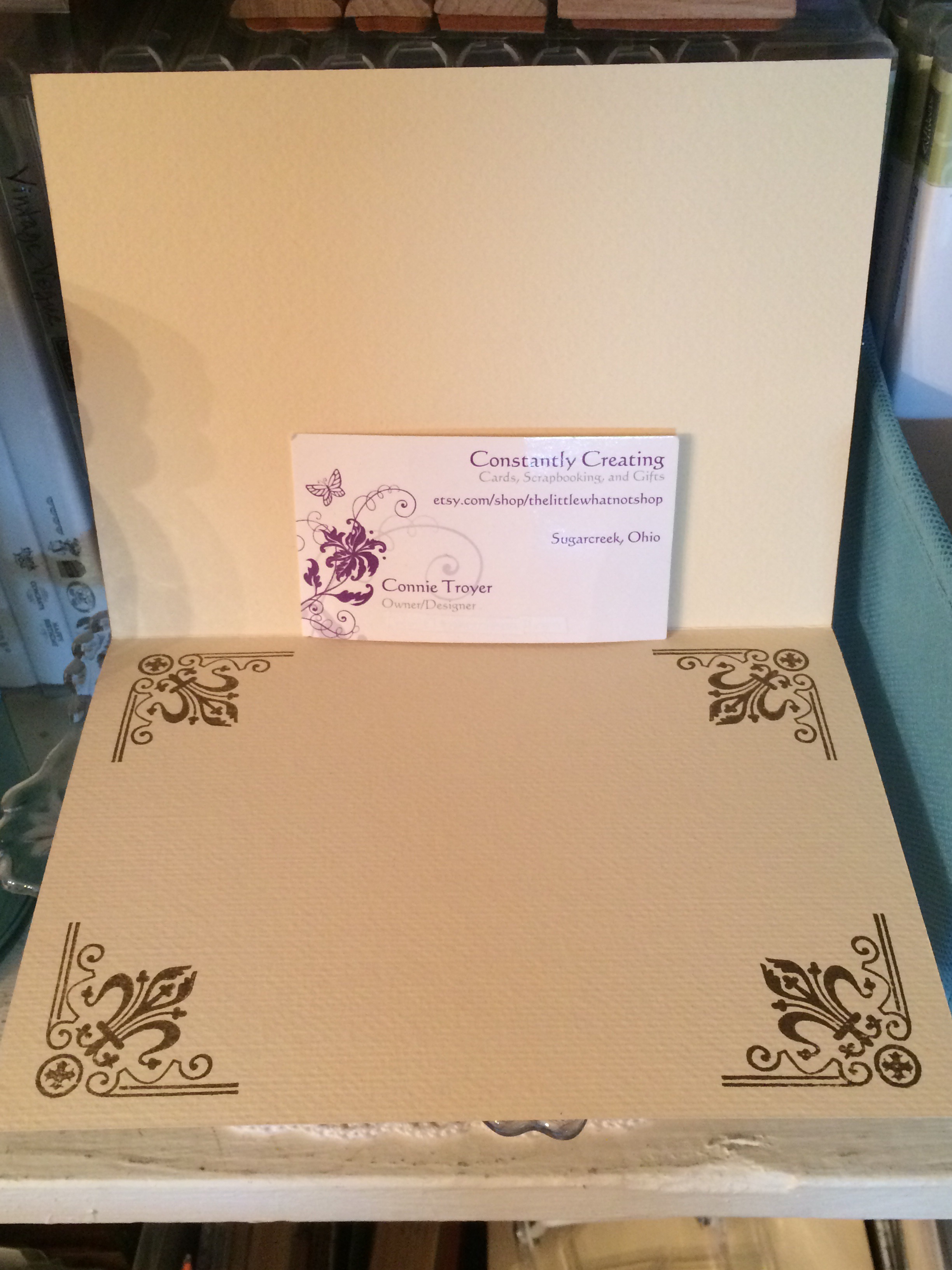
Since the inside of the 5×7 cards were so big, I felt I needed to cut down the writing space a little. Nobody needs that much room to write a short, non-effusive thank-you note. I decided to stamp some corners (maker unknown) on the inside in Stampin’ Up’s Soft Suede ink, which matched the keys pretty well. I stamped them freehand without measuring, so they may be a little off. I’m choosing not to find out. 


So cards 2 and 3 didn’t take as long as card 1 did, thankfully, though they are much simpler and not really my preference. I like details…but to move along in the process, simple cards are a necessity sometimes. I’m learning to appreciate them. 

Pat's Blog Site

One place to fit it all!

Stamp Dabbles

Donna Leonard | Independent Stampin’ Up! Demonstrator | Huntsville, AL

Niya Scrap

Démonstratrice indépendante Stampin' Up!Ÿ

From Pole to Pole

Adventures in the Land of the Pierogi

Stampin' in the Meadows

Akiko Sudano - Independent Stampin' Up! Demonstrator Downingtown, PA

Creative Stamping Designs

Karen Ksenzakovic, Independent Stampin' Up! Demonstrator in Somerville, NJ Let's make some cards!!

Stamp it up with Jaimie

Helping you find a stress free creative outlet through paper crafting.

Stamp With Amy K

Amy Koenders, Independent Stampin' Up! Demonstrator in Mendham, New Jersey...Let's make some cards!

The Daily Post

The Art and Craft of Blogging

WordPress.com News

The latest news on WordPress.com and the WordPress community.

%d bloggers like this: