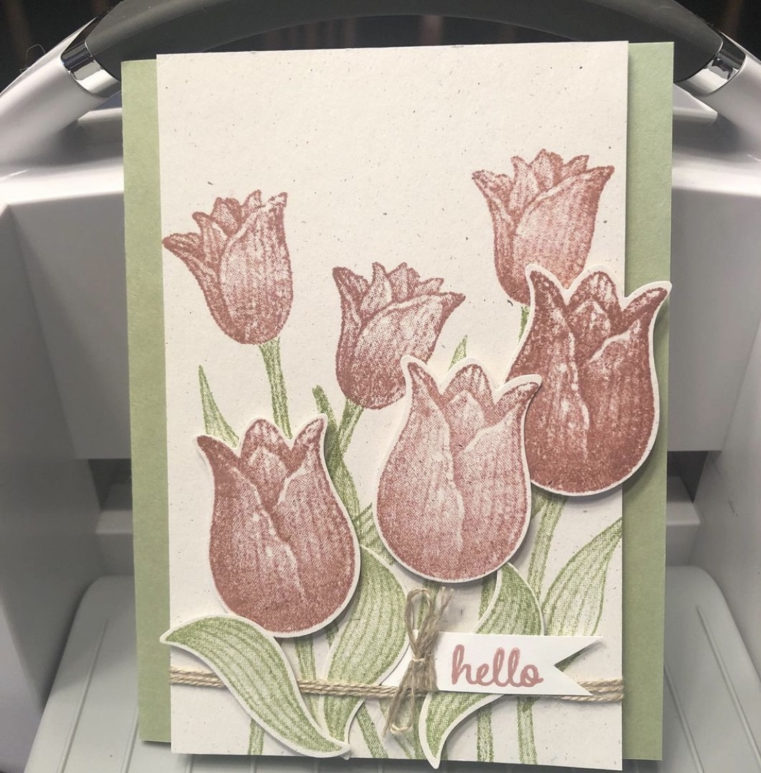
A “throwback” card I didn’t blog about, using the retired Timeless Tulips and Tranquil Thoughts stamp sets from Stampin’ Up.
I discovered some untitled, unposted posts in my WordPress tonight, ones I thought posted already. But as I’ve mentioned, I’ve had trouble getting some of my automatic posts to bounce around to the various apps I initially sent them to. So now I have a “throwback” card, I guess, to share with you (that I thought I’d already shared). And evidently there will be more to come.
This was a make-and-take idea from the 2019 Stampin’ Up OnStage before Covid hit, which I took home that weekend and made almost a year later. I used a retired Naturals cardstock that has little colored flecks in it for the base, with Pear Pizzazz ink and cardstock and Fresh Fig for the tulip blooms. I popped up some of the blooms with Dimensionals (foam dots). “Hello” is also from the retired Timeless Tulips stamp set, but the inside sentiment, “I thought of you today,” came from the Tranquil Thoughts stamp set. I took the completed card to the gift shop that sells my cards, and it did indeed sell quickly. Many thanks to Stampin’ Up for the fun idea.
I feel like I’ve been here, there, and everywhere (or my bed) for the last six months. Crafting times have been random and unplanned. I’ve been trying to reorganize my stamps (and keep my desk clear) too. This is a card I made one night after vacation and before I hit the deer.
I fussy-cut around the foliage of a retired #stampinup Magnolia Lane Memories and More card before popping it up on Dimensionals and running some retired #petalpink and white baker’s twine behind it and for the bow. I’ve used a retired kraft Magnolia Lane Cards and Envelopes card base and used some retired #envelopepaper on the inside. Retired #su gems on the card front: Frosted Flower Embellishments and Share What You Love Artisan Pearls. Current gems: Elegant Faceted Gems.
Hello and thanks for stopping by my part of this Stamp with Amy K’s Tuesday team blog hop! We’ve made cards “for the ladies” today.
One of my favorite things to do is to encourage my girl friends and other women on my life’s path. I had a Mother’s Day card in mind to create, but I’ve had an excess of other work during the last couple of weeks—so I went with this butterfly one instead. It’s a card I would send to one of my dear friends as a thinking of you or a birthday or a card of encouragement, to brighten their day and make them feel special.
I began the card really just wanting to use up some of my scraps of Flowers for Every Season 6×6 DSP (item #152486, currently on sale for $6.90 on stampinup.com during the Annual’s Last-Chance sale). I found three long and skinny scraps that were around the same size and had a pretty pattern among them that I could use as a center strip.
I decided touse the Misty Moonlight color in two of the strips as the color of my card base, and I glued a mat of Very Vanilla cardstock(item #101650) atop the card base, leaving about an 1/8″ border, to give some separation and definition to the colors in the papers that would be on top. (Forgive me for the guesstimate, but I don’t really measure things; I just work with things until they feel right.)
Once I glued the patterned DSP, I felt the strips also needed some Very Vanilla to break the color clash. Those strips are definitely an 1/8″ each becauseI cut them with my trimmer intentionally. 🙂 I also measured the smaller edge of the DSP strips so that Icould place the floral pieces in exactly thecenter. I use a ruler on my work mat and inch inward by eighths and quarters until I figure out where the middle is. (I do better with seeing physical measurements than with abstract figures.)
To add the butterfly, I first took a piece of recently sold-out Bijou ButterflyDSP and fussy-cut the largest butterfly with my Paper Snips before popping up the butterfly on foam Dimensionals (item #104430) in the top half of the card, leaving room for a sentiment below.
To create that sentiment, I used one of the Stitched with Whimsy Dies (item #155314) and Misty Moonlight ink (item #153118) with a sentiment from the Friends Are Like Seashells stamp set (item #158203).
I first took the die to a scrap of Very Vanilla, which impressed the stitching into the paper. The die does not cut around the stitching; I fussy-cut around it myself with my Paper Snips (item #103579) using the edge of the impression as a guide and then edged it with a Misty Moonlight Stampin’ Write Marker (item #153125 for the In-Color Pack of five).
Then I placed my sentiment stamp on my Stamparatus stamping platform (item #146276), created a few test sentiments forplacement, and finally stamped it where it would fit before decorating the sentiment box with embellishmentsfrom Wonderful Gems, Blue Adhesive-Backed Gems (item #153547), 2020-2022 In Color Enamel Dots (item #152480), and Playing with Patterns Resin Dots (item #152467).
I was able to pull out each of the colors used on the card with those embellishments, so Iwas pleased. (The white space in the corner was just too much for me. If you follow my blog posts, you’ll have heard that I’m not a big fan of white space.) I alsofelt that doing something different with the gems in that way spoke to the “unique” idea of the card.
I plan on decorating the inside of the card with a thinner strip of the floral paper and then selling the card to my local gift shop so one of their buyers canencourage a friend or relative too.
I hope you’veenjoyed my card today. To continue on with the hop, press the Previous and Next buttons or click on the linked names in the list. My team members always come up with inspiring and beautifulprojects! Thanks again for hopping with me. If you like this card, please leave a comment orconsider following my blog for future posts. 🙂
Using up a favorite piece of paper with a favorite technique—and it’s so easy that anybody can do it!
Hi, everybody! I’ve had quite a good run on cardmaking lately. I need to be reorganizing my craft room too but can’t seem to stay away from the desk! I know my schedule will be changing soon with springtime, so I’m thankful the creativity is here while it’s here.
One of the challenges I have in my craft room (just a secondary bedroom) is the amount of stuff—consumables like paper, embellishments, and more—due to the number of years I’ve been crafting (paper crafting for about 30 years now; other types, longer). I do confess: I LOVE paper and embellishments. I love having just the right special little thing to add to a card or scrapbook layout to top it off and make it perfect (or as perfect as the receiver will believe it to be 😉). And don’t even get me started on all the beautiful patterns and color choices I have in paper.
Sadly, as my “collection” grows and I fight losing space within four walls, I find myself striving more earnestly to use up my consumables to gain space. I’m not sure this will really work, considering how little room a few pieces of paper and gems take 😆, but I’m going with that for now in an attempt to feel as if I’m progressing somewhere. But that theory is why I made the card I’m sharing today.
I don’t actually know the name of the company who made today’s beautiful background. Sometimes I get papers from other crafters in destashes or swaps or RAKs (Random Acts of [Craft] Kindness). I had only two pieces of this one and always thought them beautiful but I’d moved them around a few times—in and out of the “make these next” piles of card parts, different storage options, and the like. The day I made this card, they moved from “make this sometime” to “make this NOW.” The design was too pretty to put off any longer. But I wasn’t sure what I wanted to do with it (the very reason, I suspect, that I kept moving it around in the first place). I first made a card base out of Stampin’s Up’s Misty Moonlight cardstock(item #153081), which matched the roses perfectly, while I continued to think. I use their cardstock for 99% of my card bases; this color is the regular 80-lb weight.
I must have had 3D things still in my subconscious after making the bird/flower card from a UK magazine kit in a previous post, because I was suddenly willing to sacrifice BOTH pieces of this pretty paper. I latched onto an idea of popping up some of the roses from one sheet on foam dots to give them dimension and make them 3D on the actual card. I cut out the two trio bunches for this and used Stampin’ Up’s self-adhesive Dimensionals underneath (item #104430, current). And then I used my Wink of Stella White and Clear glitter pens on top of all the lightest blue roses, because it’s been my go-to thing lately. I recently opened a new Clear one (item #141897, current) and am loving the amount of glitter it puts out. So fast and easy with an “Ooh, pretty!” punch. 🙂 The White one gives a nice whitewashed look (I only used it on the centers), but I didn’t think it was dramatic enough since the roses were already sketched with white too. It just softened the middles a little.
I was arbitrarily chatting while making this card (“Attempted Multitasking” is often my middle name), so I wasn’t feeling like complicating things further by sorting through my stamp sets, finding a sentiment that fit, hoping to ink and stamp the thing properly in between the dimensional roses—I needed more fast and easy. And then my eyes fell on some recent Paper Pumpkin sets I have stacked nearby. (Yes, Connie should make an effort to use these up more quickly—it will save space! 😂) I hadn’t even opened February 2021’s “Bouquet of Hope” kit yet but I thought there was something in there (consumable) that I could use, from what I was remembering from the promo pictures. Sure enough, sentiments in three languages, in die-cut sticker form. Perfect. And the English one even fit. No mess, no fuss, and I could nestle it into place without worrying about accidentally inking up 3D roses.
I decided to cut apart the “of” and “you” words because I didn’t like how close to the edge the “you” was falling, right where a right-handed person would hang onto the card. But what to do to make everything fit? Well, I ended up sticking the “of” to the top of the bottom dimensional roses and thinly chopping up Dimensional pads to fit under the part of the “f” that hung over the flower. That was tricky, yes. But it’s possible.
Then, time for embellishments! Stampin’ Up to the rescue again (and more gems used up!). I have previously hesitated on adding the Matte Black Dots (item #154284, current) to the top layers of my projects because they’re about 1/8” thick and I often “card” in layers, stacking things even higher. But here I could use them on the bottom layer without fear because the top layer would be against the envelope. 😁 I also scribbled some fake black dots onto the topmost rose trio since I didn’t want to chance them poking through the envelope when mailing. I used my black glitter brush from Art-C for that (very similar to Wink of Stella). I also added three champagne-colored gems from the Elegant Faceted Gems pack (item #152464, current) to the bottom layer to pick up the yellow/gold tones of the smaller flowers in the background. And that took care of the outside of the card.
I kept the inside even simpler. I have several ongoing card orders to fill all the time these days, and one is for a lady who likes a simpler style. (That’s hard for me, but she’s helping me learn it!) I did think of her while making both the outside and the inside of the card, wondering whether she would want it, so I deliberately left the inside blank with just a strip of leftover background paper at the edge of miscellaneous white writing space (a substitute would be Basic White cardstock, item #159276, current).
And now I’ve used up all that pretty paper. But it was worth it. 😍
Here are the links for what I’ve used in today’s post:
If you’d like to own any of these Stampin’ Up products yourself, you can go to my online store and shop with me at http://www.stampinup.com?demoid=2202334. The retiring list for the current Annual catalog hits this Wednesday!! Lots of good stuff coming! (But the Mini is still active until May 3. 😉) Contact me if you’d like paper catalogs instead. 🙂 You can also use Host Code WMW62ECS during checkout and receive a free gift! Orders totaling $50 before tax and shipping can choose a free gift from me up to $8 retail value; I’ll ship it separately to your preferred address after the order is placed. You’ll also earn 1 reward point toward a total of 8, which will get you a free $40 order from me. (And once you hit 8 points, the counter starts over!)
If you’d like to join a Stampin’ Up team and become a demonstrator yourself, I’d love to have you! I’m working on achieving some “leveling up” requirements and would be thrilled to have someone new! No pressure about sales amounts from me, ever. I know what it’s like to lead and juggle a busy life around many priorities. If you’re interested, contact me any time or check out my joining link at http://www.stampinup.com/join?demoid=2202334.
Check back on Wednesday for the 2020-2021 Annual retiring list! And thanks for stopping by. 🥰
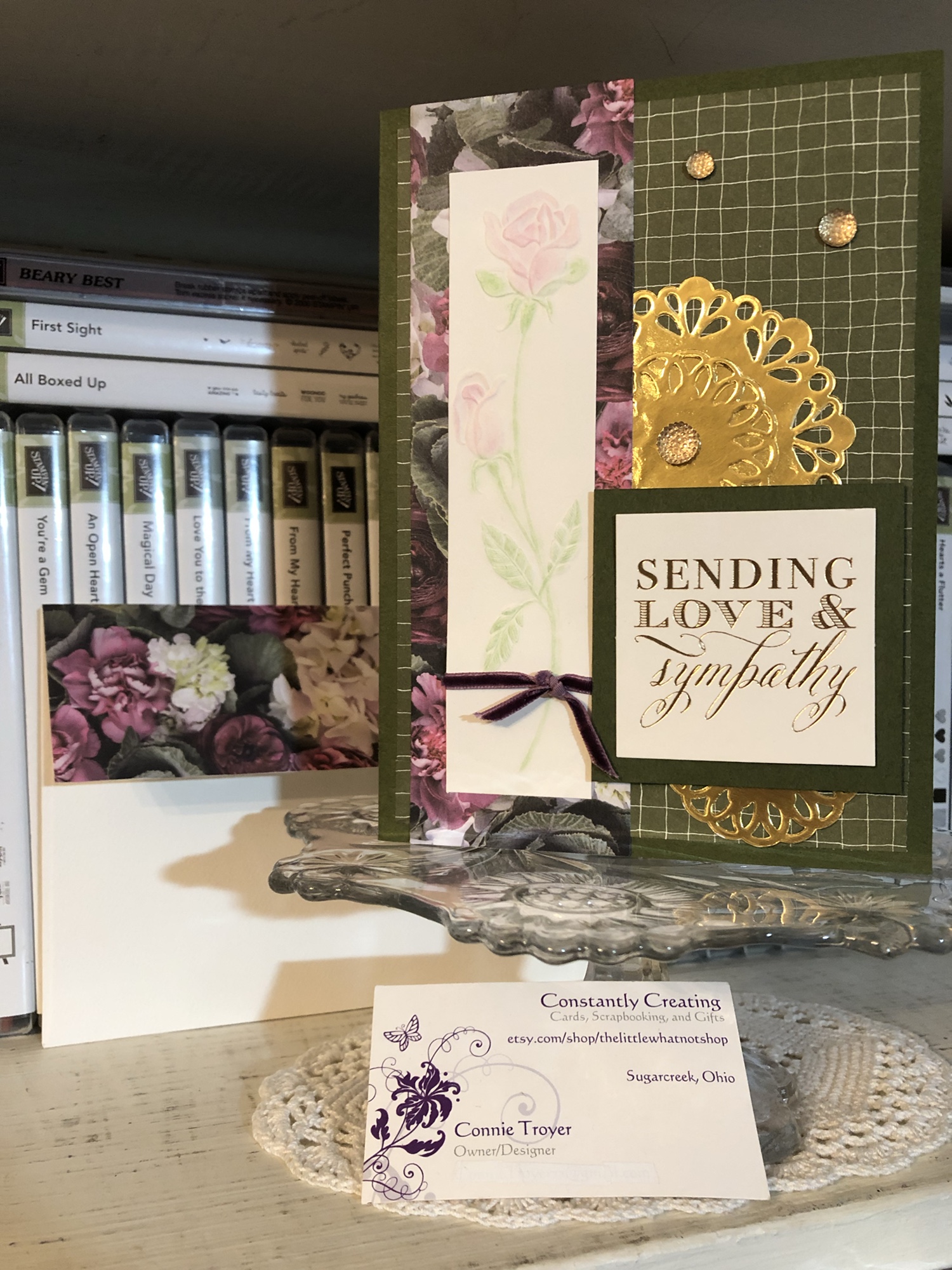
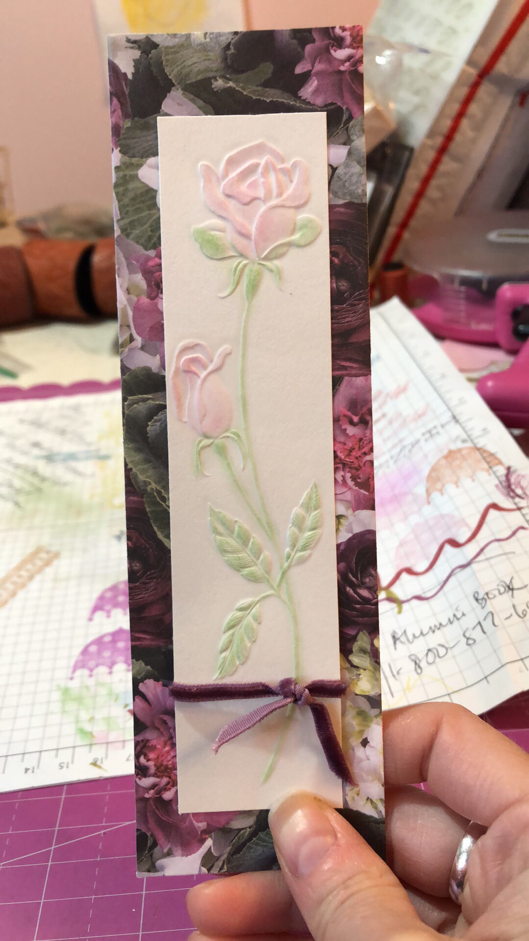
I was recently commissioned to create a custom sympathy card for a woman’s special friend who lost her daughter. My customer and I texted about various options and decided to go with a green theme, the gold-foil “Sending Love & Sympathy” square sentiment by Anna Griffin that you see here, and the cream-backed embossed rose image on the left of the card.
Initially, the rose image was entirely cream-colored, but it just wasn’t showing up well once I backed it with the Petal Promenade Designer Series Paper from Stampin’ Up. It faded away in the background instead, which wasn’t good for a focal piece. So I brought out my retired Stampin’ Up chalks and lightly spread some corresponding chalk colors over the raised areas on the rose (hoping I wouldn’t get too heavy with it, as I only had one of it!). I used a couple of the chalk applicators that comes with the set, but I have also used Q-tips in the past. I think the rose was a scrap from a mass-produced card. I decided to upcycle it. 🙂
Technically, I created everything else first before I started coloring the rose. I got a piece of Mossy Meadow cardstock, measured what I would need for a 5×7 card, sliced off the excess, and scored it where needed. When I was looking for Mossy Meadow DSP (of which I do not have a lot) so I could match the card base, I found this grid paper in the retired Going Places pack from last year. I thought it would work perfectly for a subtle pattern with some movement, yet not be a plain solid and still work with a busier pattern on top of it.
The grid paper was the perfect paper once I spotted the current Petal Promenade DSP. I simply adore that paper pack. The different kinds of flowers in it are SO beautiful and realistic. My challenge for this card was to show some of the gorgeous paper but not overshadow the focal piece of the solitary rose.
Since I accidentally cut the rose piece a little shorter than necessary (initially thinking I’d be going with an A2-sized card), I then had to rethink how to do the Petal Promenade DSP. But showing a little more at the top and bottom did give a better idea as to what the paper looked like. I just decided to go with it and see where I ended up. I took the rose piece and moved it all around the edges of the 12×12 piece until I found which section of paper suited me best. I didn’t want the large ranunculus blooms to be right beside the rose bloom, and I was trying to precisely place the greens as well, so that pinks and purples showed also.
I also tied a scrap of 1/8″ velvet Blackberry Bliss ribbon around the stem section of the rose and kept the knot in place with a Bling Zot. Then I matted the gold-foil sentiment from Anna Griffin with a plain piece of SU Mossy Meadow cardstock so that the piece would show up better against the DSP and match the card base.
When “sketching” out the card in my head at the start, I “saw” the strip of paper and rose at the left and the block sentiment down on the lower right. After I made the card a 5×7, that empty space of just grid DSP seemed rather empty. I wanted something there to fill the space, but stamping was going to be difficult to accomplish with the paper being so dark. I decided to riffle through my doilies and other embellishments to see what I could put there to take up space, and I had some retired gold SU doilies that were just the right sizes. I chose two so I could extend the largest one out far enough to feel balanced in the space and then layered the smaller one atop it. Then I added a half of a small one underneath the sentiment as well.
I accented with Gold Faceted Gems from Stampin’ Up, which are current. There are a lot in the pack, so I’m in no danger of using them up yet, even though I’ve used several each time I craft with them. 🙂 The gems bring out the subtle gold foil in the sentiment.
On the inside of the card, I placed a random pink glitter paper strip I had been moving around my desk (it might be from a Martha Stewart 12×12 paper pack), and then, more intentionally, I cut out a blank, flowered sentiment square also from the Petal Promenade DSP pack. My customer and I had decided to use the Sylvana Rossetti quote from the retired SU Love and Sympathy stamp set, and it fit perfectly inside the square. I used Mossy Meadow for the ink color. I was thankful to have used my stamp platform so that I could reink it if I needed to (and I did).
Some of my Stampin’ Up team members like to decorate their envelopes. I do it once in a while, but I generally forget to by the time I create and am ready to photograph and move the card on its way. This time I really wanted to show more of that beautiful Petal Promenade paper and make the card really feel special and coordinating with its envelope, so I took the time to measure and cut a section for the flap. The paper is simply too pretty to hide, and this way it won’t cost extra at the post office, as doodads on the front of the card will (unless they are flat like images stamped onto it).
Thanks for stopping in to see my work! Below are some things that can be used to create a similar card.
Remember that for every $50 purchased from Stampin’ Up until March 31, you can get one free Sale-a-bration item! They have some fantastic choices for us, too. In addition, for every $50 spent, you also get a free item from me – your choice up to $10 worth. Please use my code JJBCPS4W when you order. It’s the best time of year for Stampin’ Up. You don’t want to miss this. 🙂
Welcome to another post for Amy K’s Inkin’ Krew Blog Hop for Tuesday, January 8! This month we are featuring the theme of love with Stampin’ Up products. I’m making wedding and anniversary cards for my local gift shop right now (along with other themes and random custom orders), so I was very excited to join this hop!
For several days now, I thought I knew what I was going to create for this blog. In the end, I did stick to my original (barely fleshed-out) idea, but did I ever find ways to complicate it. (I always do.) I definitely should have started on it earlier. But I had craft room organization on my mind this week and I got to it when I got to it.
I was able to use several current SU products as well as a couple of retired products and ones from other companies (oops!). The focal point of the card is the bride stamp from the “Wonderful Moments” stamp set, set off by a lace oval from the Delightfully Detailed Laser-Cut Specialty Paper pack and a background of Petal Promenade DSP.
The laser-cut paper is vanilla on one side and white on the other. Since my card base was white and the bride’s dress would be too, I chose to use the vanilla side of the lace oval. And then I decided it needed something else. It felt too plain and too neutral. I kept “seeing” pink with this stamp and card, but the last two wedding cards I created had pink hues in them, so I tried to use other colors.
I have to keep trying. I did manage to sneak in an orange and a dark purple…but there’s still pink. So when I was looking at the oval and trying out colors in my head, I started sponging Bundled Sage Distress ink onto it, thinking winter colors. But then I picked up Tattered Rose and sponged it on too. (Evidently those colors should have gone on in the reverse order.) I added a second layer and different sponging before I was done. And then I got an idea, when I realized that the ink was drying slowly enough to get onto my hand as I held the card. (This is subconscious Pinterest at work in my brain, I think. Lol!)
One of the retired products in my stash that I need to use more of is our Iridescent Ice Stampin’ Emboss Powder. I’ve only used it in small bits until now…but I remembered seeing others do a whole-scene kind of treatment with it. I wasn’t even entirely sure I remembered how this product worked since I bought it late in the game, but the paper was definitely ready to be treated – it was still inky. My friend E assured me that I could indeed use Distress inks for embossing. So I got out my catch-all tray and my coffee filter and proceeded to pour the Iridescent Ice powder overtop (hoping I was making the right decision and not ruining a lovely piece of paper) and then heat embossed it, as the label suggested, three times before I finally saw the powder changing and understood what it was going to look like or do.
Turns out I love this look. It reminds me of our Dazzling Diamonds Glimmer Paper except it’s not as thick and has slightly different colors. I’ll have to try this technique again sometime. I also appreciate how the pink and green sponged inks are still coming through the translucentness of the embossing powder. It’s faint, but it works.
With the lace oval paper finished, I turned my attention to the bride stamp. I chose Archival Basic Gray ink because it felt like black would be too harsh and bold against the soft oval. I had to stamp the bride several times with my stamp platform because it was the first time I’d used the stamp and I hadn’t prepared it even though I know better. So my outline got a little thicker than I’d intended.
After she was stamped, I watercolored the bride’s hair, skin, bow, and flowers with watercolor pencils and used an AquaPainter on those places afterward. For the dress, I decided to experiment with some Nuvo Crystal Drops (Ivory Seashell color) new to my stash. Since that is also translucent, I was hoping it would soften the lines of the dress if I covered them with the liquid. I later went back over the dress again, using a paintbrush to smooth out the Drops on the paper. I also took Wink of Stella to the bride’s bouquet (though I erred first and grabbed my White instead of my Clear. Once it dried, I realized what I had done and went back over the bouquet with Clear as well.) It sparkles more in person than in the photo.
So I had one finished oval and one watercolored, Nuvoed bride. I wasn’t sure how to treat the background behind her. In my mind I had seen her on white, but that seemed far too plain now. I thought of putting a watercolor pencil down as a background but couldn’t settle on which color. Blue for sky? (So she’s out in the open, looking at nothing?) Or some kind of background stamp to imitate wallpaper or wood planks? I then decided to think about the Graceful Glass vellum and hit upon an idea I’ll use at a later date, before the vellum led me to looking through my current DSP. I ended up fussy-cutting around her and placing her on patterned paper so I wouldn’t have to mask her for a background stamp or risk ruining something.
The paper I chose to use feels most like a sunset in front of my bride, and it even matched the flowers, hair, and bow I had colored before viewing this paper pack. (That actually happens to me a lot!) Because that was my best background option thus far, I cut (and then recut, due to first error) a notecard/A1 size of paper where the jagged stripe in the paper best flowed beside her dress and body posture. Once I had the background paper glued to the notecard card base, I played with the placement of my bride, attempting to center her and play off the “sunset stripe” to its best advantage while trying to cover the bottom of the dress with the sentiment I intended on using. (Many thanks to patient E for this stage, who was with me on video chat while I created the card!)
Something then made me think about the Rose Metallic Thread I had stored with my baker’s twine, and I decided to do a bow of some sort. I’m not very good at bows with delicate threads yet. I ended up laying ATG tape on the back of the sentiment and looping it around and sticking to the tape however it looked the best to me.
The gold-and-white “Best Wishes” sentiment came from a resist coloring pack from another maker. I just left it as is, since I had enough color going on already. It fit with the “brown” tones of the card anyway. The gold on the sentiment appears to have been embossed, though it came that way in the pack and I merely cut it out. I popped up the sentiment with its new metallic loops with Stampin’ Dimensionals foam dots, placing it right above the hollow circles at the bottom of the oval.
The last touch on the front of the card was the tiny little mini pearls I used on the buttons of her bridal dress. I had SU’s white mini pearls from the Notes of Kindness card kit on her dress originally but later changed to even smaller ones from Recollections.
The inside of the card has been kept simple to be size-appropriate for the notecard and also to leave room for the sender to write. I used the retired Petite Pairs stamp set with its “for the new Mr. and Mrs.” sentiment on a bit of the Petal Promenade DSP (from the first piece I’d cut the wrong direction by accident), the current Fresh Fig ink pad, and the gorgeous Stitched Labels Framelits Dies. And then I added two more mini Recollections pearls on the sides of the inside tag. 🙂 (Side note: the Petal Promenade DSP pack is one of my favorite things in this catalog. The papers are just so beautiful!)
If I had set out to create this exact card, even with all the detail, it wouldn’t have taken me very long. But creating from scratch and using trial-and-error means that sometimes happy accidents have to happen to lead the creator to the next step, which later seems so obvious. 🙂 I’m really quite happy with this card now, but there were moments when I wondered where I was going with it. Maybe you’ll find even faster ways to recreate this card. I’d love to see what you come up with! I think this card could be used for a bridal shower, a wedding card for the couple, or an anniversary card. It just depends on which sentiments we use.
Below are the current Stampin’ Up products I used on this card. If you need any of the supplies, just click on the thumbnail to go to my store or visit this link. I’d be happy to become your demonstrator! Sale-a-Bration (from now until March 31) is the best time of the year to stock up on products and earn others for free! Please use code JJBCPS4W for a free gift when you shop with me! (You can continue with the hop participants below the thumbnails.)
Thanks for stopping by my blog! To continue with the hop, see what Karen Finkle created by clicking on the Next button or visiting her link below. To go back to see Sue Prather’s card, click Previous or her link above mine. See you next time!
A bit about the Notes of Kindness card kit I made up recently – twenty cards in one night!
I promise that I make more than card kits these days – and I’ll have some individual cards blogged about soon – but right now I’m trying to accumulate some stock for my local gift shop and get ahead on cards I need to send myself. 🙂
I recently found myself looking at another card kit I had waiting, and before I knew it, I had a bunch done! As a matter of fact, I made all twenty cards in one sitting (though I did go back and add sentiments to a few insides the next night). That’s just not me. I take way too long to make cards with my level of detail. What a freeing, productive feeling it was to have that many done at once! And I didn’t feel like the designs were too simple for my style, either.
This particular card kit, the Notes of Kindness All-Inclusive Card Kit, is current in the 2018-2019 Annual Catalog from Stampin’ Up, on page 7. The kit itself is $35 but it comes with a clear stamp block, an Archival Black ink spot, a 6-piece set of photopolymer stamps, Copper Baker’s Twine, adhesived mini pearls, Stampin’ Dimensional pop-up dots, die-cut sentiment stickers, die-cut flowers, lined envelopes, twenty printed card bases, and a kraft box you can store or gift them in. Full-color picture instructions are also included. All you need is your choice of adhesive and anything extra or different that you want to do.
There is also a refill kit you can purchase for $21 that includes all this except the stamp set, block, ink, and box – and the refill makes another twenty cards. (I know what is on my wishlist!)
I snuck another stamp set into my work so that I had “Best Wishes” wedding and anniversary cards as well as thank-yous. I also used some Wink of Stella Clear on some of my flowers to make them sparkle and shine. I made the card fronts the way the kit suggested otherwise. I did use some retired thank-you stamps on the insides where appropriate, just so I had some variation. And I was even able to use one of the German sentiments that are included. I live in a Pennsylvania Dutch area and thought I’d test one and see if it sells. (There are French sentiment stickers too!)
The colors in the kit are some of my favorites: Blushing Bride, Blackberry Bliss, Soft Seafoam, Mint Macaron, Mossy Meadow, and Basic Black and Whisper White. Though the sentiments inked up well, I love that they are photopolymer – for just in case I needed to realign something.
I think this one is my favorite. I turned it into a 5-piece card set complete with acetate box and pen!
You can see some Wink of Stella shimmer on the dark parts of this flower too.
I used the current Stitched All-Around stamp set for the “Best Wishes” cards (inside and out).
For this tiny thank-you sentiment with the twine behind it, I laid down some ATG tape first, to keep the twine controlled, before adding the Stampin’ Dimensionals and sentiment.
You can really see the Wink of Stella shimmering on this succulent. I varied where and how much I used it on the succulents but ended up loving them all!
Anyway, I’m not usually a card-kit user, but I’ve been beginning to change my mind about them. As long as they don’t feel too simple to me, I’ll probably give others a try now too. I also still have the Lots of Happy kit to finish sometime. 😉
If you’re interested in trying this kit or others, or if you need some supplies, I’m happy to be your Stampin’ Up demonstrator! Sale-a-Bration just started this week, which means you can get a free select product with any $50 purchase. And they even have a couple of amazing products for $100 orders! SAB goes through March 31. Let me know if I can help! ❤️
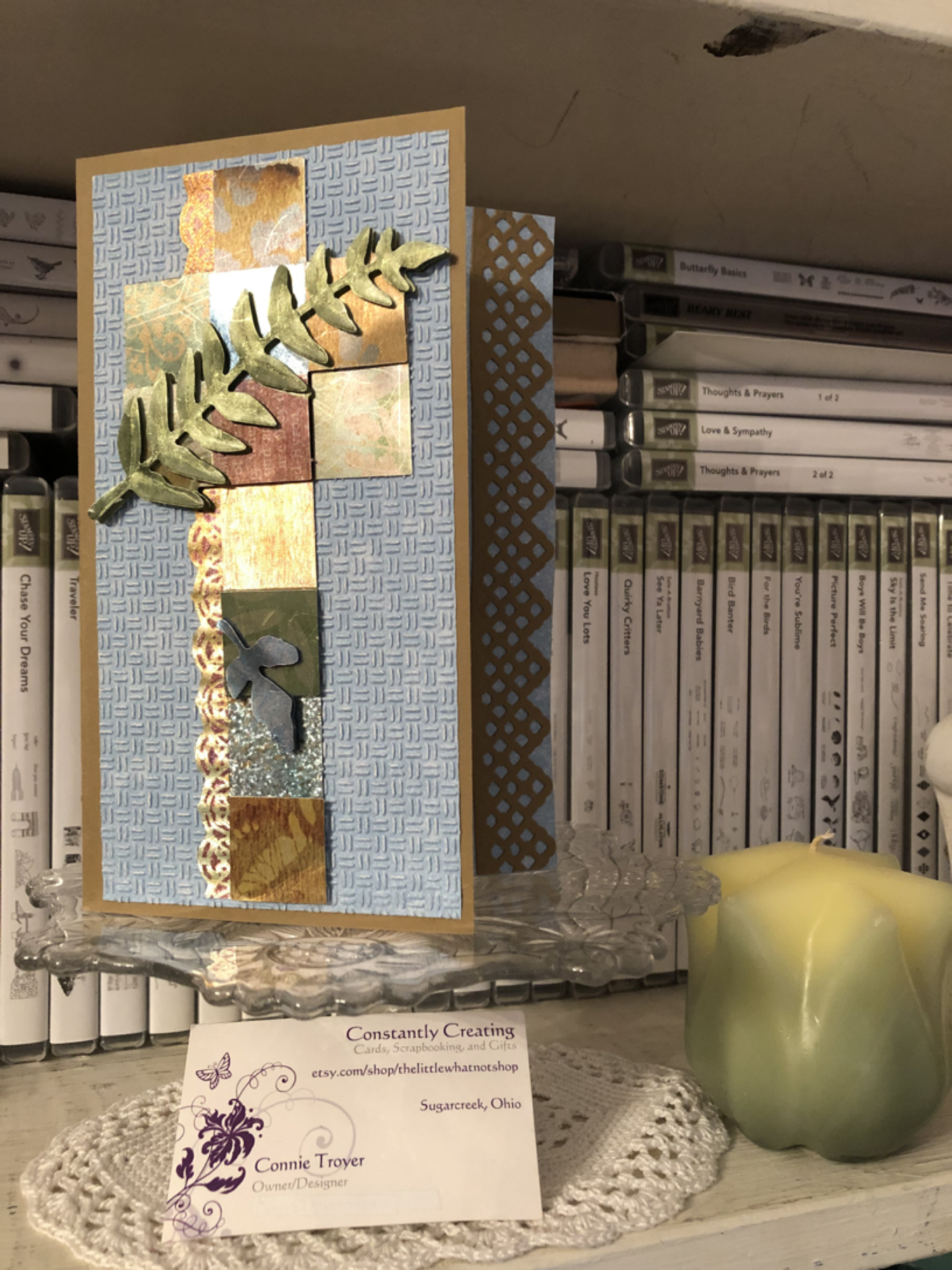
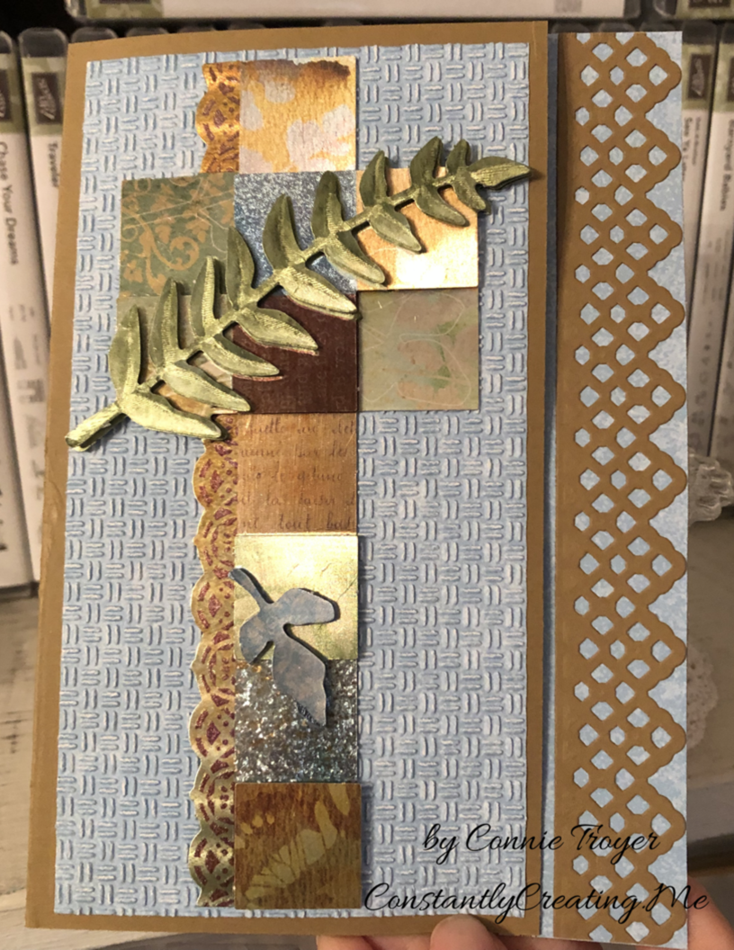
A dry decoupage sympathy card using Stampin’ Up for everything but the main image (at last!).
The hits keep coming. Two more sympathies on my to-do list, along with a celebration theme for a blog hop. For these two, at least it’s a celebration of sorts, though sad now. Still, I feel muddled. My heart aches for them, so I went looking for something that spoke to me and seemed to reflect the people I’m thinking of. My “card toppers” bin bailed me out for the one I’m blogging about today. (The other, yet unmade, will focus on Stampin’ Up’s Graceful Glass vellum DSP and alcohol markers, so stay tuned for that.)
My mother used to say that I was “an accident waiting to happen.” She’d probably still say that, given the chance. That phrase came to me as I wrestled with this card. I began to feel like it was one accident after another. I love how it turned out in the end, but my goodness, the process! (This means there’s hope for me, right?) Another case of “when things don’t go well.” Please tell me you’d never know. 😉
One of my husband’s coworkers lost her dear husband last week, and it’s been such a sad thing. I wanted to make a beautiful card – part masculine in remembrance and part feminine for her – but had no idea where to start. Since I often clean or organize when I have a problem to mull over, that’s what I ended up doing, which led me to the main cross piece seen on the front of the card today.
Finding a brown card base to match the topper was easy; Stampin’ Up’s Baked Brown Sugar, a retired color, matched the foiled copper/silver/gold/burgundy/blue cross the best. I only have so many browns, and I usually use SU for my card bases since I like how the 80-lb weight cardstock stands. (I grab premade bases only if I start with the base first rather than the main image. It’s just easier to match it that way rather than working in reverse.)
During my cleaning spree, I was also looking at and putting away some new SU Designer Series Paper. So when I tried to find paper the cross could match, the blue piece was fresh in my mind and looked prettier than any other neutrals I put next to it. The blue paper is from the Tranquil Textures DSP pack in the current Annual Catalog from Stampin’ Up. It’s not a solid blue, but it it hard to tell that with the dry embossing I put on top of it to give the card some texture. I used the “Oxford” Cuttlebug folder for the textured design. I wanted something light and barely textured like Stampin’ Up’s Subtle embossing folder, but I don’t own that particular one yet.
Here’s where things got tricky. The card is a 5×7 because the cross is so tall. But because it’s narrow, there was a lot of “white space” around it. I don’t like white space (even if it’s blue). So I started to wonder what I could do or put next to the cross to take up the width. A sentiment would only be so big, as well as being awkward to work with around the 3D leaf layers toward the bottom, so I wasn’t sure that was the answer. I thought maybe I could make a decorative edge to the card front at the right instead. I could see it in my mind but wasn’t sure how to achieve it (story of my crafting life, btw). That seemed to be the best thing to try…but all my dies were too small to stretch across 7 inches. Nothing felt right. So that night I went to bed frustrated, having made only the card base and embossing the paper.
The next night I attempted to keep going on the card while I was on the phone. I should have known better. I spotted a long Spellbinders die on my die wall and got all excited because it would fit lengthwise. I didn’t think about the fact that ALL of the edges of the die does indeed cut…until I wrapped a card base around a Cuttlebug plate (so that I didn’t cut through the second layer), positioned the die, and wondered why an inch of the card base separated from itself after I ran it through the machine. (*insert facepalm here*) To my defense, I was still on the phone. LOL
So suddenly I had a card base with one side shorter than the other. That was not what was supposed to happen. Not to mention, the magnetic plate dinged up the middle of the card base, and the B plate left marks on the back side of the base, making it warped and weak. Sigh. Time to rethink. Maybe I needed to make a new card base.
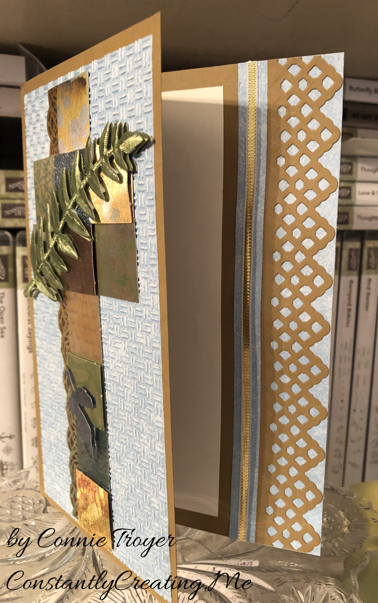
I tried to process where to go next. The decorative edge thing hadn’t worked and I couldn’t think how to make it work other than an edge punch – if I made a new base. I’ve never tried the popsicle sticks I’ve heard about, to keep part of it from cutting, so I wasn’t sure how to do that either (again, on a new base). But I hated to destroy the one I’d just cut. What I did manage to do after thinking was flip the card base around (even though I’d folded it correctly after scoring the first time). That would give me a chance to add paper atop the marked-up part to hide it and also add some stability with the extra paper layers. I hoped. I also took my bone folder and tried to work out the middle bumps and crease it sharply.
Once the base was salvaged, I decided to play with the pieces and arrange them just to see what I could do. I ended up liking a little bit of breathing room between the die cut and the now-shorter edge of the card base, rather than placing the die cut right up against the piece it had just been cut from. And obviously if there’s a peekaboo die, something needed to peek through it underneath. I grabbed more blue DSP and left it as is on the inside of the card rather than embossing it for texture like the front.
I also realized that I needed to run the textured piece through the Cuttlebug again, as one side has trouble with a piece of paper I got stuck in the roller years ago. Part of the paper was hardly embossed, so I realigned it in the folder, flipped it around to the other side that impresses better, and ran it through again. Came out perfectly that time.
The trouble was that when I left that breathing room space between the die cut and the base, it was not centered once the card was opened. I didn’t like that. But it looked like I had enough room to add 1/8″ of ribbon or something else. I chose SU’s gold and white ribbon to match the cross and the browns and loved how it looked.
But then I couldn’t get it adhered. The ribbon is thin enough that the line of Art Glitter liquid glue I laid down soaked right into the ribbon. I wasn’t confident it wouldn’t end up slightly sticking to the inside of the card once it had been closed for a while. But as I told a friend last night, when a person has too much product in her house, she will find a way. I decided to use my Cosmo Cricket Glubers Adhesive Strips. I rarely use them, but sometimes they’re just the best option. They are 1/4″ strips, though, so I took my nonstick microscissors from CutterBee and cut right down one of the strips, eyeballing it to just under 1/8″. And then I placed it with my tweezers and stuck a new piece of ribbon to it. I was much happier with the inside then.
I decided not to stamp a sentiment on the inside yet. I needed to finish up and get to bed and I wanted to really look through my stamps to figure out what I wanted to say on the card. I will probably go back and add one later, but right now it’s blank.
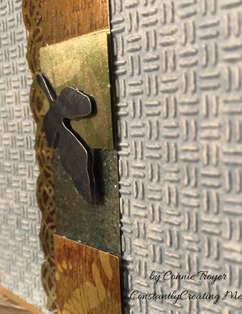
I’ve spoken about dry decoupage in past blog posts. A reader had asked me to do a tutorial on how to do it, and I am working on that currently. I hope to post one soon. For now, here are a couple of closeups to be able to see the decoupage layers that make up the cross. I should have trimmed off the little perforation bumps more as I was making the topper, but it’s probably too late to fix it now.
The cross has several layers of dimension to it in the squares as well as the leaves, which made it interesting to put together. And the leaves are the top layer.
Thanks again for coming to visit my blog! I appreciate your readership!

![IMG_E3143[1]](https://constantlycreating.me/wp-content/uploads/2023/06/img_e31431.jpg?w=840)
![IMG_E3144[1]](https://constantlycreating.me/wp-content/uploads/2023/06/img_e31441.jpg?w=840)


 Velvet Ribbon")