3D Enjoy the Moment with Dandy Wishes for Stamp with Amy K’s Tuesday Blog Hop

Playing with pieces and parts can make something beautifully unexpected.

Hello again, and welcome back to my blog! I’m joining Amy Koenders and the rest of my Stampin’ Up team for Stamp with Amy K’s Tuesday Blog Hop group—and this month we’re celebrating spring with our cards! (Spring IS on its way, right? It may look all green right now in Ohio, but we’ve been fooled before!) One of the things my husband watches for as spring breaks is how high the grass grows (read: how soon he’ll have to mow). And what comes with the growing grass but dandelions? Sometimes lots of them, if you put off the mowing! 🙂 I always liked it when they turned white and round and seedy when I was a kid, but I’m featuring the younger yellow kind on my card today. 🙂

My card also works for the Paper Players challenge this week, as they are focusing on spring cards as well. I’m linking my card to their challenge too. 🙂

I started making my card a couple of weeks ago, but the blog deadlines pushed me to finish it. I knew what I wanted to do; I just picked up other things first. (In between, I made a baby card, a wedding card, and the Alice in Wonderland “Hello there” card I posted on Instagram [see it at annegirl77!].) Does anyone else work on several cards at once, or is it just me? My attention wanders where it wills, creatively, and then I finish a bunch of cards at once. I didn’t set out to do anything specific with this card. It was just that the scraps from the last couple of posted dandelion cards were still sitting nearby and I wanted to use them up. I was merely playing around with the products and liked what was developing. I do love those yellow dandelions on the blue background, though. 🙂

For this card, I started with one of the Assorted Memories and More Cards and Envelopes (item 159234). I’m still using up my old Whisper White ones, so since I was just playing and didn’t know what I was making, I didn’t intentionally grab one of the yellow-and-white card bases in the Dandy Garden Memories and More Cards and Envelopes. So you might decide to change that if you make a similar card.

I made my bottom background layer out of a piece of Misty Moonlight Cardstock (item 153081). It measures 6″ by 4″. I didn’t adhere it right away, though. I built my scraps of Dandy Garden 6″ x 6″ Designer Series Paper (item 154297) on top of it instead. One side of the card, the DSP is 1.75″, and the other side is 2.25″. I love the Braided Burlap Trim I put with it, but it is retired. If you want to stay current, you could try the 3/8″ Fine Art Ribbon (item 154561). I used my burlap ribbon to cover the seam where the two papers met. When I did adhere the background assortment to the card base, I popped it up onto Foam Adhesive Strips (item 141825) so that the thickness of the Braided Burlap Trim wasn’t an issue with the papers below it in terms of bulges or strain on the pieces. The dimensional foam strips allowed me to tuck the ribbon under the cardstock without any worry that something would tear later or look funny.

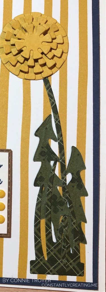
Then I got to wondering what to put on the yellow-and-white striped DSP. I hadn’t used my Dandy Wishes Dies yet (item 154315), so I made a yellow dandelion to match the other side of the paper, which has three. I cut the five layers of the blossom from Bumblebee Cardstock (item 153077) and layered the two largest graduated sizes together, gluing them completely flat. But for the next three layered sizes, I curved the little squares of the outer rims (I’m sure there’s a better name for this) in opposite directions, and I put one Stampin’ Dimensional (item 104430) in between the middle layer and the second from the top. With my fingers, I curved the middle layer (the largest of the top three) up toward me, then the next smallest size down toward the card, and then up toward me again for the smallest layer. The smallest is about 3/4″ across. The bending of the square “petals” gives it a 3D look as it pops out at the recipient yet isn’t too high to mail. When I glued them, I made sure to stagger the squares onto the empty spaces of each layer under it. It looks pretty cool in person.

I cut the stem and the leaves of the dandelion from a double-sided piece of Mossy Meadow DSP from the Neutrals 6″ x 6″ Designer Series Paper (item 155226). This was one of the five DSP packs that new demonstrators got as their free gift when they joined during this passed Sale-a-Bration. One perk of already being a demonstrator is that we get to order these kinds of products too. 🙂 There are several great designs in the pack of ten colors (times five), so I will be using them a lot. (I’m sorry that this is now two non-current items on my card, but I didn’t have any blogging intentions at the time of creation. I’m sure that whatever you use will look wonderful too!) I wish I had reversed the direction of the two taller “toothy”-looking leaves, though, because I feel like they’re too close to the stem this way. Dandelions spread out more, I think. (Of course, since my husband is the one who mows the lawn, I haven’t had to look at dandelions recently. :-D) If I make the card again, I will switch them. I do like how the two different patterns give definition and individuality to the bunch. Everything blended in too much when they were all the same pattern. I cut and glued the two grass dies on and under the leaves for an illusion of dimension.
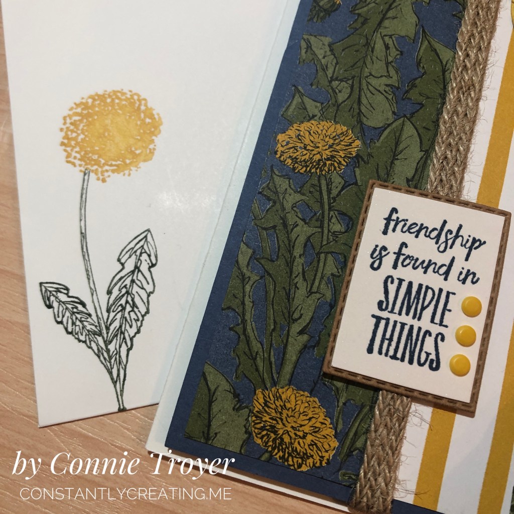
For the sentiment, I held up several and determined that the friendship one from Enjoy the Moment (item 154452) fit best in the die I’d already selected from the Rectangle Stitched Dies (item 151820). I didn’t want one that was too tall or too wide, just something that nestled in there quietly between the art elements. I stamped the sentiment in Misty Moonlight ink (pad item # is 153118) on Shimmery White Cardstock (item 101910) because I just love the sparkle in the latter! I use it often. I die-cut the white cardstock and also decided to die-cut one in kraft cardstock (another retired item). Then I manually cut off the stitched border of the white, along with a bit more with my Paper Snips (item 103579) so I could layer the two cardstocks together. I thought the kraft cardstock looked nice against the burlap ribbon and gold/brown tones of the card. Last, I added three of the smallest Playing with Patterns Resin Dots (item 152467) in Crushed Curry on the sentiment. I almost went with two, but three filled up all that white space beside the sentiment. You may choose to do something else.

I guess that’s it for how I did the outside. I made the inside sentiment (“I’m So Happy I Found You”) from the Friends Are Like Seashells stamp set (item 154368) on Shimmery White cardstock, which was stamped in retired More Mustard ink since I don’t own the In-Color Bumblebee ink pad or refill yet. I also matted the white piece with Misty Moonlight cardstock so it would pop off the page better. I cut out the words with the smallest longest die in the pack and chose the next size up for the Misty Moonlight layer. I off-centered them against the middle to save some room. On my border piece, the blue cardstock was left over after I cut two horizontal edges to use on other projects. It was tidy enough that I thought I could use it here too. I used stickers from the sticker packs in the Dandy Garden Memories and More Card Pack (item 154302) to decorate the inside border.

I also decorated the envelope by stamping two pieces of flowers from the Garden Wishes stamp set item (item 154408) with my Stamparatus (item 146276). I used my Stampin’ Write markers to color them since I only have the Bumblebee color in a marker (it’s a current In-Color, and I purchased that set of five markers). I stamped on the front of the envelope, which I rarely remember to do, because the matching 6″ x 6″ DSP was not large enough to cover the entire flap in this size of a card. 🙂
Well, that’s all I have for you today. This card was pretty easy overall. I hope you enjoy making one of your own. Thank you for visiting my blog today; I love readers! Be sure to hop down the list of my teammates to see the beautiful “spring” cards they’ve made for you!

Click the Previous button to go back to Donna Leonard’s blog!
Click the Next button to go forward to Jillian Good’s blog!
  1. Jaimie Babarczy: https://wp.me/p79UhD-4VN
  2. Karen Ksenzakovic: https://wp.me/paaNf4-4e9
  3. Mary Deatherage: https://wp.me/p5snyt-h1y
  4. Sue Prather: https://wp.me/p5yitZ-2tQ
  5. Donna Leonard: http://stampdabbles.com/?p=4619
  6. Connie Troyer: https://constantlycreating.me/2021/03/09/3d-enjoy-the-moment-with-dandy-wishes-for-stamp-with-amy-ks-tuesday-blog-hop/
  7. Jillian Good: http://dyedwith.love/?p=139
  8. Tara Carpenter: https://tarabethstamps.blogspot.com/2021/03/stampin-up-arrange-wreath-happy-easter.html
  9. Leslie Larkin https://leslielarkin.com/ice-cream-corner-suite/
  10. Terry Lynn Bright: https://tlsbrightspot.com/2021/03/09/stampin-up-celebrate-spring/
  11. Akiko Sudano: https://wp.me/paOv8E-2ww
  12. Karen Finkle: https://karenscardkorner.blogspot.com/2021/03/stampin-up-wildly-happy-for-amys-inkin.html
  13. Amy Koenders: https://wp.me/p2SFwf-moQ
  14. Krista Yagci: https://www.thestampingnook.com/post/stampin-up-jar-of-flowers-welcome-spring-card

“Cherish Every Moment” Card Using Stampin’ Up’s Forever Blossoms Stamp Set and Perennial Essence DSP and Vellum

Hello there! Welcome back to my blog. I made this card last week when I spotted my remaining scrap (less than a 6×6) of this pattern of floral-patterned paper in the Perennial Essence Designer Series Paper pack, #149100 (which is currently on the last-chance list for $8.09! Go get one!). My scrap was just so pretty that I had to use it up. I looked up the colors in the pack (Balmy Blue, Blackberry Bliss, Blueberry Bushel, Calypso Coral, Crushed Curry, Flirty Flamingo, Mossy Meadow, Old Olive, Petal Pink, So Saffron, Whisper White) and picked Petal Pink for my card base. Then I reached for my matching vellum (Perennial Essence Vellum Cardstock, #149101) and picked the Old Olive color. (The vellum pack also has Petal Pink and So Saffron.)

To decide how much of the scrap I wanted to use and where to cut it, I first stamped my sentiment (from the Floral Blossoms stamp set, #151457, which is carrying over) in Old Olive ink, #146090, so that I could narrow down the dimensions and have more exact placement. I knew I wanted to mat the floral image to give it distinction from the Petal Pink card base, since there is so much Petal Pink in this particular scrap of DSP. (Isn’t it pretty? I always love a good watercolor image.)

After cutting the vellum, I then decided to emboss the Old Olive with the Subtle Embossing Folder, #151775, to have a small pattern that would complement rather than draw attention away from the flowers. When I flipped over the vellum to put some adhesive on the back that would be behind the flowers, that’s when things changed. I stopped mid-glue because I suddenly realized how cool the back side looked. The embossing—or, rather, the debossing—made the vellum turn kind of white with the creasing! Well, then I was torn; I liked both. I decided to take pictures of each side to show you and also to be able to make a decision—sometimes I see things differently when I view a photo I’ve taken, even if I’m the same distance from the image and looking at it in real life. I’m curious to see which side you like best. Leave me a comment and let me know which side—or which card—you would have gone with. 🙂

untitled design
Green debossed “whiter” side
by connie troyer constantlycreating.me
Green embossed vellum, colored side up


untitled design-1
The way my original idea would have looked with the green vellum pointing up

I decided that I definitely liked the whiter side up and set about doing a double layer of matting to really hone in on the vellum (while still not taking away from the flowers). Pleased with my choice, I glued the now-white vellum to the larger unembossed Olive Olive vellum and the floral piece to the other smaller piece of Old Olive vellum, for two different mats. I think double matting just gives an elegant, intentional, thoughtful look to the thing being matted. I do this in my scrapbooking at times too, to help feature certain photos. When I look at the above picture now—the green-embossed side up, without the mats—it just feels so much plainer to me. (Of course, I would have added embellishments to it too.)

untitled design
Exterior of finished card
untitled design-2
Interior of card (so far)

So there you have it, readers! Let me know what you think about this card and what you would have chosen. Clickable links for the products I’ve used are below.

If you don’t already have a demonstrator and would like to receive a free catalog from me, submit your name and address in my contact form and I’ll send one right out to you (remember, the catalog goes live on June 3!). I’m also working on my first product share offering and will post details about that soon in case anyone wants to buy in. (If you’re not familiar with a product share, it’s a sampling of new product from the new catalog—though I’ll probably also have an “old product” version too, in case some want everything. That way you get a little bit of all the fun DSP, embellishments, and ribbon without the gigantic cost of buying it all individually. So stay tuned for details on that!)

Thanks again for stopping by today. Let me know if I can help you!

______________________________________________________________________________________________

My host code from now until the the end of June is GCXZKQT9, which you can add to your order before you check out. As a reminder, if you order $250 worth before tax and shipping are added in, don’t add the host code since you’ll be prompted to put in your own rewards—your own little party! And anyone who orders $50 before tax and shipping gets a free gift of up to $8 from me, along with a reward point toward a free $40 order from me to you. When you collect 8 reward points, you’ll just need to tell me what you want and I’ll have it shipped out to you, as my thanks for being my customer. 🙂 Contact me if you have any questions!

_____________________________________________________________________________________________


Product List

Wonderful Moments Bride Card for Bridal Shower, Wedding, or Anniversary

A bridal card for love-themed needs!


Welcome to another post for Amy K’s Inkin’ Krew Blog Hop for Tuesday, January 8! This month we are featuring the theme of love with Stampin’ Up products.  I’m making wedding and anniversary cards for my local gift shop right now (along with other themes and random custom orders), so I was very excited to join this hop!

For several days now, I thought I knew what I was going to create for this blog. In the end, I did stick to my original (barely fleshed-out) idea, but did I ever find ways to complicate it. (I always do.) I definitely should have started on it earlier. But I had craft room organization on my mind this week and I got to it when I got to it.

I was able to use several current SU products as well as a couple of retired products and ones from other companies (oops!). The focal point of the card is the bride stamp from the “Wonderful Moments” stamp set, set off by a lace oval from the Delightfully Detailed Laser-Cut Specialty Paper pack and a background of Petal Promenade DSP.

The laser-cut paper is vanilla on one side and white on the other. Since my card base was white and the bride’s dress would be too, I chose to use the vanilla side of the lace oval. And then I decided it needed something else. It felt too plain and too neutral. I kept “seeing” pink with this stamp and card, but the last two wedding cards I created had pink hues in them, so I tried to use other colors.

I have to keep trying. I did manage to sneak in an orange and a dark purple…but there’s still pink. So when I was looking at the oval and trying out colors in my head, I started sponging Bundled Sage Distress ink onto it, thinking winter colors. But then I picked up Tattered Rose and sponged it on too. (Evidently those colors should have gone on in the reverse order.) I added a second layer and different sponging before I was done. And then I got an idea, when I realized that the ink was drying slowly enough to get onto my hand as I held the card. (This is subconscious Pinterest at work in my brain, I think. Lol!)

One of the retired products in my stash that I need to use more of is our Iridescent Ice Stampin’ Emboss Powder. I’ve only used it in small bits until now…but I remembered seeing others do a whole-scene kind of treatment with it. I wasn’t even entirely sure I remembered how this product worked since I bought it late in the game, but the paper was definitely ready to be treated – it was still inky. My friend E assured me that I could indeed use Distress inks for embossing. So I got out my catch-all tray and my coffee filter and proceeded to pour the Iridescent Ice powder overtop (hoping I was making the right decision and not ruining a lovely piece of paper) and then heat embossed it, as the label suggested, three times  before I finally saw the powder changing and understood what it was going to look like or do.

Turns out I love this look. It reminds me of our Dazzling Diamonds Glimmer Paper except it’s not as thick and has slightly different colors. I’ll have to try this technique again sometime. I also appreciate how the pink and green sponged inks are still coming through the translucentness of the embossing powder. It’s faint, but it works.

With the lace oval paper finished, I turned my attention to the bride stamp. I chose Archival Basic Gray ink because it felt like black would be too harsh and bold against the soft oval. I had to stamp the bride several times with my stamp platform because it was the first time I’d used the stamp and I hadn’t prepared it even though I know better. So my outline got a little thicker than I’d intended.

After she was stamped, I watercolored the bride’s hair, skin, bow, and flowers with watercolor pencils and used an AquaPainter on those places afterward. For the dress, I decided to experiment with some Nuvo Crystal Drops (Ivory Seashell color) new to my stash. Since that is also translucent, I was hoping it would soften the lines of the dress if I covered them with the liquid. I later went back over the dress again, using a paintbrush to smooth out the Drops on the paper. I also took Wink of Stella to the bride’s bouquet (though I erred first and grabbed my White instead of my Clear. Once it dried, I realized what I had done and went back over the bouquet with Clear as well.) It sparkles more in person than in the photo.

So I had one finished oval and one watercolored, Nuvoed bride. I wasn’t sure how to treat the background behind her. In my mind I had seen her on white, but that seemed far too plain now. I thought of putting a watercolor pencil down as a background but couldn’t settle on which color. Blue for sky? (So she’s out in the open, looking at nothing?) Or some kind of background stamp to imitate wallpaper or wood planks? I then decided to think about the Graceful Glass vellum and hit upon an idea I’ll use at a later date, before the vellum led me to looking through my current DSP. I ended up fussy-cutting around her and placing her on patterned paper so I wouldn’t have to mask her for a background stamp or risk ruining something.

The paper I chose to use feels most like a sunset in front of my bride, and it even matched the flowers, hair, and bow I had colored before viewing this paper pack. (That actually happens to me a lot!) Because that was my best background option thus far, I cut (and then recut, due to first error) a notecard/A1 size of paper where the jagged stripe in the paper best flowed beside her dress and body posture. Once I had the background paper glued to the notecard card base, I played with the placement of my bride, attempting to center her and play off the “sunset stripe” to its best advantage while trying to cover the bottom of the dress with the sentiment I intended on using. (Many thanks to patient E for this stage, who was with me on video chat while I created the card!)

Something then made me think about the Rose Metallic Thread I had stored with my baker’s twine, and I decided to do a bow of some sort.  I’m not very good at bows with delicate threads yet. I ended up laying ATG tape on the back of the sentiment and looping it around and sticking to the tape however it looked the best to me.

The gold-and-white “Best Wishes” sentiment came from a resist coloring pack from another maker. I just left it as is, since I had enough color going on already. It fit with the “brown” tones of the card anyway. The gold on the sentiment appears to have been embossed, though it came that way in the pack and I merely cut it out. I popped up the sentiment with its new metallic loops with Stampin’ Dimensionals foam dots, placing it right above the hollow circles at the bottom of the oval.

The last touch on the front of the card was the tiny little mini pearls I used on the buttons of her bridal dress. I had SU’s white mini pearls from the Notes of Kindness card kit on her dress originally but later changed to even smaller ones from Recollections.

The inside of the card has been kept simple to be size-appropriate for the notecard and also to leave room for the sender to write. I used the retired Petite Pairs stamp set with its “for the new Mr. and Mrs.” sentiment on a bit of the Petal Promenade DSP (from the first piece I’d cut the wrong direction by accident), the current Fresh Fig ink pad, and the gorgeous Stitched Labels Framelits Dies. And then I added two more mini Recollections pearls on the sides of the inside tag. 🙂 (Side note: the Petal Promenade DSP pack is one of my favorite things in this catalog. The papers are just so beautiful!)

If I had set out to create this exact card, even with all the detail, it wouldn’t have taken me very long. But creating from scratch and using trial-and-error means that sometimes happy accidents have to happen to lead the creator to the next step, which later seems so obvious. 🙂 I’m really quite happy with this card now, but there were moments when I wondered where I was going with it. Maybe you’ll find even faster ways to recreate this card. I’d love to see what you come up with! I think this card could be used for a bridal shower, a wedding card for the couple, or an anniversary card. It just depends on which sentiments we use.

Below are the current Stampin’ Up products I used on this card. If you need any of the supplies, just click on the thumbnail to go to my store or visit this link. I’d be happy to become your demonstrator! Sale-a-Bration (from now until March 31) is the best time of the year to stock up on products and earn others for free! Please use code JJBCPS4W for a free gift when you shop with me! (You can continue with the hop participants below the thumbnails.)


Delightfully Detailed Laser-Cut Specialty Paper, 146907

Wonderful Moments stamp set, 147529

Rose Metallic Thread, 146915

Fresh Fig Classic Stampin’ Pad, 147144

Petal Promenade Designer Series Paper, 146913

Stitched Labels Framelits Dies, 146828

Stampin’ Dimensionals, 104430


Thanks for stopping by my blog! To continue with the hop, see what Karen Finkle created by clicking on the Next button or visiting her link below. To go back to see Sue Prather’s card, click Previous or her link above mine. See you next time!

  1. Shirley Gentry: https://stampinwithshirleyg.com/?p=3079
  2. Jaimie Babarczy: https://wp.me/p79UhD-2sD
  3. Julie Johnston: https://wp.me/p8SzmQ-29L
  4. Karen Ksenzakovic: https://wp.me/paaNf4-h4
  5. Mary Deatherage: https://wp.me/p5snyt-70J
  6. Sue Prather: https://wp.me/p5yitZ-XU
  7. Connie Troyer: You are here!
  8. Karen Finkle: https://karenscardkorner.blogspot.com/2019/01/stampin-up-nine-lives-for-amys-inkin.html
  9. Amy Koenders: https://wp.me/p2SFwf-cTD
Pat's Blog Site

One place to fit it all!

Stamp Dabbles

Donna Leonard | Independent Stampin’ Up! Demonstrator | Huntsville, AL

Niya Scrap

Démonstratrice indépendante Stampin' Up!®

From Pole to Pole

Adventures in the Land of the Pierogi

Stampin' in the Meadows

Akiko Sudano - Independent Stampin' Up! Demonstrator Downingtown, PA

Creative Stamping Designs

Karen Ksenzakovic, Independent Stampin' Up! Demonstrator in Somerville, NJ Let's make some cards!!

Stamp it up with Jaimie

Helping you find a creative outlet through paper crafting.

Stamp With Amy K

Amy Koenders, Independent Stampin' Up! Demonstrator in Mendham, New Jersey...Let's make some cards!

The Daily Post

The Art and Craft of Blogging

WordPress.com News

The latest news on WordPress.com and the WordPress community.