3D Enjoy the Moment with Dandy Wishes for Stamp with Amy K’s Tuesday Blog Hop

Playing with pieces and parts can make something beautifully unexpected.

Hello again, and welcome back to my blog! I’m joining Amy Koenders and the rest of my Stampin’ Up team for Stamp with Amy K’s Tuesday Blog Hop group—and this month we’re celebrating spring with our cards! (Spring IS on its way, right? It may look all green right now in Ohio, but we’ve been fooled before!) One of the things my husband watches for as spring breaks is how high the grass grows (read: how soon he’ll have to mow). And what comes with the growing grass but dandelions? Sometimes lots of them, if you put off the mowing! 🙂 I always liked it when they turned white and round and seedy when I was a kid, but I’m featuring the younger yellow kind on my card today. 🙂

My card also works for the Paper Players challenge this week, as they are focusing on spring cards as well. I’m linking my card to their challenge too. 🙂

I started making my card a couple of weeks ago, but the blog deadlines pushed me to finish it. I knew what I wanted to do; I just picked up other things first. (In between, I made a baby card, a wedding card, and the Alice in Wonderland “Hello there” card I posted on Instagram [see it at annegirl77!].) Does anyone else work on several cards at once, or is it just me? My attention wanders where it wills, creatively, and then I finish a bunch of cards at once. I didn’t set out to do anything specific with this card. It was just that the scraps from the last couple of posted dandelion cards were still sitting nearby and I wanted to use them up. I was merely playing around with the products and liked what was developing. I do love those yellow dandelions on the blue background, though. 🙂

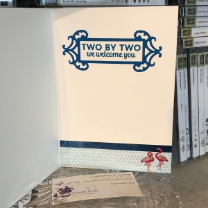
For this card, I started with one of the Assorted Memories and More Cards and Envelopes (item 159234). I’m still using up my old Whisper White ones, so since I was just playing and didn’t know what I was making, I didn’t intentionally grab one of the yellow-and-white card bases in the Dandy Garden Memories and More Cards and Envelopes. So you might decide to change that if you make a similar card.

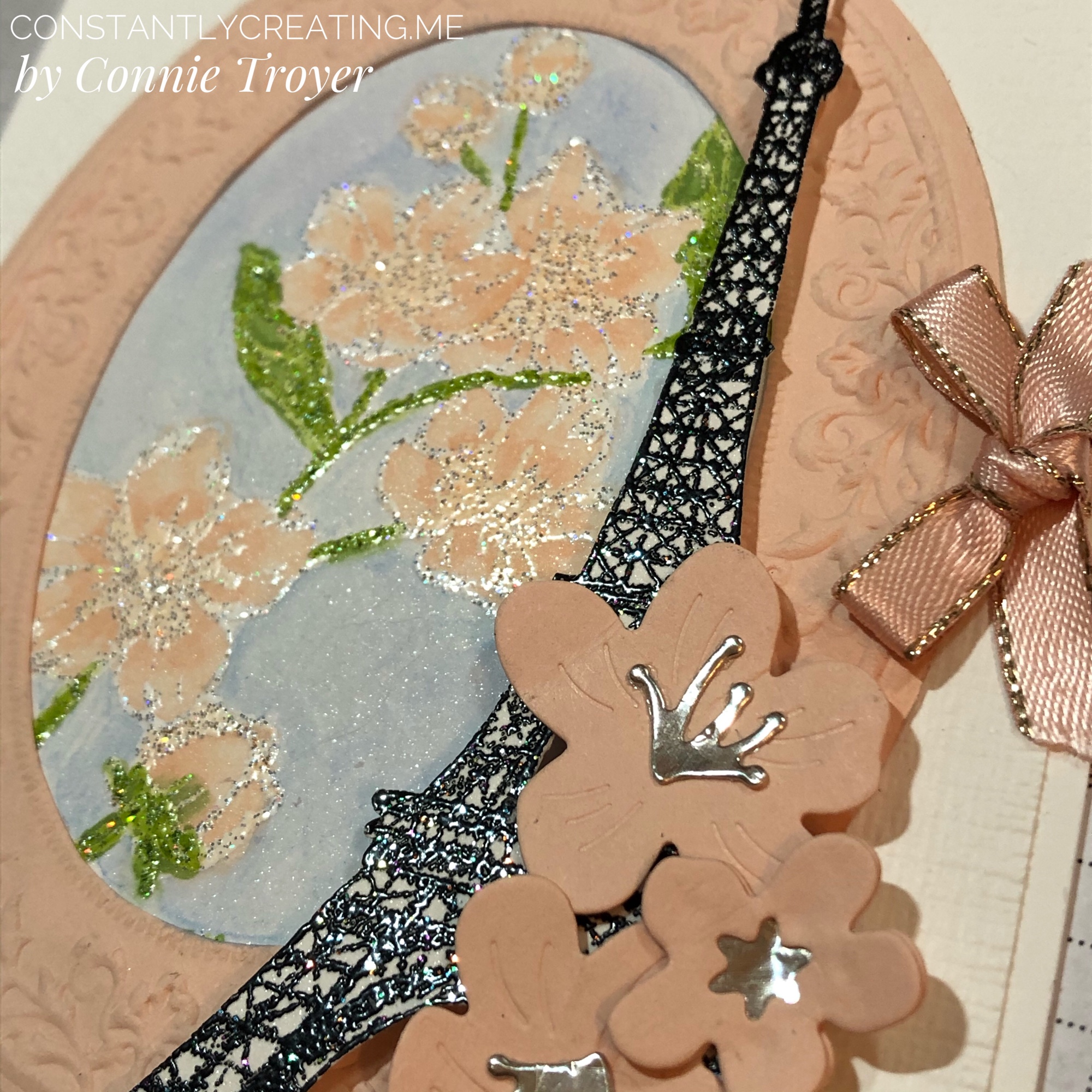
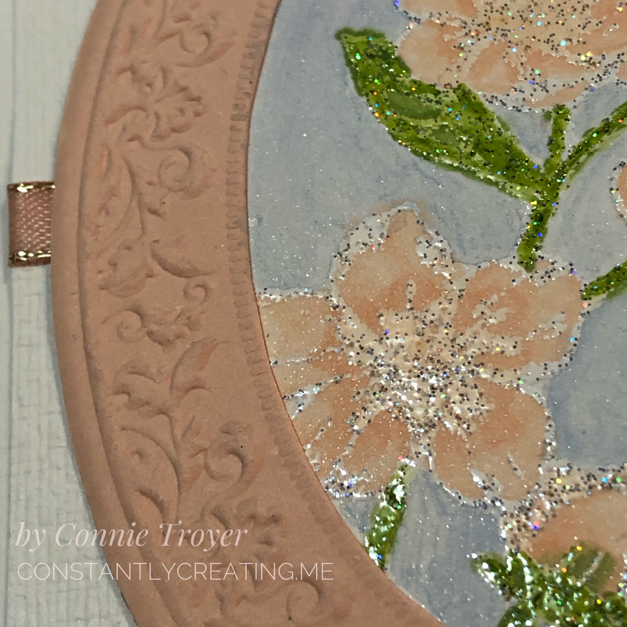
I made my bottom background layer out of a piece of Misty Moonlight Cardstock (item 153081). It measures 6″ by 4″. I didn’t adhere it right away, though. I built my scraps of Dandy Garden 6″ x 6″ Designer Series Paper (item 154297) on top of it instead. One side of the card, the DSP is 1.75″, and the other side is 2.25″. I love the Braided Burlap Trim I put with it, but it is retired. If you want to stay current, you could try the 3/8″ Fine Art Ribbon (item 154561). I used my burlap ribbon to cover the seam where the two papers met. When I did adhere the background assortment to the card base, I popped it up onto Foam Adhesive Strips (item 141825) so that the thickness of the Braided Burlap Trim wasn’t an issue with the papers below it in terms of bulges or strain on the pieces. The dimensional foam strips allowed me to tuck the ribbon under the cardstock without any worry that something would tear later or look funny.

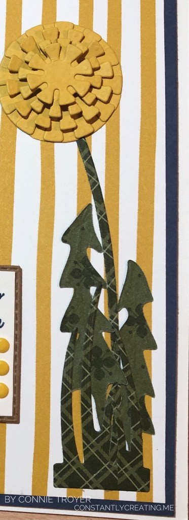
Then I got to wondering what to put on the yellow-and-white striped DSP. I hadn’t used my Dandy Wishes Dies yet (item 154315), so I made a yellow dandelion to match the other side of the paper, which has three. I cut the five layers of the blossom from Bumblebee Cardstock (item 153077) and layered the two largest graduated sizes together, gluing them completely flat. But for the next three layered sizes, I curved the little squares of the outer rims (I’m sure there’s a better name for this) in opposite directions, and I put one Stampin’ Dimensional (item 104430) in between the middle layer and the second from the top. With my fingers, I curved the middle layer (the largest of the top three) up toward me, then the next smallest size down toward the card, and then up toward me again for the smallest layer. The smallest is about 3/4″ across. The bending of the square “petals” gives it a 3D look as it pops out at the recipient yet isn’t too high to mail. When I glued them, I made sure to stagger the squares onto the empty spaces of each layer under it. It looks pretty cool in person.

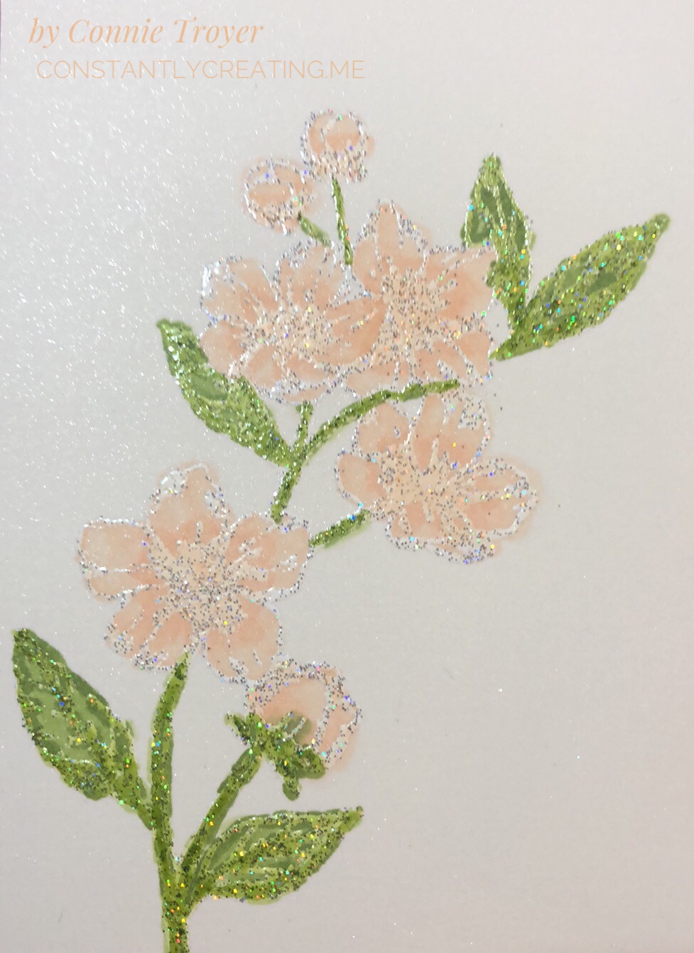
I cut the stem and the leaves of the dandelion from a double-sided piece of Mossy Meadow DSP from the Neutrals 6″ x 6″ Designer Series Paper (item 155226). This was one of the five DSP packs that new demonstrators got as their free gift when they joined during this passed Sale-a-Bration. One perk of already being a demonstrator is that we get to order these kinds of products too. 🙂 There are several great designs in the pack of ten colors (times five), so I will be using them a lot. (I’m sorry that this is now two non-current items on my card, but I didn’t have any blogging intentions at the time of creation. I’m sure that whatever you use will look wonderful too!) I wish I had reversed the direction of the two taller “toothy”-looking leaves, though, because I feel like they’re too close to the stem this way. Dandelions spread out more, I think. (Of course, since my husband is the one who mows the lawn, I haven’t had to look at dandelions recently. :-D) If I make the card again, I will switch them. I do like how the two different patterns give definition and individuality to the bunch. Everything blended in too much when they were all the same pattern. I cut and glued the two grass dies on and under the leaves for an illusion of dimension.

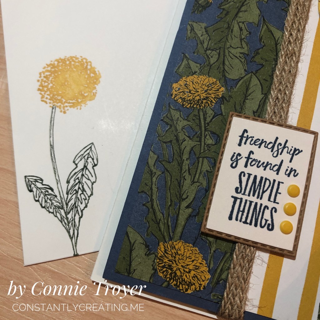
For the sentiment, I held up several and determined that the friendship one from Enjoy the Moment (item 154452) fit best in the die I’d already selected from the Rectangle Stitched Dies (item 151820). I didn’t want one that was too tall or too wide, just something that nestled in there quietly between the art elements. I stamped the sentiment in Misty Moonlight ink (pad item # is 153118) on Shimmery White Cardstock (item 101910) because I just love the sparkle in the latter! I use it often. I die-cut the white cardstock and also decided to die-cut one in kraft cardstock (another retired item). Then I manually cut off the stitched border of the white, along with a bit more with my Paper Snips (item 103579) so I could layer the two cardstocks together. I thought the kraft cardstock looked nice against the burlap ribbon and gold/brown tones of the card. Last, I added three of the smallest Playing with Patterns Resin Dots (item 152467) in Crushed Curry on the sentiment. I almost went with two, but three filled up all that white space beside the sentiment. You may choose to do something else.

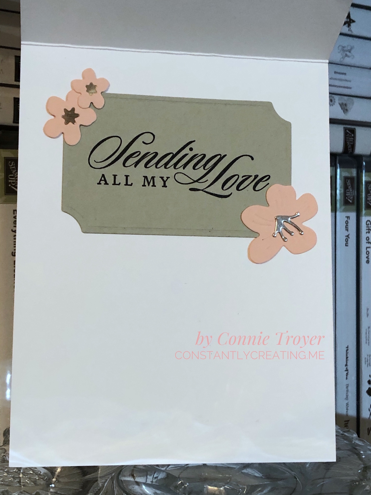
I guess that’s it for how I did the outside. I made the inside sentiment (“I’m So Happy I Found You”) from the Friends Are Like Seashells stamp set (item 154368) on Shimmery White cardstock, which was stamped in retired More Mustard ink since I don’t own the In-Color Bumblebee ink pad or refill yet. I also matted the white piece with Misty Moonlight cardstock so it would pop off the page better. I cut out the words with the smallest longest die in the pack and chose the next size up for the Misty Moonlight layer. I off-centered them against the middle to save some room. On my border piece, the blue cardstock was left over after I cut two horizontal edges to use on other projects. It was tidy enough that I thought I could use it here too. I used stickers from the sticker packs in the Dandy Garden Memories and More Card Pack (item 154302) to decorate the inside border.

I also decorated the envelope by stamping two pieces of flowers from the Garden Wishes stamp set item (item 154408) with my Stamparatus (item 146276). I used my Stampin’ Write markers to color them since I only have the Bumblebee color in a marker (it’s a current In-Color, and I purchased that set of five markers). I stamped on the front of the envelope, which I rarely remember to do, because the matching 6″ x 6″ DSP was not large enough to cover the entire flap in this size of a card. 🙂

Well, that’s all I have for you today. This card was pretty easy overall. I hope you enjoy making one of your own. Thank you for visiting my blog today; I love readers! Be sure to hop down the list of my teammates to see the beautiful “spring” cards they’ve made for you!

Click the Previous button to go back to Donna Leonard’s blog!
Click the Next button to go forward to Jillian Good’s blog!
  1. Jaimie Babarczy: https://wp.me/p79UhD-4VN
  2. Karen Ksenzakovic: https://wp.me/paaNf4-4e9
  3. Mary Deatherage: https://wp.me/p5snyt-h1y
  4. Sue Prather: https://wp.me/p5yitZ-2tQ
  5. Donna Leonard: http://stampdabbles.com/?p=4619
  6. Connie Troyer: https://constantlycreating.me/2021/03/09/3d-enjoy-the-moment-with-dandy-wishes-for-stamp-with-amy-ks-tuesday-blog-hop/
  7. Jillian Good: http://dyedwith.love/?p=139
  8. Tara Carpenter: https://tarabethstamps.blogspot.com/2021/03/stampin-up-arrange-wreath-happy-easter.html
  9. Leslie Larkin https://leslielarkin.com/ice-cream-corner-suite/
  10. Terry Lynn Bright: https://tlsbrightspot.com/2021/03/09/stampin-up-celebrate-spring/
  11. Akiko Sudano: https://wp.me/paOv8E-2ww
  12. Karen Finkle: https://karenscardkorner.blogspot.com/2021/03/stampin-up-wildly-happy-for-amys-inkin.html
  13. Amy Koenders: https://wp.me/p2SFwf-moQ
  14. Krista Yagci: https://www.thestampingnook.com/post/stampin-up-jar-of-flowers-welcome-spring-card

Flowery Eiffel Tower Love Card with Stampin’ Up’s Forever Blossoms, Parisian Beauty, and Last a Lifetime for Stamp with Amy K’s Tuesday Blog Hop

Enjoy a bit of France and flowers as we gear up for all things “love-ly” for Valentine’s Day!

img_9128-1

Whew! That’s a long blog title. (And I didn’t even add all the stamp sets!) Maybe you know by now that my preferred style is lots of details and fuss—complication is somehow my specialty. I’ve used all current Stampin’ Up products in my card today, and there are quite a few. Thank you so much for coming to my post! Thumbnails of the products I used will be at the end of post, and clicking them will take you to my online store for more details.

The theme for Stamp with Amy K’s blog hop for this month is “love.” Well, I have a “love” for all things France, so when I was thinking about current Stampin’ Up product I already own that I could create with, of course I turned to the Eiffel Tower. And flowers. I love flowers too. They’re my go-to any time of year. I didn’t have anyone particularly in mind when I created this card; it will likely go to my local gift shop for sale soon. The idea of it came to me while I was driving the other day. The background has changed since, but ideas do that in this craft room. 🙂

I started with an A2 (4.5″ x 5.5″) Thick Whisper White card base and then eyeballed and cut a slightly smaller separate piece of regular Whisper White for a layer on the top. The margin difference is between 1/8″ and 1/16″ because one was too big and the other was too small. I dry-embossed this separate piece with the Subtle 3D Embossing Folder first in one direction, and then I flipped the paper and embossed it in the other direction, which gives it a crosshatched look. I tucked a piece of 1/4″ Petal Pink Metallic-Edge Ribbon around the edges slightly higher than the middle, gluing them on the back side, and then glued my embossed piece down to the card base. (Well, technically, I did a lot of the steps backward, including that part, but do as I say, not as I did!)

The focal part of my card front is the large flower stamp from the Forever Blossoms Cling Stamp Set, surrounded by an embossed die-cut made from the Heirloom Frames Dies and Heirloom Frames 3D Embossing Folders, with the Eiffel Tower stamp from the Parisian Beauty Cling Stamp Set and die-cut flowers from the Cherry Blossoms Dies offset to the side.

I knew I wanted to use Alcohol Blends on the flowers and leaves, but I don’t like coloring large sections with the Blends and making lines, so I felt like watercoloring the background would be best for me. I used the Balmy Blue watercolor pencil in the Assortment 2 pack and an Aqua Painter. (Truthfully, I forgot to color the background until after I’d already distractedly glued the piece to the back of the oval once my flowers were done, so don’t do that. Color it all first; then cut and glue.) Since we can use Memento Tuxedo Black to hold in the colors of the alcohol markers BUT Memento is water-based and will run when touched with water during watercoloring, I decided I’d better heat-emboss some embossing powder on the image after stamping with VersaMark so that I could do both techniques. I’d wanted to try out Stampin’ Up’s new Shimmer White and Shimmer Black Stampin’ Emboss Powders anyway.

I’m actually really impressed with those new embossing powders. I didn’t expect to see the holographic flecks in them, and that feature turns out some neat highlights. The Shimmer White is, of course, white when embossed, but there’s also a mix of silver and holographic flecks that don’t meld together when heated, unlike the white and black colors themselves. And the Shimmer Black includes flecks of silver, magenta, green, blue, and something yellowy that sit subtly on top of the black. The ones in the black are very hard to pick up in the lighting when showing a card, but they’re fun to see. After I heat-embossed the Eiffel Tower with the Shimmer Black, I think my jaw actually fell open—it looked like it was sparkling with diamonds!

When I was working on the oval, I had trouble getting the embossing perfectly centered in the die-cut, and that bothered me—and it also took up more of the card front that way, room I needed—so I trimmed off the excess around the crimped part. It lays flatter now anyway without the extra border edge. Once I had that done, I used it to figure out how I wanted to show my flowers inside it. They are stamped at an angle. I actually had a different angle chosen, but I didn’t glue it in the same way I had set it, so watch that if you do it. Mark a place at the top so you don’t twist it too far to the side. I cut a small section of Shimmery White Cardstock for the flowered piece, which you can see some of in the blue background in closeups. This card is quite shimmery everywhere you look!

To color the flowers, I used my Dark Petal Pink, Light Granny Apple Green, and Dark Granny Apple Green Alcohol Blends, as well as the Color Lifter. I tried to work with the Ivory too, but I had to lift the color right out of it because it felt too dark on the buds I colored. (I used to have a Light Petal Pink Blend and wanted to use it, but at the last show where I was a vendor, the cap didn’t get put back on correctly and I didn’t catch it until it had already dried out. So I have to order a new one.) When I colored the flowers, I went over the centers and extended the color some with the Dark Petal Pink first, then lightly went over everything with the same marker, and then took the Color Lifter to the outside edges of the flowers or buds. I would have also liked to have left some white on the flowers to look more like the DSP in the Parisian Blossoms Specialty Designer Series Paper, but it just didn’t work out that way. The embossing on the flowers and leaves is really where all the shading and shadowing is, so it felt more like reverse coloring as I worked with it. There’s not a lot of space in the flowers that isn’t embossed. I did color right over the embossing, and it does not rub off (though I did not intentionally test that when it was wet).

The Parisian Beauty stamp set is one I won with my Prize Patrol number at November’s OnStage conference, and I hadn’t ordered the matching Parisian Dies yet because I already have a Bigz Eiffel Tower die and several stamp sets having to do with France. In my mind, I saw the SU die-cut at the side of the card and thought I had bought the set until I went looking and remembered. Stampin’ Up’s die-cut is much prettier than the other die I have, so I will be ordering the Parisian Dies after all. For today’s card, though, I had to fussy-cut the stamped/embossed image.

I used the Cherry Blossom dies for the flowers on top of the Eiffel Tower. The stamens and star center were cut out of Champagne Foil and the flowers themselves out of Petal Pink cardstock. I actually doubled the littlest blossom, sandwiching the foil in between to make sure it stayed where it was supposed to. I wanted the blossoms to curl up a bit and had to use the tip of my Tombow Mono Liquid Glue to get the curves I imagined, instead of my large ball tool that was “somewhere.” The dies emboss curving lines in the flowers when cut, as well.

img_9460-1

I popped up the Eiffel Tower with Mini Dimensionals to help the height of the knot at the edge of the card, so some of the cherry blossoms on top of it are glued flat and some have been half glued flat and half popped up. The littlest blossom actually has two half Mini Dimensionals at the right and is glued on top of the others otherwise. I knotted a small bow with the 1/4″ Petal Pink Metallic-Edge Ribbon (the last of my sample from OnStage!) and used glue dots under it, on top of the ribbon that was wrapped around to the back, to keep it in place.

To finish the card front, I used the “Always thinking of you” sentiment from the Very Versailles Cling stamp set and stamped it in Jet Black Staz-On ink on a scrap of Thick Whisper White cardstock (with no embossing either way). The Staz-On ink seems darker than the Tuxedo Black Memento ink, and since I had such a dark Eiffel Tower, I didn’t want to go halfway on my ink. To my surprise and delight, my Simply Shammy removed the Staz-On ink from my stamp with just a little scrubbing. Now I don’t have to drag out the pungent Staz-On Cleaner and do the whole paper towel mess! Hooray!

I also used my new Paper Trimmer and even the new Mini Cutter to trim up the sentiment scrap and the first version of my Subtle-embossed piece. The Mini Cutter is only available to demonstrators and those who become demonstrators during Sale-a-Bration, so if you want one, you’ll need to sign up to get it and some other goodies (but I promise it’s worth it!).

The inside of the card is hiding an oops, but I got a lot more creative with what you see versus what I had, so I’m happy about that mistake. I used the largest of the Painted Labels Dies to cut my “label” for the sentiment out of Sahara Sand cardstock. I stamped the “Sending All My Love” sentiment from the Last a Lifetime Cling Stamp Set in Jet Black Staz-On, using my Stamparatus. And then I glued more Champagne Foil to three more blossoms of various sizes (star centers and stamens, both) to two corners of the label. I did not curve those blossoms. 🙂

All in all, I’m pretty happy with this card. I hope you like it too. Please leave me a comment and let me know what you think or what you would have done differently—or any questions you may have. Just for fun, I’ve included a picture of the “clean and simple” version of this card to show you what it would look like without the flowers. Somehow it’s a very different feel! Nothing was glued down yet when I took the photo.

We have a very talented team creating for you today, so please “hop” around to the others on this list to see what they made! If you hit the “Previous” button, you’ll go back to Mary Deatherage’s blog, or you can go “Next” to Akiko Sudano’s offering. Both women create amazing cards! Or you can skip around with the links below—you’ll find many you like. 🙂

PreviousNext

  1. Karen Ksenzakovic – https://wp.me/paaNf4-1uG
  2. Shirley Gentry – https://stampinwithshirleyg.com/?p=10221
  3. Mary Deatherage – https://wp.me/p5snyt-aZ2
  4. Connie Troyer – You are here!
  5. Akiko Sudano – https://wp.me/paOv8E-KT
  6. Jaimie Babarczy – https://wp.me/p79UhD-3wt
  7. Karen Finkle – https://karenscardkorner.blogspot.com/2020/01/stampin-up-parisian-beauty-for-amys.html
  8. Sue Prather – https://wp.me/p5yitZ-1I8
  9. Leslie Larkin – https://leslielarkin.com/heart-to-heart-bundle-for-amys-inkin-krew-team-blog-hop/
  10. Amy Koenders – https://wp.me/p2SFwf-idu

And if you are interested in the products I used on this card, I’ve added them to the next list, and the thumbnails are direct links to my online store for more information or purchasing.

If you wish to purchase something from my online store, please use the host code WAA2PGYR during checkout. Orders of $50 before tax and shipping also gets you a free gift of your choice worth up to $8, from me to you as my thanks. 🙂 (You’ll also get a free Sale-a-Bration item from Stampin’ Up with every order of $50 before tax and shipping!) If you’re interested in becoming a demonstrator and want to sign up with a great time, I’d love to have you join mine—and Sale-a-Bration is the best time to do it! Recruits who join before March 31, 2020, will receive the brand-new (only available here) Mini Cutter (which is a guillotine-style trimmer), a 6″x6″ sampler pack of Designer Series Paper (48 sheets of most of the DSP from the Mini catalog), a free stamp set of their choice, $125 worth of items for $99, and more. I’ve never regretted it!

SAB recruit pic

Thank you again for stopping by to see what I created today!

Connie


Product List


Red Foxes in Winter Special Birthday Card

Back in the summer, I was asked to make a special birthday card for a special friend’s son who has a fondness for foxes—all shades and types. She gave me free creative rein and said she didn’t care what I did with the idea, but that he might like a red one. I considered several different fox stamps and stickers but finally chose a particular stamp that shows foxes in a wintry scene since his birthday was in February (“300-16 Red Foxes and Birches,” Stampa Rosa).

I’ve never really thought much about foxes in my life, other than thinking they’re beautiful animals in general, so I had no idea how to shade one. Coloring is something I’m still not comfortable with, because I feel like the concept of shading is one I haven’t begun to learn. Luckily for me, the wooden stamp I was using had a colored picture on the front that I just had to attempt to recreate! 🙂

First I had to choose the right paper, though, which evidently was not the bumpy watercolor paper I tried to stamp on first (twice). I knew that, but I was thinking of using my water-filled Aqua Painter on it and felt the paper would handle it. I liked the textured look of the watercolor paper too, but the image was too detailed to stamp cleanly with the bumps in the paper. Then I remembered Stampin’ Up’s Shimmery White cardstock, a must-have in my collection. It’s not any thicker than the rest of their cardstock (other than the aptly named “Thick” cardstock in the line), but it’s smooth and somehow holds up great with watercoloring–and it’s sparkly to boot (hence the “Shimmery” part of the name). Bonus for me was that the paper helped my snow scene sparkle.

Once I had the paper figured out and the stamp stamped correctly, I took my watercolor pencils and tried to emulate what I saw on the wooden stamp block. I had to mix a few shades to get that red fox coat color with the darker spots. After using the watercolor pencils, I took my Aqua Painter to it as planned and went back and forth between the two tools a few times until it felt right (because I have no idea what I’m doing, really. I’m assuming I’ll get better as I learn by trial and error).

After I was satisfied with the colors and the paper had basically dried, I went over the snow and snow-covered branches with my Clear Wink of Stella brush marker to bring back the sparkle to the snow that I’d ended up coloring over with the white pencil. (The sparkle shows through the color a little, but I really wanted the snow to glimmer.) Then I set aside the piece to dry while I figured out the rest of the card.

My favorite crafty thing to use these days are metal cutting dies. They’re simple, quick to use, and make things prettier or more elegant than I could come up with on my own. (They’re also faster for me than my Cricut.) I hang most of them on my wall and the back of my door on large magnetic sheets or vent covers so that I can easily walk over and try different sizes and shapes with whatever I’m wanting to cut out, rather than taking time to flip through a box and take die sets out of envelopes.

For this card, I looked at a bunch of large shapes, trying to decide whether to cut it into a type of oval or a fancy square or a rectangle. I ended up using one of my new sets from Spellbinders that hadn’t yet made it to my wall (Art Nouveau Designer Series “Water Lilies Decorative Element”), because it fit the image perfectly without making me cut it down too much (after all that hard work in coloring, I hated to do that!).

I debated whether to use a SU Cajun Craze cardstock base or a white base and which color to set off where. I ended up cutting several different colors of cardstock with the frame die to test them and see what worked. The card finally fell together color-wise when I brought in the darker wood-grain paper (SU “Country Lane” DSP) as a background to echo the dark shading in the picture. The dark complements the darker orangish-brown Cajun Craze well enough while keeping the same tones. With the white base, there was too much contrast and the frame jumped out at me rather than letting me focus on the colored image. So I ended up using a Cajun Craze base but covering the entire front with the wood grain and using a Cajun Craze frame on top and beneath the white colored image. (It’s a solid piece that gives a mat to whatever is inserted into the sides.)

This particular frame die acts like a gift card holder where the center flowers are, gently opening up and holding whatever is placed in the solid middle. That took some thinking, trying to measure and cut down the colored image so that it fit into that space under the flowers just right. The opening/middle rectangle is much larger than a gift card, but it’s the same idea…though this is only one way to use it.

The one thing I forgot to do to the test pieces was to make sure they were embossed well also. (One reason I love Spellbinders is because they have awesome sections of the dies that are intended to be embossed to give it a little something extra. I miss that feature when I use other brands.) So the embossing could have been done a little better in parts here, because I forgot to take that step to make it pop. I didn’t remember it until I’d mailed the card and noticed it in the pictures. In the photos above, perhaps you can see that the center flower pieces are more deeply etched than the corners above and below them. Next time…I shall remember next time. 🙂

My customer wasn’t picky about what to say on the inside either, other than asking me to write his name and theirs in it and mail it straight to him. So I had to dream up something based on other things she had said to me. After adding fox washi tape to the bottom of a white piece and then matting the paper onto a different kind of wood-grain patterned paper from a 6×6 pad (can’t remember which one now), I used three different stamp sets and another die to make the sentiment section. “A little expression of love” is from SU’s “Painter’s Palette,” “just for you” is from SU’s “From the Herd,” and “Happy birthday” is from MFT’s “LJD For the Boys” (part of the “Happy Birthday, Handsome” stamp). The die is among those in a retired nested set from SU called “Deco Labels.”

I used my stamping platform and its grid to line up the sentiments on the die-cut and stamp out a couple of test pieces in Cajun Craze ink to make sure they sat where I wanted them. (I had tried stamping right on the matted liner paper but I accidentally got ink where I shouldn’t have, so at that point I just had to cover it up because it was already adhered.)

After the sentiment box was stamped, I edged around the die-cut with my Cajun Craze Stampin’ Write Marker so it would stand out against the white paper. And, once again too late, I saw that the double fox spot on the washi piece. I didn’t create that intentionally; it’s just how it came off the roll. I wish I had seen it sooner; it bothers the part of me that prefers symmetry. 🙂 I also added two gold glitter hearts from MME (“Niche/On Trend Foam Stickers”) in the white space of the sentiment box.

I like how this one turned out even though it tested me at times and there are a couple of things I wish I could do differently. It’s always easier to make a similar card a second time. Maybe I’ll try to do one for the local gift shop. After all, I’m not completely convinced that winter is over with where I live.

Some of the Stampin’ Up items I used on this card are retired, but you can purchase the ink, cardstocks, and other current items through my online store if you want to try them (please use code 6WPHJ2MC at checkout unless your order is over $150). The thumbnails below will take you right there…and this is an awesome time to get them since Sale-a-bration is still going through the end of March. For every $50+ order before tax and shipping, you get to pick an item out of a select group of almost two dozen items and Stampin’ Up will send it to you for free with your order! Plus you’ll also get a free gift from me. 🙂 Please contact me if you have questions.

Thanks for visiting my blog! I truly appreciate my readers. ❤️ Have a lovely day! #neverstopmaking #mftstamps

Product List


Celebrate Spring with New Babies! (“Perfectly Paired” for Amy’s Inkin’ Krew Blog Hop)

Welcome to another blog post for Stamp with Amy K’s Inkin’ Krew Blog Hop! We have a very talented lineup for you this week. Thanks for stopping by to see what I created. 🙂

Our theme this month is “Celebrate Spring,” in whatever way we want to interpret that. Because I’m also making cards for my local gift shop, I chose to go with the “new birth/baby” idea. I couldn’t wait to get my hands on Stampin’ Up’s “Perfectly Paired” cling stamp set when it came out—it’s all about babies and features a Noah’s Ark image, one of my favorite themes for little ones. This stamp set (so far as we know) is only available for a couple more months since it’s in the current Occasions catalog.

Since I knew this would be a nice card and likely given with a gift, I started off by grabbing a lovely, thick envelope from my stash and then made the card base a 5×7 size to match it, using SU’s Shimmery White cardstock. I chose Shimmery White because I wanted to color the image.

Well, as usual, although I was aiming for simple, I evidently have to complicate things. And I made plenty of mistakes to cover up. My “MO,” I’m starting to think.

It occurred to me that there were waves under the ark in the stamp but I thought it might look a bit “adrift” all by itself on a flat card base. So I got some of my new Ice Blue Matt Mirror Luxury Cardstock (Crafter’s Companion) and cut it down, leaving about a 3/8″ border of white on the base for the “shimmery” part of the “Shimmery White” to show. Then I embossed some waves onto the mirror card with my Cuttlebug (“Musical Flourish” embossing folder).

My piece of mirror card was slightly longer than the embossing folder, so I embossed both ends and then attempted to hide the faint line the edge of the folder left with some retired 1/2″ SU Pacific Point ribbon. I wrapped the ribbon around the edges to give it a neater, more finished look. I believe I used my 1/4″ Scor-Tape down the middle of the back of the ribbon.

I didn’t actually cover the line left by embossing because the ribbon wasn’t wide enough, but hopefully I distracted anyone from looking too closely. I tried to keep the embossed design from overlapping when I ran it through the Cuttlebug, and the embossed line really isn’t that bad, but it’s mirror card so everything shows…. 🤷‍♀️ Whether I needed the ribbon or not, it was an attempt to make the card look better, and I built the rest of the design from there.

After fiddling with the layout, I decided to also mat the mirror card with Pacific Point cardstock to bring more of the ribbon color in for balance. I left 1/8″ of the mat showing, glued the mirror card to the mat, and then glued the combo onto the card base. I used my ATG tape gun for these. Then I set aside the card so I could concentrate on the image. And here’s where things got interesting.

I wasn’t sure whether to use my Stampin’ Blends alcohol markers to color it or my usual: watercolor pencils with either an Aqua Painter or a Blender Pen. I figured I’d do one of each type of coloring and leave the extra in my “card parts” bin for faster cardmaking later. Because those mediums require different inks to control the color, I stamped the ark image from “Perfectly Paired” once in Memento Tuxedo Black (for the alcohol markers) and once in SU’s Archival Basic Black (for the watercoloring). I labeled the backs with a pencil so I’d know which went with what…and then promptly started coloring the wrong image with the wrong medium because I was “doing,” not “thinking.” 🙄🤦‍♀️

Surprisingly, the Archival Basic Black didn’t smear too badly with the alcohol Blends, but I had been careful about not coloring over the lines, just because I was carefully coloring. It wasn’t until I smeared the lions’ whiskers a little that I even realized I’d switched the pieces. (Live and learn?) But smearing lines is why we are supposed to use Memento ink with alcohol markers. Lesson learned.

And then I discovered that I don’t yet have enough Blends to finish coloring this particular image. 🤦‍♀️🤪 I’ve been building my collection a little at a time, and although the Smoky Slate and Basic Black Combos have each made it to my purchasing list at least once, I ended up dropping them for things I wanted more. (Sacrifices!) Therefore, I have to stop coloring the image until I can get those and finish. For the record, though, this was as far as I got, and I really like this medium. (If you look closely, you can spot my whiskers accident.)

So I had to put all that away and regroup. I couldn’t remember whether Memento would smear if I got it wet (since it is a water-based ink), but I just wanted to get something going that I could use. I mentally crossed my fingers and dove in. I could always stamp another one if I had to.

Fortunately, it worked just fine—no smearing that I can tell. My coloring isn’t perfect, but at least the lines didn’t move. I went with the Aqua Painter to smooth out the watercolor pencil lines too…though in hindsight, I should have tried the Blender Pen, for better control in small places. Or just chucked it all and gone straight for my stash of Stampin’ Write markers. (I hope you’re learning from my mistakes! This veteran scrapbooker is still learning so much about cards!)

I will admit to a little cheating as well. I knew I had a Pacific Point chalk in my arsenal. As my retired SU watercolor pencils are unlabeled, I went for the chalk to color the water (with my Aqua Painter) so I could be all matchy-matchy instead of throwing off the shades by introducing some other blue. 😊 Also, I lightly colored the background a sky blue so that it wasn’t stark white paper. If I was coloring waves, I had to color sky too, right? But it’s hard to see in the picture.

So this is where I ended up with it (including doctoring the zebras with white Smooch paint and a Memento pen in desperation after watercoloring and black got the better of me). Coloring was the longest part and why it may be better to use some sort of marker next time. 🤷‍♀️ Another lesson learned!

The main focal image, colored.

Once the image was done and dried, I covered a good portion of the back of it with my 1/2″ Terrifically Tacky Tape (TTT), which is just like SU’s Sticky Strip. I did this to combat the curvature of the paper that happens once water goes onto it. Then I peeled off the tape backing and centered it in the section above the ribbon on the card front.

I had found some black, glittered chipboard faux photo corners when I was debating about the layout, so I glued those overtop the corners of the image with my Art Glitter liquid adhesive. And then I pulled a metal bar sentiment (“celebrating your arrival”) out of the heap of baby ephemera in front of me on my desk, and I adhered it to the top of the ribbon with more 1/4″ Scor-Tape. The front was done. Finally. And I’m even happy with it. 😂 I especially love how the foil look of the matt mirror cardstock shines and changes depth and color in the light. I so love using specialty materials to make cards pop.

(Oops! You can see that faint embossed line in this pic! Well, it’s not that noticeable in person. 😊)

For the inside of the card, I used the “Two by two we welcome you” sentiment from “Perfectly Paired,” stamping it with VersaMark on Shimmery White cardstock before heat embossing it with “Blue Tinsel” embossing powder from my stash. (No idea who made that; I’ve had it for years.) It was the closest embossing powder I could find to the Pacific Point color I’d been using, and it does actually look glittery, like tinsel, and has some texture to it once embossed. I then backed the white sentiment piece with a die-cut Pacific Point cardstock tag from a Spellbinders die (“Fancy Tags Two,” I believe. #neverstopmaking). I think it turned out quite lovely.

To finish off the card, I took a strip of dotted blue (SU Pool Party) cardstock from the retired Tutti-Frutti Cards and Envelopes pack and attached it to the bottom of the inside. I also cut off a small strip of matt mirror cardstock to top it. And then I found two goofy pink flamingo stickers in my stash from Sandylion and stuck them to the bottom right corner just for fun, to carry through the theme. I was looking for my smaller Noah’s Ark stamp for the corner, but I have to keep looking. 🤔🤷‍♀️

I haven’t decorated the envelope yet, but I’m thinking of stamping a row of various animals across the horizontal bottom (under the address section) as a sneak peek to the theme.

Below the list of hop participants are the current products I used in my card (or similar ones) that you can purchase through my online Stampin’ Up store if you wish to own any. (Please use host code 6WPHJ2MC when you check out.) Don’t forget that we have until March 31 to get free gifts from Stampin’ Up through Sale-a-Bration with orders of $50 or more before tax and shipping! There are some awesome reward products available! I also give free gifts to those who order through me. 😉

Thanks again for visiting today. I hope my mistakes keep you from making your own! Feel free to post questions or comments. 🙂

To continue with our hop and visit Jaimie Babarczy’s blog offering, click Next or her name in the list below. To view what Karen Ksenzakovic created, click Previous or her name. Thanks for hopping along with us!


  1. Karen Ksenzakovic
  2. Connie TroyerYou are here!
  3. Jaimie Babarczy
  4. Sue Prather
  5. Julie Johnston
  6. Mary Deatherage
  7. Karen Finkle
  8. Shirley Gentry
  9. Amy Koenders

Product List

Pat's Blog Site

One place to fit it all!

Stamp Dabbles

Donna Leonard | Independent Stampin’ Up! Demonstrator | Huntsville, AL

Niya Scrap

Démonstratrice indépendante Stampin' Up!®

From Pole to Pole

Adventures in the Land of the Pierogi

Stampin' in the Meadows

Akiko Sudano - Independent Stampin' Up! Demonstrator Downingtown, PA

Creative Stamping Designs

Karen Ksenzakovic, Independent Stampin' Up! Demonstrator in Somerville, NJ Let's make some cards!!

Stamp it up with Jaimie

Helping you find a stress free creative outlet through paper crafting.

Stamp With Amy K

Amy Koenders, Independent Stampin' Up! Demonstrator in Mendham, New Jersey...Let's make some cards!

The Daily Post

The Art and Craft of Blogging

WordPress.com News

The latest news on WordPress.com and the WordPress community.

%d bloggers like this: