Welcome to another blog post for Stamp with Amy K’s Inkin’ Krew Blog Hop! We have a very talented lineup for you this week. Thanks for stopping by to see what I created. 🙂
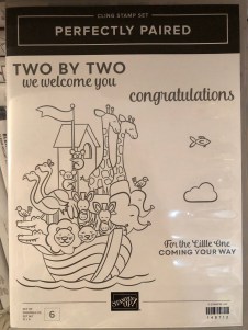
Our theme this month is “Celebrate Spring,” in whatever way we want to interpret that. Because I’m also making cards for my local gift shop, I chose to go with the “new birth/baby” idea. I couldn’t wait to get my hands on Stampin’ Up’s “Perfectly Paired” cling stamp set when it came out—it’s all about babies and features a Noah’s Ark image, one of my favorite themes for little ones. This stamp set (so far as we know) is only available for a couple more months since it’s in the current Occasions catalog.
Since I knew this would be a nice card and likely given with a gift, I started off by grabbing a lovely, thick envelope from my stash and then made the card base a 5×7 size to match it, using SU’s Shimmery White cardstock. I chose Shimmery White because I wanted to color the image.
Well, as usual, although I was aiming for simple, I evidently have to complicate things. And I made plenty of mistakes to cover up. My “MO,” I’m starting to think.
It occurred to me that there were waves under the ark in the stamp but I thought it might look a bit “adrift” all by itself on a flat card base. So I got some of my new Ice Blue Matt Mirror Luxury Cardstock (Crafter’s Companion) and cut it down, leaving about a 3/8″ border of white on the base for the “shimmery” part of the “Shimmery White” to show. Then I embossed some waves onto the mirror card with my Cuttlebug (“Musical Flourish” embossing folder).
My piece of mirror card was slightly longer than the embossing folder, so I embossed both ends and then attempted to hide the faint line the edge of the folder left with some retired 1/2″ SU Pacific Point ribbon. I wrapped the ribbon around the edges to give it a neater, more finished look. I believe I used my 1/4″ Scor-Tape down the middle of the back of the ribbon.
I didn’t actually cover the line left by embossing because the ribbon wasn’t wide enough, but hopefully I distracted anyone from looking too closely. I tried to keep the embossed design from overlapping when I ran it through the Cuttlebug, and the embossed line really isn’t that bad, but it’s mirror card so everything shows…. 🤷♀️ Whether I needed the ribbon or not, it was an attempt to make the card look better, and I built the rest of the design from there.

After fiddling with the layout, I decided to also mat the mirror card with Pacific Point cardstock to bring more of the ribbon color in for balance. I left 1/8″ of the mat showing, glued the mirror card to the mat, and then glued the combo onto the card base. I used my ATG tape gun for these. Then I set aside the card so I could concentrate on the image. And here’s where things got interesting.
I wasn’t sure whether to use my Stampin’ Blends alcohol markers to color it or my usual: watercolor pencils with either an Aqua Painter or a Blender Pen. I figured I’d do one of each type of coloring and leave the extra in my “card parts” bin for faster cardmaking later. Because those mediums require different inks to control the color, I stamped the ark image from “Perfectly Paired” once in Memento Tuxedo Black (for the alcohol markers) and once in SU’s Archival Basic Black (for the watercoloring). I labeled the backs with a pencil so I’d know which went with what…and then promptly started coloring the wrong image with the wrong medium because I was “doing,” not “thinking.” 🙄🤦♀️
Surprisingly, the Archival Basic Black didn’t smear too badly with the alcohol Blends, but I had been careful about not coloring over the lines, just because I was carefully coloring. It wasn’t until I smeared the lions’ whiskers a little that I even realized I’d switched the pieces. (Live and learn?) But smearing lines is why we are supposed to use Memento ink with alcohol markers. Lesson learned.
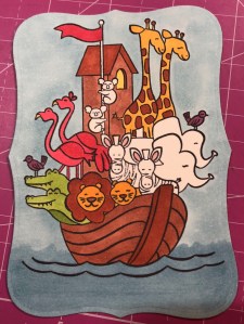
And then I discovered that I don’t yet have enough Blends to finish coloring this particular image. 🤦♀️🤪 I’ve been building my collection a little at a time, and although the Smoky Slate and Basic Black Combos have each made it to my purchasing list at least once, I ended up dropping them for things I wanted more. (Sacrifices!) Therefore, I have to stop coloring the image until I can get those and finish. For the record, though, this was as far as I got, and I really like this medium. (If you look closely, you can spot my whiskers accident.)
So I had to put all that away and regroup. I couldn’t remember whether Memento would smear if I got it wet (since it is a water-based ink), but I just wanted to get something going that I could use. I mentally crossed my fingers and dove in. I could always stamp another one if I had to.
Fortunately, it worked just fine—no smearing that I can tell. My coloring isn’t perfect, but at least the lines didn’t move. I went with the Aqua Painter to smooth out the watercolor pencil lines too…though in hindsight, I should have tried the Blender Pen, for better control in small places. Or just chucked it all and gone straight for my stash of Stampin’ Write markers. (I hope you’re learning from my mistakes! This veteran scrapbooker is still learning so much about cards!)
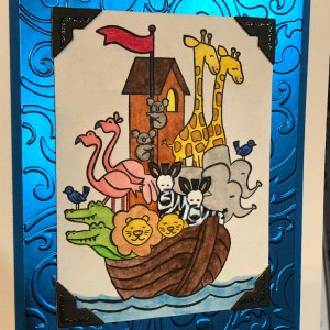
I will admit to a little cheating as well. I knew I had a Pacific Point chalk in my arsenal. As my retired SU watercolor pencils are unlabeled, I went for the chalk to color the water (with my Aqua Painter) so I could be all matchy-matchy instead of throwing off the shades by introducing some other blue. 😊 Also, I lightly colored the background a sky blue so that it wasn’t stark white paper. If I was coloring waves, I had to color sky too, right? But it’s hard to see in the picture.
So this is where I ended up with it (including doctoring the zebras with white Smooch paint and a Memento pen in desperation after watercoloring and black got the better of me). Coloring was the longest part and why it may be better to use some sort of marker next time. 🤷♀️ Another lesson learned!
Once the image was done and dried, I covered a good portion of the back of it with my 1/2″ Terrifically Tacky Tape (TTT), which is just like SU’s Sticky Strip. I did this to combat the curvature of the paper that happens once water goes onto it. Then I peeled off the tape backing and centered it in the section above the ribbon on the card front.
I had found some black, glittered chipboard faux photo corners when I was debating about the layout, so I glued those overtop the corners of the image with my Art Glitter liquid adhesive. And then I pulled a metal bar sentiment (“celebrating your arrival”) out of the heap of baby ephemera in front of me on my desk, and I adhered it to the top of the ribbon with more 1/4″ Scor-Tape. The front was done. Finally. And I’m even happy with it. 😂 I especially love how the foil look of the matt mirror cardstock shines and changes depth and color in the light. I so love using specialty materials to make cards pop.
(Oops! You can see that faint embossed line in this pic! Well, it’s not that noticeable in person. 😊)

For the inside of the card, I used the “Two by two we welcome you” sentiment from “Perfectly Paired,” stamping it with VersaMark on Shimmery White cardstock before heat embossing it with “Blue Tinsel” embossing powder from my stash. (No idea who made that; I’ve had it for years.) It was the closest embossing powder I could find to the Pacific Point color I’d been using, and it does actually look glittery, like tinsel, and has some texture to it once embossed. I then backed the white sentiment piece with a die-cut Pacific Point cardstock tag from a Spellbinders die (“Fancy Tags Two,” I believe. #neverstopmaking). I think it turned out quite lovely.
To finish off the card, I took a strip of dotted blue (SU Pool Party) cardstock from the retired Tutti-Frutti Cards and Envelopes pack and attached it to the bottom of the inside. I also cut off a small strip of matt mirror cardstock to top it. And then I found two goofy pink flamingo stickers in my stash from Sandylion and stuck them to the bottom right corner just for fun, to carry through the theme. I was looking for my smaller Noah’s Ark stamp for the corner, but I have to keep looking. 🤔🤷♀️

I haven’t decorated the envelope yet, but I’m thinking of stamping a row of various animals across the horizontal bottom (under the address section) as a sneak peek to the theme.
Below the list of hop participants are the current products I used in my card (or similar ones) that you can purchase through my online Stampin’ Up store if you wish to own any. (Please use host code 6WPHJ2MC when you check out.) Don’t forget that we have until March 31 to get free gifts from Stampin’ Up through Sale-a-Bration with orders of $50 or more before tax and shipping! There are some awesome reward products available! I also give free gifts to those who order through me. 😉
Thanks again for visiting today. I hope my mistakes keep you from making your own! Feel free to post questions or comments. 🙂
To continue with our hop and visit Jaimie Babarczy’s blog offering, click Next or her name in the list below. To view what Karen Ksenzakovic created, click Previous or her name. Thanks for hopping along with us!


- Karen Ksenzakovic
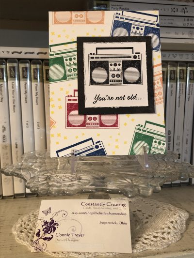
- Connie Troyer — You are here!
- Jaimie Babarczy
- Sue Prather
- Julie Johnston
- Mary Deatherage
- Karen Finkle
- Shirley Gentry
- Amy Koenders
Product List