“Cherish Every Moment” Card Using Stampin’ Up’s Forever Blossoms Stamp Set and Perennial Essence DSP and Vellum

Hello there! Welcome back to my blog. I made this card last week when I spotted my remaining scrap (less than a 6×6) of this pattern of floral-patterned paper in the Perennial Essence Designer Series Paper pack, #149100 (which is currently on the last-chance list for $8.09! Go get one!). My scrap was just so pretty that I had to use it up. I looked up the colors in the pack (Balmy Blue, Blackberry Bliss, Blueberry Bushel, Calypso Coral, Crushed Curry, Flirty Flamingo, Mossy Meadow, Old Olive, Petal Pink, So Saffron, Whisper White) and picked Petal Pink for my card base. Then I reached for my matching vellum (Perennial Essence Vellum Cardstock, #149101) and picked the Old Olive color. (The vellum pack also has Petal Pink and So Saffron.)

To decide how much of the scrap I wanted to use and where to cut it, I first stamped my sentiment (from the Floral Blossoms stamp set, #151457, which is carrying over) in Old Olive ink, #146090, so that I could narrow down the dimensions and have more exact placement. I knew I wanted to mat the floral image to give it distinction from the Petal Pink card base, since there is so much Petal Pink in this particular scrap of DSP. (Isn’t it pretty? I always love a good watercolor image.)

After cutting the vellum, I then decided to emboss the Old Olive with the Subtle Embossing Folder, #151775, to have a small pattern that would complement rather than draw attention away from the flowers. When I flipped over the vellum to put some adhesive on the back that would be behind the flowers, that’s when things changed. I stopped mid-glue because I suddenly realized how cool the back side looked. The embossing—or, rather, the debossing—made the vellum turn kind of white with the creasing! Well, then I was torn; I liked both. I decided to take pictures of each side to show you and also to be able to make a decision—sometimes I see things differently when I view a photo I’ve taken, even if I’m the same distance from the image and looking at it in real life. I’m curious to see which side you like best. Leave me a comment and let me know which side—or which card—you would have gone with. 🙂

untitled design
Green debossed “whiter” side
by connie troyer constantlycreating.me
Green embossed vellum, colored side up


untitled design-1
The way my original idea would have looked with the green vellum pointing up

I decided that I definitely liked the whiter side up and set about doing a double layer of matting to really hone in on the vellum (while still not taking away from the flowers). Pleased with my choice, I glued the now-white vellum to the larger unembossed Olive Olive vellum and the floral piece to the other smaller piece of Old Olive vellum, for two different mats. I think double matting just gives an elegant, intentional, thoughtful look to the thing being matted. I do this in my scrapbooking at times too, to help feature certain photos. When I look at the above picture now—the green-embossed side up, without the mats—it just feels so much plainer to me. (Of course, I would have added embellishments to it too.)

And since I love details and can never stop fussing with things, I took two lengths of 1/4″ Gold Shimmer Ribbon, #152156, and snipped lengthwise through strips of 1/4″ Tear and Tape Adhesive, #138995, to have 1/8″ strips on the backs of the ribbon pieces. (My usual 1/8″ redline tape has walked off somewhere and my new one hadn’t yet arrived at the house.) I made sure I was placing the very tacky ribbon straight by using my Grid Paper from Stampin’ Up (item #130148). I think I popped up the floral/center mat with Stampin’ Dimensionals (#104430) afterward to give the ribbon room to breathe.

I’ll admit it, the Gilded Gems (item #152478) were an afterthought because I wanted gems somewhere and the ribbon looked too plain on its own. I barely have enough room between the ribbons, but it’s just enough. Note: The Gilded Gems are part of the early-release Ornate Garden Suite that will be included in the upcoming 2020-2022 Annual Catalog (ordering begins June 3!), and it’s the only thing I’ve managed to preorder from that suite so far, so I keep using them! LOL. (My upline did gift me the Ornate Thanks stamp set, so you’ll see that as well before too long.)

To finish off the card, I pulled out some non-SU gold Dazzles peel-off stickers and found the perfect size to offset the sentiment. I also used four more gold Dazzles for the corners on the inside. I’m still debating what sentiment to use on the inside, or if I’ll just leave it blank. (I’m leaning toward “blank,” as the card could currently be used for more than one type of occasion, which broadens the buying audience.)

untitled design
Exterior of finished card
untitled design-2
Interior of card (so far)

So there you have it, readers! Let me know what you think about this card and what you would have chosen. Clickable links for the products I’ve used are below.

If you don’t already have a demonstrator and would like to receive a free catalog from me, submit your name and address in my contact form and I’ll send one right out to you (remember, the catalog goes live on June 3!). I’m also working on my first product share offering and will post details about that soon in case anyone wants to buy in. (If you’re not familiar with a product share, it’s a sampling of new product from the new catalog—though I’ll probably also have an “old product” version too, in case some want everything. That way you get a little bit of all the fun DSP, embellishments, and ribbon without the gigantic cost of buying it all individually. So stay tuned for details on that!)

Thanks again for stopping by today. Let me know if I can help you!

______________________________________________________________________________________________

My host code from now until the the end of June is GCXZKQT9, which you can add to your order before you check out. As a reminder, if you order $250 worth before tax and shipping are added in, don’t add the host code since you’ll be prompted to put in your own rewards—your own little party! And anyone who orders $50 before tax and shipping gets a free gift of up to $8 from me, along with a reward point toward a free $40 order from me to you. When you collect 8 reward points, you’ll just need to tell me what you want and I’ll have it shipped out to you, as my thanks for being my customer. 🙂 Contact me if you have any questions!

_____________________________________________________________________________________________


Product List

Flowery Eiffel Tower Love Card with Stampin’ Up’s Forever Blossoms, Parisian Beauty, and Last a Lifetime for Stamp with Amy K’s Tuesday Blog Hop

Enjoy a bit of France and flowers as we gear up for all things “love-ly” for Valentine’s Day!

img_9128-1

Whew! That’s a long blog title. (And I didn’t even add all the stamp sets!) Maybe you know by now that my preferred style is lots of details and fuss—complication is somehow my specialty. I’ve used all current Stampin’ Up products in my card today, and there are quite a few. Thank you so much for coming to my post! Thumbnails of the products I used will be at the end of post, and clicking them will take you to my online store for more details.

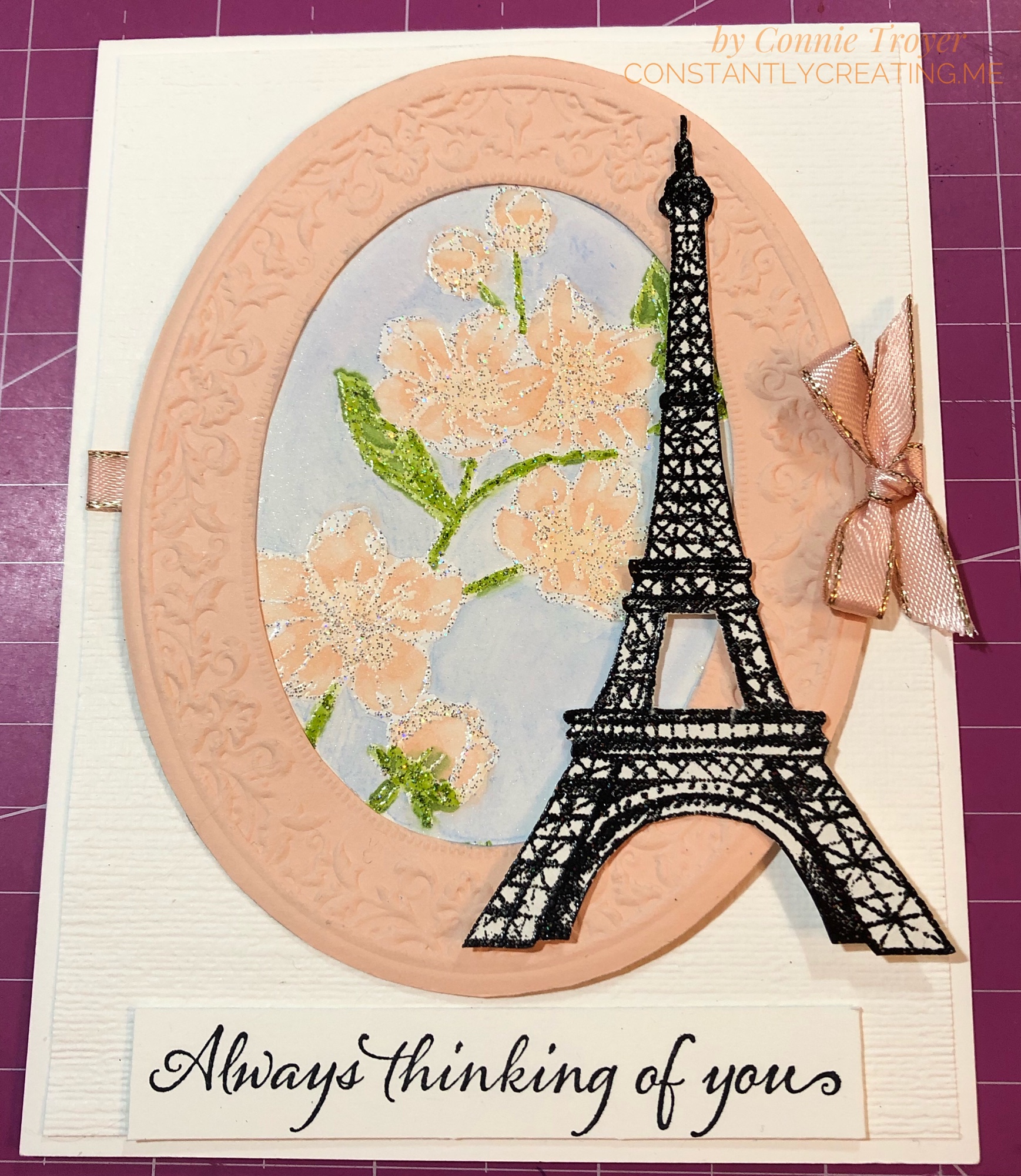
The theme for Stamp with Amy K’s blog hop for this month is “love.” Well, I have a “love” for all things France, so when I was thinking about current Stampin’ Up product I already own that I could create with, of course I turned to the Eiffel Tower. And flowers. I love flowers too. They’re my go-to any time of year. I didn’t have anyone particularly in mind when I created this card; it will likely go to my local gift shop for sale soon. The idea of it came to me while I was driving the other day. The background has changed since, but ideas do that in this craft room. 🙂

I started with an A2 (4.5″ x 5.5″) Thick Whisper White card base and then eyeballed and cut a slightly smaller separate piece of regular Whisper White for a layer on the top. The margin difference is between 1/8″ and 1/16″ because one was too big and the other was too small. I dry-embossed this separate piece with the Subtle 3D Embossing Folder first in one direction, and then I flipped the paper and embossed it in the other direction, which gives it a crosshatched look. I tucked a piece of 1/4″ Petal Pink Metallic-Edge Ribbon around the edges slightly higher than the middle, gluing them on the back side, and then glued my embossed piece down to the card base. (Well, technically, I did a lot of the steps backward, including that part, but do as I say, not as I did!)

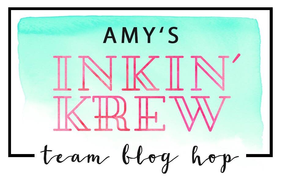
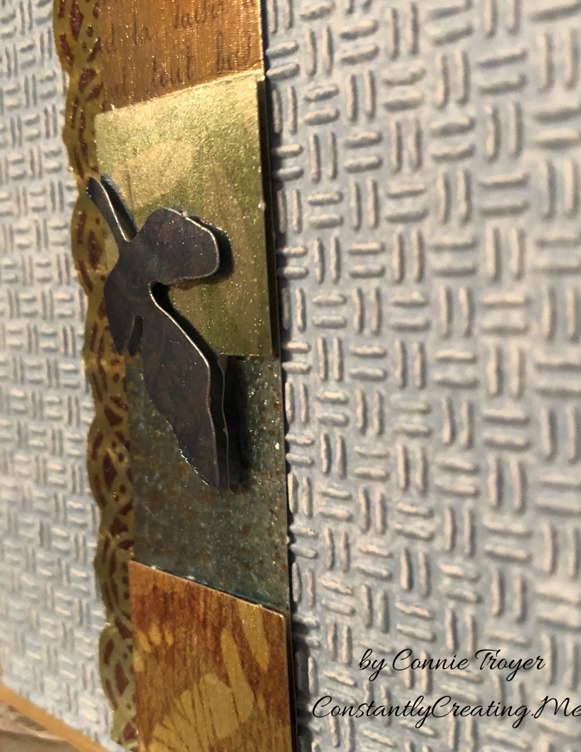
The focal part of my card front is the large flower stamp from the Forever Blossoms Cling Stamp Set, surrounded by an embossed die-cut made from the Heirloom Frames Dies and Heirloom Frames 3D Embossing Folders, with the Eiffel Tower stamp from the Parisian Beauty Cling Stamp Set and die-cut flowers from the Cherry Blossoms Dies offset to the side.

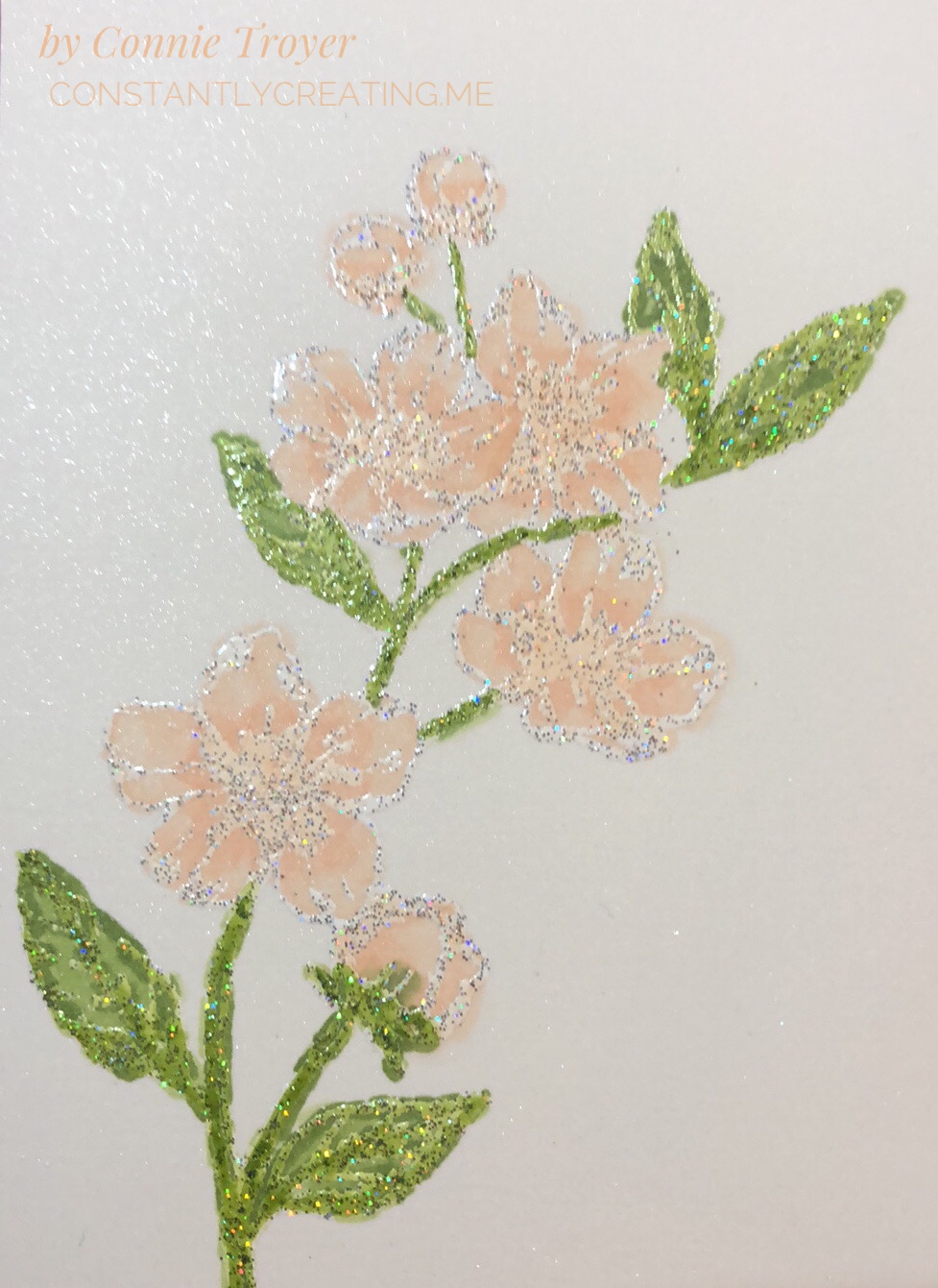
I knew I wanted to use Alcohol Blends on the flowers and leaves, but I don’t like coloring large sections with the Blends and making lines, so I felt like watercoloring the background would be best for me. I used the Balmy Blue watercolor pencil in the Assortment 2 pack and an Aqua Painter. (Truthfully, I forgot to color the background until after I’d already distractedly glued the piece to the back of the oval once my flowers were done, so don’t do that. Color it all first; then cut and glue.) Since we can use Memento Tuxedo Black to hold in the colors of the alcohol markers BUT Memento is water-based and will run when touched with water during watercoloring, I decided I’d better heat-emboss some embossing powder on the image after stamping with VersaMark so that I could do both techniques. I’d wanted to try out Stampin’ Up’s new Shimmer White and Shimmer Black Stampin’ Emboss Powders anyway.

I’m actually really impressed with those new embossing powders. I didn’t expect to see the holographic flecks in them, and that feature turns out some neat highlights. The Shimmer White is, of course, white when embossed, but there’s also a mix of silver and holographic flecks that don’t meld together when heated, unlike the white and black colors themselves. And the Shimmer Black includes flecks of silver, magenta, green, blue, and something yellowy that sit subtly on top of the black. The ones in the black are very hard to pick up in the lighting when showing a card, but they’re fun to see. After I heat-embossed the Eiffel Tower with the Shimmer Black, I think my jaw actually fell open—it looked like it was sparkling with diamonds!

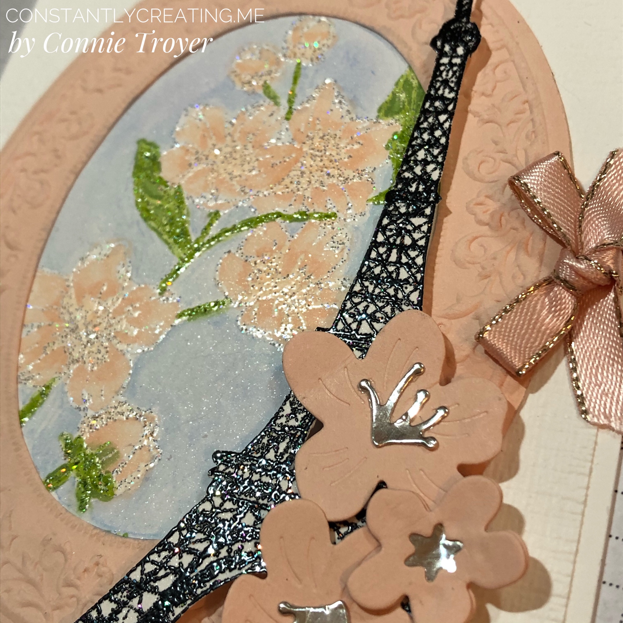
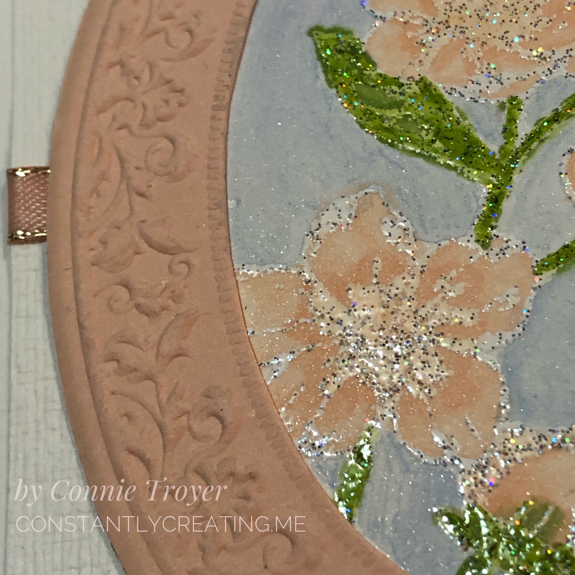
When I was working on the oval, I had trouble getting the embossing perfectly centered in the die-cut, and that bothered me—and it also took up more of the card front that way, room I needed—so I trimmed off the excess around the crimped part. It lays flatter now anyway without the extra border edge. Once I had that done, I used it to figure out how I wanted to show my flowers inside it. They are stamped at an angle. I actually had a different angle chosen, but I didn’t glue it in the same way I had set it, so watch that if you do it. Mark a place at the top so you don’t twist it too far to the side. I cut a small section of Shimmery White Cardstock for the flowered piece, which you can see some of in the blue background in closeups. This card is quite shimmery everywhere you look!

To color the flowers, I used my Dark Petal Pink, Light Granny Apple Green, and Dark Granny Apple Green Alcohol Blends, as well as the Color Lifter. I tried to work with the Ivory too, but I had to lift the color right out of it because it felt too dark on the buds I colored. (I used to have a Light Petal Pink Blend and wanted to use it, but at the last show where I was a vendor, the cap didn’t get put back on correctly and I didn’t catch it until it had already dried out. So I have to order a new one.) When I colored the flowers, I went over the centers and extended the color some with the Dark Petal Pink first, then lightly went over everything with the same marker, and then took the Color Lifter to the outside edges of the flowers or buds. I would have also liked to have left some white on the flowers to look more like the DSP in the Parisian Blossoms Specialty Designer Series Paper, but it just didn’t work out that way. The embossing on the flowers and leaves is really where all the shading and shadowing is, so it felt more like reverse coloring as I worked with it. There’s not a lot of space in the flowers that isn’t embossed. I did color right over the embossing, and it does not rub off (though I did not intentionally test that when it was wet).

The Parisian Beauty stamp set is one I won with my Prize Patrol number at November’s OnStage conference, and I hadn’t ordered the matching Parisian Dies yet because I already have a Bigz Eiffel Tower die and several stamp sets having to do with France. In my mind, I saw the SU die-cut at the side of the card and thought I had bought the set until I went looking and remembered. Stampin’ Up’s die-cut is much prettier than the other die I have, so I will be ordering the Parisian Dies after all. For today’s card, though, I had to fussy-cut the stamped/embossed image.

I used the Cherry Blossom dies for the flowers on top of the Eiffel Tower. The stamens and star center were cut out of Champagne Foil and the flowers themselves out of Petal Pink cardstock. I actually doubled the littlest blossom, sandwiching the foil in between to make sure it stayed where it was supposed to. I wanted the blossoms to curl up a bit and had to use the tip of my Tombow Mono Liquid Glue to get the curves I imagined, instead of my large ball tool that was “somewhere.” The dies emboss curving lines in the flowers when cut, as well.

img_9460-1

I popped up the Eiffel Tower with Mini Dimensionals to help the height of the knot at the edge of the card, so some of the cherry blossoms on top of it are glued flat and some have been half glued flat and half popped up. The littlest blossom actually has two half Mini Dimensionals at the right and is glued on top of the others otherwise. I knotted a small bow with the 1/4″ Petal Pink Metallic-Edge Ribbon (the last of my sample from OnStage!) and used glue dots under it, on top of the ribbon that was wrapped around to the back, to keep it in place.

To finish the card front, I used the “Always thinking of you” sentiment from the Very Versailles Cling stamp set and stamped it in Jet Black Staz-On ink on a scrap of Thick Whisper White cardstock (with no embossing either way). The Staz-On ink seems darker than the Tuxedo Black Memento ink, and since I had such a dark Eiffel Tower, I didn’t want to go halfway on my ink. To my surprise and delight, my Simply Shammy removed the Staz-On ink from my stamp with just a little scrubbing. Now I don’t have to drag out the pungent Staz-On Cleaner and do the whole paper towel mess! Hooray!

I also used my new Paper Trimmer and even the new Mini Cutter to trim up the sentiment scrap and the first version of my Subtle-embossed piece. The Mini Cutter is only available to demonstrators and those who become demonstrators during Sale-a-Bration, so if you want one, you’ll need to sign up to get it and some other goodies (but I promise it’s worth it!).

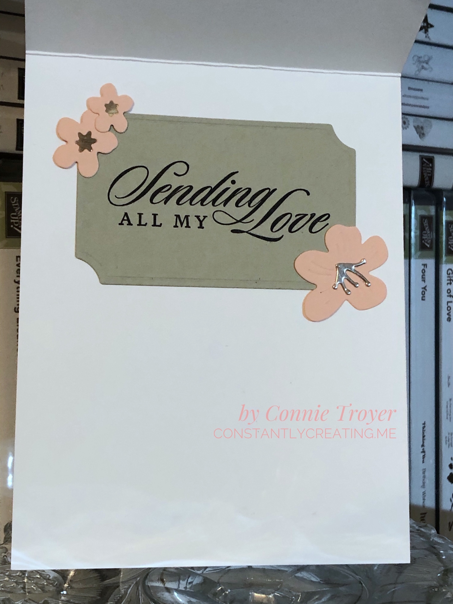
The inside of the card is hiding an oops, but I got a lot more creative with what you see versus what I had, so I’m happy about that mistake. I used the largest of the Painted Labels Dies to cut my “label” for the sentiment out of Sahara Sand cardstock. I stamped the “Sending All My Love” sentiment from the Last a Lifetime Cling Stamp Set in Jet Black Staz-On, using my Stamparatus. And then I glued more Champagne Foil to three more blossoms of various sizes (star centers and stamens, both) to two corners of the label. I did not curve those blossoms. 🙂

All in all, I’m pretty happy with this card. I hope you like it too. Please leave me a comment and let me know what you think or what you would have done differently—or any questions you may have. Just for fun, I’ve included a picture of the “clean and simple” version of this card to show you what it would look like without the flowers. Somehow it’s a very different feel! Nothing was glued down yet when I took the photo.

We have a very talented team creating for you today, so please “hop” around to the others on this list to see what they made! If you hit the “Previous” button, you’ll go back to Mary Deatherage’s blog, or you can go “Next” to Akiko Sudano’s offering. Both women create amazing cards! Or you can skip around with the links below—you’ll find many you like. 🙂

PreviousNext

  1. Karen Ksenzakovic – https://wp.me/paaNf4-1uG
  2. Shirley Gentry – https://stampinwithshirleyg.com/?p=10221
  3. Mary Deatherage – https://wp.me/p5snyt-aZ2
  4. Connie Troyer – You are here!
  5. Akiko Sudano – https://wp.me/paOv8E-KT
  6. Jaimie Babarczy – https://wp.me/p79UhD-3wt
  7. Karen Finkle – https://karenscardkorner.blogspot.com/2020/01/stampin-up-parisian-beauty-for-amys.html
  8. Sue Prather – https://wp.me/p5yitZ-1I8
  9. Leslie Larkin – https://leslielarkin.com/heart-to-heart-bundle-for-amys-inkin-krew-team-blog-hop/
  10. Amy Koenders – https://wp.me/p2SFwf-idu

And if you are interested in the products I used on this card, I’ve added them to the next list, and the thumbnails are direct links to my online store for more information or purchasing.

If you wish to purchase something from my online store, please use the host code WAA2PGYR during checkout. Orders of $50 before tax and shipping also gets you a free gift of your choice worth up to $8, from me to you as my thanks. 🙂 (You’ll also get a free Sale-a-Bration item from Stampin’ Up with every order of $50 before tax and shipping!) If you’re interested in becoming a demonstrator and want to sign up with a great time, I’d love to have you join mine—and Sale-a-Bration is the best time to do it! Recruits who join before March 31, 2020, will receive the brand-new (only available here) Mini Cutter (which is a guillotine-style trimmer), a 6″x6″ sampler pack of Designer Series Paper (48 sheets of most of the DSP from the Mini catalog), a free stamp set of their choice, $125 worth of items for $99, and more. I’ve never regretted it!

SAB recruit pic

Thank you again for stopping by to see what I created today!

Connie


Product List


Celebrate Spring with New Babies! (“Perfectly Paired” for Amy’s Inkin’ Krew Blog Hop)

Welcome to another blog post for Stamp with Amy K’s Inkin’ Krew Blog Hop! We have a very talented lineup for you this week. Thanks for stopping by to see what I created. 🙂

Our theme this month is “Celebrate Spring,” in whatever way we want to interpret that. Because I’m also making cards for my local gift shop, I chose to go with the “new birth/baby” idea. I couldn’t wait to get my hands on Stampin’ Up’s “Perfectly Paired” cling stamp set when it came out—it’s all about babies and features a Noah’s Ark image, one of my favorite themes for little ones. This stamp set (so far as we know) is only available for a couple more months since it’s in the current Occasions catalog.

Since I knew this would be a nice card and likely given with a gift, I started off by grabbing a lovely, thick envelope from my stash and then made the card base a 5×7 size to match it, using SU’s Shimmery White cardstock. I chose Shimmery White because I wanted to color the image.

Well, as usual, although I was aiming for simple, I evidently have to complicate things. And I made plenty of mistakes to cover up. My “MO,” I’m starting to think.

It occurred to me that there were waves under the ark in the stamp but I thought it might look a bit “adrift” all by itself on a flat card base. So I got some of my new Ice Blue Matt Mirror Luxury Cardstock (Crafter’s Companion) and cut it down, leaving about a 3/8″ border of white on the base for the “shimmery” part of the “Shimmery White” to show. Then I embossed some waves onto the mirror card with my Cuttlebug (“Musical Flourish” embossing folder).

My piece of mirror card was slightly longer than the embossing folder, so I embossed both ends and then attempted to hide the faint line the edge of the folder left with some retired 1/2″ SU Pacific Point ribbon. I wrapped the ribbon around the edges to give it a neater, more finished look. I believe I used my 1/4″ Scor-Tape down the middle of the back of the ribbon.

I didn’t actually cover the line left by embossing because the ribbon wasn’t wide enough, but hopefully I distracted anyone from looking too closely. I tried to keep the embossed design from overlapping when I ran it through the Cuttlebug, and the embossed line really isn’t that bad, but it’s mirror card so everything shows…. 🤷‍♀️ Whether I needed the ribbon or not, it was an attempt to make the card look better, and I built the rest of the design from there.

After fiddling with the layout, I decided to also mat the mirror card with Pacific Point cardstock to bring more of the ribbon color in for balance. I left 1/8″ of the mat showing, glued the mirror card to the mat, and then glued the combo onto the card base. I used my ATG tape gun for these. Then I set aside the card so I could concentrate on the image. And here’s where things got interesting.

I wasn’t sure whether to use my Stampin’ Blends alcohol markers to color it or my usual: watercolor pencils with either an Aqua Painter or a Blender Pen. I figured I’d do one of each type of coloring and leave the extra in my “card parts” bin for faster cardmaking later. Because those mediums require different inks to control the color, I stamped the ark image from “Perfectly Paired” once in Memento Tuxedo Black (for the alcohol markers) and once in SU’s Archival Basic Black (for the watercoloring). I labeled the backs with a pencil so I’d know which went with what…and then promptly started coloring the wrong image with the wrong medium because I was “doing,” not “thinking.” 🙄🤦‍♀️

Surprisingly, the Archival Basic Black didn’t smear too badly with the alcohol Blends, but I had been careful about not coloring over the lines, just because I was carefully coloring. It wasn’t until I smeared the lions’ whiskers a little that I even realized I’d switched the pieces. (Live and learn?) But smearing lines is why we are supposed to use Memento ink with alcohol markers. Lesson learned.

And then I discovered that I don’t yet have enough Blends to finish coloring this particular image. 🤦‍♀️🤪 I’ve been building my collection a little at a time, and although the Smoky Slate and Basic Black Combos have each made it to my purchasing list at least once, I ended up dropping them for things I wanted more. (Sacrifices!) Therefore, I have to stop coloring the image until I can get those and finish. For the record, though, this was as far as I got, and I really like this medium. (If you look closely, you can spot my whiskers accident.)

So I had to put all that away and regroup. I couldn’t remember whether Memento would smear if I got it wet (since it is a water-based ink), but I just wanted to get something going that I could use. I mentally crossed my fingers and dove in. I could always stamp another one if I had to.

Fortunately, it worked just fine—no smearing that I can tell. My coloring isn’t perfect, but at least the lines didn’t move. I went with the Aqua Painter to smooth out the watercolor pencil lines too…though in hindsight, I should have tried the Blender Pen, for better control in small places. Or just chucked it all and gone straight for my stash of Stampin’ Write markers. (I hope you’re learning from my mistakes! This veteran scrapbooker is still learning so much about cards!)

I will admit to a little cheating as well. I knew I had a Pacific Point chalk in my arsenal. As my retired SU watercolor pencils are unlabeled, I went for the chalk to color the water (with my Aqua Painter) so I could be all matchy-matchy instead of throwing off the shades by introducing some other blue. 😊 Also, I lightly colored the background a sky blue so that it wasn’t stark white paper. If I was coloring waves, I had to color sky too, right? But it’s hard to see in the picture.

So this is where I ended up with it (including doctoring the zebras with white Smooch paint and a Memento pen in desperation after watercoloring and black got the better of me). Coloring was the longest part and why it may be better to use some sort of marker next time. 🤷‍♀️ Another lesson learned!

The main focal image, colored.

Once the image was done and dried, I covered a good portion of the back of it with my 1/2″ Terrifically Tacky Tape (TTT), which is just like SU’s Sticky Strip. I did this to combat the curvature of the paper that happens once water goes onto it. Then I peeled off the tape backing and centered it in the section above the ribbon on the card front.

I had found some black, glittered chipboard faux photo corners when I was debating about the layout, so I glued those overtop the corners of the image with my Art Glitter liquid adhesive. And then I pulled a metal bar sentiment (“celebrating your arrival”) out of the heap of baby ephemera in front of me on my desk, and I adhered it to the top of the ribbon with more 1/4″ Scor-Tape. The front was done. Finally. And I’m even happy with it. 😂 I especially love how the foil look of the matt mirror cardstock shines and changes depth and color in the light. I so love using specialty materials to make cards pop.

(Oops! You can see that faint embossed line in this pic! Well, it’s not that noticeable in person. 😊)

For the inside of the card, I used the “Two by two we welcome you” sentiment from “Perfectly Paired,” stamping it with VersaMark on Shimmery White cardstock before heat embossing it with “Blue Tinsel” embossing powder from my stash. (No idea who made that; I’ve had it for years.) It was the closest embossing powder I could find to the Pacific Point color I’d been using, and it does actually look glittery, like tinsel, and has some texture to it once embossed. I then backed the white sentiment piece with a die-cut Pacific Point cardstock tag from a Spellbinders die (“Fancy Tags Two,” I believe. #neverstopmaking). I think it turned out quite lovely.

To finish off the card, I took a strip of dotted blue (SU Pool Party) cardstock from the retired Tutti-Frutti Cards and Envelopes pack and attached it to the bottom of the inside. I also cut off a small strip of matt mirror cardstock to top it. And then I found two goofy pink flamingo stickers in my stash from Sandylion and stuck them to the bottom right corner just for fun, to carry through the theme. I was looking for my smaller Noah’s Ark stamp for the corner, but I have to keep looking. 🤔🤷‍♀️

I haven’t decorated the envelope yet, but I’m thinking of stamping a row of various animals across the horizontal bottom (under the address section) as a sneak peek to the theme.

Below the list of hop participants are the current products I used in my card (or similar ones) that you can purchase through my online Stampin’ Up store if you wish to own any. (Please use host code 6WPHJ2MC when you check out.) Don’t forget that we have until March 31 to get free gifts from Stampin’ Up through Sale-a-Bration with orders of $50 or more before tax and shipping! There are some awesome reward products available! I also give free gifts to those who order through me. 😉

Thanks again for visiting today. I hope my mistakes keep you from making your own! Feel free to post questions or comments. 🙂

To continue with our hop and visit Jaimie Babarczy’s blog offering, click Next or her name in the list below. To view what Karen Ksenzakovic created, click Previous or her name. Thanks for hopping along with us!


  1. Karen Ksenzakovic
  2. Connie TroyerYou are here!
  3. Jaimie Babarczy
  4. Sue Prather
  5. Julie Johnston
  6. Mary Deatherage
  7. Karen Finkle
  8. Shirley Gentry
  9. Amy Koenders

Product List

Petal Promenade and Mossy Meadow Custom Sympathy

I was recently commissioned to create a custom sympathy card for a woman’s special friend who lost her daughter. My customer and I texted about various options and decided to go with a green theme, the gold-foil “Sending Love & Sympathy” square sentiment by Anna Griffin that you see here, and the cream-backed embossed rose image on the left of the card.

Initially, the rose image was entirely cream-colored, but it just wasn’t showing up well once I backed it with the Petal Promenade Designer Series Paper from Stampin’ Up. It faded away in the background instead, which wasn’t good for a focal piece. So I brought out my retired Stampin’ Up chalks and lightly spread some corresponding chalk colors over the raised areas on the rose (hoping I wouldn’t get too heavy with it, as I only had one of it!). I used a couple of the chalk applicators that comes with the set, but I have also used Q-tips in the past. I think the rose was a scrap from a mass-produced card. I decided to upcycle it. 🙂

Technically, I created everything else first before I started coloring the rose. I got a piece of Mossy Meadow cardstock, measured what I would need for a 5×7 card, sliced off the excess, and scored it where needed. When I was looking for Mossy Meadow DSP (of which I do not have a lot) so I could match the card base, I found this grid paper in the retired Going Places pack from last year. I thought it would work perfectly for a subtle pattern with some movement, yet not be a plain solid and still work with a busier pattern on top of it.

The grid paper was the perfect paper once I spotted the current Petal Promenade DSP. I simply adore that paper pack. The different kinds of flowers in it are SO beautiful and realistic. My challenge for this card was to show some of the gorgeous paper but not overshadow the focal piece of the solitary rose.

Since I accidentally cut the rose piece a little shorter than necessary (initially thinking I’d be going with an A2-sized card), I then had to rethink how to do the Petal Promenade DSP. But showing a little more at the top and bottom did give a better idea as to what the paper looked like. I just decided to go with it and see where I ended up. I took the rose piece and moved it all around the edges of the 12×12 piece until I found which section of paper suited me best. I didn’t want the large ranunculus blooms to be right beside the rose bloom, and I was trying to precisely place the greens as well, so that pinks and purples showed also.

I also tied a scrap of 1/8″ velvet Blackberry Bliss ribbon around the stem section of the rose and kept the knot in place with a Bling Zot. Then I matted the gold-foil sentiment from Anna Griffin with a plain piece of SU Mossy Meadow cardstock so that the piece would show up better against the DSP and match the card base.

When “sketching” out the card in my head at the start, I “saw” the strip of paper and rose at the left and the block sentiment down on the lower right. After I made the card a 5×7, that empty space of just grid DSP seemed rather empty. I wanted something there to fill the space, but stamping was going to be difficult to accomplish with the paper being so dark. I decided to riffle through my doilies and other embellishments to see what I could put there to take up space, and I had some retired gold SU doilies that were just the right sizes. I chose two so I could extend the largest one out far enough to feel balanced in the space and then layered the smaller one atop it. Then I added a half of a small one underneath the sentiment as well.

I accented with Gold Faceted Gems from Stampin’ Up, which are current. There are a lot in the pack, so I’m in no danger of using them up yet, even though I’ve used several each time I craft with them. 🙂 The gems bring out the subtle gold foil in the sentiment.

On the inside of the card, I placed a random pink glitter paper strip I had been moving around my desk (it might be from a Martha Stewart 12×12 paper pack), and then, more intentionally, I cut out a blank, flowered sentiment square also from the Petal Promenade DSP pack. My customer and I had decided to use the Sylvana Rossetti quote from the retired SU Love and Sympathy stamp set, and it fit perfectly inside the square. I used Mossy Meadow for the ink color. I was thankful to have used my stamp platform so that I could reink it if I needed to (and I did).

Some of my Stampin’ Up team members like to decorate their envelopes. I do it once in a while, but I generally forget to by the time I create and am ready to photograph and move the card on its way. This time I really wanted to show more of that beautiful Petal Promenade paper and make the card really feel special and coordinating with its envelope, so I took the time to measure and cut a section for the flap. The paper is simply too pretty to hide, and this way it won’t cost extra at the post office, as doodads on the front of the card will (unless they are flat like images stamped onto it).

Thanks for stopping in to see my work! Below are some things that can be used to create a similar card.

Remember that for every $50 purchased from Stampin’ Up until March 31, you can get one free Sale-a-bration item! They have some fantastic choices for us, too. In addition, for every $50 spent, you also get a free item from me – your choice up to $10 worth. Please use my code JJBCPS4W when you order. It’s the best time of year for Stampin’ Up. You don’t want to miss this. 🙂

Happy crafting to you!

Suggested Products

Yes, Another Sympathy (a Decoupage One This Time)

A dry decoupage sympathy card using Stampin’ Up for everything but the main image (at last!).

The hits keep coming. Two more sympathies on my to-do list, along with a celebration theme for a blog hop. For these two, at least it’s a celebration of sorts, though sad now. Still, I feel muddled. My heart aches for them, so I went looking for something that spoke to me and seemed to reflect the people I’m thinking of. My “card toppers” bin bailed me out for the one I’m blogging about today. (The other, yet unmade, will focus on Stampin’ Up’s Graceful Glass vellum DSP and alcohol markers, so stay tuned for that.)

My mother used to say that I was “an accident waiting to happen.” She’d probably still say that, given the chance. That phrase came to me as I wrestled with this card. I began to feel like it was one accident after another. I love how it turned out in the end, but my goodness, the process! (This means there’s hope for me, right?) Another case of “when things don’t go well.” Please tell me you’d never know. 😉

One of my husband’s coworkers lost her dear husband last week, and it’s been such a sad thing. I wanted to make a beautiful card – part masculine in remembrance and part feminine for her – but had no idea where to start. Since I often clean or organize when I have a problem to mull over, that’s what I ended up doing, which led me to the main cross piece seen on the front of the card today.

Finding a brown card base to match the topper was easy; Stampin’ Up’s Baked Brown Sugar, a retired color, matched the foiled copper/silver/gold/burgundy/blue cross the best. I only have so many browns, and I usually use SU for my card bases since I like how the 80-lb weight cardstock stands. (I grab premade bases only if I start with the base first rather than the main image. It’s just easier to match it that way rather than working in reverse.)

During my cleaning spree, I was also looking at and putting away some new SU Designer Series Paper. So when I tried to find paper the cross could match, the blue piece was fresh in my mind and looked prettier than any other neutrals I put next to it. The blue paper is from the Tranquil Textures DSP pack in the current Annual Catalog from Stampin’ Up. It’s not a solid blue, but it it hard to tell that with the dry embossing I put on top of it to give the card some texture. I used the “Oxford” Cuttlebug folder for the textured design. I wanted something light and barely textured like Stampin’ Up’s Subtle embossing folder, but I don’t own that particular one yet.

Here’s where things got tricky. The card is a 5×7 because the cross is so tall. But because it’s narrow, there was a lot of “white space” around it. I don’t like white space (even if it’s blue). So I started to wonder what I could do or put next to the cross to take up the width. A sentiment would only be so big, as well as being awkward to work with around the 3D leaf layers toward the bottom, so I wasn’t sure that was the answer. I thought maybe I could make a decorative edge to the card front at the right instead. I could see it in my mind but wasn’t sure how to achieve it (story of my crafting life, btw). That seemed to be the best thing to try…but all my dies were too small to stretch across 7 inches. Nothing felt right. So that night I went to bed frustrated, having made only the card base and embossing the paper.

The next night I attempted to keep going on the card while I was on the phone. I should have known better. I spotted a long Spellbinders die on my die wall and got all excited because it would fit lengthwise. I didn’t think about the fact that ALL of the edges of the die does indeed cut…until I wrapped a card base around a Cuttlebug plate (so that I didn’t cut through the second layer), positioned the die, and wondered why an inch of the card base separated from itself after I ran it through the machine. (*insert facepalm here*) To my defense, I was still on the phone. LOL

So suddenly I had a card base with one side shorter than the other. That was not what was supposed to happen. Not to mention, the magnetic plate dinged up the middle of the card base, and the B plate left marks on the back side of the base, making it warped and weak. Sigh. Time to rethink. Maybe I needed to make a new card base.

I tried to process where to go next. The decorative edge thing hadn’t worked and I couldn’t think how to make it work other than an edge punch – if I made a new base. I’ve never tried the popsicle sticks I’ve heard about, to keep part of it from cutting, so I wasn’t sure how to do that either (again, on a new base). But I hated to destroy the one I’d just cut. What I did manage to do after thinking was flip the card base around (even though I’d folded it correctly after scoring the first time). That would give me a chance to add paper atop the marked-up part to hide it and also add some stability with the extra paper layers. I hoped. I also took my bone folder and tried to work out the middle bumps and crease it sharply.

Once the base was salvaged, I decided to play with the pieces and arrange them just to see what I could do. I ended up liking a little bit of breathing room between the die cut and the now-shorter edge of the card base, rather than placing the die cut right up against the piece it had just been cut from. And obviously if there’s a peekaboo die, something needed to peek through it underneath. I grabbed more blue DSP and left it as is on the inside of the card rather than embossing it for texture like the front.

I also realized that I needed to run the textured piece through the Cuttlebug again, as one side has trouble with a piece of paper I got stuck in the roller years ago. Part of the paper was hardly embossed, so I realigned it in the folder, flipped it around to the other side that impresses better, and ran it through again. Came out perfectly that time.

The trouble was that when I left that breathing room space between the die cut and the base, it was not centered once the card was opened. I didn’t like that. But it looked like I had enough room to add 1/8″ of ribbon or something else. I chose SU’s gold and white ribbon to match the cross and the browns and loved how it looked.

But then I couldn’t get it adhered. The ribbon is thin enough that the line of Art Glitter liquid glue I laid down soaked right into the ribbon. I wasn’t confident it wouldn’t end up slightly sticking to the inside of the card once it had been closed for a while. But as I told a friend last night, when a person has too much product in her house, she will find a way. I decided to use my Cosmo Cricket Glubers Adhesive Strips. I rarely use them, but sometimes they’re just the best option. They are 1/4″ strips, though, so I took my nonstick microscissors from CutterBee and cut right down one of the strips, eyeballing it to just under 1/8″. And then I placed it with my tweezers and stuck a new piece of ribbon to it. I was much happier with the inside then.

I decided not to stamp a sentiment on the inside yet. I needed to finish up and get to bed and I wanted to really look through my stamps to figure out what I wanted to say on the card. I will probably go back and add one later, but right now it’s blank.

I’ve spoken about dry decoupage in past blog posts. A reader had asked me to do a tutorial on how to do it, and I am working on that currently. I hope to post one soon. For now, here are a couple of closeups to be able to see the decoupage layers that make up the cross. I should have trimmed off the little perforation bumps more as I was making the topper, but it’s probably too late to fix it now.

The cross has several layers of dimension to it in the squares as well as the leaves, which made it interesting to put together. And the leaves are the top layer.

Thanks again for coming to visit my blog! I appreciate your readership!

A Polar Bear Christmas

Playing along with a Stamps, Ink, Paper Challenge (128) with a Snowy Polar Bear Christmas card and matching thank-you note.

Here’s another adorable card with matching thank-you note that I created for a custom card order needing to be mailed soon. I think it fits the Stamp Ink Paper 128 challenge, shown below:

http://stampinkpaper.com/wp-content/uploads/2017/12/SIP-Challenge-128-Let-it-Snow-NEW-800.jpg

So here are my matching cards.


I’ll tackle the main Christmas card first. The embossed snowy background was given to me by a crafty friend, and I flipped it over so that the debossed side was showing. I matted it with some current SU Emerald Envy plain cardstock on a Thick Whisper White card base. The paper-pieced polar bears and trees are 3D stickers from a “Holiday Time” series – I think they might be from Walmart. They’re actually pretty cool, using poms for the tails and the ends of scarves, and the tree is glittered. 

I was having trouble fitting all three on the A2 card base, so I thought if I had one peeking over a snowbank as if he were watching the scene, I could put them a little closer together. My “snowbank” is made out of two strips of shimmery translucent vellum paper, which I cut by tracing a Card Creator Spellbinders die and then cutting it out by hand (hubby was sleeping and I was trying to minimize the noise, plus I wasn’t exactly sure where I wanted the mounds to go, so I traced/cut it especially long and then positioned them where I wanted them). I popped up the vellum in parts for effect and to fit the back polar bear in without squishing him (trying to reduce that whole “translucent” thing). 

I had thought of using white handmade mulberry paper instead of vellum, but I didn’t feel like making a bunch of noise and rooting around in my “specialty paper” drawer since it was late and I was only supposed to be “fiddling” (i.e., going to bed soon) as opposed to outright intentionally creating. 

The “Happy Holidays” sentiment above the scene is from a 2016 Hampton Art stamp and die set (SC0718). It bugs me a little that the font sizes of the two words is not the same, but as the set is either photopolymer or acrylic (read: see-through), it was easier to line up than others. I inked the stamps with Stampin’ Up’s Emerald Envy ink overtop a strip of polka-dotted paper from American Crafts/Dear Lizzy “5th and Frolic.”


I kept the inside of the main card simple with a “Warm Wishes This Holiday Season” sentiment from Close to My Heart’s “Scandinavian Wishes Stamp of the Month,” (SU Emerald Envy ink), punched it out with my retired SU Scallop Oval punch, and matted it with my SU Decorative Label punch in Emerald Envy cardstock. 

The thank-you note, on the other hand, is simply a SU Whisper White notecard size (3.5×4 7/8) with a background of gold snowflakes on vellum from SU’s “Winter Wonderland” Designer Vellum Stack. I laid an Emerald Envy cardstock piece embossed with  the “Thanks Words” Cuttlebug folder (371134) on top (putting the glue for the vellum underneath where the cardstock layer would hide the adhesive) and then cut another “snowbank” out of the gold snowflakes before finally adding the last sticker in the Holiday Time set. (Yay, another thing used up in my stash! I really am trying, hubby dear.)

These cards were ones that were simple, thought-provoking, and yet fun to create – my favorite kind. It was my first time trying to create “snowbanks” even though I’ve seen them used with regularity this season. And I’m fairly pleased with how it all turned out. Unfortunately, they’re another two cards I can’t duplicate unless I find another pack of stickers (thus then adding to my stash). 🙂

Hope you’ve enjoyed this offering! Thanks for stopping in. 

House Mouse “Musical Mice” Birthday Card

A musical birthday card for a musician celebrating a milestone year.

I took a break from Christmas cards to do up a few birthday cards that I needed to deliver or mail. One of them went to my aunt, who is a supremely talented pianist. I had thought of using this focal image for her ever since I first got my hands on this cute House Mouse stamp. 

I grabbed a premade base that was of a larger size, since the stamp itself is basically the size of an A2 card front. No room for the music note paper I wanted to use behind it. But this larger card size worked well for the idea. 


First I put down a layer of silver foil cardstock (cutting out the inner portion with snowflake and winter-themed word dies that I can use on other projects). The music paper I placed on top is from Echo Park’s “Be Mine” line. I then stamped, colored, and cut the House Mouse image so I would know what size to cut the Silver Glimmer Paper (glittered cardstock) from Stampin’ Up, which I placed behind the image as a mat. 


I think I might need to work on my coloring skills, or at the very least shading, but I’m pleased enough with my creation. 🙂 I used three sets of watercolor pencils, an AquaPainter, and Ranger’s Jet Black Archival Ink to stamp and color the image. I topped it off with some gold Smooch Paint for the knobs on the violin and the lettering of “Mauschen,” the name of the piano. I had looked up the stamp online and found the colored image from House Mouse, so I tried to imitate those color choices. (Each of the mice are named and has their own coloring specifications.) I think next time I might try a black piano, however. 

I had the most trouble finding and placing a sentiment on the card due to limitations in space and supplies. I had to revise my initial idea several times, and the more I hurried to finish it (since I needed to be leaving the house), the worse it got. Isn’t that always the way of it? Eventually something worked, although I realized an hour later that I’d forgotten to include the milestone number she was turning, as I’d intended. But maybe she doesn’t need that advertised. 😉 

So, the tag is from the American Crafts “Everyday” line, the “Just a Note” sentiment is from Rubber Cottage, and I couldn’t read my handwriting on the back of the tiny music notes I added to the tag, so I can’t say who made that. The black lace ribbon is from Stampin’ Up. I stamped the sentiment with Jet Black Staz-On ink because the tag was chipboard with a shiny top and water-based dye inks just wipe right off of those. I used my heat gun to speed up the drying process as well.


The inside of the card finished the thought begun on the front (“Just a Note”) with “Wishing You Happy Birthday.” Again not quite what I’d intended to say, but time really was of the essence, so I made do with the first couple things I found rather than creating a custom sentiment. And I’m the only one who overthinks these things, so it probably doesn’t matter. 🙂 The stamp sets I used for the inside are from Stampin’ Up (“Wrapped in Warmth”) and Close to My Heart (“Gracious Greetings”). I also embossed piano keys for the bottom border. The embossing folder I used is 5×7 and entitled “Keyboard,” from Cuttlebug. 

Coloring always takes a bit of time, and I really do need to perfect some shading skills (here’s wishing I could go back to art class), but I’m generally pleased with the images once I’m done. I always enjoy seeing how the lines swirl and blend together when I’m watercoloring. Perhaps I’m really a Renoir at heart. 😉 

That’s all for this birthday card. The others I created were simpler, of course. But details are my specialty. 🙂 Thanks for reading!

Season’s Greetings with Snow


Hello, all! It’s November now, but all I’ve been hearing for hours is rain. Still, there are Christmas cards to create. I have a couple of custom orders for them along with my own this year. This card, I’ll use for one of the orders. 

I feel like I made it out of practically nothing. Or, rather, it cost me practically nothing to do it, by the time I divide out all the pieces in the packs, etc. The card base from Die Cuts with a View was bought several years ago on clearance, and with this card I finally used up the pack (sad face here, as I loved them and have been hoarding them). It has a scalloped edge on the front of the card with two lines of glitter above the scallops and dots of glitter inside each curve. 

I have mentioned that crafters are a generous bunch. Both the embossed snowflake background and the die-cut snowman came free of charge from such generous crafters in one or two of my Facebook groups. (And the good news is that I still have a few more embossed backgrounds, though I am sadly out of snowmen.) I may have traded some of my own supplies for them, or perhaps they came as Happy Mail or a RAK (Random Act of Kindness). Either way, I’m happy to make use of them. Though I have no idea which companies to thank. The snowman looked as though he was exceedingly happy and welcoming something, so I figured he would like a snowfall. 🙂

I sized up the snowflake background to the card base and realized I’d have to cut it down a bit to keep it above the glitter lines. I backed the embossed piece with some textured purple/mauve Gauze Paper from DCWV. The snowman got a little color enhancement with some Stampin’ Up inks and a Blender Pen. I tried to give him a sort of muted vintage look to coordinate with the other colors. (And I wasn’t sure if he was stamped with archival ink that doesn’t bleed when touched with waterlike substances, so I had to color him carefully just in case it was a dye-based ink.)


I had a few sentiments that would fit the upper corner, but I had trouble deciding on one until my tiredness and the hour made the decision for me. (“Slap it down and move on,” my friend A likes to tell me. I actually listened this time.) I found this “Season’s Greetings” in a pack of rub-ons from American Crafts, so I put it on a scrap of vellum hanging out on my desk, punched it out with Stampin’ Up’s retired Word Window punch, ran it through my Xyron Sticker Maker, and then needed a way to make it show up, since vellum is see-through. Enter a remnant of gauze paper, which I’d cut out of the center of the mat for the embossed snowflake background. (Why waste perfectly good material and hide it where no one will ever see? Craft supplies aren’t cheap!) I used a Spellbinders Die to cut the simple border, which fit the vellum rub-on sentiment perfectly. And this way we got to see a little more texture of that cool paper, since the mat behind the snowflakes is small by necessity. 

To echo the glitter that came on the card base, once I knew how much room I had to play with at the sides around the front piece, I stamped a border (bought from Oriental Trading) in VersaMark, poured on some retired Iridescent Ice glitter embossing powder from Stampin’ Up, and heat set it, one on each side. 

I kept the inside of the card simple with a “Let It Snow” stamp from SU’s “Snow Place” stamp set and a couple of snowflakes from SU’s retired “Letterpress Winter” set. I used Pale Plum ink (also SU, retired) and more of the retired Iridescent Ice glittered embossing powder.

Fairly simple card overall, though some of the pieces took a bit of fiddling. I enjoyed this one and may try to make more of them with different snowmen and sentiments. Thanks for stopping by and reading!

Warmth and Cheer with Northern Flurry

It’s time to start making Christmas cards! Okay, it’s probably past time, and I’ve been creating them for a couple of weeks, but here’s my first blog post about one.


It may be October, but for crafters, it’s Christmas card season!

The other day, hubs and I figured out a new way to keep each other company while I remained productive with crafting. The result was the outside of four winter/Christmas cards finished. They’re pretty simple, but simple can be elegant sometimes. Our wedding, for example. (Or at least that’s what I was trying for back then.)

Pardon the mess behind my desk, but this is the only shot of the four together so far.

I have two custom Christmas card orders right now along with the niggle of something bigger in the works (we’ll see if it goes anywhere), so I figured all four would go one place or the other, or I could split them up.

I used all Stampin’ Up materials for these except for the bling – Whisper White cardstock, the retired Northern Flurry embossing folder, paper strips cut into banners from one of their retired 6×6 Christmas paper packs (I didn’t write down which one), Soft Suede and Early Espresso inks with matching cardstock, and the “Wishing you a season filled with warmth and cheer” sentiment from the set “Wrapped in Warmth.” The rhinestone bling is from Michael’s, SU, and CTMH.

I’m still stamping the insides of three of them. So far I have “Merry Christmas to You and Yours” (from SU’s “To You and Yours Too” set) on the inside of the Soft Suede version, shown below.


I love how the embossing just pops off the card. I had originally wanted the snowflakes to come cascading from the upper-left corner but realized after I cut the cardstock that that wasn’t going to be possible because of the direction I’d cut it. And I had thought to only have a smaller 1/4″ strip extending from top to bottom but didn’t like how that interrupted the little snowflake down there…so after some brainstorming with hubby, since he was in the room, this is what we decided looked best. And I’m pleased with it. I think it like it better than my original idea. (Not that I won’t try that original idea again some year. 🙂 )

Thanks for reading! If I can make Christmas cards for you sometime, send me a note or visit thelittlewhatnotshop.etsy.com. 🙂

Nuts and Bolts about You Birthday Card

I’ve been on book deadline this past week and will be again next week, so I haven’t had much time to play in the craft room even though I have several cards I need to make and send out. I finally HAD to make time to squeeze in one for my nephew’s birthday since the party was tonight.

My day wasn’t going that well, honestly. I’ve felt better physically, I’ve thought more coherently, and it seemed like I had a case of the dropsies, where I couldn’t hang onto things with my fingers. Imagine crafting when you drop every other item. Those are the days I pick up a book or occupy myself otherwise instead of crafting. But for this card. Regardless of how frustrated I was, it wasn’t making itself.

I had heard from his mom that nephew is now interested in robots and how things come apart and fit together, as a budding engineer would. 🙂 One of my best friends just happened to give me robot stickers for my birthday (surprise gift of 20+ sticker packs?! Yes, please!). So of course they were perfect to use for his card. (They are from Jot, btw.)

I’d been thinking of how I wanted to lay it out all week. I have these awesome gold metal gears that I thought would look great stacked and staggered in a couple of corners, and I couldn’t wait to use them. Well, even though I saw them recently, I still have to wait to use them, because I can’t figure out where I stashed them. And that was just the beginning of the frustration. Alas, some cards go like this.

 
I had to use a bigger card base because I wanted to use both the robot and the robot dog on the front of the card and they weren’t fitting on an A2 OR a horizontal card because of the height of the robot. I also had plaid paper of cream, brown, and teal that I thought would work with the teal and brighter colors of the stickers, along with a tan piece of embossed gears a crafty friend had sent me…but in the end I couldn’t make the sizing work for the plaid. I ended up using a Spellbinders card creator die (that didn’t release all its pieces, so there I was taking my CutterBee scissors to them even though I ran it through the Cuttlebug three times…), and I added in one of my new Spellbinders edge dies that I hadn’t had a chance to use yet. (It had fallen off the wall and when I picked it up, I realized it sort of looked like gears too. Why not use it? I actually tried two of those edge dies, but the one with frosted vellum did not work at all – it kept moving on me and I couldn’t get a whole one. I tossed it out of the running.)

 
I put the die that did work in a metallic foil cardstock, which turned out well. Didn’t fully cut again, but I liked the look even with the additional pieces.

So there I was with my SU Not Quite Navy cardstock mosaic die-cut piece on top of the embossed tan gears, both hovering above the 5×7 green Moroccan-patterned card base. NOT what I had imagined for this card. (I only have ten types of premade card bases. I often make my own, but whatever was the shorter route to finishing the card had my vote today.) I decided to fill in some of the mosaic holes I’d already taken out, thinking it would look better. I really wanted to add in a red color to the mosaic but didn’t want to fight that die again, so I went on. Looking at the combination of those four elements almost made me nauseated, but I’d taken too long at that point to reverse direction. It was time for robot stickers. And then to look for a balloon so the robot didn’t appear empty-handed – plus I wanted to fill in some of the space below the sentiment but above the dog. The brand-new sticker pack that held my balloon then stuck to the inside of its plastic, so I’m not sure how many of those are even useable any longer. But at least the balloon didn’t suffer.

The sentiments were the easiest part. Finally, something going right! I stamped four different ones and didn’t mess up at all, even with my cloudy thinking and growling stomach. So that tells me I’ve actually improved on my stamping. Practice makes perfect! I used SU Basic Gray Archival ink and the SU Sunburst Sayings stamp set for the “It’s your day” stamp inside the stitched wonky square Sizzix die journaling box in the “Frames” strip of three dies, adding in the red color there and hoping the ink would be dark enough to cover it. It worked! All that was left was a number on the balloon and a metal photo holder with brad for decoration. 

It’s hard to see, but the robot and dog are actually popped up, as is the wonky square sentiment. And the balloon is a puffy sticker from SandyLion (PFOM10). I was thankful I wasn’t mailing the card.

I moved on quickly to the inside, since I was supposed to be leaving my house for the party right about then. Stamped all three correctly in Basic Gray Archival ink and SU Lost Lagoon ink (hooray! No wasted time or covering up mistakes!). The “Happy Birthday” stamp is from Stampin’ Up’s “Birthday Blast.” “I’m Nuts and Bolts about You!” and the random nuts and bolts pattern I used as a border are from Stampendous/Fran’s (SSC1033). This is the second time I’ve used the Fran’s set and I like it very much.


(As usual, I forgot to take the picture BEFORE writing something on the inside.)

Sometimes I create well under stress and deadline. Not so today. I think parts of this card are really cute. I would rather have the chance to redo some of it, though. But I must move on. I am not perfect and neither is my work, and I have other cards I must do. After next week’s deadline. (Dottie, if you’re reading this, your very overdue thank-you note IS coming!)

Thanks for reading. Time to “hit the hay.”

Here are pics of some of the supplies I used.

Pat's Blog Site

One place to fit it all!

Stamp Dabbles

Donna Leonard | Independent Stampin’ Up! Demonstrator | Huntsville, AL

Niya Scrap

Démonstratrice indépendante Stampin' Up!®

From Pole to Pole

Adventures in the Land of the Pierogi

Stampin' in the Meadows

Akiko Sudano - Independent Stampin' Up! Demonstrator Downingtown, PA

Creative Stamping Designs

Karen Ksenzakovic, Independent Stampin' Up! Demonstrator in Somerville, NJ Let's make some cards!!

Stamp it up with Jaimie

Helping you find a stress free creative outlet through paper crafting.

Stamp With Amy K

Amy Koenders, Independent Stampin' Up! Demonstrator in Mendham, New Jersey...Let's make some cards!

The Daily Post

The Art and Craft of Blogging

WordPress.com News

The latest news on WordPress.com and the WordPress community.

%d bloggers like this: