Yellow Tim Holtz Floral Collage Paper Notecard

A simple get well card using a 6” washi roll from Tim Holtz.

I’ve been in a yellow phase, which is very odd for me. I used Tim Holtz’s Floral Collage Paper for this notecard, accented with DCWV patterned paper (Lemon Flower stack) and an Anna Griffin sentiment. #thelittlewhatnotshop #constantlycreating #getwellcards

Petal Promenade and Mossy Meadow Custom Sympathy

I was recently commissioned to create a custom sympathy card for a woman’s special friend who lost her daughter. My customer and I texted about various options and decided to go with a green theme, the gold-foil “Sending Love & Sympathy” square sentiment by Anna Griffin that you see here, and the cream-backed embossed rose image on the left of the card.

Initially, the rose image was entirely cream-colored, but it just wasn’t showing up well once I backed it with the Petal Promenade Designer Series Paper from Stampin’ Up. It faded away in the background instead, which wasn’t good for a focal piece. So I brought out my retired Stampin’ Up chalks and lightly spread some corresponding chalk colors over the raised areas on the rose (hoping I wouldn’t get too heavy with it, as I only had one of it!). I used a couple of the chalk applicators that comes with the set, but I have also used Q-tips in the past. I think the rose was a scrap from a mass-produced card. I decided to upcycle it. 🙂

Technically, I created everything else first before I started coloring the rose. I got a piece of Mossy Meadow cardstock, measured what I would need for a 5×7 card, sliced off the excess, and scored it where needed. When I was looking for Mossy Meadow DSP (of which I do not have a lot) so I could match the card base, I found this grid paper in the retired Going Places pack from last year. I thought it would work perfectly for a subtle pattern with some movement, yet not be a plain solid and still work with a busier pattern on top of it.

The grid paper was the perfect paper once I spotted the current Petal Promenade DSP. I simply adore that paper pack. The different kinds of flowers in it are SO beautiful and realistic. My challenge for this card was to show some of the gorgeous paper but not overshadow the focal piece of the solitary rose.

Since I accidentally cut the rose piece a little shorter than necessary (initially thinking I’d be going with an A2-sized card), I then had to rethink how to do the Petal Promenade DSP. But showing a little more at the top and bottom did give a better idea as to what the paper looked like. I just decided to go with it and see where I ended up. I took the rose piece and moved it all around the edges of the 12×12 piece until I found which section of paper suited me best. I didn’t want the large ranunculus blooms to be right beside the rose bloom, and I was trying to precisely place the greens as well, so that pinks and purples showed also.

I also tied a scrap of 1/8″ velvet Blackberry Bliss ribbon around the stem section of the rose and kept the knot in place with a Bling Zot. Then I matted the gold-foil sentiment from Anna Griffin with a plain piece of SU Mossy Meadow cardstock so that the piece would show up better against the DSP and match the card base.

When “sketching” out the card in my head at the start, I “saw” the strip of paper and rose at the left and the block sentiment down on the lower right. After I made the card a 5×7, that empty space of just grid DSP seemed rather empty. I wanted something there to fill the space, but stamping was going to be difficult to accomplish with the paper being so dark. I decided to riffle through my doilies and other embellishments to see what I could put there to take up space, and I had some retired gold SU doilies that were just the right sizes. I chose two so I could extend the largest one out far enough to feel balanced in the space and then layered the smaller one atop it. Then I added a half of a small one underneath the sentiment as well.

I accented with Gold Faceted Gems from Stampin’ Up, which are current. There are a lot in the pack, so I’m in no danger of using them up yet, even though I’ve used several each time I craft with them. 🙂 The gems bring out the subtle gold foil in the sentiment.

On the inside of the card, I placed a random pink glitter paper strip I had been moving around my desk (it might be from a Martha Stewart 12×12 paper pack), and then, more intentionally, I cut out a blank, flowered sentiment square also from the Petal Promenade DSP pack. My customer and I had decided to use the Sylvana Rossetti quote from the retired SU Love and Sympathy stamp set, and it fit perfectly inside the square. I used Mossy Meadow for the ink color. I was thankful to have used my stamp platform so that I could reink it if I needed to (and I did).

Some of my Stampin’ Up team members like to decorate their envelopes. I do it once in a while, but I generally forget to by the time I create and am ready to photograph and move the card on its way. This time I really wanted to show more of that beautiful Petal Promenade paper and make the card really feel special and coordinating with its envelope, so I took the time to measure and cut a section for the flap. The paper is simply too pretty to hide, and this way it won’t cost extra at the post office, as doodads on the front of the card will (unless they are flat like images stamped onto it).

Thanks for stopping in to see my work! Below are some things that can be used to create a similar card.

Remember that for every $50 purchased from Stampin’ Up until March 31, you can get one free Sale-a-bration item! They have some fantastic choices for us, too. In addition, for every $50 spent, you also get a free item from me – your choice up to $10 worth. Please use my code JJBCPS4W when you order. It’s the best time of year for Stampin’ Up. You don’t want to miss this. 🙂

Happy crafting to you!

Suggested Products

Cornflower-Blue/Cream/Tan Anna Griffin Sympathy Card with Gold Foil

Another sympathy card to share.

img_8042-1

Although I do have other themes than just sympathy coming up (I promise!), it’s sort of where I’m stuck for a few more days. Just so many of them to make lately 😦 , and I’ve hardly had any time in the craft room because of editing projects. I have a feeling it’s going to be a busy fall too. But. I do have this simple offering tonight (that I have to post before I start “hopping” around elsewhere), mailed a few weeks ago now.

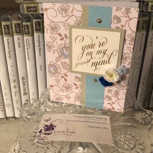
This card was for a dear friend/former roommate who lost her young husband recently. I wanted something reminiscent of a masculine idea but also to incorporate blue, as that was always her favorite color. And I wanted something that hearkened to their relationship, something beautiful and giving an idea of romance. And I didn’t have a lot of time to create it. (I actually worked on it in at least two snatches of time.) Tall order, I guess.

img_8041

I started off by going to my “cheat box”: a photo box I’ve filled with premade or prescored card bases, so that when I’m short on time, I can simply pluck one out of there. I’ve either already done the work on it or bought it usable. Although I prefer to use Stampin’ Up cardstock (80-lb. weight) for my card bases, I do also have a stash of printed American Crafts and DCWV bases (thank you, Marijane). So I found one that was flowery (romantic), tan (somber/masculine), and blue (the whole point) and hoped I could make it work.

I find printed bases harder to create with. There’s not much difference between a plain base that I top with patterned paper or a printed base, but I always find the latter harder to pull together into a card. But they are lovely and useful, so I keep trying.

I had a random scrap of blue flowered paper hanging around that seemed to match the color on the base fairly well, so I wanted to use it somehow. (I think it might be very retired SU DSP.) And I had sorted through my set of Anna Griffin sentiment tags and toppers beforehand to pull out ones that could work with sympathy cards, since it seems to be the “season” for that. This one spoke to me the most for her because of what she means to me and how the news affected me. Plus I liked how the gold foil in the sentiment matched the tan in the base.

img_8043-1

So I found some SU cardstock that coordinated, used an EK Success edge punch on one side of a long strip for the middle, and matted the sentiment with the same. (I think it’s either Crumb Cake or Tip Top Taupe cardstock.) And as I look at the pictures here, I’m wondering if I didn’t match the top and bottom bronze pearls after all (both in size and color). I meant to…. I remember thinking that the smaller size of pearl looked better next to the flowers; it didn’t take up as much room. And I already had the big one stuck at that point. Must have been more in a hurry than I thought and forgot to switch it out. (Or maybe it’s the angle of the pictures?) Erg. Well, I can’t ask for it back now. I never claimed to be perfect anyway. It’s handmade, right?

I did have some fun rummaging through my random flower canister for ones I could use on the front of the card so it wouldn’t be so plain. I nested a tiny cream one inside a couple of layers of white ones to bring in the cream-colored background of the sentiment and topped it off with a champagne-colored pearl. And of course I had to use blue flowers. This arrangement and color scheme seemed to work best. The dark blue flower is fabric ribbon with a gem in the middle of it, and the light blue rose is a rougher blend.

I chose the same SU cardstock from the front for the inside, since the inside of the card base was white. I matted the left-hand sentiment with cream for contrast. Both stamps were inked with an Encore Gold Metallic pad and heated with a heat gun afterward. The left-hand sentiment is from a retired SU set called “Words of Wisdom,” and the one on the right is from the retired SU set “Thoughts and Prayers.” I used a gold border strip from the retired SU “Painted Love Gold Vinyl Stickers” from the last catalog down one side and edge-punched the other with the EK punch from the front.

So that’s it for this one. I’m glad I’ve actually managed to mail it. Still working on that for some of the others. 😛 More to come later. Back to my edit for now. The juggling continues!

Lemon Lime Twist Green and Marvelous Magenta Lilies Sympathy

A simple but stunning sympathy to share with you today.

I’ve had a rash of sympathy cards to make lately, so I’ll be talking about those in several posts to come. They are all very different and more of a clean-and-simple idea than ones that are overly complicated.

The one I want to show today was created with a base of 80-lb. weight retired Stampin’ Up Marvelous Magenta cardstock, which matched the main lily design perfectly. It is an A2 size (so 4.25″ x 5.5″).

I cut a piece of retired SU Fabulous Foil Acetate to fit the size of the card front and then glued it with Tombow Multi-Glue (green-and-white bottle) under where the lily block would be attached. The acetate is freestanding otherwise. It is accented with silver on one side and gold on the other. The gold happened to match the warmth of my green better (and my sentiment was also in gold).

I “cheated” a little bit on this card by using a some preprinted materials. (Isn’t that what patterned paper is, though?) Specifically, I can confess that the magenta/lime/white lily piece is the front of a pocket calendar, cut down. I never would have guessed, myself, if I looked at this card for the first time. The block was just too pretty to toss, so I cut off the wording, squared it up, and found things that matched. Luckily for me, one of Stampin’ Up’s current In-Colors, Lemon Lime Twist, also matches perfectly, so I matted the calendar piece with LLT cardstock.

Then, because I was once again short on time (chronic problem), I dug through some Anna Griffin sentiment pieces I’d acquired secondhand. The lime green oval mat is a separate piece from the gold-foil sentiment, but they coordinate perfectly. And using them was faster than stamping my own. I popped up the top oval with Stampin’ Dimensionals and remembered that I had some matching In-Color felt bows from the last catalog. Raising up the top layer allowed me to nestle that bow knot right beneath it rather than stick up in its own layer.

For the inside, I used a leftover strip of the Fabulous Foil Acetate and a Hero Arts set of sympathy stamps that is one of my favorites. I turn to it often. “Sending caring thoughts your way” was stamped in SU Lemon Lime Twist ink, and the flower stamp from the same stamp set was colored with Marvelous Magenta and Lucky Limeade markers on a piece of white paper that I cut to fit the inside.

Clean and simple but elegantly stunning at the same time. It’s prettier in person, even though I did some “recycling” by using the calendar piece. Anything is fair game to go on a card!

Thank you for stopping by and reading! Leave a comment if something I did inspired you!

Pat's Blog Site

One place to fit it all!

Stamp Dabbles

Donna Leonard | Independent Stampin’ Up! Demonstrator | Huntsville, AL

Niya Scrap

Démonstratrice indépendante Stampin' Up!®

From Pole to Pole

Adventures in the Land of the Pierogi

Stampin' in the Meadows

Akiko Sudano - Independent Stampin' Up! Demonstrator Downingtown, PA

Creative Stamping Designs

Karen Ksenzakovic, Independent Stampin' Up! Demonstrator in Somerville, NJ Let's make some cards!!

Stamp it up with Jaimie

Helping you find a stress free creative outlet through paper crafting.

Stamp With Amy K

Amy Koenders, Independent Stampin' Up! Demonstrator in Mendham, New Jersey...Let's make some cards!

The Daily Post

The Art and Craft of Blogging

WordPress.com News

The latest news on WordPress.com and the WordPress community.

%d bloggers like this: