With Deepest Sympathy, Yellow Flowers and Butterflies

Thanks for visiting my blog today. Unfortunately (of sorts), I’m back with another sympathy card today. They just are not ending! It’s a good thing cards are beautiful. There has to be something redeeming about this season.

I consider this card to have two recipients. It was first intended to go to a dear friend who lost her grandmother – but in my hit-and-miss-mostly-miss craft room time as of late, I’d managed to lay it out but not glue it together before seeing her at an event. So I showed her a picture. She seemed to love it and then told me to mark sending it off my to-do list. Best news ever! …And then a couple of days later I heard about the passing of a longtime church member. 😦 I sadly trudged back up to the craft room and glued it together (being very thankful I was that far along considering my utter lack of time), and I mailed it off this week to his widow. Sigh. So many people to lose lately. I don’t like it one bit. But I hope I can bring some comfort and a bit of beauty by remembering and praying for those left behind.

The card mechanics are pretty simple. White A2 card base with scraps of Stampin’ Up’s Always Artichoke (dark green) behind some leftover SU Designer Series Paper (DSP). I don’t remember the name of the pack it came out of; I just saw this decently sized piece and thought it was pretty enough to use as a focal point. Initially it was a complete rectangle, but I had thought to echo the cut-out corners in the sentiment. Alas, I grabbed the wrong punch…and then forgot to “highlight” the corner with a pearl or gem, though I did sprinkle a few pearls elsewhere. Oh well. You wouldn’t have known, right?

The two butterflies came from generous RAKs (Random Acts of Kindness) from crafty acquaintances I’ve never actually met (but I love how Facebook brings us together…), so I can’t tell you what designers or machines they are from. They are stunning, though. The big yellow one came already assembled, and I have two more like it in other colors to use at a later date. I topped the littlest butterfly with two tiny pearls as well.

The “With Deepest Sympathy” tag came from a pack of sentiments that I’ve now used the last of. (*cheer*) I got it years ago at JoAnn Fabrics in one of those premade card sections like David Tutera or somebody. Pretty easy.

The inside was stamped in Stampin’ Up’s Mellow Moss ink (retired). There are a few favorite colors that I just love and continue to use. This one matches a lot of things I create with and has a good muted, vintage vibe to it.

The stamp on the left came from a retired Stampin’ Up set called Words of Wisdom. It has a lot of great Bible verses and sayings.

The stamps on the right are both from a favorite polyclear Hero Arts sympathy stamp set. I go to it often, but it was my first time using that flower. It stamped beautifully and I will be returning to it in future cards.

So that’s it for this one, a classic, beautiful card made with randomness that pulled together well in the end – despite my missing corner. 🙂 I hope it brings some comfort to the recipient to be thought of since I couldn’t make it to the services. ❤️

————

In Stampin’ Up news, we’re gearing up for the November 1 release of the suite called Snowflake Showcase. These products will all be sold separately – no bundle – and will be available for sale for ONE MONTH ONLY in November. There are two stamp sets, a gorgeous die set, little metal snowflake trinkets that are a little flatter than ones they’ve had in the past (which makes them perfect for mailing on a card or including in a scrapbook), and flocked white “velvet” paper. I personally can’t wait to use that paper. 🙂 A similar treatment is used in the Santa’s Workshop DSP and Memories and More Card Pack for highlighted little bits like candy canes and Santa’s hat, and it feels amazing! Just so pretty and a fun detail to touchable cards. Below are pictures of the upcoming release. Once items sell out, that’s it! So be sure you get them sooner rather later if you’re interested.

If I can help you order, you can find my Stampin’ Up shop link in my sidebar or at https://www.stampinup.com/ecweb/default.aspx. I’m happy to be your demonstrator and get you awesome products so you can create special things. 🙂 Thanks for considering me!

Happiness Surrounds stamp set
Snow Is Glistening stamp set
Snowfall Thinlits Dies
Snowflake Trinkets
White Velveteen Paper


Cornflower-Blue/Cream/Tan Anna Griffin Sympathy Card with Gold Foil

Another sympathy card to share.

img_8042-1

Although I do have other themes than just sympathy coming up (I promise!), it’s sort of where I’m stuck for a few more days. Just so many of them to make lately 😦 , and I’ve hardly had any time in the craft room because of editing projects. I have a feeling it’s going to be a busy fall too. But. I do have this simple offering tonight (that I have to post before I start “hopping” around elsewhere), mailed a few weeks ago now.

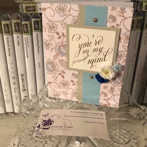
This card was for a dear friend/former roommate who lost her young husband recently. I wanted something reminiscent of a masculine idea but also to incorporate blue, as that was always her favorite color. And I wanted something that hearkened to their relationship, something beautiful and giving an idea of romance. And I didn’t have a lot of time to create it. (I actually worked on it in at least two snatches of time.) Tall order, I guess.

img_8041

I started off by going to my “cheat box”: a photo box I’ve filled with premade or prescored card bases, so that when I’m short on time, I can simply pluck one out of there. I’ve either already done the work on it or bought it usable. Although I prefer to use Stampin’ Up cardstock (80-lb. weight) for my card bases, I do also have a stash of printed American Crafts and DCWV bases (thank you, Marijane). So I found one that was flowery (romantic), tan (somber/masculine), and blue (the whole point) and hoped I could make it work.

I find printed bases harder to create with. There’s not much difference between a plain base that I top with patterned paper or a printed base, but I always find the latter harder to pull together into a card. But they are lovely and useful, so I keep trying.

I had a random scrap of blue flowered paper hanging around that seemed to match the color on the base fairly well, so I wanted to use it somehow. (I think it might be very retired SU DSP.) And I had sorted through my set of Anna Griffin sentiment tags and toppers beforehand to pull out ones that could work with sympathy cards, since it seems to be the “season” for that. This one spoke to me the most for her because of what she means to me and how the news affected me. Plus I liked how the gold foil in the sentiment matched the tan in the base.

img_8043-1

So I found some SU cardstock that coordinated, used an EK Success edge punch on one side of a long strip for the middle, and matted the sentiment with the same. (I think it’s either Crumb Cake or Tip Top Taupe cardstock.) And as I look at the pictures here, I’m wondering if I didn’t match the top and bottom bronze pearls after all (both in size and color). I meant to…. I remember thinking that the smaller size of pearl looked better next to the flowers; it didn’t take up as much room. And I already had the big one stuck at that point. Must have been more in a hurry than I thought and forgot to switch it out. (Or maybe it’s the angle of the pictures?) Erg. Well, I can’t ask for it back now. I never claimed to be perfect anyway. It’s handmade, right?

I did have some fun rummaging through my random flower canister for ones I could use on the front of the card so it wouldn’t be so plain. I nested a tiny cream one inside a couple of layers of white ones to bring in the cream-colored background of the sentiment and topped it off with a champagne-colored pearl. And of course I had to use blue flowers. This arrangement and color scheme seemed to work best. The dark blue flower is fabric ribbon with a gem in the middle of it, and the light blue rose is a rougher blend.

I chose the same SU cardstock from the front for the inside, since the inside of the card base was white. I matted the left-hand sentiment with cream for contrast. Both stamps were inked with an Encore Gold Metallic pad and heated with a heat gun afterward. The left-hand sentiment is from a retired SU set called “Words of Wisdom,” and the one on the right is from the retired SU set “Thoughts and Prayers.” I used a gold border strip from the retired SU “Painted Love Gold Vinyl Stickers” from the last catalog down one side and edge-punched the other with the EK punch from the front.

So that’s it for this one. I’m glad I’ve actually managed to mail it. Still working on that for some of the others. 😛 More to come later. Back to my edit for now. The juggling continues!

Pat's Blog Site

One place to fit it all!

Stamp Dabbles

Donna Leonard | Independent Stampin’ Up! Demonstrator | Huntsville, AL

Niya Scrap

Démonstratrice indépendante Stampin' Up!®

From Pole to Pole

Adventures in the Land of the Pierogi

Stampin' in the Meadows

Akiko Sudano - Independent Stampin' Up! Demonstrator Downingtown, PA

Creative Stamping Designs

Karen Ksenzakovic, Independent Stampin' Up! Demonstrator in Somerville, NJ Let's make some cards!!

Stamp it up with Jaimie

Helping you find a stress free creative outlet through paper crafting.

Stamp With Amy K

Amy Koenders, Independent Stampin' Up! Demonstrator in Mendham, New Jersey...Let's make some cards!

The Daily Post

The Art and Craft of Blogging

WordPress.com News

The latest news on WordPress.com and the WordPress community.

%d bloggers like this: