


Although I do have other themes than just sympathy coming up (I promise!), it’s sort of where I’m stuck for a few more days. Just so many of them to make lately 😦 , and I’ve hardly had any time in the craft room because of editing projects. I have a feeling it’s going to be a busy fall too. But. I do have this simple offering tonight (that I have to post before I start “hopping” around elsewhere), mailed a few weeks ago now.
This card was for a dear friend/former roommate who lost her young husband recently. I wanted something reminiscent of a masculine idea but also to incorporate blue, as that was always her favorite color. And I wanted something that hearkened to their relationship, something beautiful and giving an idea of romance. And I didn’t have a lot of time to create it. (I actually worked on it in at least two snatches of time.) Tall order, I guess.
I started off by going to my “cheat box”: a photo box I’ve filled with premade or prescored card bases, so that when I’m short on time, I can simply pluck one out of there. I’ve either already done the work on it or bought it usable. Although I prefer to use Stampin’ Up cardstock (80-lb. weight) for my card bases, I do also have a stash of printed American Crafts and DCWV bases (thank you, Marijane). So I found one that was flowery (romantic), tan (somber/masculine), and blue (the whole point) and hoped I could make it work.
I find printed bases harder to create with. There’s not much difference between a plain base that I top with patterned paper or a printed base, but I always find the latter harder to pull together into a card. But they are lovely and useful, so I keep trying.
I had a random scrap of blue flowered paper hanging around that seemed to match the color on the base fairly well, so I wanted to use it somehow. (I think it might be very retired SU DSP.) And I had sorted through my set of Anna Griffin sentiment tags and toppers beforehand to pull out ones that could work with sympathy cards, since it seems to be the “season” for that. This one spoke to me the most for her because of what she means to me and how the news affected me. Plus I liked how the gold foil in the sentiment matched the tan in the base.

So I found some SU cardstock that coordinated, used an EK Success edge punch on one side of a long strip for the middle, and matted the sentiment with the same. (I think it’s either Crumb Cake or Tip Top Taupe cardstock.) And as I look at the pictures here, I’m wondering if I didn’t match the top and bottom bronze pearls after all (both in size and color). I meant to…. I remember thinking that the smaller size of pearl looked better next to the flowers; it didn’t take up as much room. And I already had the big one stuck at that point. Must have been more in a hurry than I thought and forgot to switch it out. (Or maybe it’s the angle of the pictures?) Erg. Well, I can’t ask for it back now. I never claimed to be perfect anyway. It’s handmade, right?
I did have some fun rummaging through my random flower canister for ones I could use on the front of the card so it wouldn’t be so plain. I nested a tiny cream one inside a couple of layers of white ones to bring in the cream-colored background of the sentiment and topped it off with a champagne-colored pearl. And of course I had to use blue flowers. This arrangement and color scheme seemed to work best. The dark blue flower is fabric ribbon with a gem in the middle of it, and the light blue rose is a rougher blend.

I chose the same SU cardstock from the front for the inside, since the inside of the card base was white. I matted the left-hand sentiment with cream for contrast. Both stamps were inked with an Encore Gold Metallic pad and heated with a heat gun afterward. The left-hand sentiment is from a retired SU set called “Words of Wisdom,” and the one on the right is from the retired SU set “Thoughts and Prayers.” I used a gold border strip from the retired SU “Painted Love Gold Vinyl Stickers” from the last catalog down one side and edge-punched the other with the EK punch from the front.
So that’s it for this one. I’m glad I’ve actually managed to mail it. Still working on that for some of the others. 😛 More to come later. Back to my edit for now. The juggling continues!


 I forgot to mention that I had put a little bit (probably too much) with my palette knife into my paint palette and added a drop – and then two drops – of Sweet Sugarplum ink refill (SU, current product, In-Color). I’m going to guess that one drop is enough. I was trying to match the color of the SU heart enamel shapes because I already had one on the card. Two drops definitely made it darker. So then I thought maybe I should add more paste to spread out the color more and make it the lighter shade I was going for. That meant there was a whole lot of embossing paste in my palette tray, more than six hearts would require. And mixing all that with my metal paint palette was difficult and sounded like scratches on a chalkboard. Perhaps a foam board or toothpick next time.
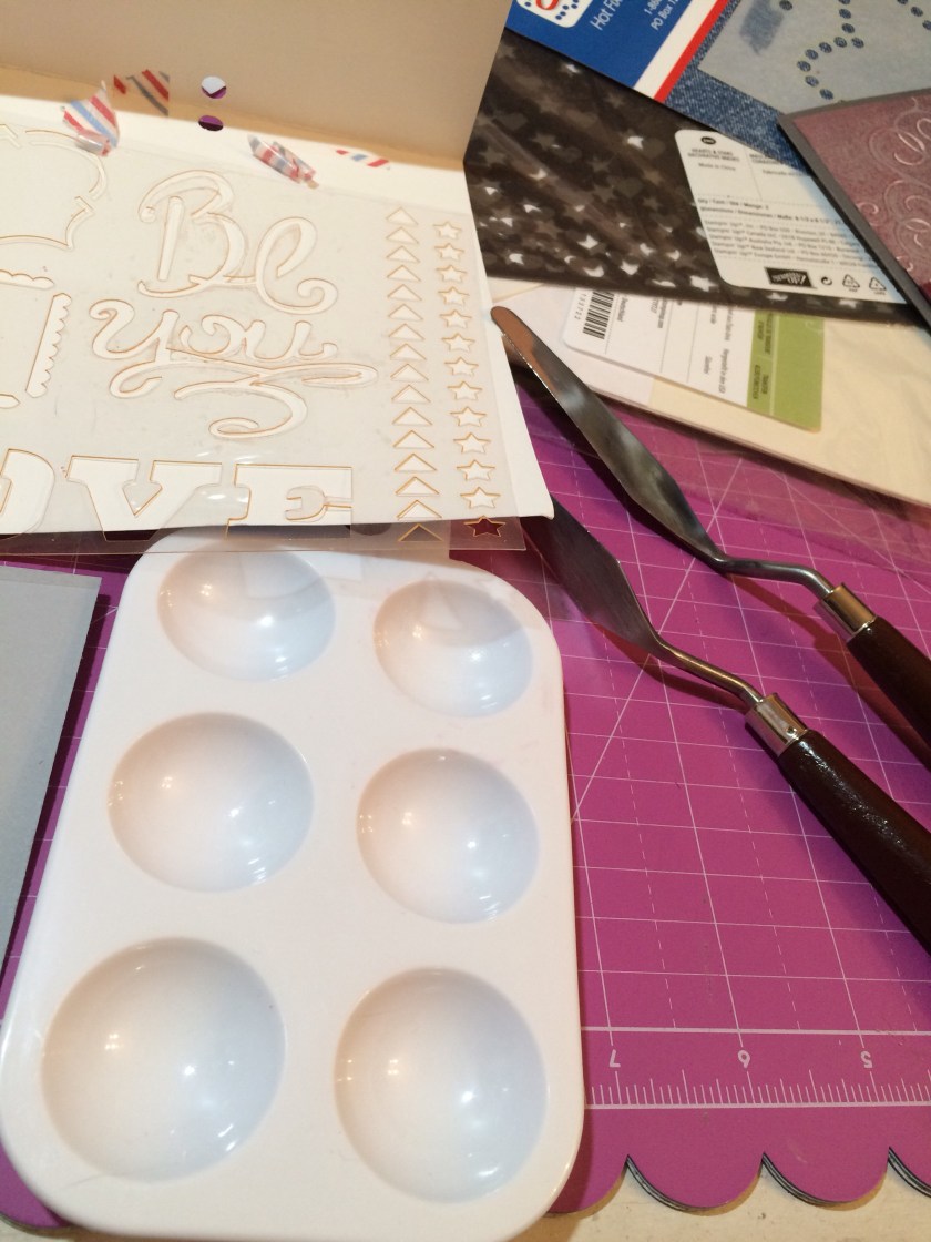
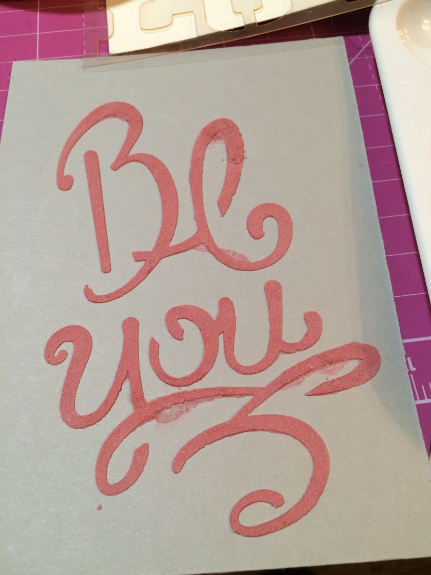 I did find that once the paste was partially dry, I could take a tool and scrape off the excess around the letters…and the piece of black background/polka-dotted paper hid that a little better than the grey cardstock. Still not perfect, though. But manageable. At this point I’m thinking of taking my Cutterbee scissors and fussy-cutting around the gray cardstock example. Seems like it’s drying pretty quickly. I can’t scrape off anything around the hearts anymore. It would let me pat the “Be You” letters back into place by hand when I was trimming those with my Creative Memories sticker placement tool (use whatever you’ve got, right?).
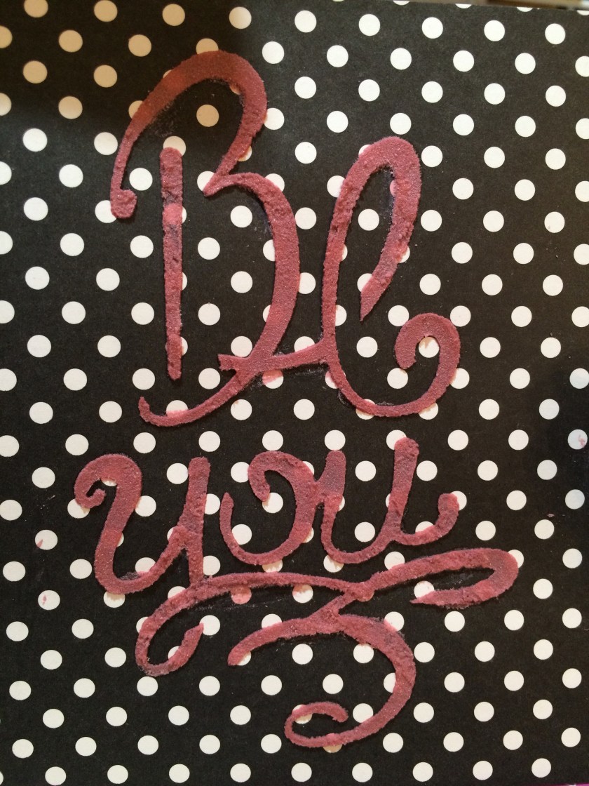 Then I tried to wash off my tools. I think I should have done that immediately. I stood at the sink scraping off the stencil (which had been used twice then) with my fingernail, under running water and even soaking it in the sink. I couldn’t get it all off, and I bent a bit of my stencil as well.


