“A Good Man” Stamp Set with Seaside Spray In-Color for Stamp with Amy K’s Tuesday Blog Hop

A masculine card for use during Father’s Day (or any day!) for Stamp with Amy K’s Tuesday blog hop.

img_9128

Hello again and welcome back to my blog—or thanks for stopping by if you’re a new visitor! The theme for Stamp with Amy K’s current Tuesday blog hop is “masculine,” so I decided to create two “Father’s Day” type of cards that can be used at any time for the guys in our lives. Since they are going to my local gift shop for sale, I needed to create something that didn’t explicitly say “Happy Father’s Day” (best for a longer shelf life!).

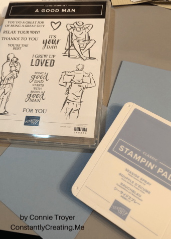
I’ve used all current or upcoming products that are available on June 4, when Stampin’ Up customers can order from the new catalog. I was able to preorder some things because of my demonstrator status. So I’m using stamps from the new cling set “A Good Man” and one of our brand-new In-Colors, Seaside Spray (only available for purchase June 4, 2019 through May/June of 2021).

Seaside Spray is a gorgeous color that reminds me of a smoky blue. It’s one of the shades in my valances, actually, so I have a feeling I’ll be using this color for years to come even after it retires. 🙂 And “A Good Man” is one of those casual, contemporary sets that have a sketched look to the images, with some slight distressing on the sentiments.

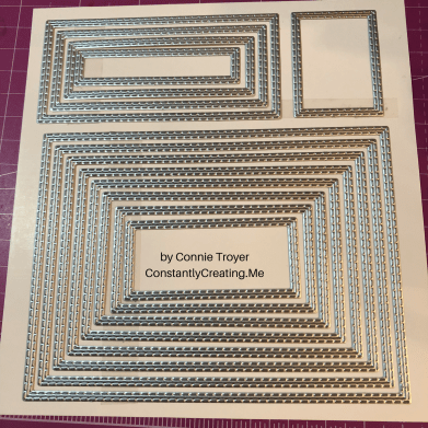
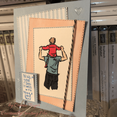
I began each A2 card with a Seaside Spray card base, taking an 8.5×11 piece of cardstock and cutting it in half. I wanted to use two of the colorable images in the stamp set, one on each card, and quickly figured out which rectangles my chosen images would fit inside in my new Stitched Rectangles die set.

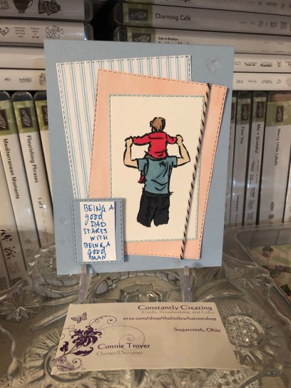
I stamped each colorable image in Memento Tuxedo Black ink and die-cut the first rectangles. Then I colored them with some of our Alcohol Blends: Dark Mango Melody, Dark Old Olive, Dark Smoky Slate, Dark and Light Basic Black, Ivory, Bronze, Dark and Light Shaded Spruce, Dark and Light Balmy Blue, and Dark and Light Real Red. (I need to get a dark blue yet, so I had to color all pants in various shades of black and gray.)

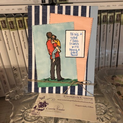
Seaside Spray isn’t one of the colors I own in the Blends yet either, so I used Light Balmy Blue for the sky and border, hoping it would look all right. Turns out it does sometimes…but not if there’s a lot of concentration. I filled in the background of one of the images but left the other white. I wasn’t sure which way to go. Tell me which one you like best. 🙂

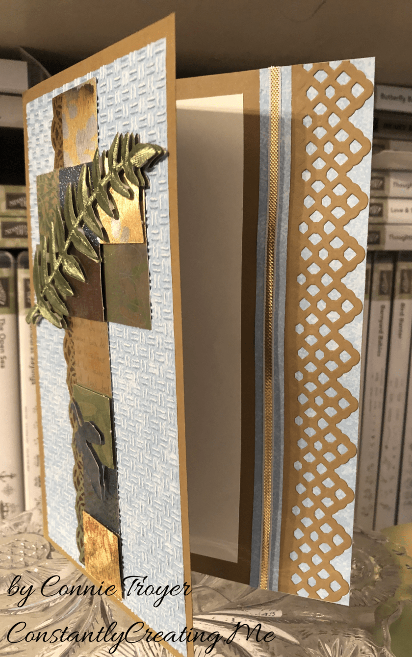
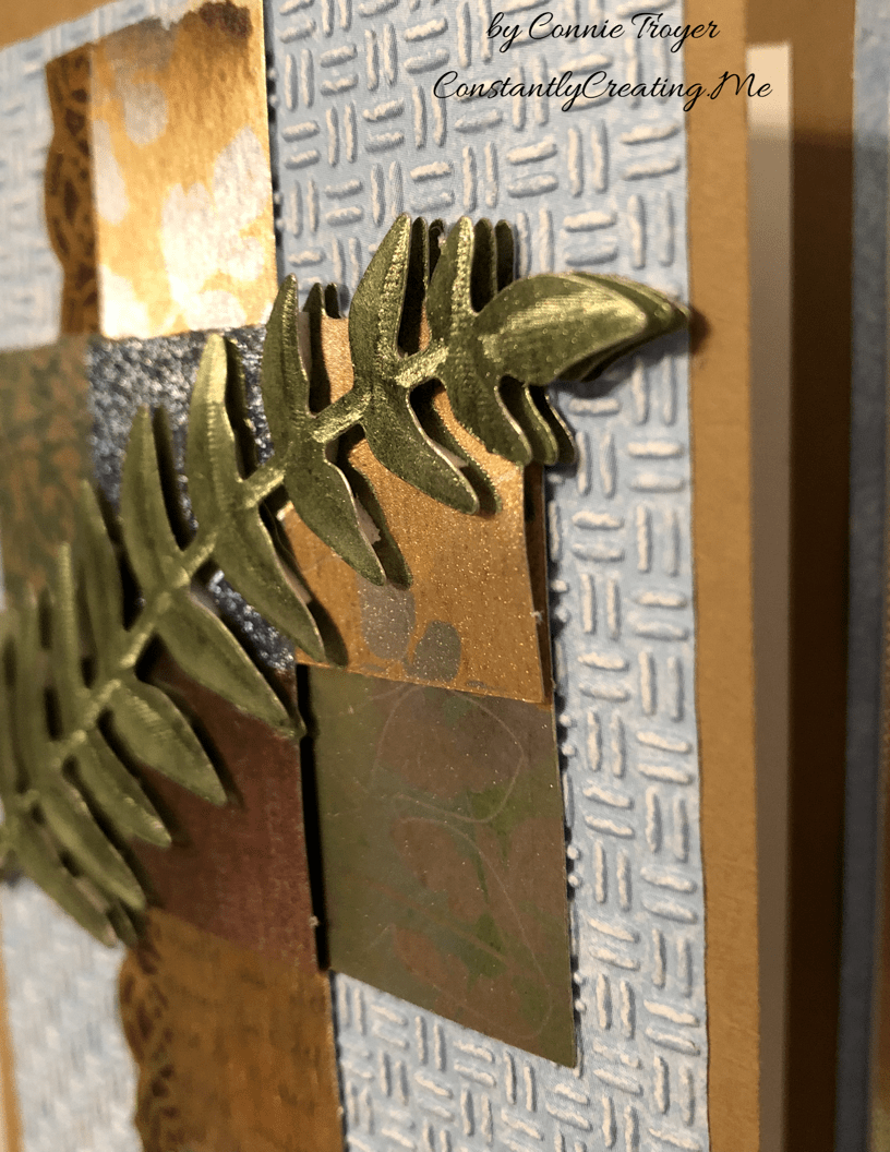
Next I die-cut other various-sized rectangles from the Come Sail Away and Perennial Essence Designer Series Paper packs and and staggered them with the images and sentiment block.

I also carefully edged around the border of one of the die-cut, colored images with my Balmy Blue Blend. I wanted to do something in the corners the way I would dye ink, but I didn’t trust myself enough to try it with the Blend. I’ve had to redo enough this evening. I’m actually pretty pleased with how the edging turned out. It was easy and looks clean and simple. I liked it so well that I did it on the second card too, with a Night of Navy Stampin’ Write Marker (but it was much easier to accomplish with the Blend, at least tonight!).

After I placed the sentiment block and glued the rectangles for the first card, I added three Heart Epoxy Droplets to two corners to finish the card.

And here is where I have to confess something. Two things, really. I lost a stamp before I finished my cards or this blog post. Specifically, I lost the main sentiment for the front of the cards. I have torn this room apart, searching through my trash can, cleaning off my desk and the cart next to me, checking my clothes…. It still hasn’t turned up. (Please tell me I’m not the only one this has happened to!) I can attest that the new cling stickers are really sticky, because I had the stamp rubber-side down in the case with the sticker facing up so I could quickly grab it and stamp it after I was done with the inside pieces. I’m certain it’s stuck to *something*. 🤦‍♀️ So... Sigh. I handwrote the same sentiment in a similar kind of font and lightly stuck it to the card—for this blog’s purposes only—where the real sentiment will be stamped in Night of Navy ink on Seaside Spray cardstock. When I find it. Humor me, please. (If I can’t find the stamp eventually, I may just have to repurchase this set because that pair of sentiments is essential!)

This card has now also convinced me that I need to get the Subtle 3D embossing folder. The background still needs something. I thought of stamping too late, after I adhered the rectangles. I’ll pretend I’m going for “clean and simple.”

The first card.
Another angle, showing the hearts a little better.

And now for my second confession. My roll of Night of Navy/Sahara Sand Baker’s Twine has gone AWOL as well. (I’m betting the cat did it. She’s been known to do so.) So I’m using most of the piece of twine that I snitched at OnStage for my Come Sail Away card I finished later at home. I also cut card #2’s heavy-striped piece of Night of Navy/Whisper White DSP the wrong size…and that was after I spilled ginger ale on four newly opened papers and cut out the wet sections. 🙄🤦‍♀️ Trust me, if I can make cards I’m proud of with all this chaos, anybody can!

So this is what I refigured for the second card, after some challenges (like the fact that I had to use the Color Lifter too, even before I cut the striped piece incorrectly). I used Linen Thread at the bottom of this one. I felt I needed to separate the Balmy Blue Blends background from the Seaside Spray cardstock because, for me, the color difference was too much to have them next to each other. My first thought was to have the striped paper cover the entire card front, but obviously that went awry. I decided that the mistake wasn’t so terrible as to have to redo that too (and I sort of hated to cover up all that beautiful new In-Color anyway), so I just went with it. I hate wasting paper. (My apologies again for the handwritten sentiment. It will look so much better with the real one….)

The gift shop card.

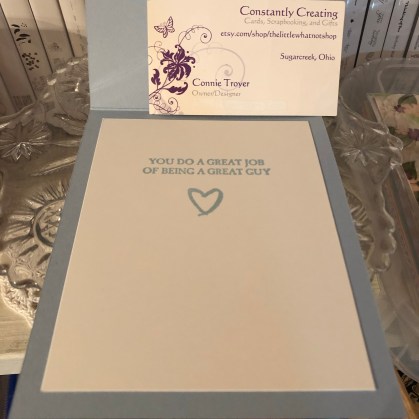
The insides of both cards are identical, and they went so much smoother than the rest. I was even watching a TV show while I stamped. (That does it—I should always watch TV while crafting. But not in the dim light, because I think that’s when I lost my stamp.)

So that’s it for me tonight. It’s time for bed. Thanks again for stopping by my blog! So sorry about all the mishaps. Some nights just go like that.

If you’re interested in receiving a catalog, I’d love to send you one. Just drop me an email with your info using my Contact Me form.

If you want to continue the hop to see what the rest of my fabulous team members made, click the Next button to see what our fearless leader, Amy Koenders, has made, and if you’d like to go backward instead, click the Previous button to visit Sue Prather’s blog.

  1. Karen Ksenzakovic – https://wp.me/paaNf4-Bn
  2. Terry Lynn Bright – https://wp.me/p8fxPh-80
  3. Jaimie Babarczy – https://wp.me/p79UhD-2Pa
  4. Mary Deatherage – https://wp.me/p5snyt-88U
  5. Karen Finkle – https://karenscardkorner.blogspot.com/2019/05/stampin-up-wood-textures-dsp-for-amys.html
  6. Akiko Sudano – https://stampininthemeadows.com/?p=462
  7. Shirley Gentry – https://stampinwithshirleyg.com/?p=5240
  8. Sue Prather – https://stampwithsueprather.com/?p=4744
  9. Connie Troyer – https://wp.me/p8xvI6-nm
  10. Amy Koenders – https://wp.me/p2SFwf-frW

Yes, Another Sympathy (a Decoupage One This Time)

A dry decoupage sympathy card using Stampin’ Up for everything but the main image (at last!).

The hits keep coming. Two more sympathies on my to-do list, along with a celebration theme for a blog hop. For these two, at least it’s a celebration of sorts, though sad now. Still, I feel muddled. My heart aches for them, so I went looking for something that spoke to me and seemed to reflect the people I’m thinking of. My “card toppers” bin bailed me out for the one I’m blogging about today. (The other, yet unmade, will focus on Stampin’ Up’s Graceful Glass vellum DSP and alcohol markers, so stay tuned for that.)

My mother used to say that I was “an accident waiting to happen.” She’d probably still say that, given the chance. That phrase came to me as I wrestled with this card. I began to feel like it was one accident after another. I love how it turned out in the end, but my goodness, the process! (This means there’s hope for me, right?) Another case of “when things don’t go well.” Please tell me you’d never know. 😉

One of my husband’s coworkers lost her dear husband last week, and it’s been such a sad thing. I wanted to make a beautiful card – part masculine in remembrance and part feminine for her – but had no idea where to start. Since I often clean or organize when I have a problem to mull over, that’s what I ended up doing, which led me to the main cross piece seen on the front of the card today.

Finding a brown card base to match the topper was easy; Stampin’ Up’s Baked Brown Sugar, a retired color, matched the foiled copper/silver/gold/burgundy/blue cross the best. I only have so many browns, and I usually use SU for my card bases since I like how the 80-lb weight cardstock stands. (I grab premade bases only if I start with the base first rather than the main image. It’s just easier to match it that way rather than working in reverse.)

During my cleaning spree, I was also looking at and putting away some new SU Designer Series Paper. So when I tried to find paper the cross could match, the blue piece was fresh in my mind and looked prettier than any other neutrals I put next to it. The blue paper is from the Tranquil Textures DSP pack in the current Annual Catalog from Stampin’ Up. It’s not a solid blue, but it it hard to tell that with the dry embossing I put on top of it to give the card some texture. I used the “Oxford” Cuttlebug folder for the textured design. I wanted something light and barely textured like Stampin’ Up’s Subtle embossing folder, but I don’t own that particular one yet.

Here’s where things got tricky. The card is a 5×7 because the cross is so tall. But because it’s narrow, there was a lot of “white space” around it. I don’t like white space (even if it’s blue). So I started to wonder what I could do or put next to the cross to take up the width. A sentiment would only be so big, as well as being awkward to work with around the 3D leaf layers toward the bottom, so I wasn’t sure that was the answer. I thought maybe I could make a decorative edge to the card front at the right instead. I could see it in my mind but wasn’t sure how to achieve it (story of my crafting life, btw). That seemed to be the best thing to try…but all my dies were too small to stretch across 7 inches. Nothing felt right. So that night I went to bed frustrated, having made only the card base and embossing the paper.

The next night I attempted to keep going on the card while I was on the phone. I should have known better. I spotted a long Spellbinders die on my die wall and got all excited because it would fit lengthwise. I didn’t think about the fact that ALL of the edges of the die does indeed cut…until I wrapped a card base around a Cuttlebug plate (so that I didn’t cut through the second layer), positioned the die, and wondered why an inch of the card base separated from itself after I ran it through the machine. (*insert facepalm here*) To my defense, I was still on the phone. LOL

So suddenly I had a card base with one side shorter than the other. That was not what was supposed to happen. Not to mention, the magnetic plate dinged up the middle of the card base, and the B plate left marks on the back side of the base, making it warped and weak. Sigh. Time to rethink. Maybe I needed to make a new card base.

I tried to process where to go next. The decorative edge thing hadn’t worked and I couldn’t think how to make it work other than an edge punch – if I made a new base. I’ve never tried the popsicle sticks I’ve heard about, to keep part of it from cutting, so I wasn’t sure how to do that either (again, on a new base). But I hated to destroy the one I’d just cut. What I did manage to do after thinking was flip the card base around (even though I’d folded it correctly after scoring the first time). That would give me a chance to add paper atop the marked-up part to hide it and also add some stability with the extra paper layers. I hoped. I also took my bone folder and tried to work out the middle bumps and crease it sharply.

Once the base was salvaged, I decided to play with the pieces and arrange them just to see what I could do. I ended up liking a little bit of breathing room between the die cut and the now-shorter edge of the card base, rather than placing the die cut right up against the piece it had just been cut from. And obviously if there’s a peekaboo die, something needed to peek through it underneath. I grabbed more blue DSP and left it as is on the inside of the card rather than embossing it for texture like the front.

I also realized that I needed to run the textured piece through the Cuttlebug again, as one side has trouble with a piece of paper I got stuck in the roller years ago. Part of the paper was hardly embossed, so I realigned it in the folder, flipped it around to the other side that impresses better, and ran it through again. Came out perfectly that time.

The trouble was that when I left that breathing room space between the die cut and the base, it was not centered once the card was opened. I didn’t like that. But it looked like I had enough room to add 1/8″ of ribbon or something else. I chose SU’s gold and white ribbon to match the cross and the browns and loved how it looked.

But then I couldn’t get it adhered. The ribbon is thin enough that the line of Art Glitter liquid glue I laid down soaked right into the ribbon. I wasn’t confident it wouldn’t end up slightly sticking to the inside of the card once it had been closed for a while. But as I told a friend last night, when a person has too much product in her house, she will find a way. I decided to use my Cosmo Cricket Glubers Adhesive Strips. I rarely use them, but sometimes they’re just the best option. They are 1/4″ strips, though, so I took my nonstick microscissors from CutterBee and cut right down one of the strips, eyeballing it to just under 1/8″. And then I placed it with my tweezers and stuck a new piece of ribbon to it. I was much happier with the inside then.

I decided not to stamp a sentiment on the inside yet. I needed to finish up and get to bed and I wanted to really look through my stamps to figure out what I wanted to say on the card. I will probably go back and add one later, but right now it’s blank.

I’ve spoken about dry decoupage in past blog posts. A reader had asked me to do a tutorial on how to do it, and I am working on that currently. I hope to post one soon. For now, here are a couple of closeups to be able to see the decoupage layers that make up the cross. I should have trimmed off the little perforation bumps more as I was making the topper, but it’s probably too late to fix it now.

The cross has several layers of dimension to it in the squares as well as the leaves, which made it interesting to put together. And the leaves are the top layer.

Thanks again for coming to visit my blog! I appreciate your readership!

Lessons in Stampin’ Up’s Embossing Paste

Well, my first foray into using Stampin’ Up’s Embossing Paste was certainly interesting. It’s been sitting on my desk patiently waiting for me to get to it. I finally got the paint palette and palette knives, and I already had ink refills to tint it with, should the mood strike. This won’t be too hard, right? I thought. Hmm.

Tonight the mood struck, when I was permitting myself a little dabble time before attempting to go to bed at a reasonable hour (since I’m on book deadline again). I had a salt-and-pepper love-themed notecard I wanted to add some hearts to as a border, and I thought the thick embossing paste would show up better rather than ink of the same color on a stamp I was waffling on.

Well. Apparently I have to figure out how not to let it bleed underneath the stencil. That seems to be my main problem. I had washi-taped down the edges of the first stencil (and card), which was created from an edge punch, and even kept my hands on all of it as secondary security, but still I erred. The heart borders weren’t terrible, though I don’t like the smudges at the bottom. I think I went over them three times. And once the paper is smudged with the color, it’s definitely hard to remove it.

I forgot to mention that I had put a little bit (probably too much) with my palette knife into my paint palette and added a drop – and then two drops – of Sweet Sugarplum ink refill (SU, current product, In-Color). I’m going to guess that one drop is enough. I was trying to match the color of the SU heart enamel shapes because I already had one on the card. Two drops definitely made it darker. So then I thought maybe I should add more paste to spread out the color more and make it the lighter shade I was going for. That meant there was a whole lot of embossing paste in my palette tray, more than six hearts would require. And mixing all that with my metal paint palette was difficult and sounded like scratches on a chalkboard. Perhaps a foam board or toothpick next time.

I started looking for other stencils I could use while I had all this goop I didn’t want to waste. I found a DCWV 6×6 stencil (EM-033-00012) that had both “LOVE” and “Be You” on it, and since this is the season for Valentine’s Day cards, I thought they’d go nicely with my current projects. I pulled two heart stencils too. Ambitious, apparently. 😉 And no, my paste didn’t stretch that far. 🙂

But in doing the “Be You” stencils on cardstock and then on DSP, I had a lot more problems with runs beneath the stencil. Granted, things were starting to dry while I searched for more stencils to use up the excess I’d made, but I thought I had time. Maybe I should have added a drop of water to keep it thin? No idea. Will have to research that.

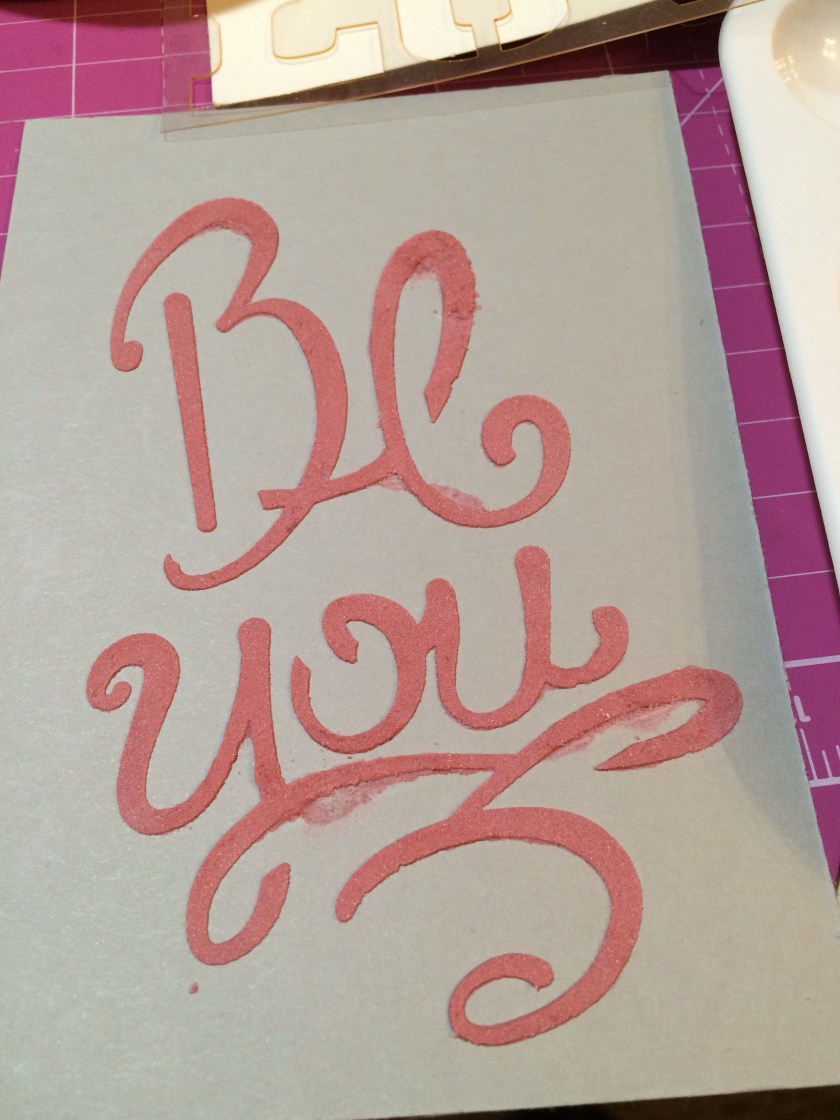
I did find that once the paste was partially dry, I could take a tool and scrape off the excess around the letters…and the piece of black background/polka-dotted paper hid that a little better than the grey cardstock. Still not perfect, though. But manageable. At this point I’m thinking of taking my Cutterbee scissors and fussy-cutting around the gray cardstock example. Seems like it’s drying pretty quickly. I can’t scrape off anything around the hearts anymore. It would let me pat the “Be You” letters back into place by hand when I was trimming those with my Creative Memories sticker placement tool (use whatever you’ve got, right?).

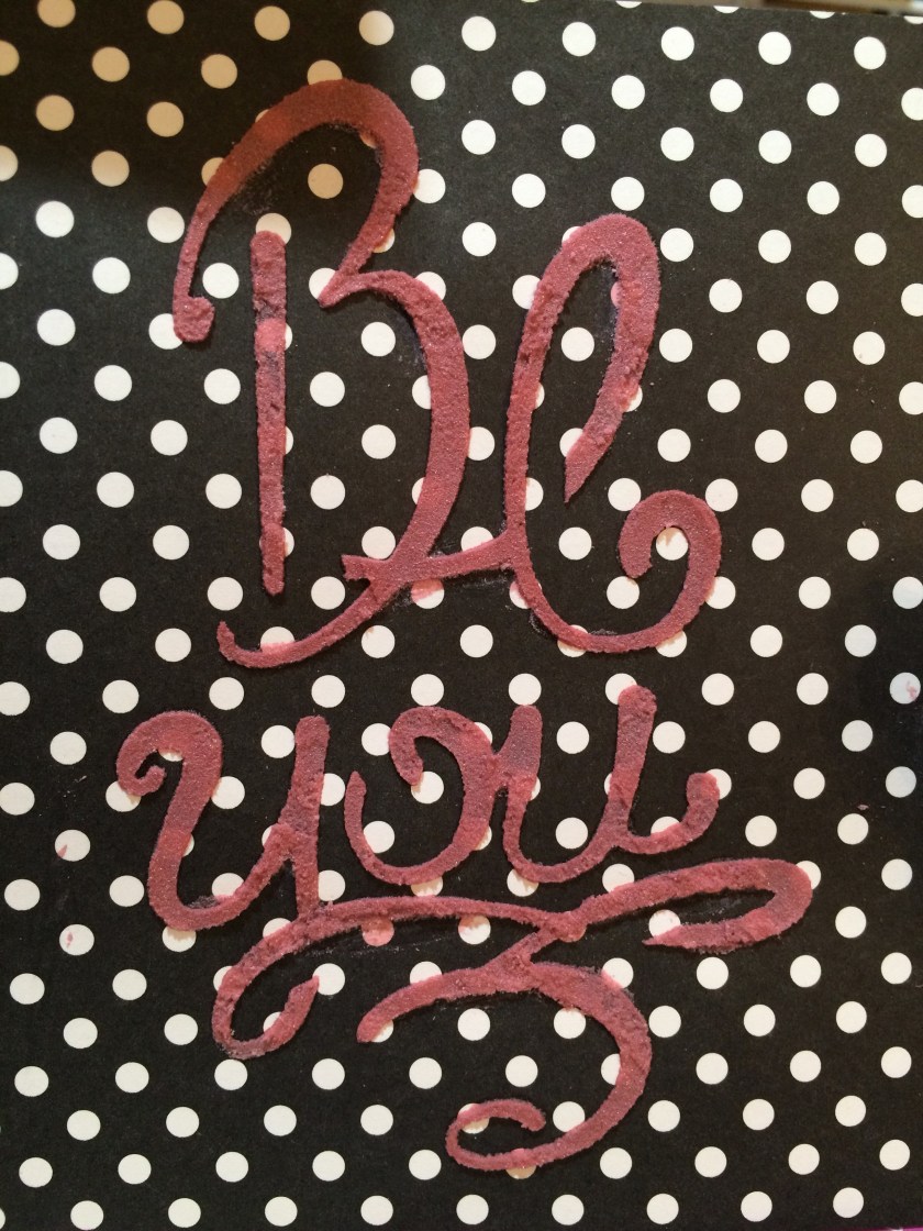
Then I tried to wash off my tools. I think I should have done that immediately. I stood at the sink scraping off the stencil (which had been used twice then) with my fingernail, under running water and even soaking it in the sink. I couldn’t get it all off, and I bent a bit of my stencil as well.

So, I’m looking for tips on just what to do or not do with stencils and embossing paste. I’ve figured out that a little ink goes a long way and the paste dries fairly quickly, and obviously I need to clean the stencil earlier – but how do I get it to stop the bleeding? Thinner, repeated layers? I like height. 😦 I couldn’t see how to washi the close parts down either. If you have advice, I’m all eyes. Thanks in advance. It has to get better than this! It leaves such a cool 3D look when it’s actually all smooth.

I’ve wondered, too, whether the embossing paste (tinted or not) would work in silicone molds like SU’s retired pressed clay molds or the current Mod Podge molds sold in various locations. Any clue?

Pics attached so you can see my mess. 🙂 And thanks for the help! I feel like such a newbie. 🙂

Connie

House Mouse “Musical Mice” Birthday Card

A musical birthday card for a musician celebrating a milestone year.

I took a break from Christmas cards to do up a few birthday cards that I needed to deliver or mail. One of them went to my aunt, who is a supremely talented pianist. I had thought of using this focal image for her ever since I first got my hands on this cute House Mouse stamp. 

I grabbed a premade base that was of a larger size, since the stamp itself is basically the size of an A2 card front. No room for the music note paper I wanted to use behind it. But this larger card size worked well for the idea. 


First I put down a layer of silver foil cardstock (cutting out the inner portion with snowflake and winter-themed word dies that I can use on other projects). The music paper I placed on top is from Echo Park’s “Be Mine” line. I then stamped, colored, and cut the House Mouse image so I would know what size to cut the Silver Glimmer Paper (glittered cardstock) from Stampin’ Up, which I placed behind the image as a mat. 


I think I might need to work on my coloring skills, or at the very least shading, but I’m pleased enough with my creation. 🙂 I used three sets of watercolor pencils, an AquaPainter, and Ranger’s Jet Black Archival Ink to stamp and color the image. I topped it off with some gold Smooch Paint for the knobs on the violin and the lettering of “Mauschen,” the name of the piano. I had looked up the stamp online and found the colored image from House Mouse, so I tried to imitate those color choices. (Each of the mice are named and has their own coloring specifications.) I think next time I might try a black piano, however. 

I had the most trouble finding and placing a sentiment on the card due to limitations in space and supplies. I had to revise my initial idea several times, and the more I hurried to finish it (since I needed to be leaving the house), the worse it got. Isn’t that always the way of it? Eventually something worked, although I realized an hour later that I’d forgotten to include the milestone number she was turning, as I’d intended. But maybe she doesn’t need that advertised. 😉 

So, the tag is from the American Crafts “Everyday” line, the “Just a Note” sentiment is from Rubber Cottage, and I couldn’t read my handwriting on the back of the tiny music notes I added to the tag, so I can’t say who made that. The black lace ribbon is from Stampin’ Up. I stamped the sentiment with Jet Black Staz-On ink because the tag was chipboard with a shiny top and water-based dye inks just wipe right off of those. I used my heat gun to speed up the drying process as well.


The inside of the card finished the thought begun on the front (“Just a Note”) with “Wishing You Happy Birthday.” Again not quite what I’d intended to say, but time really was of the essence, so I made do with the first couple things I found rather than creating a custom sentiment. And I’m the only one who overthinks these things, so it probably doesn’t matter. 🙂 The stamp sets I used for the inside are from Stampin’ Up (“Wrapped in Warmth”) and Close to My Heart (“Gracious Greetings”). I also embossed piano keys for the bottom border. The embossing folder I used is 5×7 and entitled “Keyboard,” from Cuttlebug. 

Coloring always takes a bit of time, and I really do need to perfect some shading skills (here’s wishing I could go back to art class), but I’m generally pleased with the images once I’m done. I always enjoy seeing how the lines swirl and blend together when I’m watercoloring. Perhaps I’m really a Renoir at heart. 😉 

That’s all for this birthday card. The others I created were simpler, of course. But details are my specialty. 🙂 Thanks for reading!

Thank You (Seeds for Your Garden) card

A simple (and overdue) thank-you card using American Crafts, Glitz, and Stampin’ Up products.

Sometimes life gets ahead of me and I get behind on doing the seemingly easy, necessary things in life. One thing I’m really bad about is sending thank-you cards.

It’s not that I’m not grateful or that I don’t think of the sender every time I see or use their gift…I just fail to tell them how much it means to me. I often feel at a loss for words or inadequate when trying to compose all the feels onto a tiny 5-inch card. I could blame my parents (though I won’t), as I never had to write thank-you notes for gifts received. (Maybe because of that, receiving them just isn’t that important to me personally. As long as I know they got my gift, I’m good.) I’ve finally conceded that I’m wholly out of practice and singularly bad at composing them – and 100 percent a procrastinator. I’d rather the words magically flew onto the card and into the mailbox without my fumbling assistance, while I hope they pass muster. Not to mention that writing them out now kills my fibromyalgic hands. A card and a half, give or take a half, and I’m done in with hand cramps. I love the gift; I love the sender; I hate the card that follows.

Well, like other things in life, thank-you notes are apparently necessary and extremely important to (hmm, how do I say this?)…to people who aren’t me. For this particular thank-you note, I’m about two months behind. I’ve known what front piece I was going to use for at least that long, but it was a matter of finding or taking the time to do up a card. (Now that I’m a cardmaker, I feel REALLY funny about sending a store-bought card even if I’m short on time or behind on putting one in the mail, as if I’m secretly saying that I don’t care near enough about them to take the time to handmake a card. Therefore the calendar stretches out before I get the required cards made. Sigh.)

I’ve been having a pretty busy year. I’ve flown a handful of times, once out of the country, been to board meetings twice, made a half-country trek by car once and not-as-long other car trips at least twice, said goodbye to a dear uncle, crammed in editing projects, and continued to take and finish custom card orders through it all. It’s starting to feel as if I can’t stay home long enough to get ahead on anything. Enter the now-very-behind thank-you note, which I had to make and send for the reasons above. I’m just about out of brain cells at this point.

I knew how I wanted to make the card once upon a time. I laid it all out in a heap on my desk, to signify to myself that THIS was how it was going to go. And somewhere along the line other projects joined it and other work also had to get done, and the long and short of it is that by the time I finally had to shake myself out of the procrastination coma and send the blooming thing, I had only a semblance of an idea of what I was supposed to be doing with it. Plus I couldn’t find the burlap piece. Hubs decided to join me in the craft room that night, and we watched a movie on my not-so-used TV while I fiddled with the card, trying to come up with some new design.

The card is pretty simple, or at least it looks it. I grabbed a leftover base from my stash of unused Basic Gray baby-invitation bases, hoping I won’t regret that decision when I work on her baby album next year; I liked how the darkness of the outline of the flowered piece matched. And then I just rearranged card pieces in front of me until something made sense. I think I actually meant to do something else with it, but the sizing on the striped paper was perfect as it was and rather distracted me, so I ended up completely forgetting that I meant to go the other direction. I tried a number of compilations, but in the end, this is what made sense to my boxy self.


The striped paper is from Stampin’ Up. I needed to have some sort of color separation and size difference between the flowered piece (which is from American Crafts, 320490) and the stripes, so I ended up using a yellow remnant from Glitz Design that mostly matches the yellow in the flowers. I had a better color match but didn’t like the pattern or size nearly as well. I added “bling” in the form of something akin to Stampin’ Up’s Candy Dots; these yellow and green dots are from SU’s “Little Moments” Project Life Accessory Pack. It always amazes me how colors across completely different designers can still match. Or maybe it’s more amazing that I actually manage to pull them all together on a card.

At this point I decided the card was too simple or plain. I have this fight regularly with myself. One side of my brain says it’s fine/nice/great/perfect the way it is and shouts at me to leave it alone, and the other side of my brain hesitates and weighs things and just isn’t convinced, thinking it’s not quite right yet – more tinkering needs to be done. The latter won that day. I have a bottle here of SU’s Dazzling Details glitter glue in an iridescent whitish color, and I’m not sure I’ve ever used it much. This became evident when the glitter glue came out in nonspreadable clumps instead of a smooth flow. I did my best at smooshing them out onto the flower centers while I mumbled that I should throw the bottle away, but I persisted. It was better than trying to find a similar color in my Stickles from Ranger.

I finished the centers, leaned back in my chair, put my feet up, and watched some more of the movie before going on to create the inside of the card. And right after I flipped open the card and got glitter on my fingers, I remembered that the glitter glue on the flowers would still be wet. (I like to take an entire day to dry them, if I can.) So I muttered some more, closed the card, got out the bottle of glitter glue from where I’d put it away, and proceeded to redo the flower centers.

Eventually the inside did get finished. I’m just now realizing that I forgot to take a picture of it – the urge to mail the card was finally the foremost thing in my mind, apparently – but it was just a white piece to write on and a couple of leftover strips of paper as bottom borders. And, as usual, I didn’t have enough room to write all the heartfelt thoughts battling in my head for the 5-inch piece of paper. Sigh. At least this one is finally done and gone. I’m relieved that I no longer have to remember to do it. Until next time, that is.

…I really need to get better at this thank-you-note thing. Too bad practice comes with writing them. 😛

Nuts and Bolts about You Birthday Card

I’ve been on book deadline this past week and will be again next week, so I haven’t had much time to play in the craft room even though I have several cards I need to make and send out. I finally HAD to make time to squeeze in one for my nephew’s birthday since the party was tonight.

My day wasn’t going that well, honestly. I’ve felt better physically, I’ve thought more coherently, and it seemed like I had a case of the dropsies, where I couldn’t hang onto things with my fingers. Imagine crafting when you drop every other item. Those are the days I pick up a book or occupy myself otherwise instead of crafting. But for this card. Regardless of how frustrated I was, it wasn’t making itself.

I had heard from his mom that nephew is now interested in robots and how things come apart and fit together, as a budding engineer would. 🙂 One of my best friends just happened to give me robot stickers for my birthday (surprise gift of 20+ sticker packs?! Yes, please!). So of course they were perfect to use for his card. (They are from Jot, btw.)

I’d been thinking of how I wanted to lay it out all week. I have these awesome gold metal gears that I thought would look great stacked and staggered in a couple of corners, and I couldn’t wait to use them. Well, even though I saw them recently, I still have to wait to use them, because I can’t figure out where I stashed them. And that was just the beginning of the frustration. Alas, some cards go like this.

 
I had to use a bigger card base because I wanted to use both the robot and the robot dog on the front of the card and they weren’t fitting on an A2 OR a horizontal card because of the height of the robot. I also had plaid paper of cream, brown, and teal that I thought would work with the teal and brighter colors of the stickers, along with a tan piece of embossed gears a crafty friend had sent me…but in the end I couldn’t make the sizing work for the plaid. I ended up using a Spellbinders card creator die (that didn’t release all its pieces, so there I was taking my CutterBee scissors to them even though I ran it through the Cuttlebug three times…), and I added in one of my new Spellbinders edge dies that I hadn’t had a chance to use yet. (It had fallen off the wall and when I picked it up, I realized it sort of looked like gears too. Why not use it? I actually tried two of those edge dies, but the one with frosted vellum did not work at all – it kept moving on me and I couldn’t get a whole one. I tossed it out of the running.)

 
I put the die that did work in a metallic foil cardstock, which turned out well. Didn’t fully cut again, but I liked the look even with the additional pieces.

So there I was with my SU Not Quite Navy cardstock mosaic die-cut piece on top of the embossed tan gears, both hovering above the 5×7 green Moroccan-patterned card base. NOT what I had imagined for this card. (I only have ten types of premade card bases. I often make my own, but whatever was the shorter route to finishing the card had my vote today.) I decided to fill in some of the mosaic holes I’d already taken out, thinking it would look better. I really wanted to add in a red color to the mosaic but didn’t want to fight that die again, so I went on. Looking at the combination of those four elements almost made me nauseated, but I’d taken too long at that point to reverse direction. It was time for robot stickers. And then to look for a balloon so the robot didn’t appear empty-handed – plus I wanted to fill in some of the space below the sentiment but above the dog. The brand-new sticker pack that held my balloon then stuck to the inside of its plastic, so I’m not sure how many of those are even useable any longer. But at least the balloon didn’t suffer.

The sentiments were the easiest part. Finally, something going right! I stamped four different ones and didn’t mess up at all, even with my cloudy thinking and growling stomach. So that tells me I’ve actually improved on my stamping. Practice makes perfect! I used SU Basic Gray Archival ink and the SU Sunburst Sayings stamp set for the “It’s your day” stamp inside the stitched wonky square Sizzix die journaling box in the “Frames” strip of three dies, adding in the red color there and hoping the ink would be dark enough to cover it. It worked! All that was left was a number on the balloon and a metal photo holder with brad for decoration. 

It’s hard to see, but the robot and dog are actually popped up, as is the wonky square sentiment. And the balloon is a puffy sticker from SandyLion (PFOM10). I was thankful I wasn’t mailing the card.

I moved on quickly to the inside, since I was supposed to be leaving my house for the party right about then. Stamped all three correctly in Basic Gray Archival ink and SU Lost Lagoon ink (hooray! No wasted time or covering up mistakes!). The “Happy Birthday” stamp is from Stampin’ Up’s “Birthday Blast.” “I’m Nuts and Bolts about You!” and the random nuts and bolts pattern I used as a border are from Stampendous/Fran’s (SSC1033). This is the second time I’ve used the Fran’s set and I like it very much.


(As usual, I forgot to take the picture BEFORE writing something on the inside.)

Sometimes I create well under stress and deadline. Not so today. I think parts of this card are really cute. I would rather have the chance to redo some of it, though. But I must move on. I am not perfect and neither is my work, and I have other cards I must do. After next week’s deadline. (Dottie, if you’re reading this, your very overdue thank-you note IS coming!)

Thanks for reading. Time to “hit the hay.”

Here are pics of some of the supplies I used.

Pat's Blog Site

One place to fit it all!

Stamp Dabbles

Donna Leonard | Independent Stampin’ Up! Demonstrator | Huntsville, AL

Niya Scrap

Démonstratrice indépendante Stampin' Up!®

From Pole to Pole

Adventures in the Land of the Pierogi

Stampin' in the Meadows

Akiko Sudano - Independent Stampin' Up! Demonstrator Downingtown, PA

Creative Stamping Designs

Karen Ksenzakovic, Independent Stampin' Up! Demonstrator in Somerville, NJ Let's make some cards!!

Stamp it up with Jaimie

Helping you find a stress free creative outlet through paper crafting.

Stamp With Amy K

Amy Koenders, Independent Stampin' Up! Demonstrator in Mendham, New Jersey...Let's make some cards!

The Daily Post

The Art and Craft of Blogging

WordPress.com News

The latest news on WordPress.com and the WordPress community.

%d bloggers like this: