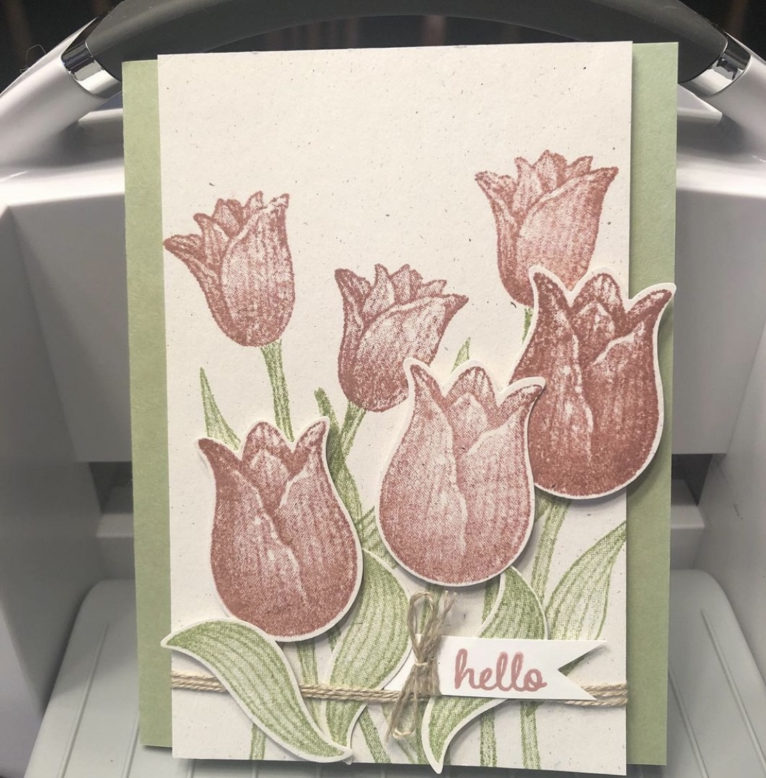
A “throwback” card I didn’t blog about, using the retired Timeless Tulips and Tranquil Thoughts stamp sets from Stampin’ Up.
I discovered some untitled, unposted posts in my WordPress tonight, ones I thought posted already. But as I’ve mentioned, I’ve had trouble getting some of my automatic posts to bounce around to the various apps I initially sent them to. So now I have a “throwback” card, I guess, to share with you (that I thought I’d already shared). And evidently there will be more to come.
This was a make-and-take idea from the 2019 Stampin’ Up OnStage before Covid hit, which I took home that weekend and made almost a year later. I used a retired Naturals cardstock that has little colored flecks in it for the base, with Pear Pizzazz ink and cardstock and Fresh Fig for the tulip blooms. I popped up some of the blooms with Dimensionals (foam dots). “Hello” is also from the retired Timeless Tulips stamp set, but the inside sentiment, “I thought of you today,” came from the Tranquil Thoughts stamp set. I took the completed card to the gift shop that sells my cards, and it did indeed sell quickly. Many thanks to Stampin’ Up for the fun idea.
I feel like I’ve been here, there, and everywhere (or my bed) for the last six months. Crafting times have been random and unplanned. I’ve been trying to reorganize my stamps (and keep my desk clear) too. This is a card I made one night after vacation and before I hit the deer.
I fussy-cut around the foliage of a retired #stampinup Magnolia Lane Memories and More card before popping it up on Dimensionals and running some retired #petalpink and white baker’s twine behind it and for the bow. I’ve used a retired kraft Magnolia Lane Cards and Envelopes card base and used some retired #envelopepaper on the inside. Retired #su gems on the card front: Frosted Flower Embellishments and Share What You Love Artisan Pearls. Current gems: Elegant Faceted Gems.
Hello and thanks for stopping by my part of this Stamp with Amy K’s Tuesday team blog hop! We’ve made cards “for the ladies” today.
One of my favorite things to do is to encourage my girl friends and other women on my life’s path. I had a Mother’s Day card in mind to create, but I’ve had an excess of other work during the last couple of weeks—so I went with this butterfly one instead. It’s a card I would send to one of my dear friends as a thinking of you or a birthday or a card of encouragement, to brighten their day and make them feel special.
I began the card really just wanting to use up some of my scraps of Flowers for Every Season 6×6 DSP (item #152486, currently on sale for $6.90 on stampinup.com during the Annual’s Last-Chance sale). I found three long and skinny scraps that were around the same size and had a pretty pattern among them that I could use as a center strip.
I decided touse the Misty Moonlight color in two of the strips as the color of my card base, and I glued a mat of Very Vanilla cardstock(item #101650) atop the card base, leaving about an 1/8″ border, to give some separation and definition to the colors in the papers that would be on top. (Forgive me for the guesstimate, but I don’t really measure things; I just work with things until they feel right.)
Once I glued the patterned DSP, I felt the strips also needed some Very Vanilla to break the color clash. Those strips are definitely an 1/8″ each becauseI cut them with my trimmer intentionally. 🙂 I also measured the smaller edge of the DSP strips so that Icould place the floral pieces in exactly thecenter. I use a ruler on my work mat and inch inward by eighths and quarters until I figure out where the middle is. (I do better with seeing physical measurements than with abstract figures.)
To add the butterfly, I first took a piece of recently sold-out Bijou ButterflyDSP and fussy-cut the largest butterfly with my Paper Snips before popping up the butterfly on foam Dimensionals (item #104430) in the top half of the card, leaving room for a sentiment below.
To create that sentiment, I used one of the Stitched with Whimsy Dies (item #155314) and Misty Moonlight ink (item #153118) with a sentiment from the Friends Are Like Seashells stamp set (item #158203).
I first took the die to a scrap of Very Vanilla, which impressed the stitching into the paper. The die does not cut around the stitching; I fussy-cut around it myself with my Paper Snips (item #103579) using the edge of the impression as a guide and then edged it with a Misty Moonlight Stampin’ Write Marker (item #153125 for the In-Color Pack of five).
Then I placed my sentiment stamp on my Stamparatus stamping platform (item #146276), created a few test sentiments forplacement, and finally stamped it where it would fit before decorating the sentiment box with embellishmentsfrom Wonderful Gems, Blue Adhesive-Backed Gems (item #153547), 2020-2022 In Color Enamel Dots (item #152480), and Playing with Patterns Resin Dots (item #152467).
I was able to pull out each of the colors used on the card with those embellishments, so Iwas pleased. (The white space in the corner was just too much for me. If you follow my blog posts, you’ll have heard that I’m not a big fan of white space.) I alsofelt that doing something different with the gems in that way spoke to the “unique” idea of the card.
I plan on decorating the inside of the card with a thinner strip of the floral paper and then selling the card to my local gift shop so one of their buyers canencourage a friend or relative too.
I hope you’veenjoyed my card today. To continue on with the hop, press the Previous and Next buttons or click on the linked names in the list. My team members always come up with inspiring and beautifulprojects! Thanks again for hopping with me. If you like this card, please leave a comment orconsider following my blog for future posts. 🙂
Using up a favorite piece of paper with a favorite technique—and it’s so easy that anybody can do it!
Hi, everybody! I’ve had quite a good run on cardmaking lately. I need to be reorganizing my craft room too but can’t seem to stay away from the desk! I know my schedule will be changing soon with springtime, so I’m thankful the creativity is here while it’s here.
One of the challenges I have in my craft room (just a secondary bedroom) is the amount of stuff—consumables like paper, embellishments, and more—due to the number of years I’ve been crafting (paper crafting for about 30 years now; other types, longer). I do confess: I LOVE paper and embellishments. I love having just the right special little thing to add to a card or scrapbook layout to top it off and make it perfect (or as perfect as the receiver will believe it to be 😉). And don’t even get me started on all the beautiful patterns and color choices I have in paper.
Sadly, as my “collection” grows and I fight losing space within four walls, I find myself striving more earnestly to use up my consumables to gain space. I’m not sure this will really work, considering how little room a few pieces of paper and gems take 😆, but I’m going with that for now in an attempt to feel as if I’m progressing somewhere. But that theory is why I made the card I’m sharing today.
I don’t actually know the name of the company who made today’s beautiful background. Sometimes I get papers from other crafters in destashes or swaps or RAKs (Random Acts of [Craft] Kindness). I had only two pieces of this one and always thought them beautiful but I’d moved them around a few times—in and out of the “make these next” piles of card parts, different storage options, and the like. The day I made this card, they moved from “make this sometime” to “make this NOW.” The design was too pretty to put off any longer. But I wasn’t sure what I wanted to do with it (the very reason, I suspect, that I kept moving it around in the first place). I first made a card base out of Stampin’s Up’s Misty Moonlight cardstock(item #153081), which matched the roses perfectly, while I continued to think. I use their cardstock for 99% of my card bases; this color is the regular 80-lb weight.
I must have had 3D things still in my subconscious after making the bird/flower card from a UK magazine kit in a previous post, because I was suddenly willing to sacrifice BOTH pieces of this pretty paper. I latched onto an idea of popping up some of the roses from one sheet on foam dots to give them dimension and make them 3D on the actual card. I cut out the two trio bunches for this and used Stampin’ Up’s self-adhesive Dimensionals underneath (item #104430, current). And then I used my Wink of Stella White and Clear glitter pens on top of all the lightest blue roses, because it’s been my go-to thing lately. I recently opened a new Clear one (item #141897, current) and am loving the amount of glitter it puts out. So fast and easy with an “Ooh, pretty!” punch. 🙂 The White one gives a nice whitewashed look (I only used it on the centers), but I didn’t think it was dramatic enough since the roses were already sketched with white too. It just softened the middles a little.
I was arbitrarily chatting while making this card (“Attempted Multitasking” is often my middle name), so I wasn’t feeling like complicating things further by sorting through my stamp sets, finding a sentiment that fit, hoping to ink and stamp the thing properly in between the dimensional roses—I needed more fast and easy. And then my eyes fell on some recent Paper Pumpkin sets I have stacked nearby. (Yes, Connie should make an effort to use these up more quickly—it will save space! 😂) I hadn’t even opened February 2021’s “Bouquet of Hope” kit yet but I thought there was something in there (consumable) that I could use, from what I was remembering from the promo pictures. Sure enough, sentiments in three languages, in die-cut sticker form. Perfect. And the English one even fit. No mess, no fuss, and I could nestle it into place without worrying about accidentally inking up 3D roses.
I decided to cut apart the “of” and “you” words because I didn’t like how close to the edge the “you” was falling, right where a right-handed person would hang onto the card. But what to do to make everything fit? Well, I ended up sticking the “of” to the top of the bottom dimensional roses and thinly chopping up Dimensional pads to fit under the part of the “f” that hung over the flower. That was tricky, yes. But it’s possible.
Then, time for embellishments! Stampin’ Up to the rescue again (and more gems used up!). I have previously hesitated on adding the Matte Black Dots (item #154284, current) to the top layers of my projects because they’re about 1/8” thick and I often “card” in layers, stacking things even higher. But here I could use them on the bottom layer without fear because the top layer would be against the envelope. 😁 I also scribbled some fake black dots onto the topmost rose trio since I didn’t want to chance them poking through the envelope when mailing. I used my black glitter brush from Art-C for that (very similar to Wink of Stella). I also added three champagne-colored gems from the Elegant Faceted Gems pack (item #152464, current) to the bottom layer to pick up the yellow/gold tones of the smaller flowers in the background. And that took care of the outside of the card.
I kept the inside even simpler. I have several ongoing card orders to fill all the time these days, and one is for a lady who likes a simpler style. (That’s hard for me, but she’s helping me learn it!) I did think of her while making both the outside and the inside of the card, wondering whether she would want it, so I deliberately left the inside blank with just a strip of leftover background paper at the edge of miscellaneous white writing space (a substitute would be Basic White cardstock, item #159276, current).
And now I’ve used up all that pretty paper. But it was worth it. 😍
Here are the links for what I’ve used in today’s post:
If you’d like to own any of these Stampin’ Up products yourself, you can go to my online store and shop with me at http://www.stampinup.com?demoid=2202334. The retiring list for the current Annual catalog hits this Wednesday!! Lots of good stuff coming! (But the Mini is still active until May 3. 😉) Contact me if you’d like paper catalogs instead. 🙂 You can also use Host Code WMW62ECS during checkout and receive a free gift! Orders totaling $50 before tax and shipping can choose a free gift from me up to $8 retail value; I’ll ship it separately to your preferred address after the order is placed. You’ll also earn 1 reward point toward a total of 8, which will get you a free $40 order from me. (And once you hit 8 points, the counter starts over!)
If you’d like to join a Stampin’ Up team and become a demonstrator yourself, I’d love to have you! I’m working on achieving some “leveling up” requirements and would be thrilled to have someone new! No pressure about sales amounts from me, ever. I know what it’s like to lead and juggle a busy life around many priorities. If you’re interested, contact me any time or check out my joining link at http://www.stampinup.com/join?demoid=2202334.
Check back on Wednesday for the 2020-2021 Annual retiring list! And thanks for stopping by. 🥰
Enjoy a bit of France and flowers as we gear up for all things “love-ly” for Valentine’s Day!
Whew! That’s a long blog title. (And I didn’t even add all the stamp sets!) Maybe you know by now that my preferred style is lots of details and fuss—complication is somehow my specialty. I’ve used all current Stampin’ Up products in my card today, and there are quite a few. Thank you so much for coming to my post! Thumbnails of the products I used will be at the end of post, and clicking them will take you to my online store for more details.
The theme for Stamp with Amy K’s blog hop for this month is “love.” Well, I have a “love” for all things France, so when I was thinking about current Stampin’ Up product I already own that I could create with, of course I turned to the Eiffel Tower. And flowers. I love flowers too. They’re my go-to any time of year. I didn’t have anyone particularly in mind when I created this card; it will likely go to my local gift shop for sale soon. The idea of it came to me while I was driving the other day. The background has changed since, but ideas do that in this craft room. 🙂
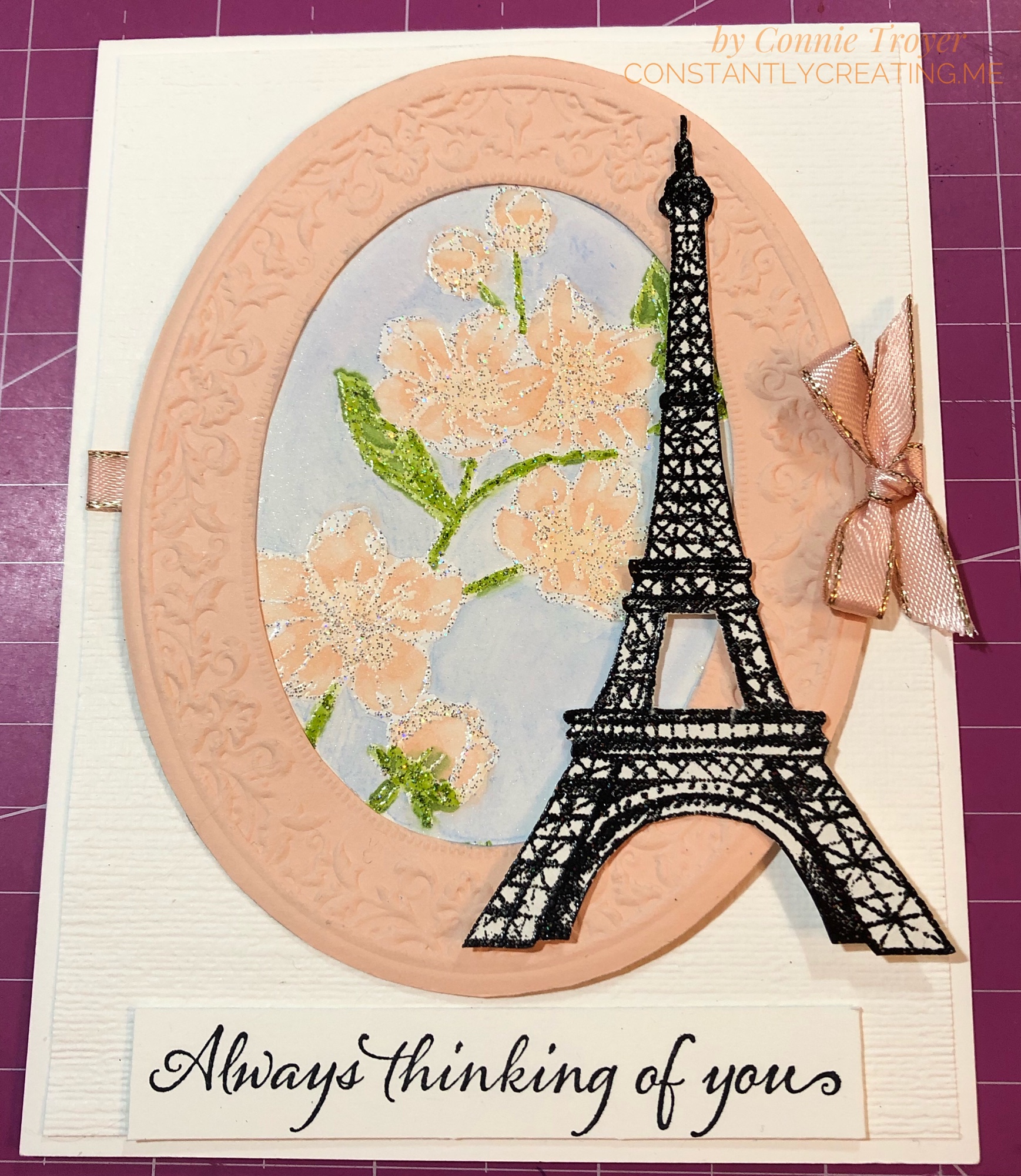
I started with an A2 (4.5″ x 5.5″) Thick Whisper White card base and then eyeballed and cut a slightly smaller separate piece of regular Whisper White for a layer on the top. The margin difference is between 1/8″ and 1/16″ because one was too big and the other was too small. I dry-embossed this separate piece with the Subtle 3D Embossing Folder first in one direction, and then I flipped the paper and embossed it in the other direction, which gives it a crosshatched look. I tucked a piece of 1/4″ Petal Pink Metallic-Edge Ribbon around the edges slightly higher than the middle, gluing them on the back side, and then glued my embossed piece down to the card base. (Well, technically, I did a lot of the steps backward, including that part, but do as I say, not as I did!)
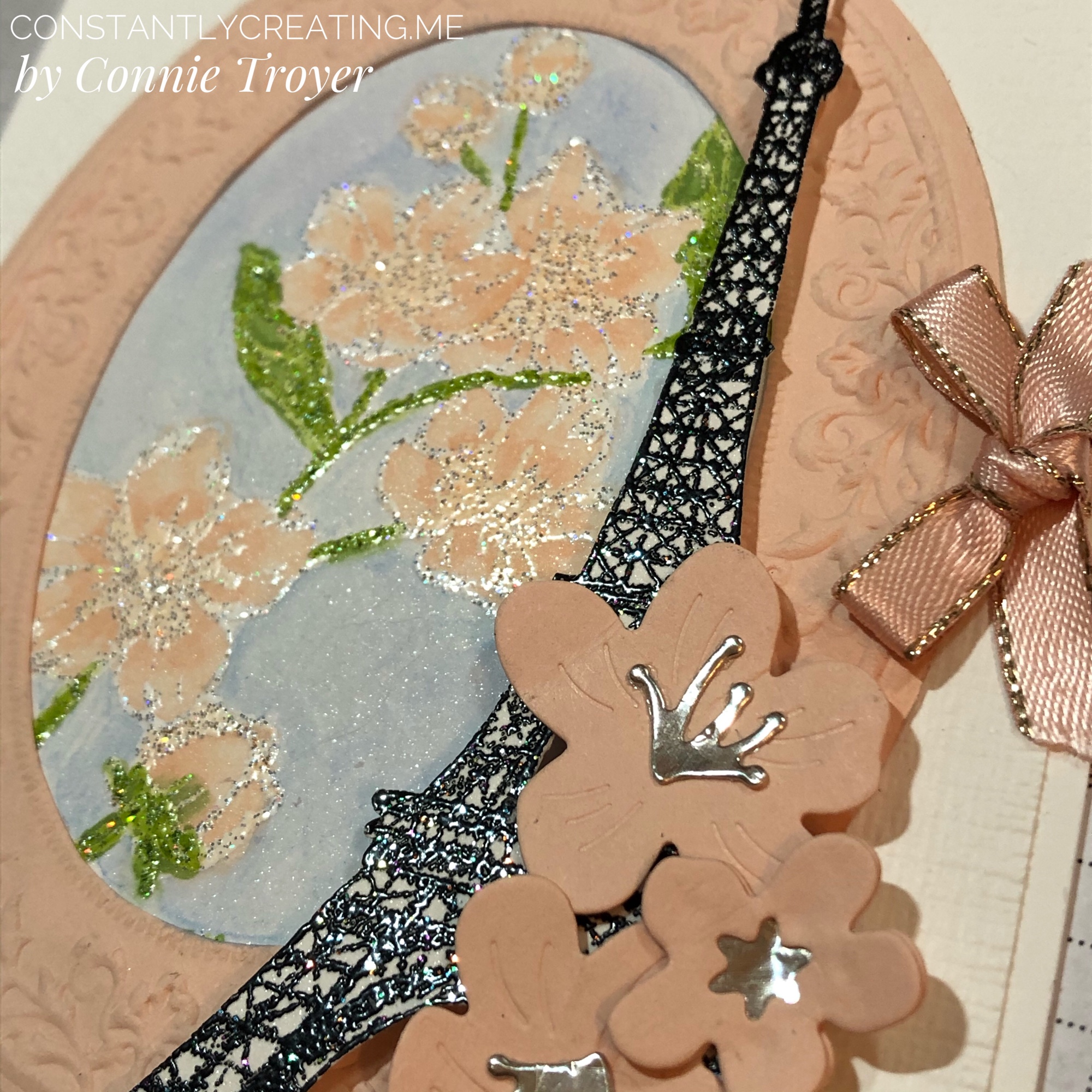
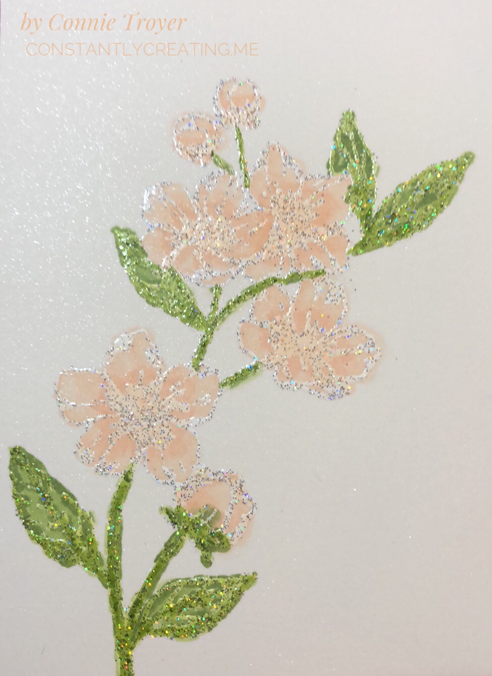
The focal part of my card front is the large flower stamp from the Forever Blossoms Cling Stamp Set, surrounded by an embossed die-cut made from the Heirloom Frames Dies and Heirloom Frames 3D Embossing Folders, with the Eiffel Tower stamp from the Parisian Beauty Cling Stamp Set and die-cut flowers from the Cherry Blossoms Dies offset to the side.
I knew I wanted to use Alcohol Blends on the flowers and leaves, but I don’t like coloring large sections with the Blends and making lines, so I felt like watercoloring the background would be best for me. I used the Balmy Blue watercolor pencil in the Assortment 2 pack and an Aqua Painter. (Truthfully, I forgot to color the background until after I’d already distractedly glued the piece to the back of the oval once my flowers were done, so don’t do that. Color it all first; then cut and glue.) Since we can use Memento Tuxedo Black to hold in the colors of the alcohol markers BUT Memento is water-based and will run when touched with water during watercoloring, I decided I’d better heat-emboss some embossing powder on the image after stamping with VersaMark so that I could do both techniques. I’d wanted to try out Stampin’ Up’s new Shimmer White and Shimmer Black Stampin’ Emboss Powders anyway.
I’m actually really impressed with those new embossing powders. I didn’t expect to see the holographic flecks in them, and that feature turns out some neat highlights. The Shimmer White is, of course, white when embossed, but there’s also a mix of silver and holographic flecks that don’t meld together when heated, unlike the white and black colors themselves. And the Shimmer Black includes flecks of silver, magenta, green, blue, and something yellowy that sit subtly on top of the black. The ones in the black are very hard to pick up in the lighting when showing a card, but they’re fun to see. After I heat-embossed the Eiffel Tower with the Shimmer Black, I think my jaw actually fell open—it looked like it was sparkling with diamonds!
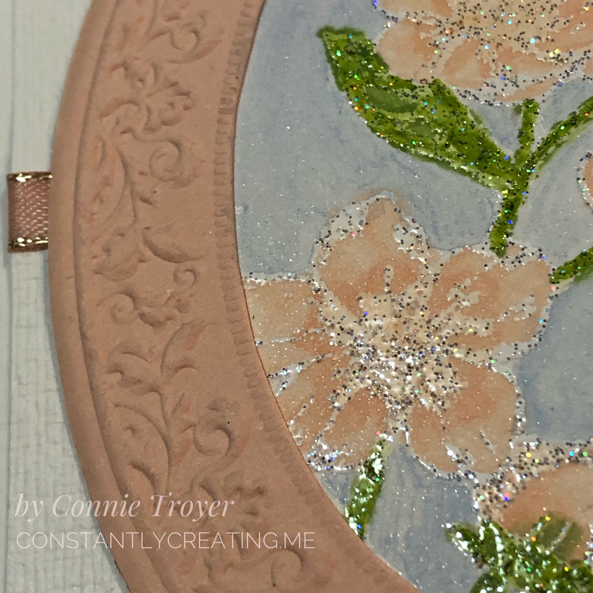
When I was working on the oval, I had trouble getting the embossing perfectly centered in the die-cut, and that bothered me—and it also took up more of the card front that way, room I needed—so I trimmed off the excess around the crimped part. It lays flatter now anyway without the extra border edge. Once I had that done, I used it to figure out how I wanted to show my flowers inside it. They are stamped at an angle. I actually had a different angle chosen, but I didn’t glue it in the same way I had set it, so watch that if you do it. Mark a place at the top so you don’t twist it too far to the side. I cut a small section of Shimmery White Cardstock for the flowered piece, which you can see some of in the blue background in closeups. This card is quite shimmery everywhere you look!
To color the flowers, I used my Dark Petal Pink, Light Granny Apple Green, and Dark Granny Apple Green Alcohol Blends, as well as the Color Lifter. I tried to work with the Ivory too, but I had to lift the color right out of it because it felt too dark on the buds I colored. (I used to have a Light Petal Pink Blend and wanted to use it, but at the last show where I was a vendor, the cap didn’t get put back on correctly and I didn’t catch it until it had already dried out. So I have to order a new one.) When I colored the flowers, I went over the centers and extended the color some with the Dark Petal Pink first, then lightly went over everything with the same marker, and then took the Color Lifter to the outside edges of the flowers or buds. I would have also liked to have left some white on the flowers to look more like the DSP in the Parisian Blossoms Specialty Designer Series Paper, but it just didn’t work out that way. The embossing on the flowers and leaves is really where all the shading and shadowing is, so it felt more like reverse coloring as I worked with it. There’s not a lot of space in the flowers that isn’t embossed. I did color right over the embossing, and it does not rub off (though I did not intentionally test that when it was wet).
The Parisian Beauty stamp set is one I won with my Prize Patrol number at November’s OnStage conference, and I hadn’t ordered the matching Parisian Dies yet because I already have a Bigz Eiffel Tower die and several stamp sets having to do with France. In my mind, I saw the SU die-cut at the side of the card and thought I had bought the set until I went looking and remembered. Stampin’ Up’s die-cut is much prettier than the other die I have, so I will be ordering the Parisian Dies after all. For today’s card, though, I had to fussy-cut the stamped/embossed image.
I used the Cherry Blossom dies for the flowers on top of the Eiffel Tower. The stamens and star center were cut out of Champagne Foil and the flowers themselves out of Petal Pink cardstock. I actually doubled the littlest blossom, sandwiching the foil in between to make sure it stayed where it was supposed to. I wanted the blossoms to curl up a bit and had to use the tip of my Tombow Mono Liquid Glue to get the curves I imagined, instead of my large ball tool that was “somewhere.” The dies emboss curving lines in the flowers when cut, as well.
I popped up the Eiffel Tower with Mini Dimensionals to help the height of the knot at the edge of the card, so some of the cherry blossoms on top of it are glued flat and some have been half glued flat and half popped up. The littlest blossom actually has two half Mini Dimensionals at the right and is glued on top of the others otherwise. I knotted a small bow with the 1/4″ Petal Pink Metallic-Edge Ribbon (the last of my sample from OnStage!) and used glue dots under it, on top of the ribbon that was wrapped around to the back, to keep it in place.
To finish the card front, I used the “Always thinking of you” sentiment from the Very Versailles Cling stamp set and stamped it in Jet Black Staz-On ink on a scrap of Thick Whisper White cardstock (with no embossing either way). The Staz-On ink seems darker than the Tuxedo Black Memento ink, and since I had such a dark Eiffel Tower, I didn’t want to go halfway on my ink. To my surprise and delight, my Simply Shammy removed the Staz-On ink from my stamp with just a little scrubbing. Now I don’t have to drag out the pungent Staz-On Cleaner and do the whole paper towel mess! Hooray!
I also used my new Paper Trimmer and even the new Mini Cutter to trim up the sentiment scrap and the first version of my Subtle-embossed piece. The Mini Cutter is only available to demonstrators and those who become demonstrators during Sale-a-Bration, so if you want one, you’ll need to sign up to get it and some other goodies (but I promise it’s worth it!).
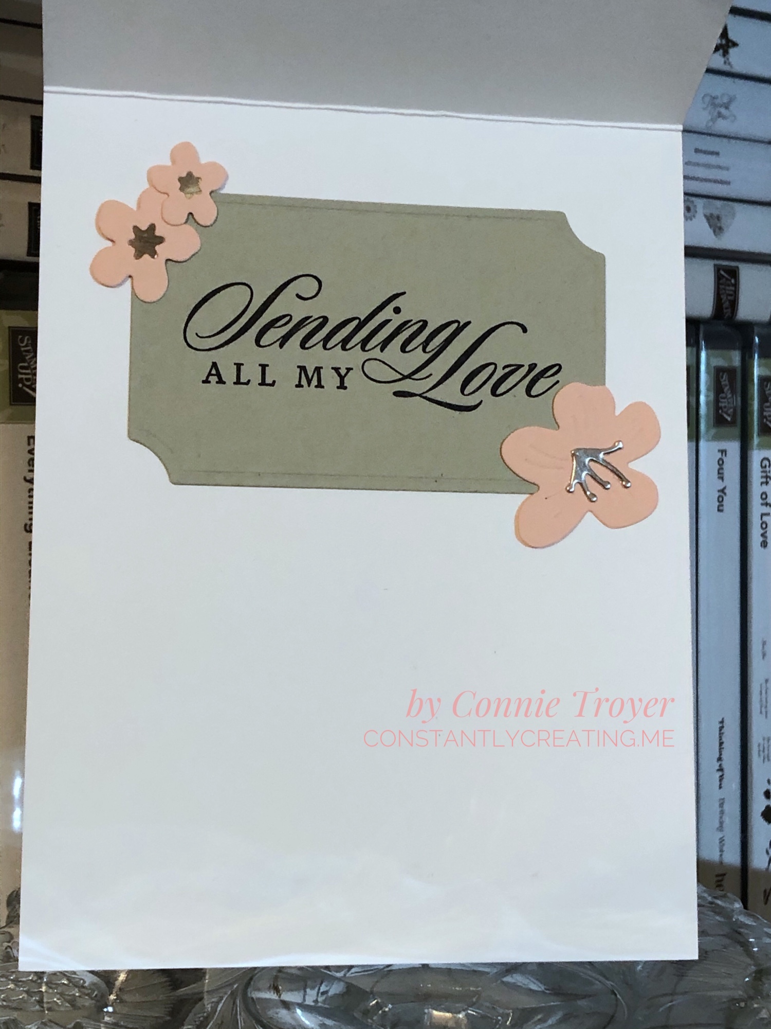
The inside of the card is hiding an oops, but I got a lot more creative with what you see versus what I had, so I’m happy about that mistake. I used the largest of the Painted Labels Dies to cut my “label” for the sentiment out of Sahara Sand cardstock. I stamped the “Sending All My Love” sentiment from the Last a Lifetime Cling Stamp Set in Jet Black Staz-On, using my Stamparatus. And then I glued more Champagne Foil to three more blossoms of various sizes (star centers and stamens, both) to two corners of the label. I did not curve those blossoms. 🙂
All in all, I’m pretty happy with this card. I hope you like it too. Please leave me a comment and let me know what you think or what you would have done differently—or any questions you may have. Just for fun, I’ve included a picture of the “clean and simple” version of this card to show you what it would look like without the flowers. Somehow it’s a very different feel! Nothing was glued down yet when I took the photo.
We have a very talented team creating for you today, so please “hop” around to the others on this list to see what they made! If you hit the “Previous” button, you’ll go back to Mary Deatherage’s blog, or you can go “Next” to Akiko Sudano’s offering. Both women create amazing cards! Or you can skip around with the links below—you’ll find many you like. 🙂
And if you are interested in the products I used on this card, I’ve added them to the next list, and the thumbnails are direct links to my online store for more information or purchasing.
If you wish to purchase something from my online store, please use the host code WAA2PGYR during checkout. Orders of $50 before tax and shipping also gets you a free gift of your choice worth up to $8, from me to you as my thanks. 🙂 (You’ll also get a free Sale-a-Bration item from Stampin’ Up with every order of $50 before tax and shipping!) If you’re interested in becoming a demonstrator and want to sign up with a great time, I’d love to have you join mine—and Sale-a-Bration is the best time to do it! Recruits who join before March 31, 2020, will receive the brand-new (only available here) Mini Cutter (which is a guillotine-style trimmer), a 6″x6″ sampler pack of Designer Series Paper (48 sheets of most of the DSP from the Mini catalog), a free stamp set of their choice, $125 worth of items for $99, and more. I’ve never regretted it!
Thank you again for stopping by to see what I created today!
Welcome to my blog for Stamp with Amy K’s Inkin’ Krew Blog Hop for Tuesday, August 13! We have a great lineup for you today. Thanks for stopping by to see what I created. 🙂
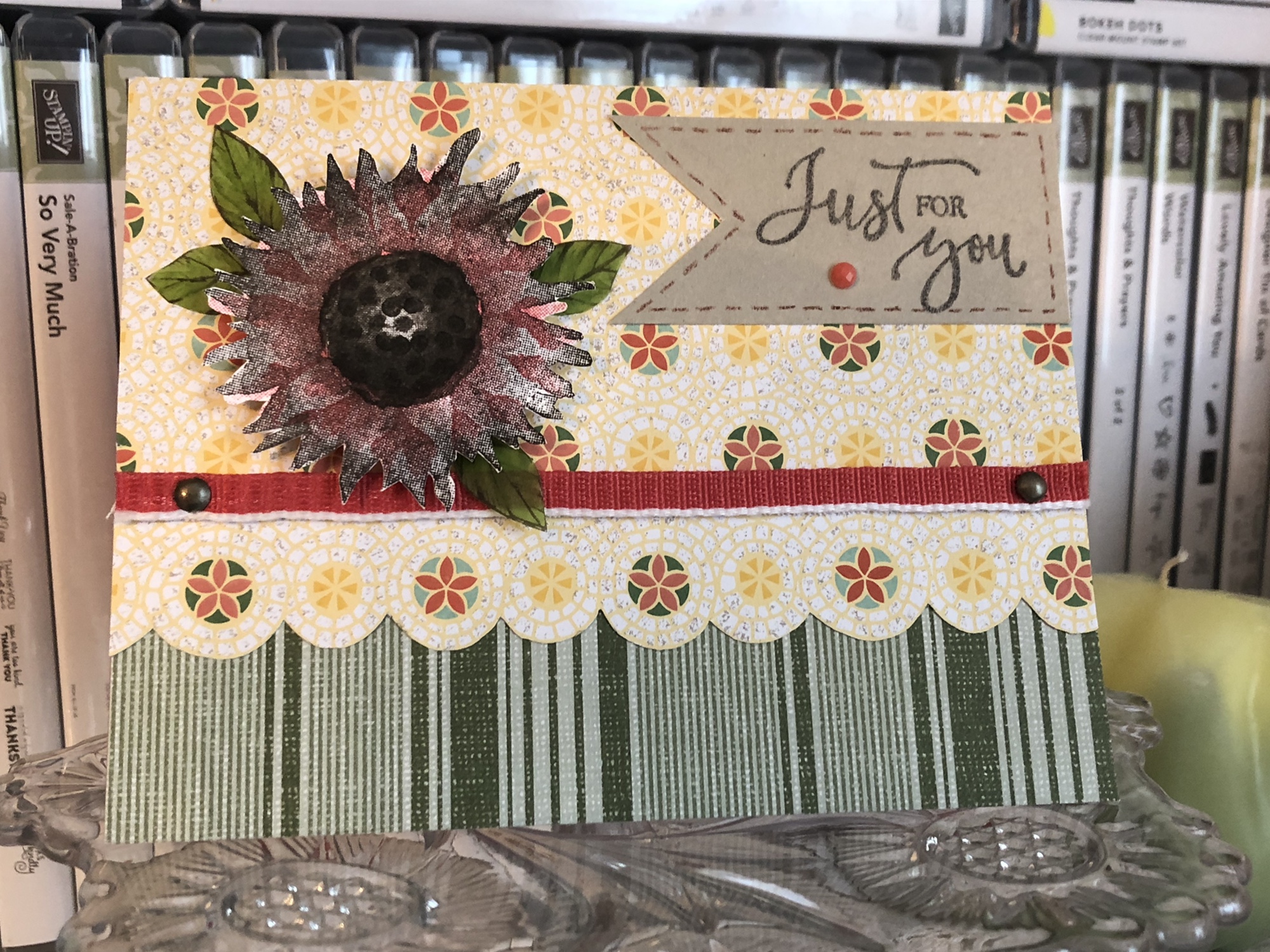
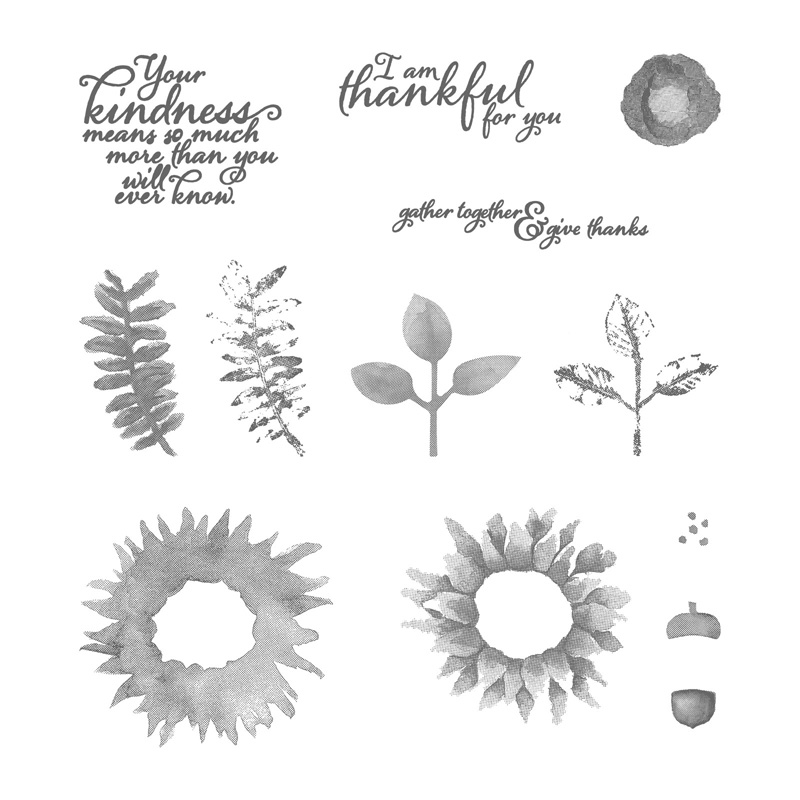
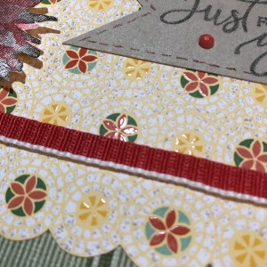
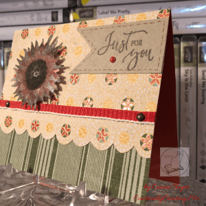
With the seasonal change coming soon, this month’s blog hop theme is “fall frenzy.” So I have a thinking of you/just for you sunflower card to share with you today using Stampin’ Up’s “Painted Harvest” and “Rare Blessings” stamp sets.
Painted Harvest
Rare Blessings
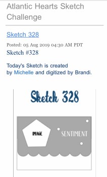
I decided to use last week’s Atlantic Hearts Sketch Challenge—Sketch #328—to give me a basic idea of construction. I don’t use sketches often because I usually just design straight from my brain based on what I’m feeling with the products I see in front of me, but I’ve had a busy weekend (okay, month). I’m thankful I can turn to a sketch or a Pinterest pin for less-than-ideal crafting times when I need to come up with something quickly in either design or time. So here is the sketch image I worked from.
I was also inspired by a card from my teammate Leslie Larkin (leslielarkin.com) that was posted on our team Facebook page last month. After I saw her card, I wanted to make one immediately. I love the black-and-white flower with the color around it (she used Memento Tuxedo Black ink with Lovely Lipstick paper, cardstock, and gems).
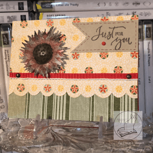
So without further paragraphs, let’s get to my card! Although I had to create it in a crunch, I found several ideas vying for realization as I looked through my current DSP and video-chatted with a crafty friend. I didn’t have time to make the five cards I wanted to, so I’ve had to back-burner most of them. I did pull out supplies to make a second card following the same sketch, so I’ll make that and post it another day. Here’s the one I put together for today. (Be sure to catch the updated picture at the end!)
What I ended up using was a Terracotta Tile card base, a sheet of striped paper from the “Come Sail Away” DSP pack (Mossy Meadow color), and a sheet of flowered paper from the Mosaic Mood Specialty DSP (Crushed Curry, Garden Green, Mint Macaron, Terracotta Tile, and Very Vanilla colors). It is a specialty DSP because half the sheets in the pack have Spot UV gloss on the paper to showcase various designs. In the paper I used, the flowered circles have the gloss on them.
I thought the Mosaic Mood paper would work for the scalloped piece on the sketch because the flowered circles are all in a row and have radiating circles around each flower. I just took my scissors and fussy-cut around the largest circle of each flower in the row, up to where it touches the next circle. It seemed the fastest way to move forward on the card and stop all the overthinking I was doing.
The striped Mossy Meadow paper from “Come Sail Away” pulls out the Garden Green from the “Mosaic Mood” paper and balances everything visually. For some reason, I always think stripes go on the bottom. I suppose that’s one of my “ruts” in card-making. However much I tried to argue with that while designing the card, in the end it was easiest to cave and promise myself that I’d try something new later.
Once I had the stripes glued down and the top portion cut, I tried to find a way to use the beautiful 1/2″ Poppy Parade Textured Weave Ribbon in my “current product accessories” bin. I began using the ribbon the way it comes off the roll but didn’t like how it was the same width as the flowered/scalloped border. I needed something thinner, but I only have so many ribbons and twine options right now. So I put some heavy-duty Tear & Tape Adhesive down on one side of the ribbon and did my best at folding it over in half (it’s kind of tricky, actually). And then I located the 1/8″ Glubers glue line I’d cut in half previously for another card. It comes in 1/4″ strips, but as I’ve mislaid my 1/8″ red-line tape, I made do with the other—twice now. Tear & Tape Adhesive would have worked for that as well, but I already had the other one cut and waiting for me.
The metallic brads are basically just decorative. Since I hadn’t yet adhered the flowered piece to my card base, I could still punch a tiny hole on each side of the ribbon, place the brads through the holes, and fasten them at the back before gluing the paper. I’m considering them to be two of the gem places in the sketch, with the third located on the tag. My brads are miscellaneous from my stash, but Stampin’ Up has a great set of Metallic Brads in the current catalog, so I’ll add them to the list of supplies at the end.
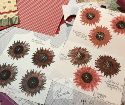
Then came the tedious part of the card—figuring out which colors to use for the two-step photopolymer “Painted Harvest” sunflower. I know I’ve saved some color swatches for this sunflower in Pinterest, but for some reason I thought it would be faster to use the colors I’d narrowed down and stacked on my table rather than search in my Color Combos and Sketches board. Hindsight is 20/20.
I wasn’t entirely sure how the stamping was supposed to go, so I got some scrap paper and started “playing” with the two darker ink colors I’d pulled—Early Espresso and Soft Suede. I did several of both colors as the base. Then I opened the two ink colors in my stash that matched the paper the best—Terracotta Tile and a very old (but perfectly juicy) Ruby Red. I need to get a Poppy Parade ink pad yet. I wasn’t sure which color would work best with both the Poppy Parade ribbon and the Terracotta Tile in the paper.
After too much experimentation, including tone-on-tone and color mixing in the brighter colors, I chose to go with the Early Espresso/Ruby Red combination. The Terracotta Tile is more orange than Poppy Parade, and the Ruby Red has a better balance of an orange and something rosier or pinker when both Terracotta Tile and Poppy Parade are on the same card. The flower spots that have Terracotta Tile in them on the DSP are small enough it doesn’t seem to matter much. I had originally picked a Soft Suede/Terracotta Tile combination, but I didn’t stamp the center quite right on the best piece and royally messed it up when trying to fix it, per my usual. Anyway, that color combination works too.
The center of the finished flower is tone-on-tone Early Espresso. Stamping the center of the sunflower was a little challenging to line up at first, but the more I “practiced,” the better I got at it. So just keep trying while you figure out how it works. After I chose one of the images I’d stamped, I then fussy-cut around the finished sunflower and added pop-up foam dots to the back of it. I’m just now realizing that I probably should have added leaves as well. But I’m calling this card done. Maybe I’ll add leaves before I send it. That’s for another day.
For the “Just for You” tag from the “Rare Blessings” stamp set, I used Early Espresso ink and a scrap of Crumb Cake cardstock. The stamp set is one of the new cling sets, so I had to put it together first with the new stickers (that actually stick to the block!). I actually kind of love doing that with the new stamp sets. 🙂 After that was done and I stamped it on the Crumb Cake, I cut down the tag and snipped up the middle at the left with my scissors to make a banner end. Then I took a Really Rust Stampin’ Write Marker (retired) and added some faux stitching in a thin border just inside the edges of the tag. I would have used an Early Espresso marker, but something happened to mine and I no longer have one. The Really Rust is close enough to the Terracotta Tile that it still matches. And, finally, I added a Terracotta Tile gem from the 2019-2020 In-Color Faceted Dots embellishment pack to the tag as one of the gem spots in the sketch.
I’m not sure what is going on the inside yet. The card is going to a friend who recently lost his mother. I need to look for the right sentiment before I send it with a delayed memorial gift. It’s been a busy year here. But at least I’m one step closer in getting the card and gift sent out the door.
UPDATE!: I decided to add some vellum leaves from the Magnolia Lane Memories and More Card Pack around the flower. I fussy-cut them and colored them on the front and back (to make them darker) with my Dark Old Olive Alcohol Blend marker. (I don’t have the Mossy Meadow Blends yet, so I made do.) The sentiment on the inside reads “With Deepest Sympathy” and is from the current Golden Afternoon stamp set. I stamped it in Crumb Cake. I also ran one of the sticker border strips across the bottom of the inside from the Magnolia Lane Memories and More Card Pack. NOW I’m finished with the card. 🙂
That’s all for today. Stay tuned for the next card using “Painted Harvest” and Sketch 328. Thanks again for visiting! Feel free to post questions or comments. Below the list of blog hop participants of my Stampin’ Up team members are the products I used in my card. You can purchase any of them through my online store here—or just click on the picture—and if you use the host code 3W7RXKCU when you check out, I’ll send a free gift your way! Also, if you happen to need a current Annual Catalog or the upcoming Holiday Catalog (which should arrive on my doorstep tomorrow), I’m happy to send you one! Just use the Contact Me link at the top of the main page.
To continue with our blog hop using the arrows, click Previous to view Paula Vincent’s offering or Next to view Karen Ksenzakovic’s card. Or you can click any of the links below to go directly to any demonstrator’s blog.
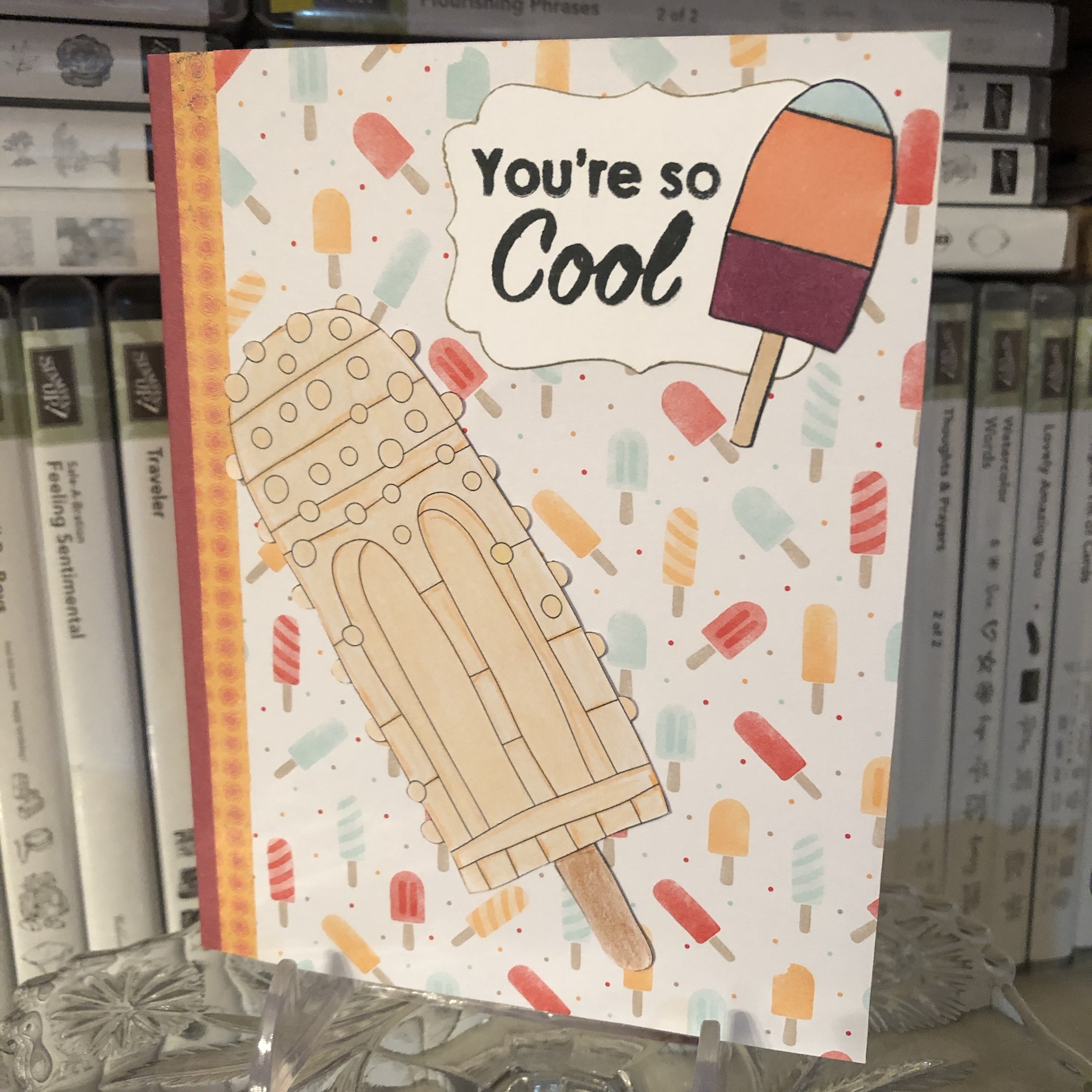
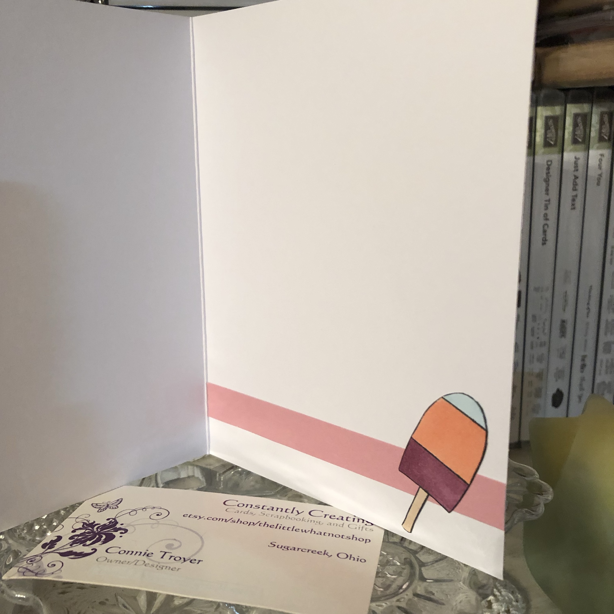
This fun summertime card uses some retired Stampin’ Up DSP—Tasty Treats and Cupcakes & Carousels—along with an unnamed stamp set by a different maker featuring puns (I used the sentiment and the small popsicle here). I even incorporated a large popsicle from an adult coloring book; my aunt colored it. I colored the small popsicle with Stampin’ Blends alcohol markers (Balmy Blue, Light Calypso Coral, and Light Blackberry Bliss) and I used Tuxedo Black Memento Ink for the sentiment and small popsicle. The Decorative Label Punch was used around the sentiment (which I then inked the edges of with a Crumb Cake Stampin’ Write Marker).
Welcome to another post for Amy K’s Inkin’ Krew Blog Hop for Tuesday, January 8! This month we are featuring the theme of love with Stampin’ Up products. I’m making wedding and anniversary cards for my local gift shop right now (along with other themes and random custom orders), so I was very excited to join this hop!
For several days now, I thought I knew what I was going to create for this blog. In the end, I did stick to my original (barely fleshed-out) idea, but did I ever find ways to complicate it. (I always do.) I definitely should have started on it earlier. But I had craft room organization on my mind this week and I got to it when I got to it.
I was able to use several current SU products as well as a couple of retired products and ones from other companies (oops!). The focal point of the card is the bride stamp from the “Wonderful Moments” stamp set, set off by a lace oval from the Delightfully Detailed Laser-Cut Specialty Paper pack and a background of Petal Promenade DSP.
The laser-cut paper is vanilla on one side and white on the other. Since my card base was white and the bride’s dress would be too, I chose to use the vanilla side of the lace oval. And then I decided it needed something else. It felt too plain and too neutral. I kept “seeing” pink with this stamp and card, but the last two wedding cards I created had pink hues in them, so I tried to use other colors.
I have to keep trying. I did manage to sneak in an orange and a dark purple…but there’s still pink. So when I was looking at the oval and trying out colors in my head, I started sponging Bundled Sage Distress ink onto it, thinking winter colors. But then I picked up Tattered Rose and sponged it on too. (Evidently those colors should have gone on in the reverse order.) I added a second layer and different sponging before I was done. And then I got an idea, when I realized that the ink was drying slowly enough to get onto my hand as I held the card. (This is subconscious Pinterest at work in my brain, I think. Lol!)
One of the retired products in my stash that I need to use more of is our Iridescent Ice Stampin’ Emboss Powder. I’ve only used it in small bits until now…but I remembered seeing others do a whole-scene kind of treatment with it. I wasn’t even entirely sure I remembered how this product worked since I bought it late in the game, but the paper was definitely ready to be treated – it was still inky. My friend E assured me that I could indeed use Distress inks for embossing. So I got out my catch-all tray and my coffee filter and proceeded to pour the Iridescent Ice powder overtop (hoping I was making the right decision and not ruining a lovely piece of paper) and then heat embossed it, as the label suggested, three times before I finally saw the powder changing and understood what it was going to look like or do.
Turns out I love this look. It reminds me of our Dazzling Diamonds Glimmer Paper except it’s not as thick and has slightly different colors. I’ll have to try this technique again sometime. I also appreciate how the pink and green sponged inks are still coming through the translucentness of the embossing powder. It’s faint, but it works.
With the lace oval paper finished, I turned my attention to the bride stamp. I chose Archival Basic Gray ink because it felt like black would be too harsh and bold against the soft oval. I had to stamp the bride several times with my stamp platform because it was the first time I’d used the stamp and I hadn’t prepared it even though I know better. So my outline got a little thicker than I’d intended.
After she was stamped, I watercolored the bride’s hair, skin, bow, and flowers with watercolor pencils and used an AquaPainter on those places afterward. For the dress, I decided to experiment with some Nuvo Crystal Drops (Ivory Seashell color) new to my stash. Since that is also translucent, I was hoping it would soften the lines of the dress if I covered them with the liquid. I later went back over the dress again, using a paintbrush to smooth out the Drops on the paper. I also took Wink of Stella to the bride’s bouquet (though I erred first and grabbed my White instead of my Clear. Once it dried, I realized what I had done and went back over the bouquet with Clear as well.) It sparkles more in person than in the photo.
So I had one finished oval and one watercolored, Nuvoed bride. I wasn’t sure how to treat the background behind her. In my mind I had seen her on white, but that seemed far too plain now. I thought of putting a watercolor pencil down as a background but couldn’t settle on which color. Blue for sky? (So she’s out in the open, looking at nothing?) Or some kind of background stamp to imitate wallpaper or wood planks? I then decided to think about the Graceful Glass vellum and hit upon an idea I’ll use at a later date, before the vellum led me to looking through my current DSP. I ended up fussy-cutting around her and placing her on patterned paper so I wouldn’t have to mask her for a background stamp or risk ruining something.
The paper I chose to use feels most like a sunset in front of my bride, and it even matched the flowers, hair, and bow I had colored before viewing this paper pack. (That actually happens to me a lot!) Because that was my best background option thus far, I cut (and then recut, due to first error) a notecard/A1 size of paper where the jagged stripe in the paper best flowed beside her dress and body posture. Once I had the background paper glued to the notecard card base, I played with the placement of my bride, attempting to center her and play off the “sunset stripe” to its best advantage while trying to cover the bottom of the dress with the sentiment I intended on using. (Many thanks to patient E for this stage, who was with me on video chat while I created the card!)
Something then made me think about the Rose Metallic Thread I had stored with my baker’s twine, and I decided to do a bow of some sort. I’m not very good at bows with delicate threads yet. I ended up laying ATG tape on the back of the sentiment and looping it around and sticking to the tape however it looked the best to me.
The gold-and-white “Best Wishes” sentiment came from a resist coloring pack from another maker. I just left it as is, since I had enough color going on already. It fit with the “brown” tones of the card anyway. The gold on the sentiment appears to have been embossed, though it came that way in the pack and I merely cut it out. I popped up the sentiment with its new metallic loops with Stampin’ Dimensionals foam dots, placing it right above the hollow circles at the bottom of the oval.
The last touch on the front of the card was the tiny little mini pearls I used on the buttons of her bridal dress. I had SU’s white mini pearls from the Notes of Kindness card kit on her dress originally but later changed to even smaller ones from Recollections.
The inside of the card has been kept simple to be size-appropriate for the notecard and also to leave room for the sender to write. I used the retired Petite Pairs stamp set with its “for the new Mr. and Mrs.” sentiment on a bit of the Petal Promenade DSP (from the first piece I’d cut the wrong direction by accident), the current Fresh Fig ink pad, and the gorgeous Stitched Labels Framelits Dies. And then I added two more mini Recollections pearls on the sides of the inside tag. 🙂 (Side note: the Petal Promenade DSP pack is one of my favorite things in this catalog. The papers are just so beautiful!)
If I had set out to create this exact card, even with all the detail, it wouldn’t have taken me very long. But creating from scratch and using trial-and-error means that sometimes happy accidents have to happen to lead the creator to the next step, which later seems so obvious. 🙂 I’m really quite happy with this card now, but there were moments when I wondered where I was going with it. Maybe you’ll find even faster ways to recreate this card. I’d love to see what you come up with! I think this card could be used for a bridal shower, a wedding card for the couple, or an anniversary card. It just depends on which sentiments we use.
Below are the current Stampin’ Up products I used on this card. If you need any of the supplies, just click on the thumbnail to go to my store or visit this link. I’d be happy to become your demonstrator! Sale-a-Bration (from now until March 31) is the best time of the year to stock up on products and earn others for free! Please use code JJBCPS4W for a free gift when you shop with me! (You can continue with the hop participants below the thumbnails.)
Thanks for stopping by my blog! To continue with the hop, see what Karen Finkle created by clicking on the Next button or visiting her link below. To go back to see Sue Prather’s card, click Previous or her link above mine. See you next time!
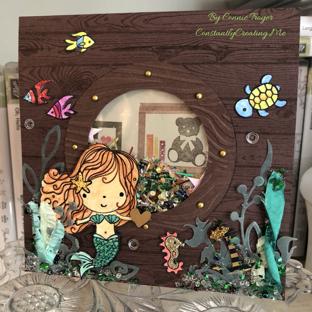
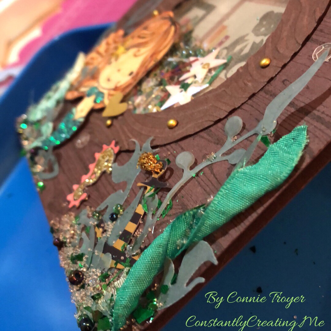
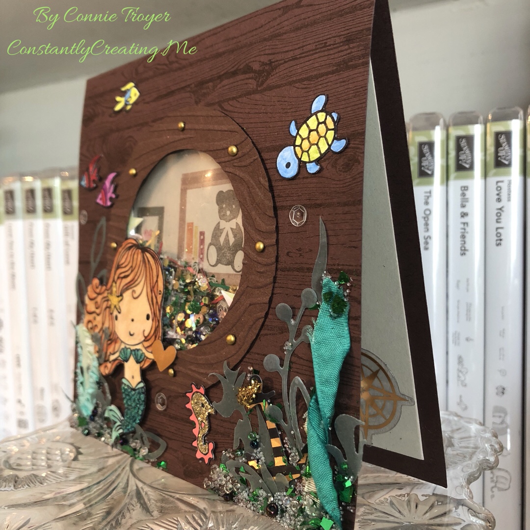
Thanks to my niece’s unicorn birthday card, I got in a few more custom card orders. One of those was for a special mermaid birthday card. I get the craziest ideas in my head sometimes, without any inkling of how I’m actually going to accomplish them. And then, through trial and error and time and SMH-at-myself moments, eventually they come together–and hopefully I’m even pleased and kind of impressed that the whole thing didn’t flop. Such was the case with the mystifying mermaid.
I could see it in my head–a cute little mermaid on the outside of a wooden ship, peering through the porthole to see what she could see, much as I imagine Ariel would have done had she not been collecting artifacts in her grotto or spying on the dancing taking place on the deck of Prince Eric’s ship. The trouble was that I didn’t quite think through all the steps of just how to create it.
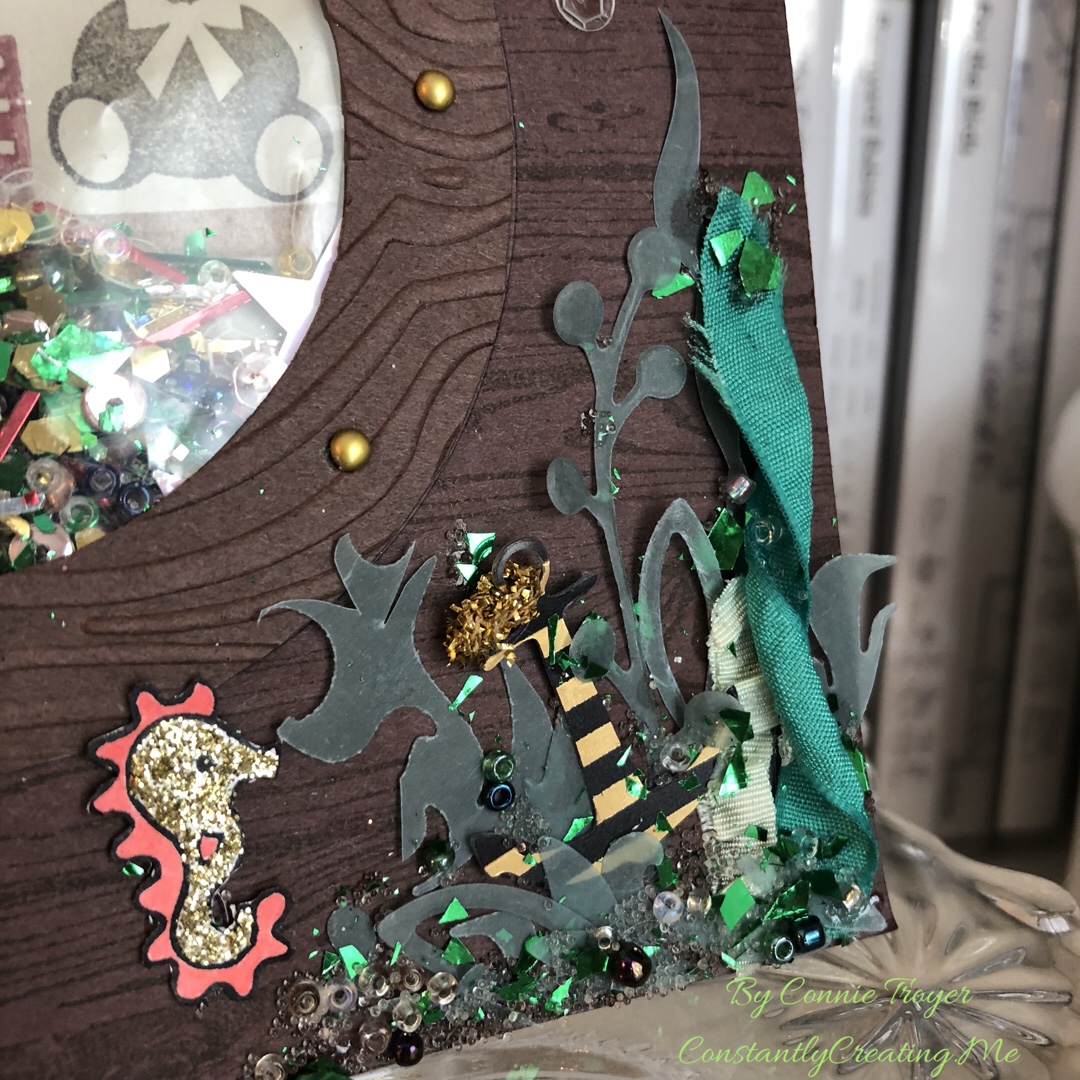
The ship wouldn’t be a problem to create, as I own the Stampin’ Up Hardwood stamp (current catalog) and the porthole and mermaid were only going to be so big (I didn’t have to create the entire ship). I began by cutting down a piece of Stampin’ Up Chocolate Chip (retired) cardstock to 6″x12″, scored it 6″ up, and folded it. (And then shortly thereafter I cut down that card base to 5.5″x5.5″.) I used SU Early Espresso ink (current) to stamp overtop the Chocolate Chip so the wood grain could be seen. I then looked at several circle dies on my die wall and decided that the double-circle die from SU’s “Sliding Star” Framelits (retired) had the spacing I wanted for the porthole. I centered the die on the now-smaller card base, put another piece of cardstock behind the card base so the marks in my die-cutting plate wouldn’t transfer to the inside of my card base, and ran it through (forgetting until then that the die would cut through both the base and the extra piece. Oops! Goof #1!).
(Side note: There are at least two ways to create a shaker card. The way I know best, I didn’t do. It would have been easier to cut a separate 5.5″ piece and make that the porthole piece with foam strips rather than cut through the base and do it all backward. But I didn’t think that far ahead. Goof #2.)
Once I had the hole cut into the card base, I had to make the porthole cover, which would need to extend over the hole slightly. I went back to my Chocolate Chip cardstock to find a remnant that would fit, placed the die on the paper, and traced around the inside circle. Then I grabbed one of my most favorite and very old tools (a layering tool from Stampin’ Up from waaaay back), put the smallest layering circle against the die, and dragged it around the die with a pencil through the center of the layering circle (it rolls around objects to make slightly larger mats). Then I cut the now-slightly-larger circle out of the cardstock by hand. Once I had both circles cut, I embossed the new porthole with a wood grain embossing folder, decided I wanted the debossed side up, marked where the mini brads should go, punched the necessary 1/16″ holes (it’s easier than forcing brads through the paper by hand), and placed my chosen brassy mini brads in their spots. And then I glued the porthole onto the card base.
But that still didn’t get me the shaker feature. And that’s when I realized that I was once again taking the hard road by not doing the way I already know (albeit not well). So I conferenced with my friend E, who happened to be on video chat with me while I crafted (there are some days I love technology!). And she proceeded to explain to me how to use my much-desired Fuse tool that I’d purchased, longed to use, put off using, and then started looking at in a rather intimidated fashion. Apparently one can make shaker pockets with a Fuse tool! I’d heard that somewhere but had never attempted it. And fortunately for me, I’d happened to find some Fuse Project Life pockets on clearance the last time I went to JoAnn Fabrics. Even better, I found them in my craft room without too much looking.
While the Fuse warmed up, I revisited the shaker elements I’d gathered a few days prior–different colors and shapes of sequins (the stars reminded me of starfish, and the gold, clear, and rose were the perfect shades); seed beads in clear and marine colors and clear Stampin’ Up microbeads (retired) for space in the shaker pocket; leftover gold, green, and red long confetti flakes from a Stampin’ Up card kit; gold, white, and green mica flakes (that I’d never tried using); gold glitter hexagonal flakes; and some white Rock Candy Distress Glitter from Ranger. I spooned various quantities of these things into the pocket–and put in too many (goof #3?)–but actually managed to work the Fuse tool correctly on the first try. The second try wasn’t as good, but I’ll practice now that I’m no longer scared of it. 🙂 I cut away the excess of the filled shaker pocket and asked E how to hide the thing in the card.
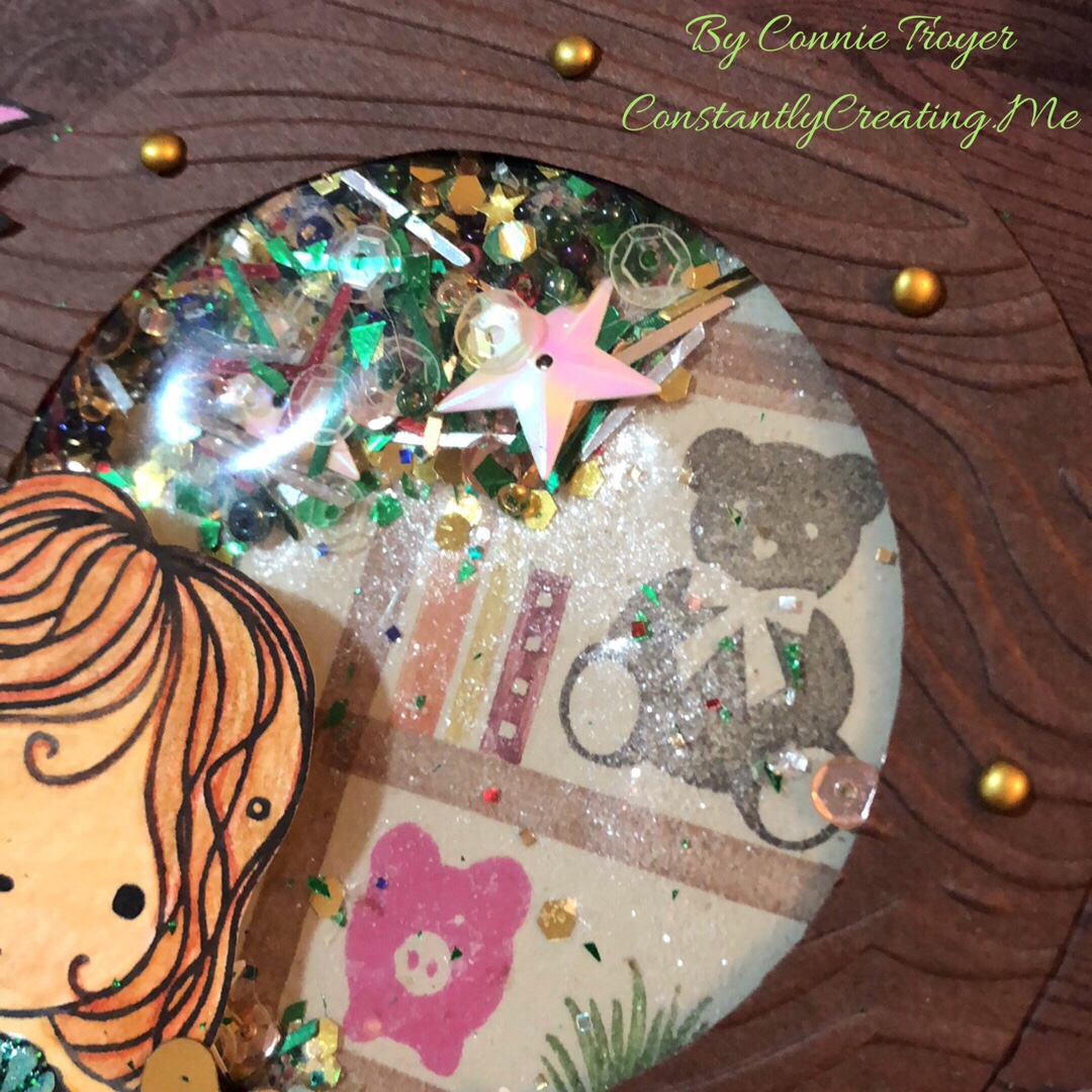
Since I wanted my mermaid to be looking at something inside the ship, I cut a large circle in a lighter color and stamped the background of a bookshelf and human objects with SU Bookcase Builder (retired), which would be seen through the shaker pocket; then I glued that to the back of the acetate piece in what I hoped would be the right position (since the shaker elements would and did move around). Then I took another remnant of Chocolate Chip cardstock, placed foam dots around the edges, and put it overtop the background and shaker pocket. And then I breathed a sigh of relief, because the thing actually shook around the way it was supposed to, even if I did probably put too much in it. I was hoping it would look like the outside of the porthole had collected some sea stuff there on the ledge as it moved through the water…but Miss Mermaid got what appears to be the amount that collects in a shipwreck! Oh well. Live and learn and stuff another envelope later.
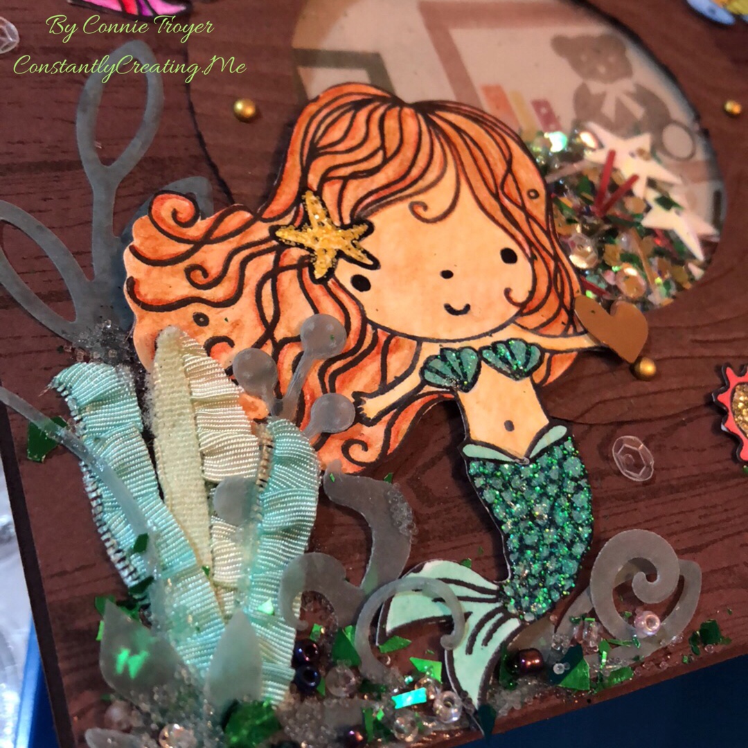
So my porthole was done–and I’d previously colorized my little mermaid and her friends with watercolor pencils, an Aqua Painter, Adirondack Dimensional Pearls, Stickles, Nuvo Glitter Drops, and Distress Glitter Stickles. I’d actually tried to stamp her tail on some very nice flaked cardstock that reminded me of scales, but that didn’t work like I’d thought it would (and I should have known better anyway–another goof), so watercoloring and two layers of glitter glue ended up working for the tail instead. I fussy-cut them all out, glued the mermaid to the card front in between two of the mini brads in the porthole, and started trying to figure out my seaweed issue. In my head, I saw things floating near her on the outside of the ship, like her friends or the occasional sea life. I ended up with more things there than I’d intended, but I think it’s cute anyway.
I found some retired Stampin’ Up ribbon in Emerald Envy, Pistachio Pudding, and Coastal Cabana that was ruched or ruffled, so I thought that might work for seaweed. I didn’t think I had any seaweed dies or stamps–but I found dies that would have worked better after the card was done (goof #5). Too late. So I trimmed up the ribbon (cut some of it in half and twisted others) and found some greenery dies on my wall that I thought could pass for seaweed. I used a couple of miscellaneous green vellum sheets of paper with the dies and then attempted to glue them all together with Zots and Tombow Multi (green and white) Glue.
But I couldn’t stop there. I had to add beads and microbeads and mica flakes to the outside bottom edges too. The inside of the shaker can’t have all the fun. Plus, I was hoping to hide some of the glue marks on the vellum pieces. 😀 I also found a little gold heart die-cut for the mermaid to hold, a gold compass for the inside of the card, and a black-and-gold die-cut anchor piece inside a random pack of travel/beach die-cuts I’d just received. I let it all dry overnight but had to go back in the morning, shift a couple of things, and reglue. My twisted seaweed had righted itself, and one of the taller seaweeds I’d cut by hand was tilting precariously.
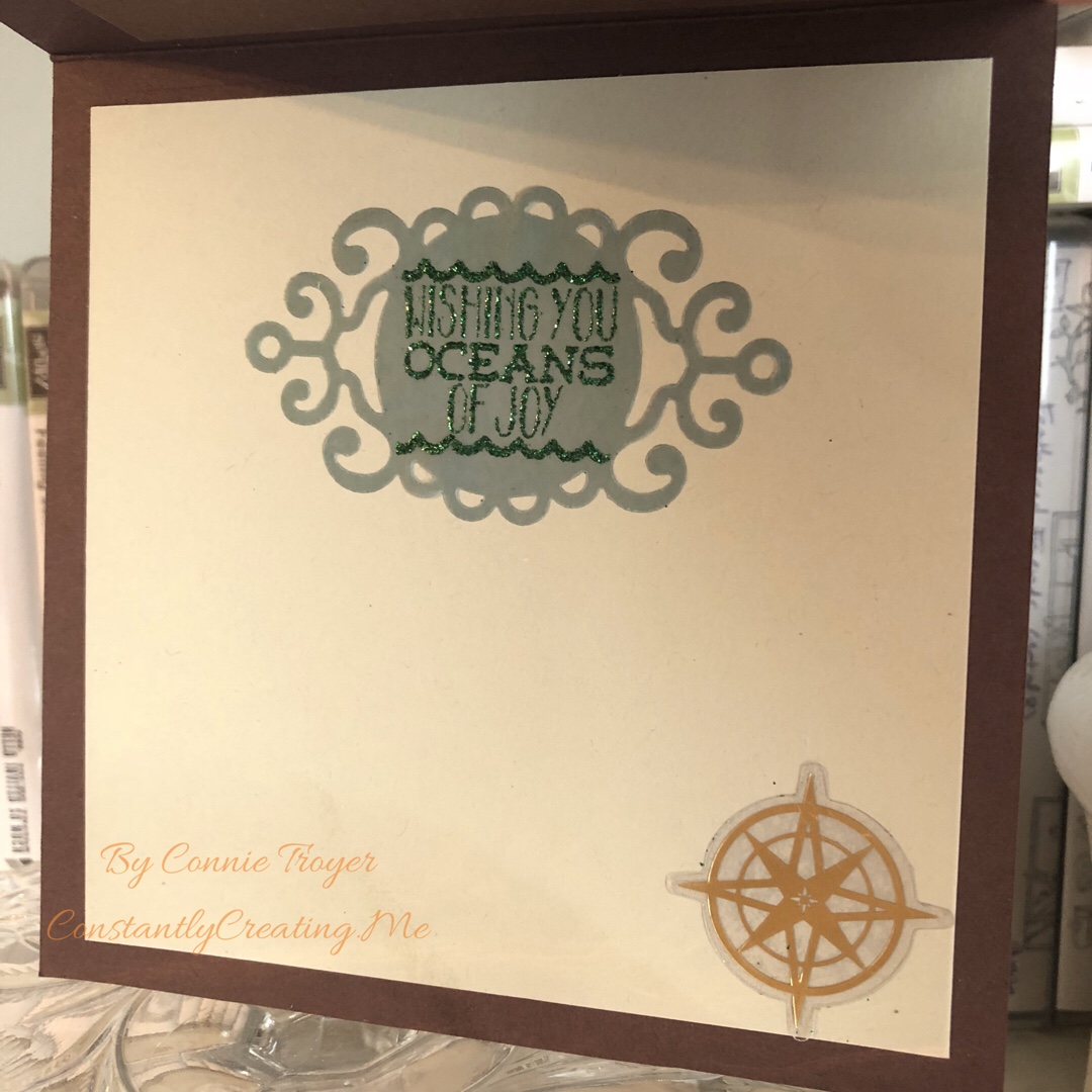
After the front was done, I had to do the inside. Thanks to guidance from the client, I knew which sentiment to use. I had just enough green vellum remnant left to cut out a tag that had a wispy or ocean feel to it, and I stamped the “Wishing You Oceans of Joy” sentiment from Elizabeth Craft Designs with SU Lost Lagoon ink (not normally something one can emboss with–goof #6). But it held okay on the vellum, at least long enough for me to pour Green Tinsel embossing powder over it and heat it all. It joined the compass on the inside of the card and I resisted the temptation to create more seaweed or pour more microbeads onto something. 🙂
I probably spent far too long on this card, but it was fun to work with the vision I had in my head and see it all come about. Now I just have to hope that the little recipient doesn’t shake off all the beads immediately!

![IMG_E3143[1]](https://constantlycreating.me/wp-content/uploads/2023/06/img_e31431.jpg?w=840)
![IMG_E3144[1]](https://constantlycreating.me/wp-content/uploads/2023/06/img_e31441.jpg?w=840)


")
")


")


")