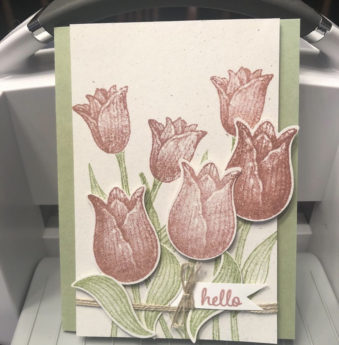
A “throwback” card I didn’t blog about, using the retired Timeless Tulips and Tranquil Thoughts stamp sets from Stampin’ Up.
I discovered some untitled, unposted posts in my WordPress tonight, ones I thought posted already. But as I’ve mentioned, I’ve had trouble getting some of my automatic posts to bounce around to the various apps I initially sent them to. So now I have a “throwback” card, I guess, to share with you (that I thought I’d already shared). And evidently there will be more to come.
This was a make-and-take idea from the 2019 Stampin’ Up OnStage before Covid hit, which I took home that weekend and made almost a year later. I used a retired Naturals cardstock that has little colored flecks in it for the base, with Pear Pizzazz ink and cardstock and Fresh Fig for the tulip blooms. I popped up some of the blooms with Dimensionals (foam dots). “Hello” is also from the retired Timeless Tulips stamp set, but the inside sentiment, “I thought of you today,” came from the Tranquil Thoughts stamp set. I took the completed card to the gift shop that sells my cards, and it did indeed sell quickly. Many thanks to Stampin’ Up for the fun idea.
Hello there and thanks for stopping by my blog! I’m sorry I’ve been quiet lately; I’ve had too many projects and people to please recently. (You all knows how that goes, right? Maybe I’m not the only one? 😂)
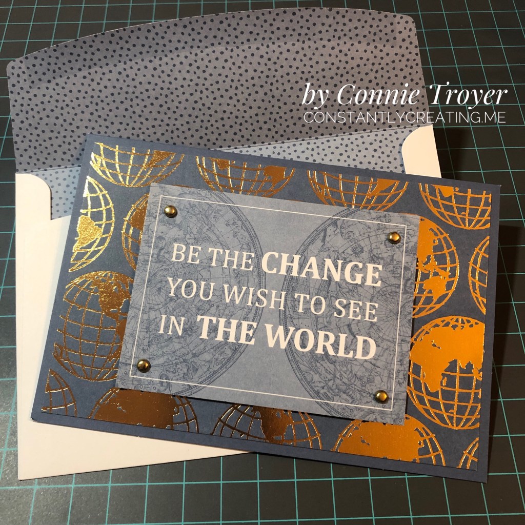
I haven’t had a lot of time in the craft room this month but I did sneak in there a couple of evenings recently to try to finish a batch for my local gift shop/employer. I’ve done a few grad cards and some easy cards. Here’s an easy one you can duplicate if you have or can find the World of Good Memories and More Card Pack and the Flowers for Every Season Cards and Envelopes.
I used a piece of Misty Moonlight cardstock for my A6-sized base first and then picked the large foiled globe card and the smaller 3×4 “Be the Change” card out of the card pack. I adhered the largest card with my preferred glue, and then I measured (yes, I actually measured!) and punched 3/16” holes in the corners for some 3/16” gold brads. Once I had the brads fastened, I popped up the card on foam dimensionals. And that was it! I used a Misty-Moonlight-lined envelope from the Flowers for Every Season Cards and Envelopes and called it done. 😂 I guess simple and easy really is the best. (The next post about a fancy grad card I did this week will be the opposite!) Most of all, I liked the sentiment on this card. I think it could even be used as a grad card, a masculine card, or one of encouragement. Thanks again for visiting, and stay tuned for more when I get time!
Hello and thanks for stopping by my part of this Stamp with Amy K’s Tuesday team blog hop! We’ve made cards “for the ladies” today.
One of my favorite things to do is to encourage my girl friends and other women on my life’s path. I had a Mother’s Day card in mind to create, but I’ve had an excess of other work during the last couple of weeks—so I went with this butterfly one instead. It’s a card I would send to one of my dear friends as a thinking of you or a birthday or a card of encouragement, to brighten their day and make them feel special.
I began the card really just wanting to use up some of my scraps of Flowers for Every Season 6×6 DSP (item #152486, currently on sale for $6.90 on stampinup.com during the Annual’s Last-Chance sale). I found three long and skinny scraps that were around the same size and had a pretty pattern among them that I could use as a center strip.
I decided touse the Misty Moonlight color in two of the strips as the color of my card base, and I glued a mat of Very Vanilla cardstock(item #101650) atop the card base, leaving about an 1/8″ border, to give some separation and definition to the colors in the papers that would be on top. (Forgive me for the guesstimate, but I don’t really measure things; I just work with things until they feel right.)
Once I glued the patterned DSP, I felt the strips also needed some Very Vanilla to break the color clash. Those strips are definitely an 1/8″ each becauseI cut them with my trimmer intentionally. 🙂 I also measured the smaller edge of the DSP strips so that Icould place the floral pieces in exactly thecenter. I use a ruler on my work mat and inch inward by eighths and quarters until I figure out where the middle is. (I do better with seeing physical measurements than with abstract figures.)
To add the butterfly, I first took a piece of recently sold-out Bijou ButterflyDSP and fussy-cut the largest butterfly with my Paper Snips before popping up the butterfly on foam Dimensionals (item #104430) in the top half of the card, leaving room for a sentiment below.
To create that sentiment, I used one of the Stitched with Whimsy Dies (item #155314) and Misty Moonlight ink (item #153118) with a sentiment from the Friends Are Like Seashells stamp set (item #158203).
I first took the die to a scrap of Very Vanilla, which impressed the stitching into the paper. The die does not cut around the stitching; I fussy-cut around it myself with my Paper Snips (item #103579) using the edge of the impression as a guide and then edged it with a Misty Moonlight Stampin’ Write Marker (item #153125 for the In-Color Pack of five).
Then I placed my sentiment stamp on my Stamparatus stamping platform (item #146276), created a few test sentiments forplacement, and finally stamped it where it would fit before decorating the sentiment box with embellishmentsfrom Wonderful Gems, Blue Adhesive-Backed Gems (item #153547), 2020-2022 In Color Enamel Dots (item #152480), and Playing with Patterns Resin Dots (item #152467).
I was able to pull out each of the colors used on the card with those embellishments, so Iwas pleased. (The white space in the corner was just too much for me. If you follow my blog posts, you’ll have heard that I’m not a big fan of white space.) I alsofelt that doing something different with the gems in that way spoke to the “unique” idea of the card.
I plan on decorating the inside of the card with a thinner strip of the floral paper and then selling the card to my local gift shop so one of their buyers canencourage a friend or relative too.
I hope you’veenjoyed my card today. To continue on with the hop, press the Previous and Next buttons or click on the linked names in the list. My team members always come up with inspiring and beautifulprojects! Thanks again for hopping with me. If you like this card, please leave a comment orconsider following my blog for future posts. 🙂
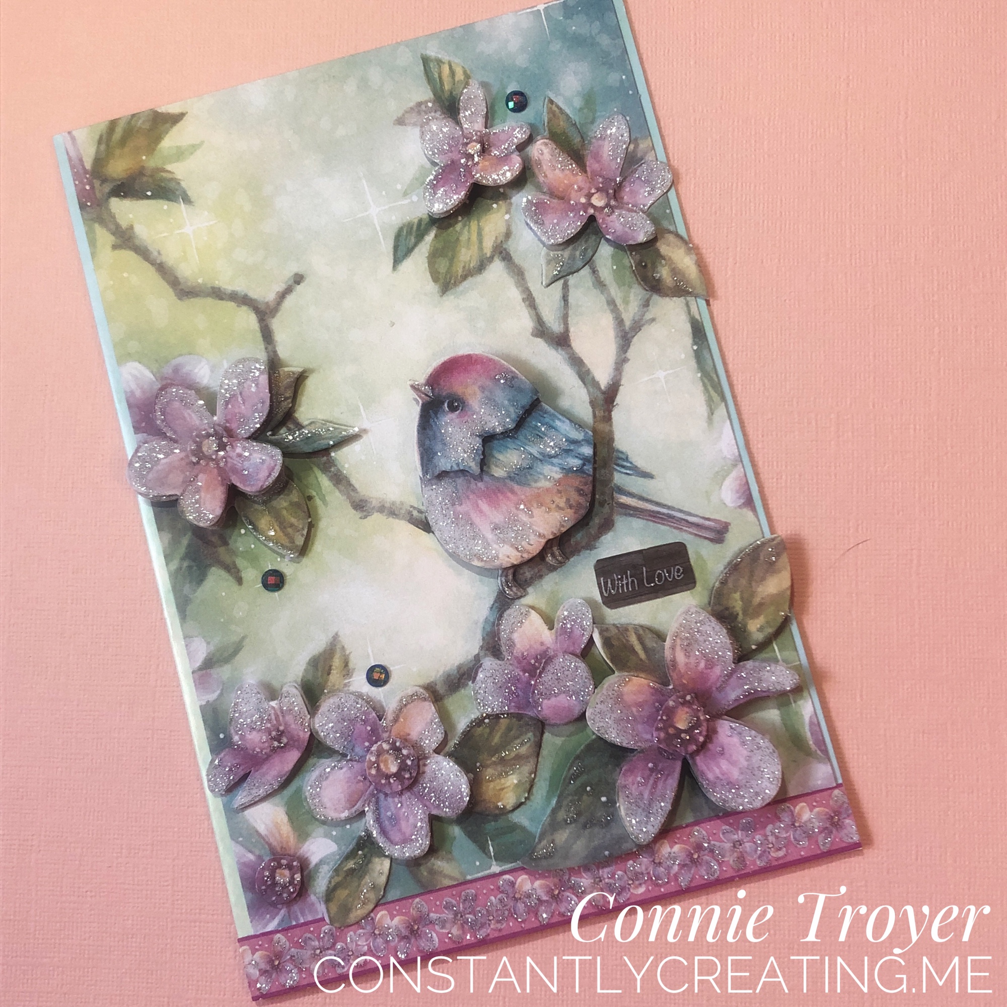
I made a sweet little 3D dry decoupage card from a UK magazine kit last week when I was supposed to be cleaning off my desk. It was just too irresistible not to make! Silver glitter accents the bird, flowers, and bottom border. Foam pads pop up various levels of flowers and the bird for definition. I modified the “Made with Love” label they gave me so it could be used with several kinds of cards. I think I will add matching paper and a butterfly to the inside. It’s the perfect little springtime card.
.
Currently for sale if someone wants to claim it – $5 plus first-class shipping or have me add it to a stack already in process for you! 🙂
Using up a favorite piece of paper with a favorite technique—and it’s so easy that anybody can do it!
Hi, everybody! I’ve had quite a good run on cardmaking lately. I need to be reorganizing my craft room too but can’t seem to stay away from the desk! I know my schedule will be changing soon with springtime, so I’m thankful the creativity is here while it’s here.
One of the challenges I have in my craft room (just a secondary bedroom) is the amount of stuff—consumables like paper, embellishments, and more—due to the number of years I’ve been crafting (paper crafting for about 30 years now; other types, longer). I do confess: I LOVE paper and embellishments. I love having just the right special little thing to add to a card or scrapbook layout to top it off and make it perfect (or as perfect as the receiver will believe it to be 😉). And don’t even get me started on all the beautiful patterns and color choices I have in paper.
Sadly, as my “collection” grows and I fight losing space within four walls, I find myself striving more earnestly to use up my consumables to gain space. I’m not sure this will really work, considering how little room a few pieces of paper and gems take 😆, but I’m going with that for now in an attempt to feel as if I’m progressing somewhere. But that theory is why I made the card I’m sharing today.
I don’t actually know the name of the company who made today’s beautiful background. Sometimes I get papers from other crafters in destashes or swaps or RAKs (Random Acts of [Craft] Kindness). I had only two pieces of this one and always thought them beautiful but I’d moved them around a few times—in and out of the “make these next” piles of card parts, different storage options, and the like. The day I made this card, they moved from “make this sometime” to “make this NOW.” The design was too pretty to put off any longer. But I wasn’t sure what I wanted to do with it (the very reason, I suspect, that I kept moving it around in the first place). I first made a card base out of Stampin’s Up’s Misty Moonlight cardstock(item #153081), which matched the roses perfectly, while I continued to think. I use their cardstock for 99% of my card bases; this color is the regular 80-lb weight.
I must have had 3D things still in my subconscious after making the bird/flower card from a UK magazine kit in a previous post, because I was suddenly willing to sacrifice BOTH pieces of this pretty paper. I latched onto an idea of popping up some of the roses from one sheet on foam dots to give them dimension and make them 3D on the actual card. I cut out the two trio bunches for this and used Stampin’ Up’s self-adhesive Dimensionals underneath (item #104430, current). And then I used my Wink of Stella White and Clear glitter pens on top of all the lightest blue roses, because it’s been my go-to thing lately. I recently opened a new Clear one (item #141897, current) and am loving the amount of glitter it puts out. So fast and easy with an “Ooh, pretty!” punch. 🙂 The White one gives a nice whitewashed look (I only used it on the centers), but I didn’t think it was dramatic enough since the roses were already sketched with white too. It just softened the middles a little.
I was arbitrarily chatting while making this card (“Attempted Multitasking” is often my middle name), so I wasn’t feeling like complicating things further by sorting through my stamp sets, finding a sentiment that fit, hoping to ink and stamp the thing properly in between the dimensional roses—I needed more fast and easy. And then my eyes fell on some recent Paper Pumpkin sets I have stacked nearby. (Yes, Connie should make an effort to use these up more quickly—it will save space! 😂) I hadn’t even opened February 2021’s “Bouquet of Hope” kit yet but I thought there was something in there (consumable) that I could use, from what I was remembering from the promo pictures. Sure enough, sentiments in three languages, in die-cut sticker form. Perfect. And the English one even fit. No mess, no fuss, and I could nestle it into place without worrying about accidentally inking up 3D roses.
I decided to cut apart the “of” and “you” words because I didn’t like how close to the edge the “you” was falling, right where a right-handed person would hang onto the card. But what to do to make everything fit? Well, I ended up sticking the “of” to the top of the bottom dimensional roses and thinly chopping up Dimensional pads to fit under the part of the “f” that hung over the flower. That was tricky, yes. But it’s possible.
Then, time for embellishments! Stampin’ Up to the rescue again (and more gems used up!). I have previously hesitated on adding the Matte Black Dots (item #154284, current) to the top layers of my projects because they’re about 1/8” thick and I often “card” in layers, stacking things even higher. But here I could use them on the bottom layer without fear because the top layer would be against the envelope. 😁 I also scribbled some fake black dots onto the topmost rose trio since I didn’t want to chance them poking through the envelope when mailing. I used my black glitter brush from Art-C for that (very similar to Wink of Stella). I also added three champagne-colored gems from the Elegant Faceted Gems pack (item #152464, current) to the bottom layer to pick up the yellow/gold tones of the smaller flowers in the background. And that took care of the outside of the card.
I kept the inside even simpler. I have several ongoing card orders to fill all the time these days, and one is for a lady who likes a simpler style. (That’s hard for me, but she’s helping me learn it!) I did think of her while making both the outside and the inside of the card, wondering whether she would want it, so I deliberately left the inside blank with just a strip of leftover background paper at the edge of miscellaneous white writing space (a substitute would be Basic White cardstock, item #159276, current).
And now I’ve used up all that pretty paper. But it was worth it. 😍
Here are the links for what I’ve used in today’s post:
If you’d like to own any of these Stampin’ Up products yourself, you can go to my online store and shop with me at http://www.stampinup.com?demoid=2202334. The retiring list for the current Annual catalog hits this Wednesday!! Lots of good stuff coming! (But the Mini is still active until May 3. 😉) Contact me if you’d like paper catalogs instead. 🙂 You can also use Host Code WMW62ECS during checkout and receive a free gift! Orders totaling $50 before tax and shipping can choose a free gift from me up to $8 retail value; I’ll ship it separately to your preferred address after the order is placed. You’ll also earn 1 reward point toward a total of 8, which will get you a free $40 order from me. (And once you hit 8 points, the counter starts over!)
If you’d like to join a Stampin’ Up team and become a demonstrator yourself, I’d love to have you! I’m working on achieving some “leveling up” requirements and would be thrilled to have someone new! No pressure about sales amounts from me, ever. I know what it’s like to lead and juggle a busy life around many priorities. If you’re interested, contact me any time or check out my joining link at http://www.stampinup.com/join?demoid=2202334.
Check back on Wednesday for the 2020-2021 Annual retiring list! And thanks for stopping by. 🥰
Welcome to my blog for Stamp with Amy K’s Inkin’ Krew Blog Hop for Tuesday, August 13! We have a great lineup for you today. Thanks for stopping by to see what I created. 🙂
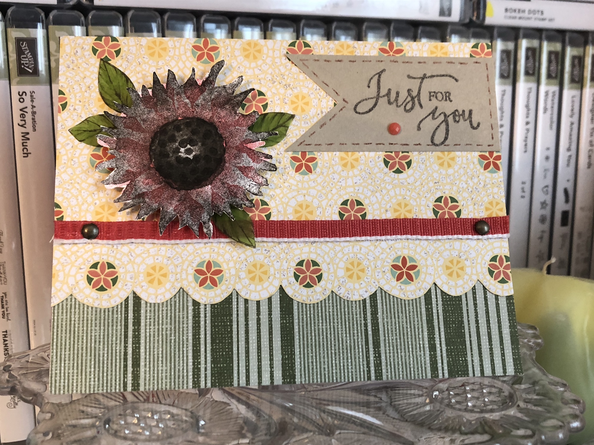
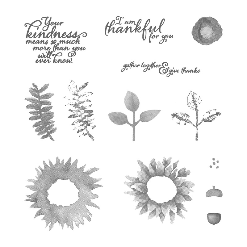
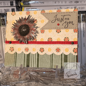
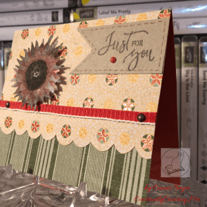
With the seasonal change coming soon, this month’s blog hop theme is “fall frenzy.” So I have a thinking of you/just for you sunflower card to share with you today using Stampin’ Up’s “Painted Harvest” and “Rare Blessings” stamp sets.
Painted Harvest
Rare Blessings
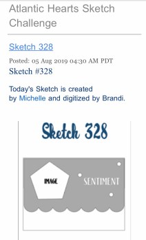
I decided to use last week’s Atlantic Hearts Sketch Challenge—Sketch #328—to give me a basic idea of construction. I don’t use sketches often because I usually just design straight from my brain based on what I’m feeling with the products I see in front of me, but I’ve had a busy weekend (okay, month). I’m thankful I can turn to a sketch or a Pinterest pin for less-than-ideal crafting times when I need to come up with something quickly in either design or time. So here is the sketch image I worked from.
I was also inspired by a card from my teammate Leslie Larkin (leslielarkin.com) that was posted on our team Facebook page last month. After I saw her card, I wanted to make one immediately. I love the black-and-white flower with the color around it (she used Memento Tuxedo Black ink with Lovely Lipstick paper, cardstock, and gems).
So without further paragraphs, let’s get to my card! Although I had to create it in a crunch, I found several ideas vying for realization as I looked through my current DSP and video-chatted with a crafty friend. I didn’t have time to make the five cards I wanted to, so I’ve had to back-burner most of them. I did pull out supplies to make a second card following the same sketch, so I’ll make that and post it another day. Here’s the one I put together for today. (Be sure to catch the updated picture at the end!)
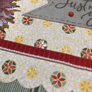
What I ended up using was a Terracotta Tile card base, a sheet of striped paper from the “Come Sail Away” DSP pack (Mossy Meadow color), and a sheet of flowered paper from the Mosaic Mood Specialty DSP (Crushed Curry, Garden Green, Mint Macaron, Terracotta Tile, and Very Vanilla colors). It is a specialty DSP because half the sheets in the pack have Spot UV gloss on the paper to showcase various designs. In the paper I used, the flowered circles have the gloss on them.
I thought the Mosaic Mood paper would work for the scalloped piece on the sketch because the flowered circles are all in a row and have radiating circles around each flower. I just took my scissors and fussy-cut around the largest circle of each flower in the row, up to where it touches the next circle. It seemed the fastest way to move forward on the card and stop all the overthinking I was doing.
The striped Mossy Meadow paper from “Come Sail Away” pulls out the Garden Green from the “Mosaic Mood” paper and balances everything visually. For some reason, I always think stripes go on the bottom. I suppose that’s one of my “ruts” in card-making. However much I tried to argue with that while designing the card, in the end it was easiest to cave and promise myself that I’d try something new later.
Once I had the stripes glued down and the top portion cut, I tried to find a way to use the beautiful 1/2″ Poppy Parade Textured Weave Ribbon in my “current product accessories” bin. I began using the ribbon the way it comes off the roll but didn’t like how it was the same width as the flowered/scalloped border. I needed something thinner, but I only have so many ribbons and twine options right now. So I put some heavy-duty Tear & Tape Adhesive down on one side of the ribbon and did my best at folding it over in half (it’s kind of tricky, actually). And then I located the 1/8″ Glubers glue line I’d cut in half previously for another card. It comes in 1/4″ strips, but as I’ve mislaid my 1/8″ red-line tape, I made do with the other—twice now. Tear & Tape Adhesive would have worked for that as well, but I already had the other one cut and waiting for me.
The metallic brads are basically just decorative. Since I hadn’t yet adhered the flowered piece to my card base, I could still punch a tiny hole on each side of the ribbon, place the brads through the holes, and fasten them at the back before gluing the paper. I’m considering them to be two of the gem places in the sketch, with the third located on the tag. My brads are miscellaneous from my stash, but Stampin’ Up has a great set of Metallic Brads in the current catalog, so I’ll add them to the list of supplies at the end.
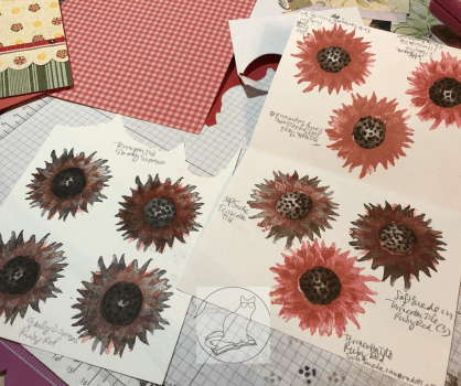
Then came the tedious part of the card—figuring out which colors to use for the two-step photopolymer “Painted Harvest” sunflower. I know I’ve saved some color swatches for this sunflower in Pinterest, but for some reason I thought it would be faster to use the colors I’d narrowed down and stacked on my table rather than search in my Color Combos and Sketches board. Hindsight is 20/20.
I wasn’t entirely sure how the stamping was supposed to go, so I got some scrap paper and started “playing” with the two darker ink colors I’d pulled—Early Espresso and Soft Suede. I did several of both colors as the base. Then I opened the two ink colors in my stash that matched the paper the best—Terracotta Tile and a very old (but perfectly juicy) Ruby Red. I need to get a Poppy Parade ink pad yet. I wasn’t sure which color would work best with both the Poppy Parade ribbon and the Terracotta Tile in the paper.
After too much experimentation, including tone-on-tone and color mixing in the brighter colors, I chose to go with the Early Espresso/Ruby Red combination. The Terracotta Tile is more orange than Poppy Parade, and the Ruby Red has a better balance of an orange and something rosier or pinker when both Terracotta Tile and Poppy Parade are on the same card. The flower spots that have Terracotta Tile in them on the DSP are small enough it doesn’t seem to matter much. I had originally picked a Soft Suede/Terracotta Tile combination, but I didn’t stamp the center quite right on the best piece and royally messed it up when trying to fix it, per my usual. Anyway, that color combination works too.
The center of the finished flower is tone-on-tone Early Espresso. Stamping the center of the sunflower was a little challenging to line up at first, but the more I “practiced,” the better I got at it. So just keep trying while you figure out how it works. After I chose one of the images I’d stamped, I then fussy-cut around the finished sunflower and added pop-up foam dots to the back of it. I’m just now realizing that I probably should have added leaves as well. But I’m calling this card done. Maybe I’ll add leaves before I send it. That’s for another day.
For the “Just for You” tag from the “Rare Blessings” stamp set, I used Early Espresso ink and a scrap of Crumb Cake cardstock. The stamp set is one of the new cling sets, so I had to put it together first with the new stickers (that actually stick to the block!). I actually kind of love doing that with the new stamp sets. 🙂 After that was done and I stamped it on the Crumb Cake, I cut down the tag and snipped up the middle at the left with my scissors to make a banner end. Then I took a Really Rust Stampin’ Write Marker (retired) and added some faux stitching in a thin border just inside the edges of the tag. I would have used an Early Espresso marker, but something happened to mine and I no longer have one. The Really Rust is close enough to the Terracotta Tile that it still matches. And, finally, I added a Terracotta Tile gem from the 2019-2020 In-Color Faceted Dots embellishment pack to the tag as one of the gem spots in the sketch.
I’m not sure what is going on the inside yet. The card is going to a friend who recently lost his mother. I need to look for the right sentiment before I send it with a delayed memorial gift. It’s been a busy year here. But at least I’m one step closer in getting the card and gift sent out the door.
UPDATE!: I decided to add some vellum leaves from the Magnolia Lane Memories and More Card Pack around the flower. I fussy-cut them and colored them on the front and back (to make them darker) with my Dark Old Olive Alcohol Blend marker. (I don’t have the Mossy Meadow Blends yet, so I made do.) The sentiment on the inside reads “With Deepest Sympathy” and is from the current Golden Afternoon stamp set. I stamped it in Crumb Cake. I also ran one of the sticker border strips across the bottom of the inside from the Magnolia Lane Memories and More Card Pack. NOW I’m finished with the card. 🙂
That’s all for today. Stay tuned for the next card using “Painted Harvest” and Sketch 328. Thanks again for visiting! Feel free to post questions or comments. Below the list of blog hop participants of my Stampin’ Up team members are the products I used in my card. You can purchase any of them through my online store here—or just click on the picture—and if you use the host code 3W7RXKCU when you check out, I’ll send a free gift your way! Also, if you happen to need a current Annual Catalog or the upcoming Holiday Catalog (which should arrive on my doorstep tomorrow), I’m happy to send you one! Just use the Contact Me link at the top of the main page.
To continue with our blog hop using the arrows, click Previous to view Paula Vincent’s offering or Next to view Karen Ksenzakovic’s card. Or you can click any of the links below to go directly to any demonstrator’s blog.
So what’s the first thing I do after a week of hard mental labor with *zero* time in the craft room, before I even go to bed? Make a card, of course! Thanks to Deb for the kit pieces – I just rearranged them in a pleasing arrangement. 🙂 And there’s another waiting yet. But bedtime first. #cardmakersofinstagram #easypeasy #randombits #thelittlewhatnotshop #constantlycreating
A bit about the Notes of Kindness card kit I made up recently – twenty cards in one night!
I promise that I make more than card kits these days – and I’ll have some individual cards blogged about soon – but right now I’m trying to accumulate some stock for my local gift shop and get ahead on cards I need to send myself. 🙂
I recently found myself looking at another card kit I had waiting, and before I knew it, I had a bunch done! As a matter of fact, I made all twenty cards in one sitting (though I did go back and add sentiments to a few insides the next night). That’s just not me. I take way too long to make cards with my level of detail. What a freeing, productive feeling it was to have that many done at once! And I didn’t feel like the designs were too simple for my style, either.
This particular card kit, the Notes of Kindness All-Inclusive Card Kit, is current in the 2018-2019 Annual Catalog from Stampin’ Up, on page 7. The kit itself is $35 but it comes with a clear stamp block, an Archival Black ink spot, a 6-piece set of photopolymer stamps, Copper Baker’s Twine, adhesived mini pearls, Stampin’ Dimensional pop-up dots, die-cut sentiment stickers, die-cut flowers, lined envelopes, twenty printed card bases, and a kraft box you can store or gift them in. Full-color picture instructions are also included. All you need is your choice of adhesive and anything extra or different that you want to do.
There is also a refill kit you can purchase for $21 that includes all this except the stamp set, block, ink, and box – and the refill makes another twenty cards. (I know what is on my wishlist!)
I snuck another stamp set into my work so that I had “Best Wishes” wedding and anniversary cards as well as thank-yous. I also used some Wink of Stella Clear on some of my flowers to make them sparkle and shine. I made the card fronts the way the kit suggested otherwise. I did use some retired thank-you stamps on the insides where appropriate, just so I had some variation. And I was even able to use one of the German sentiments that are included. I live in a Pennsylvania Dutch area and thought I’d test one and see if it sells. (There are French sentiment stickers too!)
The colors in the kit are some of my favorites: Blushing Bride, Blackberry Bliss, Soft Seafoam, Mint Macaron, Mossy Meadow, and Basic Black and Whisper White. Though the sentiments inked up well, I love that they are photopolymer – for just in case I needed to realign something.
I think this one is my favorite. I turned it into a 5-piece card set complete with acetate box and pen!
You can see some Wink of Stella shimmer on the dark parts of this flower too.
I used the current Stitched All-Around stamp set for the “Best Wishes” cards (inside and out).
For this tiny thank-you sentiment with the twine behind it, I laid down some ATG tape first, to keep the twine controlled, before adding the Stampin’ Dimensionals and sentiment.
You can really see the Wink of Stella shimmering on this succulent. I varied where and how much I used it on the succulents but ended up loving them all!
Anyway, I’m not usually a card-kit user, but I’ve been beginning to change my mind about them. As long as they don’t feel too simple to me, I’ll probably give others a try now too. I also still have the Lots of Happy kit to finish sometime. 😉
If you’re interested in trying this kit or others, or if you need some supplies, I’m happy to be your Stampin’ Up demonstrator! Sale-a-Bration just started this week, which means you can get a free select product with any $50 purchase. And they even have a couple of amazing products for $100 orders! SAB goes through March 31. Let me know if I can help! ❤️
For my second time “hopping” with Amy’s Inkin’ Krew on Tuesdays, I chose a simple thank-you card that anyone can make.
Hello! It’s time (somehow) for my second team blog hop with Amy’s Inkin’ Krew! This month’s theme is “Giving Thanks,” so I have a simple thank-you card to share today. It didn’t take much time at all, and it’s one anybody can make!
I’ve remarked in past posts how difficult thank-you cards seem to be for me to get out on time. I found a new way to help speed up the process. This kind of card always brings out the scrapbooker in me. First, there is no stamping on it at all. And second, I used a front piece that is part of a 12″x12″ piece of decorative paper from American Crafts (item # 320490) that I picked up at JoAnn Fabrics in the open-stock paper section some months back. The paper included twelve different “seed packets” that said various things. All show flowers or a type of plant. You can see another example of one here. I merely cut them apart with my trimmer and sorted them by type before filing them for later. They weren’t all about gratitude, but I did set those aside so I could reach them quickly in an effort to get them onto cards and out the door faster. 🙂
So since I knew what main piece I was using, I just built the rest of the card from there, using the colors I saw. I had a retired piece of Stampin’ Up 80-lb cardstock (possibly Bashful Blue) that I cut into two bases, using one for this card and saving the other for later. I chose it because of the tiny little circle flowers behind the orange poppies (if they are poppies). I had to try out several versions of patterned paper for other layers between them to see what looked best. The little orange-and-yellow flowered patterned piece directly underneath is from a pack of retired Designer Series Paper from Stampin’ Up. I had always wondered what I was going to use that scrap piece for. It fit just right. 🙂 The neutral chevrons are from an Art-C Ephemera Pack. It was the only cardstock in the pack and I just wanted to use it up so I didn’t have to keep awkwardly storing it in the package. A bonus was that it toned down the orange flowers and grounded everything with its “neutralness.”
It was actually hardest to figure out the arrangement of the pieces after I knew what matched. I was not following a sketch, instead just making it up as I went along. I rearranged things several times and eventually decided that it was too plain as is – no embellishments?? – so I wanted to add the Pool Party Thick Baker’s Twine (the closest color I had to the blue base)…but I didn’t like any place I put it overtop the seed packet design. And the layers were a little too boring for me just one after another. (Though, granted, that would have been even easier and faster to make!) So I placed the seed packet piece above the chevrons and left a large space for the baker’s twine to go across as a decorative detail. Thankfully I thought ahead a little bit, because I realized before I glued it down that the baker’s twine (rightfully called “Thick”) is difficult to place underneath patterned paper without gaining a large bump in the paper and awkward gluing. That’s where the foam pop-up dots come in.
I used my ATG tape gun to adhere the seed packet to the chevron piece, leaving the top portion unglued, so that it essentially became one piece instead of two. Then I put pop-up dots on the back side of both papers regardless of where they overlapped. Before taking off the backing paper of the pop-up dots, I fed the twine under the chevron layer and arranged where I wanted it to lay in the end. Then I carefully took up the unattached background and pulled off the pop-up dots before placing it down just as carefully (and hopefully straight). I tied the ends of the twine into a bow and moved on.
To bring a little more detail to the card, I wanted to bring out the little dots in the centers of the orange flowers (Merriam Webster tells me those things are called “anthers,” so I learned something tonight). My first thought was to use my liquid Ranger’s Inkssentials Enamel Accents bottle of black, which dries nicely with a bit of a 3D idea off the paper; however, I didn’t have a lot of time and I would have had to move other things to get to it. I had a bottle of Ranger’s Adirondack Dimensional Pearls in the Espresso color nearby that I hoped was dark enough to get the look I wanted without being too off-color. It is more like a lovely chocolate brown, but it seemed to dry a little darker, and since there wasn’t much of it on the card anyway, it worked out well. So well that at first I thought I had used the Enamel Accents after all, when I started writing this post. 🙂 I just slowly worked a little out of the bottle and dabbed the tip near or to the so-called anthers, before putting it aside and letting it dry overnight. They still dried a little “puffy” like I had wanted for texture.
With the inside, I knew I would be writing a long note, because it was also going to be a “catching up on life since I haven’t called” kind of card. So I just used the smallest scrap of chevron paper and glued it horizontally on the bottom of the inside. (And then I ended up writing on it anyway, so I probably should have just left it off.)
So that’s it. To recreate the card, just find one of those 12″x12″ sheets (I’ve seen several kinds now since I bought the first one), cut it apart, and find paper and string to match it. And decorate otherwise if you wish. Easy-peasy. 🙂
Thanks for joining me today! To continue “hopping” with the Krew, you can click the “Next” (forward) button to view Shirley Gentry’s card or the “Previous” (backward) button to view Linda Richenberg’s takes on “Giving Thanks.” I have such amazing team members who do wonderful work. Please be sure to check them out. 🙂 See you next time!
If you get lost or want to hop around the participants, here is the lineup of Krew members:
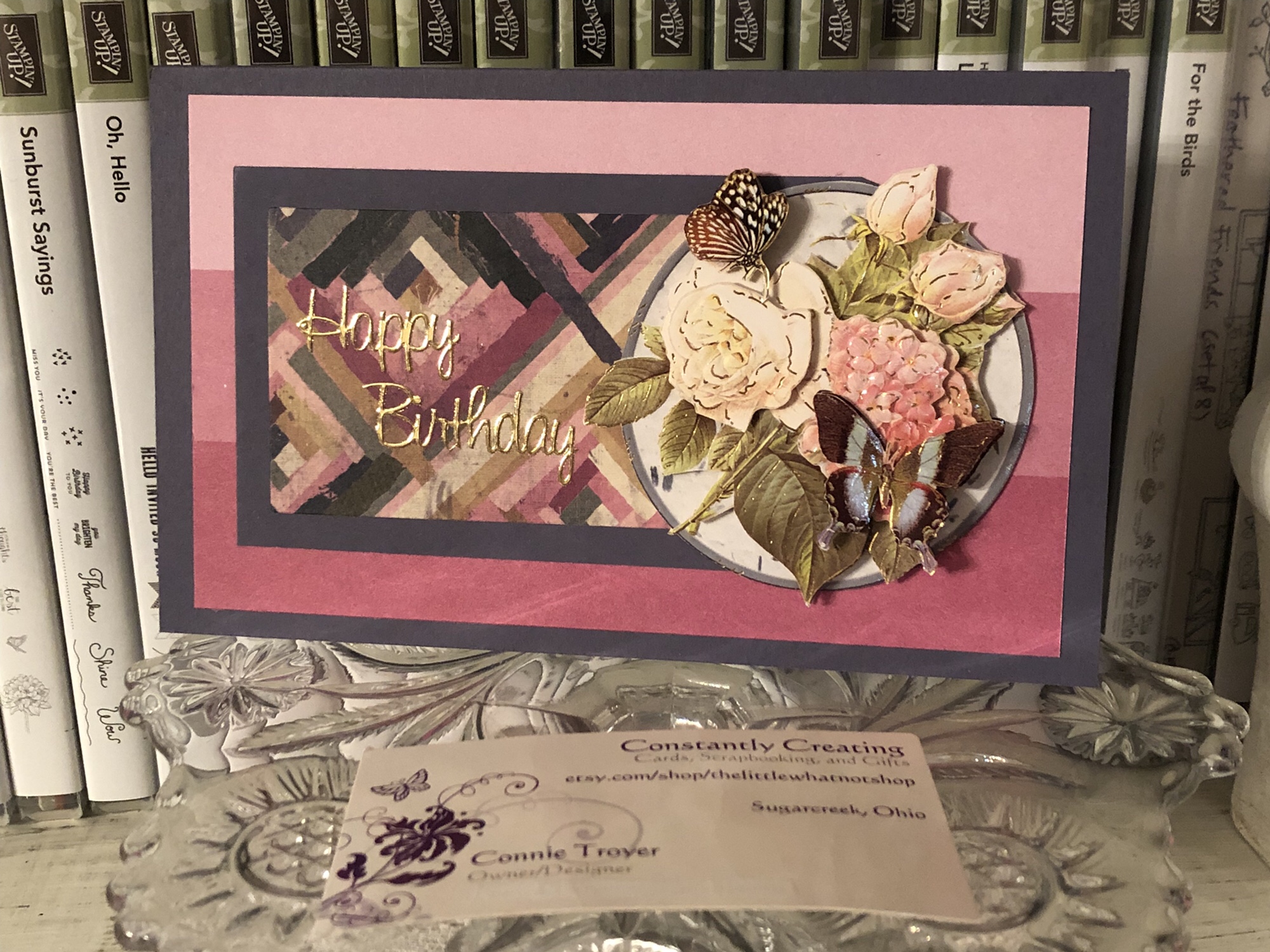
A quick decoupage birthday card I created before bedtime.
Last night I attempted to go to bed a little earlier, but I still had some time to kill before actually turning in (the brain was still restless, looking for something to amuse itself with).
I had wandered into the craft room for something else and ended up stumbling upon this Log Cabin quilt paper remnant on the desk while putting some things away. And oddly enough, there was matching SU designer series paper and cardstock right beside it in a heap intended for quilt cards for the local gift shop. Not for the particular card they ended up creating, but at least they’re being used, right?
I’ve also started keeping a new organizational system for pieces I can grab and adhere to cards quickly, trying to speed up my creative process. So before I stacked any layers together, I turned to my “Card Toppers to Use” drawer and this 3D flowered circle was the first one I pulled out. And it even mostly matches. 🙂 Just had to decide how to utilize the card front’s space.
This was the arrangement that seemed most pleasing to me – and I even ended up using a very retired color of SU cardstock for the base and middle layer as a plus! (No idea what color it is…it was an In-Color back 10-15 years ago! I haven’t researched it.)
The 3D pieces are some of my favorite ones to make. It’s so relaxing to sit there and fiddle while talking or listening to something else. And they’re pretty impressive up close.
I had a pack of gold Dazzles sentiments on my desk in the heap as well, so I cut apart a “Happy Birthday” one to make it fit better, and it went on easily. I refrained from adding any Wink of Stella or bling bits, as the card front is busy enough already.
The inside of the card is simply a scrap of border paper from a UK magazine (love those!) and a sentiment from a Studio 112 clear stamp set on top of a remnant of white. I used Stampin’ Up’s Sweet Sugarplum ink for the saying.
This card feels supremely satisfying to me. It didn’t take me long at all to create it from start to finish – maybe 20-30 minutes? – and even though I was just throwing bits of random things together, it turned out to be something pretty. I think that method is actually my favorite way of creating and also turns out my most creative works, making something out of nothing missing any semblance of sense at the start. 🙂
I’m not sure who is going to end up with this card, so it’s currently for sale if someone wants it. It may end up at the gift shop otherwise, if they like it enough. 🙂

![IMG_E3143[1]](https://constantlycreating.me/wp-content/uploads/2023/06/img_e31431.jpg?w=840)
![IMG_E3144[1]](https://constantlycreating.me/wp-content/uploads/2023/06/img_e31441.jpg?w=840)