“Cherish Every Moment” Card Using Stampin’ Up’s Forever Blossoms Stamp Set and Perennial Essence DSP and Vellum

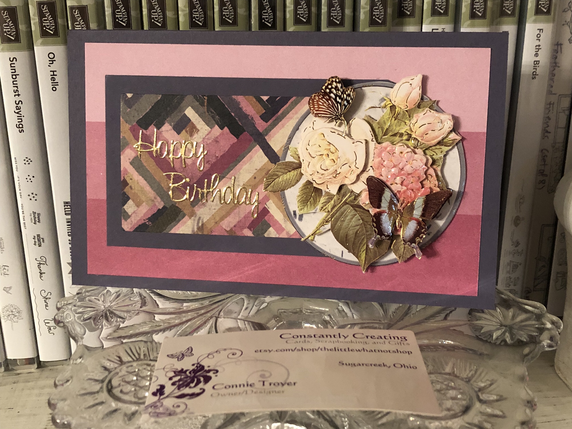
Hello there! Welcome back to my blog. I made this card last week when I spotted my remaining scrap (less than a 6×6) of this pattern of floral-patterned paper in the Perennial Essence Designer Series Paper pack, #149100 (which is currently on the last-chance list for $8.09! Go get one!). My scrap was just so pretty that I had to use it up. I looked up the colors in the pack (Balmy Blue, Blackberry Bliss, Blueberry Bushel, Calypso Coral, Crushed Curry, Flirty Flamingo, Mossy Meadow, Old Olive, Petal Pink, So Saffron, Whisper White) and picked Petal Pink for my card base. Then I reached for my matching vellum (Perennial Essence Vellum Cardstock, #149101) and picked the Old Olive color. (The vellum pack also has Petal Pink and So Saffron.)

To decide how much of the scrap I wanted to use and where to cut it, I first stamped my sentiment (from the Floral Blossoms stamp set, #151457, which is carrying over) in Old Olive ink, #146090, so that I could narrow down the dimensions and have more exact placement. I knew I wanted to mat the floral image to give it distinction from the Petal Pink card base, since there is so much Petal Pink in this particular scrap of DSP. (Isn’t it pretty? I always love a good watercolor image.)

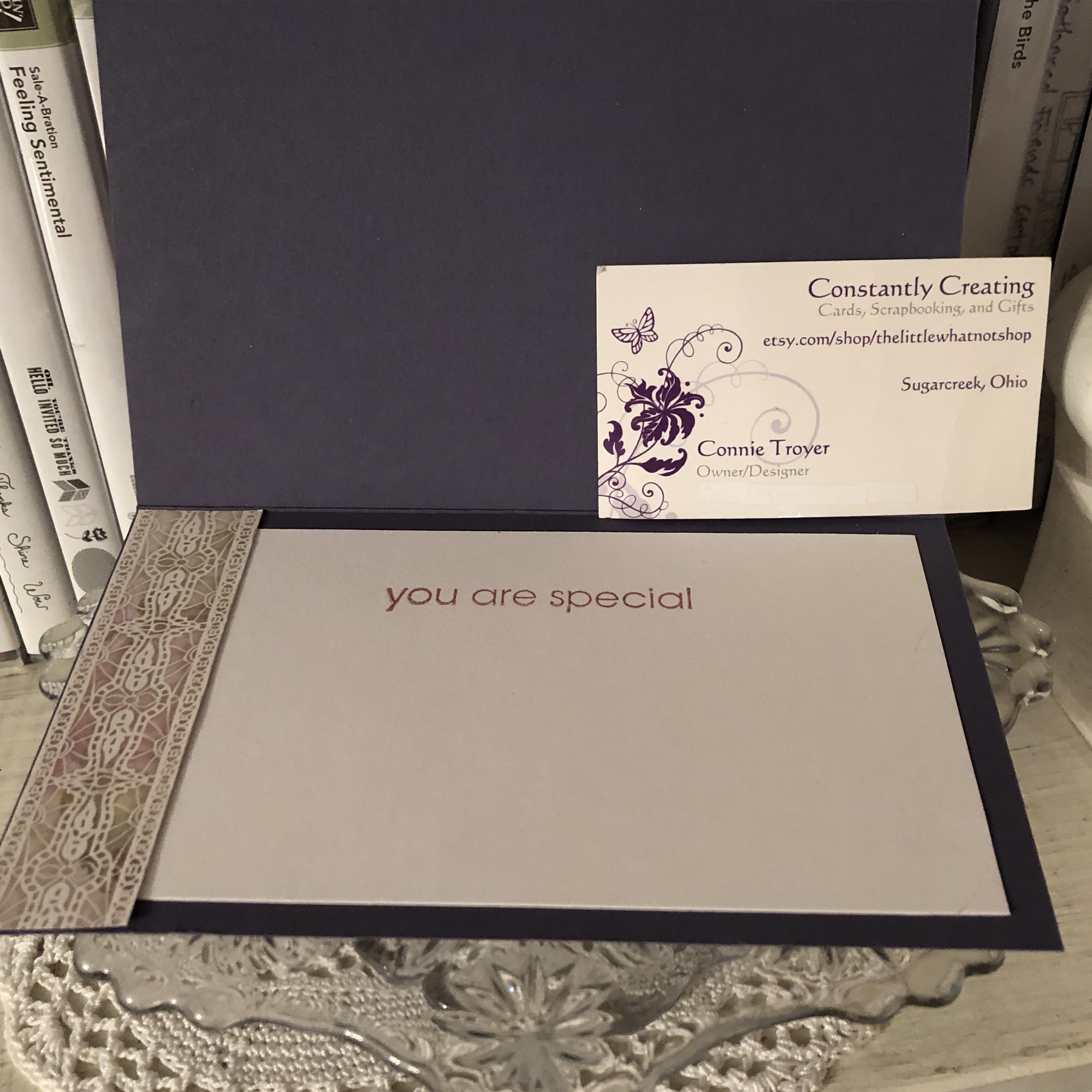
After cutting the vellum, I then decided to emboss the Old Olive with the Subtle Embossing Folder, #151775, to have a small pattern that would complement rather than draw attention away from the flowers. When I flipped over the vellum to put some adhesive on the back that would be behind the flowers, that’s when things changed. I stopped mid-glue because I suddenly realized how cool the back side looked. The embossing—or, rather, the debossing—made the vellum turn kind of white with the creasing! Well, then I was torn; I liked both. I decided to take pictures of each side to show you and also to be able to make a decision—sometimes I see things differently when I view a photo I’ve taken, even if I’m the same distance from the image and looking at it in real life. I’m curious to see which side you like best. Leave me a comment and let me know which side—or which card—you would have gone with. 🙂

untitled design
Green debossed “whiter” side
by connie troyer constantlycreating.me
Green embossed vellum, colored side up


untitled design-1
The way my original idea would have looked with the green vellum pointing up

I decided that I definitely liked the whiter side up and set about doing a double layer of matting to really hone in on the vellum (while still not taking away from the flowers). Pleased with my choice, I glued the now-white vellum to the larger unembossed Olive Olive vellum and the floral piece to the other smaller piece of Old Olive vellum, for two different mats. I think double matting just gives an elegant, intentional, thoughtful look to the thing being matted. I do this in my scrapbooking at times too, to help feature certain photos. When I look at the above picture now—the green-embossed side up, without the mats—it just feels so much plainer to me. (Of course, I would have added embellishments to it too.)

untitled design
Exterior of finished card
untitled design-2
Interior of card (so far)

So there you have it, readers! Let me know what you think about this card and what you would have chosen. Clickable links for the products I’ve used are below.

If you don’t already have a demonstrator and would like to receive a free catalog from me, submit your name and address in my contact form and I’ll send one right out to you (remember, the catalog goes live on June 3!). I’m also working on my first product share offering and will post details about that soon in case anyone wants to buy in. (If you’re not familiar with a product share, it’s a sampling of new product from the new catalog—though I’ll probably also have an “old product” version too, in case some want everything. That way you get a little bit of all the fun DSP, embellishments, and ribbon without the gigantic cost of buying it all individually. So stay tuned for details on that!)

Thanks again for stopping by today. Let me know if I can help you!

______________________________________________________________________________________________

My host code from now until the the end of June is GCXZKQT9, which you can add to your order before you check out. As a reminder, if you order $250 worth before tax and shipping are added in, don’t add the host code since you’ll be prompted to put in your own rewards—your own little party! And anyone who orders $50 before tax and shipping gets a free gift of up to $8 from me, along with a reward point toward a free $40 order from me to you. When you collect 8 reward points, you’ll just need to tell me what you want and I’ll have it shipped out to you, as my thanks for being my customer. 🙂 Contact me if you have any questions!

_____________________________________________________________________________________________


Product List

Berry-and-Blue Birthday 3D Decoupage Quilt Card

A quick decoupage birthday card I created before bedtime.

Last night I attempted to go to bed a little earlier, but I still had some time to kill before actually turning in (the brain was still restless, looking for something to amuse itself with).

I had wandered into the craft room for something else and ended up stumbling upon this Log Cabin quilt paper remnant on the desk while putting some things away. And oddly enough, there was matching SU designer series paper and cardstock right beside it in a heap intended for quilt cards for the local gift shop. Not for the particular card they ended up creating, but at least they’re being used, right?

I’ve also started keeping a new organizational system for pieces I can grab and adhere to cards quickly, trying to speed up my creative process. So before I stacked any layers together, I turned to my “Card Toppers to Use” drawer and this 3D flowered circle was the first one I pulled out. And it even mostly matches. 🙂 Just had to decide how to utilize the card front’s space.

This was the arrangement that seemed most pleasing to me – and I even ended up using a very retired color of SU cardstock for the base and middle layer as a plus! (No idea what color it is…it was an In-Color back 10-15 years ago! I haven’t researched it.)

The 3D pieces are some of my favorite ones to make. It’s so relaxing to sit there and fiddle while talking or listening to something else. And they’re pretty impressive up close.

I had a pack of gold Dazzles sentiments on my desk in the heap as well, so I cut apart a “Happy Birthday” one to make it fit better, and it went on easily. I refrained from adding any Wink of Stella or bling bits, as the card front is busy enough already.

The inside of the card is simply a scrap of border paper from a UK magazine (love those!) and a sentiment from a Studio 112 clear stamp set on top of a remnant of white. I used Stampin’ Up’s Sweet Sugarplum ink for the saying.

This card feels supremely satisfying to me. It didn’t take me long at all to create it from start to finish – maybe 20-30 minutes? – and even though I was just throwing bits of random things together, it turned out to be something pretty. I think that method is actually my favorite way of creating and also turns out my most creative works, making something out of nothing missing any semblance of sense at the start. 🙂

I’m not sure who is going to end up with this card, so it’s currently for sale if someone wants it. It may end up at the gift shop otherwise, if they like it enough. 🙂

One Embossing Folder, Three Looks (Including SU Hanging Garden)

View on Instagram https://ift.tt/2GJF3Yv
Three different looks to using the same Darice embossing folder and SU Orchid Opulence cardstock. Two of the cards have embossing, and my favorite has debossing. All were glittered with Wink of Stella Clear, white, and/or gold glitter pens. All ribbon and twine is Stampin’ Up too. Sentiments are Sticko stickers, a Stampin’ Up stamp (from “Hanging Garden”), or gold Dazzles. The card with the lace has a set-on, popped-up front.
#thelittlewhatnotshop #forstacy #fordixie #darice #embossingfolders #stampinup #winkofstella #orchidopulence #etsysellerofinstagram #bakerstwine #laceribbon #coloringwithmarkers #embossing #debossing #flowers #dazzles #hanginggarden #sticko #customorders

Masculine mover thank-you card 4

Card 4 in my series of five masculine thank-you cards for movers.

Continuing in my set of five masculine thank-you cards (to be sent to people who helped my client move), this “Card 4” is another one where I couldn’t get the brown-and-white DCWV “key” paper to work with the plaid and metallic silver-toned base. The colors just weren’t compatible enough. But I thought it would still be simple and masculine, two other requirements for the order, so I continued.

At this point in the order, it was just about keeping things consistent (like the gold embossing powder)…and I’d already used the plaid once on a different card anyway (in my “Card 1” post here). This section was the remnant of the 6×6 piece. I like to use up my scraps when I can to keep my scraps box under control, so there wasn’t much question as to whether I’d use it now. (It was “either use it now” or throw it on the desk to be used soon, since I couldn’t really take the time to look up which Stampin’ Up paper pack I’d taken it from. The scraps box wasn’t an option. I’m fussy about my SU paper and always put the scraps back with their pads since I have matching inks and embellishments in my supplies.)

I wish I knew what company this base is from. I was given a number of thick metallic bases in a craft swap, and they’ve been great to work with. They feel thicker than the usual Stampin’ Up cardstock I typically use for my bases (those are an 80-lb card weight, I think). A good base is key to the card not falling over or flattening instead of standing up.

The mechanics of how I did this card are simple. I’ve already mailed the cards, so I’m not sure of the precise measurements of the individual pieces, but I think the remnant plaid piece is just over 2 inches. I believe the squarish one in the middle was the back side of the grey plaid paper I used in “Card 1” (K and Company). I already had a chunk cut out of it for the other card, so one side had already been shortened. I measured where I wanted it to fall on one of the strips of the yellow-and-grey piece and lopped off the other side with my Fiskars trimmer.

(Confession: I don’t do a lot of measuring or precutting. It’s more annoying to store the paper as pieces get cut out of it, but I’m always afraid of limiting myself to certain sizes or creativity if I “only” have so much of something because I’ve cut it down. I do both scrapbooking and cards, so I can be pretty random in my sizing of card fronts, mats, and journaling boxes. Usually I just take the large piece of paper and a pencil straight to my project and mark where I want to cut it for that specific purpose and then file the rest away to use later. I probably ought to rethink this as I try to streamline my process for card making, since precut pieces would make it faster, but I’ve been loathe to change.)

snapseed

Once I had the grey square piece cut, I took my anti-static bag to the front (I remembered!) to prepare it for heat embossing. I already had my embossing tray, coffee filter, embossing powder, and heat gun out (and just typing that sentence shows why it’s easier to do multiple cards with the same supplies at once), so I stamped the thank-you stamp (“One Big Meaning,” Stampin’ Up, current) with my VersaMark pad, pressed it onto the grey piece (don’t wiggle it!), sprinkled it with the gold embossing powder (Hampton Arts), and took my (very old) Marvy Uchida heat gun to it. (See this post about why I use a coffee filter with my embossing powder.)

It actually turned out well! Though I am beginning to wonder whether my powder is too old – or maybe it’s just the brand. I don’t think my Stampin’ Up powders dimple like that, but they’re newer. And I don’t heat emboss all that much, so I haven’t really compared it to my others yet. The dimpled look is fine for these masculine cards and during other times as well, but occasionally I do want a smoother look, which seems possible with other powders. Or companies. This is something I need to research. (If anybody has any knowledge or tips, feel free to leave me a comment!) After I glued the square piece onto the plaid one with my ATG gun, I repeated the embossing process with the “for your kindness” stamp (“So Very Much, Stampin’ Up SAB set, retired). Then I sat back and took a look at it to see if the card “needed” anything else.

It wasn’t very long before the empty spaces in the square bugged me. This is why I have trouble doing simple cards. I apparently despise “white space.” My husband is forever telling me to leave things alone and not fill every little area. I’m not very good at that. But sometimes something actually needs to be filled and looks better once it is. I think that’s the case with this one. It would have been fine on its own, but the little added touches make it more special. I used a gold peel-off from Dazzles for the top swoosh and heart doodads – not sure which exact one, since I’m still not near my supplies as I write this. (I’ve figured out how to blog ahead of time and schedule posts!) After I was done with the center, I adhered my Crushed Curry Enamel Dots (Stampin’ Up, retired) at the edges of the plaid piece. I probably could have left those off entirely, but I had pulled them when I was looking for something to finish off the grey square, so they were in front of me. And I don’t “leave well enough alone” very well either. 🙂

I was pleased with how this one turned out. It fit the requirements and didn’t take overly long.

Thanks for stopping by!


Pat's Blog Site

One place to fit it all!

Stamp Dabbles

Donna Leonard | Independent Stampin’ Up! Demonstrator | Huntsville, AL

Niya Scrap

Démonstratrice indépendante Stampin' Up!®

From Pole to Pole

Adventures in the Land of the Pierogi

Stampin' in the Meadows

Akiko Sudano - Independent Stampin' Up! Demonstrator Downingtown, PA

Creative Stamping Designs

Karen Ksenzakovic, Independent Stampin' Up! Demonstrator in Somerville, NJ Let's make some cards!!

Stamp it up with Jaimie

Helping you find a stress free creative outlet through paper crafting.

Stamp With Amy K

Amy Koenders, Independent Stampin' Up! Demonstrator in Mendham, New Jersey...Let's make some cards!

The Daily Post

The Art and Craft of Blogging

WordPress.com News

The latest news on WordPress.com and the WordPress community.

%d bloggers like this: