Hello there! Welcome back to my blog. I made this card last week when I spotted my remaining scrap (less than a 6×6) of this pattern of floral-patterned paper in the Perennial Essence Designer Series Paper pack, #149100 (which is currently on the last-chance list for $8.09! Go get one!). My scrap was just so pretty that I had to use it up. I looked up the colors in the pack (Balmy Blue, Blackberry Bliss, Blueberry Bushel, Calypso Coral, Crushed Curry, Flirty Flamingo, Mossy Meadow, Old Olive, Petal Pink, So Saffron, Whisper White) and picked Petal Pink for my card base. Then I reached for my matching vellum (Perennial Essence Vellum Cardstock, #149101) and picked the Old Olive color. (The vellum pack also has Petal Pink and So Saffron.)
To decide how much of the scrap I wanted to use and where to cut it, I first stamped my sentiment (from the Floral Blossoms stamp set, #151457, which is carrying over) in Old Olive ink, #146090, so that I could narrow down the dimensions and have more exact placement. I knew I wanted to mat the floral image to give it distinction from the Petal Pink card base, since there is so much Petal Pink in this particular scrap of DSP. (Isn’t it pretty? I always love a good watercolor image.)
After cutting the vellum, I then decided to emboss the Old Olive with the Subtle Embossing Folder, #151775, to have a small pattern that would complement rather than draw attention away from the flowers. When I flipped over the vellum to put some adhesive on the back that would be behind the flowers, that’s when things changed. I stopped mid-glue because I suddenly realized how cool the back side looked. The embossing—or, rather, the debossing—made the vellum turn kind of white with the creasing! Well, then I was torn; I liked both. I decided to take pictures of each side to show you and also to be able to make a decision—sometimes I see things differently when I view a photo I’ve taken, even if I’m the same distance from the image and looking at it in real life. I’m curious to see which side you like best. Leave me a comment and let me know which side—or which card—you would have gone with. 🙂
Green debossed “whiter” sideGreen embossed vellum, colored side up
The way my original idea would have looked with the green vellum pointing up
I decided that I definitely liked the whiter side up and set about doing a double layer of matting to really hone in on the vellum (while still not taking away from the flowers). Pleased with my choice, I glued the now-white vellum to the larger unembossed Olive Olive vellum and the floral piece to the other smaller piece of Old Olive vellum, for two different mats. I think double matting just gives an elegant, intentional, thoughtful look to the thing being matted. I do this in my scrapbooking at times too, to help feature certain photos. When I look at the above picture now—the green-embossed side up, without the mats—it just feels so much plainer to me. (Of course, I would have added embellishments to it too.)
Exterior of finished cardInterior of card (so far)
So there you have it, readers! Let me know what you think about this card and what you would have chosen. Clickable links for the products I’ve used are below.
If you don’t already have a demonstrator and would like to receive a free catalog from me, submit your name and address in my contact form and I’ll send one right out to you (remember, the catalog goes live on June 3!). I’m also working on my first product share offering and will post details about that soon in case anyone wants to buy in. (If you’re not familiar with a product share, it’s a sampling of new product from the new catalog—though I’ll probably also have an “old product” version too, in case some want everything. That way you get a little bit of all the fun DSP, embellishments, and ribbon without the gigantic cost of buying it all individually. So stay tuned for details on that!)
Thanks again for stopping by today. Let me know if I can help you!
My host code from now until the the end of June is GCXZKQT9, which you can add to your order before you check out. As a reminder, if you order $250 worth before tax and shipping are added in, don’t add the host code since you’ll be prompted to put in your own rewards—your own little party! And anyone who orders $50 before tax and shipping gets a free gift of up to $8 from me, along with a reward point toward a free $40 order from me to you. When you collect 8 reward points, you’ll just need to tell me what you want and I’ll have it shipped out to you, as my thanks for being my customer. 🙂 Contact me if you have any questions!
Back in the summer, I was asked to make a special birthday card for a special friend’s son who has a fondness for foxes—all shades and types. She gave me free creative rein and said she didn’t care what I did with the idea, but that he might like a red one. I considered several different fox stamps and stickers but finally chose a particular stamp that shows foxes in a wintry scene since his birthday was in February (“300-16 Red Foxes and Birches,” Stampa Rosa).
I’ve never really thought much about foxes in my life, other than thinking they’re beautiful animals in general, so I had no idea how to shade one. Coloring is something I’m still not comfortable with, because I feel like the concept of shading is one I haven’t begun to learn. Luckily for me, the wooden stamp I was using had a colored picture on the front that I just had to attempt to recreate! 🙂
First I had to choose the right paper, though, which evidently was not the bumpy watercolor paper I tried to stamp on first (twice). I knew that, but I was thinking of using my water-filled Aqua Painter on it and felt the paper would handle it. I liked the textured look of the watercolor paper too, but the image was too detailed to stamp cleanly with the bumps in the paper. Then I remembered Stampin’ Up’s Shimmery White cardstock, a must-have in my collection. It’s not any thicker than the rest of their cardstock (other than the aptly named “Thick” cardstock in the line), but it’s smooth and somehow holds up great with watercoloring–and it’s sparkly to boot (hence the “Shimmery” part of the name). Bonus for me was that the paper helped my snow scene sparkle.
Once I had the paper figured out and the stamp stamped correctly, I took my watercolor pencils and tried to emulate what I saw on the wooden stamp block. I had to mix a few shades to get that red fox coat color with the darker spots. After using the watercolor pencils, I took my Aqua Painter to it as planned and went back and forth between the two tools a few times until it felt right (because I have no idea what I’m doing, really. I’m assuming I’ll get better as I learn by trial and error).
After I was satisfied with the colors and the paper had basically dried, I went over the snow and snow-covered branches with my Clear Wink of Stella brush marker to bring back the sparkle to the snow that I’d ended up coloring over with the white pencil. (The sparkle shows through the color a little, but I really wanted the snow to glimmer.) Then I set aside the piece to dry while I figured out the rest of the card.
My favorite crafty thing to use these days are metal cutting dies. They’re simple, quick to use, and make things prettier or more elegant than I could come up with on my own. (They’re also faster for me than my Cricut.) I hang most of them on my wall and the back of my door on large magnetic sheets or vent covers so that I can easily walk over and try different sizes and shapes with whatever I’m wanting to cut out, rather than taking time to flip through a box and take die sets out of envelopes.
For this card, I looked at a bunch of large shapes, trying to decide whether to cut it into a type of oval or a fancy square or a rectangle. I ended up using one of my new sets from Spellbinders that hadn’t yet made it to my wall (Art Nouveau Designer Series “Water Lilies Decorative Element”), because it fit the image perfectly without making me cut it down too much (after all that hard work in coloring, I hated to do that!).
I debated whether to use a SU Cajun Craze cardstock base or a white base and which color to set off where. I ended up cutting several different colors of cardstock with the frame die to test them and see what worked. The card finally fell together color-wise when I brought in the darker wood-grain paper (SU “Country Lane” DSP) as a background to echo the dark shading in the picture. The dark complements the darker orangish-brown Cajun Craze well enough while keeping the same tones. With the white base, there was too much contrast and the frame jumped out at me rather than letting me focus on the colored image. So I ended up using a Cajun Craze base but covering the entire front with the wood grain and using a Cajun Craze frame on top and beneath the white colored image. (It’s a solid piece that gives a mat to whatever is inserted into the sides.)
This particular frame die acts like a gift card holder where the center flowers are, gently opening up and holding whatever is placed in the solid middle. That took some thinking, trying to measure and cut down the colored image so that it fit into that space under the flowers just right. The opening/middle rectangle is much larger than a gift card, but it’s the same idea…though this is only one way to use it.
The one thing I forgot to do to the test pieces was to make sure they were embossed well also. (One reason I love Spellbinders is because they have awesome sections of the dies that are intended to be embossed to give it a little something extra. I miss that feature when I use other brands.) So the embossing could have been done a little better in parts here, because I forgot to take that step to make it pop. I didn’t remember it until I’d mailed the card and noticed it in the pictures. In the photos above, perhaps you can see that the center flower pieces are more deeply etched than the corners above and below them. Next time…I shall remember next time. 🙂
My customer wasn’t picky about what to say on the inside either, other than asking me to write his name and theirs in it and mail it straight to him. So I had to dream up something based on other things she had said to me. After adding fox washi tape to the bottom of a white piece and then matting the paper onto a different kind of wood-grain patterned paper from a 6×6 pad (can’t remember which one now), I used three different stamp sets and another die to make the sentiment section. “A little expression of love” is from SU’s “Painter’s Palette,” “just for you” is from SU’s “From the Herd,” and “Happy birthday” is from MFT’s “LJD For the Boys” (part of the “Happy Birthday, Handsome” stamp). The die is among those in a retired nested set from SU called “Deco Labels.”
I used my stamping platform and its grid to line up the sentiments on the die-cut and stamp out a couple of test pieces in Cajun Craze ink to make sure they sat where I wanted them. (I had tried stamping right on the matted liner paper but I accidentally got ink where I shouldn’t have, so at that point I just had to cover it up because it was already adhered.)
After the sentiment box was stamped, I edged around the die-cut with my Cajun Craze Stampin’ Write Marker so it would stand out against the white paper. And, once again too late, I saw that the double fox spot on the washi piece. I didn’t create that intentionally; it’s just how it came off the roll. I wish I had seen it sooner; it bothers the part of me that prefers symmetry. 🙂 I also added two gold glitter hearts from MME (“Niche/On Trend Foam Stickers”) in the white space of the sentiment box.
I like how this one turned out even though it tested me at times and there are a couple of things I wish I could do differently. It’s always easier to make a similar card a second time. Maybe I’ll try to do one for the local gift shop. After all, I’m not completely convinced that winter is over with where I live.
Some of the Stampin’ Up items I used on this card are retired, but you can purchase the ink, cardstocks, and other current items through my online store if you want to try them (please use code 6WPHJ2MC at checkout unless your order is over $150). The thumbnails below will take you right there…and this is an awesome time to get them since Sale-a-bration is still going through the end of March. For every $50+ order before tax and shipping, you get to pick an item out of a select group of almost two dozen items and Stampin’ Up will send it to you for free with your order! Plus you’ll also get a free gift from me. 🙂 Please contact me if you have questions.
Thanks for visiting my blog! I truly appreciate my readers. ❤️ Have a lovely day! #neverstopmaking #mftstamps
Welcome to another blog post for Stamp with Amy K’s Inkin’ Krew Blog Hop! We have a very talented lineup for you this week. Thanks for stopping by to see what I created. 🙂
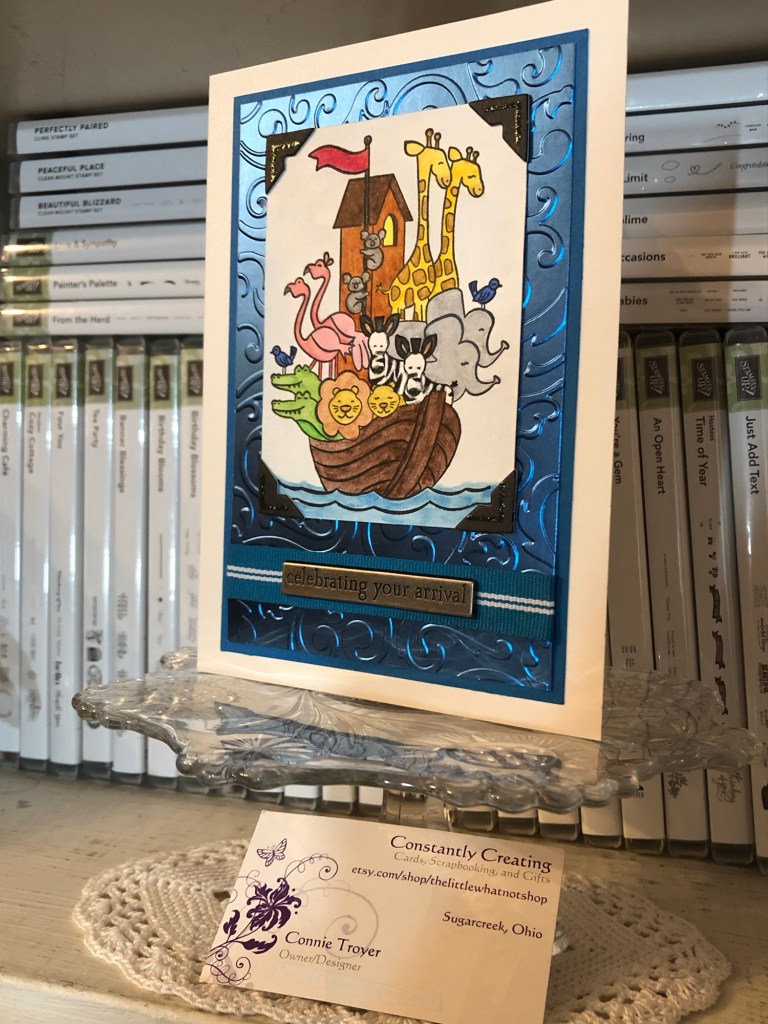
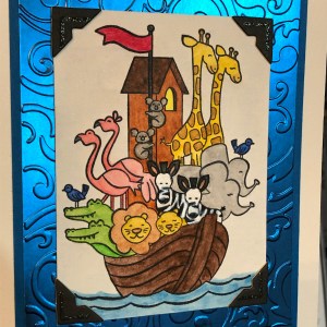
Our theme this month is “Celebrate Spring,” in whatever way we want to interpret that. Because I’m also making cards for my local gift shop, I chose to go with the “new birth/baby” idea. I couldn’t wait to get my hands on Stampin’ Up’s “Perfectly Paired” cling stamp set when it came out—it’s all about babies and features a Noah’s Ark image, one of my favorite themes for little ones. This stamp set (so far as we know) is only available for a couple more months since it’s in the current Occasions catalog.
Since I knew this would be a nice card and likely given with a gift, I started off by grabbing a lovely, thick envelope from my stash and then made the card base a 5×7 size to match it, using SU’s Shimmery White cardstock. I chose Shimmery White because I wanted to color the image.
Well, as usual, although I was aiming for simple, I evidently have to complicate things. And I made plenty of mistakes to cover up. My “MO,” I’m starting to think.
It occurred to me that there were waves under the ark in the stamp but I thought it might look a bit “adrift” all by itself on a flat card base. So I got some of my new Ice Blue Matt Mirror Luxury Cardstock (Crafter’s Companion) and cut it down, leaving about a 3/8″ border of white on the base for the “shimmery” part of the “Shimmery White” to show. Then I embossed some waves onto the mirror card with my Cuttlebug (“Musical Flourish” embossing folder).
My piece of mirror card was slightly longer than the embossing folder, so I embossed both ends and then attempted to hide the faint line the edge of the folder left with some retired 1/2″ SU Pacific Point ribbon. I wrapped the ribbon around the edges to give it a neater, more finished look. I believe I used my 1/4″ Scor-Tape down the middle of the back of the ribbon.
I didn’t actually cover the line left by embossing because the ribbon wasn’t wide enough, but hopefully I distracted anyone from looking too closely. I tried to keep the embossed design from overlapping when I ran it through the Cuttlebug, and the embossed line really isn’t that bad, but it’s mirror card so everything shows…. 🤷♀️ Whether I needed the ribbon or not, it was an attempt to make the card look better, and I built the rest of the design from there.
After fiddling with the layout, I decided to also mat the mirror card with Pacific Point cardstock to bring more of the ribbon color in for balance. I left 1/8″ of the mat showing, glued the mirror card to the mat, and then glued the combo onto the card base. I used my ATG tape gun for these. Then I set aside the card so I could concentrate on the image. And here’s where things got interesting.
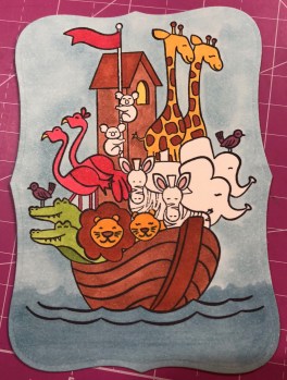
I wasn’t sure whether to use my Stampin’ Blends alcohol markers to color it or my usual: watercolor pencils with either an Aqua Painter or a Blender Pen. I figured I’d do one of each type of coloring and leave the extra in my “card parts” bin for faster cardmaking later. Because those mediums require different inks to control the color, I stamped the ark image from “Perfectly Paired” once in Memento Tuxedo Black (for the alcohol markers) and once in SU’s Archival Basic Black (for the watercoloring). I labeled the backs with a pencil so I’d know which went with what…and then promptly started coloring the wrong image with the wrong medium because I was “doing,” not “thinking.” 🙄🤦♀️
Surprisingly, the Archival Basic Black didn’t smear too badly with the alcohol Blends, but I had been careful about not coloring over the lines, just because I was carefully coloring. It wasn’t until I smeared the lions’ whiskers a little that I even realized I’d switched the pieces. (Live and learn?) But smearing lines is why we are supposed to use Memento ink with alcohol markers. Lesson learned.
And then I discovered that I don’t yet have enough Blends to finish coloring this particular image. 🤦♀️🤪 I’ve been building my collection a little at a time, and although the Smoky Slate and Basic Black Combos have each made it to my purchasing list at least once, I ended up dropping them for things I wanted more. (Sacrifices!) Therefore, I have to stop coloring the image until I can get those and finish. For the record, though, this was as far as I got, and I really like this medium. (If you look closely, you can spot my whiskers accident.)
So I had to put all that away and regroup. I couldn’t remember whether Memento would smear if I got it wet (since it is a water-based ink), but I just wanted to get something going that I could use. I mentally crossed my fingers and dove in. I could always stamp another one if I had to.
Fortunately, it worked just fine—no smearing that I can tell. My coloring isn’t perfect, but at least the lines didn’t move. I went with the Aqua Painter to smooth out the watercolor pencil lines too…though in hindsight, I should have tried the Blender Pen, for better control in small places. Or just chucked it all and gone straight for my stash of Stampin’ Write markers. (I hope you’re learning from my mistakes! This veteran scrapbooker is still learning so much about cards!)
I will admit to a little cheating as well. I knew I had a Pacific Point chalk in my arsenal. As my retired SU watercolor pencils are unlabeled, I went for the chalk to color the water (with my Aqua Painter) so I could be all matchy-matchy instead of throwing off the shades by introducing some other blue. 😊 Also, I lightly colored the background a sky blue so that it wasn’t stark white paper. If I was coloring waves, I had to color sky too, right? But it’s hard to see in the picture.
So this is where I ended up with it (including doctoring the zebras with white Smooch paint and a Memento pen in desperation after watercoloring and black got the better of me). Coloring was the longest part and why it may be better to use some sort of marker next time. 🤷♀️ Another lesson learned!
The main focal image, colored.
Once the image was done and dried, I covered a good portion of the back of it with my 1/2″ Terrifically Tacky Tape (TTT), which is just like SU’s Sticky Strip. I did this to combat the curvature of the paper that happens once water goes onto it. Then I peeled off the tape backing and centered it in the section above the ribbon on the card front.
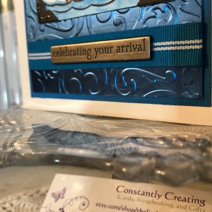
I had found some black, glittered chipboard faux photo corners when I was debating about the layout, so I glued those overtop the corners of the image with my Art Glitter liquid adhesive. And then I pulled a metal bar sentiment (“celebrating your arrival”) out of the heap of baby ephemera in front of me on my desk, and I adhered it to the top of the ribbon with more 1/4″ Scor-Tape. The front was done. Finally. And I’m even happy with it. 😂 I especially love how the foil look of the matt mirror cardstock shines and changes depth and color in the light. I so love using specialty materials to make cards pop.
(Oops! You can see that faint embossed line in this pic! Well, it’s not that noticeable in person. 😊)
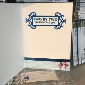
For the inside of the card, I used the “Two by two we welcome you” sentiment from “Perfectly Paired,” stamping it with VersaMark on Shimmery White cardstock before heat embossing it with “Blue Tinsel” embossing powder from my stash. (No idea who made that; I’ve had it for years.) It was the closest embossing powder I could find to the Pacific Point color I’d been using, and it does actually look glittery, like tinsel, and has some texture to it once embossed. I then backed the white sentiment piece with a die-cut Pacific Point cardstock tag from a Spellbinders die (“Fancy Tags Two,” I believe. #neverstopmaking). I think it turned out quite lovely.
To finish off the card, I took a strip of dotted blue (SU Pool Party) cardstock from the retired Tutti-Frutti Cards and Envelopes pack and attached it to the bottom of the inside. I also cut off a small strip of matt mirror cardstock to top it. And then I found two goofy pink flamingo stickers in my stash from Sandylion and stuck them to the bottom right corner just for fun, to carry through the theme. I was looking for my smaller Noah’s Ark stamp for the corner, but I have to keep looking. 🤔🤷♀️
I haven’t decorated the envelope yet, but I’m thinking of stamping a row of various animals across the horizontal bottom (under the address section) as a sneak peek to the theme.
Below the list of hop participants are the current products I used in my card (or similar ones) that you can purchase through my online Stampin’ Up store if you wish to own any. (Please use host code 6WPHJ2MC when you check out.) Don’t forget that we have until March 31 to get free gifts from Stampin’ Up through Sale-a-Bration with orders of $50 or more before tax and shipping! There are some awesome reward products available! I also give free gifts to those who order through me. 😉
Thanks again for visiting today. I hope my mistakes keep you from making your own! Feel free to post questions or comments. 🙂
To continue with our hop and visit Jaimie Babarczy’s blog offering, click Next or her name in the list below. To view what Karen Ksenzakovic created, click Previous or her name. Thanks for hopping along with us!
While it seems like all I am making right now, when I have time to get into my craft room, is wedding, baby, bee, and lemon cards (for the gift shop and a custom order), I’ve been needing to do up another sympathy card as well. I rarely have a chance to make anything for my friends and family besides birthday and sympathy, to be honest, and those never stop coming. And although it was in the back of my mind to make a sympathy sooner rather than later, this card sort of fell together by accident.
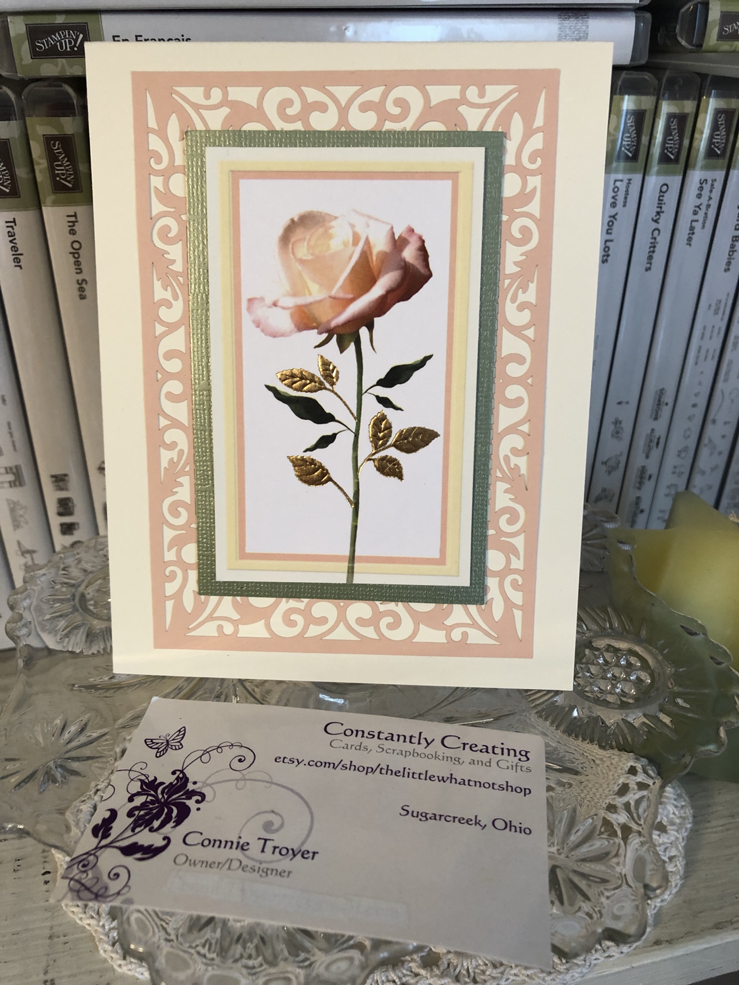
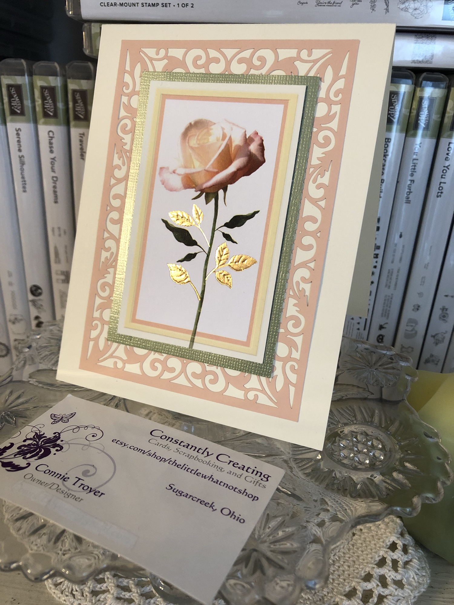
The gorgeous sage green/peach/vanilla/white matted rose piece was in the last RAK I received from a crafty friend. I think it is a piece that came from a mass-produced card and was upcycled, because the leaves are even made of gold embossed foil. It really is beautiful. I had laid it aside because the mat was coming up and looked a tad larger on one side. One night I fixed it and absentmindedly put adhesive on the back before I realized I hadn’t prepared anything for it to go on…so I kept shuffling it around my desk for a few days, upside down so it wouldn’t stick to things. 🙂
I was actually searching for papers for another wedding card when I spotted my new pack of Petal Pink and white Beautifully Detailed Laser-Cut Specialty Paper” (148812, $14) that is in the new 2019 Occasions catalog (orderable as of January 3)–and it matched perfectly with the rose piece I had just moved…again. (The specialty paper pack includes eight sheets, four each of two design types. One type is a full 12×12 sheet that looks like filigree swirls, and the other type is full of elegant sections that can be cut into card fronts, borders, or accents.)
Once I confirmed that the pieces matched, I carefully cut away one of the card front pieces that looked the best when I placed the rose on top of them to test them (on top of the plastic bag holding the specialty paper, since I already had adhesive in my way). Then I found a piece of Thick Very Vanilla cardstock, cut it in half, and scored both, using one as my card base. And then I laid more adhesive on the back of the rose piece, just in case, before adhering it first to the laser-cut paper and then to the card base. The laser-cut paper I chose has a large opening in the middle, which the edges of the green mat just barely covered on the sides, so the adhesive went right through to the base.
I almost left the borders of the specialty paper free without gluing them, but I was afraid they would get creased since they’re so delicate, even though they’re a good weight. So I did take a bit of my Art Glitter fine-tip glue to tack down the corners in the thickest part and occasionally on the sides just to keep it from catching on something.
I kept the inside simple with a stamp from the retired Thoughts and Prayers stamp set from SU, and I used Grapefruit Grove ink because I thought the paper was the same color until I checked it tonight (oops!). I may go back and add one of the border pieces of the specialty paper on the bottom, but I haven’t decided how much room we will need for the handwritten message of the card.
Be sure and pick up a pack of this laser-cut specialty paper when the Occasions catalog goes live on January 3. There are so many options for creating with it, and it’s simply lovely. Here are other current items I used for this card:
I’m happy to help you order if you need a Stampin’ Up demonstrator. 🙂 You can use the code PNWVCZEU to order through my store (http://www.stampinup.com/ECWeb/default.aspx?dbwsdemoid=2202334) through January 5. (If it is after January 5, feel free to contact me for a new code!)
Sometimes things are just too pretty or useful to throw away. (Yes, I have a Depression-era mind-set.) Here I used part of a printed card that had made its way to me into a little hello card, complete with a new tag, wood and resin pieces, two types of patterned paper (one being embossed and glittered), Stampin’ Up Lucky Limeade ribbon, and translucent, glow-in-the-dark Nuvo Drops.


")


 Shimmer Ribbon")

 Vellum Cardstock")