Hello there! Welcome back to my blog. I made this card last week when I spotted my remaining scrap (less than a 6×6) of this pattern of floral-patterned paper in the Perennial Essence Designer Series Paper pack, #149100 (which is currently on the last-chance list for $8.09! Go get one!). My scrap was just so pretty that I had to use it up. I looked up the colors in the pack (Balmy Blue, Blackberry Bliss, Blueberry Bushel, Calypso Coral, Crushed Curry, Flirty Flamingo, Mossy Meadow, Old Olive, Petal Pink, So Saffron, Whisper White) and picked Petal Pink for my card base. Then I reached for my matching vellum (Perennial Essence Vellum Cardstock, #149101) and picked the Old Olive color. (The vellum pack also has Petal Pink and So Saffron.)
To decide how much of the scrap I wanted to use and where to cut it, I first stamped my sentiment (from the Floral Blossoms stamp set, #151457, which is carrying over) in Old Olive ink, #146090, so that I could narrow down the dimensions and have more exact placement. I knew I wanted to mat the floral image to give it distinction from the Petal Pink card base, since there is so much Petal Pink in this particular scrap of DSP. (Isn’t it pretty? I always love a good watercolor image.)
After cutting the vellum, I then decided to emboss the Old Olive with the Subtle Embossing Folder, #151775, to have a small pattern that would complement rather than draw attention away from the flowers. When I flipped over the vellum to put some adhesive on the back that would be behind the flowers, that’s when things changed. I stopped mid-glue because I suddenly realized how cool the back side looked. The embossing—or, rather, the debossing—made the vellum turn kind of white with the creasing! Well, then I was torn; I liked both. I decided to take pictures of each side to show you and also to be able to make a decision—sometimes I see things differently when I view a photo I’ve taken, even if I’m the same distance from the image and looking at it in real life. I’m curious to see which side you like best. Leave me a comment and let me know which side—or which card—you would have gone with. 🙂
Green debossed “whiter” sideGreen embossed vellum, colored side up
The way my original idea would have looked with the green vellum pointing up
I decided that I definitely liked the whiter side up and set about doing a double layer of matting to really hone in on the vellum (while still not taking away from the flowers). Pleased with my choice, I glued the now-white vellum to the larger unembossed Olive Olive vellum and the floral piece to the other smaller piece of Old Olive vellum, for two different mats. I think double matting just gives an elegant, intentional, thoughtful look to the thing being matted. I do this in my scrapbooking at times too, to help feature certain photos. When I look at the above picture now—the green-embossed side up, without the mats—it just feels so much plainer to me. (Of course, I would have added embellishments to it too.)
Exterior of finished cardInterior of card (so far)
So there you have it, readers! Let me know what you think about this card and what you would have chosen. Clickable links for the products I’ve used are below.
If you don’t already have a demonstrator and would like to receive a free catalog from me, submit your name and address in my contact form and I’ll send one right out to you (remember, the catalog goes live on June 3!). I’m also working on my first product share offering and will post details about that soon in case anyone wants to buy in. (If you’re not familiar with a product share, it’s a sampling of new product from the new catalog—though I’ll probably also have an “old product” version too, in case some want everything. That way you get a little bit of all the fun DSP, embellishments, and ribbon without the gigantic cost of buying it all individually. So stay tuned for details on that!)
Thanks again for stopping by today. Let me know if I can help you!
My host code from now until the the end of June is GCXZKQT9, which you can add to your order before you check out. As a reminder, if you order $250 worth before tax and shipping are added in, don’t add the host code since you’ll be prompted to put in your own rewards—your own little party! And anyone who orders $50 before tax and shipping gets a free gift of up to $8 from me, along with a reward point toward a free $40 order from me to you. When you collect 8 reward points, you’ll just need to tell me what you want and I’ll have it shipped out to you, as my thanks for being my customer. 🙂 Contact me if you have any questions!
Welcome to my blog for Stamp with Amy K’s Inkin’ Krew Blog Hop for Tuesday, August 13! We have a great lineup for you today. Thanks for stopping by to see what I created. 🙂
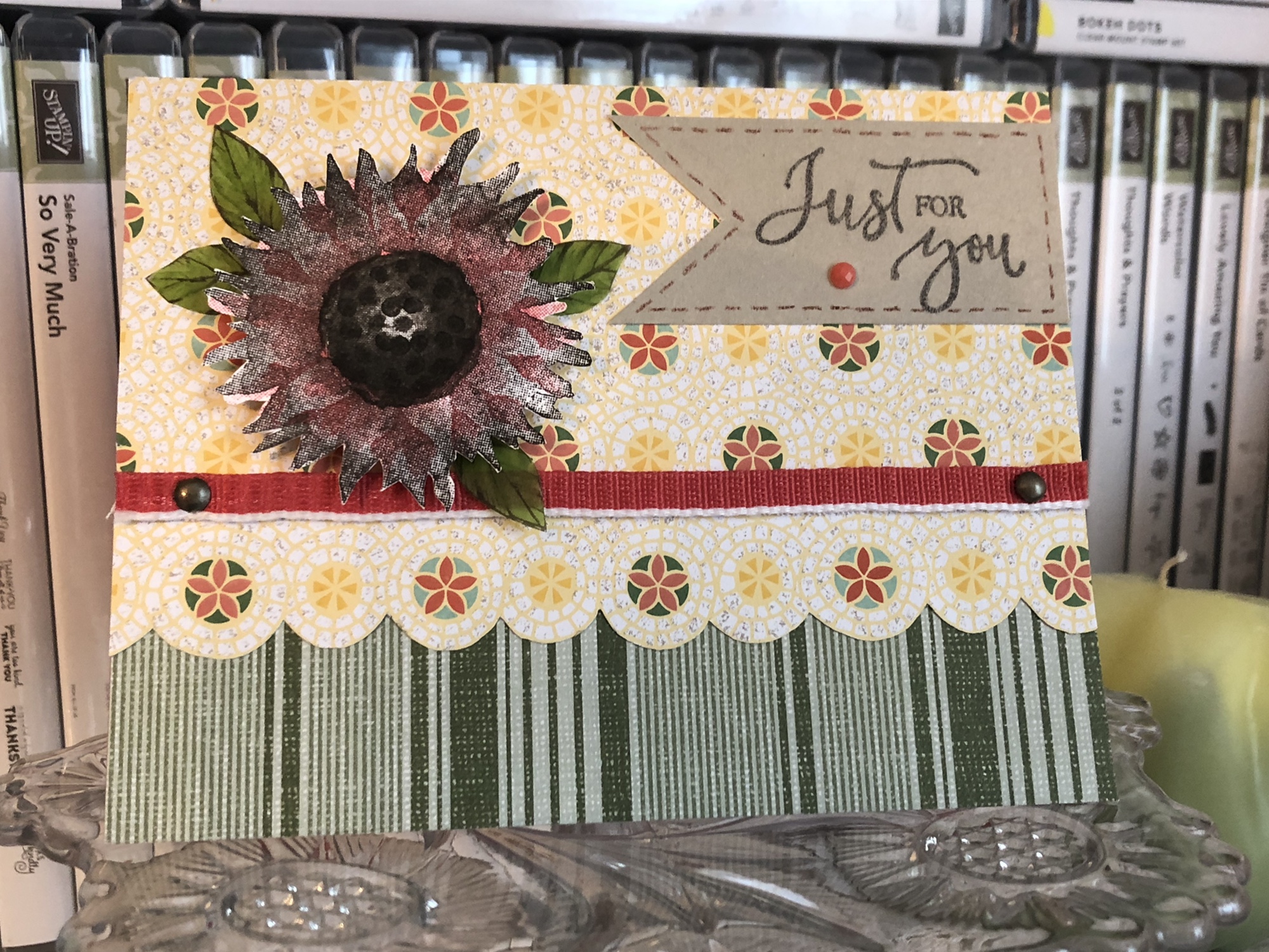
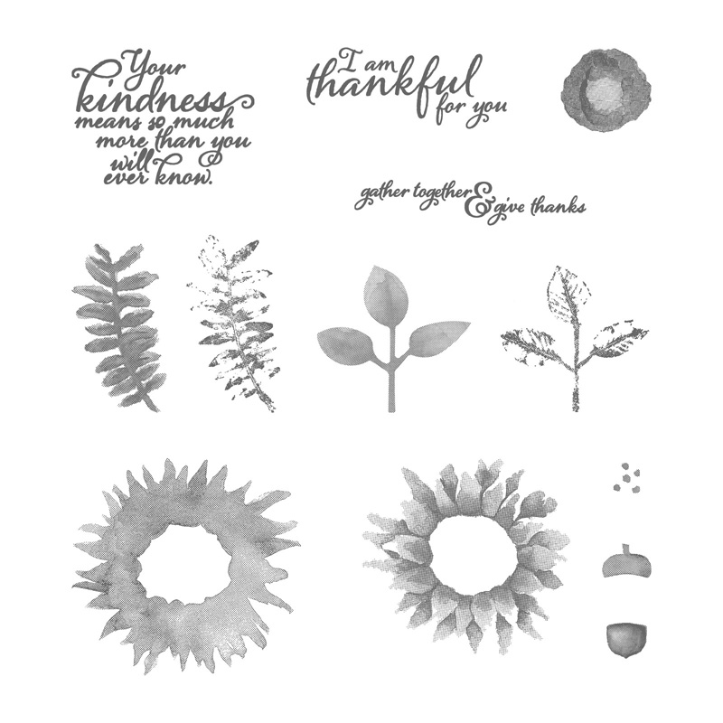
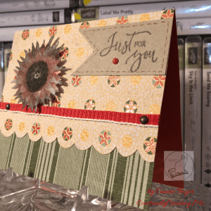
With the seasonal change coming soon, this month’s blog hop theme is “fall frenzy.” So I have a thinking of you/just for you sunflower card to share with you today using Stampin’ Up’s “Painted Harvest” and “Rare Blessings” stamp sets.
Painted Harvest
Rare Blessings
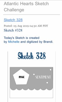
I decided to use last week’s Atlantic Hearts Sketch Challenge—Sketch #328—to give me a basic idea of construction. I don’t use sketches often because I usually just design straight from my brain based on what I’m feeling with the products I see in front of me, but I’ve had a busy weekend (okay, month). I’m thankful I can turn to a sketch or a Pinterest pin for less-than-ideal crafting times when I need to come up with something quickly in either design or time. So here is the sketch image I worked from.
I was also inspired by a card from my teammate Leslie Larkin (leslielarkin.com) that was posted on our team Facebook page last month. After I saw her card, I wanted to make one immediately. I love the black-and-white flower with the color around it (she used Memento Tuxedo Black ink with Lovely Lipstick paper, cardstock, and gems).
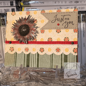
So without further paragraphs, let’s get to my card! Although I had to create it in a crunch, I found several ideas vying for realization as I looked through my current DSP and video-chatted with a crafty friend. I didn’t have time to make the five cards I wanted to, so I’ve had to back-burner most of them. I did pull out supplies to make a second card following the same sketch, so I’ll make that and post it another day. Here’s the one I put together for today. (Be sure to catch the updated picture at the end!)
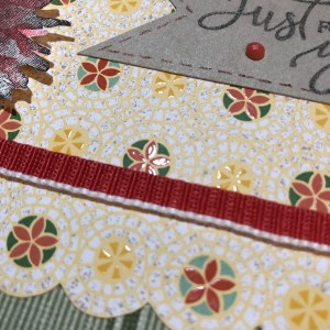
What I ended up using was a Terracotta Tile card base, a sheet of striped paper from the “Come Sail Away” DSP pack (Mossy Meadow color), and a sheet of flowered paper from the Mosaic Mood Specialty DSP (Crushed Curry, Garden Green, Mint Macaron, Terracotta Tile, and Very Vanilla colors). It is a specialty DSP because half the sheets in the pack have Spot UV gloss on the paper to showcase various designs. In the paper I used, the flowered circles have the gloss on them.
I thought the Mosaic Mood paper would work for the scalloped piece on the sketch because the flowered circles are all in a row and have radiating circles around each flower. I just took my scissors and fussy-cut around the largest circle of each flower in the row, up to where it touches the next circle. It seemed the fastest way to move forward on the card and stop all the overthinking I was doing.
The striped Mossy Meadow paper from “Come Sail Away” pulls out the Garden Green from the “Mosaic Mood” paper and balances everything visually. For some reason, I always think stripes go on the bottom. I suppose that’s one of my “ruts” in card-making. However much I tried to argue with that while designing the card, in the end it was easiest to cave and promise myself that I’d try something new later.
Once I had the stripes glued down and the top portion cut, I tried to find a way to use the beautiful 1/2″ Poppy Parade Textured Weave Ribbon in my “current product accessories” bin. I began using the ribbon the way it comes off the roll but didn’t like how it was the same width as the flowered/scalloped border. I needed something thinner, but I only have so many ribbons and twine options right now. So I put some heavy-duty Tear & Tape Adhesive down on one side of the ribbon and did my best at folding it over in half (it’s kind of tricky, actually). And then I located the 1/8″ Glubers glue line I’d cut in half previously for another card. It comes in 1/4″ strips, but as I’ve mislaid my 1/8″ red-line tape, I made do with the other—twice now. Tear & Tape Adhesive would have worked for that as well, but I already had the other one cut and waiting for me.
The metallic brads are basically just decorative. Since I hadn’t yet adhered the flowered piece to my card base, I could still punch a tiny hole on each side of the ribbon, place the brads through the holes, and fasten them at the back before gluing the paper. I’m considering them to be two of the gem places in the sketch, with the third located on the tag. My brads are miscellaneous from my stash, but Stampin’ Up has a great set of Metallic Brads in the current catalog, so I’ll add them to the list of supplies at the end.
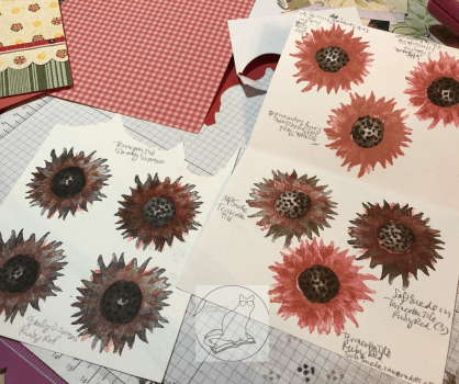
Then came the tedious part of the card—figuring out which colors to use for the two-step photopolymer “Painted Harvest” sunflower. I know I’ve saved some color swatches for this sunflower in Pinterest, but for some reason I thought it would be faster to use the colors I’d narrowed down and stacked on my table rather than search in my Color Combos and Sketches board. Hindsight is 20/20.
I wasn’t entirely sure how the stamping was supposed to go, so I got some scrap paper and started “playing” with the two darker ink colors I’d pulled—Early Espresso and Soft Suede. I did several of both colors as the base. Then I opened the two ink colors in my stash that matched the paper the best—Terracotta Tile and a very old (but perfectly juicy) Ruby Red. I need to get a Poppy Parade ink pad yet. I wasn’t sure which color would work best with both the Poppy Parade ribbon and the Terracotta Tile in the paper.
After too much experimentation, including tone-on-tone and color mixing in the brighter colors, I chose to go with the Early Espresso/Ruby Red combination. The Terracotta Tile is more orange than Poppy Parade, and the Ruby Red has a better balance of an orange and something rosier or pinker when both Terracotta Tile and Poppy Parade are on the same card. The flower spots that have Terracotta Tile in them on the DSP are small enough it doesn’t seem to matter much. I had originally picked a Soft Suede/Terracotta Tile combination, but I didn’t stamp the center quite right on the best piece and royally messed it up when trying to fix it, per my usual. Anyway, that color combination works too.
The center of the finished flower is tone-on-tone Early Espresso. Stamping the center of the sunflower was a little challenging to line up at first, but the more I “practiced,” the better I got at it. So just keep trying while you figure out how it works. After I chose one of the images I’d stamped, I then fussy-cut around the finished sunflower and added pop-up foam dots to the back of it. I’m just now realizing that I probably should have added leaves as well. But I’m calling this card done. Maybe I’ll add leaves before I send it. That’s for another day.
For the “Just for You” tag from the “Rare Blessings” stamp set, I used Early Espresso ink and a scrap of Crumb Cake cardstock. The stamp set is one of the new cling sets, so I had to put it together first with the new stickers (that actually stick to the block!). I actually kind of love doing that with the new stamp sets. 🙂 After that was done and I stamped it on the Crumb Cake, I cut down the tag and snipped up the middle at the left with my scissors to make a banner end. Then I took a Really Rust Stampin’ Write Marker (retired) and added some faux stitching in a thin border just inside the edges of the tag. I would have used an Early Espresso marker, but something happened to mine and I no longer have one. The Really Rust is close enough to the Terracotta Tile that it still matches. And, finally, I added a Terracotta Tile gem from the 2019-2020 In-Color Faceted Dots embellishment pack to the tag as one of the gem spots in the sketch.
I’m not sure what is going on the inside yet. The card is going to a friend who recently lost his mother. I need to look for the right sentiment before I send it with a delayed memorial gift. It’s been a busy year here. But at least I’m one step closer in getting the card and gift sent out the door.
UPDATE!: I decided to add some vellum leaves from the Magnolia Lane Memories and More Card Pack around the flower. I fussy-cut them and colored them on the front and back (to make them darker) with my Dark Old Olive Alcohol Blend marker. (I don’t have the Mossy Meadow Blends yet, so I made do.) The sentiment on the inside reads “With Deepest Sympathy” and is from the current Golden Afternoon stamp set. I stamped it in Crumb Cake. I also ran one of the sticker border strips across the bottom of the inside from the Magnolia Lane Memories and More Card Pack. NOW I’m finished with the card. 🙂
That’s all for today. Stay tuned for the next card using “Painted Harvest” and Sketch 328. Thanks again for visiting! Feel free to post questions or comments. Below the list of blog hop participants of my Stampin’ Up team members are the products I used in my card. You can purchase any of them through my online store here—or just click on the picture—and if you use the host code 3W7RXKCU when you check out, I’ll send a free gift your way! Also, if you happen to need a current Annual Catalog or the upcoming Holiday Catalog (which should arrive on my doorstep tomorrow), I’m happy to send you one! Just use the Contact Me link at the top of the main page.
To continue with our blog hop using the arrows, click Previous to view Paula Vincent’s offering or Next to view Karen Ksenzakovic’s card. Or you can click any of the links below to go directly to any demonstrator’s blog.


")


 Shimmer Ribbon")

 Vellum Cardstock")